Tag: papers

Create a publication-ready correlation matrix, with significance levels, in R

Create a publication-ready correlation matrix, with significance levels, in R

TLDR; You can use the corrtable package (see CRAN or Github)!

In most (observational) research papers you read, you will probably run into a correlation matrix. Often it looks something like this:

FACTOR ANALYSIS

In Social Sciences, like Psychology, researchers like to denote the statistical significance levels of the correlation coefficients, often using asterisks (i.e., *). Then the table will look more like this:

Table 4 from Family moderators of relation between community ...

Regardless of my personal preferences and opinions, I had to make many of these tables for the scientific (non-)publications of my Ph.D..

I remember that, when I first started using R, I found it quite difficult to generate these correlation matrices automatically.

Yes, there is the cor function, but it does not include significance levels.

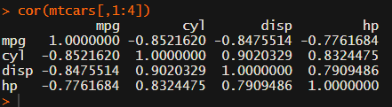
Then there the (in)famous Hmisc package, with its rcorr function. But this tool provides a whole new range of issues.

What’s this storage.mode, and what are we trying to coerce again?

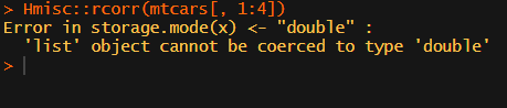
Soon you figure out that Hmisc::rcorr only takes in matrices (thus with only numeric values). Hurray, now you can run a correlation analysis on your dataframe, you think…

Yet, the output is all but publication-ready!

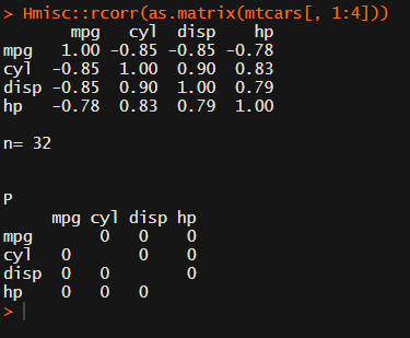
You wanted one correlation matrix, but now you have two… Double the trouble?

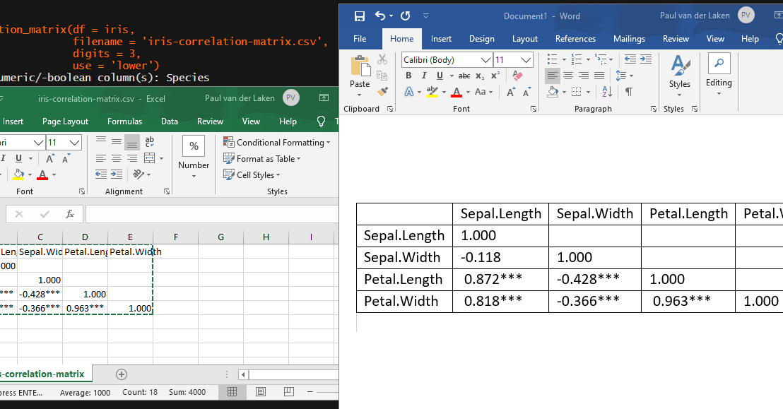
[UPDATED] To spare future scholars the struggle of the early day R programming, Laura Lambert and I created an R package corrtable, which includes the helpful function correlation_matrix.

This correlation_matrix takes in a dataframe, selects only the numeric (and boolean/logical) columns, calculates the correlation coefficients and p-values, and outputs a fully formatted publication-ready correlation matrix!

You can specify many formatting options in correlation_matrix.

For instance, you can use only 2 decimals. You can focus on the lower triangle (as the lower and upper triangle values are identical). And you can drop the diagonal values:

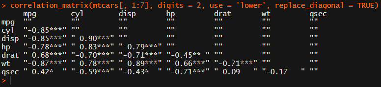
Or maybe you are interested in a different type of correlation coefficients, and not so much in significance levels:

For other formatting options, do have a look at the source code on github.

Now, to make matters even easier, the package includes a second function (save_correlation_matrix) to directly save any created correlation matrices:

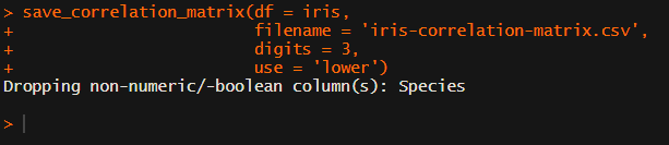
Once you open your new correlation matrix file in Excel, it is immediately ready to be copy-pasted into Word!

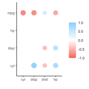
If you are looking for ways to visualize your correlations do have a look at the packages corrr, corrplot, or ppsr.

I hope this package is of help to you!

Do reach out if you get to use them in any of your research papers!

Sign up to keep up to date on the latest R, Data Science & Tech content:

Learn from the Pros: How media companies visualize data

Learn from the Pros: How media companies visualize data

Past months, multiple companies shared their approaches to data visualization and their lessons learned.

Click the companies in the list below to jump to their respective section


Financial Times

The Financial Times (FT) released a searchable database of the many data visualizations they produced over the years. Some lovely examples include:

Graphic showing what May needs to happen to get her deal over the line when MPs vote on Friday
Data visualization belonging to a recent Brexit piece by the FT, viahttps://www.ft.com/graphics
Dutch housing graphic
Searching the FT database for European House Prices via https://www.ft.com/graphics returns this map of the Netherlands.

BBC

The BBC released a free cookbook for data visualization using R programming. Here is the associated Medium post announcing the book.

The BBC data team developed an R package (bbplot) which makes the process of creating publication-ready graphics in their in-house style using R’s ggplot2 library a more reproducible process, as well as making it easier for people new to R to create graphics.

Apart from sharing several best practices related to data visualization, they walk you through the steps and R code to create graphs such as the below:

One of the graphs the BBC cookbook will help you create, via https://bbc.github.io/rcookbook/

Economist

The data team at the Economist also felt a need to share their lessons learned via Medium. They show some of their most misleading, confusing, and failing graphics of the past years, and share the following mistakes and their remedies:

  • Truncating the scale (image #1 below)
  • Forcing a relationship by cherry-picking scales
  • Choosing the wrong visualisation method (image #2 below)
  • Taking the “mind-stretch” a little too far (image #3 below)
  • Confusing use of colour (image #4 below)
  • Including too much detail
  • Lots of data, not enough space

Moreover, they share the data behind these failing and repaired data visualizations:

Via https://medium.economist.com/mistakes-weve-drawn-a-few-8cdd8a42d368

FiveThirtyEight

I could not resist including this (older) overview of the 52 best charts FiveThirtyEight claimed they made.

All 538’s data visualizations are just stunningly beautiful and often very
ingenious, using new chart formats to display complex patterns. Moreover, the range of topics they cover is huge. Anything ranging from their traditional background — politics — to great cover stories on sumo wrestling and pricy wine.

Viahttps://fivethirtyeight.com/features/the-52-best-and-weirdest-charts-we-made-in-2016/
Via https://fivethirtyeight.com/features/the-52-best-and-weirdest-charts-we-made-in-2016/ You should definitely check out the original cover story via https://projects.fivethirtyeight.com/sumo/
Via https://fivethirtyeight.com/features/the-52-best-and-weirdest-charts-we-made-in-2016/