Category: news

Using data science to uncover botnets on Twitter

I love how people are using data and data science to fight fake news these days (see also Identifying Dirty Twitter Bots), and I recently came across another great example.

Conspirador Norteño (real name unkown) is a member of what they call #TheResistance. It’s a group of data scientists discovering and analyzing so-called botnets – networks of artificial accounts on social media websites, like Twitter.

TheResistance uses quantitative analysis to unveil large groups of fake accounts, spreading potential fake news, or fake-endorsing the (fake) news spread by others.

In a recent Twitter thread, Norteno shows how they discovered that many of Dr. Shiva Ayyadurai (self-proclaimed Inventor of Email) his early followers are likely bots.

They looked at the date of these accounts started following Shiva, offset by the date of their accounts’ creation. A remarkeable pattern appeared:

Afbeelding
Via https://twitter.com/conspirator0/status/1244411551546847233/photo/1

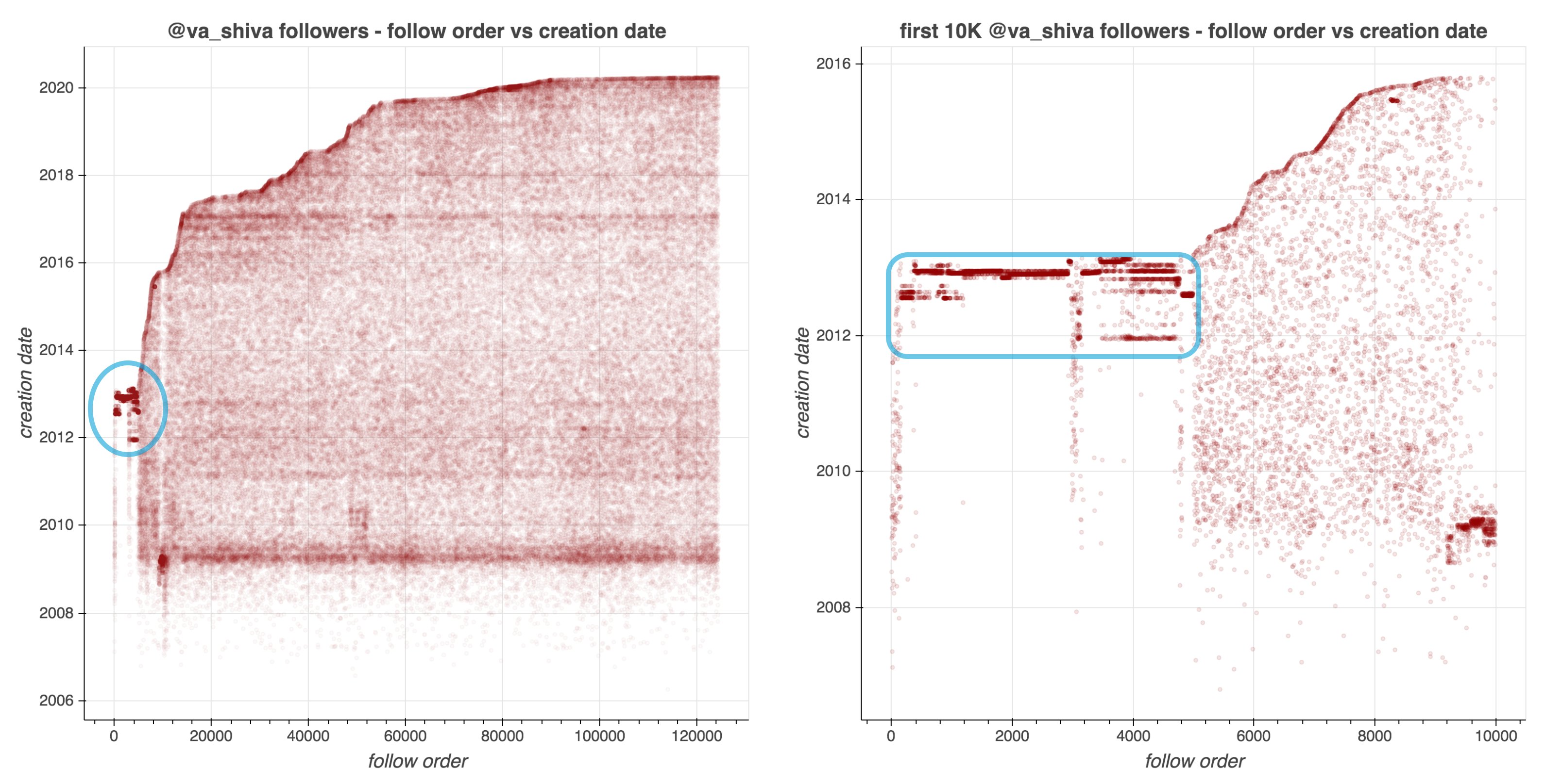
Although @va_shiva‘s recent followers look unremarkable, a significant majority of his first 5000 followers appear to have been created in batches and to have subsequently followed @va_shiva in rapid succession.

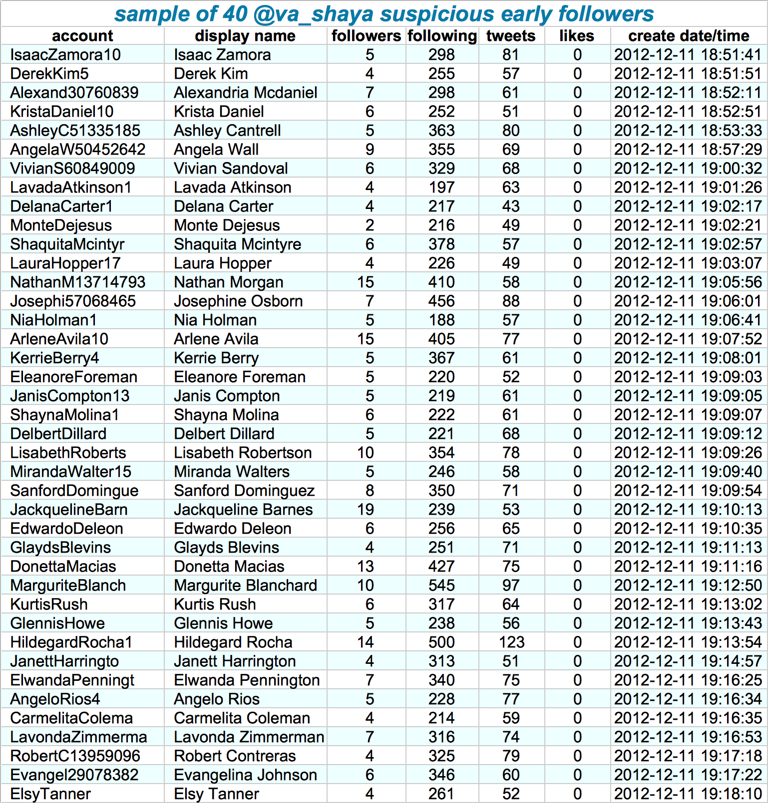
Looking at those followers in more detail, other suspicious patterns emerge. Their names follow a same pattern, they have an about equal amount of followers, followings, tweets, and (no) likes. Moreover, they were created only seconds apart. Many of them seem to follow each other as well.

Afbeelding
Via https://twitter.com/conspirator0/status/1244411636410187782/photo/1

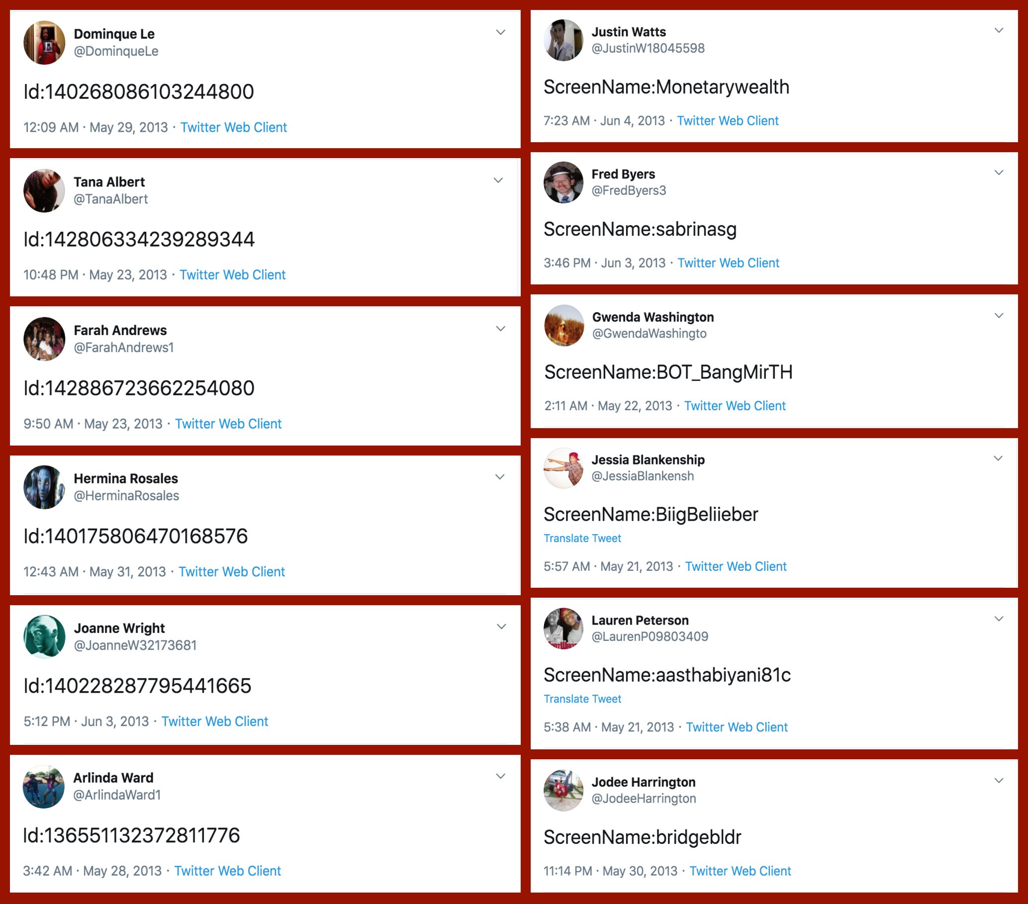
If that wasn’t enough proof of something’s off, here’s a variety of their tweets… Not really what everyday folks would tweet right? Plus similar patterns again across acounts.

Afbeelding
Via: https://twitter.com/conspirator0/status/1244411760129515522/photo/1

At first, I thought, so what? This Shiva guy probably just set up some automated (Python?) scripts to make Twitter account and follow him. Good for him. It worked out, as his most recent 10k followers followed him organically.

However, it becomes more scary if you notice this Shiva guy is (succesfully) promoting the firing of people working for the government:

Anyways, wanted to share this simple though cool approach to finding bots & fake news networks on social media. I hope you liked it, and would love to hear your thoughts in the comments!

Simulating Corona Virus Outbreaks – with and without social distancing

Simulating Corona Virus Outbreaks – with and without social distancing

I don’t want to participate in the general debate on COVID19 as there are enough, much more knowledgeable experts doing so already.

However, I did want to share something that sparked my interest: this great article by the Washington Post where they show the importance of social distancing in case of viral outbreaks with four simple simulations:

  1. Regular viral outbreak
  2. Viral outbreak with forced (temporary) quarantaine
  3. Viral outbreak with moderate social distancing
  4. Viral outbreak with extensive social distancing

While these are obviously much oversimplified models of reality, the results convey a powerful and very visual message showing the importance of our social behavior in such a crisis.

1. Simulation of regular viral outbreak
2. Simulation with temporary quarantaine opening up.

As these simulations are randomized, you will get your own personalized results when you read the article! Try it out yourself: washingtonpost.com/graphics/2020/world/corona-simulator/?tid=

A comparison of my results:

Realtime Corona Virus Dashboard

Realtime Corona Virus Dashboard

John Hopkins University’s Center for Systems Science and Engineering maintains this Corona virus dashboard showing the latest statistics and other information regarding the 2019-2020 outbreak in Wuhan.

The dashboard is updated every 15 minutes and demonstrates, among others, the total infected, death toll, recovery rate, and geographical spread.

Caselaw Access Project: Structured data of over 6 million U.S. court decisions

Caselaw Access Project: Structured data of over 6 million U.S. court decisions

Case.law seems like a very interesting data source for a machine learning or text mining project:

The Caselaw Access Project (“CAP”) expands public access to U.S. law. Our goal is to make all published U.S. court decisions freely available to the public online, in a consistent format, digitized from the collection of the Harvard Law Library.

The capstone of the Caselaw Access Project is a robust set of tools which facilitate access to the cases and their associated metadata. We currently offer five ways to access the data: APIbulk downloadssearchbrowse, and a historical trends viewer.

https://case.law/about/

Our open-source API is the best option for anybody interested in programmatically accessing our metadata, full-text search, or individual cases.

If you need a large collection of cases, you will probably be best served by our bulk data downloads. Bulk downloads for Illinois and Arkansas are available without a login, and unlimited bulk files are available to research scholars.

https://case.law/about/

Case metadata, such as the case name, citation, court, date, etc., is freely and openly accessible without limitation. Full case text can be freely viewed or downloaded but you must register for an account to do so, and currently you may view or download no more than 500 cases per day. In addition, research scholars can qualify for bulk data access by agreeing to certain use and redistribution restrictions. You can request a bulk access agreement by creating an account and then visiting your account page.

Access limitations on full text and bulk data are a component of Harvard’s collaboration agreement with Ravel Law, Inc. (now part of Lexis-Nexis). These limitations will end, at the latest, in March of 2024. In addition, these limitations apply only to cases from jurisdictions that continue to publish their official case law in print form. Once a jurisdiction transitions from print-first publishing to digital-first publishing, these limitations cease. Thus far, Illinois and Arkansas have made this important and positive shift and, as a result, all historical cases from these jurisdictions are freely available to the public without restriction. We hope many other jurisdictions will follow their example soon.

https://case.law/about/

A different project altogether is helping the team behind Caselaw improve its data quality:

Our data inevitably includes countless errors as part of the digitization process. The public launch of this project is only the start of discovering errors, and we hope you will help us in finding and fixing them.

Some parts of our data are higher quality than others. Case metadata, such as the party names, docket number, citation, and date, has received human review. Case text and general head matter has been generated by machine OCR and has not received human review.

You can report errors of all kinds at our Github issue tracker, where you can also see currently known issues. We particularly welcome metadata corrections, feature requests, and suggestions for large-scale algorithmic changes. We are not currently able to process individual OCR corrections, but welcome general suggestions on the OCR correction process.

https://case.law/about/
Northstar: The interactive, drag-and-drop data science platform by MIT

Northstar: The interactive, drag-and-drop data science platform by MIT

MIT researchers have spent years developing the new drag-and-drop analytics tools they call Northstar.

Northstar is an interactive data science platform that rethinks how people interact with data. It empowers users without programming experience, background in statistics or machine learning expertise to explore and mine data through an intuitive user interface, and effortlessly build, analyze, and evaluate machine learning (ML) pipelines.

northstar.mit.edu/

Northstar starts as a blank, white interface. Users upload datasets into the system, which appear in a “datasets” box on the left. Any data labels will automatically populate a separate “attributes” box below. There’s also an “operators” box that contains various algorithms, as well as the new AutoML tool. All data are stored and analyzed in the cloud.

news.mit.edu/2019/drag-drop-data-analytics-0627

You can read more about the tool’s functionalities in this MIT news article, which includes several promising GIFs:

Moreover, on the Northstar website you can find this longer video explaining the tool in detail.

https://vimeo.com/342787403

While Northstar looks insanely cool and promising, I do worry about putting such power in the hands of people who may not have much experience with statistics and/or machine learning. We all know how easily errors and bias may slip into data-driven processes, so I am curious to see how these next-gen kind of tools will be deployed and used.

Zeit’s interactive visualization of the 2019 European election results

Zeit’s interactive visualization of the 2019 European election results

Zeit — the German newspaper — analyzed recent election results in over 80,000 regions of Europe. They discovered many patterns – from the radical left to the extremist right. Moreover, they allow you to find patterns yourself, among others in your own region.

They published the summarized election results in this beautiful interactive map of Europe.

The map is beautifully color-coded for the dominant political view (Conservative, Green, Liberal, Socialist, Far left, or Far right) per region. Moreover, you can select these views and look for regions where they received respectively many votes. Like in the below, where I opted for the Liberal view, which finds strongest support in regions of the Netherlands, France, Czechia, Romania, Denmark, Estonia, and Finland.

For instance, the region of Tilburg in the Netherlands — where I live — voted mostly Liberal, as depicted by the yellow Netherlands. In contrast, in the German border regions conservative and socialist parties received most votes, whereas in the Belgian border regions uncategorizable parties received most votes.

Zeit discovered some cool patterns themselves as well, as discussed in the original article. These include:

  • Right-Wing Populists in Poland
  • North-South divides in Italy and Spain
  • Considerable support for regional parties in Catalonia, Belgium, Scotland and Italy
  • Dominant Green and Liberal views in the Netherlands, France, and Germany

Have a look yourself, it’s a great example of open access data-driven journalism!