Continuing my recent line of posts on data visualization resources, I found another repository in my inbox: OriginLab’s GraphGallery!
If I’m being honest, I would personally advice you to look at the dataviz project instead, if you haven’t heard of that one yet.
However, OriginLab might win in terms of sentiment. It has this nostalgic look of the ’90s, and apparently people really used it during that time. Nevertheless, despite looking old, the repo seems to be quite extensive, with nearly 400 different types of data visualizations:
Quantity isn’t everything though, as some of the 400 entries are disgustingly horrible:
There’s so much wrong with this graph…
What I do like about this OriginLab repo is that it has an option to sort its contents using a random order. This really facilitates discovery of new pearls:
Thanks to Maarten Lambrechts for sharing this resource on twitter a while back!
This visualisation tool I've never heard of is used by "500.000 scientists and engineers" and has an amazing gallery of 388 different chart types and variations https://t.co/0N3Td6jhqlpic.twitter.com/A7g4DeEGEv
YouTube recommended I’d watch this recorded presentation by Raymond Hettinger at PyBay2019 last October. Quite a long presentation for what I’d normally watch, but what an eye-openers it contains!
Raymond Hettinger is a Python core developer and in this video he presents 10 programming strategies in these 60 minutes, all using live examples. Some are quite obvious, but the presentation and examples make them very clear. Raymond presents some serious programming truths, and I think they’ll stick.
First, Raymond discusses chunking and aliasing. He brings up the theory that the human mind can only handle/remember 7 pieces of information at a time, give or take 2. Anything above proves to much cognitive load, and causes discomfort as well as errors. Hence, in a programming context, we need to make sure programmers can use all 7 to improve the code, rather than having to decypher what’s in front of them. In a programming context, we do so by modularizing and standardizing through functions, modules, and packages. Raymond uses the Python random module to hightlight the importance of chunking and modular code. This part was quite long, but still interesting.
For the next two strategies, Raymond quotes the Feinmann method of solving problems: “(1) write down a clear problem specification; (2) think very, very hard; (3) write down a solution”. Using the example of a tree walker, Raymond shows how the strategies of incremental development and solving simpler programs can help you build programs that solve complex problems. This part only lasts a couple of minutes but really underlines the immense value of these strategies.
Next, Raymond touches on the DRY principle: Don’t Repeat Yourself. But in a context I haven’t seen it in yet, object oriented programming [OOP], classes, and inherintance.
Raymond continues to build his arsenal of programming strategies in the next 10 minutes, where he argues that programmers should repeat tasks manually until patterns emerge, before they starting moving code into functions. Even though I might not fully agree with him here, he does have some fun examples of file conversion that speak in his case.
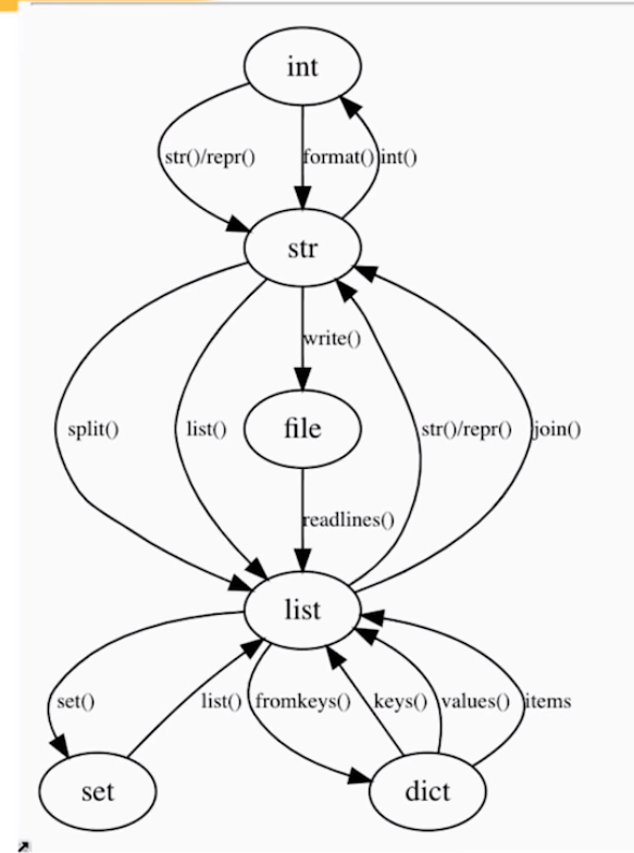
Lastly, Raymond uses the graph below to make the case that OOP is a graph traversal problem. According to Raymond, the Python ecosystem is so rich that there’s often no need to make new classes. You can simply look at the graph below. Look for the island you are currently on, check which island you need to get to, and just use the methods that are available, or write some new ones.
While there were several more strategies that Raymond wanted to discuss, he doesn’t make it to the end of his list of strategies as he spend to much time on the first, chunking bit. Super curious as to the rest? Contact Raymond on Twitter.
Thanks to Sebastian Raschka I am able to share this great GitHub overview page of relevant graph classification techniques, and the scientific papers behind them. The overview divides the algorithms into four groups:
As well as a link to relevant graph classification benchmark datasets.
"Awesome Graph Classification" — A collection of graph classification methods, covering embedding, deep learning, graph kernel, and factorization papers with reference implementations https://t.co/ugpL3xSvf1
Data visualizations that make smart use of icons have a way of conveying information that sticks. Dataviz professionals like Moritz Stefaner know this and use the practice in their daily work.
A recent #tidytuesday entry by Georgios Karamanis demonstrates how easy it is to integrate visual icons in your data figures when you write code in R. You can simply store the URL location of an icon as a data column, and map it to an aesthetic using the ggplot2::geom_image function.
Do have a closer look at Georgios’ github repository for week 21 of tidytuesday. You will probably have to alter the code a bit to get it to work. though!
For those who haven’t moved away from base R plotting functions yet, here’s a good StackOverflow item showing how to use icons in both base R and tidyverse.
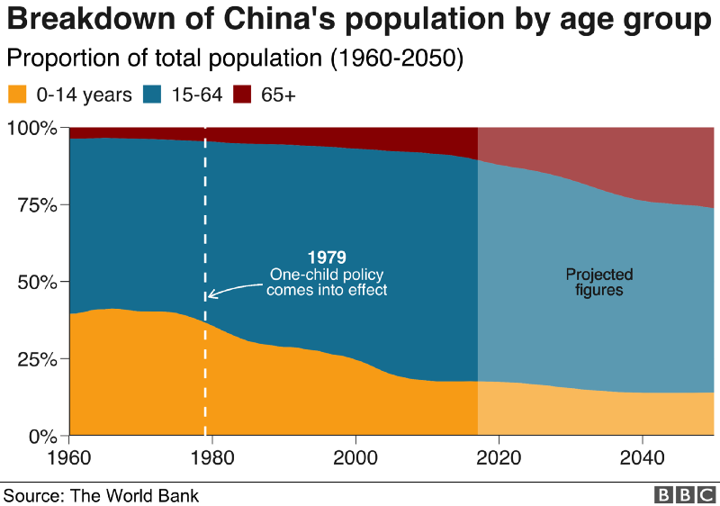
The BBC data team developed an R package (bbplot) which makes the process of creating publication-ready graphics in their in-house style using R’s ggplot2 library a more reproducible process, as well as making it easier for people new to R to create graphics.
Apart from sharing several best practices related to data visualization, they walk you through the steps and R code to create graphs such as the below:
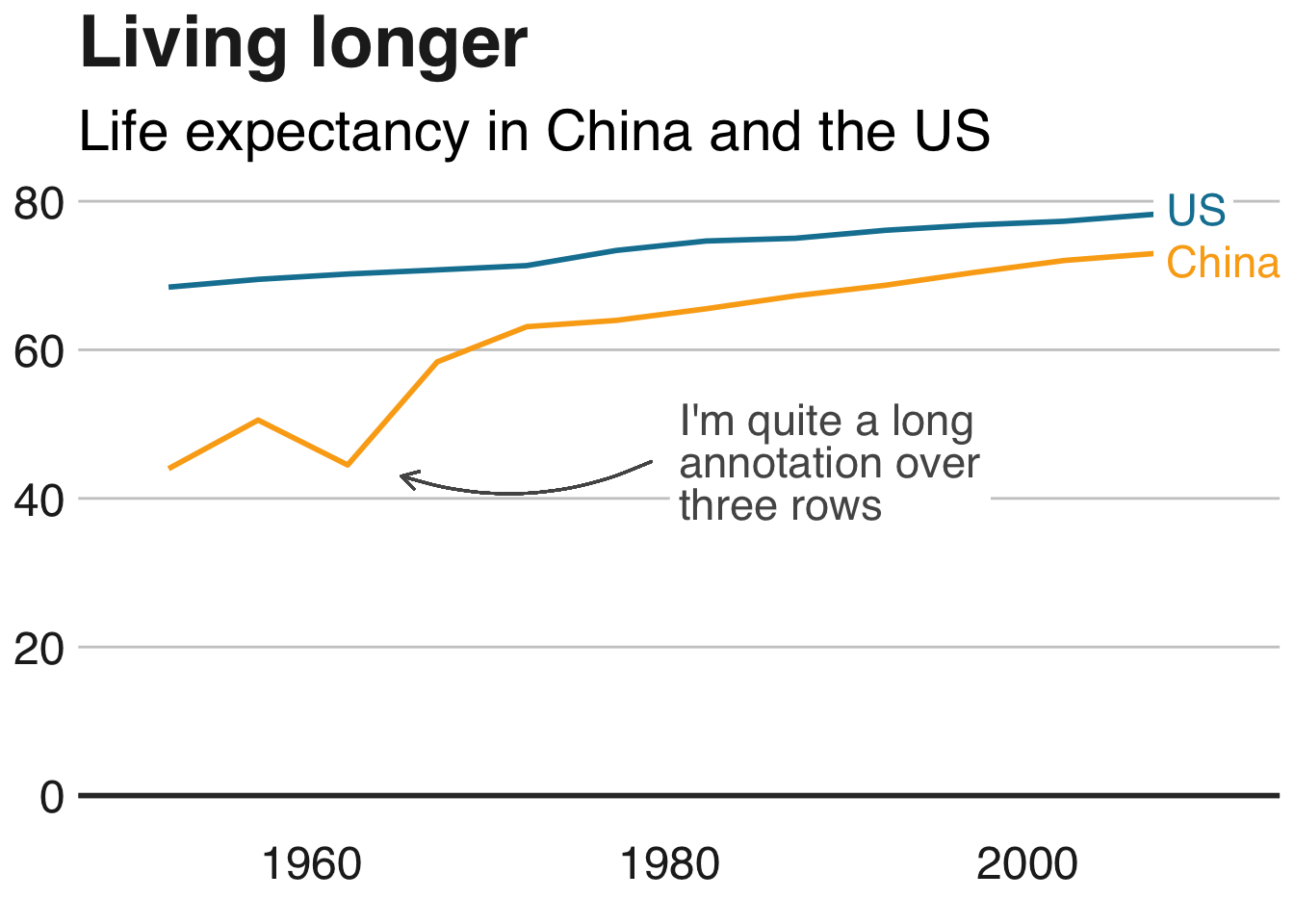
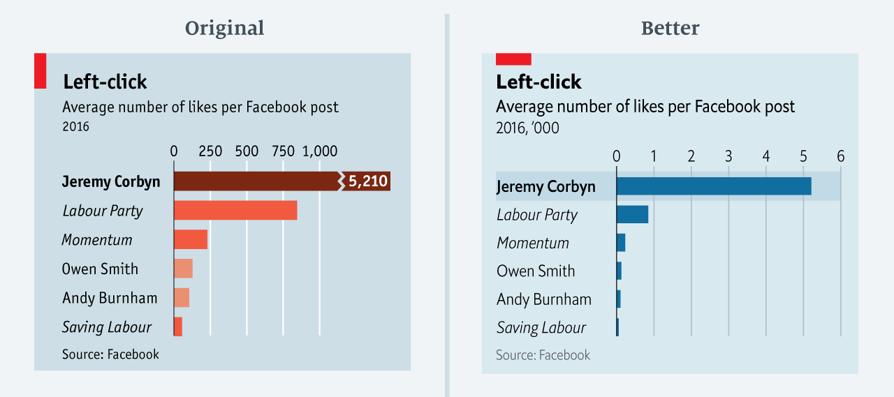
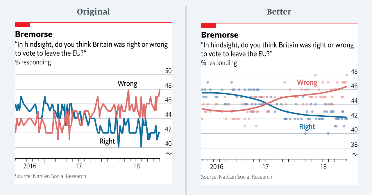
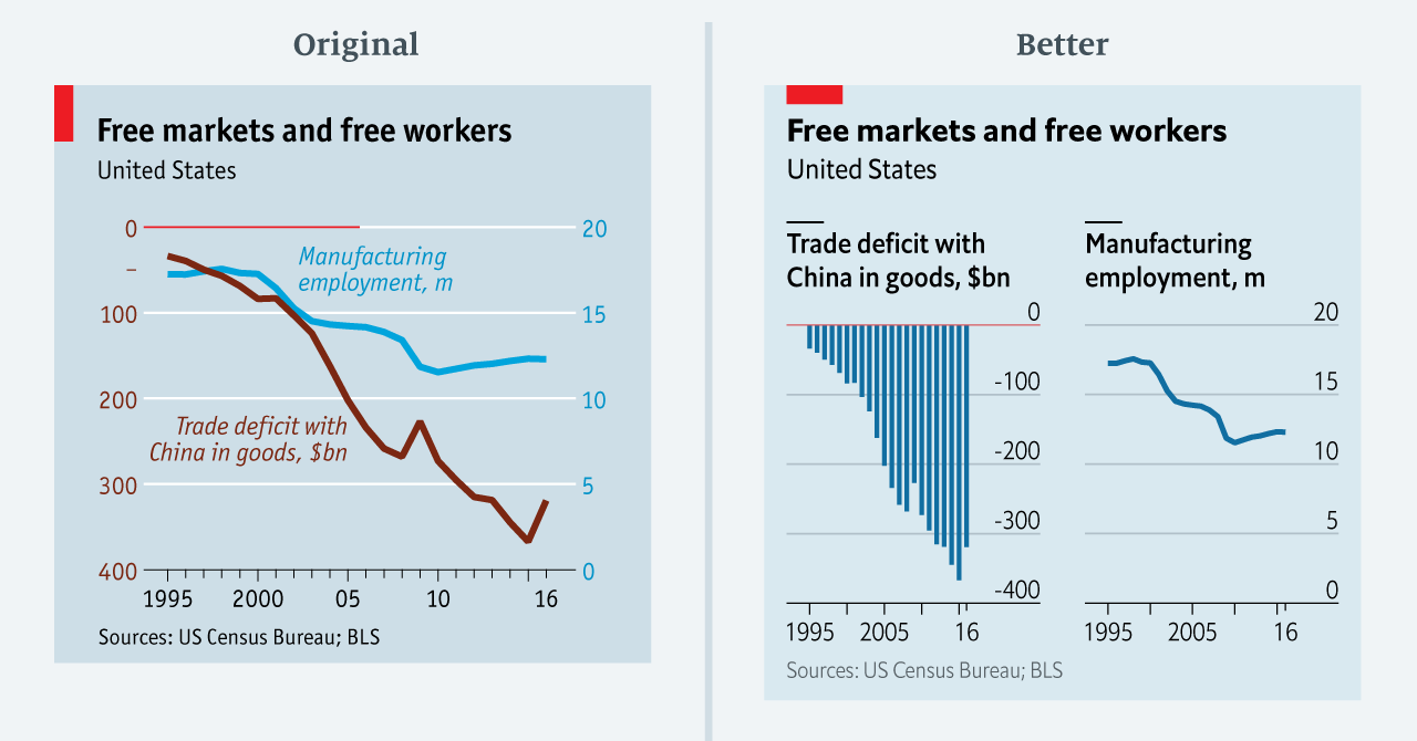
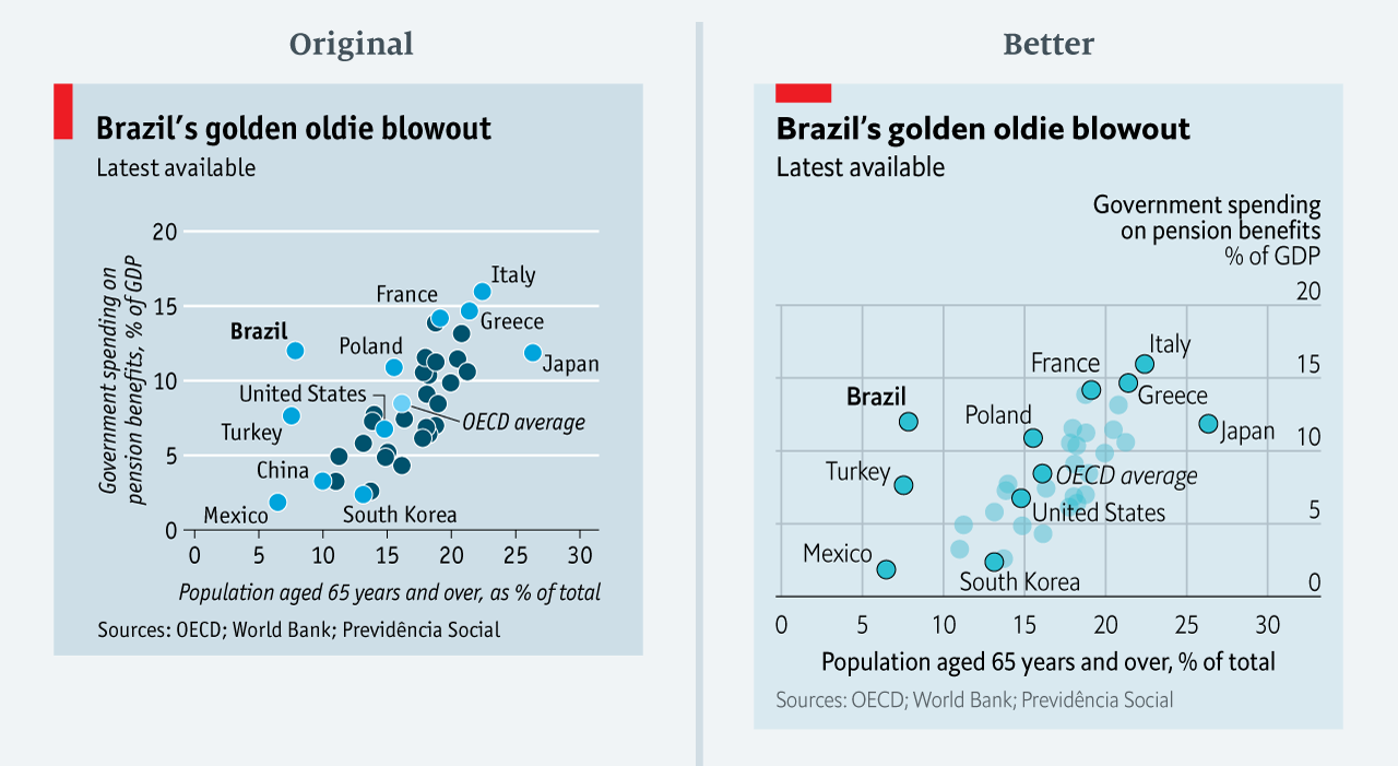
The data team at the Economist also felt a need to share their lessons learned via Medium. They show some of their most misleading, confusing, and failing graphics of the past years, and share the following mistakes and their remedies:
Truncating the scale (image #1 below)
Forcing a relationship by cherry-picking scales
Choosing the wrong visualisation method (image #2 below)
Taking the “mind-stretch” a little too far (image #3 below)
Confusing use of colour (image #4 below)
Including too much detail
Lots of data, not enough space
Moreover, they share the data behind these failing and repaired data visualizations:
All 538’s data visualizations are just stunningly beautiful and often very ingenious, using new chart formats to display complex patterns. Moreover, the range of topics they cover is huge. Anything ranging from their traditional background — politics — to great cover stories on sumo wrestling and pricy wine.