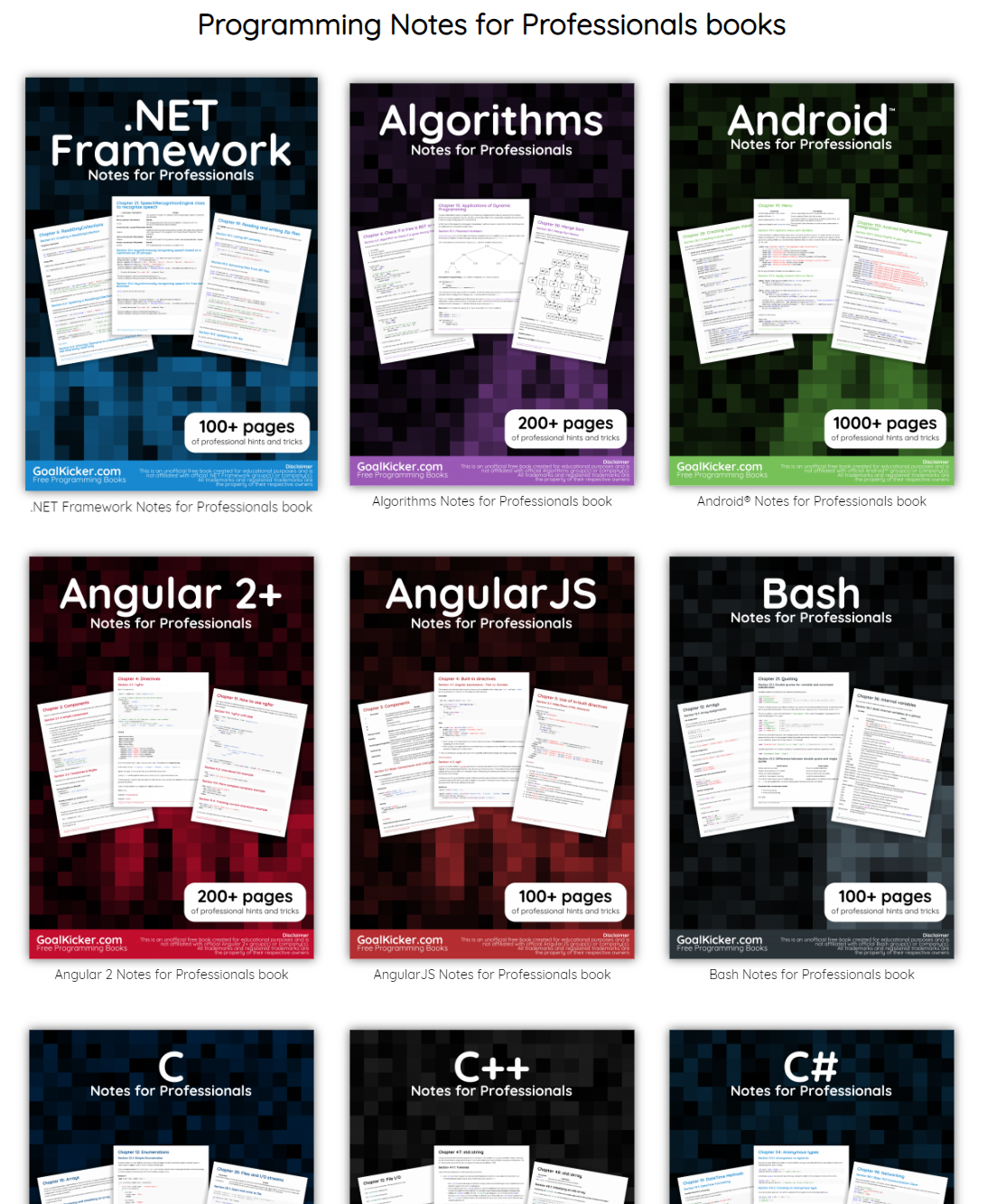
This specific link has been on my to-do list for so-long now that I’ve decided to just share it without any further ado.
The people behind GoalKicker, for whatever reason, decided to compile nearly 100 books on different programming languages based on among others StackOverflow entries. Their open access library contains books on languages from Latex to Linux, from Java to JavaScript, from SQL to MySQL, and from C, to C++, C#, and objective-C.
My analysis, shown below, concludes that the Android and iPhone tweets are clearly from different people, posting during different times of day and using hashtags, links, and retweets in distinct ways. What’s more, we can see that the Android tweets are angrier and more negative, while the iPhone tweets tend to be benign announcements and pictures.
Of course, a lot has changed in the last year. Trump was elected and inaugurated, and his Twitter account has become only more newsworthy. So it’s worth revisiting the analysis, for a few reasons:
There is a year of new data, with over 2700 more tweets. And quite notably, Trump stopped using the Android in March 2017. This is why machine learning approaches like didtrumptweetit.com are useful since they can still distinguish Trump’s tweets from his campaign’s by training on the kinds of features I used in my original post.
I’ve found a better dataset: in my original analysis, I was working quickly and used thetwitteRpackage to query Trump’s tweets. I since learned there’s a bug in the package that caused it to retrieve only about half the tweets that could have been retrieved, and in any case, I was able to go back only to January 2016. I’ve since found the truly excellent Trump Twitter Archive, which contains all of Trump’s tweets going back to 2009. Below I show some R code for querying it.
I’ve heard some interesting questions that I wanted to follow up on: These come from the comments on the original post and other conversations I’ve had since. Two questions included what device Trump tended to use before the campaign, and what types of tweets tended to lead to high engagement.
So here I’m following up with a few more analyses of the \@realDonaldTrump account. As I did last year, I’ll show most of my code, especially those that involve text mining with thetidytextpackage (now a published O’Reilly book!). You can find the remainder of the code here.
Updating the dataset
The first step was to find a more up-to-date dataset of Trump’s tweets. The Trump Twitter Archive, by Brendan Brown, is a brilliant project for tracking them, and is easily retrievable from R.
As of today, it contains 31548, including the text, device, and the number of retweets and favourites. (Also impressively, it updates hourly, and since September 2016 it includes tweets that were afterwards deleted).
Devices over time
My analysis from last summer was useful for journalists interpreting Trump’s tweets since it was able to distinguish Trump’s tweets from those sent by his staff. But it stopped being true in March 2017, when Trump switched to using an iPhone.
Let’s dive into at the history of all the devices used to tweet from the account, since the first tweets in 2009.
library(forcats)all_tweets%>%mutate(source=fct_lump(source,5))%>%count(month=round_date(created_at,"month"),source)%>%complete(month,source,fill=list(n=0))%>%mutate(source=reorder(source,-n,sum))%>%group_by(month)%>%mutate(percent=n/sum(n),maximum=cumsum(percent),minimum=lag(maximum,1,0))%>%ggplot(aes(month,ymin=minimum,ymax=maximum,fill=source))+geom_ribbon()+scale_y_continuous(labels=percent_format())+labs(x="Time",y="% of Trump's tweets",fill="Source",title="Source of @realDonaldTrump tweets over time",subtitle="Summarized by month")
A number of different people have clearly tweeted for the \@realDonaldTrump account over time, forming a sort of geological strata. I’d divide it into basically five acts:
Early days: All of Trump’s tweets until late 2011 came from the Web Client.
Other platforms: There was then a burst of tweets from TweetDeck and TwitLonger Beta, but these disappeared. Some exploration (shown later) indicate these may have been used by publicists promoting his book, though some (like this one from TweetDeck) clearly either came from him or were dictated.
Starting the Android: Trump’s first tweet from the Android was in February 2013, and it quickly became his main device.
Campaign: The iPhone was introduced only when Trump announced his campaign by 2015. It was clearly used by one or more of his staff, because by the end of the campaign it made up a majority of the tweets coming from the account. (There was also an iPad used occasionally, which was lumped with several other platforms into the “Other” category). The iPhone reduced its activity after the election and before the inauguration.
Which devices did Trump use himself, and which did other people use to tweet for him? To answer this, we could consider that Trump almost never uses hashtags, pictures or links in his tweets. Thus, the percentage of tweets containing one of those features is a proxy for how much others are tweeting for him.
library(stringr)all_tweets%>%mutate(source=fct_lump(source,5))%>%filter(!str_detect(text,"^(\"|RT)"))%>%group_by(source,year=year(created_at))%>%summarize(tweets=n(),hashtag=sum(str_detect(str_to_lower(text),"#[a-z]|http")))%>%ungroup()%>%mutate(source=reorder(source,-tweets,sum))%>%filter(tweets>=20)%>%ggplot(aes(year,hashtag/tweets,color=source))+geom_line()+geom_point()+scale_x_continuous(breaks=seq(2009,2017,2))+scale_y_continuous(labels=percent_format())+facet_wrap(~source)+labs(x="Time",y="% of Trump's tweets with a hashtag, picture or link",title="Tweets with a hashtag, picture or link by device",subtitle="Not including retweets; only years with at least 20 tweets from a device.")
This suggests that each of the devices may have a mix (TwitLonger Beta was certainly entirely staff, as was the mix of “Other” platforms during the campaign), but that only Trump ever tweeted from an Android.
When did Trump start talking about Barack Obama?
Now that we have data going back to 2009, we can take a look at how Trump used to tweet, and when his interest turned political.
In the early days of the account, it was pretty clear that a publicist was writing Trump’s tweets for him. In fact, his first-ever tweet refers to him in the third person:
Be sure to tune in and watch Donald Trump on Late Night with David Letterman as he presents the Top Ten List tonight!
The first hundred or so tweets follow a similar pattern (interspersed with a few cases where he tweets for himself and signs it). But this changed alongside his views of the Obama administration. Trump’s first-ever mention of Obama was entirely benign:
Staff Sgt. Salvatore A. Giunta received the Medal of Honor from Pres. Obama this month. It was a great honor to have him visit me today.
But his next were a different story. This article shows how Trump’s opinion of the administration turned from praise to criticism at the end of 2010 and in early 2011 when he started spreading a conspiracy theory about Obama’s country of origin. His second and third tweets about the president both came in July 2011, followed by many more.
What changed? Well, it was two months after the infamous 2011 White House Correspondents Dinner, where Obama mocked Trump for his conspiracy theories, causing Trump to leave in a rage. Trump has denied that the dinner pushed him towards politics… but there certainly was a reaction at the time.
all_tweets%>%filter(!str_detect(text,"^(\"|RT)"))%>%group_by(month=round_date(created_at,"month"))%>%summarize(tweets=n(),hashtag=sum(str_detect(str_to_lower(text),"obama")),percent=hashtag/tweets)%>%ungroup()%>%filter(tweets>=10)%>%ggplot(aes(as.Date(month),percent))+geom_line()+geom_point()+geom_vline(xintercept=as.integer(as.Date("2011-04-30")),color="red",lty=2)+geom_vline(xintercept=as.integer(as.Date("2012-11-06")),color="blue",lty=2)+scale_y_continuous(labels=percent_format())+labs(x="Time",y="% of Trump's tweets that mention Obama",subtitle=paste0("Summarized by month; only months containing at least 10 tweets.\n","Red line is White House Correspondent's Dinner, blue is 2012 election."),title="Trump's tweets mentioning Obama")
Between July 2011 and November 2012 (Obama’s re-election), a full 32.3%% of Trump’s tweets mentioned Obama by name (and that’s not counting the ones that mentioned him or the election implicitly, like this). Of course, this is old news, but it’s an interesting insight into what Trump’s Twitter was up to when it didn’t draw as much attention as it does now.
Trump’s opinion of Obama is well known enough that this may be the most redundant sentiment analysis I’ve ever done, but it’s worth noting that this was the time period where Trump’s tweets first turned negative. This requires tokenizing the tweets into words. I do so with the tidytext package created by me and Julia Silge.
all_tweet_words%>%inner_join(get_sentiments("afinn"))%>%group_by(month=round_date(created_at,"month"))%>%summarize(average_sentiment=mean(score),words=n())%>%filter(words>=10)%>%ggplot(aes(month,average_sentiment))+geom_line()+geom_hline(color="red",lty=2,yintercept=0)+labs(x="Time",y="Average AFINN sentiment score",title="@realDonaldTrump sentiment over time",subtitle="Dashed line represents a 'neutral' sentiment average. Only months with at least 10 words present in the AFINN lexicon")
(Did I mention you can learn more about using R for sentiment analysis in our new book?)
Changes in words since the election
My original analysis was on tweets in early 2016, and I’ve often been asked how and if Trump’s tweeting habits have changed since the election. The remainder of the analyses will look only at tweets since Trump launched his campaign (June 16, 2015), and disregards retweets.
library(stringr)campaign_tweets<-all_tweets%>%filter(created_at>="2015-06-16")%>%mutate(source=str_replace(source,"Twitter for ",""))%>%filter(!str_detect(text,"^(\"|RT)"))tweet_words<-all_tweet_words%>%filter(created_at>="2015-06-16")
We can compare words used before the election to ones used after.
What words were used more before or after the election?
Some of the words used mostly before the election included “Hillary” and “Clinton” (along with “Crooked”), though he does still mention her. He no longer talks about his competitors in the primary, including (and the account no longer has need of the #trump2016 hashtag).
Of course, there’s one word with a far greater shift than others: “fake”, as in “fake news”. Trump started using the term only in January, claiming it after some articles had suggested fake news articles were partly to blame for Trump’s election.
As of early August Trump is using the phrase more than ever, with about 9% of his tweets mentioning it. As we’ll see in a moment, this was a savvy social media move.
What words lead to retweets?
One of the most common follow-up questions I’ve gotten is what terms tend to lead to Trump’s engagement.
What words tended to lead to unusually many retweets, or unusually few?
word_summary%>%filter(total>=25)%>%arrange(desc(median_retweets))%>%slice(c(1:20,seq(n()-19,n())))%>%mutate(type=rep(c("Most retweets","Fewest retweets"),each=20))%>%mutate(word=reorder(word,median_retweets))%>%ggplot(aes(word,median_retweets))+geom_col()+labs(x="",y="Median # of retweets for tweets containing this word",title="Words that led to many or few retweets")+coord_flip()+facet_wrap(~type,ncol=1,scales="free_y")
Some of Trump’s most retweeted topics include Russia, North Korea, the FBI (often about Clinton), and, most notably, “fake news”.
Of course, Trump’s tweets have gotten more engagement over time as well (which partially confounds this analysis: worth looking into more!) His typical number of retweets skyrocketed when he announced his campaign, grew throughout, and peaked around his inauguration (though it’s stayed pretty high since).
all_tweets%>%group_by(month=round_date(created_at,"month"))%>%summarize(median_retweets=median(retweet_count),number=n())%>%filter(number>=10)%>%ggplot(aes(month,median_retweets))+geom_line()+scale_y_continuous(labels=comma_format())+labs(x="Time",y="Median # of retweets")
Also worth noticing: before the campaign, the only patch where he had a notable increase in retweets was his year of tweeting about Obama. Trump’s foray into politics has had many consequences, but it was certainly an effective social media strategy.
Conclusion: I wish this hadn’t aged well
Until today, last year’s Trump post was the only blog post that analyzed politics, and (not unrelatedly!) the highest amount of attention any of my posts have received. I got to write up an article for the Washington Post, and was interviewed on Sky News, CTV, and NPR. People have built great tools and analyses on top of my work, with some of my favorites including didtrumptweetit.com and the Atlantic’s analysis. And I got the chance to engage with, well, different points of view.
The post has certainly had some professional value. But it disappoints me that the analysis is as relevant as it is today. At the time I enjoyed my 15 minutes of fame, but I also hoped it would end. (“Hey, remember when that Twitter account seemed important?” “Can you imagine what Trump would tweet about this North Korea thing if we were president?”) But of course, Trump’s Twitter account is more relevant than ever.
I don’t love analysing political data; I prefer writing about baseball, biology, R education, and programming languages. But as you might imagine, that’s the least of the reasons I wish this particular chapter of my work had faded into obscurity.
About the author:
David Robinson is a Data Scientist at Stack Overflow. In May 2015, he received his PhD in Quantitative and Computational Biology from Princeton University, where he worked with Professor John Storey. His interests include statistics, data analysis, genomics, education, and programming in R.
Every non-hyperbolic tweet is from iPhone (his staff).
Every hyperbolic tweet is from Android (from him).
When Trump wishes the Olympic team good luck, he’s tweeting from his iPhone. When he’s insulting a rival, he’s usually tweeting from an Android. Is this an artefact showing which tweets are Trump’s own and which are by some handler?
My analysis, shown below, concludes that the Android and iPhone tweets are clearly from different people, posting during different times of day and using hashtags, links, and retweets in distinct ways. What’s more, we can see that the Android tweets are angrier and more negative, while the iPhone tweets tend to be benign announcements and pictures. Overall I’d agree with @tvaziri’s analysis: this lets us tell the difference between the campaign’s tweets (iPhone) and Trump’s own (Android).
The dataset
First, we’ll retrieve the content of Donald Trump’s timeline using the userTimelinefunction in the twitteR package:1
library(dplyr)library(purrr)library(twitteR)
# You'd need to set global options with an authenticated app
setup_twitter_oauth(getOption("twitter_consumer_key"),getOption("twitter_consumer_secret"),getOption("twitter_access_token"),getOption("twitter_access_token_secret"))# We can request only 3200 tweets at a time; it will return fewer
# depending on the API
trump_tweets<-userTimeline("realDonaldTrump",n=3200)trump_tweets_df<-tbl_df(map_df(trump_tweets,as.data.frame))
# if you want to follow along without setting up Twitter authentication,
# just use my dataset:
load(url("http://varianceexplained.org/files/trump_tweets_df.rda"))
We clean this data a bit, extracting the source application. (We’re looking only at the iPhone and Android tweets- a much smaller number are from the web client or iPad).
library(tidyr)tweets<-trump_tweets_df%>%select(id,statusSource,text,created)%>%extract(statusSource,"source","Twitter for (.*?)<")%>%filter(source%in%c("iPhone","Android"))
Overall, this includes 628 tweets from iPhone, and 762 tweets from Android.
One consideration is what time of day the tweets occur, which we’d expect to be a “signature” of their user. Here we can certainly spot a difference:
library(lubridate)library(scales)tweets%>%count(source,hour=hour(with_tz(created,"EST")))%>%mutate(percent=n/sum(n))%>%ggplot(aes(hour,percent,color=source))+geom_line()+scale_y_continuous(labels=percent_format())+labs(x="Hour of day (EST)",y="% of tweets",color="")
Trump on the Android does a lot more tweeting in the morning, while the campaign posts from the iPhone more in the afternoon and early evening.
Another place we can spot a difference is in Trump’s anachronistic behavior of “manually retweeting” people by copy-pasting their tweets, then surrounding them with quotation marks:
Almost all of these quoted tweets are posted from the Android:
In the remaining by-word analyses in this text, I’ll filter these quoted tweets out (since they contain text from followers that may not be representative of Trump’s own tweets).
Somewhere else we can see a difference involves sharing links or pictures in tweets.
tweet_picture_counts<-tweets%>%filter(!str_detect(text,'^"'))%>%count(source,picture=ifelse(str_detect(text,"t.co"),"Picture/link","No picture/link"))ggplot(tweet_picture_counts,aes(source,n,fill=picture))+geom_bar(stat="identity",position="dodge")+labs(x="",y="Number of tweets",fill="")
It turns out tweets from the iPhone were 38 times as likely to contain either a picture or a link. This also makes sense with our narrative: the iPhone (presumably run by the campaign) tends to write “announcement” tweets about events, like this:
The media is going crazy. They totally distort so many things on purpose. Crimea, nuclear, “the baby” and so much more. Very dishonest!
Comparison of words
Now that we’re sure there’s a difference between these two accounts, what can we say about the difference in the content? We’ll use the tidytextpackage that Julia Silge and I developed.
We start by dividing into individual words using the unnest_tokens function (see this vignette for more), and removing some common “stopwords”2:
## # A tibble: 8,753 x 4
##                    id source             created                   word
##
## 1  676494179216805888 iPhone 2015-12-14 20:09:15                 record
## 2  676494179216805888 iPhone 2015-12-14 20:09:15                 health
## 3  676494179216805888 iPhone 2015-12-14 20:09:15 #makeamericagreatagain
## 4  676494179216805888 iPhone 2015-12-14 20:09:15             #trump2016
## 5  676509769562251264 iPhone 2015-12-14 21:11:12               accolade
## 6  676509769562251264 iPhone 2015-12-14 21:11:12             @trumpgolf
## 7  676509769562251264 iPhone 2015-12-14 21:11:12                 highly
## 8  676509769562251264 iPhone 2015-12-14 21:11:12              respected
## 9  676509769562251264 iPhone 2015-12-14 21:11:12                   golf
## 10 676509769562251264 iPhone 2015-12-14 21:11:12                odyssey
## # ... with 8,743 more rows
What were the most common words in Trump’s tweets overall?
These should look familiar for anyone who has seen the feed. Now let’s consider which words are most common from the Android relative to the iPhone, and vice versa. We’ll use the simple measure of log odds ratio, calculated for each word as:3
log2(# in Android+1Total Android+1# in iPhone+1Total iPhone+1)”>log2(# in Android + 1 / Total Android + log2(# in Android+1Total Android+1# in iPhone+1Total iPhone+1)
Which are the words most likely to be from Android and most likely from iPhone?
A few observations:
Most hashtags come from the iPhone. Indeed, almost no tweets from Trump’s Android contained hashtags, with some rare exceptions like this one. (This is true only because we filtered out the quoted “retweets”, as Trump does sometimes quote tweets like this that contain hashtags).
Words like “join” and “tomorrow”, and times like “7pm”, also came only from the iPhone. The iPhone is clearly responsible for event announcements like this one (“Join me in Houston, Texas tomorrow night at 7pm!”)
A lot of “emotionally charged” words, like “badly”, “crazy”, “weak”, and “dumb”, were overwhelmingly more common on Android. This supports the original hypothesis that this is the “angrier” or more hyperbolic account.
Sentiment analysis: Trump’s tweets are much more negative than his campaign’s
Since we’ve observed a difference in sentiment between the Android and iPhone tweets, let’s try quantifying it. We’ll work with the NRC Word-Emotion Association lexicon, available from the tidytext package, which associates words with 10 sentiments: positive, negative, anger, anticipation, disgust, fear, joy, sadness, surprise, and trust.
## # A tibble: 6 x 4
##    source    sentiment total_words words
##
## 1 Android        anger        4901   321
## 2 Android anticipation        4901   256
## 3 Android      disgust        4901   207
## 4 Android         fear        4901   268
## 5 Android          joy        4901   199
## 6 Android     negative        4901   560
(For example, we see that 321 of the 4901 words in the Android tweets were associated with “anger”). We then want to measure how much more likely the Android account is to use an emotionally-charged term relative to the iPhone account. Since this is count data, we can use a Poisson test to measure the difference:
And we can visualize it with a 95% confidence interval:
Thus, Trump’s Android account uses about 40-80% more words related to disgust, sadness, fear, anger, and other “negative” sentiments than the iPhone account does. (The positive emotions weren’t different to a statistically significant extent).
We’re especially interested in which words drove this different in sentiment. Let’s consider the words with the largest changes within each category:
This confirms that lots of words annotated as negative sentiments (with a few exceptions like “crime” and “terrorist”) are more common in Trump’s Android tweets than the campaign’s iPhone tweets.
Conclusion: the ghost in the political machine
I was fascinated by the recent New Yorker article about Tony Schwartz, Trump’s ghostwriter for The Art of the Deal. Of particular interest was how Schwartz imitated Trump’s voice and philosophy:
In his journal, Schwartz describes the process of trying to make Trump’s voice palatable in the book. It was kind of “a trick,” he writes, to mimic Trump’s blunt, staccato, no-apologies delivery while making him seem almost boyishly appealing…. Looking back at the text now, Schwartz says, “I created a character far more winning than Trump actually is.”
Like any journalism, data journalism is ultimately about human interest, and there’s one human I’m interested in: who is writing these iPhone tweets?
The majority of the tweets from the iPhone are fairly benign declarations. But consider cases like these, both posted from an iPhone:
Failing @NYTimes will always take a good story about me and make it bad. Every article is unfair and biased. Very sad!
These tweets certainly sound like the Trump we all know. Maybe our above analysis isn’t complete: maybe Trump has sometimes, however rarely, tweeted from an iPhone (perhaps dictating, or just using it when his own battery ran out). But what if our hypothesis is right, and these weren’t authored by the candidate- just someone trying their best to sound like him?
Or what about tweets like this (also iPhone), which defend Trump’s slogan- but doesn’t really sound like something he’d write?
Our country does not feel ‘great already’ to the millions of wonderful people living in poverty, violence and despair.
A lot has been written about Trump’s mental state. But I’d really rather get inside the head of this anonymous staffer, whose job is to imitate Trump’s unique cadence (“Very sad!”), or to put a positive spin on it, to millions of followers. Are they a true believer, or just a cog in a political machine, mixing whatever mainstream appeal they can into the @realDonaldTrump concoction? Like Tony Schwartz, will they one day regret their involvement?
To keep the post concise I don’t show all of the code, especially code that generates figures. But you can find the full code here.
We had to use a custom regular expression for Twitter, since typical tokenizers would split the # off of hashtags and @ off of usernames. We also removed links and ampersands (&) from the text.
David Robinson is a Data Scientist at Stack Overflow. In May 2015, he received his PhD in Quantitative and Computational Biology from Princeton University, where he worked with Professor John Storey. His interests include statistics, data analysis, genomics, education, and programming in R.
Follow this link to the 2017 sequel to this article.