Bret Beheim — senior researcher at the Max Planck Institute for Evolutionary Anthropology — posted a great GIF animation of the response to his research survey. He calls the figure citation gates, relating the year of scientific publication to the likelihood that the research materials are published open-source or accessible.
To generate the visualization, Bret used R’s base plotting functionality combined with Thomas Lin Pedersen‘s R package tweenrto animate it.
I've been experimenting with R animations using the tweenR package for visualizing the results of our reproducibility survey, and I think it turned out pretty nice. pic.twitter.com/MRerAWHNYT
Bret shared his R code for the above GIF of his citation gateson GitHub. With the open source code, this amazing visual display inspired others to make similar GIFs for their own projects. For example, Anne-Wil Kruijt’s dance of the confidence intervals:
Two wks ago I built a shiny 'CI demo' app for a job interview. Yet I wasn't quite content with it. Then 2 days ago @babeheim posted an amazing gif (srsly, go check it!). Super inspired, & borrowing heavily from his code: my rendition of 'the Dance of the Confidence Intervals' pic.twitter.com/ORheOBBzDm
A spin-off of the citation gates: A gif showing confidence intervals of sample means.
Applied to a Human Resource Management context, we could use this similar animation setup to explore, for instance, recruitment, selection, or talent management processes.
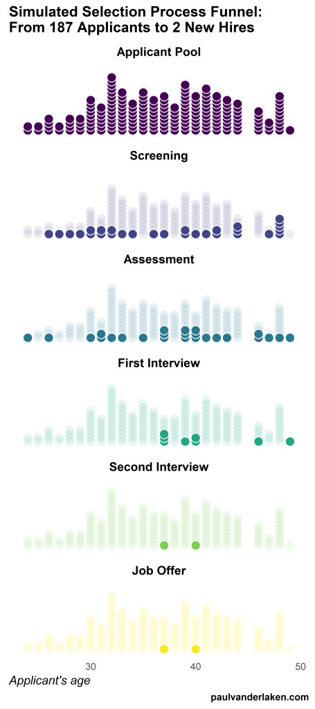
Unfortunately, I couldn’t get the below figure to animate properly yet, but I am working on it (damn ggplot2 facets). It’s a quick simulation of how this type of visualization could help to get insights into the recruitment and selection process for open vacancies.
The figure shows how nearly 200 applicants — sorted by their age — go through several selection barriers. A closer look demonstrates that some applicants actually skip the screening and assessment steps and join via a fast lane in the first interview round, which could happen, for instance, when there are known or preferred internal candidates. When animated, such insights would become more clearly visible.
ungeviz is a new R package by Claus Wilke, whom you may know from his amazing work and books on Data Visualization. The package name comes from the German word “Ungewissheit”, which means uncertainty. You can install the developmental version via:
devtools::install_github("clauswilke/ungeviz")
The package includes some bootstrapping functionality that, when combined with ggplot2 and gganimate, can produce some seriousy powerful visualizations. For instance, take the below piece of code:
data(BlueJays, package="Stat2Data")
# set up bootstrapping object that generates 20 bootstraps# and groups by variable `KnownSex`bs<-ungeviz::bootstrapper(20, KnownSex)
ggplot(BlueJays, aes(BillLength, Head, color=KnownSex)) +
geom_smooth(method="lm", color=NA) +
geom_point(alpha=0.3) +# `.row` is a generated column providing a unique row number# to all rows in the bootstrapped data frame
geom_point(data=bs, aes(group= .row)) +
geom_smooth(data=bs, method="lm", fullrange=TRUE, se=FALSE) +
facet_wrap(~KnownSex, scales="free_x") +
scale_color_manual(values= c(F="#D55E00", M="#0072B2"), guide="none") +
theme_bw() +
transition_states(.draw, 1, 1) +
enter_fade() +
exit_fade()
Here’s what’s happening:
Claus loads in the BlueJays dataset, which contains some data on birds.
He then runs the ungezviz::bootstrapper function to generate a new dataset of bootstrapped samples.
Next, Claus uses ggplot2::geom_smooth(method = "lm") to run a linear model on the orginal BlueJays dataset, but does not color in the regression line (color = NA), thus showing only the confidence interval of the model.
Moreover, Claus uses ggplot2::geom_point(alpha = 0.3) to visualize the orginal data points, but slightly faded.
Subsequent, for each of the bootstrapped samples (group = .row), Claus again draws the data points (unfaded), and runs linear models while drawing only the regression line (se = FALSE).
Using ggplot2::facet_wrap, Claus seperates the data for BlueJays$KnownSex.
Using gganimate::transition_states(.draw, 1, 1), Claus prints each linear regression line to a row of the bootstrapped dataset only one second, before printing the next.
The result an astonishing GIF of the regression lines that could be fit to bootstrapped subsamples of the BlueJays data, along with their confidence interval:
One example of the practical use of ungeviz, original on its GitHub page
Another valuable use of the new package is the visualization of uncertainty from fitted models, for example as confidence strips. The below code shows the powerful combination of broom::tidy with ungeviz::stat_conf_strip to visualize effect size estimates of a linear model along with their confidence intervals.
library(broom)
#> #> Attaching package: 'broom'#> The following object is masked from 'package:ungeviz':#> #> bootstrapdf_model<- lm(mpg~disp+hp+qsec, data=mtcars) %>%
tidy() %>%
filter(term!="(Intercept)")
ggplot(df_model, aes(estimate=estimate, moe=std.error, y=term)) +
stat_conf_strip(fill="lightblue", height=0.8) +
geom_point(aes(x=estimate), size=3) +
geom_errorbarh(aes(xmin=estimate-std.error, xmax=estimate+std.error), height=0.5) +
scale_alpha_identity() +
xlim(-2, 1)
Visualizing effect size estimates with ungeviz, via its GitHub page
Very curious to see where this package develops into. What use cases can you think of?