Tag: gganimate

rstudio::conf 2019 summary

rstudio::conf 2019 summary

Cool intro video!
Thanks to Amelia for pointing to it

Welcome to rstudio::conf 2019

Similar to last year, I was not able to attend rstudio::conf 2019.

Fortunately, so much of the conference is shared on Twitter and media outlets that I still felt included. Here are some things that I liked and learned from, despite the Austin-Tilburg distance.

All presentations are streamed

One great thing about rstudio::conf is that all presentations are streamed and later posted on the RStudio website.

Of what I’ve already reviewed, I really liked Jenny Bryan’s presentation on lazy evaluation, Max Kuhn’s presentation on parsnip, and teaching data science with puzzles by Irene Steves. Also, the gt package is a serious power tool! And I was already a gganimate fanboy, as you know from here and here.

One of the insights shared in Jenny Bryan’s talk that can be a life-saver

I think I’m going to watch all talks over the coming weekends!

Slides & Extra Materials

There’s an official rstudio-conf repository on Github hosting many materials in an orderly fashion.

Karl Broman made his own awesome GitHub repository with links to the videos, the slides, and all kinds of extra resources.

Karl’s handy github repo of rstudio::conf

All takeaways in a handy #rstudioconf Shiny app

Garrick Aden-Buie made a fabulous Shiny app that allows you to review all #rstudioconf tweets during and since the conference. It even includes some random statistics about the tweets, and a page with all the shared media.

Some random takeaways

Image
Via this tweet about this rstudio::conf presentation
Some words of wisdom by Emily Robinson (whom we know from here)
You should consider joining #tidytuesday!

Extra: Online RStudio Webinars

Did you know that RStudio also posts all the webinars they host? There really are some hidden pearls among them. For instance, this presentation by Nathan Stephens on rendering rmarkdown to powerpoint will save me tons of work, and those new to broom will also be astonished by this webinar by Alex Hayes.

Animated Snow in R, 2.0: gganimate API update

Animated Snow in R, 2.0: gganimate API update

Last year, inspired by a tweet from Ilya Kashnitsky, I wrote a snow animation which you can read all about here

Now, this year, the old code no longer worked due to an update to the gganimate API. Hence, I was about to only refactor the code, but decided to give the whole thing a minor update. Below, you find the 2.0 version of my R snow animation.

# PACKAGES ####
pkg <- c("here", "tidyverse", "gganimate", "animation")
sapply(pkg, function(x){
if (!x %in% installed.packages()){install.packages(x)}
library(x, character.only = TRUE)
})

# CUSTOM FUNCTIONS ####
map_to_range <- function(x, from, to) {
# Shifting the vector so that min(x) == 0
x <- x - min(x)
# Scaling to the range of [0, 1]
x <- x / max(x)
# Scaling to the needed amplitude
x <- x * (to - from)
# Shifting to the needed level
x + from
}

# CONSTANTS ####
N <- 500 # number of flakes
TIMES <- 100 # number of loops
XPOS_DELTA <- 0.01
YSPEED_MIN = 0.005
YSPEED_MAX = 0.03
FLAKE_SIZE_COINFLIP = 5
FLAKE_SIZE_COINFLIP_PROB = 0.1
FLAKE_SIZE_MIN = 4
FLAKE_SIZE_MAX = 20

# INITIALIZE DATA ####
set.seed(1)

size <- runif(N) + rbinom(N, FLAKE_SIZE_COINFLIP, FLAKE_SIZE_COINFLIP_PROB) # random flake size
yspeed <- map_to_range(size, YSPEED_MIN, YSPEED_MAX)

# create storage vectors
xpos <- rep(NA, N * TIMES)
ypos <- rep(NA, N * TIMES)

# loop through simulations
for(i in seq(TIMES)){
if(i == 1){
# initiate values
xpos[1:N] <- runif(N, min = -0.1, max = 1.1)
ypos[1:N] <- runif(N, min = 1.1, max = 2)
} else {
# specify datapoints to update
first_obs <- (N * i - N + 1)
last_obs <- (N * i)
# update x position
# random shift
xpos[first_obs:last_obs] <- xpos[(first_obs-N):(last_obs-N)] - runif(N, min = -XPOS_DELTA, max = XPOS_DELTA)
# update y position
# lower by yspeed
ypos[first_obs:last_obs] <- ypos[(first_obs-N):(last_obs-N)] - yspeed
# reset if passed bottom screen
xpos <- ifelse(ypos < -0.1, runif(N), xpos) # restart at random x
ypos <- ifelse(ypos < -0.1, 1.1, ypos) # restart just above top
}
}


# VISUALIZE DATA ####
cbind.data.frame(ID = rep(1:N, TIMES)
,x = xpos
,y = ypos
,s = size
,t = rep(1:TIMES, each = N)) %>%
# create animation
ggplot() +
geom_point(aes(x, y, size = s, alpha = s), color = "white", pch = 42) +
scale_size_continuous(range = c(FLAKE_SIZE_MIN, FLAKE_SIZE_MAX)) +
scale_alpha_continuous(range = c(0.2, 0.8)) +
coord_cartesian(c(0, 1), c(0, 1)) +
theme_void() +
theme(legend.position = "none",
panel.background = element_rect("black")) +
transition_time(t) +
ease_aes('linear') ->
snow_plot

snow_anim <- animate(snow_plot, nframes = TIMES, width = 600, height = 600)

If you want to see some spin-offs of last years code:

Animated vs. Static Data Visualizations

Animated vs. Static Data Visualizations

GIFs or animations are rising quickly in the data visualization world (see for instance here).

However, in my personal experience, they are not as widely used in business settings. You might even say animations are frowned by, for instance, LinkedIn, which removed the option to even post GIFs on their platform!

Nevertheless, animations can be pretty useful sometimes. For instance, they can display what happens during a process, like a analytical model converging, which can be useful for didactic purposes. Alternatively, they can be great for showing or highlighting trends over time.  

I am curious what you think are the pro’s and con’s of animations. Below, I posted two visualizations of the same data. The data consists of the simulated workforce trends, including new hires and employee attrition over the course of twelve months. 

versus

Would you prefer the static, or the animated version? Please do share your thoughts in the comments below, or on the respective LinkedIn and Twitter posts!


Want to reproduce these plots? Or play with the data? Here’s the R code:

# LOAD IN PACKAGES ####
# install.packages('devtools')
# devtools::install_github('thomasp85/gganimate')
library(tidyverse)
library(gganimate)
library(here)


# SET CONSTANTS ####
# data
HEADCOUNT = 270
HIRE_RATE = 0.12
HIRE_ADDED_SEASONALITY = rep(floor(seq(14, 0, length.out = 6)), 2)
LEAVER_RATE = 0.16
LEAVER_ADDED_SEASONALITY = c(rep(0, 3), 10, rep(0, 6), 7, 12)

# plot
TEXT_SIZE = 12
LINE_SIZE1 = 2
LINE_SIZE2 = 1.1
COLORS = c("darkgreen", "red", "blue")

# saving
PLOT_WIDTH = 8
PLOT_HEIGHT = 6
FRAMES_PER_POINT = 5


# HELPER FUNCTIONS ####
capitalize_string = function(text_string){
paste0(toupper(substring(text_string, 1, 1)), substring(text_string, 2, nchar(text_string)))
}


# SIMULATE WORKFORCE DATA ####
set.seed(1)

# generate random leavers and some seasonality
leavers <- rbinom(length(month.abb), HEADCOUNT, TURNOVER_RATE / length(month.abb)) + LEAVER_ADDED_SEASONALITY

# generate random hires and some seasonality
joiners <- rbinom(length(month.abb), HEADCOUNT, HIRE_RATE / length(month.abb)) + HIRE_ADDED_SEASONALITY

# combine in dataframe
data.frame(
month = factor(month.abb, levels = month.abb, ordered = TRUE)
, workforce = HEADCOUNT - cumsum(leavers) + cumsum(joiners)
, left = leavers
, hires = joiners
) ->
wf

# transform to long format
wf_long <- gather(wf, key = "variable", value = "value", -month)
capitalize the name of variables
wf_long$variable <- capitalize_string(wf_long$variable)


# VISUALIZE & ANIMATE ####
# draw workforce plot
ggplot(wf_long, aes(x = month, y = value, group = variable)) +
geom_line(aes(col = variable, size = variable == "workforce")) +
scale_color_manual(values = COLORS) +
scale_size_manual(values = c(LINE_SIZE2, LINE_SIZE1), guide = FALSE) +
guides(color = guide_legend(override.aes = list(size = c(rep(LINE_SIZE2, 2), LINE_SIZE1)))) +
# theme_PVDL() +
labs(x = NULL, y = NULL, color = "KPI", caption = "paulvanderlaken.com") +
ggtitle("Workforce size over the course of a year") +
NULL ->
workforce_plot

# ggsave(here("workforce_plot.png"), workforce_plot, dpi = 300, width = PLOT_WIDTH, height = PLOT_HEIGHT)

# animate the plot
workforce_plot +
geom_segment(aes(xend = 12, yend = value), linetype = 2, colour = 'grey') +
geom_label(aes(x = 12.5, label = paste(variable, value), col = variable),
hjust = 0, size = 5) +
transition_reveal(variable, along = as.numeric(month)) +
enter_grow() +
coord_cartesian(clip = 'off') +
theme(
plot.margin = margin(5.5, 100, 11, 5.5)
, legend.position = "none"
) ->
animated_workforce

anim_save(here("workforce_animation.gif"),
animate(animated_workforce, nframes = nrow(wf) * FRAMES_PER_POINT,
width = PLOT_WIDTH, height = PLOT_HEIGHT, units = "in", res = 300))
Your own personalized motivational GIF

Your own personalized motivational GIF

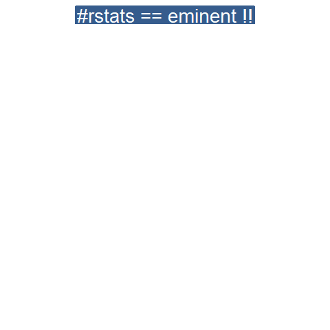
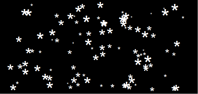
One of the R OpenSci ozunconference 2018 projects was all about gganimate. The guys and gals dubbed this project learngganimate and dedicated an expansive GitHub repository to it. As part of this project, they created some — let’s call it — very creative GIFS.

One of their GIFs I particularly liked, copied below. Using the OpenSci syn package they looked up synonyms for cool and printed those in some nice colors.

On GitHub, you can find the original code for this project. However, I didn’t get it working on my machine — due to recent updates to the gganimate package — so I had to create my own version, which you find below.

devtools::install_github("ropenscilabs/syn") # only needed for first-time install
devtools::install_github('thomasp85/gganimate') # install the most recent version of gganimate

library(syn)
library(ggplot2)
library(gganimate)
library(dplyr)

set.seed(1) # for reproducibility purposes

synonyms <- syn("great") # store synonyms for your word of chosing

n = 15 # number of synonyms to sample
time = 3 # their position in the plot as well as the duration of their display

# generate dataframe with random synonyms sentences and assigned locations
sentences_df <- data_frame(
sentence = paste("#rstats ==", sample(synonyms, n), "!!")
, x = time
, y = seq(time, time * n, time)
)

# generate the actual plot
ggplot(sentences_df,
aes(x, -y,
label = sentence,
group = sentence,
fill = sentence)) +
geom_label(size = 10, colour = "white", label.size = 0.3) +
transition_components(id = sentence, time = y,
enter_length = n * time + time ,
exit_length = n * time + time) +
scale_fill_viridis_d() +
theme_void() +
theme(legend.position = "none") ->
plot1

# animate the plot
animate(plot1, nframes = n * time + time)

This code renders the following GIF:

Try to play around with the code to change the GIF:

  • Change the set.seed argument to get different synonyms in there,
  • Change the n to include more or less words,
  • Change the x and y variables to position the labels differently,
  • Change the size, colour, and fill of the geom_label function to change the label design,
  • Or change the transition_components arguments to change the display timing.

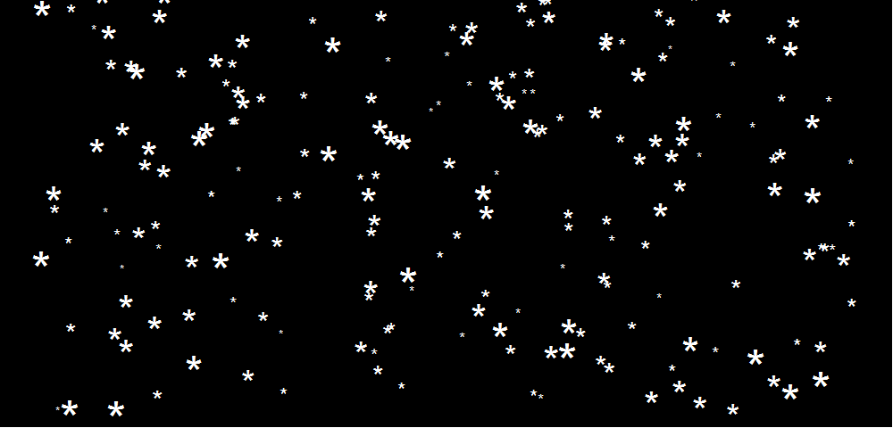
Moreover, you could change the sentence variable to something to motivate yourself. For instnace, in the following code, I changed it to include my name, and synonyms for the word good. Moreover, I picked a different gganimate function — transition_time — to display the labels according to a different pattern. 

set.seed(2) # for reproducibility purposes

# generate dataframe with random synonyms sentences and assigned locations
sentences_df <- data_frame(
sentence = paste0("Paul is ", sample(syn("good"), n), "!")
, x = time
, y = seq(time, time * n, time)
)

# generate the actual plot
ggplot(sentences_df,
aes(x, -y,
label = sentence,
group = sentence,
fill = sentence)) +
geom_label(size = 10, colour = "white", label.size = 0.3) +
transition_time(time = y) +
scale_fill_viridis_d() +
theme_void() +
theme(legend.position = "none") ->
plot2

# animate the plot
animate(plot2, nframes = n * time + time)

I think the result is very pleasing, comforting, and positive! Except maybe for the dinkum bit, but fortunately neither I or thesaurus.com know what that means, so it might as well be positive : )

If you go about creating your own animations, you can save them using the save_animation function of the gganimate package. Good luck!


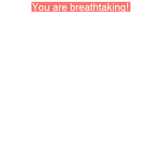
PS. The code to generate the GIF at the top of this blog is posted below. It uses another gganimate function called transition_states:

set.seed(3) # for reproducibility purposes

time = 5
n = 5

# generate dataframe with random synonyms sentences and assigned locations
sentences_df <- data_frame(
sentence = paste0("You are ", sample(syn("amazing"), n), "!")
, x = runif(n)
, y = seq(time, time * n, time)
)

# generate the actual plot
ggplot(sentences_df,
aes(x, -y,
label = sentence,
group = sentence,
fill = sentence)) +
geom_label(size = 12, colour = "white", label.size = 0.5) +
transition_states(states = sentence, transition_length = time, state_length = time) +
theme_void() +
theme(legend.position = "none") +
coord_cartesian(xlim = c(-0.5, 1.5)) ->
plot3

# animate the plot
animate(plot3, nframes = n * time + time)

Animated Citation Gates turned into Selection Gates

Bret Beheim — senior researcher at the Max Planck Institute for Evolutionary Anthropology — posted a great GIF animation of the response to his research survey. He calls the figure citation gates, relating the year of scientific publication to the likelihood that the research materials are published open-source or accessible.

To generate the visualization, Bret used R’s base plotting functionality combined with Thomas Lin Pedersen‘s R package tweenrto animate it.

Bret shared his R code for the above GIF of his citation gates on GitHub. With the open source code, this amazing visual display inspired others to make similar GIFs for their own projects. For example, Anne-Wil Kruijt’s dance of the confidence intervals:

A spin-off of the citation gates: A gif showing confidence intervals of sample means.

Applied to a Human Resource Management context, we could use this similar animation setup to explore, for instance, recruitment, selection, or talent management processes.

Unfortunately, I couldn’t get the below figure to animate properly yet, but I am working on it (damn ggplot2 facets). It’s a quick simulation of how this type of visualization could help to get insights into the recruitment and selection process for open vacancies.

The figure shows how nearly 200 applicants — sorted by their age — go through several selection barriers. A closer look demonstrates that some applicants actually skip the screening and assessment steps and join via a fast lane in the first interview round, which could happen, for instance, when there are known or preferred internal candidates. When animated, such insights would become more clearly visible.

Animated Snow in R

Animated Snow in R

Due to the recent updates to the gganimate package, the code below no longer produces the desired animation.
A working, updated version can be found here

After hearing R play the Jingle Bells tune, I really got into the holiday vibe. It made me think of Ilya Kashnitsky (homepage, twitter) his snowy image in R.

if(!"tidyverse" %in% installed.packages()) install.packages("tidyverse")

library("tidyverse")

n <- 100 
tibble(x = runif(n),  
y = runif(n),  
s = runif(n, min = 4, max = 20)) %>%
ggplot(aes(x, y, size = s)) +
geom_point(color = "white", pch = 42) +
scale_size_identity() +
coord_cartesian(c(0,1), c(0,1)) +
theme_void() +
theme(panel.background = element_rect("black"))

snow.png

This greatly fits the Christmas theme we have going here. Inspired by Ilya’s script, I decided to make an animated snowy GIF! Sure R is able to make something like the lively visualizations Daniel Shiffman (Coding Train) usually makes in Processing/JavaScript? It seems so:

snow

### ANIMATED SNOW === BY PAULVANDERLAKEN.COM
### PUT THIS FILE IN AN RPROJECT FOLDER

# load in packages
pkg <- c("here", "tidyverse", "gganimate", "animation")
sapply(pkg, function(x){
if (!x %in% installed.packages()){install.packages(x)}
library(x, character.only = TRUE)
})

# parameters
n <- 100 # number of flakes
times <- 100 # number of loops
xstart <- runif(n, max = 1) # random flake start x position
ystart <- runif(n, max = 1.1) # random flake start y position
size <- runif(n, min = 4, max = 20) # random flake size
xspeed <- seq(-0.02, 0.02, length.out = 100) # flake shift speeds to randomly pick from
yspeed <- runif(n, min = 0.005, max = 0.025) # random flake fall speed

# create storage vectors
xpos <- rep(NA, n * times)
ypos <- rep(NA, n * times)

# loop through simulations
for(i in seq(times)){
if(i == 1){
# initiate values
xpos[1:n] <- xstart
ypos[1:n] <- ystart
} else {
# specify datapoints to update
first_obs <- (n*i - n + 1)
last_obs <- (n*i)
# update x position
# random shift
xpos[first_obs:last_obs] <- xpos[(first_obs-n):(last_obs-n)] - sample(xspeed, n, TRUE)
# update y position
# lower by yspeed
ypos[first_obs:last_obs] <- ypos[(first_obs-n):(last_obs-n)] - yspeed
# reset if passed bottom screen
xpos <- ifelse(ypos < -0.1, runif(n), xpos) # restart at random x
ypos <- ifelse(ypos < -0.1, 1.1, ypos) # restart just above top
}
}

# store in dataframe
data_fluid <- cbind.data.frame(x = xpos,
y = ypos,
s = size,
t = rep(1:times, each = n))

# create animation
snow <- data_fluid %>%
ggplot(aes(x, y, size = s, frame = t)) +
geom_point(color = "white", pch = 42) +
scale_size_identity() +
coord_cartesian(c(0, 1), c(0, 1)) +
theme_void() +
theme(panel.background = element_rect("black"))

# save animation
gganimate(snow, filename = here("snow.gif"), title_frame = FALSE, interval = .1)

snowsnow.gifsnow.gif

Updates: