Tag: text

Harry Plotter: Celebrating the 20 year anniversary with tidytext and the tidyverse in R

Harry Plotter: Celebrating the 20 year anniversary with tidytext and the tidyverse in R

It has been twenty years since the first Harry Potter novel, the sorcerer’s/philosopher’s stone, was published. To honour the series, I started a text analysis and visualization project, which my other-half wittily dubbed Harry Plotter. In several blogs, I intend to demonstrate how Hadley Wickham’s tidyverse and packages that build on its principles, such as tidytext (free book), have taken programming in R to an all-new level. Moreover, I just enjoy making pretty graphs : )

In this first blog (easier read), we will look at the sentiment throughout the books. In a second blog, we have examined the stereotypes behind the Hogwarts houses.

Setup

First, we need to set up our environment in RStudio. We will be needing several packages for our analyses. Most importantly, Bradley Boehmke was nice enough to gather all Harry Potter books in his harrypotter package on GitHub. We need devtools to install that package the first time, but from then on can load it in normally. Next, we load the tidytext package, which automates and tidies a lot of the text mining functionalities. We also need plyr for a specific function (ldply()). Other tidyverse packages we can load in a single bundle, including ggplot2dplyr, and tidyr, which I use in almost every of my projects. Finally, we load the wordcloud visualization package which draws on tm.

After loading these packages, I set some additional default options.

# LOAD IN PACKAGES
# library(devtools)
# devtools::install_github("bradleyboehmke/harrypotter")
library(harrypotter)
library(tidytext)
library(plyr)
library(tidyverse)
library(wordcloud)

# OPTIONS
options(stringsAsFactors = F, # do not convert upon loading
        scipen = 999, # do not convert numbers to e-values
        max.print = 200) # stop printing after 200 values

# VIZUALIZATION SETTINGS
theme_set(theme_light()) # set default ggplot theme to light
fs = 12 # default plot font size

Data preparation

With RStudio set, its time to the text of each book from the harrypotter package which we then “pipe” (%>% – another magical function from the tidyverse – specifically magrittr) along to bind all objects into a single dataframe. Here, each row represents a book with the text for each chapter stored in a separate columns. We want tidy data, so we use tidyr’s gather() function to turn each column into grouped rows. With tidytext’s unnest_tokens() function we can separate the tokens (in this case, single words) from these chapters.

# LOAD IN BOOK CHAPTERS
# TRANSFORM TO TOKENIZED DATASET
hp_words <- list(
 philosophers_stone = philosophers_stone,
 chamber_of_secrets = chamber_of_secrets,
 prisoner_of_azkaban = prisoner_of_azkaban,
 goblet_of_fire = goblet_of_fire,
 order_of_the_phoenix = order_of_the_phoenix,
 half_blood_prince = half_blood_prince,
 deathly_hallows = deathly_hallows
) %>%
 ldply(rbind) %>% # bind all chapter text to dataframe columns
 mutate(book = factor(seq_along(.id), labels = .id)) %>% # identify associated book
 select(-.id) %>% # remove ID column
 gather(key = 'chapter', value = 'text', -book) %>% # gather chapter columns to rows
 filter(!is.na(text)) %>% # delete the rows/chapters without text
 mutate(chapter = as.integer(chapter)) %>% # chapter id to numeric
 unnest_tokens(word, text, token = 'words') # tokenize data frame

Let’s inspect our current data format with head(), which prints the first rows (default n = 6).

# EXAMINE FIRST AND LAST WORDS OF SAGA
hp_words %>% head()
##                   book chapter  word
## 1   philosophers_stone       1   the
## 1.1 philosophers_stone       1   boy
## 1.2 philosophers_stone       1   who
## 1.3 philosophers_stone       1 lived
## 1.4 philosophers_stone       1    mr
## 1.5 philosophers_stone       1   and

Word frequency

A next step would be to examine word frequencies.

# PLOT WORD FREQUENCY PER BOOK
hp_words %>%
  group_by(book, word) %>%
  anti_join(stop_words, by = "word") %>% # delete stopwords
  count() %>% # summarize count per word per book
  arrange(desc(n)) %>% # highest freq on top
  group_by(book) %>% # 
  mutate(top = seq_along(word)) %>% # identify rank within group
  filter(top <= 15) %>% # retain top 15 frequent words
  # create barplot
  ggplot(aes(x = -top, fill = book)) + 
  geom_bar(aes(y = n), stat = 'identity', col = 'black') +
  # make sure words are printed either in or next to bar
  geom_text(aes(y = ifelse(n > max(n) / 2, max(n) / 50, n + max(n) / 50),
                label = word), size = fs/3, hjust = "left") +
  theme(legend.position = 'none', # get rid of legend
        text = element_text(size = fs), # determine fontsize
        axis.text.x = element_text(angle = 45, hjust = 1, size = fs/1.5), # rotate x text
        axis.ticks.y = element_blank(), # remove y ticks
        axis.text.y = element_blank()) + # remove y text
  labs(y = "Word count", x = "", # add labels
       title = "Harry Plotter: Most frequent words throughout the saga") +
  facet_grid(. ~ book) + # separate plot for each book
  coord_flip() # flip axes

download.png

Unsuprisingly, Harry is the most common word in every single book and Ron and Hermione are also present. Dumbledore’s role as an (irresponsible) mentor becomes greater as the storyline progresses. The plot also nicely depicts other key characters:

  • Lockhart and Dobby in book 2,
  • Lupin in book 3,
  • Moody and Crouch in book 4,
  • Umbridge in book 5,
  • Ginny in book 6,
  • and the final confrontation with He who must not be named in book 7.

Finally, why does J.K. seem obsessively writing about eyes that look at doors?

Estimating sentiment

Next, we turn to the sentiment of the text. tidytext includes three famous sentiment dictionaries:

  • AFINN: including bipolar sentiment scores ranging from -5 to 5
  • bing: including bipolar sentiment scores
  • nrc: including sentiment scores for many different emotions (e.g., anger, joy, and surprise)

The following script identifies all words that occur both in the books and the dictionaries and combines them into a long dataframe:

# EXTRACT SENTIMENT WITH THREE DICTIONARIES
hp_senti <- bind_rows(
  # 1 AFINN 
  hp_words %>% 
    inner_join(get_sentiments("afinn"), by = "word") %>%
    filter(score != 0) %>% # delete neutral words
    mutate(sentiment = ifelse(score < 0, 'negative', 'positive')) %>% # identify sentiment
    mutate(score = sqrt(score ^ 2)) %>% # all scores to positive
    group_by(book, chapter, sentiment) %>% 
    mutate(dictionary = 'afinn'), # create dictionary identifier
  # 2 BING 
  hp_words %>% 
    inner_join(get_sentiments("bing"), by = "word") %>%
    group_by(book, chapter, sentiment) %>%
    mutate(dictionary = 'bing'), # create dictionary identifier
  # 3 NRC 
  hp_words %>% 
    inner_join(get_sentiments("nrc"), by = "word") %>%
    group_by(book, chapter, sentiment) %>%
    mutate(dictionary = 'nrc') # create dictionary identifier
)

# EXAMINE FIRST SENTIMENT WORDS
hp_senti %>% head()
## # A tibble: 6 x 6
## # Groups:   book, chapter, sentiment [2]
##                 book chapter      word score sentiment dictionary
##                                   
## 1 philosophers_stone       1     proud     2  positive      afinn
## 2 philosophers_stone       1 perfectly     3  positive      afinn
## 3 philosophers_stone       1     thank     2  positive      afinn
## 4 philosophers_stone       1   strange     1  negative      afinn
## 5 philosophers_stone       1  nonsense     2  negative      afinn
## 6 philosophers_stone       1       big     1  positive      afinn

Wordcloud

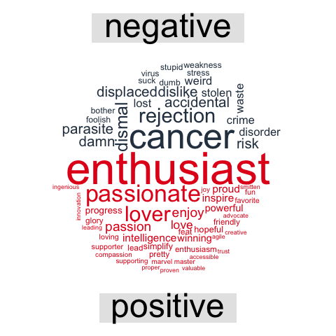
Although wordclouds are not my favorite visualizations, they do allow for a quick display of frequencies among a large body of words.

hp_senti %>%
  group_by(word) %>%
  count() %>% # summarize count per word
  mutate(log_n = sqrt(n)) %>% # take root to decrease outlier impact
  with(wordcloud(word, log_n, max.words = 100))

download (1)

It appears we need to correct for some words that occur in the sentiment dictionaries but have a different meaning in J.K. Rowling’s books. Most importantly, we need to filter two character names.

# DELETE SENTIMENT FOR CHARACTER NAMES
hp_senti_sel <- hp_senti %>% filter(!word %in% c("harry","moody"))

Words per sentiment

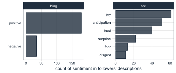
Let’s quickly sketch the remaining words per sentiment.

# VIZUALIZE MOST FREQUENT WORDS PER SENTIMENT
hp_senti_sel %>% # NAMES EXCLUDED
  group_by(word, sentiment) %>%
  count() %>% # summarize count per word per sentiment
  group_by(sentiment) %>%
  arrange(sentiment, desc(n)) %>% # most frequent on top
  mutate(top = seq_along(word)) %>% # identify rank within group
  filter(top <= 15) %>% # keep top 15 frequent words
  ggplot(aes(x = -top, fill = factor(sentiment))) + 
  # create barplot
  geom_bar(aes(y = n), stat = 'identity', col = 'black') +
  # make sure words are printed either in or next to bar
  geom_text(aes(y = ifelse(n > max(n) / 2, max(n) / 50, n + max(n) / 50),
                label = word), size = fs/3, hjust = "left") +
  theme(legend.position = 'none', # remove legend
        text = element_text(size = fs), # determine fontsize
        axis.text.x = element_text(angle = 45, hjust = 1), # rotate x text
        axis.ticks.y = element_blank(), # remove y ticks
        axis.text.y = element_blank()) + # remove y text
  labs(y = "Word count", x = "", # add manual labels
       title = "Harry Plotter: Words carrying sentiment as counted throughout the saga",
       subtitle = "Using tidytext and the AFINN, bing, and nrc sentiment dictionaries") +
  facet_grid(. ~ sentiment) + # separate plot for each sentiment
  coord_flip() # flip axes

download (2).png

This seems ok. Let’s continue to plot the sentiment over time.

Positive and negative sentiment throughout the series

As positive and negative sentiment is included in each of the three dictionaries we can to compare and contrast scores.

# VIZUALIZE POSTIVE/NEGATIVE SENTIMENT OVER TIME
plot_sentiment <- hp_senti_sel %>% # NAMES EXCLUDED
  group_by(dictionary, sentiment, book, chapter) %>%
  summarize(score = sum(score), # summarize AFINN scores
            count = n(), # summarize bing and nrc counts
            # move bing and nrc counts to score 
            score = ifelse(is.na(score), count, score))  %>%
  filter(sentiment %in% c('positive','negative')) %>%   # only retain bipolar sentiment
  mutate(score = ifelse(sentiment == 'negative', -score, score)) %>% # reverse negative values
  # create area plot
  ggplot(aes(x = chapter, y = score)) +    
  geom_area(aes(fill = score > 0),stat = 'identity') +
  scale_fill_manual(values = c('red','green')) + # change colors
  # add black smoothed line without standard error
  geom_smooth(method = "loess", se = F, col = "black") + 
  theme(legend.position = 'none', # remove legend
        text = element_text(size = fs)) + # change font size
  labs(x = "Chapter", y = "Sentiment score", # add labels
       title = "Harry Plotter: Sentiment during the saga",
       subtitle = "Using tidytext and the AFINN, bing, and nrc sentiment dictionaries") +
     # separate plot per book and dictionary and free up x-axes
  facet_grid(dictionary ~ book, scale = "free_x")
plot_sentiment

download (3).png

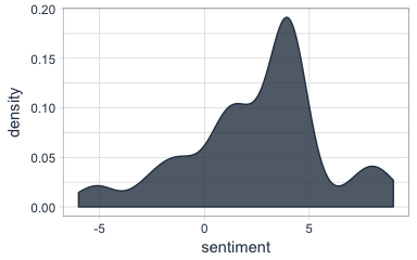
Let’s zoom in on the smoothed average.

plot_sentiment + coord_cartesian(ylim = c(-100,50)) # zoom in plot

download (4).png

Sentiment seems overly negative throughout the series. Particularly salient is that every book ends on a down note, except the Prisoner of Azkaban. Moreover, sentiment becomes more volatile in books four through six. These start out negative, brighten up in the middle, just to end in misery again. In her final book, J.K. Rowling depicts a world about to be conquered by the Dark Lord and the average negative sentiment clearly resembles this grim outlook.

The bing sentiment dictionary estimates the most negative sentiment on average, but that might be due to this specific text.

Other emotions throughout the series

Finally, let’s look at the other emotions that are included in the nrc dictionary.

# VIZUALIZE EMOTIONAL SENTIMENT OVER TIME
hp_senti_sel %>% # NAMES EXCLUDED 
  filter(!sentiment %in% c('negative','positive')) %>% # only retain other sentiments (nrc)
  group_by(sentiment, book, chapter) %>%
  count() %>% # summarize count
  # create area plot
  ggplot(aes(x = chapter, y = n)) +
  geom_area(aes(fill = sentiment), stat = 'identity') + 
  # add black smoothing line without standard error
  geom_smooth(aes(fill = sentiment), method = "loess", se = F, col = 'black') + 
  theme(legend.position = 'none', # remove legend
        text = element_text(size = fs)) + # change font size
  labs(x = "Chapter", y = "Emotion score", # add labels
       title = "Harry Plotter: Emotions during the saga",
       subtitle = "Using tidytext and the nrc sentiment dictionary") +
  # separate plots per sentiment and book and free up x-axes
  facet_grid(sentiment ~ book, scale = "free_x") 

download (5).png

This plot is less insightful as either the eight emotions are represented by similar words or J.K. Rowling combines all in her writing simultaneously. Patterns across emotions are highly similar, evidenced especially by the patterns in the Chamber of Secrets. In a next post, I will examine sentiment in a more detailed fashion, testing the differences over time and between characters statistically. For now, I hope you enjoyed these visualizations. Feel free to come back or subscribe to read my subsequent analyses.

The second blog in the Harry Plotter series examines the stereotypes behind the Hogwarts houses.

Text Mining: Shirin’s Twitter Feed

Text mining and analytics, natural language processing, and topic modelling have definitely become sort of an obsession of mine. I am just amazed by the insights one can retrieve from textual information, and with the ever increasing amounts of unstructured data on the internet, recreational analysts are coming up with the most amazing text mining projects these days.

Only last week, I came across posts talking about how the text in the Game of Thrones books to demonstrate a gender bias, how someone created an entire book with weirdly-satisfying computer-generated poems, and how to conduct a rather impressive analysis of your Twitter following. The latter, I copied below, with all props obviously for Shirin – the author.

For those of you who want to learn more about text mining and, specifically, how to start mining in R with tidytext, an new text-mining complement to the tidyverse, I can strongly recommend the new book by Julia Silge and David Robinson. This book has helped me greatly in learning the basics and you can definitely expect some blogs on my personal text mining projects soon.

===== COPIED FROM SHIRIN’S PLAYGROUND =====

Lately, I have been more and more taken with tidy principles of data analysis. They are elegant and make analyses clearer and easier to comprehend. Following the tidyverse and ggraph, I have been quite intrigued by applying tidy principles to text analysis with Julia Silge and David Robinson’s tidytext.

In this post, I will explore tidytext with an analysis of my Twitter followers’ descriptions to try and learn more about the people who are interested in my tweets, which are mainly about Data Science and Machine Learning.

Resources I found useful for this analysis were http://www.rdatamining.com/docs/twitter-analysis-with-r and http://tidytextmining.com/tidytext.html

Retrieving Twitter data

I am using twitteR to retrieve data from Twitter (I have also tried rtweet but for some reason, my API key, secret and token (that worked with twitteR) resulted in a “failed to authorize” error with rtweet’s functions).

library(twitteR)

Once we have set up our Twitter REST API, we get the necessary information to authenticate our access.

consumerKey = "INSERT KEY HERE"
consumerSecret = "INSERT SECRET KEY HERE"
accessToken = "INSERT TOKEN HERE"
accessSecret = "INSERT SECRET TOKEN HERE"
options(httr_oauth_cache = TRUE)

setup_twitter_oauth(consumer_key = consumerKey, 
                    consumer_secret = consumerSecret, 
                    access_token = accessToken, 
                    access_secret = accessSecret)

Now, we can access information from Twitter, like timeline tweets, user timelines, mentions, tweets & retweets, followers, etc.

All the following datasets were retrieved on June 7th 2017, converted to a data frame for tidy analysis and saved for later use:

  • the last 3200 tweets on my timeline
my_name <- userTimeline("ShirinGlander", n = 3200, includeRts=TRUE)
my_name_df <- twListToDF(my_name)
save(my_name_df, file = "my_name.RData")
  • my last 3200 mentions and retweets
my_mentions <- mentions(n = 3200)
my_mentions_df <- twListToDF(my_mentions)
save(my_mentions_df, file = "my_mentions.RData")

my_retweets <- retweetsOfMe(n = 3200)
my_retweets_df <- twListToDF(my_retweets)
save(my_retweets_df, file = "my_retweets.RData")
  • the last 3200 tweets to me
tweetstome <- searchTwitter("@ShirinGlander", n = 3200)
tweetstome_df <- twListToDF(tweetstome)
save(tweetstome_df, file = "tweetstome.RData")
  • my friends and followers
user <- getUser("ShirinGlander")

friends <- user$getFriends() # who I follow
friends_df <- twListToDF(friends)
save(friends_df, file = "my_friends.RData")

followers <- user$getFollowers() # my followers
followers_df <- twListToDF(followers)
save(followers_df, file = "my_followers.RData")

Analyzing friends and followers

In this post, I will have a look at my friends and followers.

load("my_friends.RData")
load("my_followers.RData")

I am going to use packages from the tidyverse (tidyquant for plotting).

library(tidyverse)
library(tidyquant)
  • Number of friends (who I follow on Twitter): 225
  • Number of followers (who follows me on Twitter): 324
  • Number of friends who are also followers: 97

What languages do my followers speak?

One of the columns describing my followers is which language they have set for their Twitter account. Not surprisingly, English is by far the most predominant language of my followers, followed by German, Spanish and French.

followers_df %>%
  count(lang) %>%
  droplevels() %>%
  ggplot(aes(x = reorder(lang, desc(n)), y = n)) +
    geom_bar(stat = "identity", color = palette_light()[1], fill = palette_light()[1], alpha = 0.8) +
    theme_tq() +
    theme(axis.text.x = element_text(angle = 45, vjust = 1, hjust = 1)) +
    labs(x = "language ISO 639-1 code",
         y = "number of followers")

Who are my most “influential” followers (i.e. followers with the biggest network)?

I also have information about the number of followers that each of my followers have (2nd degree followers). Most of my followers are followed by up to ~ 1000 people, while only a few have a very large network.

followers_df %>%
  ggplot(aes(x = log2(followersCount))) +
    geom_density(color = palette_light()[1], fill = palette_light()[1], alpha = 0.8) +
    theme_tq() +
    labs(x = "log2 of number of followers",
         y = "density")

How active are my followers (i.e. how often do they tweet)

The followers data frame also tells me how many statuses (i.e. tweets) each of followers have. To make the numbers comparable, I am normalizing them by the number of days that they have had their accounts to calculate the average number of tweets per day.

followers_df %>%
  mutate(date = as.Date(created, format = "%Y-%m-%d"),
         today = as.Date("2017-06-07", format = "%Y-%m-%d"),
         days = as.numeric(today - date),
         statusesCount_pDay = statusesCount / days) %>%
  ggplot(aes(x = log2(statusesCount_pDay))) +
    geom_density(color = palette_light()[1], fill = palette_light()[1], alpha = 0.8) +
    theme_tq()

Who are my followers with the biggest network and who tweet the most?

followers_df %>%
  mutate(date = as.Date(created, format = "%Y-%m-%d"),
         today = as.Date("2017-06-07", format = "%Y-%m-%d"),
         days = as.numeric(today - date),
         statusesCount_pDay = statusesCount / days) %>%
  select(screenName, followersCount, statusesCount_pDay) %>%
  arrange(desc(followersCount)) %>%
  top_n(10)
##         screenName followersCount statusesCount_pDay
## 1        dr_morton         150937           71.35193
## 2    Scientists4EU          66117           17.64389
## 3       dr_morton_          63467           46.57763
## 4   NewScienceWrld          60092           54.65874
## 5     RubenRabines          42286           25.99592
## 6  machinelearnbot          27427          204.67061
## 7  BecomingDataSci          16807           25.24069
## 8       joelgombin           6566           21.24094
## 9    renato_umeton           1998           19.58387
## 10 FranPatogenLoco            311           28.92593
followers_df %>%
  mutate(date = as.Date(created, format = "%Y-%m-%d"),
         today = as.Date("2017-06-07", format = "%Y-%m-%d"),
         days = as.numeric(today - date),
         statusesCount_pDay = statusesCount / days) %>%
  select(screenName, followersCount, statusesCount_pDay) %>%
  arrange(desc(statusesCount_pDay)) %>%
  top_n(10)
##         screenName followersCount statusesCount_pDay
## 1  machinelearnbot          27427          204.67061
## 2        dr_morton         150937           71.35193
## 3   NewScienceWrld          60092           54.65874
## 4       dr_morton_          63467           46.57763
## 5  FranPatogenLoco            311           28.92593
## 6     RubenRabines          42286           25.99592
## 7  BecomingDataSci          16807           25.24069
## 8       joelgombin           6566           21.24094
## 9    renato_umeton           1998           19.58387
## 10   Scientists4EU          66117           17.64389

Is there a correlation between number of followers and number of tweets?

Indeed, there seems to be a correlation that users with many followers also tend to tweet more often.

followers_df %>%
  mutate(date = as.Date(created, format = "%Y-%m-%d"),
         today = as.Date("2017-06-07", format = "%Y-%m-%d"),
         days = as.numeric(today - date),
         statusesCount_pDay = statusesCount / days) %>%
  ggplot(aes(x = followersCount, y = statusesCount_pDay, color = days)) +
    geom_smooth(method = "lm") +
    geom_point() +
    scale_color_continuous(low = palette_light()[1], high = palette_light()[2]) +
    theme_tq()

Tidy text analysis

Next, I want to know more about my followers by analyzing their Twitter descriptions with the tidytext package.

library(tidytext)
library(SnowballC)

To prepare the data, I am going to unnest the words (or tokens) in the user descriptions, convert them to the word stem, remove stop words and urls.

data(stop_words)

tidy_descr <- followers_df %>%
  unnest_tokens(word, description) %>%
  mutate(word_stem = wordStem(word)) %>%
  anti_join(stop_words, by = "word") %>%
  filter(!grepl("\\.|http", word))

What are the most commonly used words in my followers’ descriptions?

The first question I want to ask is what words are most common in my followers’ descriptions.

Not surprisingly, the most common word is “data”. I do tweet mostly about data related topics, so it makes sense that my followers are mostly likeminded. The rest is also related to data science, machine learning and R.

tidy_descr %>%
  count(word_stem, sort = TRUE) %>%
  filter(n > 20) %>%
  ggplot(aes(x = reorder(word_stem, n), y = n)) +
    geom_col(color = palette_light()[1], fill = palette_light()[1], alpha = 0.8) +
    coord_flip() +
    theme_tq() +
    labs(x = "",
         y = "count of word stem in all followers' descriptions")

This, we can also show with a word cloud.

library(wordcloud)
library(tm)
tidy_descr %>%
  count(word_stem) %>%
  mutate(word_stem = removeNumbers(word_stem)) %>%
  with(wordcloud(word_stem, n, max.words = 100, colors = palette_light()))

Instead of looking for the most common words, we can also look for the most common ngrams: here, for the most common word pairs (bigrams) in my followers’ descriptions.

tidy_descr_ngrams <- followers_df %>%
  unnest_tokens(bigram, description, token = "ngrams", n = 2) %>%
  filter(!grepl("\\.|http", bigram)) %>%
  separate(bigram, c("word1", "word2"), sep = " ") %>%
  filter(!word1 %in% stop_words$word) %>%
  filter(!word2 %in% stop_words$word)

bigram_counts <- tidy_descr_ngrams %>%
  count(word1, word2, sort = TRUE)
bigram_counts %>%
  filter(n > 10) %>%
  ggplot(aes(x = reorder(word1, -n), y = reorder(word2, -n), fill = n)) +
    geom_tile(alpha = 0.8, color = "white") +
    scale_fill_gradientn(colours = c(palette_light()[[1]], palette_light()[[2]])) +
    coord_flip() +
    theme_tq() +
    theme(legend.position = "right") +
    theme(axis.text.x = element_text(angle = 45, vjust = 1, hjust = 1)) +
    labs(x = "first word in pair",
         y = "second word in pair")

These, we can also show as a graph:

library(igraph)
library(ggraph)
bigram_graph <- bigram_counts %>%
  filter(n > 5) %>%
  graph_from_data_frame()

set.seed(1)

a <- grid::arrow(type = "closed", length = unit(.15, "inches"))
ggraph(bigram_graph, layout = "fr") +
  geom_edge_link(aes(edge_alpha = n), show.legend = FALSE,
                 arrow = a, end_cap = circle(.07, 'inches')) +
  geom_node_point(color =  palette_light()[1], size = 5, alpha = 0.8) +
  geom_node_text(aes(label = name), vjust = 1, hjust = 0.5) +
  theme_void()

We can also use bigram analysis to identify negated meanings (this will become relevant for sentiment analysis later). So, let’s look at which words are preceded by “not” or “no”.

bigrams_separated <- followers_df %>%
  unnest_tokens(bigram, description, token = "ngrams", n = 2) %>%
  filter(!grepl("\\.|http", bigram)) %>%
  separate(bigram, c("word1", "word2"), sep = " ") %>%
  filter(word1 == "not" | word1 == "no") %>%
  filter(!word2 %in% stop_words$word)

not_words <- bigrams_separated %>%
  filter(word1 == "not") %>%
  inner_join(get_sentiments("afinn"), by = c(word2 = "word")) %>%
  count(word2, score, sort = TRUE) %>%
  ungroup()
not_words %>%
  mutate(contribution = n * score) %>%
  arrange(desc(abs(contribution))) %>%
  head(20) %>%
  mutate(word2 = reorder(word2, contribution)) %>%
  ggplot(aes(word2, n * score, fill = n * score > 0)) +
    geom_col(show.legend = FALSE) +
    scale_fill_manual(values = palette_light()) +
    labs(x = "",
         y = "Sentiment score * number of occurrences",
         title = "Words preceded by \"not\"") +
    coord_flip() +
    theme_tq()

What’s the predominant sentiment in my followers’ descriptions?

For sentiment analysis, I will exclude the words with a negated meaning from nrc and switch their positive and negative meanings from bing (although in this case, there was only one negated word, “endorsement”, so it won’t make a real difference).

tidy_descr_sentiment <- tidy_descr %>%
  left_join(select(bigrams_separated, word1, word2), by = c("word" = "word2")) %>%
  inner_join(get_sentiments("nrc"), by = "word") %>%
  inner_join(get_sentiments("bing"), by = "word") %>%
  rename(nrc = sentiment.x, bing = sentiment.y) %>%
  mutate(nrc = ifelse(!is.na(word1), NA, nrc),
         bing = ifelse(!is.na(word1) & bing == "positive", "negative", 
                       ifelse(!is.na(word1) & bing == "negative", "positive", bing)))
tidy_descr_sentiment %>%
  filter(nrc != "positive") %>%
  filter(nrc != "negative") %>%
  gather(x, y, nrc, bing) %>%
  count(x, y, sort = TRUE) %>%
  filter(n > 10) %>%
  ggplot(aes(x = reorder(y, n), y = n)) +
    facet_wrap(~ x, scales = "free") +
    geom_col(color = palette_light()[1], fill = palette_light()[1], alpha = 0.8) +
    coord_flip() +
    theme_tq() +
    labs(x = "",
         y = "count of sentiment in followers' descriptions")

Are followers’ descriptions mostly positive or negative?

The majority of my followers have predominantly positive descriptions.

tidy_descr_sentiment %>%
  count(screenName, word, bing) %>%
  group_by(screenName, bing) %>%
  summarise(sum = sum(n)) %>%
  spread(bing, sum, fill = 0) %>%
  mutate(sentiment = positive - negative) %>%
  ggplot(aes(x = sentiment)) +
    geom_density(color = palette_light()[1], fill = palette_light()[1], alpha = 0.8) +
    theme_tq()

What are the most common positive and negative words in followers’ descriptions?

library(reshape2)
tidy_descr_sentiment %>%
  count(word, bing, sort = TRUE) %>%
  acast(word ~ bing, value.var = "n", fill = 0) %>%
  comparison.cloud(colors = palette_light()[1:2],
                   max.words = 100)

Topic modeling: are there groups of followers with specific interests?

Topic modeling can be used to categorize words into groups. Here, we can use it to see whether (some) of my followers can be grouped into subgroups according to their descriptions.

library(topicmodels)
dtm_words_count <- tidy_descr %>%
  mutate(word_stem = removeNumbers(word_stem)) %>%
  count(screenName, word_stem, sort = TRUE) %>%
  ungroup() %>%
  filter(word_stem != "") %>%
  cast_dtm(screenName, word_stem, n)

# set a seed so that the output of the model is predictable
dtm_lda <- LDA(dtm_words_count, k = 5, control = list(seed = 1234))

topics_beta <- tidy(dtm_lda, matrix = "beta")
p1 <- topics_beta %>%
  filter(grepl("[a-z]+", term)) %>% # some words are Chinese, etc. I don't want these because ggplot doesn't plot them correctly
  group_by(topic) %>%
  top_n(10, beta) %>%
  ungroup() %>%
  arrange(topic, -beta) %>%
  mutate(term = reorder(term, beta)) %>%
  ggplot(aes(term, beta, color = factor(topic), fill = factor(topic))) +
    geom_col(show.legend = FALSE, alpha = 0.8) +
    scale_color_manual(values = palette_light()) +
    scale_fill_manual(values = palette_light()) +
    facet_wrap(~ topic, ncol = 5) +
    coord_flip() +
    theme_tq() +
    labs(x = "",
         y = "beta (~ occurrence in topics 1-5)",
         title = "The top 10 most characteristic words describe topic categories.")
user_topic <- tidy(dtm_lda, matrix = "gamma") %>%
  arrange(desc(gamma)) %>%
  group_by(document) %>%
  top_n(1, gamma)
p2 <- user_topic %>%
  group_by(topic) %>%
  top_n(10, gamma) %>%
  ggplot(aes(x = reorder(document, -gamma), y = gamma, color = factor(topic))) +
    facet_wrap(~ topic, scales = "free", ncol = 5) +
    geom_point(show.legend = FALSE, size = 4, alpha = 0.8) +
    scale_color_manual(values = palette_light()) +
    scale_fill_manual(values = palette_light()) +
    theme_tq() +
    coord_flip() +
    labs(x = "",
         y = "gamma\n(~ affiliation with topics 1-5)")
library(grid)
library(gridExtra)
grid.arrange(p1, p2, ncol = 1, heights = c(0.7, 0.3))

The upper of the two plots above show the words that were most strongly grouped to five topics. The lower plots show my followers with the strongest affiliation with these five topics.

Because in my tweets I only cover a relatively narrow range of topics (i.e. related to data), my followers are not very diverse in terms of their descriptions and the five topics are not very distinct.

If you find yourself in any of the topics, let me know if you agree with the topic that was modeled for you!

For more text analysis, see my post about text mining and sentiment analysis of a Stuff You Should Know Podcast.