Tag: harrypotter

AI Book Review: You look like a thing and I love you

AI Book Review: You look like a thing and I love you

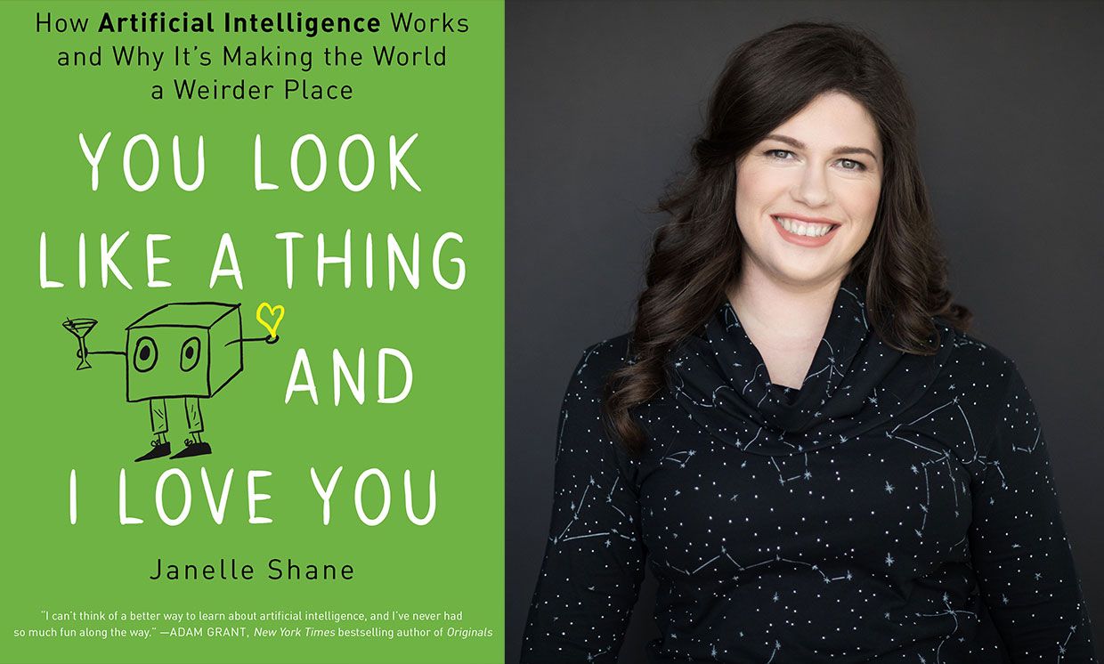
The following are my summary and take-aways from Janelle Shane’s 2019 book named You look like a thing and I love you. Most of the below are excerpts from Janelle’s book, combined, or rewritten by me. For the sake of copyright, just consider everything Janelle’s : )

Image result for things called ai janelle shane

AI weirdness

You look like a thing and I love you is about AI. More specifically, the book is about what AI can and can not do. And how and why AI often fails in miserably hilareous ways.

Janelle has spend her time foing fun experiments with AI. In this book, she shares those experiments along with many real life examples of AIs in practice. While explaining the technical details behind these AIs in an accesible though technically correct way, she informs the reader where, how, and why AIs fail.

Janelle took AIs out of their comfort zone and it produced some hilareously weird results. She proposes five principles of AI Weirdness:

  1. The danger of AI is not that it’s too smart, but that it’s not smart enough
  2. AI has the approximate brainpower of a worm
  3. AI does not really understand the problem you want it to solve
  4. But: AI will do exactly what you tell it to. Or at least it will try its best.
  5. And AI willt ake the path of the least resistance

Definitions: What is (not) AI?

If it seems like AI is everywhere, it’s partly because Artificial Intelligence means lots of things, depending on whether you’re reading science fiction or selling a new app or doing academic research.

To spot an AI in the wild, it’s important to know the difference between machine learning algorithms (what Janelle calls AI in her book) and traditional, rules-based programs.

To solve a problem with a rules-based program, you have to know every step required to complete the program’s task and how to describe each one of those steps. But a machine learning algorithm figures out the rules for itself via trail and error, gauging its success on goals the programmer has specified. As the AI tries to reach this goal, it can discover rules and correlations that the programmer didn’t even know existed. This is what makes AIs attractive problem solvers and is particularly handy if the rules are really complicated or just plain mysterious.

Sometimes an AI’s brilliant problem-solving rules actually rely on mistaken assumptions. Rules that served it well in training but fail miserably when it encountered the real world. While training errors are common in complex AIs, the consequences of these mistakes can be serious.

It’s often not easy to tell when AIs make mistakes. Since we don’t write the rules, they come up with their own, and they don’t write them down or explain them the way a human would.

The difference between succesful AI problem solving and failure usually has a lot to do with the suitability of the task for an AI solution. And there are plenty of tasks for which AI solutions are more efficient than human solutions. But there are also plenty of cases where things go miserably wrong.

Janelle proposes four signs of “AI Doom”, contexts where machine learning will not produce the desired results:

  1. The problem is too hard, broad, or complex
  2. The problem is not what we thought it was
  3. There are sneaky shortcuts to solving the problem
  4. The AI tried to solve the problem learning from flawed data

Programming an AI is almost more like teaching a child than programming a computer.

Explaining how AI works

In her book, Janelle takes us through many example problems which she or others tried to solve using AIs. These example problems are increasingly hilareous, but I assure you that they are technically and didactically sound:

  • Playing tic-tac-toe
  • Managing a cockroach farm
  • Riding a bicycle
  • Rating sandwich deliciousness
  • Tossing a sandwich into a wall
  • Guiding people through a hallway
  • Answering questions regarding photo’s
  • Categorizing doodles
  • Categorizing fish
  • Tossing pancakes
  • Autonomous walking
  • Autonomous driving
  • Playing Pacman

The amazing thing is these ridiculous example problems actually serve a purpose. They are used to explain different algorithms and their applications, strengths, and limitations! Janelle covers a wide variety of algorithms in such a way that anyone new to machine learning would understand, while people with some experience will still be amused.

Janelle talks about artificial neural networks, random forests, and markov chains. Moreover, she explains how activation functions, recurrancy and long short-term memory, evolutionary algorithms and gradient descent work. And all in understandable though technically correct language.

Janelle herself seems particularly fond of generative algorithms. She’s elaborates on having deployed recurrent neural nets, generative adversial networks, and markov chains for a wide variety of generative tasks. In the book, Jabekke explains what went well and went wrong when coming up with new and original…

  • pick-up lines
  • knock-knock jokes
  • names for species of birds
  • perfumes names
  • ice-cream flavors
  • cooking recipes
  • dream descriptions
  • horse drawings
  • Harry Potter scripts
  • cat names
  • Halloween costumes
  • elementary school blueprints
  • names for Benedict Cumberbatch
  • Dungeons and Dragons spells
  • pie recipes

Where does AI fail?

Janelle’s book is lingered with examples of failing AI. As a matter of fact, the whole book seems like an ode to how machine learning can and will inevitably fail. Particularly in the latter chapters, Janelle covers many limitations of and issues with AI in much detail:

  • class imbalance
  • overfitting
  • unrealistic simulation conditions
  • data quality issues
  • self-fullfilling prophecies
  • undesirable reward function optimization
  • missing the obvious
  • catastrophic forgetting
  • human biases in the data
  • machine bias
  • math-washing / bias laundering
  • bias amplification
  • adversarial attacks

Definite recommendation

I have yet to come across a book that explain AI in this much detail and in a manner as accessible and entertaining as Janelle Shane does in You look like a thing and I love you. Janelle makes machine learning and AI understandable for a wide public without passing on the deeper technical details. Taking a critical stance, she provides a good overview of the strenghts and weaknesses of AI, and a realistic outlook for the future to come. This book is not looking for sensation or hype, although reading it will be a most amusing experience for the more technical as well as the lay reader.

I highly recommend you reward yourself with a copy!

Harry Plotter: Network analysis of spell usage

Harry Plotter: Network analysis of spell usage

Apparently, I was not the only geek who decided to celebrate the 20th anniversary of the Harry Potter saga with statistical analysis. Students Moritz Haine and Markus Dienstknecht of the Data Science for Decision Making Master at Maastricht University started their own celebratory project as part of a course Information Retrieval and Text Mining.

Students in previous years looked at for example Lord of the Rings, Star Wars and Game of Thrones. However, to our surprise, Harry Potter was missing. Since the books are about magic, we decided it would be interesting to identify all of the spells and the wizards that cast the most spells

Moritz Haine

From the books, the students extracted 41 different wizards, 64 different spells and 253 spells. Moritz points out that they could only include spoken spells, even though the most powerful wizards can also cast spells without naming them. They expect this might be the reason why Dumbledore and Voldemort are not ranked as high. At the end of their project, Moritz and Markus visualized their results in a spell-character mapping.

Spells
A network mapping of the characters and spells casted in the Harry Potter saga [original]
This is the latest addition to my collection of Harry Potter analyses, to which a similar, interactive web application of spell usage was added only last week.


Harry Plotter: Shiny App of Spell Usage

Harry Plotter: Shiny App of Spell Usage

In my second Harry Plotter blog (22-Aug-2017), I wrote:

I would like to demonstrate how regular expressions can be used to retrieve (sub)strings that follow a specific format. We could use regex to examine, for instance, when, and by whom, which magical spells are cast.

Well, Prusinowskik (real name unknown) beat me to it, and how! S/He formed a comprehensive list of all spells found in the Harry Potter saga (see below), and categorized these into “spells“, “charms“, and “curses“, and into “popular“, “dueling” and “unforgivable” purposes. Next, Prusinowskik built an interactive Shiny application with lovely JavaScript graphs (package: rCharts) for us to discover precisely when during the saga which spells are cast (see also below). Moreover, the analysis was repeated for both the books and the movies.

Truly excellent work Prusinowskik! The Shiny app can be found here.

spells_dash
Overview of dueling spells (interactive)

spells
Overview of spells (interactive)


Text Mining: Pythonic Heavy Metal

Text Mining: Pythonic Heavy Metal

This blog summarized work that has been posted here, here, and here.

Iain of degeneratestate.org wrote a three-piece series where he applied text mining to the lyrics of 222,623 songs from 7,364 heavy metal bands spread over 22,314 albums that he scraped from darklyrics.com. He applied a broad range of different analyses in Python, the code of which you can find here on Github.

For example, he starts part 1 by calculated the difficulty/complexity of the lyrics of each band using the Simple Measure of Gobbledygook or SMOG and contrasted this to the number of swearwords used, finding a nice correlation.

Ratio of swear words vs readability
Lyric complexity relates positive to swearwords used.

Furthermore, he ran some word importance analysis, looking at word frequencies, log-likelihood ratios, and TF-IDF scores. This allowed him to contrast the word usage of the different bands, finding, for instance, one heavy metal band that was characterized by the words “oh yeah baby got love“: fans might recognize either Motorhead, Machinehead, or Diamondhead.

Examplehead WordImportance 3

Using cosine distance measures, Iain could compare the word vectors of the different bands, ultimately recognizing band similarity, and song representativeness for a band. This allowed interesting analysis, such as a clustering of the various bands:

Metal Cluster Dendrogram

However, all his analysis worked out nicely. While he also applied t-SNE to visualize band similarity in a two-dimensional space, the solution was uninformative due to low variance in the data.

He could predict the band behind a song by training a one-vs-rest logistic regression classifier based on the reduced lyric space of 150 dimensions after latent semantic analysis. Despite classifying a song to one of 120 different bands, the classifier had a precision and recall both around 0.3, with negligible hyper parameter tuning. He used the classification errors to examine which bands get confused with each other, and visualized this using two network graphs.

Metal Graph 1

In part 2, Iain tried to create a heavy metal lyric generator (which you can now try out).

His first approach was to use probabilistic distributions known as language models. Basically he develops a Markov Chain, in his opinion more of a “unsmoothed maximum-likelihood language model“, which determines the next most probable word based on the previous word(s). This model is based on observed word chains, for instance, those in the first two lines to Iron Maiden’s Number of the Beast:

Another approach would be to train a neural network. Iain used Keras, which ran on an amazon GPU instance. He recognizes the power of neural nets, but says they also come at a cost:

“The maximum likelihood models we saw before took twenty minutes to code from scratch. Even using powerful libraries, it took me a while to understand NNs well enough to use. On top of this, training the models here took days of computer time, plus more of my human time tweeking hyper parameters to get the models to converge. I lack the temporal, financial and computational resources to fully explore the hyperparameter space of these models, so the results presented here should be considered suboptimal.” – Iain

He started out with feed forward networks on a character level. His best try consisted of two feed forward layers of 512 units, followed by a softmax output, with layer normalisation, dropout and tanh activations, which he trained for 20 epochs to minimise the mean cross-entropy. Although it quickly beat the maximum likelihood Markov model, its longer outputs did not look like genuine heavy metal songs.

So he turned to recurrent neural network (RNN). The RNN Iain used contains two LSTM layers of 512 units each, followed by a fully connected softmax layer. He unrolled the sequence for 32 characters and trained the model by predicting the next 32 characters, given their immediately preceding characters, while minimizing the mean cross-entropy:

“To generate text from the RNN model, we step character-by-character through a sequence. At each step, we feed the current symbol into the model, and the model returns a probability distribution over the next character. We then sample from this distribution to get the next character in the sequence and this character goes on to become the next input to the model. The first character fed into the model at the beginning of generation is always a special start-of-sequence character.” – Iain

This approach worked quite well, and you can compare and contrast it with the earlier models here. If you’d just like to generate some lyrics, the models are hosted online at deepmetal.io.

In part 3, Iain looks into emotional arcs, examining the happiness and metalness of words and lyrics. Exploring words in the Happy/Metal Plane

When applied to the combined lyrics of albums, you could examine how bands developed their signature sound over time. For example, the lyrics of Metallica’s first few albums seem to be quite heavy metal and unhappy, before moving to a happier place. The Black album is almost sentiment-neutral, but after that they became ever more darker and more metal, moving back to the style to their first few albums. He applied the same analysis on the text of the Harry Potter books, of which especially the first and last appear especially metal.

The Evolution of Metallica's style in the Happy/Metal Plane


Harry Plotter: Part 2 – Hogwarts Houses and their Stereotypes

Harry Plotter: Part 2 – Hogwarts Houses and their Stereotypes

Two weeks ago, I started the Harry Plotter project to celebrate the 20th anniversary of the first Harry Potter book. I could not have imagined that the first blog would be so well received. It reached over 4000 views in a matter of days thanks to the lovely people in the data science and #rstats community that were kind enough to share it (special thanks to MaraAverick and DataCamp). The response from the Harry Potter community, for instance on reddit, was also just overwhelming

Part 2: Hogwarts Houses

All in all, I could not resist a sequel and in this second post we will explore the four houses of Hogwarts: GryffindorHufflepuffRavenclaw, and Slytherin. At the end of today’s post we will end up with visualizations like this:

treemap_house_word_ratio

Various stereotypes exist regarding these houses and a textual analysis seemed a perfect way to uncover their origins. More specifically, we will try to identify which words are most unique, informative, important or otherwise characteristic for each house by means of ratio and tf-idf statistics. Additionally, we will try to estime a personality profile for each house using these characteristic words and the emotions they relate to. Again, we rely strongly on ggplot2 for our visualizations, but we will also be using the treemaps of treemapify. Moreover, I have a special surprise this second post, as I found the orginal Harry Potter font, which will definately make the visualizations feel more authentic. Of course, we will conduct all analyses in a tidy manner using tidytext and the tidyverse.

I hope you will enjoy this blog and that you’ll be back for more. To be the first to receive new content, please subscribe to my website www.paulvanderlaken.com, follow me on Twitter, or add me on LinkedIn. Additionally, if you would like to contribute to, collaborate on, or need assistance with a data science project or venture, please feel free to reach out.

R Setup

All analysis were performed in RStudio, and knit using rmarkdown so that you can follow my steps.

In term of setup, we will be needing some of the same packages as last time. Bradley Boehmke gathered the text of the Harry Potter books in his harrypotter package. We need devtools to install that package the first time, but from then on can load it in as usual. We need plyr for ldply(). We load in most other tidyverse packages in a single bundle and add tidytext. Finally, I load the Harry Potter font and set some default plotting options.

# SETUP ####
# LOAD IN PACKAGES
# library(devtools)
# devtools::install_github("bradleyboehmke/harrypotter")
library(harrypotter)
library(plyr)
library(tidyverse)
library(tidytext)

# VIZUALIZATION SETTINGS
# custom Harry Potter font
# http://www.fontspace.com/category/harry%20potter
library(extrafont)
font_import(paste0(getwd(),"/fontomen_harry-potter"), prompt = F) # load in custom Harry Potter font
windowsFonts(HP = windowsFont("Harry Potter"))
theme_set(theme_light(base_family = "HP")) # set default ggplot theme to light
default_title = "Harry Plotter: References to the Hogwarts houses" # set default title
default_caption = "www.paulvanderlaken.com" # set default caption
dpi = 600 # set default dpi

Importing and Transforming Data

Before we import and transform the data in one large piping chunk, I need to specify some variables.

First, I tell R the house names, which we are likely to need often, so standardization will help prevent errors. Next, my girlfriend was kind enough to help me (colorblind) select the primary and secondary colors for the four houses. Here, the ggplot2 color guide in my R resources list helped a lot! Finally, I specify the regular expression (tutorials) which we will use a couple of times in order to identify whether text includes either of the four house names.

# DATA PREPARATION ####
houses <- c('gryffindor', 'ravenclaw', 'hufflepuff', 'slytherin') # define house names
houses_colors1 <- c("red3", "yellow2", "blue4", "#006400") # specify primary colors
houses_colors2 <- c("#FFD700", "black", "#B87333", "#BCC6CC") # specify secondary colors
regex_houses <- paste(houses, collapse = "|") # regular expression

Import Data and Tidy

Ok, let’s import the data now. You may recognize pieces of the code below from last time, but this version runs slightly smoother after some optimalization. Have a look at the current data format.

# LOAD IN BOOK TEXT 
houses_sentences <- list(
  `Philosophers Stone` = philosophers_stone,
  `Chamber of Secrets` = chamber_of_secrets,
  `Prisoner of Azkaban` = prisoner_of_azkaban,
  `Goblet of Fire` = goblet_of_fire,
  `Order of the Phoenix` = order_of_the_phoenix,
  `Half Blood Prince` = half_blood_prince,
  `Deathly Hallows` = deathly_hallows
) %>% 
  # TRANSFORM TO TOKENIZED DATASET
  ldply(cbind) %>% # bind all chapters to dataframe
  mutate(.id = factor(.id, levels = unique(.id), ordered = T)) %>% # identify associated book
  unnest_tokens(sentence, `1`, token = 'sentences') %>% # seperate sentences
  filter(grepl(regex_houses, sentence)) %>% # exclude sentences without house reference
  cbind(sapply(houses, function(x) grepl(x, .$sentence)))# identify references
# examine
max.char = 30 # define max sentence length
houses_sentences %>%
  mutate(sentence = ifelse(nchar(sentence) > max.char, # cut off long sentences
                           paste0(substring(sentence, 1, max.char), "..."),
                           sentence)) %>% 
  head(5)
##                  .id                          sentence gryffindor
## 1 Philosophers Stone "well, no one really knows unt...      FALSE
## 2 Philosophers Stone "and what are slytherin and hu...      FALSE
## 3 Philosophers Stone everyone says hufflepuff are a...      FALSE
## 4 Philosophers Stone "better hufflepuff than slythe...      FALSE
## 5 Philosophers Stone "there's not a single witch or...      FALSE
##   ravenclaw hufflepuff slytherin
## 1     FALSE       TRUE      TRUE
## 2     FALSE       TRUE      TRUE
## 3     FALSE       TRUE     FALSE
## 4     FALSE       TRUE      TRUE
## 5     FALSE      FALSE      TRUE

Transform to Long Format

Ok, looking great, but not tidy yet. We need gather the columns and put them in a long dataframe. Thinking ahead, it would be nice to already capitalize the house names for which I wrote a custom Capitalize() function.

# custom capitalization function
Capitalize = function(text){ 
  paste0(substring(text,1,1) %>% toupper(),
         substring(text,2))
}

# TO LONG FORMAT
houses_long <- houses_sentences %>%
  gather(key = house, value = test, -sentence, -.id) %>% 
  mutate(house = Capitalize(house)) %>% # capitalize names
  filter(test) %>% select(-test) # delete rows where house not referenced
# examine
houses_long %>%
  mutate(sentence = ifelse(nchar(sentence) > max.char, # cut off long sentences
                           paste0(substring(sentence, 1, max.char), "..."),
                           sentence)) %>% 
  head(20)
##                   .id                          sentence      house
## 1  Philosophers Stone i've been asking around, and i... Gryffindor
## 2  Philosophers Stone           "gryffindor," said ron. Gryffindor
## 3  Philosophers Stone "the four houses are called gr... Gryffindor
## 4  Philosophers Stone you might belong in gryffindor... Gryffindor
## 5  Philosophers Stone " brocklehurst, mandy" went to... Gryffindor
## 6  Philosophers Stone "finnigan, seamus," the sandy-... Gryffindor
## 7  Philosophers Stone                     "gryffindor!" Gryffindor
## 8  Philosophers Stone when it finally shouted, "gryf... Gryffindor
## 9  Philosophers Stone well, if you're sure -- better... Gryffindor
## 10 Philosophers Stone he took off the hat and walked... Gryffindor
## 11 Philosophers Stone "thomas, dean," a black boy ev... Gryffindor
## 12 Philosophers Stone harry crossed his fingers unde... Gryffindor
## 13 Philosophers Stone resident ghost of gryffindor t... Gryffindor
## 14 Philosophers Stone looking pleased at the stunned... Gryffindor
## 15 Philosophers Stone gryffindors have never gone so... Gryffindor
## 16 Philosophers Stone the gryffindor first years fol... Gryffindor
## 17 Philosophers Stone they all scrambled through it ... Gryffindor
## 18 Philosophers Stone nearly headless nick was alway... Gryffindor
## 19 Philosophers Stone professor mcgonagall was head ... Gryffindor
## 20 Philosophers Stone over the noise, snape said, "a... Gryffindor

Visualize House References

Woohoo, so tidy! Now comes the fun part: visualization. The following plots how often houses are mentioned overall, and in each book seperately.

# set plot width & height
w = 10; h = 6  

# PLOT REFERENCE FREQUENCY
houses_long %>%
  group_by(house) %>%
  summarize(n = n()) %>% # count sentences per house
  ggplot(aes(x = desc(house), y = n)) +
  geom_bar(aes(fill = house), stat = 'identity') +
  geom_text(aes(y = n / 2, label = house, col = house),  # center text
            size = 8, family = 'HP') +
  scale_fill_manual(values = houses_colors1) +
  scale_color_manual(values = houses_colors2) +
  theme(axis.text.y = element_blank(),
        axis.ticks.y = element_blank(),
        legend.position = 'none') +
  labs(title = default_title,
       subtitle = "Combined references in all Harry Potter books",
       caption = default_caption,
       x = '', y = 'Name occurence') + 
  coord_flip()

barplot_house_occurance.png

# PLOT REFERENCE FREQUENCY OVER TIME 
houses_long %>%
  group_by(.id, house) %>%
  summarize(n = n()) %>% # count sentences per house per book
  ggplot(aes(x = .id, y = n, group = house)) +
  geom_line(aes(col = house), size = 2) +
  scale_color_manual(values = houses_colors1) +
  theme(legend.position = 'bottom',
        axis.text.x = element_text(angle = 15, hjust = 0.5, vjust = 0.5)) + # rotate x axis text
  labs(title = default_title, 
       subtitle = "References throughout the Harry Potter books",
       caption = default_caption,
       x = NULL, y = 'Name occurence', color = 'House') 

house_occurance_overtime.png

The Harry Potter font looks wonderful, right?

In terms of the data, Gryffindor and Slytherin definitely play a larger role in the Harry Potter stories. However, as the storyline progresses, Slytherin as a house seems to lose its importance. Their downward trend since the Chamber of Secrets results in Ravenclaw being mentioned more often in the final book (Edit – this is likely due to the diadem horcrux, as you will see later on).

I can’t but feel sorry for house Hufflepuff, which never really gets to involved throughout the saga.

Retrieve Reference Words & Data

Let’s dive into the specific words used in combination with each house. The following code retrieves and counts the single words used in the sentences where houses are mentioned.

# IDENTIFY WORDS USED IN COMBINATION WITH HOUSES
words_by_houses <- houses_long %>% 
  unnest_tokens(word, sentence, token = 'words') %>% # retrieve words
  mutate(word = gsub("'s", "", word)) %>% # remove possesive determiners
  group_by(house, word) %>% 
  summarize(word_n = n()) # count words per house
# examine
words_by_houses %>% head()
## # A tibble: 6 x 3
## # Groups:   house [1]
##        house        word word_n
##        <chr>       <chr>  <int>
## 1 Gryffindor         104      1
## 2 Gryffindor        22nd      1
## 3 Gryffindor           a    251
## 4 Gryffindor   abandoned      1
## 5 Gryffindor  abandoning      1
## 6 Gryffindor abercrombie      1

Visualize Word-House Combinations

Now we can visualize which words relate to each of the houses. Because facet_wrap() has trouble reordering the axes (because words may related to multiple houses in different frequencies), I needed some custom functionality, which I happily recycled from dgrtwo’s github. With these reorder_within() and scale_x_reordered() we can now make an ordered barplot of the top-20 most frequent words per house.

# custom functions for reordering facet plots
# https://github.com/dgrtwo/drlib/blob/master/R/reorder_within.R
reorder_within <- function(x, by, within, fun = mean, sep = "___", ...) {
  new_x <- paste(x, within, sep = sep)
  reorder(new_x, by, FUN = fun)
}

scale_x_reordered <- function(..., sep = "___") {
  reg <- paste0(sep, ".+$")
  ggplot2::scale_x_discrete(labels = function(x) gsub(reg, "", x), ...)
}

# set plot width & height
w = 10; h = 7; 

# PLOT MOST FREQUENT WORDS PER HOUSE
words_per_house = 20 # set number of top words
words_by_houses %>%
  group_by(house) %>%
  arrange(house, desc(word_n)) %>%
  mutate(top = row_number()) %>% # count word top position
  filter(top <= words_per_house) %>% # retain specified top number
  ggplot(aes(reorder_within(word, -top, house), # reorder by minus top number
             word_n, fill = house)) +
  geom_col(show.legend = F) +
  scale_x_reordered() + # rectify x axis labels 
  scale_fill_manual(values = houses_colors1) +
  scale_color_manual(values = houses_colors2) + 
  facet_wrap(~ house, scales = "free_y") + # facet wrap and free y axis
  coord_flip() +
  labs(title = default_title, 
       subtitle = "Words most commonly used together with houses",
       caption = default_caption,
       x = NULL, y = 'Word Frequency')

barplot_house_word_frequency2.png

Unsurprisingly, several stop words occur most frequently in the data. Intuitively, we would rerun the code but use dplyr::anti_join() on tidytext::stop_words to remove stop words.

# PLOT MOST FREQUENT WORDS PER HOUSE
# EXCLUDING STOPWORDS
words_by_houses %>%
  anti_join(stop_words, 'word') %>% # remove stop words
  group_by(house) %>% 
  arrange(house, desc(word_n)) %>%
  mutate(top = row_number()) %>% # count word top position
  filter(top <= words_per_house) %>% # retain specified top number
  ggplot(aes(reorder_within(word, -top, house), # reorder by minus top number
             word_n, fill = house)) +
  geom_col(show.legend = F) +
  scale_x_reordered() + # rectify x axis labels
  scale_fill_manual(values = houses_colors1) +
  scale_color_manual(values = houses_colors2) + 
  facet_wrap(~ house, scales = "free") + # facet wrap and free scales
  coord_flip() +
  labs(title = default_title, 
       subtitle = "Words most commonly used together with houses, excluding stop words",
       caption = default_caption,
       x = NULL, y = 'Word Frequency')

barplot_house_word_frequency_nostopwords2.png

However, some stop words have a different meaning in the Harry Potter universe. points are for instance quite informative to the Hogwarts houses but included in stop_words.

Moreover, many of the most frequent words above occur in relation to multiple or all houses. Take, for instance, Harry and Ron, which are in the top-10 of each house, or words like tablehouse, and professor.

We are more interested in words that describe one house, but not another. Similarly, we only want to exclude stop words which are really irrelevant. To this end, we compute a ratio-statistic below. This statistic displays how frequently a word occurs in combination with one house rather than with the others. However, we need to adjust this ratio for how often houses occur in the text as more text (and thus words) is used in reference to house Gryffindor than, for instance, Ravenclaw.

words_by_houses <- words_by_houses %>%
  group_by(word) %>% mutate(word_sum = sum(word_n)) %>% # counts words overall
  group_by(house) %>% mutate(house_n = n()) %>%
  ungroup() %>%
    # compute ratio of usage in combination with house as opposed to overall
  # adjusted for house references frequency as opposed to overall frequency
  mutate(ratio = (word_n / (word_sum - word_n + 1) / (house_n / n()))) 
# examine
words_by_houses %>% select(-word_sum, -house_n) %>% arrange(desc(word_n)) %>% head()
## # A tibble: 6 x 4
##        house       word word_n     ratio
##        <chr>      <chr>  <int>     <dbl>
## 1 Gryffindor        the   1057  2.373115
## 2  Slytherin        the    675  1.467926
## 3 Gryffindor gryffindor    602 13.076218
## 4 Gryffindor        and    477  2.197259
## 5 Gryffindor         to    428  2.830435
## 6 Gryffindor         of    362  2.213186
# PLOT MOST UNIQUE WORDS PER HOUSE BY RATIO
words_by_houses %>%
  group_by(house) %>%
  arrange(house, desc(ratio)) %>%
  mutate(top = row_number()) %>% # count word top position
  filter(top <= words_per_house) %>% # retain specified top number
  ggplot(aes(reorder_within(word, -top, house), # reorder by minus top number
             ratio, fill = house)) +
  geom_col(show.legend = F) +
  scale_x_reordered() + # rectify x axis labels
  scale_fill_manual(values = houses_colors1) +
  scale_color_manual(values = houses_colors2) + 
  facet_wrap(~ house, scales = "free") +  # facet wrap and free scales
  coord_flip() +
  labs(title = default_title, 
       subtitle = "Most informative words per house, by ratio",
       caption = default_caption,
       x = NULL, y = 'Adjusted Frequency Ratio (house vs. non-house)')

barplot_house_word_ratio.png

# PS. normally I would make a custom ggplot function 
#    when I plot three highly similar graphs

This ratio statistic (x-axis) should be interpreted as follows: night is used 29 times more often in combination with Gryffindor than with the other houses.

Do you think the results make sense:

  • Gryffindors spent dozens of hours during their afternoonsevenings, and nights in the, often emptytower room, apparently playing chess? Nevile Longbottom and Hermione Granger are Gryffindors, obviously, and Sirius Black is also on the list. The sword of Gryffindor is no surprise here either.
  • Hannah AbbotErnie Macmillan and Cedric Diggory are Hufflepuffs. Were they mostly hot curly blondes interested in herbology? Nevertheless, wild and aggresive seem unfitting for Hogwarts most boring house.
  • A lot of names on the list of Helena Ravenclaw’s house. Roger DaviesPadma Patil, Cho Chang, Miss S. FawcettStewart AckerleyTerry Boot, and Penelope Clearwater are indeed Ravenclaws, I believe. Ravenclaw’s Diadem was one of Voldemort horcruxes. AlectoCarrow, Death Eater by profession, was apparently sent on a mission by Voldemort to surprise Harry in Rawenclaw’s common room (source), which explains what she does on this list. Can anybody tell me what buststatue and spot have in relation to Ravenclaw?
  • House Slytherin is best represented by Gregory Goyle, one of the members of Draco Malfoy’s gang along with Vincent CrabbePansy Parkinson also represents house SlytherinSlytherin are famous for speaking Parseltongue and their house’s gem is an emerald. House Gaunt were pure-blood descendants from Salazar Slytherin and apparently Viktor Krum would not have misrepresented the Slytherin values either. Oh, and only the heir of Slytherin could control the monster in the Chamber of Secrets.

Honestly, I was not expecting such good results! However, there is always room for improvement.

We may want to exclude words that only occur once or twice in the book (e.g., Alecto) as well as the house names. Additionally, these barplots are not the optimal visualization if we would like to include more words per house. Fortunately, Hadley Wickham helped me discover treeplots. Let’s draw one using the ggfittext and the treemapify packages.

# set plot width & height
w = 12; h = 8; 

# PACKAGES FOR TREEMAP
# devtools::install_github("wilkox/ggfittext")
# devtools::install_github("wilkox/treemapify")
library(ggfittext)
library(treemapify)


# PLOT MOST UNIQUE WORDS PER HOUSE BY RATIO
words_by_houses %>%
  filter(word_n > 3) %>% # filter words with few occurances
  filter(!grepl(regex_houses, word)) %>% # exclude house names
  group_by(house) %>%
  arrange(house, desc(ratio), desc(word_n)) %>%
  mutate(top = seq_along(ratio)) %>%
  filter(top <= words_per_house) %>% # filter top n words
  ggplot(aes(area = ratio, label = word, subgroup = house, fill = house)) +
  geom_treemap() + # create treemap
  geom_treemap_text(aes(col = house), family = "HP", place = 'center') + # add text
  geom_treemap_subgroup_text(aes(col = house), # add house names
                             family = "HP", place = 'center', alpha = 0.3, grow = T) +
  geom_treemap_subgroup_border(colour = 'black') +
  scale_fill_manual(values = houses_colors1) +
  scale_color_manual(values = houses_colors2) + 
  theme(legend.position = 'none') +
  labs(title = default_title, 
       subtitle = "Most informative words per house, by ratio",
       caption = default_caption)

treemap_house_word_ratio

A treemap can display more words for each of the houses and displays their relative proportions better. New words regarding the houses include the following, but do you see any others?

  • Slytherin girls laugh out loud whereas Ravenclaw had a few little, pretty girls?
  • Gryffindors, at least Harry and his friends, got in trouble often, that is a fact.
  • Yellow is the color of house Hufflepuff whereas Slytherin is green indeed.
  • Zacherias Smith joined Hufflepuff and Luna Lovegood Ravenclaw.
  • Why is Voldemort in camp Ravenclaw?!

In the earlier code, we specified a minimum number of occurances for words to be included, which is a bit hacky but necessary to make the ratio statistic work as intended. Foruntately, there are other ways to estimate how unique or informative words are to houses that do not require such hacks.

TF-IDF

tf-idf similarly estimates how unique / informative words are for a body of text (for more info: Wikipedia). We can calculate a tf-idf score for each word within each document (in our case house texts) by taking the product of two statistics:

  • TF or term frequency, meaning the number of times the word occurs in a document.
  • IDF or inverse document frequency, specifically the logarithm of the inverse number of documents the word occurs in.

A high tf-idf score means that a word occurs relatively often in a specific document and not often in other documents. Different weighting schemes can be used to td-idf’s performance in different settings but we used the simple default of tidytext::bind_tf_idf().

An advantage of tf-idf over the earlier ratio statistic is that we no longer need to specify a minimum frequency: low frequency words will have low tf and thus low tf-idf. A disadvantage is that tf-idf will automatically disregard words occur together with each house, be it only once: these words have zero idf (log(4/4)) so zero tf-idf.

Let’s run the treemap gain, but not on the computed tf-idf scores.

words_by_houses <- words_by_houses %>%
  # compute term frequency and inverse document frequency
  bind_tf_idf(word, house, word_n)
# examine
words_by_houses %>% select(-house_n) %>% head()
## # A tibble: 6 x 8
##        house        word word_n word_sum    ratio           tf       idf
##        <chr>       <chr>  <int>    <int>    <dbl>        <dbl>     <dbl>
## 1 Gryffindor         104      1        1 2.671719 6.488872e-05 1.3862944
## 2 Gryffindor        22nd      1        1 2.671719 6.488872e-05 1.3862944
## 3 Gryffindor           a    251      628 1.774078 1.628707e-02 0.0000000
## 4 Gryffindor   abandoned      1        1 2.671719 6.488872e-05 1.3862944
## 5 Gryffindor  abandoning      1        2 1.335860 6.488872e-05 0.6931472
## 6 Gryffindor abercrombie      1        1 2.671719 6.488872e-05 1.3862944
## # ... with 1 more variables: tf_idf <dbl>
# PLOT MOST UNIQUE WORDS PER HOUSE BY TF_IDF
words_per_house = 30
words_by_houses %>%
  filter(tf_idf > 0) %>% # filter for zero tf_idf
  group_by(house) %>%
  arrange(house, desc(tf_idf), desc(word_n)) %>%
  mutate(top = seq_along(tf_idf)) %>%
  filter(top <= words_per_house) %>%
  ggplot(aes(area = tf_idf, label = word, subgroup = house, fill = house)) +
  geom_treemap() + # create treemap
  geom_treemap_text(aes(col = house), family = "HP", place = 'center') + # add text
  geom_treemap_subgroup_text(aes(col = house), # add house names
                             family = "HP", place = 'center', alpha = 0.3, grow = T) +
  geom_treemap_subgroup_border(colour = 'black') +
  scale_fill_manual(values = houses_colors1) +
  scale_color_manual(values = houses_colors2) + 
  theme(legend.position = 'none') +
  labs(title = default_title, 
       subtitle = "Most informative words per house, by tf-idf",
       caption = default_caption)

treemap_house_word_tfidf.png

This plot looks quite different from its predecessor. For instance, Marcus Flint and Adrian Pucey are added to house Slytherin and Hufflepuff’s main color is indeed not just yellow, but canary yellow. Severus Snape’s dual role is also nicely depicted now, with him in both house Slytherin and house Gryffindor. Do you notice any other important differences? Did we lose any important words because they occured in each of our four documents?

House Personality Profiles (by NRC Sentiment Analysis)

We end this second Harry Plotter blog by examining to what the extent the stereotypes that exist of the Hogwarts Houses can be traced back to the books. To this end, we use the NRC sentiment dictionary, see also the the previous blog, with which we can estimate to what extent the most informative words for houses (we have over a thousand for each house) relate to emotions such as anger, fear, or trust.

The code below retains only the emotion words in our words_by_houses dataset and multiplies their tf-idf scores by their relative frequency, so that we retrieve one score per house per sentiment.

# PLOT SENTIMENT OF INFORMATIVE WORDS (TFIDF)
words_by_houses %>%
  inner_join(get_sentiments("nrc"), by = 'word') %>%
  group_by(house, sentiment) %>%
  summarize(score = sum(word_n / house_n * tf_idf)) %>% # compute emotion score
  ggplot(aes(x = house, y = score, group = house)) +
  geom_col(aes(fill = house)) + # create barplots
  geom_text(aes(y = score / 2, label = substring(house, 1, 1), col = house), 
            family = "HP", vjust = 0.5) + # add house letter in middle
  facet_wrap(~ Capitalize(sentiment), scales = 'free_y') + # facet and free y axis
  scale_fill_manual(values = houses_colors1) +
  scale_color_manual(values = houses_colors2) + 
  theme(legend.position = 'none', # tidy dataviz
        axis.text.y = element_blank(),
        axis.ticks.y = element_blank(),
        axis.text.x = element_blank(),
        axis.ticks.x = element_blank(),
        strip.text.x = element_text(colour = 'black', size = 12)) +
  labs(title = default_title, 
       subtitle = "Sentiment (nrc) related to houses' informative words (tf-idf)",
       caption = default_caption,
       y = "Sentiment score", x = NULL)

barplot_sentiment_house_tfidf.png

The results to a large extent confirm the stereotypes that exist regarding the Hogwarts houses:

  • Gryffindors are full of anticipation and the most positive and trustworthy.
  • Hufflepuffs are the most joyous but not extraordinary on any other front.
  • Ravenclaws are distinguished by their low scores. They are super not-angry and relatively not-anticipating, not-negative, and not-sad.
  • Slytherins are the angriest, the saddest, and the most feared and disgusting. However, they are also relatively joyous (optimistic?) and very surprising (shocking?).

Conclusion and future work

With this we have come to the end of the second part of the Harry Plotter project, in which we used tf-idf and ratio statistics to examine which words were most informative / unique to each of the houses of Hogwarts. The data was retrieved using the harrypotter package and transformed using tidytext and the tidyverse. Visualizations were made with ggplot2 and treemapify, using a Harry Potter font.

I have several ideas for subsequent posts and I’d love to hear your preferences or suggestions:

  • I would like to demonstrate how regular expressions can be used to retrieve (sub)strings that follow a specific format. We could use regex to examine, for instance, when, and by whom, which magical spells are cast.
  • I would like to use network analysis to examine the interactions between the characters. We could retrieve networks from the books and conduct sentiment analysis to establish the nature of relationships. Similarly, we could use unsupervised learning / clustering to explore character groups.
  • I would like to use topic models, such as latent dirichlet allocation, to identify the main topics in the books. We could, for instance, try to summarize each book chapter in single sentence, or examine how topics (e.g., love or death) build or fall over time.
  • Finally, I would like to build an interactive application / dashboard in Shiny (another hobby of mine) so that readers like you can explore patterns in the books yourself. Unfortunately, the free on shinyapps.io only 25 hosting hours per month : (

For now, I hope you enjoyed this blog and that you’ll be back for more. To receive new content first, please subscribe to my website www.paulvanderlaken.com, follow me on Twitter, or add me on LinkedIn.

If you would like to contribute to, collaborate on, or need assistance with a data science project or venture, please feel free to reach out

Harry Plotter: Celebrating the 20 year anniversary with tidytext and the tidyverse in R

Harry Plotter: Celebrating the 20 year anniversary with tidytext and the tidyverse in R

It has been twenty years since the first Harry Potter novel, the sorcerer’s/philosopher’s stone, was published. To honour the series, I started a text analysis and visualization project, which my other-half wittily dubbed Harry Plotter. In several blogs, I intend to demonstrate how Hadley Wickham’s tidyverse and packages that build on its principles, such as tidytext (free book), have taken programming in R to an all-new level. Moreover, I just enjoy making pretty graphs : )

In this first blog (easier read), we will look at the sentiment throughout the books. In a second blog, we have examined the stereotypes behind the Hogwarts houses.

Setup

First, we need to set up our environment in RStudio. We will be needing several packages for our analyses. Most importantly, Bradley Boehmke was nice enough to gather all Harry Potter books in his harrypotter package on GitHub. We need devtools to install that package the first time, but from then on can load it in normally. Next, we load the tidytext package, which automates and tidies a lot of the text mining functionalities. We also need plyr for a specific function (ldply()). Other tidyverse packages we can load in a single bundle, including ggplot2dplyr, and tidyr, which I use in almost every of my projects. Finally, we load the wordcloud visualization package which draws on tm.

After loading these packages, I set some additional default options.

# LOAD IN PACKAGES
# library(devtools)
# devtools::install_github("bradleyboehmke/harrypotter")
library(harrypotter)
library(tidytext)
library(plyr)
library(tidyverse)
library(wordcloud)

# OPTIONS
options(stringsAsFactors = F, # do not convert upon loading
        scipen = 999, # do not convert numbers to e-values
        max.print = 200) # stop printing after 200 values

# VIZUALIZATION SETTINGS
theme_set(theme_light()) # set default ggplot theme to light
fs = 12 # default plot font size

Data preparation

With RStudio set, its time to the text of each book from the harrypotter package which we then “pipe” (%>% – another magical function from the tidyverse – specifically magrittr) along to bind all objects into a single dataframe. Here, each row represents a book with the text for each chapter stored in a separate columns. We want tidy data, so we use tidyr’s gather() function to turn each column into grouped rows. With tidytext’s unnest_tokens() function we can separate the tokens (in this case, single words) from these chapters.

# LOAD IN BOOK CHAPTERS
# TRANSFORM TO TOKENIZED DATASET
hp_words <- list(
 philosophers_stone = philosophers_stone,
 chamber_of_secrets = chamber_of_secrets,
 prisoner_of_azkaban = prisoner_of_azkaban,
 goblet_of_fire = goblet_of_fire,
 order_of_the_phoenix = order_of_the_phoenix,
 half_blood_prince = half_blood_prince,
 deathly_hallows = deathly_hallows
) %>%
 ldply(rbind) %>% # bind all chapter text to dataframe columns
 mutate(book = factor(seq_along(.id), labels = .id)) %>% # identify associated book
 select(-.id) %>% # remove ID column
 gather(key = 'chapter', value = 'text', -book) %>% # gather chapter columns to rows
 filter(!is.na(text)) %>% # delete the rows/chapters without text
 mutate(chapter = as.integer(chapter)) %>% # chapter id to numeric
 unnest_tokens(word, text, token = 'words') # tokenize data frame

Let’s inspect our current data format with head(), which prints the first rows (default n = 6).

# EXAMINE FIRST AND LAST WORDS OF SAGA
hp_words %>% head()
##                   book chapter  word
## 1   philosophers_stone       1   the
## 1.1 philosophers_stone       1   boy
## 1.2 philosophers_stone       1   who
## 1.3 philosophers_stone       1 lived
## 1.4 philosophers_stone       1    mr
## 1.5 philosophers_stone       1   and

Word frequency

A next step would be to examine word frequencies.

# PLOT WORD FREQUENCY PER BOOK
hp_words %>%
  group_by(book, word) %>%
  anti_join(stop_words, by = "word") %>% # delete stopwords
  count() %>% # summarize count per word per book
  arrange(desc(n)) %>% # highest freq on top
  group_by(book) %>% # 
  mutate(top = seq_along(word)) %>% # identify rank within group
  filter(top <= 15) %>% # retain top 15 frequent words
  # create barplot
  ggplot(aes(x = -top, fill = book)) + 
  geom_bar(aes(y = n), stat = 'identity', col = 'black') +
  # make sure words are printed either in or next to bar
  geom_text(aes(y = ifelse(n > max(n) / 2, max(n) / 50, n + max(n) / 50),
                label = word), size = fs/3, hjust = "left") +
  theme(legend.position = 'none', # get rid of legend
        text = element_text(size = fs), # determine fontsize
        axis.text.x = element_text(angle = 45, hjust = 1, size = fs/1.5), # rotate x text
        axis.ticks.y = element_blank(), # remove y ticks
        axis.text.y = element_blank()) + # remove y text
  labs(y = "Word count", x = "", # add labels
       title = "Harry Plotter: Most frequent words throughout the saga") +
  facet_grid(. ~ book) + # separate plot for each book
  coord_flip() # flip axes

download.png

Unsuprisingly, Harry is the most common word in every single book and Ron and Hermione are also present. Dumbledore’s role as an (irresponsible) mentor becomes greater as the storyline progresses. The plot also nicely depicts other key characters:

  • Lockhart and Dobby in book 2,
  • Lupin in book 3,
  • Moody and Crouch in book 4,
  • Umbridge in book 5,
  • Ginny in book 6,
  • and the final confrontation with He who must not be named in book 7.

Finally, why does J.K. seem obsessively writing about eyes that look at doors?

Estimating sentiment

Next, we turn to the sentiment of the text. tidytext includes three famous sentiment dictionaries:

  • AFINN: including bipolar sentiment scores ranging from -5 to 5
  • bing: including bipolar sentiment scores
  • nrc: including sentiment scores for many different emotions (e.g., anger, joy, and surprise)

The following script identifies all words that occur both in the books and the dictionaries and combines them into a long dataframe:

# EXTRACT SENTIMENT WITH THREE DICTIONARIES
hp_senti <- bind_rows(
  # 1 AFINN 
  hp_words %>% 
    inner_join(get_sentiments("afinn"), by = "word") %>%
    filter(score != 0) %>% # delete neutral words
    mutate(sentiment = ifelse(score < 0, 'negative', 'positive')) %>% # identify sentiment
    mutate(score = sqrt(score ^ 2)) %>% # all scores to positive
    group_by(book, chapter, sentiment) %>% 
    mutate(dictionary = 'afinn'), # create dictionary identifier
  # 2 BING 
  hp_words %>% 
    inner_join(get_sentiments("bing"), by = "word") %>%
    group_by(book, chapter, sentiment) %>%
    mutate(dictionary = 'bing'), # create dictionary identifier
  # 3 NRC 
  hp_words %>% 
    inner_join(get_sentiments("nrc"), by = "word") %>%
    group_by(book, chapter, sentiment) %>%
    mutate(dictionary = 'nrc') # create dictionary identifier
)

# EXAMINE FIRST SENTIMENT WORDS
hp_senti %>% head()
## # A tibble: 6 x 6
## # Groups:   book, chapter, sentiment [2]
##                 book chapter      word score sentiment dictionary
##                                   
## 1 philosophers_stone       1     proud     2  positive      afinn
## 2 philosophers_stone       1 perfectly     3  positive      afinn
## 3 philosophers_stone       1     thank     2  positive      afinn
## 4 philosophers_stone       1   strange     1  negative      afinn
## 5 philosophers_stone       1  nonsense     2  negative      afinn
## 6 philosophers_stone       1       big     1  positive      afinn

Wordcloud

Although wordclouds are not my favorite visualizations, they do allow for a quick display of frequencies among a large body of words.

hp_senti %>%
  group_by(word) %>%
  count() %>% # summarize count per word
  mutate(log_n = sqrt(n)) %>% # take root to decrease outlier impact
  with(wordcloud(word, log_n, max.words = 100))

download (1)

It appears we need to correct for some words that occur in the sentiment dictionaries but have a different meaning in J.K. Rowling’s books. Most importantly, we need to filter two character names.

# DELETE SENTIMENT FOR CHARACTER NAMES
hp_senti_sel <- hp_senti %>% filter(!word %in% c("harry","moody"))

Words per sentiment

Let’s quickly sketch the remaining words per sentiment.

# VIZUALIZE MOST FREQUENT WORDS PER SENTIMENT
hp_senti_sel %>% # NAMES EXCLUDED
  group_by(word, sentiment) %>%
  count() %>% # summarize count per word per sentiment
  group_by(sentiment) %>%
  arrange(sentiment, desc(n)) %>% # most frequent on top
  mutate(top = seq_along(word)) %>% # identify rank within group
  filter(top <= 15) %>% # keep top 15 frequent words
  ggplot(aes(x = -top, fill = factor(sentiment))) + 
  # create barplot
  geom_bar(aes(y = n), stat = 'identity', col = 'black') +
  # make sure words are printed either in or next to bar
  geom_text(aes(y = ifelse(n > max(n) / 2, max(n) / 50, n + max(n) / 50),
                label = word), size = fs/3, hjust = "left") +
  theme(legend.position = 'none', # remove legend
        text = element_text(size = fs), # determine fontsize
        axis.text.x = element_text(angle = 45, hjust = 1), # rotate x text
        axis.ticks.y = element_blank(), # remove y ticks
        axis.text.y = element_blank()) + # remove y text
  labs(y = "Word count", x = "", # add manual labels
       title = "Harry Plotter: Words carrying sentiment as counted throughout the saga",
       subtitle = "Using tidytext and the AFINN, bing, and nrc sentiment dictionaries") +
  facet_grid(. ~ sentiment) + # separate plot for each sentiment
  coord_flip() # flip axes

download (2).png

This seems ok. Let’s continue to plot the sentiment over time.

Positive and negative sentiment throughout the series

As positive and negative sentiment is included in each of the three dictionaries we can to compare and contrast scores.

# VIZUALIZE POSTIVE/NEGATIVE SENTIMENT OVER TIME
plot_sentiment <- hp_senti_sel %>% # NAMES EXCLUDED
  group_by(dictionary, sentiment, book, chapter) %>%
  summarize(score = sum(score), # summarize AFINN scores
            count = n(), # summarize bing and nrc counts
            # move bing and nrc counts to score 
            score = ifelse(is.na(score), count, score))  %>%
  filter(sentiment %in% c('positive','negative')) %>%   # only retain bipolar sentiment
  mutate(score = ifelse(sentiment == 'negative', -score, score)) %>% # reverse negative values
  # create area plot
  ggplot(aes(x = chapter, y = score)) +    
  geom_area(aes(fill = score > 0),stat = 'identity') +
  scale_fill_manual(values = c('red','green')) + # change colors
  # add black smoothed line without standard error
  geom_smooth(method = "loess", se = F, col = "black") + 
  theme(legend.position = 'none', # remove legend
        text = element_text(size = fs)) + # change font size
  labs(x = "Chapter", y = "Sentiment score", # add labels
       title = "Harry Plotter: Sentiment during the saga",
       subtitle = "Using tidytext and the AFINN, bing, and nrc sentiment dictionaries") +
     # separate plot per book and dictionary and free up x-axes
  facet_grid(dictionary ~ book, scale = "free_x")
plot_sentiment

download (3).png

Let’s zoom in on the smoothed average.

plot_sentiment + coord_cartesian(ylim = c(-100,50)) # zoom in plot

download (4).png

Sentiment seems overly negative throughout the series. Particularly salient is that every book ends on a down note, except the Prisoner of Azkaban. Moreover, sentiment becomes more volatile in books four through six. These start out negative, brighten up in the middle, just to end in misery again. In her final book, J.K. Rowling depicts a world about to be conquered by the Dark Lord and the average negative sentiment clearly resembles this grim outlook.

The bing sentiment dictionary estimates the most negative sentiment on average, but that might be due to this specific text.

Other emotions throughout the series

Finally, let’s look at the other emotions that are included in the nrc dictionary.

# VIZUALIZE EMOTIONAL SENTIMENT OVER TIME
hp_senti_sel %>% # NAMES EXCLUDED 
  filter(!sentiment %in% c('negative','positive')) %>% # only retain other sentiments (nrc)
  group_by(sentiment, book, chapter) %>%
  count() %>% # summarize count
  # create area plot
  ggplot(aes(x = chapter, y = n)) +
  geom_area(aes(fill = sentiment), stat = 'identity') + 
  # add black smoothing line without standard error
  geom_smooth(aes(fill = sentiment), method = "loess", se = F, col = 'black') + 
  theme(legend.position = 'none', # remove legend
        text = element_text(size = fs)) + # change font size
  labs(x = "Chapter", y = "Emotion score", # add labels
       title = "Harry Plotter: Emotions during the saga",
       subtitle = "Using tidytext and the nrc sentiment dictionary") +
  # separate plots per sentiment and book and free up x-axes
  facet_grid(sentiment ~ book, scale = "free_x") 

download (5).png

This plot is less insightful as either the eight emotions are represented by similar words or J.K. Rowling combines all in her writing simultaneously. Patterns across emotions are highly similar, evidenced especially by the patterns in the Chamber of Secrets. In a next post, I will examine sentiment in a more detailed fashion, testing the differences over time and between characters statistically. For now, I hope you enjoyed these visualizations. Feel free to come back or subscribe to read my subsequent analyses.

The second blog in the Harry Plotter series examines the stereotypes behind the Hogwarts houses.