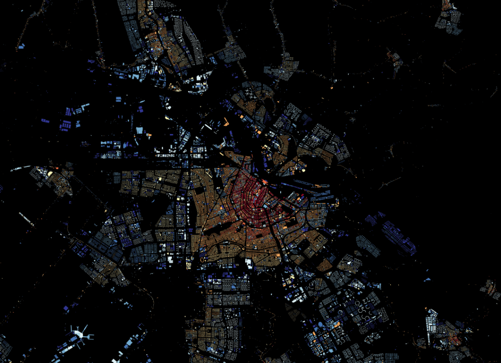
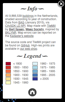
Could you guess that you are looking at Amsterdam?
Maybe you spotted the canals?
Bert Spaan colorcoded every building in the Netherlands according to their yaer of construction and visualized the resulting map of nearly 10 million buildings in a JavaScript leaflet webpage.
It resulted in this wonderful map, which my screenshots don’t do any honor. So have a look yourself!
Most data scientists favor Python as a programming language these days. However, there’s also still a large group of data scientists coming from a statistics, econometrics, or social science and therefore favoring R, the programming language they learned in university. Now there’s a new kid on the block: Julia.
According to some, you can think of Julia as a mixture of R and Python, but faster. As a programming language for data science, Julia has some major advantages:
Julia is light-weight and efficient and will run on the tiniest of computers
Julia is just-in-time (JIT) compiled, and can approach or match the speed of C
Julia is a functional language at its core
Julia support metaprogramming: Julia programs can generate other Julia programs
Julia has a math-friendly syntax
Julia has refined parallelization compared to other data science languages
Julia can call C, Fortran, Python or R packages
However, others also argue that Julia comes with some disadvantages for data science, like data frame printing, 1-indexing, and its external package management.
Comparing Julia to Python and R
Open Risk Manual published this side-by-side review of the main open source Data Science languages: Julia, Python, R.
You can click the links below to jump directly to the section you’re interested in. Once there, you can compare the packages and functions that allow you to perform Data Science tasks in the three languages.
Here’s a very well written Medium article that guides you through installing Julia and starting with some simple Data Science tasks. At least, Julia’s plots look like:
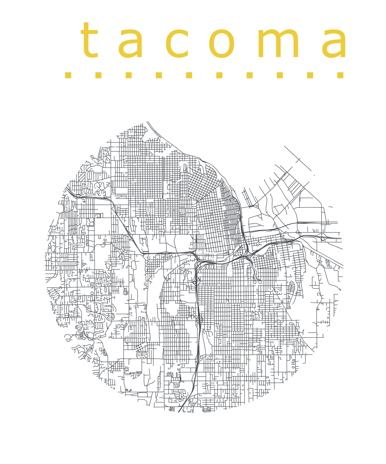
Katie Jolly wanted to surprise a friend with a nice geeky gift: a custom-made map cutout. Using R and some visual finetuning in Inkscape, she was able to made the below.
A detailed write-up of how Katie got to this product is posted here.
Basically, the R’s tigris package included all data on roads, and the ArcGIS Open Data Hub provided the neighborhood boundaries. Fortunately, the sf package is great for transforming and manipulating geospatial data, and includes some functions to retrieve a subset of roads based on their distance to a centroid. With this subset, Katie could then build these wonderful plots in no time with ggplot2.
Nothing beats a aesthetically-pleasing data visualization in the form of a map (see evidence here, here, here, or here).
Moreover, we’ve already witnessed some great R tutorials by Ilya Kashnitsky before (see Animated Snow in R).
These two come together in Ilya’s recent post on subplots in ggplot2 maps, with which he completely amazed me. The creation process is actually easier than the end result makes it look: make several visualizations and add them as ggplot2::annotation_custom() to your main ggplot2 map — the same as if you are adding a logo to your plot. Enjoy:
Timo Grossenbacher works as reporter/coder for SRF Data, the data journalism unit of Swiss Radio and TV. He analyzes and visualizes data and investigates data-driven stories. On his website, he hosts a growing list of cool projects. One of his recent blogs covers categorical spatial interpolation in R. The end result of that blog looks amazing:
This map was built with data Timo crowdsourced for one of his projects. With this data, Timo took the following steps, which are covered in his tutorial:
Read in the data, first the geometries (Germany political boundaries), then the point data upon which the interpolation will be based on.
Preprocess the data (simplify geometries, convert CSV point data into an sf object, reproject the geodata into the ETRS CRS, clip the point data to Germany, so data outside of Germany is discarded).
Then, a regular grid (a raster without “data”) is created. Each grid point in this raster will later be interpolated from the point data.
Run the spatial interpolation with the kknn package. Since this is quite computationally and memory intensive, the resulting raster is split up into 20 batches, and each batch is computed by a single CPU core in parallel.
Visualize the resulting raster with ggplot2.
All code for the above process can be accessed on Timo’s Github. The georeferenced points underlying the interpolation look like the below, where each point represents the location of a person who selected a certain pronunciation in an online survey. More details on the crowdsourced pronunciation project van be found here, .
Another of Timo’s R map, before he applied k-nearest neighbors on these crowdsourced data. [original]If you want to know more, please read the original blog or follow Timo’s new DataCamp course called Communicating with Data in the Tidyverse.
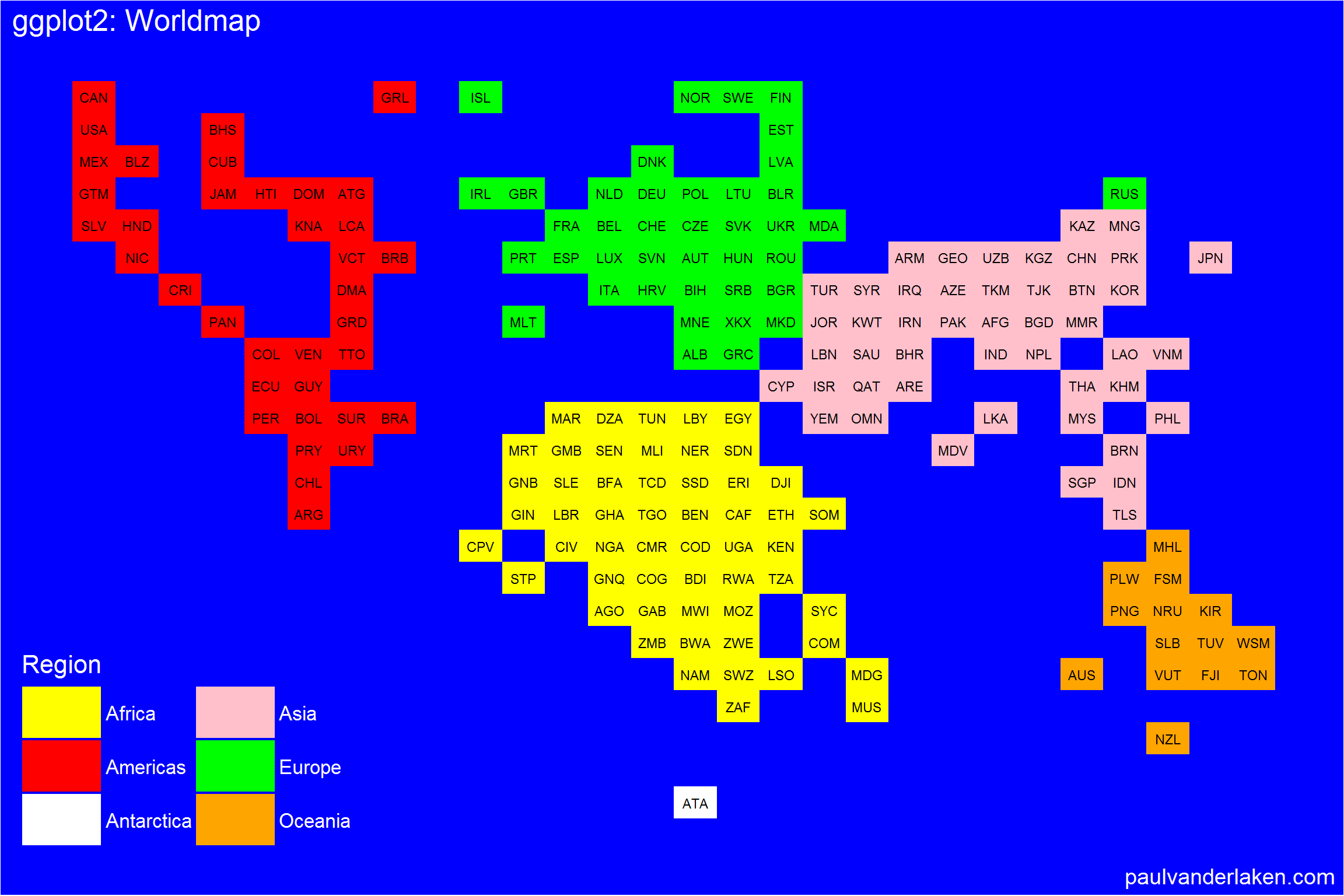
# retrieve data filelink="https://gist.githubusercontent.com/maartenzam/787498bbc07ae06b637447dbd430ea0a/raw/9a9dafafb44d8990f85243a9c7ca349acd3a0d07/worldtilegrid.csv"geodata<-read.csv(link)%>%as.tibble()# load in geodatastr(geodata)# examine geodata