Timo Grossenbacher works as reporter/coder for SRF Data, the data journalism unit of Swiss Radio and TV. He analyzes and visualizes data and investigates data-driven stories. On his website, he hosts a growing list of cool projects. One of his recent blogs covers categorical spatial interpolation in R. The end result of that blog looks amazing:
This map was built with data Timo crowdsourced for one of his projects. With this data, Timo took the following steps, which are covered in his tutorial:
Read in the data, first the geometries (Germany political boundaries), then the point data upon which the interpolation will be based on.
Preprocess the data (simplify geometries, convert CSV point data into an sf object, reproject the geodata into the ETRS CRS, clip the point data to Germany, so data outside of Germany is discarded).
Then, a regular grid (a raster without “data”) is created. Each grid point in this raster will later be interpolated from the point data.
Run the spatial interpolation with the kknn package. Since this is quite computationally and memory intensive, the resulting raster is split up into 20 batches, and each batch is computed by a single CPU core in parallel.
Visualize the resulting raster with ggplot2.
All code for the above process can be accessed on Timo’s Github. The georeferenced points underlying the interpolation look like the below, where each point represents the location of a person who selected a certain pronunciation in an online survey. More details on the crowdsourced pronunciation project van be found here, .
Another of Timo’s R map, before he applied k-nearest neighbors on these crowdsourced data. [original]If you want to know more, please read the original blog or follow Timo’s new DataCamp course called Communicating with Data in the Tidyverse.
A pixel map of holiday and living locations made by Taras Kaduk in R [original]
Taras Kaduk seems as excited about R and the tidyverse as I am, as he built the beautiful map above. It flags all the cities he has visited and, in red, the cities he has lived. Taras was nice enough to share his code here, in the original blog post.
Now, I am not much of a globetrotter, but I do like programming. Hence, I immediately wanted to play with the code and visualize my own holiday destinations. Below you can find my attempt. The updated code I also posted below, but WordPress doesn’t handle code well, so you better look here.
Let’s run you through the steps to make such a map. First, we need to load some packages. I use the apply family to install and/or load a set of packages so that if I/you run the script on a different computer, it will still work. In terms of packages, the tidyverse (read more) includes some nice data manipulation packages as well as the famous ggplot2 package for visualizations. We need maps and ggmap for their mapping functionalities. here is a great little package for convenient project management, as you will see (read more).
Next, we need to load in the coordinates (longitudes and latitudes) of our holiday destinations. Now, I started out creating a dataframe with city coordinates by hand. However, this was definitely not a scale-able solution. Fortunately, after some Googling, I came across ggmap::geocode(). This function allows you to query the Google maps API(no longer works) Data Science Toolkit, which returns all kinds of coordinates data for any character string you feed it.
Although, I ran into two problems with this approach, this was nothing we couldn’t fix. First, my home city of Breda apparently has a name-city in the USA, which Google favors. Accordingly, you need to be careful and/or specific regarding the strings you feed to geocode() (e.g., “Breda NL“). Second, API’s often have a query limit, meaning you can only ask for data every so often. geocode() will quickly return NAs when you feed it more than two, three values. Hence, I wrote a simple while loop to repeat the query until the API retrieves coordinates. The query will pause shortly in between every attempt. Returned coordinates are then stored in the empty dataframe I created earlier. Now, we can easily query a couple dozen of locations without errors.
You can try it yourself: all you need to change is the city_name string.
### cities data ----------------------------------------------------------------

# cities to geolocate
city_name <- c("breda NL", "utrecht", "rotterdam", "tilburg", "amsterdam",
               "london", "singapore", "kuala lumpur", "zanzibar", "antwerp",
               "middelkerke", "maastricht", "bruges", "san fransisco", "vancouver",
               "willemstad", "hurghada", "paris", "rome", "bordeaux",
               "berlin", "kos", "crete", "kefalonia", "corfu",
               "dubai", " barcalona", "san sebastian", "dominican republic",
               "porto", "gran canaria", "albufeira", "istanbul",
               "lake como", "oslo", "riga", "newcastle", "dublin",
               "nice", "cardiff", "san fransisco", "tokyo", "kyoto", "osaka",
               "bangkok", "krabi thailand", "chang mai thailand", "koh tao thailand")

# initialize empty dataframe
tibble(
  city = city_name,
  lon = rep(NA, length(city_name)),
  lat = rep(NA, length(city_name))
) ->
  cities

# loop cities through API to overcome SQ limit
# stop after if unsuccessful after 5 attempts
for(c in city_name){
  temp <- tibble(lon = NA)
  # geolocate until found or tried 5 times
  attempt <- 0 # set attempt counter
  while(is.na(temp$lon) & attempt < 5) {
    temp <- geocode(c, source = "dsk")
    attempt <- attempt + 1
    cat(c, attempt, ifelse(!is.na(temp[[1]]), "success", "failure"), "\n") # print status
    Sys.sleep(runif(1)) # sleep for random 0-1 seconds
  }
  # write to dataframe
  cities[cities$city == c, -1] <- temp
}
Now, Taras wrote a very convenient piece of code to generate the dotted world map, which I borrowed from his blog:
With both the dot data and the cities’ geocode() coordinates ready, it is high time to visualize the map. Note that I use one geom_point() layer to plot the dots, small and black, and another layer to plot the cities data in transparent red. Taras added a third layer for the cities he had actually lived in; I purposefully did not as I have only lived in the Netherlands and the UK. Note that I again use the convenient here::here() function to save the plot in my current project folder.
I very much like the look of this map and I’d love to see what innovative, other applications you guys can come up with. To copy the code, please look here on RPubs. Do share your personal creations and also remember to take a look at Taras original blog!
The US Census Download Center contains rich information on its countries demographic data. Here you can find a piece of R code that uses the highcharter package in R to create an interactive map showing the median household per country.
Shazam is a mobile app that can be asked to identify a song by making it “listen”’ to a piece of music. Due to its immense popularity, the organization’s name quickly turned into a verb used in regular conversation (“Do you know this song? Let’s Shazam it.“). A successful identification is referred to as a Shazam recognition.
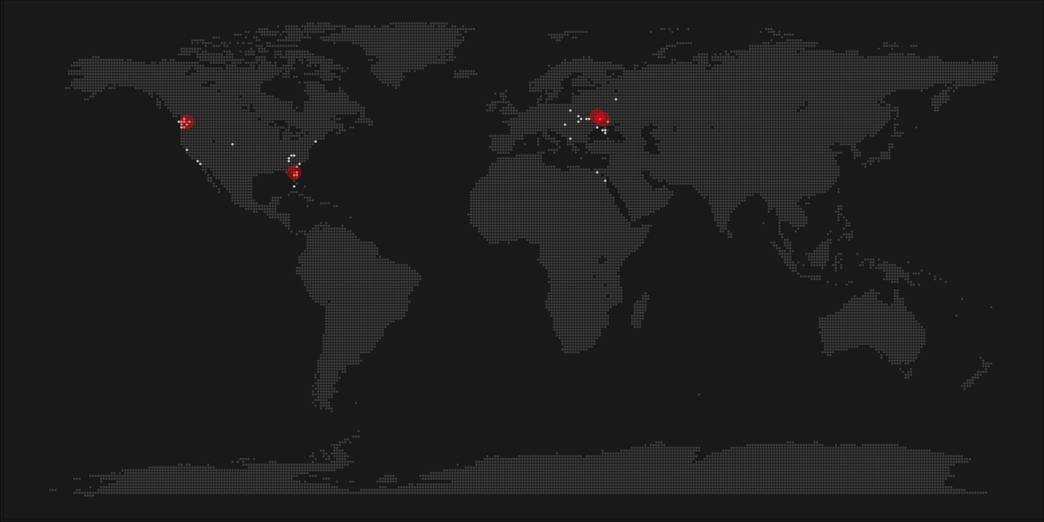
Shazam users can opt-in to anonymously share their location data with Shazam. Umar Hansa used to work for Shazam and decided to plot the geospatial data of 1 billion Shazam recognitions, during one of the company’s “hackdays“. The following wonderful city, country, and world maps are the result.
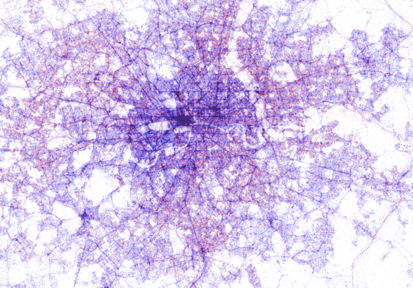
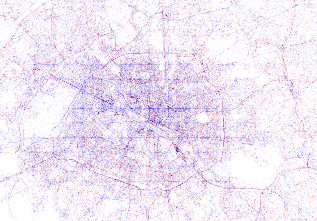
All visualisations (source) follow the same principle: Dots, representing successful Shazam recognitions, are plotted onto a blank geographical coordinate system. Can you guess the cities represented by these dots?
These first maps have an additional colour coding for operating systems. Can you guess which is which?
Blue dots represent iOS (Apple iPhones) and seem to cluster in the downtown area’s whereas red Android phones dominate the zones further from the city centres. Did you notice something else? Recall that Umar used a blank canvas, not a map from Google. Nevertheless, in all visualizations the road network is clearly visible. Umar guesses that passengers (hopefully not the drivers) often Shazam music playing in the car.
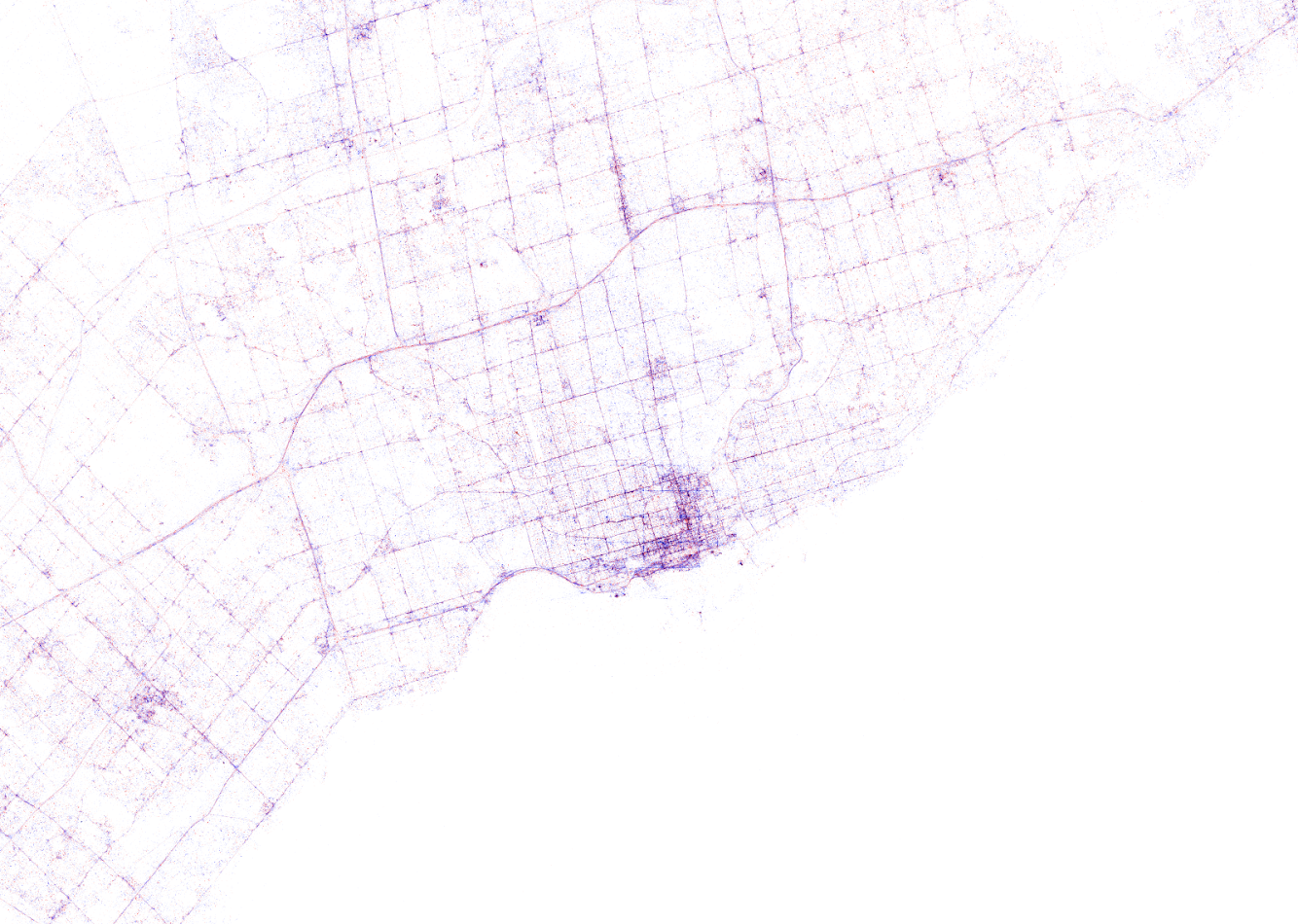
Try to guess the Canadian and American cities below and compare their layout to the two European cities that follow.
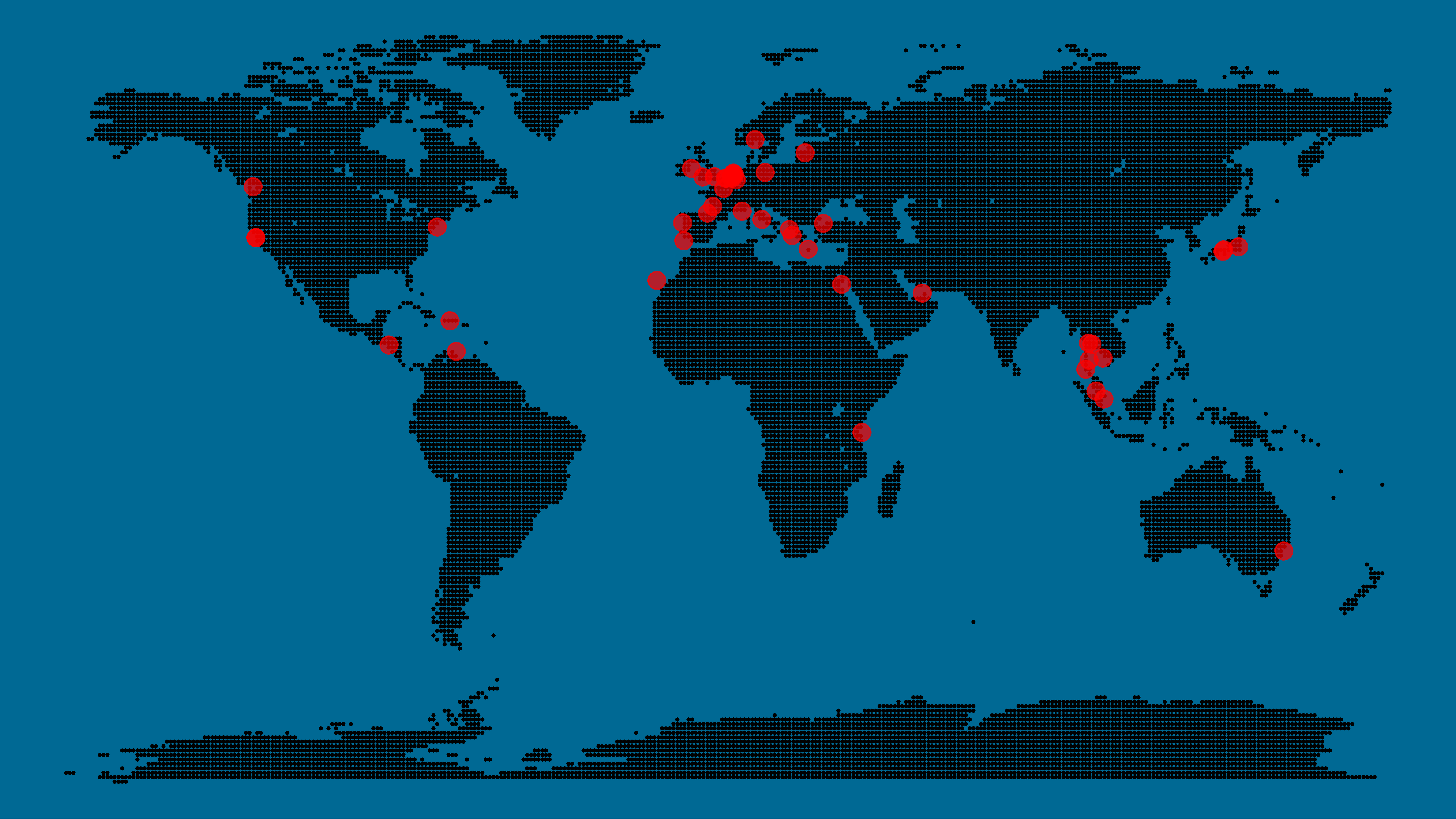
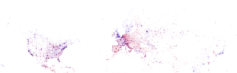
The maps were respectively of Toronto, San Fransisco, London, and Paris. It is just amazing how accurate they resemble the actual world. You have got to love the clear Atlantic borders of Europe in the world map below.
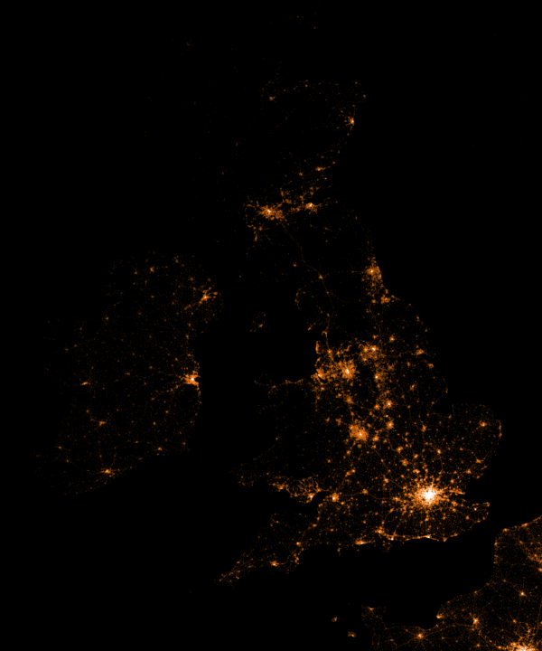
Are iPhones less common (among Shazam users) in Southern and Eastern Europe? In contrast, England and the big Japanese and Russian cities jump right out as iPhone hubs. In order to allow users to explore the data in more detail, Umar created an interactive tool comparing his maps to Google’s maps. A publicly available version you can access here (note that you can zoom in).This required quite complex code, the details of which are in his blog. For now, here is another, beautiful map of England, with (the density of) Shazam recognitions reflected by color intensity on a dark background.
London is so crowded! New York also looks very cool. Central Park, the rivers and the bay are so clearly visible, whereas Governors Island is completely lost on this map.
If you liked this blog, please read Umar’s own blog post on this project for more background information, pieces of the JavaScript code, and the original images. If you which to follow his work, you can find him on Twitter.
EDIT — Here and here you find an alternative way of visualizing geographical maps using population data as input for line maps in the R-package ggjoy.
HD version of this world map can be found on http://spatial.ly/
A few weeks back, I gave some examples of how data, predictive analytics, and visualization are changing the Tour de France experience. Today, I came across another wonderful example visualizing the sequences of geospatial data (i.e., the movement) of the cyclists during the 11th stage of the Tour de France (blue dots). Moreover, the locations of the four choppers capturing the live video feed are tracked in yellow.
This short clip again reflects the enormous amounts of rich data currently being collected in this sports event.


 This required quite complex code, the details of which are in