As some of you might know, I am defending my PhD dissertation later this year. It’s titled “Data-Driven Human Resource Management: The rise of people analytics and its application to expatriate management” and, over the past few months, I was tasked with designing its cover.
Now, I didn’t want to buy some random stock photo depicting data, an organization, or overly happy employees. I’d rather build something myself. Something reflecting what I liked about the dissertation project: statistical programming and sharing and creating knowledge with others.
Hence, I came up with the idea to use the collective intelligence of the People Analytics community to generate a unique cover. It required a dataset of people analytics-related concepts, which I asked People Analytics professionals on LinkedIn, Twitter, and other channels to help compile. Via a Google Form, colleagues, connections, acquitances, and complete strangers contributed hundreds of keywords ranging from the standard (employees, HRM, performance) to the surprising (monetization, quantitative scissors [which I had to Google]). After reviewing the list and adding some concepts of my own creation, I ended up with 1786 unique words related to either business, HRM, expatriation, data science, or statistics.
I very much dislike wordclouds (these are kind of cool though), but already had a different idea in mind. I thought of generating a background cover of the words relating to my dissertation topic, over which I could then place my title and other information. I wanted to place these keywords randomly, maybe using a color schema, or with some random sizes.
The picture below shows the result of one of my first attempts. I programmed everything in R, writing some custom functionality to generate the word-datasets, the cover-plot, and .png, .pdf, and .gif files as output.
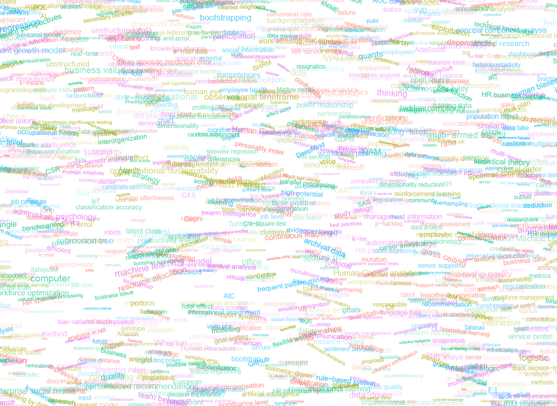
Random colors did not produce a pleasing result and I definitely needed more and larger words in order to fill my 17cm by 24cm canvas!
Hence, I started experimenting. Using base R’s expand.grid() and set.seed() together with mapply(), I could quickly explore and generate a large amount of covers based on different parameter settings and random fluctuations.
expand.grid(seed = c(1:3),
            dupl = c(1:4, seq(5, 30, 5)),
            font = c("sans", "League Spartan"),
            colors = c(blue_scheme, red_scheme,
                       rainbow_scheme, random_scheme),
            size_mult = seq(1, 3, 0.3),
            angle_sd = c(5, 10, 12, 15)) ->
  param

mapply(create_textcover,
       param$seed, param$dupl,
       param$font, param$colors,
       param$size_mult, param$angle_sd)
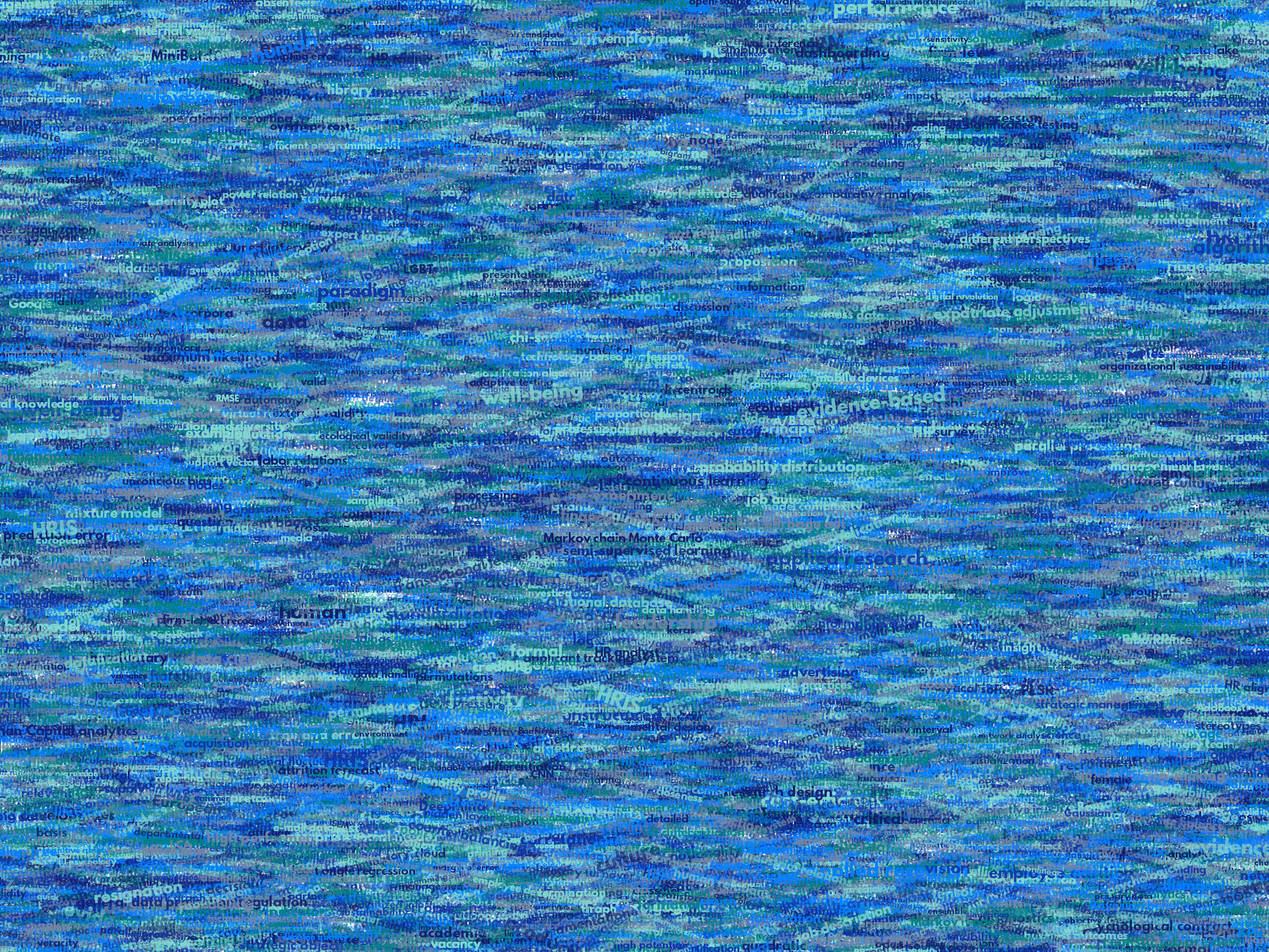
The generation process for each unique cover only took a few seconds, so I would generate a few hundred, quickly browse through them, update the parameters to match my preferences, and then generate a new set. Among others, I varied the color palette used, the size range of the words, their angle, the font used, et cetera. To fill up the canvas, I experimented with repeating the words: two, three, five, heck, even twenty, thirty times. After an evening of generating and rating, I came to the final settings for my cover:
- Words were repeated twenty times in the dataset.
- Words were randomly distributed across the canvas.
- Words placed in random order onto the canvas, except for a select set of relevant words, placed last.
- Words’ transparency ranged randomly between 0% and 70%.
- Words’ color was randomly selected out of six colors from this palette of blues.
- Words’ writing angles were normally distributed around 0 degrees, with a standard deviation of 12 degrees. However, 25% of words were explicitly without angle.
- Words’ size ranged between 1 and 4 based on a negative binomial distribution (10 * 0.8) resulting in more small than large words. The set of relevant words were explicitly enlarged throughout.
With League Spartan (#thisisparta) loaded as a beautiful custom font, this was the final cover background which I and my significant other liked most:
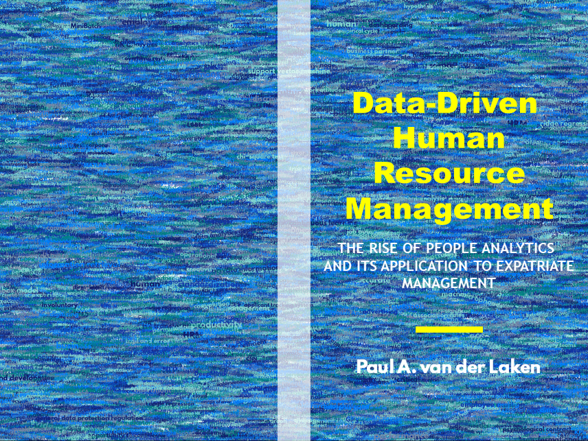
While I still need to decide on the final details regarding title placement and other details, I suspect that the final cover will look something like below — the white stripe in the middle depicting the book’s back.
Now, for the finale, I wanted to visualize the generation process via a GIF. Thomas Lin Pedersen developed this great gganimate package, which builds on the older animation package. The package greatly simplifies creating your own GIFs, as I already discussed in this earlier blog about animated GIFs in R. Anywhere, here is the generation process, where each frame includes the first frame ^ 3.2 words:

If you are interested in the process, or the R code I’ve written, feel free to reach out!
I’m sharing a digital version of the dissertation online sometime around the defense date: November 9th, 2018. If you’d like a copy, you can still leave your e-mailadress in the Google Form here and I’ll make sure you’ll receive your copy in time!