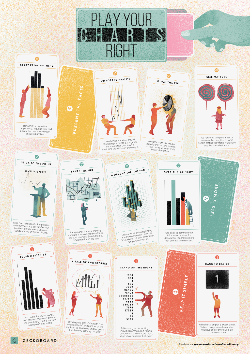
In a world where data really matters, we all want to create effective charts. But data visualization is rarely taught in schools, or covered in on-the-job training. Most of us learn as we go along, and therefore we often make choices or mistakes that confuse and disorient our audience. From overcomplicating or overdressing our charts, to conveying an entirely inaccurate message, there are common design pitfalls that can easily be avoided. We’ve put together these pointers to help you create simpler charts that effectively get across the meaning of your data.
Based on work by experts such as Stephen Few, Dona Wong, Albert Cairo, Cole Nussbaumer Knaflic, and Andy Kirk, the authors at Geckoboard wrote down a list of recommendations which I summarize below:
Present the facts
Start your axis at zero whenever possible, to prevent misinterpretation. Particularly bar charts.
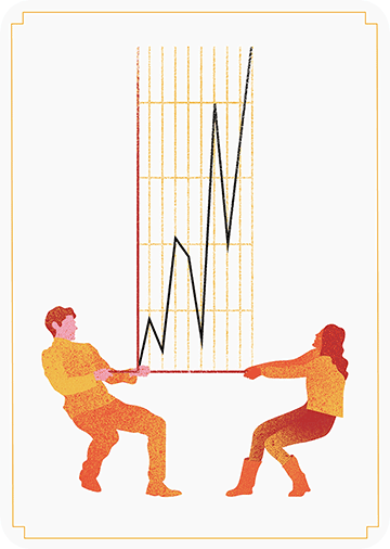
The width and height of line and scatter plots influence its messages.
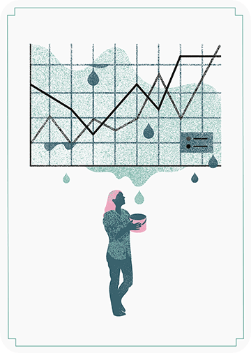
Area and size are hard to interpret. Hence, there’s often a better alternative to the pie chart. Read also this.
GIFs or animations are rising quickly in the data visualization world (see for instance here).
However, in my personal experience, they are not as widely used in business settings. You might even say animations are frowned by, for instance, LinkedIn, which removed the option to even post GIFs on their platform!
Nevertheless, animations can be pretty useful sometimes. For instance, they can display what happens during a process, like a analytical model converging, which can be useful for didactic purposes. Alternatively, they can be great for showing or highlighting trends over time.
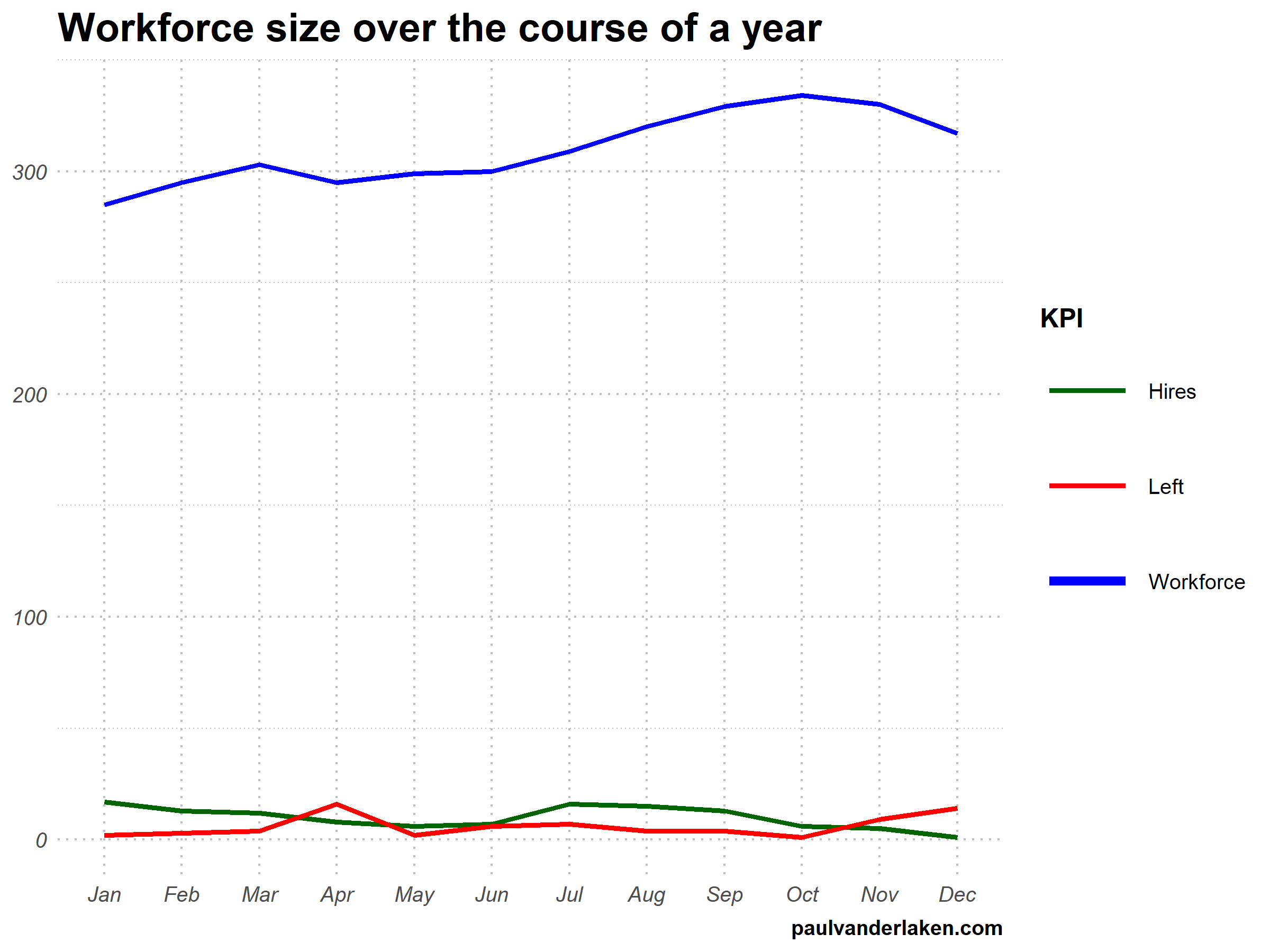
I am curious what you think are the pro’s and con’s of animations. Below, I posted two visualizations of the same data. The data consists of the simulated workforce trends, including new hires and employee attrition over the course of twelve months.
versus
Would you prefer the static, or the animated version? Please do share your thoughts in the comments below, or on the respective LinkedIn and Twitter posts!
Want to reproduce these plots? Or play with the data? Here’s the R code:
# transform to long format wf_long <- gather(wf, key = "variable", value = "value", -month) capitalize the name of variables wf_long$variable <- capitalize_string(wf_long$variable)
# VISUALIZE & ANIMATE #### # draw workforce plot ggplot(wf_long, aes(x = month, y = value, group = variable)) + geom_line(aes(col = variable, size = variable == "workforce")) + scale_color_manual(values = COLORS) + scale_size_manual(values = c(LINE_SIZE2, LINE_SIZE1), guide = FALSE) + guides(color = guide_legend(override.aes = list(size = c(rep(LINE_SIZE2, 2), LINE_SIZE1)))) + # theme_PVDL() + labs(x = NULL, y = NULL, color = "KPI", caption = "paulvanderlaken.com") + ggtitle("Workforce size over the course of a year") + NULL -> workforce_plot


