As a company that uses a lot of automation, optimization, and machine learning in their day-to-day business, Google is set on developing AI in a socially responsible way.
Fortunately for us, Google decided to share their principles and best practices for us to read.
Update March, 2021: My R package for the predictive power score (ppsr) is live on CRAN! Try install.packages("ppsr") in your R terminal to get the latest version.
Last week, I shared this Medium blog on PPS — or Predictive Power Score — on my LinkedIn and got so many enthousiastic responses, that I had to share it with here too.
Basically, the predictive power score is a normalized metric (values range from 0 to 1) that shows you to what extent you can use a variable X (say age) to predict a variable Y (say weight in kgs).
A PPS high score of, for instance, 0.85, would show that weight can be predicted pretty good using age.
A low PPS score, of say 0.10, would imply that weight is hard to predict using age.
The PPS acts a bit like a correlation coefficient we’re used too, but it is also different in many ways that are useful to data scientists:
PPS also detects and summarizes non-linear relationships
PPS is assymetric, so that it models Y ~ X, but not necessarily X ~ Y
PPS can summarize predictive value of / among categorical variables and nominal data
However, you may argue that the PPS is harder to interpret than the common correlation coefficent:
PPS can reflect quite complex and very different patterns
Therefore, PPS are hard to compare: a 0.5 may reflect a linear relationship but also many other relationships
PPS are highly dependent on the used algorithm: you can use any algorithm from OLS to CART to full-blown NN or XGBoost. Your algorithm hihgly depends the patterns you’ll detect and thus your scores
PPS are highly dependent on the the evaluation metric (RMSE, MAE, etc).
Here’s an example picture from the original blog, showing a case in which PSS shows the relevant predictive value of Y ~ X, whereas a correlation coefficient would show no relationship whatsoever:
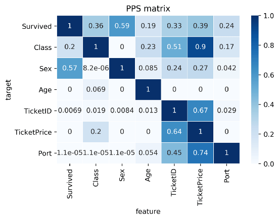
Here’s two more pictures from the original blog showing the differences with a standard correlation matrix on the Titanic data:
I highly suggest you readthe original blog for more details and information, and that you check out the associated Python packageppscore:
Installing the package:
pip install ppscore
Calculating the PPS for a given pandas dataframe:
import ppscore as pps
pps.score(df, "feature_column", "target_column")
You can also calculate the whole PPS matrix:
pps.matrix(df)
There’s no R package yet, but it should not be hard to implement this general logic.
Florian Wetschoreck — the author — already noted that there may be several use cases where he’d think PPS may add value:
Find patterns in the data [red: data exploration]: The PPS finds every relationship that the correlation finds — and more. Thus, you can use the PPS matrix as an alternative to the correlation matrix to detect and understand linear or nonlinear patterns in your data. This is possible across data types using a single score that always ranges from 0 to 1.
Feature selection: In addition to your usual feature selection mechanism, you can use the predictive power score to find good predictors for your target column. Also, you can eliminate features that just add random noise. Those features sometimes still score high in feature importance metrics. In addition, you can eliminate features that can be predicted by other features because they don’t add new information. Besides, you can identify pairs of mutually predictive features in the PPS matrix — this includes strongly correlated features but will also detect non-linear relationships.
Detect information leakage: Use the PPS matrix to detect information leakage between variables — even if the information leakage is mediated via other variables.
Data Normalization: Find entity structures in the data via interpreting the PPS matrix as a directed graph. This might be surprising when the data contains latent structures that were previously unknown. For example: the TicketID in the Titanic dataset is often an indicator for a family.
A receiver operating characteristic (ROC) curve displays how well a model can classify binary outcomes. An ROC curve is generated by plotting the false positive rate of a model against its true positive rate, for each possible cutoff value. Often, the area under the curve (AUC) is calculated and used as a metric showing how well a model can classify data points.
If you’re interest in learning more about ROC and AUC, I recommend this short Medium blog, which contains this neat graphic:
Dariya Sydykova, graduate student at the Wilke lab at the University of Texas at Austin, shared some great visual animations of how model accuracy and model cutoffs alter the ROC curve and the AUC metric. The quotes and animations are from the associated github repository.
ROC & AUC
The plot on the left shows the distributions of predictors for the two outcomes, and the plot on the right shows the ROC curve for these distributions. The vertical line that travels left-to-right is the cutoff value. The red dot that travels along the ROC curve corresponds to the false positive rate and the true positive rate for the cutoff value given in the plot on the left.
The traveling cutoff demonstrates the trade-off between trying to classify one outcome correctly and trying to classify the other outcome correcly. When we try to increase the true positive rate, we also increase the false positive rate. When we try to decrease the false positive rate, we decrease the true positive rate.
The shape of an ROC curve changes when a model changes the way it classifies the two outcomes.
The animation [below] starts with a model that cannot tell one outcome from the other, and the two distributions completely overlap (essentially a random classifier). As the two distributions separate, the ROC curve approaches the left-top corner, and the AUC value of the curve increases. When the model can perfectly separate the two outcomes, the ROC curve forms a right angle and the AUC becomes 1.
Precision-Recall
Two other metrics that are often used to quantify model performance are precision and recall.
Precision (also called positive predictive value) is defined as the number of true positives divided by the total number of positive predictions. Hence, precision quantifies what percentage of the positive predictions were correct: How correct your model’s positive predictions were.
Recall (also called sensitivity) is defined as the number of true positives divided by the total number of true postives and false negatives (i.e. all actual positives). Hence, recall quantifies what percentage of the actual positives you were able to identify: How sensitive your model was in identifying positives.
Dariya also made some visualizations of precision-recall curves:
Precision-recall curves also displays how well a model can classify binary outcomes. However, it does it differently from the way an ROC curve does. Precision-recall curve plots true positive rate (recall or sensitivity) against the positive predictive value (precision).
In the middle, here below, the ROC curve with AUC. On the right, the associated precision-recall curve.
Similarly to the ROC curve, when the two outcomes separate, precision-recall curves will approach the top-right corner. Typically, a model that produces a precision-recall curve that is closer to the top-right corner is better than a model that produces a precision-recall curve that is skewed towards the bottom of the plot.
Class imbalance
Class imbalance happens when the number of outputs in one class is different from the number of outputs in another class. For example, one of the distributions has 1000 observations and the other has 10. An ROC curve tends to be more robust to class imbalanace that a precision-recall curve.
In this animation [below], both distributions start with 1000 outcomes. The blue one is then reduced to 50. The precision-recall curve changes shape more drastically than the ROC curve, and the AUC value mostly stays the same. We also observe this behaviour when the other disribution is reduced to 50.
Here’s the same, but now with the red distribution shrinking to just 50 samples.
Dariya invites you to use these visualizations for educational purposes:
Please feel free to use the animations and scripts in this repository for teaching or learning. You can directly download the gif files for any of the animations, or you can recreate them using these scripts. Each script is named according to the animation it generates (i.e. animate_ROC.r generates ROC.gif, animate_SD.r generates SD.gif, etc.).
Want to learn more about the different evaluation metrics for machine learning? Here’s a nice how-to guide by Neptune.ai demonstrating different metrics applied in Python.
GIFs or animations are rising quickly in the data visualization world (see for instance here).
However, in my personal experience, they are not as widely used in business settings. You might even say animations are frowned by, for instance, LinkedIn, which removed the option to even post GIFs on their platform!
Nevertheless, animations can be pretty useful sometimes. For instance, they can display what happens during a process, like a analytical model converging, which can be useful for didactic purposes. Alternatively, they can be great for showing or highlighting trends over time.
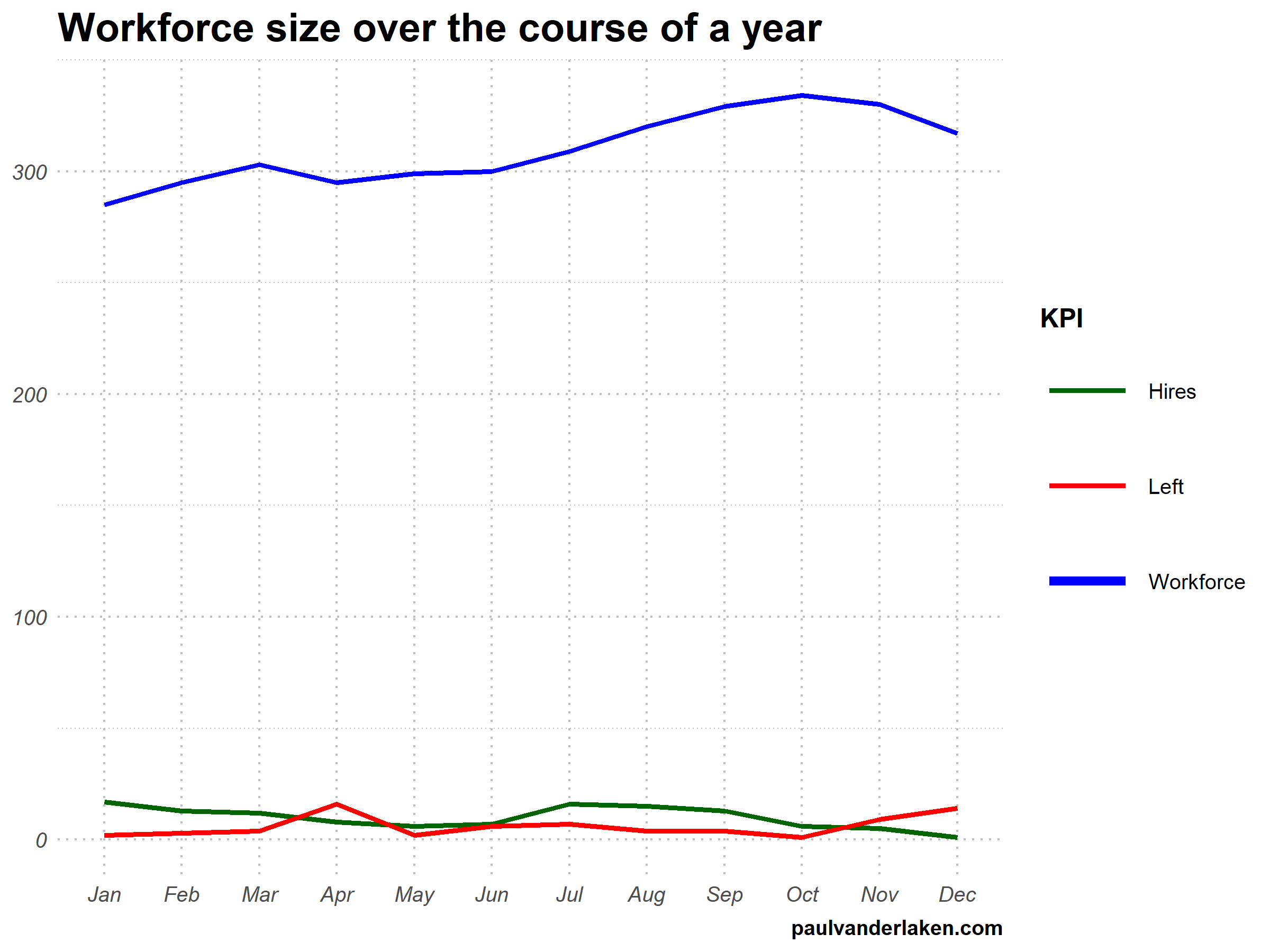
I am curious what you think are the pro’s and con’s of animations. Below, I posted two visualizations of the same data. The data consists of the simulated workforce trends, including new hires and employee attrition over the course of twelve months.
versus
Would you prefer the static, or the animated version? Please do share your thoughts in the comments below, or on the respective LinkedIn and Twitter posts!
Want to reproduce these plots? Or play with the data? Here’s the R code:
# transform to long format wf_long <- gather(wf, key = "variable", value = "value", -month) capitalize the name of variables wf_long$variable <- capitalize_string(wf_long$variable)
# VISUALIZE & ANIMATE #### # draw workforce plot ggplot(wf_long, aes(x = month, y = value, group = variable)) + geom_line(aes(col = variable, size = variable == "workforce")) + scale_color_manual(values = COLORS) + scale_size_manual(values = c(LINE_SIZE2, LINE_SIZE1), guide = FALSE) + guides(color = guide_legend(override.aes = list(size = c(rep(LINE_SIZE2, 2), LINE_SIZE1)))) + # theme_PVDL() + labs(x = NULL, y = NULL, color = "KPI", caption = "paulvanderlaken.com") + ggtitle("Workforce size over the course of a year") + NULL -> workforce_plot


