In this original blog, with equally original title, Delip Rao poses twelve (+1) harsh truths about the real world practice of machine learning. I found it quite enlightning to read a non-hyped article about ML for once. Particularly because Delip’s experiences seem to overlap quite nicely with the principles of software design and Agile working.
Delip’s 12 truths I’ve copied in headers below. If they spark your interest, read more here:
It has to work
No matter how hard you push and no matter what the priority, you can’t increase the speed of light
With sufficient thrust, pigs fly just fine. However, this is not necessarily a good idea
Some things in life can never be fully appreciated nor understood unless experienced firsthand
It is always possible to agglutinate multiple separate problems into a single complex interdependent solution. In most cases, this is a bad idea
It is easier to ignore or move a problem around than it is to solve it
You always have to tradeoff something
Everything is more complicated than you think
You will always under-provision resources
One size never fits all. Your model will make embarrassing errors all the time despite your best intentions
Every old idea will be proposed again with a different name and a different presentation, regardless of whether it works
Perfection has been reached not when there is nothing left to add, but when there is nothing left to take away
Delip added in a +1, with his zero-indexed truth: You are Not a Scientist.
Yes, that’s all of you building stuff with machine learning with a “scientist” in the title, including all of you with PhDs, has-been-academics, and academics with one foot in the industry. Machine learning (and other AI application areas, like NLP, Vision, Speech, …) is an engineering research discipline (as opposed to science research).
Delip [bio] is the VP of Research at AI Foundation where he leads speech, language, and vision research efforts for generating and detecting artificial content. You can find his personal webblog here.
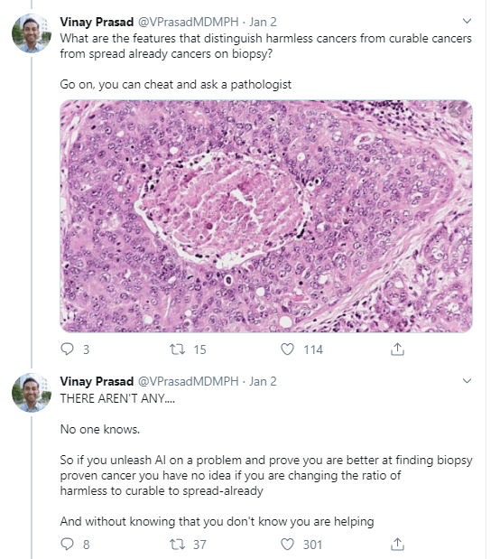
I came across this opinionated though informed commentary by Vinay Prasad on the recent Nature article where Google’s machine learning experts trained models to predict whether scans of patients’ breasts (mammogram’s) show cancerous cells or not.
Vinay Prasad [official bio] is a practicing hematologist-oncologist and Associate Professor of Medicine at Oregon Health and Science University. So he knows what he’s talking about.
He argues that “cancer screening is the LAST thing you should pick FIRST to work on with AI”. Which is an interesting statement in and of itself.
Regardless of my personal opinion on the topic, I found the paper, Vinay’s commentary, and the broader discussion on twitter very interesting and educational to read. I feel it shows how important it is to know the context in which you are applying machine learning. What tremendous value it provides to have domain experts in the same team as the data and machine learning experts.
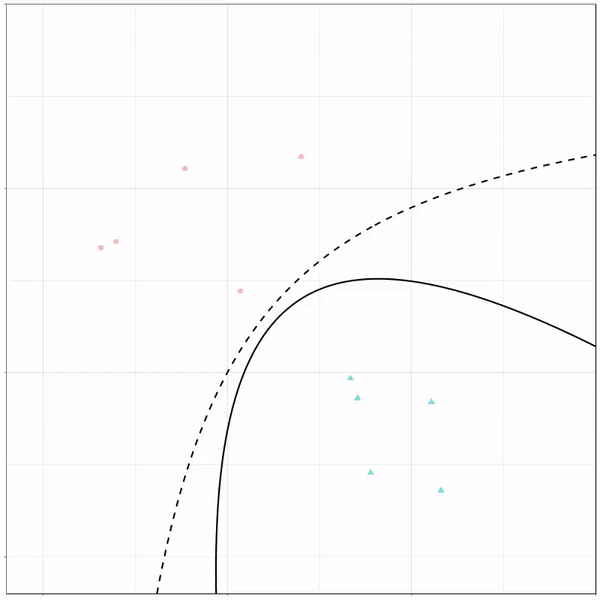
Ryan Holbrook made awesome animated GIFs in R of several classifiers learning a decision rule boundary between two classes. Basically, what you see is a machine learning model in action, learning how to distinguish data of two classes, say cats and dogs, using some X and Y variables.
These visuals can be great to understand these algorithms, the models, and their learning process a bit better.
Here’s the original tweet, with the logistic regression animation. If you follow it, you will find a whole thread of classifier GIFs. These I extracted, pasted, and explained below.
A thread of classifiers learning a decision rule. Dashed line is optimal boundary. Animations with #gganimate by @thomasp85 and @drob. #rstats
Logistic regression {stats::glm} with each class having normally distributed features. (1/n) pic.twitter.com/kKmqdO2zGy
Below is the GIF which I extracted using EZgif.com.
What you see is observations from two classes, say cats and dogs, each represented using colored dots. The dots are placed along X and Y axes, which represent variables about the observations. Their tail lengths and their hairyness, for instance.
Now there’s an optimal way to seperate these classes, which is the dashed line. That line best seperates the cats from the dogs based on these two variables X and Y. As this is an optimal boundary given this data, it is stable, it does not change.
However, there’s also a solid black line, which does change. This line represents the learned boundary by the machine learning model, in this case using logistic regression. As the model is shown more data, it learns, and the boundary is updated. This learned boundary represents the best line with which the model has learned to seperate cats from dogs.
Anything above the boundary is predicted to be class 1, a dog. Everything below predicted to be class 2, a cat. As logistic regression results in a linear model, the seperation boundary is very much linear/straight.
Logistic regression gif by Ryan Holbrook
These animations are great to get a sense of how the models come to their boundaries in the back-end.
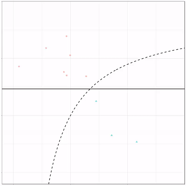
For instance, other machine learning models are able to use non-linear boundaries to dinstinguish classes, such as this quadratic discriminant analysis (qda). This “learned” boundary is much closer to the optimal boundary:
Quadratic discriminant analysis gif by Ryan Holbrook
Multivariate adaptive regression splines gif by Ryan Holbrook
Next, we have the k-nearest neighbors algorithm, which predicts for each point (animal) the class (cat/dog) based on the “k” points closest to it. As you see, this results in a highly fluctuating, localized boundary.
K-nearest neighbors gif by Ryan Holbrook
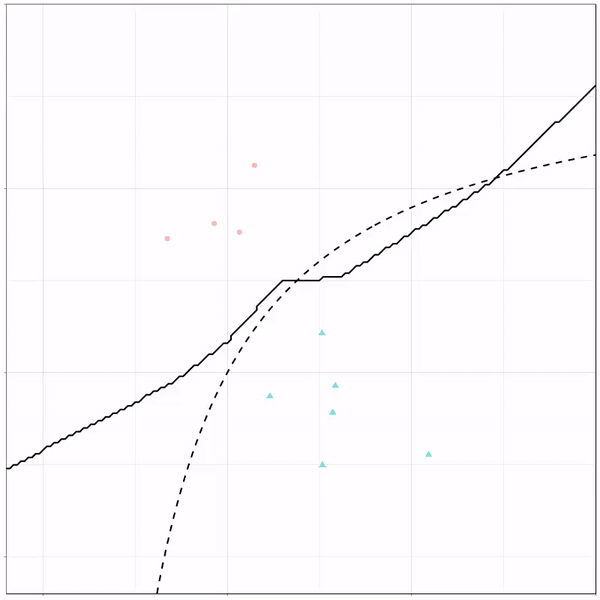
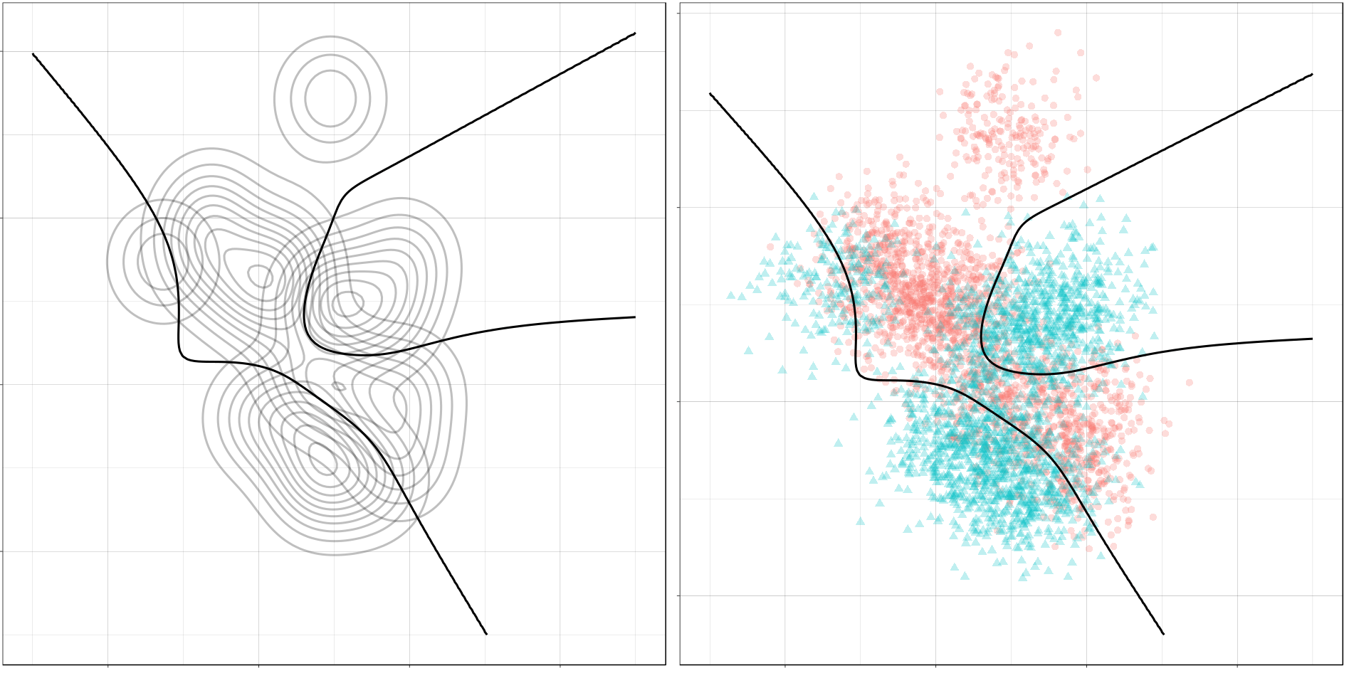
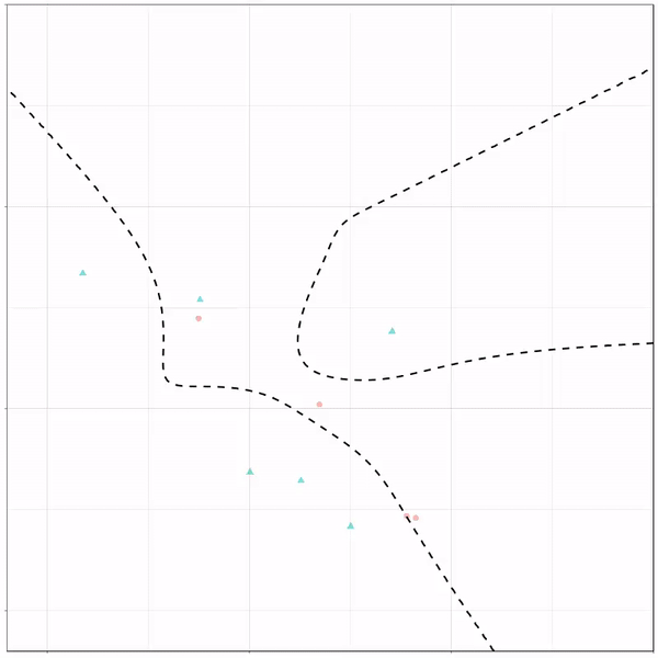
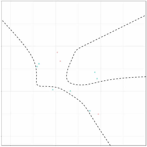
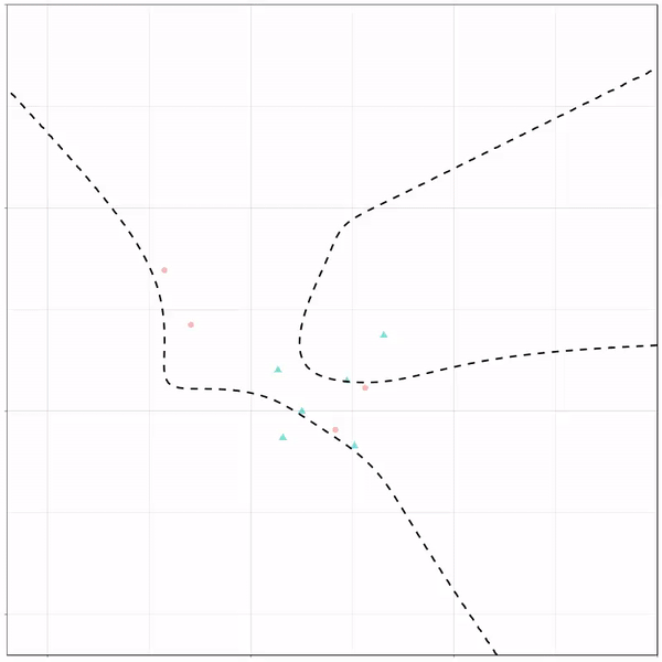
Now, Ryan decided to push the challenge, and simulate new data for two classes with a more difficult decision boundary. The new data and optimal boundaries look like this:
On these data, Ryan put a whole range of non-linear models to work.
Like this support-vector machine, which tries to create optimal boundaries built of support vectors around all the cats and all the dohs (this is definitely not a technical, error-free explanation of what’s happening here).
Let’s jump into some tree-based algorithms and the resulting models. A decision tree classifies data based on multiple, sequential, binary splits. Here, Ryan trained a simple decision tree:
Decision tree gif by Ryan Holbrook
As well as it’s big brother, a random forest, which uses hundreds of trees in the back end and thus results in a more flexible boundary:
Random forest gif by Ryan Holbrook
Extreme gradient boosting is also a tree-based algorithm, which leverages many machine learning techniques to optimize the bias-variance tradeoff. Here’s an earlier blog on how to get started with Xgboost in Python or R:
Thanks to Sebastian Raschka I am able to share this great GitHub overview page of relevant graph classification techniques, and the scientific papers behind them. The overview divides the algorithms into four groups:
As well as a link to relevant graph classification benchmark datasets.
"Awesome Graph Classification" — A collection of graph classification methods, covering embedding, deep learning, graph kernel, and factorization papers with reference implementations https://t.co/ugpL3xSvf1
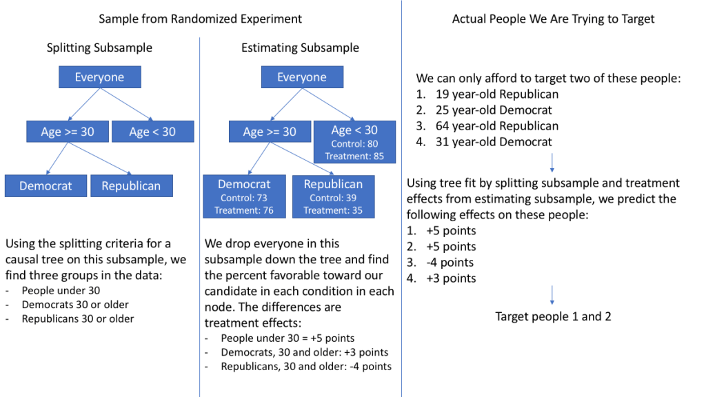
I stumbled accros this incredibly interesting read by Mark White, who discusses the (academic) theory behind, inner workings, and example (R) applications of causal random forests:
These so-called “honest” forests seem a great technique to identify opportunities for personalized actions: think of marketing, HR, medicine, healthcare, and other personalized recommendations. Note that an experimental setup for data collection is still necessary to gather the right data for these techniques.
Jared Wilber posted this great walkthrough where he codes a simple R data pipeline using purrr and tidyr to train a large variety of models and methods on the same base data, all in a non-repetitive, reproducible, clean, and thus tidy fashion. Really impressive workflow!