Tag: network

Try Hack Me – Cyber Security Challenges

Try Hack Me – Cyber Security Challenges

Sometimes I just stumble across these random resources that I immediately want to share with fellow geeks. If you like computers and programming, you should definitely have a look at…

https://tryhackme.com

TryHackMe started in 2018 by two cyber security enthusiasts, Ashu Savani and Ben Spring, who met at a summer internship. When getting started with in the field, they found learning security to be a fragmented, inaccessable and difficult experience; often being given a vulnerable machine’s IP with no additional resources is not the most efficient way to learn, especially when you don’t have any prior knowledge. When Ben returned back to University he created a way to deploy machines and sent it to Ashu, who suggested uploading all the notes they’d made over the summer onto a centralised platform for others to learn, for free.

To allow users to share their knowledge, TryHackMe allows other users (at no charge) to create a virtual room, which contains a combination of theoretical and practical learning components.. In early 2019, Jon Peters started creating rooms and suggested the platform build up a community, a task he took on and succeeded in.

The platform has never raised any capital and is entirely bootstrapped.

https://tryhackme.com/about

I don’t have any affiliation or whatever with the platform, but I just think it’s a super cool resource if you want to learn more about hands-on computer stuff.

Here’s a nice demo on an advanced programmer taking on one of the first challenges. I definitely still have a long way to go, but it’s fun to watch someone sneak into a (dummy) server and look for clues! Like a proper detective, but then an extra nerdy one!

There are many “hacktivities” you can try on the platform.

And if you’re serious about learning this stuff, there are learning paths set out for you!

If you like their content, do consider taking a paid subscription and share this great initiative!

Using data science to uncover botnets on Twitter

I love how people are using data and data science to fight fake news these days (see also Identifying Dirty Twitter Bots), and I recently came across another great example.

Conspirador Norteño (real name unkown) is a member of what they call #TheResistance. It’s a group of data scientists discovering and analyzing so-called botnets – networks of artificial accounts on social media websites, like Twitter.

TheResistance uses quantitative analysis to unveil large groups of fake accounts, spreading potential fake news, or fake-endorsing the (fake) news spread by others.

In a recent Twitter thread, Norteno shows how they discovered that many of Dr. Shiva Ayyadurai (self-proclaimed Inventor of Email) his early followers are likely bots.

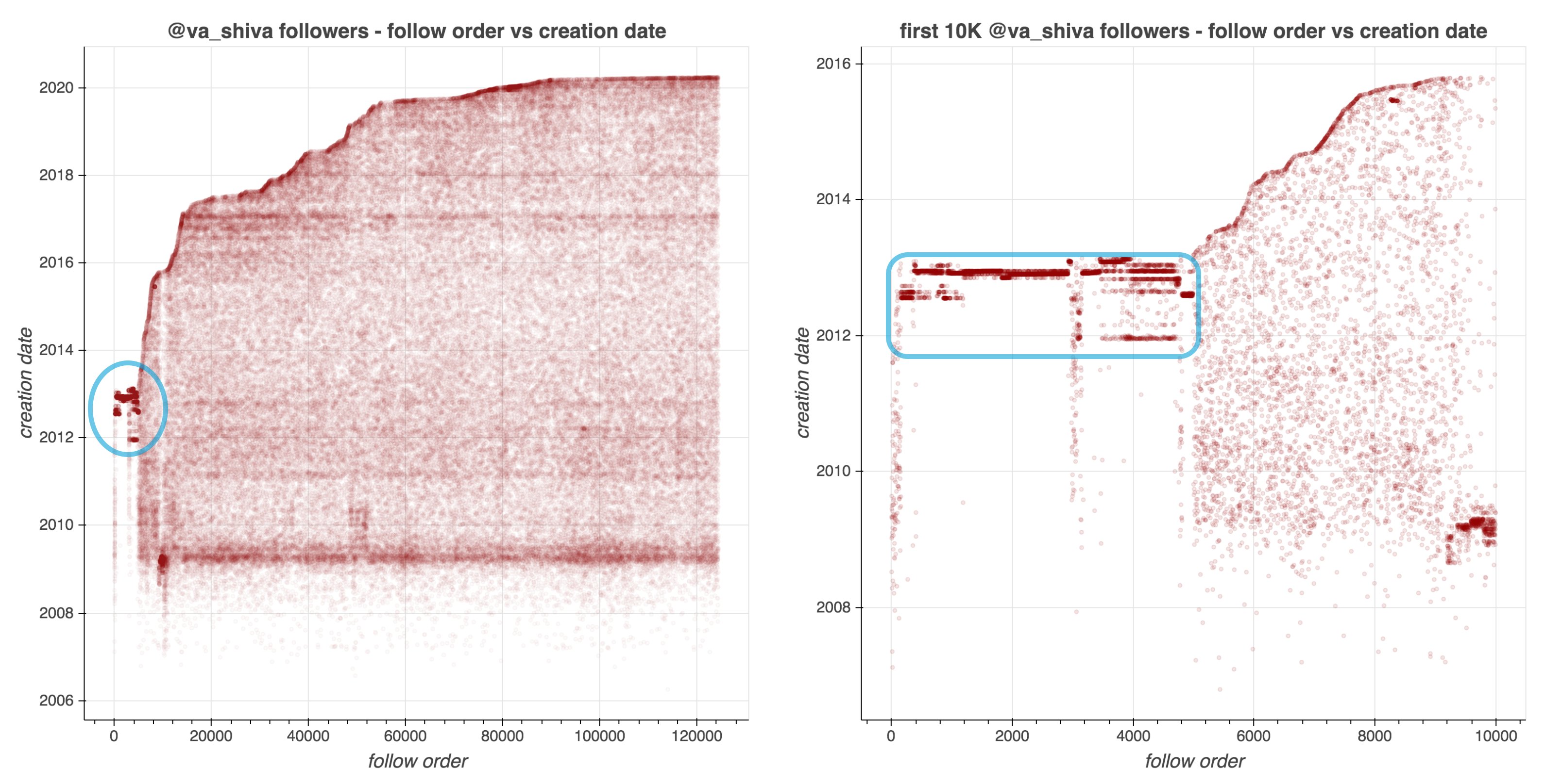
They looked at the date of these accounts started following Shiva, offset by the date of their accounts’ creation. A remarkeable pattern appeared:

Afbeelding
Via https://twitter.com/conspirator0/status/1244411551546847233/photo/1

Although @va_shiva‘s recent followers look unremarkable, a significant majority of his first 5000 followers appear to have been created in batches and to have subsequently followed @va_shiva in rapid succession.

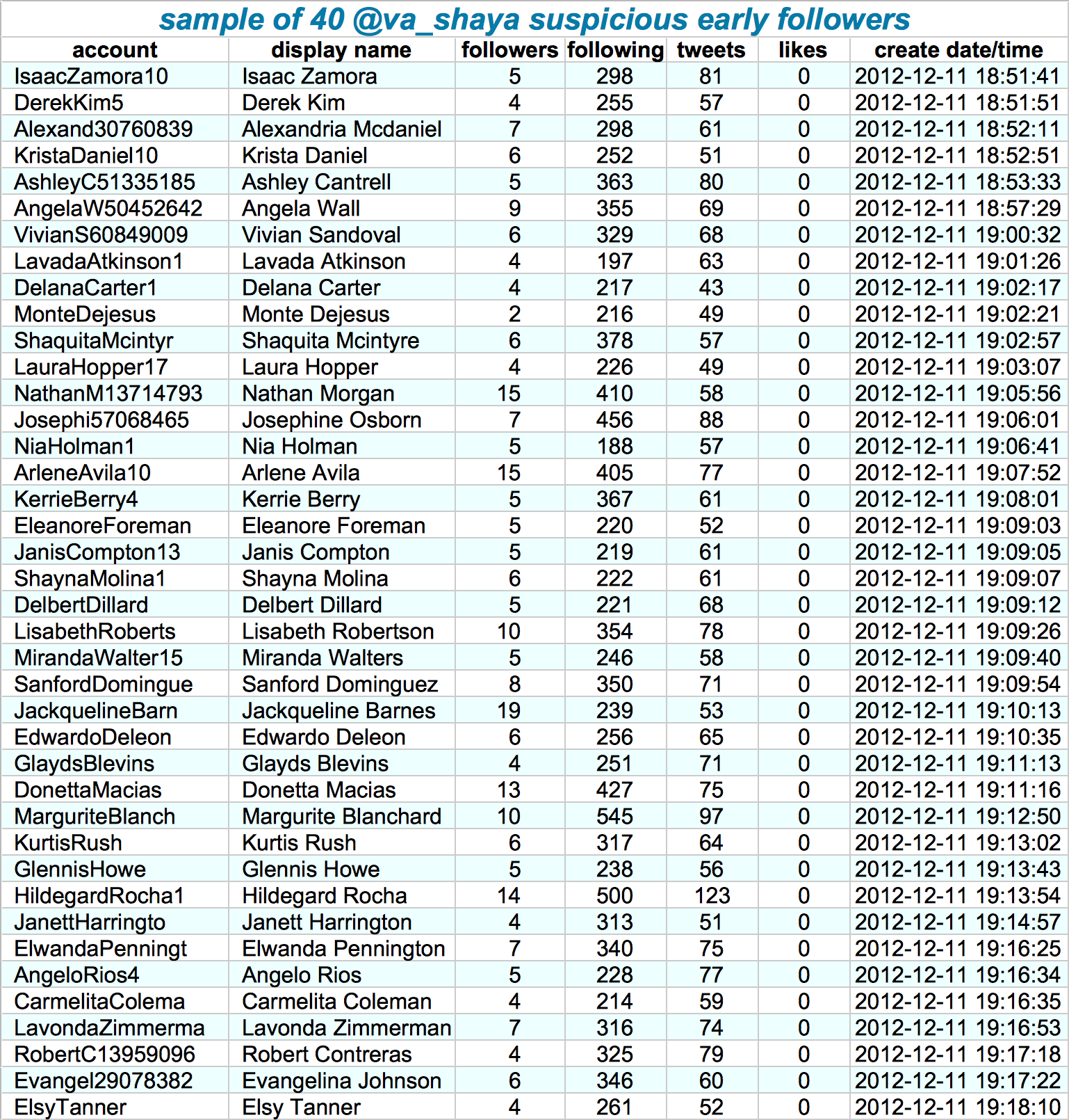
Looking at those followers in more detail, other suspicious patterns emerge. Their names follow a same pattern, they have an about equal amount of followers, followings, tweets, and (no) likes. Moreover, they were created only seconds apart. Many of them seem to follow each other as well.

Afbeelding
Via https://twitter.com/conspirator0/status/1244411636410187782/photo/1

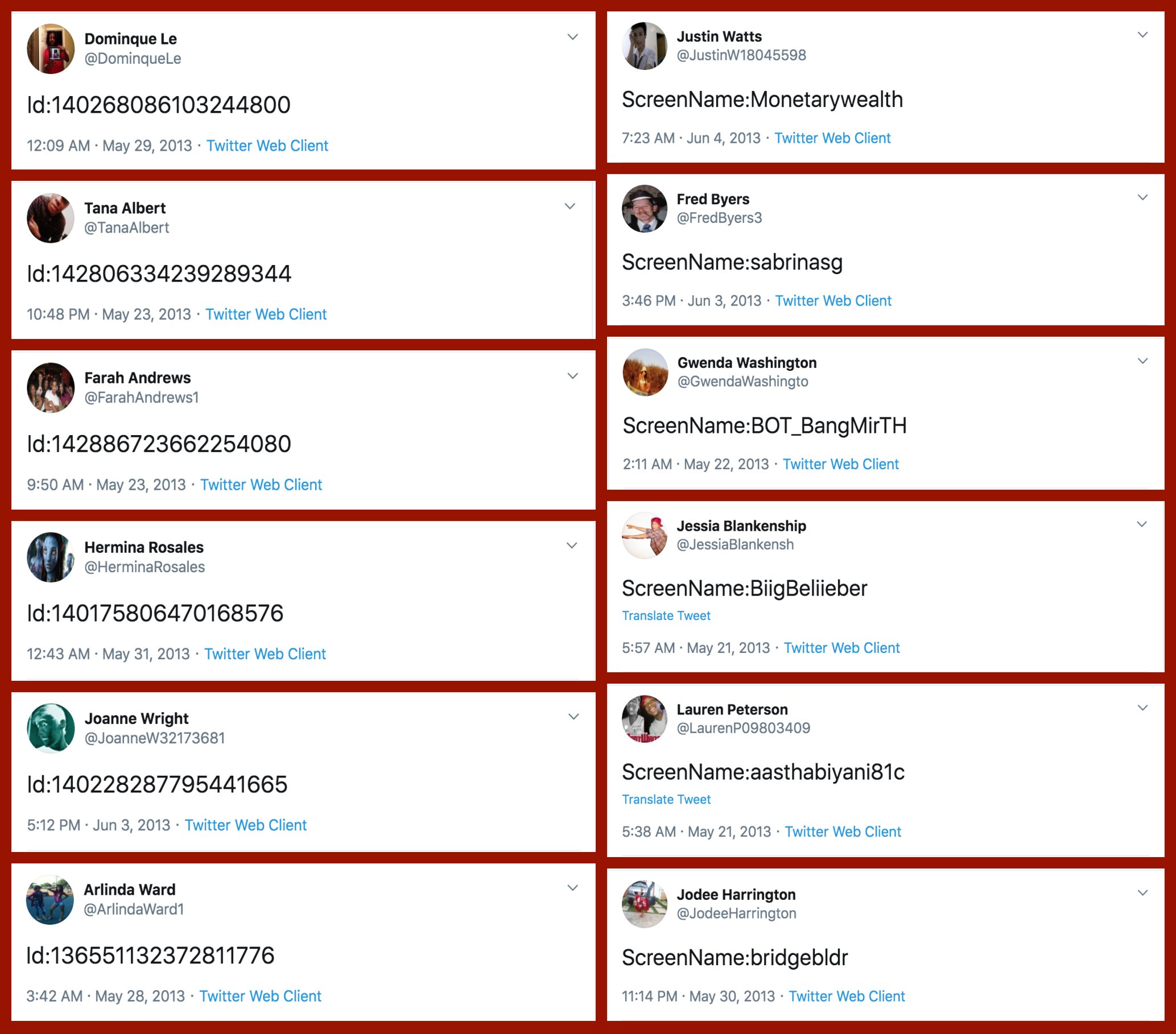
If that wasn’t enough proof of something’s off, here’s a variety of their tweets… Not really what everyday folks would tweet right? Plus similar patterns again across acounts.

Afbeelding
Via: https://twitter.com/conspirator0/status/1244411760129515522/photo/1

At first, I thought, so what? This Shiva guy probably just set up some automated (Python?) scripts to make Twitter account and follow him. Good for him. It worked out, as his most recent 10k followers followed him organically.

However, it becomes more scary if you notice this Shiva guy is (succesfully) promoting the firing of people working for the government:

Anyways, wanted to share this simple though cool approach to finding bots & fake news networks on social media. I hope you liked it, and would love to hear your thoughts in the comments!

Simulating data with Bayesian networks, by Daniel Oehm

Simulating data with Bayesian networks, by Daniel Oehm

Daniel Oehm wrote this interesting blog about how to simulate realistic data using a Bayesian network.

Bayesian networks are a type of probabilistic graphical model that uses Bayesian inference for probability computations. Bayesian networks aim to model conditional dependence, and therefore causation, by representing conditional dependence by edges in a directed graph. Through these relationships, one can efficiently conduct inference on the random variables in the graph through the use of factors.

Devin Soni via Medium

As Bayes nets represent data as a probabilistic graph, it is very easy to use that structure to simulate new data that demonstrate the realistic patterns of the underlying causal system. Daniel’s post shows how to do this with bnlearn.

Daniel’s example Bayes net

New data is simulated from a Bayes net (see above) by first sampling from each of the root nodes, in this case sex. Then followed by the children conditional on their parent(s) (e.g. sport | sex and hg | sex) until data for all nodes has been drawn. The numbers on the nodes below indicate the sequence in which the data is simulated, noting that rcc is the terminal node.

Daniel Oehms in his blog

The original and simulated datasets are compared in a couple of ways 1) observing the distributions of the variables 2) comparing the output from various models and 3) comparing conditional probability queries. The third test is more of a sanity check. If the data is generated from the original Bayes net then a new one fit on the simulated data should be approximately the same. The more rows we generate the closer the parameters will be to the original values.

The original data alongside the generated data in Daniel’s example

As you can see, a Bayesian network allows you to generate data that looks, feels, and behaves a lot like the data on which you based your network on in the first place.

This can be super useful if you want to generate a synthetic / fake / artificial dataset without sharing personal or sensitive data.

Moreover, the underlying Bayesian net can be very useful to compute missing values. In Daniel’s example, he left out some values on purpose (pretending they were missing) and imputed them with the Bayes net. He found that the imputed values for the missing data points were quite close to the original ones:

For two variables, the original values plotted against the imputed replacements.

In the original blog, Daniel goes on to show how to further check the integrity of the simulated data using statistical models and shares all his code so you can try this out yourself. Please do give his website a visit as Daniel has many more interesting statistics blogs!

Overviews of Graph Classification and Network Clustering methods

Thanks to Sebastian Raschka I am able to share this great GitHub overview page of relevant graph classification techniques, and the scientific papers behind them. The overview divides the algorithms into four groups:

  1. Factorization
  2. Spectral and Statistical Fingerprints
  3. Deep Learning
  4. Graph Kernels

Moreover, the overview contains links to similar collections on community detectionclassification/regression trees and gradient boosting papers with implementations.

As well as a link to relevant graph classification benchmark datasets.

Overview of built-in colors in R

Overview of built-in colors in R

Most of my data visualizations I create using R programming — as you might have noticed from the content of my website.

Though I am colorblind myself, I love to work with colors and color palettes in my visualizations. And I’ve come across quite some neat tricks in my time.

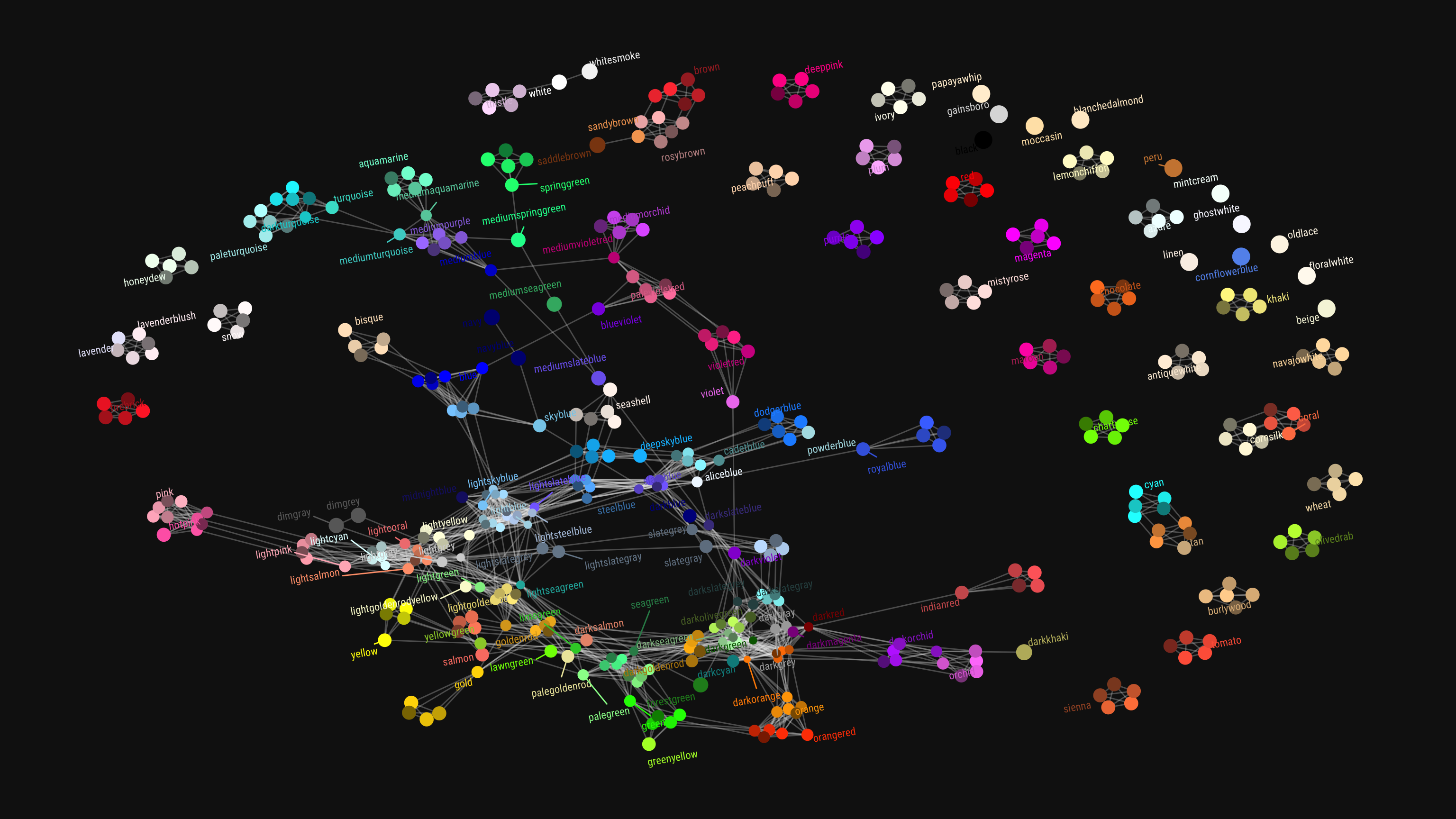
For instance, did you it’s super easy to create a reproducible though custom color palette? Or that there’s a quick reference card for ggplot2’s built-in colors? Or, and this is this blog post’s main subject, that you can access all built-in base colors using colors()!

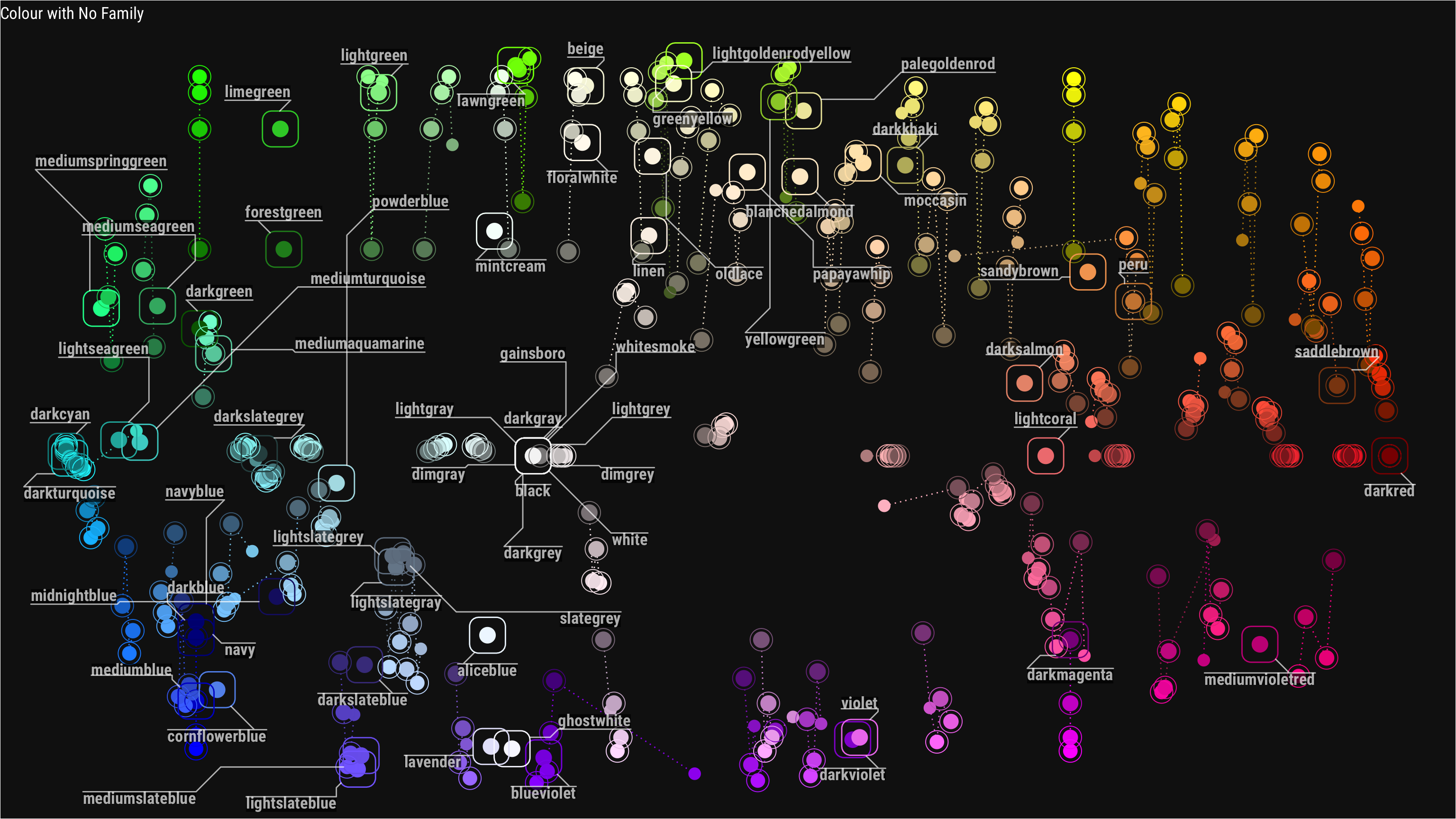
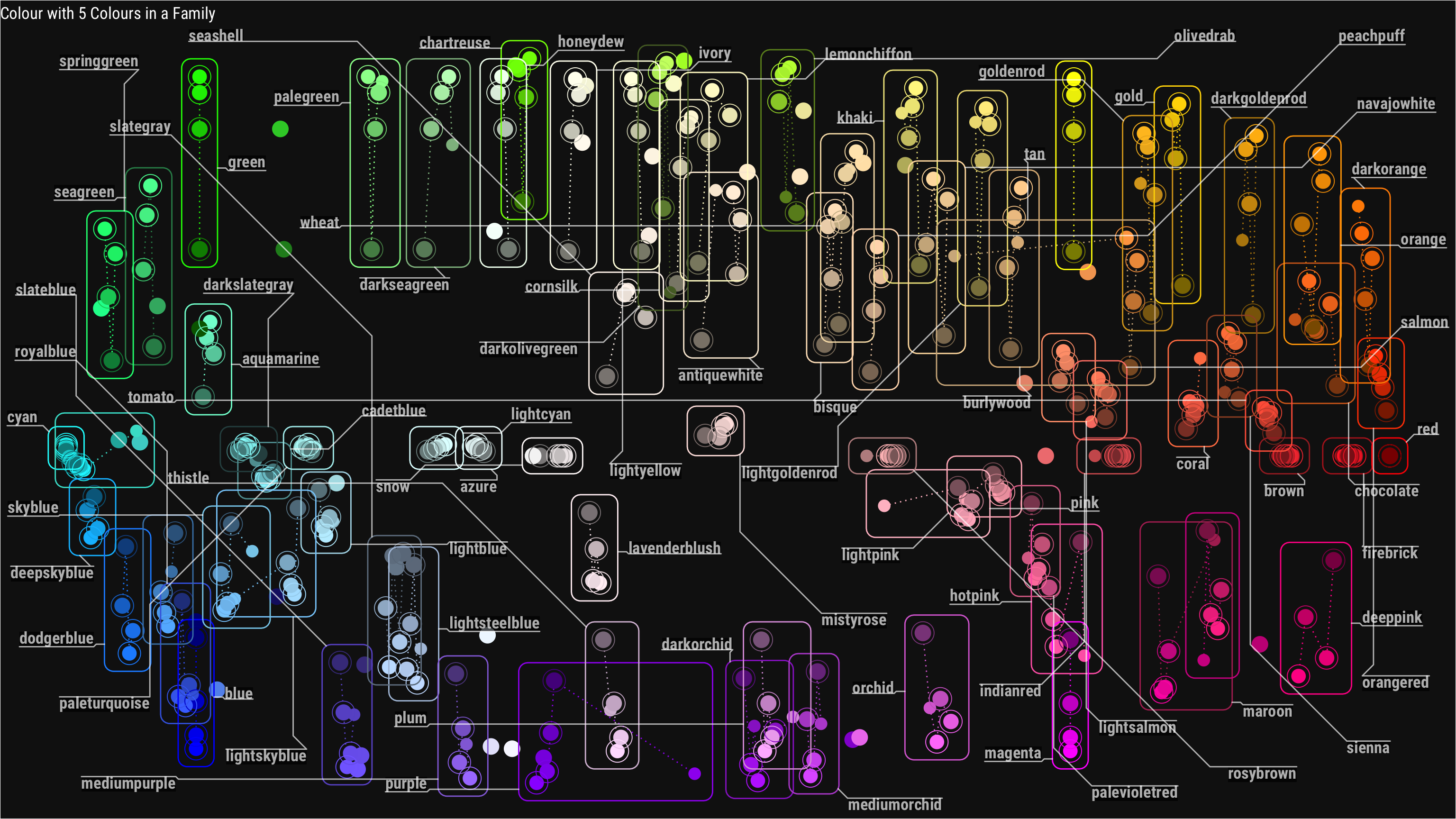
This last trick, I learned in this recent blog post I came across, by Chisato. She explored all colors() base R incorporates, using the new ggforce and ggraph packages (thank you Thomas Lin Petersen!). Her exploration resulted in some nice visual overviews, which you can view in more detail in the original blog here.

Colors() with no color family
Colors() that have at least 5 colors in their family
Colors() with similar names
Xenographics: Unusual charts and maps

Xenographics: Unusual charts and maps

Xeno.graphics is the collection of unusual charts and maps Maarten Lambrechts maintains. It’s a repository of novel, innovative, and experimental visualizations to inspire you, to fight xenographphobia, and popularize new chart types.

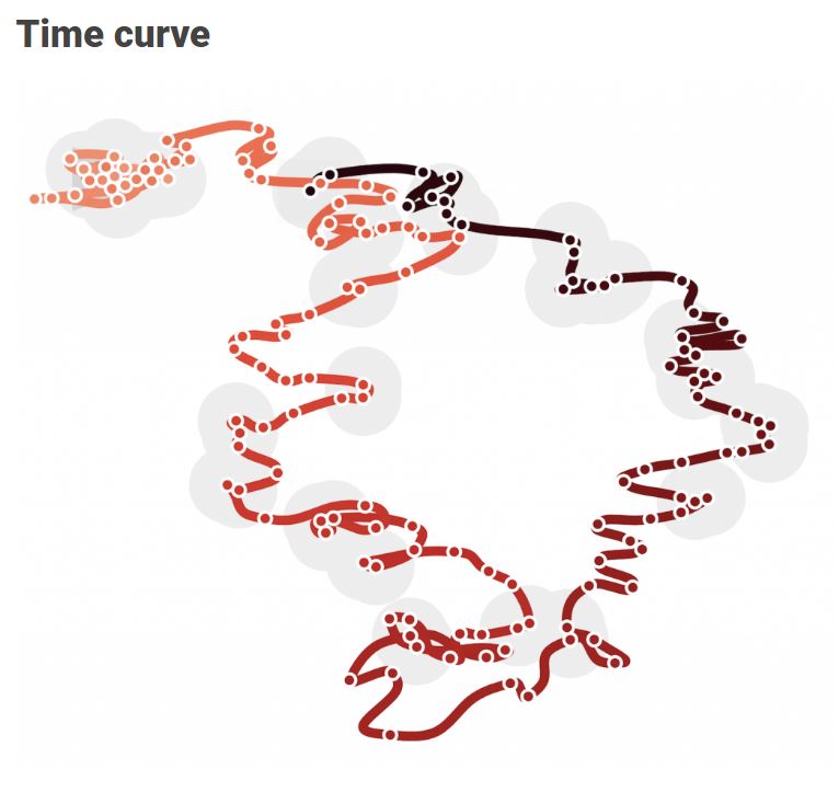
For instance, have you ever before heard of a time curve? These are very useful to visualize the development of a relationship over time.

temp.JPG
Time curves are based on the metaphor of folding a timeline visualization into itself so as to bring similar time points close to each other. This metaphor can be applied to any dataset where a similarity metric between temporal snapshots can be defined, thus it is largely datatype-agnostic. [https://xeno.graphics/time-curve]
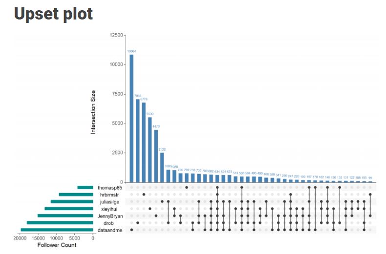
The upset plot is another example of an upcoming visualization. It can demonstrate the overlap or insection in a dataset. For instance, in the social network of #rstats twitter heroes, as the below example from the Xenographics website does.

temp.JPG
Understanding relationships between sets is an important analysis task. The major challenge in this context is the combinatorial explosion of the number of set intersections if the number of sets exceeds a trivial threshold. To address this, we introduce UpSet, a novel visualization technique for the quantitative analysis of sets, their intersections, and aggregates of intersections. [https://xeno.graphics/upset-plot/]
The below necklace map is new to me too. What it does precisely is unclear to me as well.

temp
In a necklace map, the regions of the underlying two-dimensional map are projected onto intervals on a one-dimensional curve (the necklace) that surrounds the map regions. Symbols are scaled such that their area corresponds to the data of their region and placed without overlap inside the corresponding interval on the necklace. [https://xeno.graphics/necklace-map/]
There are hundreds of other interestingcharts, maps, figures, and plots, so do have a look yourself. Moreover, the xenographics collection is still growing. If you know of one that isn’t here already, please submit it. You can also expect some posts about  certain topics around xenographics.

temp.JPG