By adjusting the three elements in this simple framework, you can build any type of machine learning program.
In the tutorial, Eric shows you how to implement this same framework in Python (using jax) and implement linear regression, logistic regression, and artificial neural networks all in the same way (using gradient descent).
I can’t even begin to explain it as well as Eric does himself, so I highly recommend you watch and code along with the Youtube tutorial (~1 hour):
Have you ever wondered what goes on behind the scenes of a deep learning framework? Or what is going on behind that pre-trained model that you took from Kaggle? Then this tutorial is for you! In this tutorial, we will demystify the internals of deep learning frameworks – in the process equipping us with foundational knowledge that lets us understand what is going on when we train and fit a deep learning model. By learning the foundations without a deep learning framework as a pedagogical crutch, you will walk away with foundational knowledge that will give you the confidence to implement any model you want in any framework you choose.
Ryan Holbrook made awesome animated GIFs in R of several classifiers learning a decision rule boundary between two classes. Basically, what you see is a machine learning model in action, learning how to distinguish data of two classes, say cats and dogs, using some X and Y variables.
These visuals can be great to understand these algorithms, the models, and their learning process a bit better.
Here’s the original tweet, with the logistic regression animation. If you follow it, you will find a whole thread of classifier GIFs. These I extracted, pasted, and explained below.
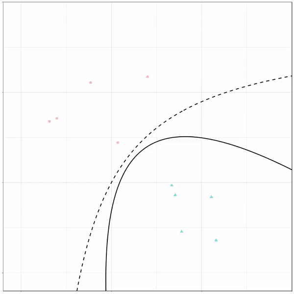
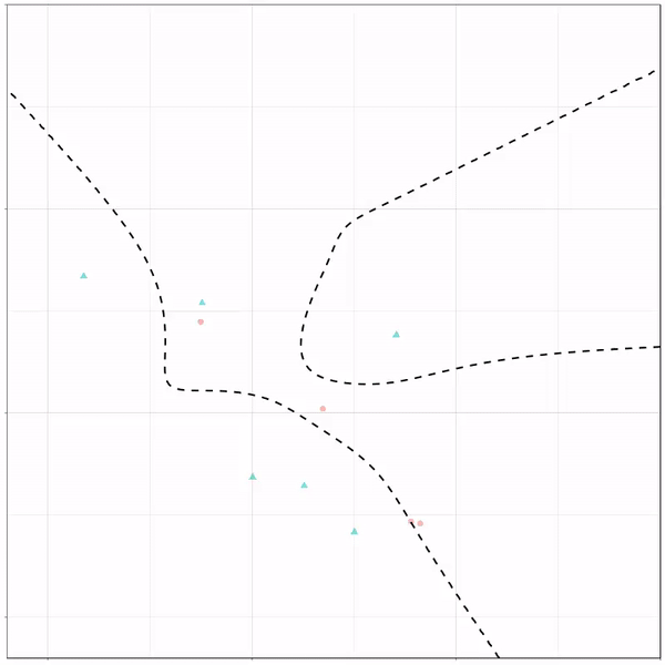
A thread of classifiers learning a decision rule. Dashed line is optimal boundary. Animations with #gganimate by @thomasp85 and @drob. #rstats
Logistic regression {stats::glm} with each class having normally distributed features. (1/n) pic.twitter.com/kKmqdO2zGy
Below is the GIF which I extracted using EZgif.com.
What you see is observations from two classes, say cats and dogs, each represented using colored dots. The dots are placed along X and Y axes, which represent variables about the observations. Their tail lengths and their hairyness, for instance.
Now there’s an optimal way to seperate these classes, which is the dashed line. That line best seperates the cats from the dogs based on these two variables X and Y. As this is an optimal boundary given this data, it is stable, it does not change.
However, there’s also a solid black line, which does change. This line represents the learned boundary by the machine learning model, in this case using logistic regression. As the model is shown more data, it learns, and the boundary is updated. This learned boundary represents the best line with which the model has learned to seperate cats from dogs.
Anything above the boundary is predicted to be class 1, a dog. Everything below predicted to be class 2, a cat. As logistic regression results in a linear model, the seperation boundary is very much linear/straight.
Logistic regression gif by Ryan Holbrook
These animations are great to get a sense of how the models come to their boundaries in the back-end.
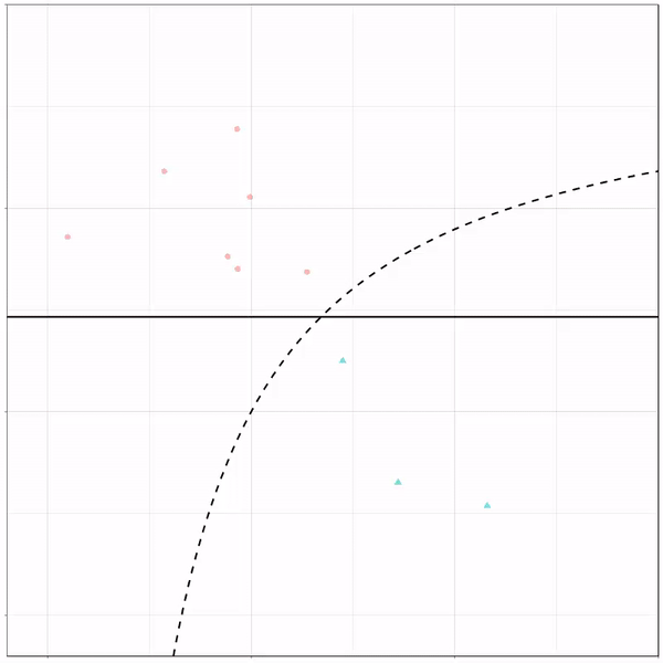
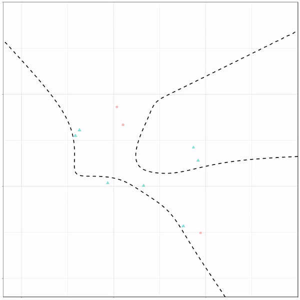
For instance, other machine learning models are able to use non-linear boundaries to dinstinguish classes, such as this quadratic discriminant analysis (qda). This “learned” boundary is much closer to the optimal boundary:
Quadratic discriminant analysis gif by Ryan Holbrook
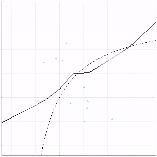
Multivariate adaptive regression splines gif by Ryan Holbrook
Next, we have the k-nearest neighbors algorithm, which predicts for each point (animal) the class (cat/dog) based on the “k” points closest to it. As you see, this results in a highly fluctuating, localized boundary.
K-nearest neighbors gif by Ryan Holbrook
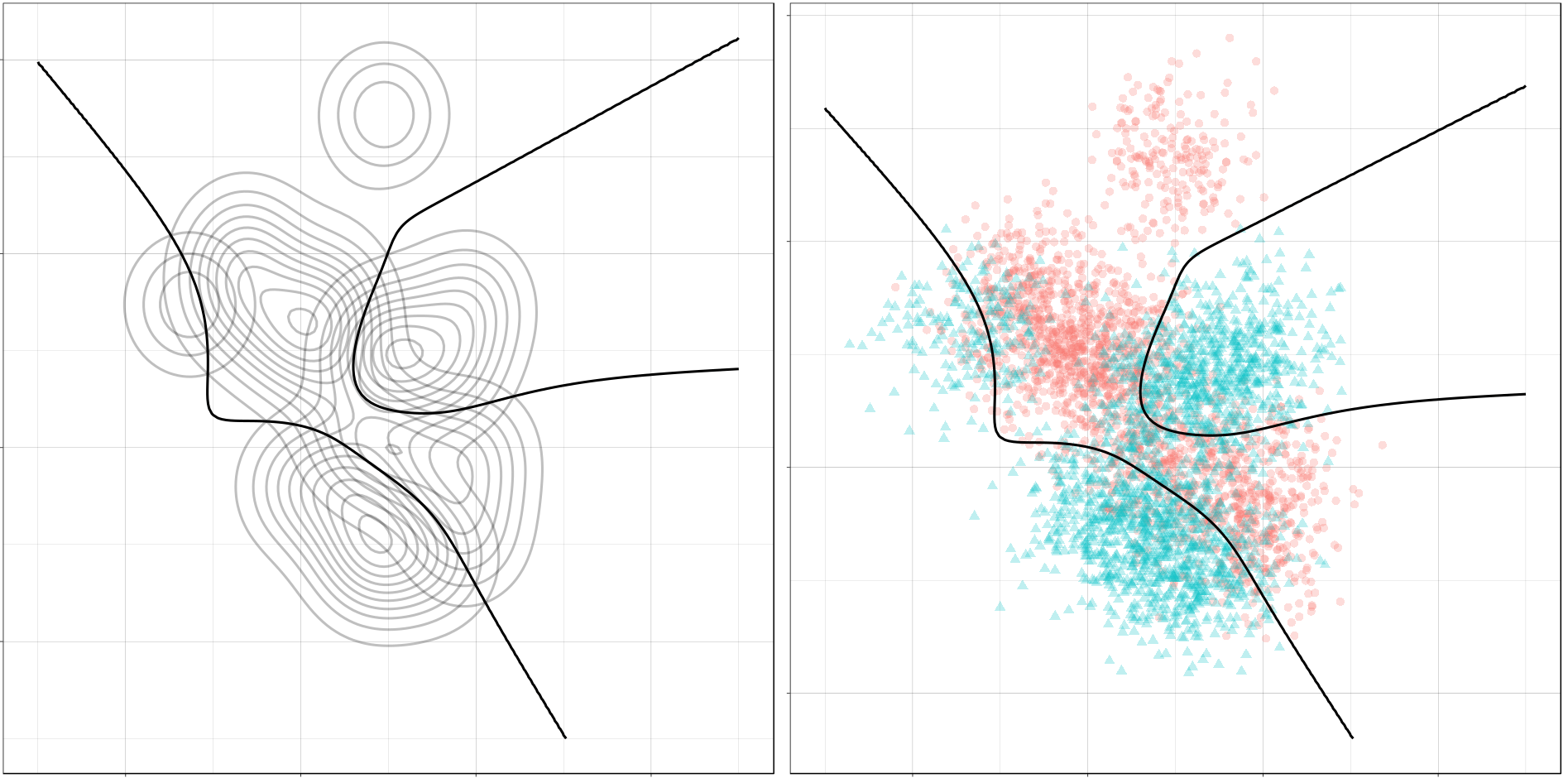
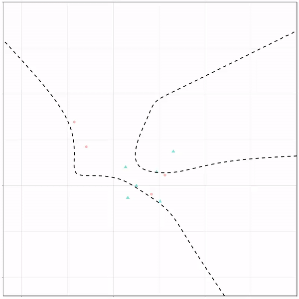
Now, Ryan decided to push the challenge, and simulate new data for two classes with a more difficult decision boundary. The new data and optimal boundaries look like this:
On these data, Ryan put a whole range of non-linear models to work.
Like this support-vector machine, which tries to create optimal boundaries built of support vectors around all the cats and all the dohs (this is definitely not a technical, error-free explanation of what’s happening here).
Let’s jump into some tree-based algorithms and the resulting models. A decision tree classifies data based on multiple, sequential, binary splits. Here, Ryan trained a simple decision tree:
Decision tree gif by Ryan Holbrook
As well as it’s big brother, a random forest, which uses hundreds of trees in the back end and thus results in a more flexible boundary:
Random forest gif by Ryan Holbrook
Extreme gradient boosting is also a tree-based algorithm, which leverages many machine learning techniques to optimize the bias-variance tradeoff. Here’s an earlier blog on how to get started with Xgboost in Python or R:
I found this interesting blog by Guilherme Duarte Marmerola where he shows how the predictions of algorithmic models (such as gradient boosted machines, or random forests) can be calibrated by stacking a logistic regression model on top of it: by using the predicted leaves of the algorithmic model as features / inputs in a subsequent logistic model.
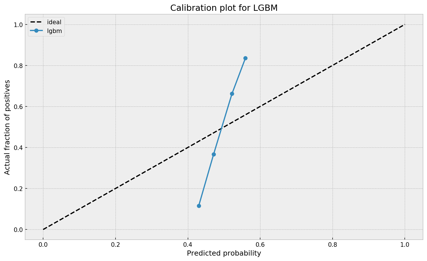
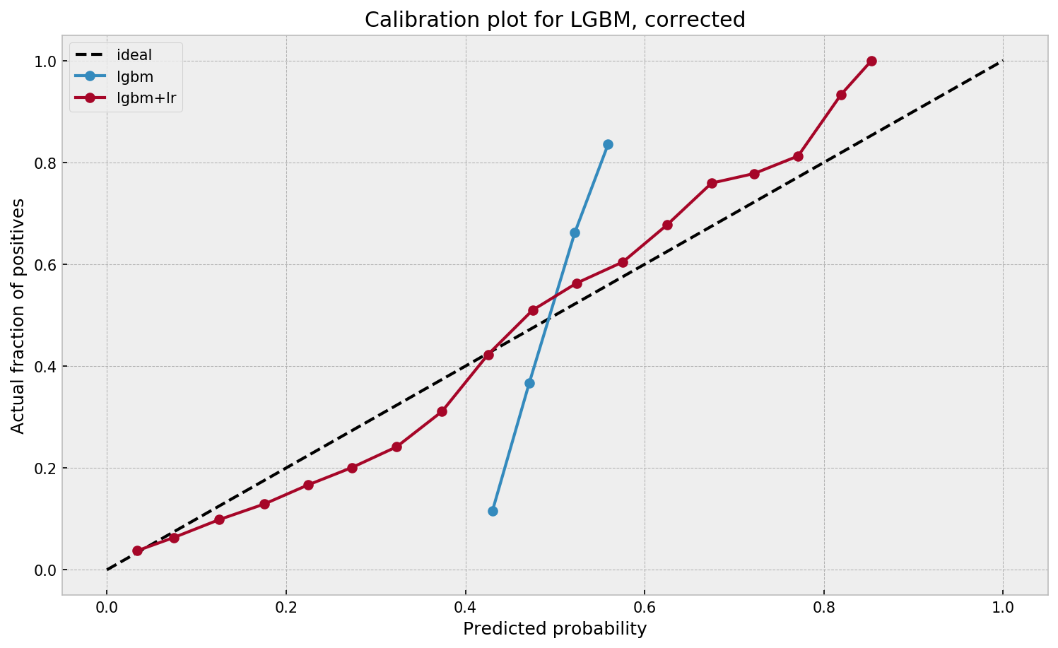
When working with ML models such as GBMs, RFs, SVMs or kNNs (any one that is not a logistic regression) we can observe a pattern that is intriguing: the probabilities that the model outputs do not correspond to the real fraction of positives we see in real life.
This is visible in the predictions of the light gradient boosted machine (LGBM) Guilherme trained: its predictions range only between ~ 0.45 and ~ 0.55. In contrast, the actual fraction of positive observations in those groups is much lower or higher (ranging from ~ 0.10 to ~0.85).
I highly recommend you look at Guilherme’s code to see for yourself what’s happening behind the scenes, but basically it’s this:
Train an algorithmic model (e.g., GBM) using your regular features (data)
Retrieve the probabilities GBM predicts
Retrieve the leaves (end-nodes) in which the GBM sorts the observations
Turn the array of leaves into a matrix of (one-hot-encoded) features, showing for each observation which leave it ended up in (1) and which not (many 0’s)
Basically, until now, you have used the GBM to reduce the original features to a new, one-hot-encoded matrix of binary features
Now you can use that matrix of new features as input for a logistic regression model predicting your target (Y) variable
Apparently, those logistic regression predictions will show a greater spread of probabilities with the same or better accuracy
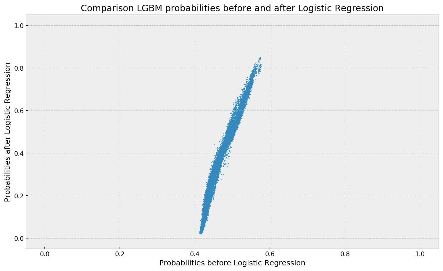
Here’s a visual depiction from Guilherme’s blog, with the original GBM predictions on the X-axis, and the new logistic predictions on the Y-axis.
As you can see, you retain roughly the same ordering, but the logistic regression probabilities spread is much larger.
Now according to Guilherme and the Facebook paper he refers to, the accuracy of the logistic predictions should not be less than those of the original algorithmic method.
Much better. The calibration plot of lgbm+lr is much closer to the ideal. Now, when the model tells us that the probability of success is 60%, we can actually be much more confident that this is the true fraction of success! Let us now try this with the ET model.
In his blog, Guilherme shows the same process visually for an Extremely Randomized Trees model, so I highly recommend you read the original article. Also, you can find the complete code on his GitHub.
Josh Starmer is assistant professor at the genetics department of the University of North Carolina at Chapel Hill.
But more importantly: Josh is the mastermind behind StatQuest!
StatQuest is a Youtube channel (and website) dedicated to explaining complex statistical concepts — like data distributions, probability, or novel machine learning algorithms — in simple terms.
Once you watch one of Josh’s “Stat-Quests”, you immediately recognize the effort he put into this project. Using great visuals, a just-about-right pace, and relateable examples, Josh makes statistics accessible to everyone. For instance, take this series on logistic regression:
And do you really know what happens under the hood when you run a principal component analysis? After this video you will:
Or are you more interested in learning the fundamental concepts behind machine learning, then Josh has some videos for you, for instance on bias and variance or gradient descent:
With nearly 200 videos and counting, StatQuest is truly an amazing resource for students ‘and teachers on topics related to statistics and data analytics. For some of the concepts, Josh even posted videos running you through the analysis steps and results interpretation in the R language.
StatQuest started out as an attempt to explain statistics to my co-workers – who are all genetics researchers at UNC-Chapel Hill. They did these amazing experiments, but they didn’t always know what to do with the data they generated. That was my job. But I wanted them to understand that what I do isn’t magic – it’s actually quite simple. It only seems hard because it’s all wrapped up in confusing terminology and typically communicated using equations. I found that if I stripped away the terminology and communicated the concepts using pictures, it became easy to understand.
Over time I made more and more StatQuests and now it’s my passion on YouTube.


