Grant McDermott developed this new R package I wish I had thought of: parttree
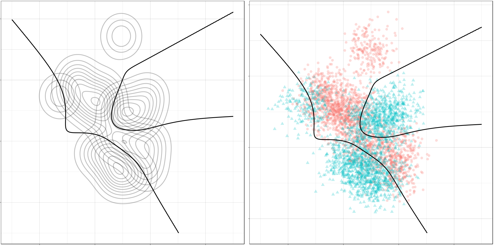
parttree includes a set of simple functions for visualizing decision tree partitions in R with ggplot2. The package is not yet on CRAN, but can be installed from GitHub using:
Using the familiar ggplot2 syntax, we can simply add decision tree boundaries to a plot of our data.
In this example from his Github page, Grant trains a decision tree on the famous Titanic data using the parsnip package. And then visualizes the resulting partition / decision boundaries using the simple function geom_parttree()
library(parsnip)
library(titanic) ## Just for a different data set
set.seed(123) ## For consistent jitter
titanic_train$Survived = as.factor(titanic_train$Survived)
## Build our tree using parsnip (but with rpart as the model engine)
ti_tree =
  decision_tree() %>%
  set_engine("rpart") %>%
  set_mode("classification") %>%
  fit(Survived ~ Pclass + Age, data = titanic_train)
## Plot the data and model partitions
titanic_train %>%
  ggplot(aes(x=Pclass, y=Age)) +
  geom_jitter(aes(col=Survived), alpha=0.7) +
  geom_parttree(data = ti_tree, aes(fill=Survived), alpha = 0.1) +
  theme_minimal()
Super awesome!
This visualization precisely shows where the trained decision tree thinks it should predict that the passengers of the Titanic would have survived (blue regions) or not (red), based on their age and passenger class (Pclass).
This will be super helpful if you need to explain to yourself, your team, or your stakeholders how you model works. Currently, only rpart decision trees are supported, but I am very much hoping that Grant continues building this functionality!
I came across this opinionated though informed commentary by Vinay Prasad on the recent Nature article where Google’s machine learning experts trained models to predict whether scans of patients’ breasts (mammogram’s) show cancerous cells or not.
Vinay Prasad [official bio] is a practicing hematologist-oncologist and Associate Professor of Medicine at Oregon Health and Science University. So he knows what he’s talking about.
He argues that “cancer screening is the LAST thing you should pick FIRST to work on with AI”. Which is an interesting statement in and of itself.
Regardless of my personal opinion on the topic, I found the paper, Vinay’s commentary, and the broader discussion on twitter very interesting and educational to read. I feel it shows how important it is to know the context in which you are applying machine learning. What tremendous value it provides to have domain experts in the same team as the data and machine learning experts.
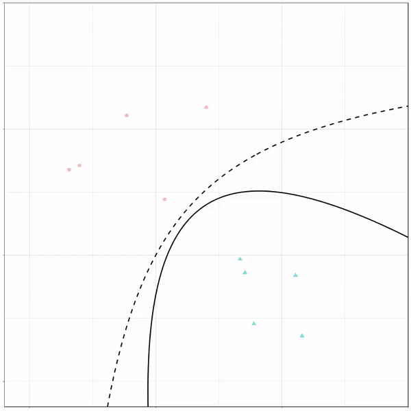
Ryan Holbrook made awesome animated GIFs in R of several classifiers learning a decision rule boundary between two classes. Basically, what you see is a machine learning model in action, learning how to distinguish data of two classes, say cats and dogs, using some X and Y variables.
These visuals can be great to understand these algorithms, the models, and their learning process a bit better.
Here’s the original tweet, with the logistic regression animation. If you follow it, you will find a whole thread of classifier GIFs. These I extracted, pasted, and explained below.
A thread of classifiers learning a decision rule. Dashed line is optimal boundary. Animations with #gganimate by @thomasp85 and @drob. #rstats
Logistic regression {stats::glm} with each class having normally distributed features. (1/n) pic.twitter.com/kKmqdO2zGy
Below is the GIF which I extracted using EZgif.com.
What you see is observations from two classes, say cats and dogs, each represented using colored dots. The dots are placed along X and Y axes, which represent variables about the observations. Their tail lengths and their hairyness, for instance.
Now there’s an optimal way to seperate these classes, which is the dashed line. That line best seperates the cats from the dogs based on these two variables X and Y. As this is an optimal boundary given this data, it is stable, it does not change.
However, there’s also a solid black line, which does change. This line represents the learned boundary by the machine learning model, in this case using logistic regression. As the model is shown more data, it learns, and the boundary is updated. This learned boundary represents the best line with which the model has learned to seperate cats from dogs.
Anything above the boundary is predicted to be class 1, a dog. Everything below predicted to be class 2, a cat. As logistic regression results in a linear model, the seperation boundary is very much linear/straight.
Logistic regression gif by Ryan Holbrook
These animations are great to get a sense of how the models come to their boundaries in the back-end.
For instance, other machine learning models are able to use non-linear boundaries to dinstinguish classes, such as this quadratic discriminant analysis (qda). This “learned” boundary is much closer to the optimal boundary:
Quadratic discriminant analysis gif by Ryan Holbrook
Multivariate adaptive regression splines gif by Ryan Holbrook
Next, we have the k-nearest neighbors algorithm, which predicts for each point (animal) the class (cat/dog) based on the “k” points closest to it. As you see, this results in a highly fluctuating, localized boundary.
K-nearest neighbors gif by Ryan Holbrook
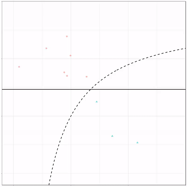
Now, Ryan decided to push the challenge, and simulate new data for two classes with a more difficult decision boundary. The new data and optimal boundaries look like this:
On these data, Ryan put a whole range of non-linear models to work.
Like this support-vector machine, which tries to create optimal boundaries built of support vectors around all the cats and all the dohs (this is definitely not a technical, error-free explanation of what’s happening here).
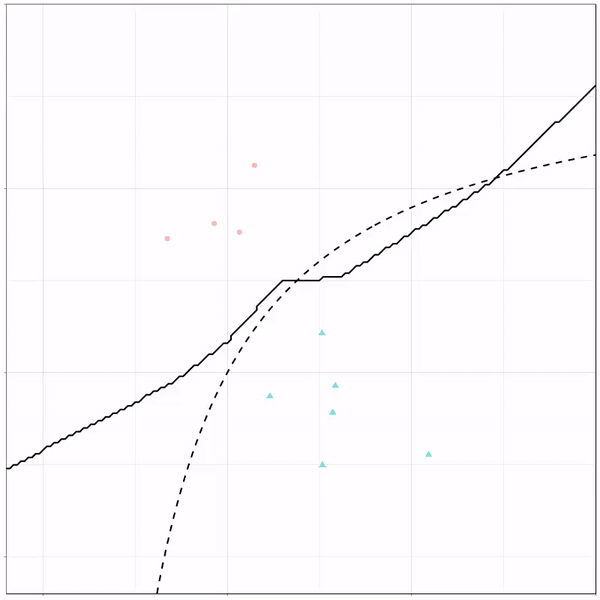
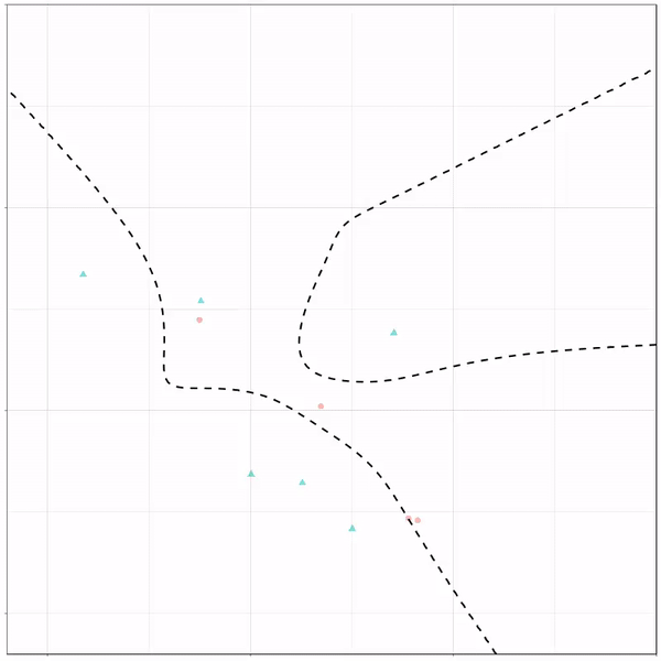
Let’s jump into some tree-based algorithms and the resulting models. A decision tree classifies data based on multiple, sequential, binary splits. Here, Ryan trained a simple decision tree:
Decision tree gif by Ryan Holbrook
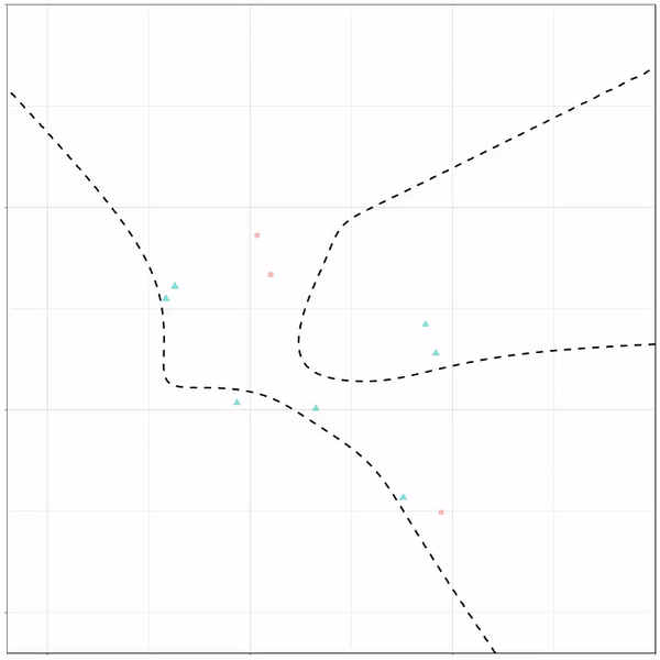
As well as it’s big brother, a random forest, which uses hundreds of trees in the back end and thus results in a more flexible boundary:
Random forest gif by Ryan Holbrook
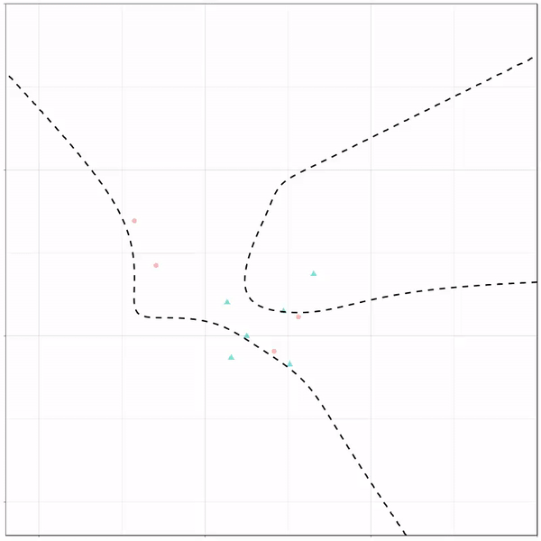
Extreme gradient boosting is also a tree-based algorithm, which leverages many machine learning techniques to optimize the bias-variance tradeoff. Here’s an earlier blog on how to get started with Xgboost in Python or R:
I was training a predictive model for work for use in a Shiny App. However, as the training set was quite large (700k+ obs.), the model object to save was also quite large in size (500mb). This slows down your operation significantly!
Basically, all you really need are the coefficients (and a link function, in case of glm()). However, I can imagine that you are not eager to write new custom predictions functions, but that you would rather want to rely on R’s predict.lm and predict.glm. Hence, you’ll need to save some more object information.
Via Google I came to this blog, which provides this great custom R function (below) to decrease the object size of trained generalized linear models considerably! It retains only those object data that are necessary to make R’s predict functions work.
My saved linear model went from taking up half a GB to only 27kb! That’s a 99.995% reduction!
Thanks to Sebastian Raschka I am able to share this great GitHub overview page of relevant graph classification techniques, and the scientific papers behind them. The overview divides the algorithms into four groups:
As well as a link to relevant graph classification benchmark datasets.
"Awesome Graph Classification" — A collection of graph classification methods, covering embedding, deep learning, graph kernel, and factorization papers with reference implementations https://t.co/ugpL3xSvf1
A receiver operating characteristic (ROC) curve displays how well a model can classify binary outcomes. An ROC curve is generated by plotting the false positive rate of a model against its true positive rate, for each possible cutoff value. Often, the area under the curve (AUC) is calculated and used as a metric showing how well a model can classify data points.
If you’re interest in learning more about ROC and AUC, I recommend this short Medium blog, which contains this neat graphic:
Dariya Sydykova, graduate student at the Wilke lab at the University of Texas at Austin, shared some great visual animations of how model accuracy and model cutoffs alter the ROC curve and the AUC metric. The quotes and animations are from the associated github repository.
ROC & AUC
The plot on the left shows the distributions of predictors for the two outcomes, and the plot on the right shows the ROC curve for these distributions. The vertical line that travels left-to-right is the cutoff value. The red dot that travels along the ROC curve corresponds to the false positive rate and the true positive rate for the cutoff value given in the plot on the left.
The traveling cutoff demonstrates the trade-off between trying to classify one outcome correctly and trying to classify the other outcome correcly. When we try to increase the true positive rate, we also increase the false positive rate. When we try to decrease the false positive rate, we decrease the true positive rate.
The shape of an ROC curve changes when a model changes the way it classifies the two outcomes.
The animation [below] starts with a model that cannot tell one outcome from the other, and the two distributions completely overlap (essentially a random classifier). As the two distributions separate, the ROC curve approaches the left-top corner, and the AUC value of the curve increases. When the model can perfectly separate the two outcomes, the ROC curve forms a right angle and the AUC becomes 1.
Precision-Recall
Two other metrics that are often used to quantify model performance are precision and recall.
Precision (also called positive predictive value) is defined as the number of true positives divided by the total number of positive predictions. Hence, precision quantifies what percentage of the positive predictions were correct: How correct your model’s positive predictions were.
Recall (also called sensitivity) is defined as the number of true positives divided by the total number of true postives and false negatives (i.e. all actual positives). Hence, recall quantifies what percentage of the actual positives you were able to identify: How sensitive your model was in identifying positives.
Dariya also made some visualizations of precision-recall curves:
Precision-recall curves also displays how well a model can classify binary outcomes. However, it does it differently from the way an ROC curve does. Precision-recall curve plots true positive rate (recall or sensitivity) against the positive predictive value (precision).
In the middle, here below, the ROC curve with AUC. On the right, the associated precision-recall curve.
Similarly to the ROC curve, when the two outcomes separate, precision-recall curves will approach the top-right corner. Typically, a model that produces a precision-recall curve that is closer to the top-right corner is better than a model that produces a precision-recall curve that is skewed towards the bottom of the plot.
Class imbalance
Class imbalance happens when the number of outputs in one class is different from the number of outputs in another class. For example, one of the distributions has 1000 observations and the other has 10. An ROC curve tends to be more robust to class imbalanace that a precision-recall curve.
In this animation [below], both distributions start with 1000 outcomes. The blue one is then reduced to 50. The precision-recall curve changes shape more drastically than the ROC curve, and the AUC value mostly stays the same. We also observe this behaviour when the other disribution is reduced to 50.
Here’s the same, but now with the red distribution shrinking to just 50 samples.
Dariya invites you to use these visualizations for educational purposes:
Please feel free to use the animations and scripts in this repository for teaching or learning. You can directly download the gif files for any of the animations, or you can recreate them using these scripts. Each script is named according to the animation it generates (i.e. animate_ROC.r generates ROC.gif, animate_SD.r generates SD.gif, etc.).
Want to learn more about the different evaluation metrics for machine learning? Here’s a nice how-to guide by Neptune.ai demonstrating different metrics applied in Python.