Came across this awesome Youtube video that blew my mind. Definitely a handy resource if you want to explain the inner workings of neural networks. Have a look!
I’ve seen a fair share of Tinder experiments come by, for instance, someone A/B-testing attractiveness with and without facial hair, but these new two posts on Medium are the best I’ve come across so far.
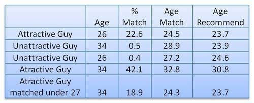
In his first experiment, this self-proclaimed worst online dater went catfishing. He made a Tinder account using stock photos of attractive and less attractive and old and young guys, looking and sampled some like ratio’s.
Basically, his conclusion was that “Tinder actually can work, but pretty much only if you are an attractive guy”
In the second experiment, the author decided to treat Tinder as an economy and study it as an (socio-)economist would:
The wealth of an economy is quantified in terms its currency. […] In Tinder the currency is “likes”. […] Wealth in Tinder is not distributed equally. Attractive guys have more wealth in the Tinder economy (get more “likes”) than unattractive guys do. […] An unequal wealth distribution is to be expected, but there is a more interesting question: What is the degree of this unequal wealth distribution and how does this inequality compare to other economies?
The author notes some caveats of this analysis. First and foremost, the data was collected in quite an unethical way, by asking questions to 27 of the matches with the fake accounts the author set up. Moreover, self-report bias is quite likely, as it’s easy to lie on Tinder. Still, the results are quite amusing:
Basically,“the bottom 80% of men are fighting over the bottom 22% of women and the top 78% of women are fighting over the top 20% of men”
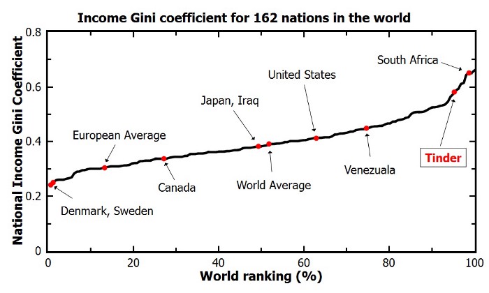
The Lorenz curve shows the proportion of wealth owned by the bottom x% of a population. If wealth was equally distributed the curve would be perfectly diagonal (a 45 degree slope). The steeper the slope, the less inequal an economy. The below shows the curve for a perfectly equal economy, the US economy, and the estimated Tinder economy:
Similarly, the Gini coefficient can be used to represent the wealth equality of an economy. It ranges from 0 to 1, where 0 corresponds with perfect equality (everybody has the same wealth) and 1 corresponds with perfect inequality (one dictator with all the wealth). While most European countries, and even the US, score quite low on this Gini index, the Tinder economy is estimated to be much more towards the lower end.
According to my last post, the most attractive men will be liked by only approximately 20% of all the females on Tinder. […] Unfortunately, this percentage decreases rapidly as you go down the attractiveness scale. According to this analysis a man of average attractiveness can only expect to be liked by slightly less than 1% of females (0.87%). This equates to 1 “like” for every 115 females.
The good news is that if you are only getting liked by a few girls on Tinder you shouldn’t take it personally. You aren’t necessarily unattractive. You can be of above average attractiveness and still only get liked by a few percent of women on Tinder. The bad news is that if you aren’t in the very upper echelons of Tinder wealth (i.e. attractiveness) you aren’t likely to have much success using Tinder. You would probably be better off just going to a bar or joining some coed recreational sports team.
MIT researchers have spent years developing the new drag-and-drop analytics tools they call Northstar.
Northstar is an interactive data science platform that rethinks how people interact with data. It empowers users without programming experience, background in statistics or machine learning expertise to explore and mine data through an intuitive user interface, and effortlessly build, analyze, and evaluate machine learning (ML) pipelines.
Northstar starts as a blank, white interface. Users upload datasets into the system, which appear in a “datasets” box on the left. Any data labels will automatically populate a separate “attributes” box below. There’s also an “operators” box that contains various algorithms, as well as the new AutoML tool. All data are stored and analyzed in the cloud.
While Northstar looks insanely cool and promising, I do worry about putting such power in the hands of people who may not have much experience with statistics and/or machine learning. We all know how easily errors and bias may slip into data-driven processes, so I am curious to see how these next-gen kind of tools will be deployed and used.
In a recent post, Claus shared the link to a GitHub repository where he hosts some of the R programming code with which Claus made the graphics for his dataviz book. The repository is named practical ggplot2, after the R package Clause used to make many of his visuals.
Check it out, the page contains some pearls and the code behind them, which will help you learn to create fabulous visualizations yourself. Some examples:
Created by Andrew Stewart, and tweeted by John Holbein, the visuals show samples taken from a normal distributed variable with a mean of 10 and a standard deviation of 2. In the left section, Andrew took several samples of 20. In the right section, the sample size was increased to 500.
Just look at how much the distribution and the estimated mean change for small samples!
Andrew shared his code via Github, so I was able to download and tweak it a bit to make my own version.
Andrew’s version seems to be concerned with potential Type 1 errors when small samples are taken. A type 1 error occurs when you reject your null hypothesis (you reject “there is no effect”) while you should not have (“there is actually no effect”).
You can see this in the distributions Andrew sampled from in the tweet above. The data for conditions A (red) and B (blue) are sampled from the same distribution, with mean 10 and standard deviation 2. While there should thus be no difference between the groups, small samples may cause researchers to erroneously conclude that there is a difference between conditions A and B due to the observed data.
We could use Andrew’s basic code and tweak it a bit to simulate a setting in which Type 2 errors could occur. A type 2 error occurs when you do not reject your null hypothesis (you maintain “there is no effect”) whereas there is actually an effect, which you thus missed.
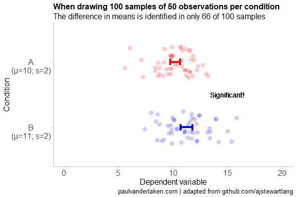
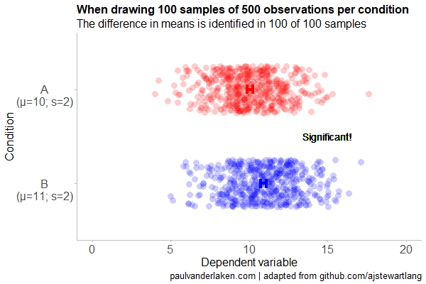
To illustrate this, I adapted Andrew’s code: I sampled data for condition B using a normal distribution with a slightly higher mean value of 11, as opposed to the mean of 10 for condition A. The standard deviation remained the same in both conditions (2).
Next, I drew 10 data samples from both conditions, for various sample sizes: 10, 20, 50, 100, 250, 500, and even 1000. After drawing these samples for both conditions, I ran a simple t-test to compare their means, and estimate whether any observed difference could be considered significant (at the alpha = 0.05 level [95%]).
In the end, I visualized the results in a similar fashion as Andrew did. Below are the results.
As you can see, only in 1 of our 10 samples with size 10 were we able to conclude that there was a difference in means. This means that we are 90% incorrect.
After increasing the sample size to 100, we strongly decrease our risk of Type 2 errors. Now we are down to 20% incorrect conclusions.
At this point though, I decided to rework Andrew’s code even more, to clarify the message.
I was not so much interested in the estimated distribution, which currently only distracts. Similarly, the points and axes can be toned down a bit. Moreover, I’d like to be able to see when my condition samples have significant different means, so let’s add a 95% confidence interval, and some text. Finally, let’s increase the number of drawn samples per sample size to, say, 100, to reduce the influence that chance may have on our Type 2 error rate estimations.
Let’s rerun the code and generate some GIFs!
The below demonstrates that small samples of only 10 observations per condition have only about a 11% probability of detecting the difference in means when the true difference is 1 (or half the standard deviation [i.e., 2]). In other words, there is a 89% chance of a Type 2 error occuring, where we fail to reject the null hypothesis due to sampling error.
Doubling the sample size to 20, more than doubles our detection rate. We now correctly identify the difference 28% of the time.
With 50 observations the Type 2 error rate drops to 34%.
Finally, with sample sizes of 100+ our results become somewhat reliable. We are now able to correctly identify the true difference over 95% of the times.
With a true difference of half the standard deviation, further increases in the sample size start to lose their added value. For instance, a sample size of 250 already uncovers the effect in all 100 samples, so doubling to 500 would not make sense.
I hope you liked the visuals. If you are interested in these kind of analysis, or want to estimate how large of a sample you need in your own study, have a look at power analysis. These analysis can help you determine the best setup for your own research initiatives.
If you’d like to reproduce or change the graphics above, here is the R code. Note that it is strongly inspired by Andrew’s original code.
# setup -------------------------------------------------------------------

# The new version of gganimate by Thomas Lin Pedersen - @thomasp85 may not yet be on CRAN so use devtools
# devtools::install_github('thomasp85/gganimate')

library(ggplot2)
library(dplyr)
library(glue)
library(magrittr)
library(gganimate)


# main function to create and save the animation --------------------------

save_created_animation = function(sample_size,
                                  samples = 100,
                                  colors = c("red", "blue"),
                                  Amean = 10, Asd = 2,
                                  Bmean = 11, Bsd = 2,
                                  seed = 1){

  ### generate the data

  # set the seed
  set.seed(seed)

  # set the names of our variables
  cnames <- c("Score", "Condition", "Sample")

  # create an empty data frame to store our simulated samples
  df <- data.frame(matrix(rep(NA_character_, samples * sample_size * 2 * length(cnames)), ncol = length(cnames), dimnames = list(NULL, cnames)), stringsAsFactors = FALSE)

  # create an empty vector to store whether t.test identifies significant difference in means
  result <- rep(NA_real_, samples)

  # run a for loop to iteratively simulate the samples
  for (i in seq_len(samples)) {
    # draw random samples for both conditions
    a <- rnorm(sample_size, mean = Amean, sd = Asd)
    b <- rnorm(sample_size, mean = Bmean, sd = Bsd)
    # test whether there the difference in the means of samples is significant
    result[i] = t.test(a, b)$p.value < 0.05
    # add the identifiers for both conditions, and for the sample iteration
    a <- cbind(a, rep(glue("A\n(μ={Amean}; σ={Asd})"), sample_size), rep(i, sample_size))
    b <- cbind(b, rep(glue("B\n(μ={Bmean}; σ={Bsd})"), sample_size), rep(i, sample_size))
    # bind the two sampled conditions together in a single matrix and set its names
    ab <- rbind(a, b)
    colnames(ab) <- cnames
    # push the matrix into its reserved spot in the reserved dataframe
    df[((i - 1) * sample_size * 2 + 1):((i * (sample_size * 2))), ] <- ab
  }


  ### prepare the data

  # create a custom function to calculate the standard error
  se <- function(x) sd(x) / sqrt(length(x))

  df %>%
    # switch data types for condition and score
    mutate(Condition = factor(Condition)) %>%
    mutate(Score = as.numeric(Score)) %>%
    # calculate the mean and standard error to be used in the error bar
    group_by(Condition, Sample) %>%
    mutate(Score_Mean = mean(Score)) %>%
    mutate(Score_SE = se(Score)) ->
    df

  # create a new dataframe storing the result per sample
  df_result <- data.frame(Sample = unique(df$Sample), Result = result, stringsAsFactors = FALSE)

  # and add this result to the dataframe
  df <- left_join(df, df_result, by = "Sample")

  # identify whether not all but also not zero samples identified the difference in means
  # if so, store the string "only ", later to be added into the subtitle
  result_mention_adj <- ifelse(sum(result) != 0 & sum(result) < length(result), "only ", "")


  ### create a custom theme

  textsize <- 16

  my_theme <- theme(
    text = element_text(size = textsize),
    axis.title.x = element_text(size = textsize),
    axis.title.y = element_text(size = textsize),
    axis.text.y = element_text(hjust = 0.5, vjust = 0.75),
    axis.text = element_text(size = textsize),
    legend.title = element_text(size = textsize),
    legend.text =  element_text(size = textsize),
    legend.position = "right",
    plot.title = element_text(lineheight = .8, face = "bold", size = textsize),
    panel.border = element_blank(),
    panel.grid.minor = element_blank(),
    panel.grid.major = element_blank(),
    axis.line = element_line(color = "grey", size = 0.5, linetype = "solid"),
    axis.ticks = element_line(color = "grey")
  )

  # store the chosen colors in a named vector for use as palette,
  # and add the colors for (in)significant results
  COLORS = c(colors, "black", "darkgrey")
  names(COLORS) = c(levels(df$Condition), "1", "0")


  ### create the animated plot

  df %>%
    ggplot(aes(y = Score, x = Condition, fill = Condition, color = Condition)) +
    geom_point(aes(y = Score), position = position_jitter(width = 0.25), alpha = 0.20, stroke = NA, size = 1) +
    geom_errorbar(aes(ymin = Score_Mean - 1.96 * Score_SE, ymax = Score_Mean + 1.96 * Score_SE), width = 0.10, size = 1.5) +
    geom_text(data = . %>% filter(as.numeric(Condition) == 1),
              aes(x = levels(df$Condition)[1], y = Result * 10 + 5,
                  label = ifelse(Result == 1, "Significant!", "Insignificant!"),
                  col = as.character(Result)), position = position_nudge(x = -0.5), size = 5) +
    transition_states(Sample, transition_length = 1, state_length = 2) +
    guides(fill = FALSE) +
    guides(color = FALSE) +
    scale_x_discrete(limits = rev(levels(df$Condition)), breaks = rev(levels(df$Condition))) +
    scale_y_continuous(limits = c(0, 20), breaks = seq(0, 20, 5)) +
    scale_color_manual(values = COLORS) +
    scale_fill_manual(values = COLORS) +
    coord_flip() +
    theme_minimal() +
    my_theme +
    labs(x = "Condition") +
    labs(y = "Dependent variable") +
    labs(title = glue("When drawing {samples} samples of {sample_size} observations per condition")) +
    labs(subtitle = glue("The difference in means is identified in {result_mention_adj}{sum(result)} of {length(result)} samples")) +
    labs(caption = "paulvanderlaken.com | adapted from github.com/ajstewartlang") ->
    ani

  ### save the animated plot

  anim_save(paste0(paste("sampling_error", sample_size, sep = "_"), ".gif"),
            animate(ani, nframes = samples * 10, duration = samples, width = 600, height = 400))

}


# call animation function for different sample sizes ----------------------

# !!! !!! !!!
# the number of samples is set to 100 by default
# if left at 100, each function call will take a long time!
# add argument `samples = 10` to get quicker results, like so:
# save_created_animation(10, samples = 10)
# !!! !!! !!!

save_created_animation(10)
save_created_animation(20)
save_created_animation(50)
save_created_animation(100)
save_created_animation(250)
save_created_animation(500)
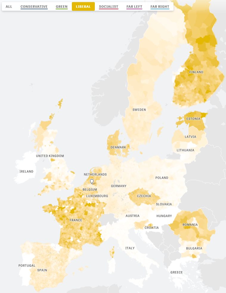
Zeit — the German newspaper — analyzed recent election results in over 80,000 regions of Europe. They discovered many patterns – from the radical left to the extremist right. Moreover, they allow you to find patterns yourself, among others in your own region.
The map is beautifully color-coded for the dominant political view (Conservative, Green, Liberal, Socialist, Far left, or Far right) per region. Moreover, you can select these views and look for regions where they received respectively many votes. Like in the below, where I opted for the Liberal view, which finds strongest support in regions of the Netherlands, France, Czechia, Romania, Denmark, Estonia, and Finland.
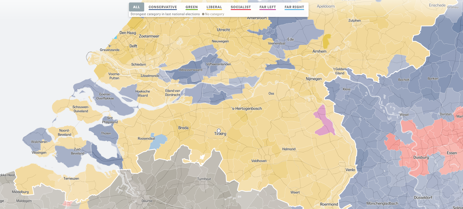
For instance, the region of Tilburg in the Netherlands — where I live — voted mostly Liberal, as depicted by the yellow Netherlands. In contrast, in the German border regions conservative and socialist parties received most votes, whereas in the Belgian border regions uncategorizable parties received most votes.