Tag: probability

Simulating and visualizing the Monty Hall problem in Python & R

Simulating and visualizing the Monty Hall problem in Python & R

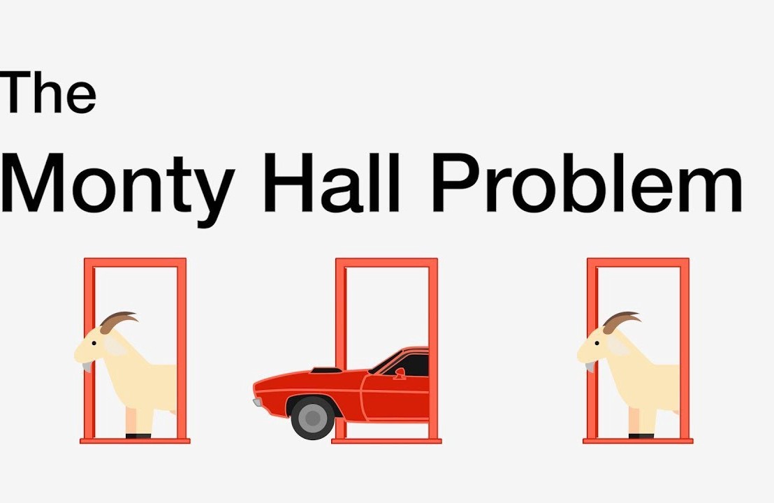
I recently visited a data science meetup where one of the speakers — Harm Bodewes — spoke about playing out the Monty Hall problem with his kids.

The Monty Hall problem is probability puzzle. Based on the American television game show Let’s Make a Deal and its host, named Monty Hall:

You’re given the choice of three doors.

Behind one door sits a prize: a shiny sports car.

Behind the others doors, something shitty, like goats.

You pick a door — say, door 1.

Now, the host, who knows what’s behind the doors, opens one of the other doors — say, door 2 — which reveals a goat.

The host then asks you:
Do you want to stay with door 1,
or
would you like to switch to door 3?

The probability puzzle here is:

Is switching doors the smart thing to do?

Back to my meetup.

Harm — the presenter — had ran the Monty Hall experiment with his kids.

Twenty-five times, he had hidden candy under one of three plastic cups. His kids could then pick a cup, he’d remove one of the non-candy cups they had not picked, and then he’d proposed them to make the switch.

The results he had tracked, and visualized in a simple Excel graph. And here he was presenting these results to us, his Meetup audience.

People (also statisticans) had been arguing whether it is best to stay or switch doors for years. Yet, here, this random guy ran a play-experiment and provided very visual proof removing any doubts you might have yourself.

You really need to switch doors!

At about the same time, I came across this Github repo by Saghir, who had made some vectorised simulations of the problem in R. I thought it was a fun excercise to simulate and visualize matters in two different data science programming languages — Python & R — and see what I’d run in to.

So I’ll cut to the chase.

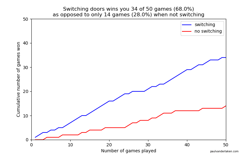
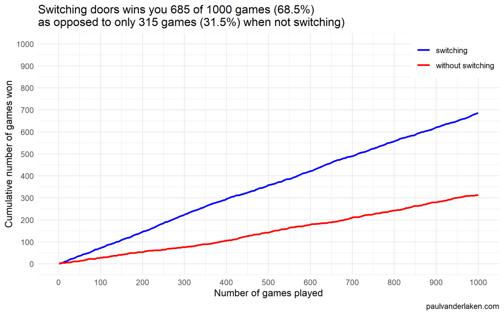
As we play more and more games against Monty Hall, it becomes very clear that you really, really, really need to switch doors in order to maximize the probability of winning a car.

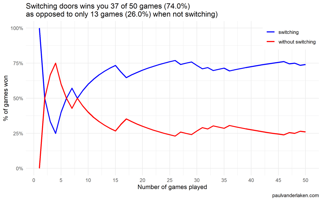
Actually, the more games we play, the closer the probability of winning in our sample gets to the actual probability.

Even after 1000 games, the probabilities are still not at their actual values. But, ultimately…

If you stick to your door, you end up with the car in only 33% of the cases.

If you switch to the other door, you end up with the car 66% of the time!

Simulation Code

In both Python and R, I wrote two scripts. You can find the most recent version of the code on my Github. However, I pasted the versions of March 4th 2020 below.

The first script contains a function simulating a single game of Monty Hall. A second script runs this function an X amount of times, and visualizes the outcomes as we play more and more games.

Python

simulate_game.py

import random

def simulate_game(make_switch=False, n_doors=3, seed=None):
    ''' 
    Simulate a game of Monty Hall
    For detailed information: https://en.wikipedia.org/wiki/Monty_Hall_problem
    Basically, there are several closed doors and behind only one of them is a prize.
    The player can choose one door at the start. 
    Next, the game master (Monty Hall) opens all the other doors, but one.
    Now, the player can stick to his/her initial choice or switch to the remaining closed door.
    If the prize is behind the player's final choice he/she wins.

    Keyword arguments:
    make_switch -- a boolean value whether the player switches after its initial choice and Monty Hall opening all other non-prize doors but one (default False)
    n_doors -- an integer value > 2, for the number of doors behind which one prize and (n-1) non-prizes (e.g., goats) are hidden (default 3)
    seed -- a seed to set (default None)
    '''

    # check the arguments
    if type(make_switch) is not bool:
        raise TypeError("`make_switch` must be boolean")
    if type(n_doors) is float:
        n_doors = int(n_doors)
        raise Warning("float value provided for `n_doors`: forced to integer value of", n_doors)
    if type(n_doors) is not int:
        raise TypeError("`n_doors` needs to be a positive integer > 2")
    if n_doors < 2:
        raise ValueError("`n_doors` needs to be a positive integer > 2")

    # if a seed was provided, set it
    if seed is not None:
        random.seed(seed)

    # sample one index for the door to hide the car behind
    prize_index = random.randint(0, n_doors - 1)

    # sample one index for the door initially chosen by the player
    choice_index = random.randint(0, n_doors - 1)

    # we can test for the current result
    current_result = prize_index == choice_index

    # now Monty Hall opens all doors the player did not choose, except for one door
    # next, he asks the player if he/she wants to make a switch
    if (make_switch):
        # if we do, we change to the one remaining door, which inverts our current choice
        # if we had already picked the prize door, the one remaining closed door has a nonprize
        # if we had not already picked the prize door, the one remaining closed door has the prize
        return not current_result
    else:
        # the player sticks with his/her original door,
        # which may or may not be the prize door
        return current_result

visualize_game_results.py

from simulate_game import simulate_game
from random import seed
from numpy import mean, cumsum
from matplotlib import pyplot as plt
import os

# set the seed here
# do not set the `seed` parameter in `simulate_game()`,
# as this will make the function retun `n_games` times the same results
seed(1)

# pick number of games you want to simulate
n_games = 1000

# simulate the games and store the boolean results
results_with_switching = [simulate_game(make_switch=True) for _ in range(n_games)]
results_without_switching = [simulate_game(make_switch=False) for _ in range(n_games)]

# make a equal-length list showing, for each element in the results, the game to which it belongs
games = [i + 1 for i in range(n_games)]

# generate a title based on the results of the simulations
title = f'Switching doors wins you {sum(results_with_switching)} of {n_games} games ({mean(results_with_switching) * 100:.1f}%)' + \
    '\n' + \
    f'as opposed to only {sum(results_without_switching)} games ({mean(results_without_switching) * 100:.1f}%) when not switching'

# set some basic plotting parameters
w = 8
h = 5

# make a line plot of the cumulative wins with and without switching
plt.figure(figsize=(w, h))
plt.plot(games, cumsum(results_with_switching), color='blue', label='switching')
plt.plot(games, cumsum(results_without_switching), color='red', label='no switching')
plt.axis([0, n_games, 0, n_games])
plt.title(title)
plt.legend()
plt.xlabel('Number of games played')
plt.ylabel('Cumulative number of games won')
plt.figtext(0.95, 0.03, 'paulvanderlaken.com', wrap=True, horizontalalignment='right', fontsize=6)

# you can uncomment this to see the results directly,
# but then python will not save the result to your directory
# plt.show()
# plt.close()

# create a directory to store the plots in
# if this directory does not yet exist
try:
    os.makedirs('output')
except OSError:
    None
plt.savefig('output/monty-hall_' + str(n_games) + '_python.png')

Visualizations (matplotlib)

R

simulate-game.R

Note that I wrote a second function, simulate_n_games, which just runs simulate_game an N number of times.

#' Simulate a game of Monty Hall
#' For detailed information: https://en.wikipedia.org/wiki/Monty_Hall_problem
#' Basically, there are several closed doors and behind only one of them is a prize.
#' The player can choose one door at the start. 
#' Next, the game master (Monty Hall) opens all the other doors, but one.
#' Now, the player can stick to his/her initial choice or switch to the remaining closed door.
#' If the prize is behind the player's final choice he/she wins.
#' 
#' @param make_switch A boolean value whether the player switches after its initial choice and Monty Hall opening all other non-prize doors but one. Defaults to `FALSE`
#' @param n_doors An integer value > 2, for the number of doors behind which one prize and (n-1) non-prizes (e.g., goats) are hidden. Defaults to `3L`
#' @param seed A seed to set. Defaults to `NULL`
#'
#' @return A boolean value indicating whether the player won the prize
#'
#' @examples 
#' simulate_game()
#' simulate_game(make_switch = TRUE)
#' simulate_game(make_switch = TRUE, n_doors = 5L, seed = 1)
simulate_game = function(make_switch = FALSE, n_doors = 3L, seed = NULL) {
  
  # check the arguments
  if (!is.logical(make_switch) | is.na(make_switch)) stop("`make_switch` needs to be TRUE or FALSE")
  if (is.double(n_doors)) {
    n_doors = as.integer(n_doors)
    warning(paste("double value provided for `n_doors`: forced to integer value of", n_doors))
  }
  if (!is.integer(n_doors) | n_doors < 2) stop("`n_doors` needs to be a positive integer > 2")
  
  # if a seed was provided, set it
  if (!is.null(seed)) set.seed(seed)
  
  # create a integer vector for the door indices
  doors = seq_len(n_doors)
  
  # create a boolean vector showing which doors are opened
  # all doors are closed at the start of the game
  isClosed = rep(TRUE, length = n_doors)
  
  # sample one index for the door to hide the car behind
  prize_index = sample(doors, size = 1)
  
  # sample one index for the door initially chosen by the player
  # this can be the same door as the prize door
  choice_index = sample(doors, size = 1)
  
  # now Monty Hall opens all doors the player did not choose
  # except for one door
  # if we have already picked the prize door, the one remaining closed door has a nonprize
  # if we have not picked the prize door, the one remaining closed door has the prize
  if (prize_index == choice_index) {
    # if we have the prize, Monty Hall can open all but two doors:
    #   ours, which we remove from the options to sample from and open
    #   and one goat-conceiling door, which we do not open
    isClosed[sample(doors[-prize_index], size = n_doors - 2)] = FALSE
  } else {
    # else, Monty Hall can also open all but two doors:
    #   ours
    #   and the prize-conceiling door
    isClosed[-c(prize_index, choice_index)] = FALSE
  }
  
  # now Monty Hall asks us whether we want to make a switch
  if (make_switch) {
    # if we decide to make a switch, we can pick the closed door that is not our door
    choice_index = doors[isClosed][doors[isClosed] != choice_index]
  }
  
  # we return a boolean value showing whether the player choice is the prize door
  return(choice_index == prize_index)
}


#' Simulate N games of Monty Hall
#' Calls the `simulate_game()` function `n` times and returns a boolean vector representing the games won
#' 
#' @param n An integer value for the number of times to call the `simulate_game()` function
#' @param seed A seed to set in the outer loop. Defaults to `NULL`
#' @param ... Any parameters to be passed to the `simulate_game()` function. 
#' No seed can be passed to the simulate_game function as that would result in `n` times the same result 
#'
#' @return A boolean vector indicating for each of the games whether the player won the prize
#'
#' @examples 
#' simulate_n_games(n = 100)
#' simulate_n_games(n = 500, make_switch = TRUE)
#' simulate_n_games(n = 1000, seed = 123, make_switch = TRUE, n_doors = 5L)
simulate_n_games = function(n, seed = NULL, make_switch = FALSE, ...) {
  # round the number of iterations to an integer value
  if (is.double(n)) {
    n = as.integer(n)
  }
  if (!is.integer(n) | n < 1) stop("`n_games` needs to be a positive integer > 1")
  # if a seed was provided, set it
  if (!is.null(seed)) set.seed(seed)
  return(vapply(rep(make_switch, n), simulate_game, logical(1), ...))
}

visualize-game-results.R

Note that we source in the simulate-game.R file to get access to the simulate_game and simulate_n_games functions.

Also note that I make a second plot here, to show the probabilities of winning converging to their real-world probability as we play more and more games.

source('R/simulate-game.R')

# install.packages('ggplot2')
library(ggplot2)

# set the seed here
# do not set the `seed` parameter in `simulate_game()`,
# as this will make the function return `n_games` times the same results
seed = 1

# pick number of games you want to simulate
n_games = 1000

# simulate the games and store the boolean results
results_without_switching = simulate_n_games(n = n_games, seed = seed, make_switch = FALSE)
results_with_switching = simulate_n_games(n = n_games, seed = seed, make_switch = TRUE)

# store the cumulative wins in a dataframe
results = data.frame(
  game = seq_len(n_games),
  cumulative_wins_without_switching = cumsum(results_without_switching),
  cumulative_wins_with_switching = cumsum(results_with_switching)
)

# function that turns values into nice percentages
format_percentage = function(values, digits = 1) {
  return(paste0(formatC(values * 100, digits = digits, format = 'f'), '%'))
}

# generate a title based on the results of the simulations
title = paste(
  paste0('Switching doors wins you ', sum(results_with_switching), ' of ', n_games, ' games (', format_percentage(mean(results_with_switching)), ')'),
  paste0('as opposed to only ', sum(results_without_switching), ' games (', format_percentage(mean(results_without_switching)), ') when not switching)'),
  sep = '\n'
)

# set some basic plotting parameters
linesize = 1 # size of the plotted lines
x_breaks = y_breaks = seq(from = 0, to = n_games, length.out = 10 + 1) # breaks of the axes
y_limits = c(0, n_games) # limits of the y axis - makes y limits match x limits
w = 8 # width for saving plot
h = 5 # height for saving plot
palette = setNames(c('blue', 'red'), nm = c('switching', 'without switching')) # make a named color scheme

# make a line plot of the cumulative wins with and without switching
ggplot(data = results) +
  geom_line(aes(x = game, y = cumulative_wins_with_switching, col = names(palette[1])), size = linesize) +
  geom_line(aes(x = game, y = cumulative_wins_without_switching, col = names(palette[2])), size = linesize) +
  scale_x_continuous(breaks = x_breaks) +
  scale_y_continuous(breaks = y_breaks, limits = y_limits) +
  scale_color_manual(values = palette) +
  theme_minimal() +
  theme(legend.position = c(1, 1), legend.justification = c(1, 1), legend.background = element_rect(fill = 'white', color = 'transparent')) +
  labs(x = 'Number of games played') +
  labs(y = 'Cumulative number of games won') +
  labs(col = NULL) +
  labs(caption = 'paulvanderlaken.com') +
  labs(title = title)

# save the plot in the output folder
# create the output folder if it does not exist yet
if (!file.exists('output')) dir.create('output', showWarnings = FALSE)
ggsave(paste0('output/monty-hall_', n_games, '_r.png'), width = w, height = h)


# make a line plot of the rolling % win chance with and without switching
ggplot(data = results) +
  geom_line(aes(x = game, y = cumulative_wins_with_switching / game, col = names(palette[1])), size = linesize) +
  geom_line(aes(x = game, y = cumulative_wins_without_switching / game, col = names(palette[2])), size = linesize) +
  scale_x_continuous(breaks = x_breaks) +
  scale_y_continuous(labels = function(x) format_percentage(x, digits = 0)) +
  scale_color_manual(values = palette) +
  theme_minimal() +
  theme(legend.position = c(1, 1), legend.justification = c(1, 1), legend.background = element_rect(fill = 'white', color = 'transparent')) +
  labs(x = 'Number of games played') +
  labs(y = '% of games won') +
  labs(col = NULL) +
  labs(caption = 'paulvanderlaken.com') +
  labs(title = title)


# save the plot in the output folder
# create the output folder if it does not exist yet
if (!file.exists('output')) dir.create('output', showWarnings = FALSE)
ggsave(paste0('output/monty-hall_perc_', n_games, '_r.png'), width = w, height = h)

Visualizations (ggplot2)

I specifically picked a seed (the second one I tried) in which not switching looked like it was better during the first few games played.

In R, I made an additional plot that shows the probabilities converging.

As we play more and more games, our results move to the actual probabilities of winning:

After the first four games, you could have erroneously concluded that not switching would result in better chances of you winning a sports car. However, in the long run, that is definitely not true.

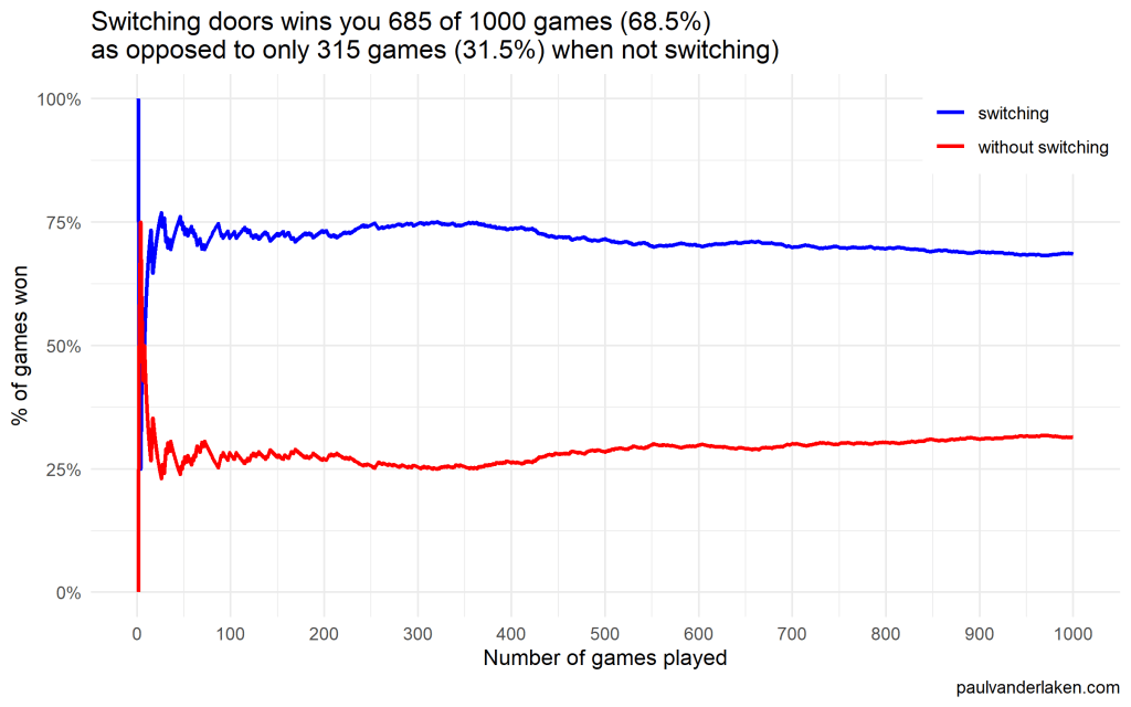
I was actually suprised to see that these lines look to be mirroring each other. But actually, that’s quite logical maybe… We already had the car with our initial door guess in those games. If we would have sticked to that initial choice of a door, we would have won, whereas all the cases where we switched, we lost.

Keep me posted!

I hope you enjoyed these simulations and visualizations, and am curious to see what you come up with yourself!

For instance, you could increase the number of doors in the game, or the number of goat-doors Monty Hall opens. When does it become a disadvantage to switch?

Cover image via Medium

Bayes theorem, and making probability intuitive – by 3Blue1Brown

Bayes theorem, and making probability intuitive – by 3Blue1Brown

This video I’ve been meaning to watch for a while now. It another great visual explanation of a statistics topic by the 3Blue1Brown Youtube channel (which I’ve covered before, multiple times).

This time, it’s all about Bayes theorem, and I just love how Grant Sanderson explains the concept so visually. He argues that rather then memorizing the theorem, we’d rather learn how to draw out the context. Have a look at the video, or read my summary below:

Grant Sanderson explains the concept very visually following an example outlined in Daniel Kahneman’s and Amos Tversky’s book Thinking Fast, Thinking Slow:

Steve is very shy and withdrawn, invariably helpful but with very little interest in people or in the world of reality. A meek and tidy soul, he has a need for order and structure, and a passion for detail.”

Is Steve more likely to be a librarian or a farmer?

Question from Thinking Fast, Thinking Slow

What was your first guess?

Kahneman and Tversky argue that people take into account Steve’s disposition and therefore lean towards librarians.

However, few people take into account that librarians are quite scarce in our society, which is rich with farmers. For every librarian, there are 20+ farmers. Hence, despite the disposition, Steve is probably more like to be a farmer.

https://www.youtube.com/watch?v=HZGCoVF3YvM&feature=youtu.be

Rather than remembering the upper theorem, Grant argues that it’s often easier to just draw out the rectangle of probabilities below.

Try it out for yourself using another example by Kahneman and Tversky:

https://www.youtube.com/watch?v=HZGCoVF3YvM&feature=youtu.be
Calibrating algorithmic predictions with logistic regression

Calibrating algorithmic predictions with logistic regression

I found this interesting blog by Guilherme Duarte Marmerola where he shows how the predictions of algorithmic models (such as gradient boosted machines, or random forests) can be calibrated by stacking a logistic regression model on top of it: by using the predicted leaves of the algorithmic model as features / inputs in a subsequent logistic model.

When working with ML models such as GBMs, RFs, SVMs or kNNs (any one that is not a logistic regression) we can observe a pattern that is intriguing: the probabilities that the model outputs do not correspond to the real fraction of positives we see in real life.

Guilherme’s in his blog post

This is visible in the predictions of the light gradient boosted machine (LGBM) Guilherme trained: its predictions range only between ~ 0.45 and ~ 0.55. In contrast, the actual fraction of positive observations in those groups is much lower or higher (ranging from ~ 0.10 to ~0.85).

Motivated by sklearn’s topic Probability Calibration and the paper Practical Lessons from Predicting Clicks on Ads at Facebook, Guilherme continues to show how the output probabilities of a tree-based model can be calibrated, while simultenously improving its accuracy.

I highly recommend you look at Guilherme’s code to see for yourself what’s happening behind the scenes, but basically it’s this:

  • Train an algorithmic model (e.g., GBM) using your regular features (data)
  • Retrieve the probabilities GBM predicts
  • Retrieve the leaves (end-nodes) in which the GBM sorts the observations
  • Turn the array of leaves into a matrix of (one-hot-encoded) features, showing for each observation which leave it ended up in (1) and which not (many 0’s)
  • Basically, until now, you have used the GBM to reduce the original features to a new, one-hot-encoded matrix of binary features
  • Now you can use that matrix of new features as input for a logistic regression model predicting your target (Y) variable
  • Apparently, those logistic regression predictions will show a greater spread of probabilities with the same or better accuracy

Here’s a visual depiction from Guilherme’s blog, with the original GBM predictions on the X-axis, and the new logistic predictions on the Y-axis.

As you can see, you retain roughly the same ordering, but the logistic regression probabilities spread is much larger.

Now according to Guilherme and the Facebook paper he refers to, the accuracy of the logistic predictions should not be less than those of the original algorithmic method.

Much better. The calibration plot of lgbm+lr is much closer to the ideal. Now, when the model tells us that the probability of success is 60%, we can actually be much more confident that this is the true fraction of success! Let us now try this with the ET model.

Guilherme in https://gdmarmerola.github.io/probability-calibration/

In his blog, Guilherme shows the same process visually for an Extremely Randomized Trees model, so I highly recommend you read the original article. Also, you can find the complete code on his GitHub.

E-Book: Probabilistic Programming & Bayesian Methods for Hackers

E-Book: Probabilistic Programming & Bayesian Methods for Hackers

The Bayesian method is the natural approach to inference, yet it is hidden from readers behind chapters of slow, mathematical analysis. Nevertheless, mathematical analysis is only one way to “think Bayes”. With cheap computing power, we can now afford to take an alternate route via probabilistic programming.

Cam Davidson-Pilon wrote the book Bayesian Methods for Hackers as a introduction to Bayesian inference from a computational and understanding-first, mathematics-second, point of view.

The book is available via Amazon, but you can access an online e-book for free. There’s also an associated GitHub repo.

The book explains Bayesian principles with code and visuals. For instance:

%matplotlib inline
from IPython.core.pylabtools import figsize
import numpy as np
from matplotlib import pyplot as plt
figsize(11, 9)

import scipy.stats as stats

dist = stats.beta
n_trials = [0, 1, 2, 3, 4, 5, 8, 15, 50, 500]
data = stats.bernoulli.rvs(0.5, size=n_trials[-1])
x = np.linspace(0, 1, 100)

for k, N in enumerate(n_trials):
    sx = plt.subplot(len(n_trials)/2, 2, k+1)
    plt.xlabel("$p$, probability of heads") \
        if k in [0, len(n_trials)-1] else None
    plt.setp(sx.get_yticklabels(), visible=False)
    heads = data[:N].sum()
    y = dist.pdf(x, 1 + heads, 1 + N - heads)
    plt.plot(x, y, label="observe %d tosses,\n %d heads" % (N, heads))
    plt.fill_between(x, 0, y, color="#348ABD", alpha=0.4)
    plt.vlines(0.5, 0, 4, color="k", linestyles="--", lw=1)

    leg = plt.legend()
    leg.get_frame().set_alpha(0.4)
    plt.autoscale(tight=True)


plt.suptitle("Bayesian updating of posterior probabilities",
             y=1.02,
             fontsize=14)

plt.tight_layout()

I can only recommend you start with the online version of Bayesian Methods for Hackers, but note that the print version helps sponsor the author ánd includes some additional features:

  • Additional Chapter on Bayesian A/B testing
  • Updated examples
  • Answers to the end of chapter questions
  • Additional explanation, and rewritten sections to aid the reader.

If you’re interested in learning more about Bayesian analysis, I recommend these other books:

Logistic regression is not fucked, by Jake Westfall

Logistic regression is not fucked, by Jake Westfall

Recently, I came across a social science paper that had used linear probability regression. I had never heard of linear probability models (LPM), but it seems just an application of ordinary least squares regression but to a binomial dependent variable.

According to some, LPM is a commonly used alternative for logistic regression, which is what I was learned to use when the outcome is binary.

Potentially because of my own social science background (HRM), using linear regression without a link transformation on binary data just seems very unintuitive and error-prone to me. Hence, I sought for more information.

I particularly liked this article by Jake Westfall, which he dubbed “Logistic regression is not fucked”, following a series of blogs in which he talks about methods that are fucked and not useful.

Jake explains the classification problem and both methods inner workings in a very straightforward way, using great visual aids. He shows how LMP would differ from logistic models, and why its proposed benefits are actually not so beneficial. Maybe I’m in my bubble, but Jake’s arguments resonated.

Read his article yourself:
http://jakewestfall.org/blog/index.php/2018/03/12/logistic-regression-is-not-fucked/

Here’s the summary:
Arguments against the use of logistic regression due to problems with “unobserved heterogeneity” proceed from two distinct sets of premises. The first argument points out that if the binary outcome arises from a latent continuous outcome and a threshold, then observed effects also reflect latent heteroskedasticity. This is true, but only relevant in cases where we actually care about an underlying continuous variable, which is not usually the case. The second argument points out that logistic regression coefficients are not collapsible over uncorrelated covariates, and claims that this precludes any substantive interpretation. On the contrary, we can interpret logistic regression coefficients perfectly well in the face of non-collapsibility by thinking clearly about the conditional probabilities they refer to. 

GIF visualizations of Type 1 and Type 2 error in relation to sample size

GIF visualizations of Type 1 and Type 2 error in relation to sample size

On twitter, I came across the tweet below showing some great GIF visualizations on the dangers of taking small samples.

Created by Andrew Stewart, and tweeted by John Holbein, the visuals show samples taken from a normal distributed variable with a mean of 10 and a standard deviation of 2. In the left section, Andrew took several samples of 20. In the right section, the sample size was increased to 500.

Just look at how much the distribution and the estimated mean change for small samples!

Andrew shared his code via Github, so I was able to download and tweak it a bit to make my own version.

Andrew’s version seems to be concerned with potential Type 1 errors when small samples are taken. A type 1 error occurs when you reject your null hypothesis (you reject “there is no effect”) while you should not have (“there is actually no effect”).

You can see this in the distributions Andrew sampled from in the tweet above. The data for conditions A (red) and B (blue) are sampled from the same distribution, with mean 10 and standard deviation 2. While there should thus be no difference between the groups, small samples may cause researchers to erroneously conclude that there is a difference between conditions A and B due to the observed data.

We could use Andrew’s basic code and tweak it a bit to simulate a setting in which Type 2 errors could occur. A type 2 error occurs when you do not reject your null hypothesis (you maintain “there is no effect”) whereas there is actually an effect, which you thus missed.

To illustrate this, I adapted Andrew’s code: I sampled data for condition B using a normal distribution with a slightly higher mean value of 11, as opposed to the mean of 10 for condition A. The standard deviation remained the same in both conditions (2).

Next, I drew 10 data samples from both conditions, for various sample sizes: 10, 20, 50, 100, 250, 500, and even 1000. After drawing these samples for both conditions, I ran a simple t-test to compare their means, and estimate whether any observed difference could be considered significant (at the alpha = 0.05 level [95%]).

In the end, I visualized the results in a similar fashion as Andrew did. Below are the results.

As you can see, only in 1 of our 10 samples with size 10 were we able to conclude that there was a difference in means. This means that we are 90% incorrect.

After increasing the sample size to 100, we strongly decrease our risk of Type 2 errors. Now we are down to 20% incorrect conclusions.

At this point though, I decided to rework Andrew’s code even more, to clarify the message.

I was not so much interested in the estimated distribution, which currently only distracts. Similarly, the points and axes can be toned down a bit. Moreover, I’d like to be able to see when my condition samples have significant different means, so let’s add a 95% confidence interval, and some text. Finally, let’s increase the number of drawn samples per sample size to, say, 100, to reduce the influence that chance may have on our Type 2 error rate estimations.

Let’s rerun the code and generate some GIFs!

The below demonstrates that small samples of only 10 observations per condition have only about a 11% probability of detecting the difference in means when the true difference is 1 (or half the standard deviation [i.e., 2]). In other words, there is a 89% chance of a Type 2 error occuring, where we fail to reject the null hypothesis due to sampling error.

Doubling the sample size to 20, more than doubles our detection rate. We now correctly identify the difference 28% of the time.

With 50 observations the Type 2 error rate drops to 34%.

Finally, with sample sizes of 100+ our results become somewhat reliable. We are now able to correctly identify the true difference over 95% of the times.

With a true difference of half the standard deviation, further increases in the sample size start to lose their added value. For instance, a sample size of 250 already uncovers the effect in all 100 samples, so doubling to 500 would not make sense.

I hope you liked the visuals. If you are interested in these kind of analysis, or want to estimate how large of a sample you need in your own study, have a look at power analysis. These analysis can help you determine the best setup for your own research initiatives.


If you’d like to reproduce or change the graphics above, here is the R code. Note that it is strongly inspired by Andrew’s original code.

# setup -------------------------------------------------------------------

# The new version of gganimate by Thomas Lin Pedersen - @thomasp85 may not yet be on CRAN so use devtools
# devtools::install_github('thomasp85/gganimate')

library(ggplot2)
library(dplyr)
library(glue)
library(magrittr)
library(gganimate)


# main function to create and save the animation --------------------------

save_created_animation = function(sample_size, 
                                  samples = 100, 
                                  colors = c("red", "blue"), 
                                  Amean = 10, Asd = 2, 
                                  Bmean = 11, Bsd = 2, 
                                  seed = 1){
  
  ### generate the data
  
  # set the seed
  set.seed(seed)

  # set the names of our variables
  cnames <- c("Score", "Condition", "Sample") 

  # create an empty data frame to store our simulated samples
  df <- data.frame(matrix(rep(NA_character_, samples * sample_size * 2 * length(cnames)), ncol = length(cnames), dimnames = list(NULL, cnames)), stringsAsFactors = FALSE)
  
  # create an empty vector to store whether t.test identifies significant difference in means
  result <- rep(NA_real_, samples)
  
  # run a for loop to iteratively simulate the samples
  for (i in seq_len(samples)) {
    # draw random samples for both conditions
    a <- rnorm(sample_size, mean = Amean, sd = Asd) 
    b <- rnorm(sample_size, mean = Bmean, sd = Bsd) 
    # test whether there the difference in the means of samples is significant 
    result[i] = t.test(a, b)$p.value < 0.05
    # add the identifiers for both conditions, and for the sample iteration
    a <- cbind(a, rep(glue("A\n(μ={Amean}; σ={Asd})"), sample_size), rep(i, sample_size))
    b <- cbind(b, rep(glue("B\n(μ={Bmean}; σ={Bsd})"), sample_size), rep(i, sample_size))
    # bind the two sampled conditions together in a single matrix and set its names
    ab <- rbind(a, b)
    colnames(ab) <- cnames
    # push the matrix into its reserved spot in the reserved dataframe
    df[((i - 1) * sample_size * 2 + 1):((i * (sample_size * 2))), ] <- ab
  }


  ### prepare the data
  
  # create a custom function to calculate the standard error
  se <- function(x) sd(x) / sqrt(length(x))
  
  df %>%
    # switch data types for condition and score
    mutate(Condition = factor(Condition)) %>%
    mutate(Score = as.numeric(Score)) %>%
    # calculate the mean and standard error to be used in the error bar
    group_by(Condition, Sample) %>%
    mutate(Score_Mean = mean(Score)) %>% 
    mutate(Score_SE = se(Score)) ->
    df
  
  # create a new dataframe storing the result per sample 
  df_result <- data.frame(Sample = unique(df$Sample), Result = result, stringsAsFactors = FALSE)
  
  # and add this result to the dataframe
  df <- left_join(df, df_result, by = "Sample")
  
  # identify whether not all but also not zero samples identified the difference in means
  # if so, store the string "only ", later to be added into the subtitle
  result_mention_adj <- ifelse(sum(result) != 0 & sum(result) < length(result), "only ", "")


  ### create a custom theme
  
  textsize <- 16
  
  my_theme <- theme(
    text = element_text(size = textsize),
    axis.title.x = element_text(size = textsize),
    axis.title.y = element_text(size = textsize),
    axis.text.y = element_text(hjust = 0.5, vjust = 0.75),
    axis.text = element_text(size = textsize),
    legend.title = element_text(size = textsize),
    legend.text =  element_text(size = textsize),
    legend.position = "right",
    plot.title = element_text(lineheight = .8, face = "bold", size = textsize),
    panel.border = element_blank(),
    panel.grid.minor = element_blank(),
    panel.grid.major = element_blank(),
    axis.line = element_line(color = "grey", size = 0.5, linetype = "solid"),
    axis.ticks = element_line(color = "grey")
  )
  
  # store the chosen colors in a named vector for use as palette, 
  # and add the colors for (in)significant results
  COLORS = c(colors, "black", "darkgrey")
  names(COLORS) = c(levels(df$Condition), "1", "0")
  
  
  ### create the animated plot
  
  df %>%
    ggplot(aes(y = Score, x = Condition, fill = Condition, color = Condition)) +
    geom_point(aes(y = Score), position = position_jitter(width = 0.25), alpha = 0.20, stroke = NA, size = 1) +
    geom_errorbar(aes(ymin = Score_Mean - 1.96 * Score_SE, ymax = Score_Mean + 1.96 * Score_SE), width = 0.10, size = 1.5) +
    geom_text(data = . %>% filter(as.numeric(Condition) == 1), 
              aes(x = levels(df$Condition)[1], y = Result * 10 + 5, 
                  label = ifelse(Result == 1, "Significant!", "Insignificant!"),
                  col = as.character(Result)), position = position_nudge(x = -0.5), size = 5) +
    transition_states(Sample, transition_length = 1, state_length = 2) +
    guides(fill = FALSE) +
    guides(color = FALSE) +
    scale_x_discrete(limits = rev(levels(df$Condition)), breaks = rev(levels(df$Condition))) +
    scale_y_continuous(limits = c(0, 20), breaks = seq(0, 20, 5)) +
    scale_color_manual(values = COLORS) +
    scale_fill_manual(values = COLORS) +
    coord_flip() +
    theme_minimal() +
    my_theme +
    labs(x = "Condition") +
    labs(y = "Dependent variable") +
    labs(title = glue("When drawing {samples} samples of {sample_size} observations per condition")) +
    labs(subtitle = glue("The difference in means is identified in {result_mention_adj}{sum(result)} of {length(result)} samples")) +
    labs(caption = "paulvanderlaken.com | adapted from github.com/ajstewartlang") ->
    ani
  
  ### save the animated plot
  
  anim_save(paste0(paste("sampling_error", sample_size, sep = "_"), ".gif"), 
            animate(ani, nframes = samples * 10, duration = samples, width = 600, height = 400))
  
}


# call animation function for different sample sizes ----------------------

# !!! !!! !!!
# the number of samples is set to 100 by default
# if left at 100, each function call will take a long time!
# add argument `samples = 10` to get quicker results, like so:
# save_created_animation(10, samples = 10)
# !!! !!! !!!

save_created_animation(10)
save_created_animation(20)
save_created_animation(50)
save_created_animation(100)
save_created_animation(250)
save_created_animation(500)