Sharon’s list contains many neat tricks, some of which less well-known base functions, others features of more niche packages. Here’s the ones I am definitely adding to my R tricks overview and want to highlight here as well:
Categorize values into interval cut()
Convert numbers that came in as strings with commas to R numbers with readr::parse_number(mydf$mycol)
Create a searchable, sortable HTML table in 1 line of code with DT::datatable(mydf, filter = 'top')
Display a fraction between 0 and 1 as a percentage with scales::percent(myfraction)
Generate a vector of 1:length(myvec) with seq_along(myvec)
The Bayesian method is the natural approach to inference, yet it is hidden from readers behind chapters of slow, mathematical analysis. Nevertheless, mathematical analysis is only one way to “think Bayes”. With cheap computing power, we can now afford to take an alternate route via probabilistic programming.
Cam Davidson-Pilon wrote the book Bayesian Methods for Hackers as a introduction to Bayesian inference from a computational and understanding-first, mathematics-second, point of view.
The book explains Bayesian principles with code and visuals. For instance:
%matplotlib inline
from IPython.core.pylabtools import figsize
import numpy as np
from matplotlib import pyplot as plt
figsize(11, 9)

import scipy.stats as stats

dist = stats.beta
n_trials = [0, 1, 2, 3, 4, 5, 8, 15, 50, 500]
data = stats.bernoulli.rvs(0.5, size=n_trials[-1])
x = np.linspace(0, 1, 100)

for k, N in enumerate(n_trials):
    sx = plt.subplot(len(n_trials)/2, 2, k+1)
    plt.xlabel("$p$, probability of heads") \
        if k in [0, len(n_trials)-1] else None
    plt.setp(sx.get_yticklabels(), visible=False)
    heads = data[:N].sum()
    y = dist.pdf(x, 1 + heads, 1 + N - heads)
    plt.plot(x, y, label="observe %d tosses,\n %d heads" % (N, heads))
    plt.fill_between(x, 0, y, color="#348ABD", alpha=0.4)
    plt.vlines(0.5, 0, 4, color="k", linestyles="--", lw=1)

    leg = plt.legend()
    leg.get_frame().set_alpha(0.4)
    plt.autoscale(tight=True)


plt.suptitle("Bayesian updating of posterior probabilities",
             y=1.02,
             fontsize=14)

plt.tight_layout()
I can only recommend you start with the online version of Bayesian Methods for Hackers, but note that the print version helps sponsor the author ánd includes some additional features:
Additional Chapter on Bayesian A/B testing
Updated examples
Answers to the end of chapter questions
Additional explanation, and rewritten sections to aid the reader.
If you’re interested in learning more about Bayesian analysis, I recommend these other books:
Kelly Bodwin is an Assistant Professor of Statistics at Cal Poly (San Luis Obispo) and teaches multiple courses in statistical programming. Based on her experiences, she compiled this great shortlist of five great tips to teach programming.
Kelly truly mentions some best practices, so have a look at the original article, which she summarized as follows:
1. Define your terms
Establish basic coding vocabulary early on.
What is the console, a script, the environment?
What is a function a variable, a dataframe?
What are strings, characters, and integers?
2. Be deliberate about teaching versus bypassing peripheral skills
Use tools like RStudio Cloud, R Markdown, and the usethis package to shelter students from setup.
Personally, this is what kept me from learning Python for a long time — the issues with starting up.
Kelly provides this personal checklist of peripherals skills including which ones she includes in her introductory courses:
The best way to debug is to read your process out loud as a sentence.
Basically Kelly argues that you should learn students to be able to translate their requirements into (R) code.
When you continuously read out your code as step-by-step computer instructions, students will learn to translate their own desires to computer instructions.
Created by Andrew Stewart, and tweeted by John Holbein, the visuals show samples taken from a normal distributed variable with a mean of 10 and a standard deviation of 2. In the left section, Andrew took several samples of 20. In the right section, the sample size was increased to 500.
Just look at how much the distribution and the estimated mean change for small samples!
Andrew shared his code via Github, so I was able to download and tweak it a bit to make my own version.
Andrew’s version seems to be concerned with potential Type 1 errors when small samples are taken. A type 1 error occurs when you reject your null hypothesis (you reject “there is no effect”) while you should not have (“there is actually no effect”).
You can see this in the distributions Andrew sampled from in the tweet above. The data for conditions A (red) and B (blue) are sampled from the same distribution, with mean 10 and standard deviation 2. While there should thus be no difference between the groups, small samples may cause researchers to erroneously conclude that there is a difference between conditions A and B due to the observed data.
We could use Andrew’s basic code and tweak it a bit to simulate a setting in which Type 2 errors could occur. A type 2 error occurs when you do not reject your null hypothesis (you maintain “there is no effect”) whereas there is actually an effect, which you thus missed.
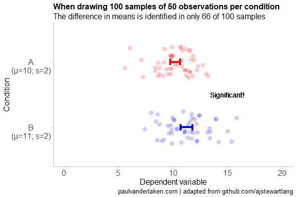
To illustrate this, I adapted Andrew’s code: I sampled data for condition B using a normal distribution with a slightly higher mean value of 11, as opposed to the mean of 10 for condition A. The standard deviation remained the same in both conditions (2).
Next, I drew 10 data samples from both conditions, for various sample sizes: 10, 20, 50, 100, 250, 500, and even 1000. After drawing these samples for both conditions, I ran a simple t-test to compare their means, and estimate whether any observed difference could be considered significant (at the alpha = 0.05 level [95%]).
In the end, I visualized the results in a similar fashion as Andrew did. Below are the results.
As you can see, only in 1 of our 10 samples with size 10 were we able to conclude that there was a difference in means. This means that we are 90% incorrect.
After increasing the sample size to 100, we strongly decrease our risk of Type 2 errors. Now we are down to 20% incorrect conclusions.
At this point though, I decided to rework Andrew’s code even more, to clarify the message.
I was not so much interested in the estimated distribution, which currently only distracts. Similarly, the points and axes can be toned down a bit. Moreover, I’d like to be able to see when my condition samples have significant different means, so let’s add a 95% confidence interval, and some text. Finally, let’s increase the number of drawn samples per sample size to, say, 100, to reduce the influence that chance may have on our Type 2 error rate estimations.
Let’s rerun the code and generate some GIFs!
The below demonstrates that small samples of only 10 observations per condition have only about a 11% probability of detecting the difference in means when the true difference is 1 (or half the standard deviation [i.e., 2]). In other words, there is a 89% chance of a Type 2 error occuring, where we fail to reject the null hypothesis due to sampling error.
Doubling the sample size to 20, more than doubles our detection rate. We now correctly identify the difference 28% of the time.
With 50 observations the Type 2 error rate drops to 34%.
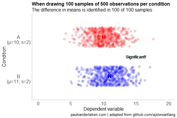
Finally, with sample sizes of 100+ our results become somewhat reliable. We are now able to correctly identify the true difference over 95% of the times.
With a true difference of half the standard deviation, further increases in the sample size start to lose their added value. For instance, a sample size of 250 already uncovers the effect in all 100 samples, so doubling to 500 would not make sense.
I hope you liked the visuals. If you are interested in these kind of analysis, or want to estimate how large of a sample you need in your own study, have a look at power analysis. These analysis can help you determine the best setup for your own research initiatives.
If you’d like to reproduce or change the graphics above, here is the R code. Note that it is strongly inspired by Andrew’s original code.
# setup -------------------------------------------------------------------

# The new version of gganimate by Thomas Lin Pedersen - @thomasp85 may not yet be on CRAN so use devtools
# devtools::install_github('thomasp85/gganimate')

library(ggplot2)
library(dplyr)
library(glue)
library(magrittr)
library(gganimate)


# main function to create and save the animation --------------------------

save_created_animation = function(sample_size,
                                  samples = 100,
                                  colors = c("red", "blue"),
                                  Amean = 10, Asd = 2,
                                  Bmean = 11, Bsd = 2,
                                  seed = 1){

  ### generate the data

  # set the seed
  set.seed(seed)

  # set the names of our variables
  cnames <- c("Score", "Condition", "Sample")

  # create an empty data frame to store our simulated samples
  df <- data.frame(matrix(rep(NA_character_, samples * sample_size * 2 * length(cnames)), ncol = length(cnames), dimnames = list(NULL, cnames)), stringsAsFactors = FALSE)

  # create an empty vector to store whether t.test identifies significant difference in means
  result <- rep(NA_real_, samples)

  # run a for loop to iteratively simulate the samples
  for (i in seq_len(samples)) {
    # draw random samples for both conditions
    a <- rnorm(sample_size, mean = Amean, sd = Asd)
    b <- rnorm(sample_size, mean = Bmean, sd = Bsd)
    # test whether there the difference in the means of samples is significant
    result[i] = t.test(a, b)$p.value < 0.05
    # add the identifiers for both conditions, and for the sample iteration
    a <- cbind(a, rep(glue("A\n(μ={Amean}; σ={Asd})"), sample_size), rep(i, sample_size))
    b <- cbind(b, rep(glue("B\n(μ={Bmean}; σ={Bsd})"), sample_size), rep(i, sample_size))
    # bind the two sampled conditions together in a single matrix and set its names
    ab <- rbind(a, b)
    colnames(ab) <- cnames
    # push the matrix into its reserved spot in the reserved dataframe
    df[((i - 1) * sample_size * 2 + 1):((i * (sample_size * 2))), ] <- ab
  }


  ### prepare the data

  # create a custom function to calculate the standard error
  se <- function(x) sd(x) / sqrt(length(x))

  df %>%
    # switch data types for condition and score
    mutate(Condition = factor(Condition)) %>%
    mutate(Score = as.numeric(Score)) %>%
    # calculate the mean and standard error to be used in the error bar
    group_by(Condition, Sample) %>%
    mutate(Score_Mean = mean(Score)) %>%
    mutate(Score_SE = se(Score)) ->
    df

  # create a new dataframe storing the result per sample
  df_result <- data.frame(Sample = unique(df$Sample), Result = result, stringsAsFactors = FALSE)

  # and add this result to the dataframe
  df <- left_join(df, df_result, by = "Sample")

  # identify whether not all but also not zero samples identified the difference in means
  # if so, store the string "only ", later to be added into the subtitle
  result_mention_adj <- ifelse(sum(result) != 0 & sum(result) < length(result), "only ", "")


  ### create a custom theme

  textsize <- 16

  my_theme <- theme(
    text = element_text(size = textsize),
    axis.title.x = element_text(size = textsize),
    axis.title.y = element_text(size = textsize),
    axis.text.y = element_text(hjust = 0.5, vjust = 0.75),
    axis.text = element_text(size = textsize),
    legend.title = element_text(size = textsize),
    legend.text =  element_text(size = textsize),
    legend.position = "right",
    plot.title = element_text(lineheight = .8, face = "bold", size = textsize),
    panel.border = element_blank(),
    panel.grid.minor = element_blank(),
    panel.grid.major = element_blank(),
    axis.line = element_line(color = "grey", size = 0.5, linetype = "solid"),
    axis.ticks = element_line(color = "grey")
  )

  # store the chosen colors in a named vector for use as palette,
  # and add the colors for (in)significant results
  COLORS = c(colors, "black", "darkgrey")
  names(COLORS) = c(levels(df$Condition), "1", "0")


  ### create the animated plot

  df %>%
    ggplot(aes(y = Score, x = Condition, fill = Condition, color = Condition)) +
    geom_point(aes(y = Score), position = position_jitter(width = 0.25), alpha = 0.20, stroke = NA, size = 1) +
    geom_errorbar(aes(ymin = Score_Mean - 1.96 * Score_SE, ymax = Score_Mean + 1.96 * Score_SE), width = 0.10, size = 1.5) +
    geom_text(data = . %>% filter(as.numeric(Condition) == 1),
              aes(x = levels(df$Condition)[1], y = Result * 10 + 5,
                  label = ifelse(Result == 1, "Significant!", "Insignificant!"),
                  col = as.character(Result)), position = position_nudge(x = -0.5), size = 5) +
    transition_states(Sample, transition_length = 1, state_length = 2) +
    guides(fill = FALSE) +
    guides(color = FALSE) +
    scale_x_discrete(limits = rev(levels(df$Condition)), breaks = rev(levels(df$Condition))) +
    scale_y_continuous(limits = c(0, 20), breaks = seq(0, 20, 5)) +
    scale_color_manual(values = COLORS) +
    scale_fill_manual(values = COLORS) +
    coord_flip() +
    theme_minimal() +
    my_theme +
    labs(x = "Condition") +
    labs(y = "Dependent variable") +
    labs(title = glue("When drawing {samples} samples of {sample_size} observations per condition")) +
    labs(subtitle = glue("The difference in means is identified in {result_mention_adj}{sum(result)} of {length(result)} samples")) +
    labs(caption = "paulvanderlaken.com | adapted from github.com/ajstewartlang") ->
    ani

  ### save the animated plot

  anim_save(paste0(paste("sampling_error", sample_size, sep = "_"), ".gif"),
            animate(ani, nframes = samples * 10, duration = samples, width = 600, height = 400))

}


# call animation function for different sample sizes ----------------------

# !!! !!! !!!
# the number of samples is set to 100 by default
# if left at 100, each function call will take a long time!
# add argument `samples = 10` to get quicker results, like so:
# save_created_animation(10, samples = 10)
# !!! !!! !!!

save_created_animation(10)
save_created_animation(20)
save_created_animation(50)
save_created_animation(100)
save_created_animation(250)
save_created_animation(500)
Yan Holtz recently created a neat little overview of handy R Markdown tips and tricks that improve the appearance of output documents. He dubbed this overview Pimp my RMD. Have a look, it’s worth it!
The website PapersWithCode.com lists all scientific publications of which the codes are open-sourced on GitHub. Moreover, you can sort these papers by the stars they accumulated on Github over the past days.
The authors, @rbstojnic and @rosstaylor90, just made this in their spare time. Thank you, sirs!
Papers with Code allows you to quickly browse state-of-the-art research on GANs and the code behind them, for instance. Alternatively, you can browse for research and code on sentiment analysis or LSTMs.


