Both in science and business, we often experience difficulties collecting enough data to test our hypotheses, either because target groups are small or hard to access, or because data collection entails prohibitive costs.
Such obstacles may result in data sets that are too small for the complexity of the statistical model needed to answer the questions we’re really interested in.
This unique book provides guidelines and tools for implementing solutions to issues that arise in small sample studies. Each chapter illustrates statistical methods that allow researchers and analysts to apply the optimal statistical model for their research question when the sample is too small.
This book will enable anyone working with data to test their hypotheses even when the statistical model required for answering their questions are too complex for the sample sizes they can collect. The covered statistical models range from the estimation of a population mean to models with latent variables and nested observations, and solutions include both classical and Bayesian methods. All proposed solutions are described in steps researchers can implement with their own data and are accompanied with annotated syntax in R.
We can’t just throw data into machines and expect to see any meaning […], we need to think [about this]. I see a strong trend in the practitioners community to just automate everything, to just throw data into a black box and expect to get money out of it, and I really don’t believe in that.
All pictures below are slides from the above video.
My summary / interpretation
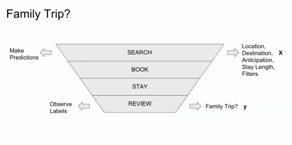
Lucas highlights an example he has been working on at Booking.com, where they seek to predict which searching activities on their website are for family trips.
What happens is that people forget to specify that they intend to travel as a family, forget to input one/two/three child travellers will come along on the trip, and end up not being able to book the accomodations that come up during their search. If Booking.com would know, in advance, that people (may) be searching for family accomodations, they can better guide these bookers to family arrangements.
The problem here is that many business processes in real life look and act like a funnel. Samples drop out of the process during the course of it. So too the user search activity on Booking.com’s website acts like a funnel.
People come to search for arrangements
Less people end up actually booking arrangements
Even less people actually go on their trip
And even less people then write up a review
However, only for those people that end up writing a review, Booking.com knows 100% certain that they it concerned a family trip, as that is the moment the user can specify so. Of all other people, who did not reach stage 4 of the funnel, Booking.com has no (or not as accurate an) idea whether they were looking for family trips.
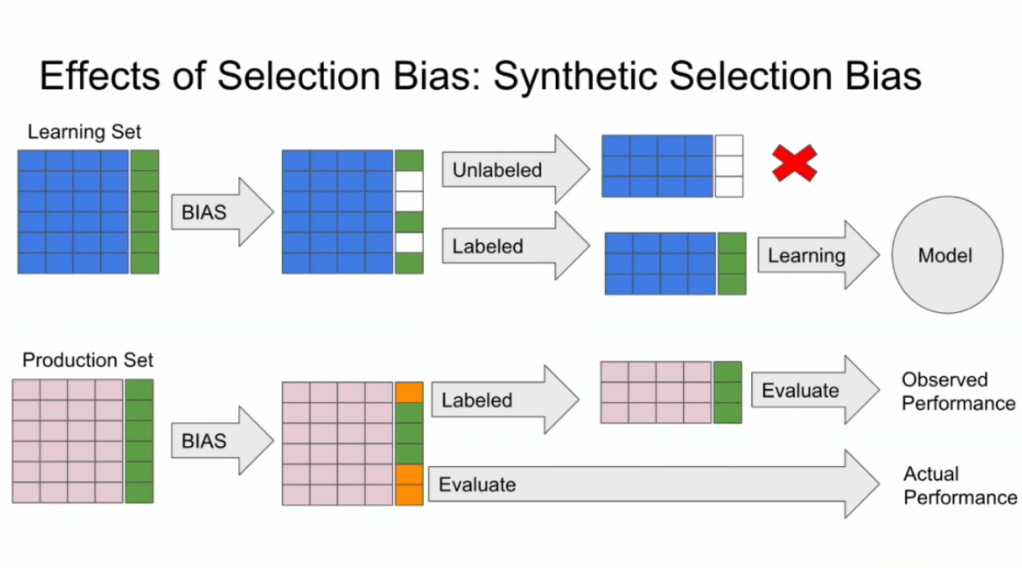
Such a funnel thus inherently produces business data with selection bias in it. Only for people making it to the review stage we know whether they were family trips or not. And only those labeled data can be used to train our machine learning model.
And now for the issue: if you train and evaluate a machine learning model on data generated with such a selection bias, your observed performance metrics will not reflect the actual performance of your machine learning model!
Actually, they are pretty much overestimates.
This is very much an issue, even though many ML practitioners don’t see aware. Selection bias makes us blind as to the real performance of our machine learning models. It produces high variance in the region of our feature space where labels are missing. This leads us to being overconfident in our ability to predict whether some user is looking for a family trip. And if the mechanism causing the selection bias is still there, we could never find out that we are overconfident. Consistently estimating, say, 30% of people are looking for family trips, whereas only 25% are.
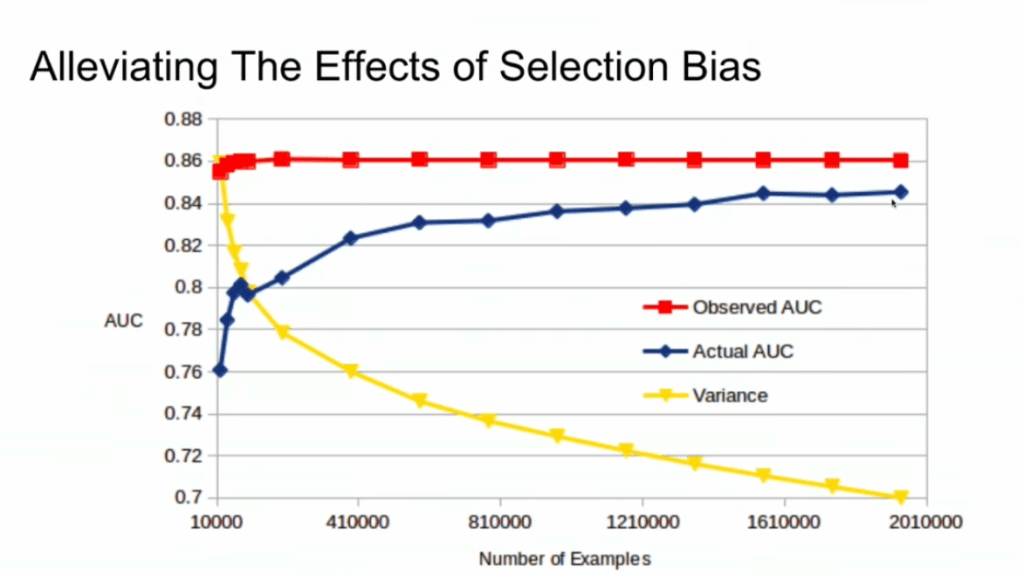
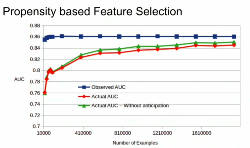
Fortunately, Lucas proposes a very simple solution! Just adding more observations can (partially) alleviate this detrimental effect of selection bias. Although our bias still remains, the variance goes down and the difference between our observed and actual performance decreases.
A second issue and solution to selection bias relates to propensity (see also): the extent to which your features X influence not only the outcome Y, but also the selection criteria s.
If our features X influence both the outcome Y but also the selection criteria s, selection bias will occur in your data and can thus screw up your conclusion. In order to inspect to what extent this occurs in your setting, you will want to estimate a propensity model. If that model is good, and X appears valuable in predicting s, you have a selection bias problem.
Via a propensity model s ~ X, we quantify to what extent selection bias influences our data and model. The nice thing is that we, as data scientists, control the features X we use to train a model. Hence, we could just use only features X that do not predict s to predict Y. Conclusion: we can conduct propensity-based feature selection in our Y ~ X by simply avoiding features X that predicted s!
Still, Lucas does point that this becomes difficult when you have valuable features that predict both s and Y. Hence, propensity-based feature selection may end up cost(ing) you performance, as you will need to remove features relevant to Y.
I can’t begin to count how often I have wanted to visualize a (normal) distribution in a plot. For instance to show how my sample differs from expectations, or to highlight the skewness of the scores on a particular variable. I wish I’d known earlier that I could just add one simple geom to my ggplot!
Want a different mean and standard deviation, just add a list to the args argument:
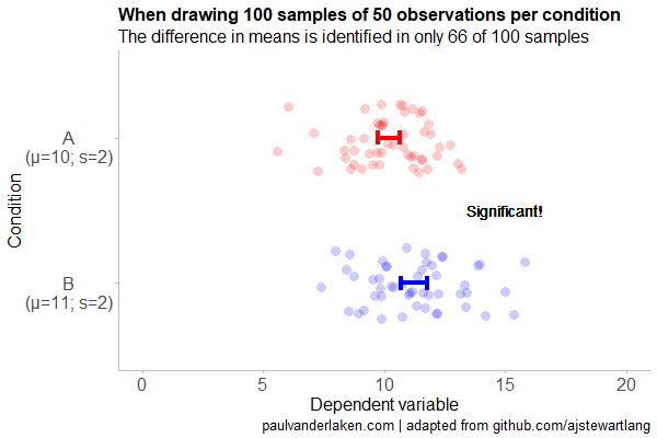
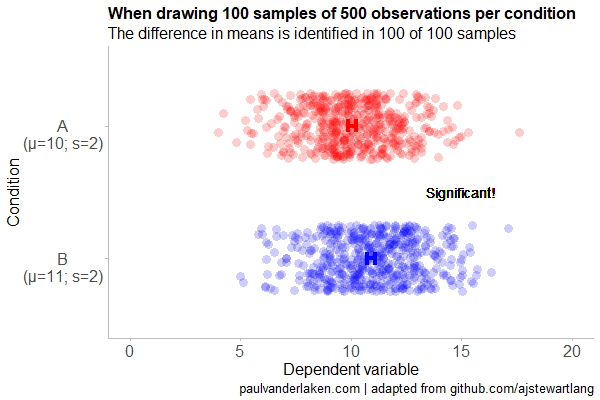
Created by Andrew Stewart, and tweeted by John Holbein, the visuals show samples taken from a normal distributed variable with a mean of 10 and a standard deviation of 2. In the left section, Andrew took several samples of 20. In the right section, the sample size was increased to 500.
Just look at how much the distribution and the estimated mean change for small samples!
Andrew shared his code via Github, so I was able to download and tweak it a bit to make my own version.
Andrew’s version seems to be concerned with potential Type 1 errors when small samples are taken. A type 1 error occurs when you reject your null hypothesis (you reject “there is no effect”) while you should not have (“there is actually no effect”).
You can see this in the distributions Andrew sampled from in the tweet above. The data for conditions A (red) and B (blue) are sampled from the same distribution, with mean 10 and standard deviation 2. While there should thus be no difference between the groups, small samples may cause researchers to erroneously conclude that there is a difference between conditions A and B due to the observed data.
We could use Andrew’s basic code and tweak it a bit to simulate a setting in which Type 2 errors could occur. A type 2 error occurs when you do not reject your null hypothesis (you maintain “there is no effect”) whereas there is actually an effect, which you thus missed.
To illustrate this, I adapted Andrew’s code: I sampled data for condition B using a normal distribution with a slightly higher mean value of 11, as opposed to the mean of 10 for condition A. The standard deviation remained the same in both conditions (2).
Next, I drew 10 data samples from both conditions, for various sample sizes: 10, 20, 50, 100, 250, 500, and even 1000. After drawing these samples for both conditions, I ran a simple t-test to compare their means, and estimate whether any observed difference could be considered significant (at the alpha = 0.05 level [95%]).
In the end, I visualized the results in a similar fashion as Andrew did. Below are the results.
As you can see, only in 1 of our 10 samples with size 10 were we able to conclude that there was a difference in means. This means that we are 90% incorrect.
After increasing the sample size to 100, we strongly decrease our risk of Type 2 errors. Now we are down to 20% incorrect conclusions.
At this point though, I decided to rework Andrew’s code even more, to clarify the message.
I was not so much interested in the estimated distribution, which currently only distracts. Similarly, the points and axes can be toned down a bit. Moreover, I’d like to be able to see when my condition samples have significant different means, so let’s add a 95% confidence interval, and some text. Finally, let’s increase the number of drawn samples per sample size to, say, 100, to reduce the influence that chance may have on our Type 2 error rate estimations.
Let’s rerun the code and generate some GIFs!
The below demonstrates that small samples of only 10 observations per condition have only about a 11% probability of detecting the difference in means when the true difference is 1 (or half the standard deviation [i.e., 2]). In other words, there is a 89% chance of a Type 2 error occuring, where we fail to reject the null hypothesis due to sampling error.
Doubling the sample size to 20, more than doubles our detection rate. We now correctly identify the difference 28% of the time.
With 50 observations the Type 2 error rate drops to 34%.
Finally, with sample sizes of 100+ our results become somewhat reliable. We are now able to correctly identify the true difference over 95% of the times.
With a true difference of half the standard deviation, further increases in the sample size start to lose their added value. For instance, a sample size of 250 already uncovers the effect in all 100 samples, so doubling to 500 would not make sense.
I hope you liked the visuals. If you are interested in these kind of analysis, or want to estimate how large of a sample you need in your own study, have a look at power analysis. These analysis can help you determine the best setup for your own research initiatives.
If you’d like to reproduce or change the graphics above, here is the R code. Note that it is strongly inspired by Andrew’s original code.
# setup -------------------------------------------------------------------

# The new version of gganimate by Thomas Lin Pedersen - @thomasp85 may not yet be on CRAN so use devtools
# devtools::install_github('thomasp85/gganimate')

library(ggplot2)
library(dplyr)
library(glue)
library(magrittr)
library(gganimate)


# main function to create and save the animation --------------------------

save_created_animation = function(sample_size,
                                  samples = 100,
                                  colors = c("red", "blue"),
                                  Amean = 10, Asd = 2,
                                  Bmean = 11, Bsd = 2,
                                  seed = 1){

  ### generate the data

  # set the seed
  set.seed(seed)

  # set the names of our variables
  cnames <- c("Score", "Condition", "Sample")

  # create an empty data frame to store our simulated samples
  df <- data.frame(matrix(rep(NA_character_, samples * sample_size * 2 * length(cnames)), ncol = length(cnames), dimnames = list(NULL, cnames)), stringsAsFactors = FALSE)

  # create an empty vector to store whether t.test identifies significant difference in means
  result <- rep(NA_real_, samples)

  # run a for loop to iteratively simulate the samples
  for (i in seq_len(samples)) {
    # draw random samples for both conditions
    a <- rnorm(sample_size, mean = Amean, sd = Asd)
    b <- rnorm(sample_size, mean = Bmean, sd = Bsd)
    # test whether there the difference in the means of samples is significant
    result[i] = t.test(a, b)$p.value < 0.05
    # add the identifiers for both conditions, and for the sample iteration
    a <- cbind(a, rep(glue("A\n(μ={Amean}; σ={Asd})"), sample_size), rep(i, sample_size))
    b <- cbind(b, rep(glue("B\n(μ={Bmean}; σ={Bsd})"), sample_size), rep(i, sample_size))
    # bind the two sampled conditions together in a single matrix and set its names
    ab <- rbind(a, b)
    colnames(ab) <- cnames
    # push the matrix into its reserved spot in the reserved dataframe
    df[((i - 1) * sample_size * 2 + 1):((i * (sample_size * 2))), ] <- ab
  }


  ### prepare the data

  # create a custom function to calculate the standard error
  se <- function(x) sd(x) / sqrt(length(x))

  df %>%
    # switch data types for condition and score
    mutate(Condition = factor(Condition)) %>%
    mutate(Score = as.numeric(Score)) %>%
    # calculate the mean and standard error to be used in the error bar
    group_by(Condition, Sample) %>%
    mutate(Score_Mean = mean(Score)) %>%
    mutate(Score_SE = se(Score)) ->
    df

  # create a new dataframe storing the result per sample
  df_result <- data.frame(Sample = unique(df$Sample), Result = result, stringsAsFactors = FALSE)

  # and add this result to the dataframe
  df <- left_join(df, df_result, by = "Sample")

  # identify whether not all but also not zero samples identified the difference in means
  # if so, store the string "only ", later to be added into the subtitle
  result_mention_adj <- ifelse(sum(result) != 0 & sum(result) < length(result), "only ", "")


  ### create a custom theme

  textsize <- 16

  my_theme <- theme(
    text = element_text(size = textsize),
    axis.title.x = element_text(size = textsize),
    axis.title.y = element_text(size = textsize),
    axis.text.y = element_text(hjust = 0.5, vjust = 0.75),
    axis.text = element_text(size = textsize),
    legend.title = element_text(size = textsize),
    legend.text =  element_text(size = textsize),
    legend.position = "right",
    plot.title = element_text(lineheight = .8, face = "bold", size = textsize),
    panel.border = element_blank(),
    panel.grid.minor = element_blank(),
    panel.grid.major = element_blank(),
    axis.line = element_line(color = "grey", size = 0.5, linetype = "solid"),
    axis.ticks = element_line(color = "grey")
  )

  # store the chosen colors in a named vector for use as palette,
  # and add the colors for (in)significant results
  COLORS = c(colors, "black", "darkgrey")
  names(COLORS) = c(levels(df$Condition), "1", "0")


  ### create the animated plot

  df %>%
    ggplot(aes(y = Score, x = Condition, fill = Condition, color = Condition)) +
    geom_point(aes(y = Score), position = position_jitter(width = 0.25), alpha = 0.20, stroke = NA, size = 1) +
    geom_errorbar(aes(ymin = Score_Mean - 1.96 * Score_SE, ymax = Score_Mean + 1.96 * Score_SE), width = 0.10, size = 1.5) +
    geom_text(data = . %>% filter(as.numeric(Condition) == 1),
              aes(x = levels(df$Condition)[1], y = Result * 10 + 5,
                  label = ifelse(Result == 1, "Significant!", "Insignificant!"),
                  col = as.character(Result)), position = position_nudge(x = -0.5), size = 5) +
    transition_states(Sample, transition_length = 1, state_length = 2) +
    guides(fill = FALSE) +
    guides(color = FALSE) +
    scale_x_discrete(limits = rev(levels(df$Condition)), breaks = rev(levels(df$Condition))) +
    scale_y_continuous(limits = c(0, 20), breaks = seq(0, 20, 5)) +
    scale_color_manual(values = COLORS) +
    scale_fill_manual(values = COLORS) +
    coord_flip() +
    theme_minimal() +
    my_theme +
    labs(x = "Condition") +
    labs(y = "Dependent variable") +
    labs(title = glue("When drawing {samples} samples of {sample_size} observations per condition")) +
    labs(subtitle = glue("The difference in means is identified in {result_mention_adj}{sum(result)} of {length(result)} samples")) +
    labs(caption = "paulvanderlaken.com | adapted from github.com/ajstewartlang") ->
    ani

  ### save the animated plot

  anim_save(paste0(paste("sampling_error", sample_size, sep = "_"), ".gif"),
            animate(ani, nframes = samples * 10, duration = samples, width = 600, height = 400))

}


# call animation function for different sample sizes ----------------------

# !!! !!! !!!
# the number of samples is set to 100 by default
# if left at 100, each function call will take a long time!
# add argument `samples = 10` to get quicker results, like so:
# save_created_animation(10, samples = 10)
# !!! !!! !!!

save_created_animation(10)
save_created_animation(20)
save_created_animation(50)
save_created_animation(100)
save_created_animation(250)
save_created_animation(500)