I can’t begin to count how often I have wanted to visualize a (normal) distribution in a plot. For instance to show how my sample differs from expectations, or to highlight the skewness of the scores on a particular variable. I wish I’d known earlier that I could just add one simple geom to my ggplot!
Want a different mean and standard deviation, just add a list to the args argument:
Survival of the Best Fit was built by Gabor Csapo, Jihyun Kim, Miha Klasinc, and Alia ElKattan. They are software engineers, designers and technologists, advocating for better software that allows members of the public to question its impact on society.
You don’t need to be an engineer to question how technology is affecting our lives. The goal is not for everyone to be a data scientist or machine learning engineer, though the field can certainly use more diversity, but to have enough awareness to join the conversation and ask important questions.
With Survival of the Best Fit, we want to reach an audience that may not be the makers of the very technology that impact them everyday. We want to help them better understand how AI works and how it may affect them, so that they can better demand transparency and accountability in systems that make more and more decisions for us.
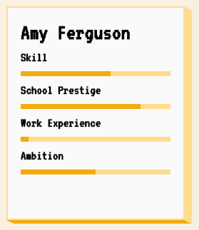
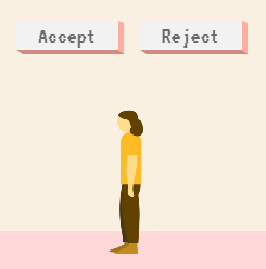
I found that the game provides a great intuitive explanation of how (humas) bias can slip into A.I. or machine learning applications in recruitment, selection, or other human resource management practices and processes.
Note, as Joachin replied below, that the game apparently does not learn from user-input, but is programmed to always result in bias towards blues. I kind of hoped that there was actually an algorithm “learning” in the backend, and while the developers could argue that the bias arises from the added external training data (you picked either Google, Apple, or Amazon to learn from), it feels like a bit of a disappointment that there is no real interactivity here.
Created by Andrew Stewart, and tweeted by John Holbein, the visuals show samples taken from a normal distributed variable with a mean of 10 and a standard deviation of 2. In the left section, Andrew took several samples of 20. In the right section, the sample size was increased to 500.
Just look at how much the distribution and the estimated mean change for small samples!
Andrew shared his code via Github, so I was able to download and tweak it a bit to make my own version.
Andrew’s version seems to be concerned with potential Type 1 errors when small samples are taken. A type 1 error occurs when you reject your null hypothesis (you reject “there is no effect”) while you should not have (“there is actually no effect”).
You can see this in the distributions Andrew sampled from in the tweet above. The data for conditions A (red) and B (blue) are sampled from the same distribution, with mean 10 and standard deviation 2. While there should thus be no difference between the groups, small samples may cause researchers to erroneously conclude that there is a difference between conditions A and B due to the observed data.
We could use Andrew’s basic code and tweak it a bit to simulate a setting in which Type 2 errors could occur. A type 2 error occurs when you do not reject your null hypothesis (you maintain “there is no effect”) whereas there is actually an effect, which you thus missed.
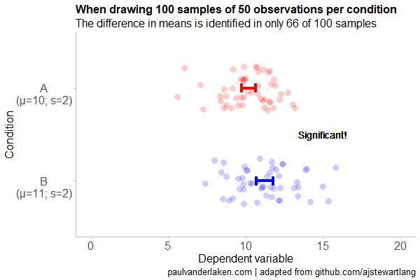
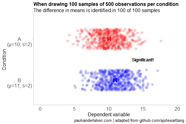
To illustrate this, I adapted Andrew’s code: I sampled data for condition B using a normal distribution with a slightly higher mean value of 11, as opposed to the mean of 10 for condition A. The standard deviation remained the same in both conditions (2).
Next, I drew 10 data samples from both conditions, for various sample sizes: 10, 20, 50, 100, 250, 500, and even 1000. After drawing these samples for both conditions, I ran a simple t-test to compare their means, and estimate whether any observed difference could be considered significant (at the alpha = 0.05 level [95%]).
In the end, I visualized the results in a similar fashion as Andrew did. Below are the results.
As you can see, only in 1 of our 10 samples with size 10 were we able to conclude that there was a difference in means. This means that we are 90% incorrect.
After increasing the sample size to 100, we strongly decrease our risk of Type 2 errors. Now we are down to 20% incorrect conclusions.
At this point though, I decided to rework Andrew’s code even more, to clarify the message.
I was not so much interested in the estimated distribution, which currently only distracts. Similarly, the points and axes can be toned down a bit. Moreover, I’d like to be able to see when my condition samples have significant different means, so let’s add a 95% confidence interval, and some text. Finally, let’s increase the number of drawn samples per sample size to, say, 100, to reduce the influence that chance may have on our Type 2 error rate estimations.
Let’s rerun the code and generate some GIFs!
The below demonstrates that small samples of only 10 observations per condition have only about a 11% probability of detecting the difference in means when the true difference is 1 (or half the standard deviation [i.e., 2]). In other words, there is a 89% chance of a Type 2 error occuring, where we fail to reject the null hypothesis due to sampling error.
Doubling the sample size to 20, more than doubles our detection rate. We now correctly identify the difference 28% of the time.
With 50 observations the Type 2 error rate drops to 34%.
Finally, with sample sizes of 100+ our results become somewhat reliable. We are now able to correctly identify the true difference over 95% of the times.
With a true difference of half the standard deviation, further increases in the sample size start to lose their added value. For instance, a sample size of 250 already uncovers the effect in all 100 samples, so doubling to 500 would not make sense.
I hope you liked the visuals. If you are interested in these kind of analysis, or want to estimate how large of a sample you need in your own study, have a look at power analysis. These analysis can help you determine the best setup for your own research initiatives.
If you’d like to reproduce or change the graphics above, here is the R code. Note that it is strongly inspired by Andrew’s original code.
# setup -------------------------------------------------------------------

# The new version of gganimate by Thomas Lin Pedersen - @thomasp85 may not yet be on CRAN so use devtools
# devtools::install_github('thomasp85/gganimate')

library(ggplot2)
library(dplyr)
library(glue)
library(magrittr)
library(gganimate)


# main function to create and save the animation --------------------------

save_created_animation = function(sample_size,
                                  samples = 100,
                                  colors = c("red", "blue"),
                                  Amean = 10, Asd = 2,
                                  Bmean = 11, Bsd = 2,
                                  seed = 1){

  ### generate the data

  # set the seed
  set.seed(seed)

  # set the names of our variables
  cnames <- c("Score", "Condition", "Sample")

  # create an empty data frame to store our simulated samples
  df <- data.frame(matrix(rep(NA_character_, samples * sample_size * 2 * length(cnames)), ncol = length(cnames), dimnames = list(NULL, cnames)), stringsAsFactors = FALSE)

  # create an empty vector to store whether t.test identifies significant difference in means
  result <- rep(NA_real_, samples)

  # run a for loop to iteratively simulate the samples
  for (i in seq_len(samples)) {
    # draw random samples for both conditions
    a <- rnorm(sample_size, mean = Amean, sd = Asd)
    b <- rnorm(sample_size, mean = Bmean, sd = Bsd)
    # test whether there the difference in the means of samples is significant
    result[i] = t.test(a, b)$p.value < 0.05
    # add the identifiers for both conditions, and for the sample iteration
    a <- cbind(a, rep(glue("A\n(μ={Amean}; σ={Asd})"), sample_size), rep(i, sample_size))
    b <- cbind(b, rep(glue("B\n(μ={Bmean}; σ={Bsd})"), sample_size), rep(i, sample_size))
    # bind the two sampled conditions together in a single matrix and set its names
    ab <- rbind(a, b)
    colnames(ab) <- cnames
    # push the matrix into its reserved spot in the reserved dataframe
    df[((i - 1) * sample_size * 2 + 1):((i * (sample_size * 2))), ] <- ab
  }


  ### prepare the data

  # create a custom function to calculate the standard error
  se <- function(x) sd(x) / sqrt(length(x))

  df %>%
    # switch data types for condition and score
    mutate(Condition = factor(Condition)) %>%
    mutate(Score = as.numeric(Score)) %>%
    # calculate the mean and standard error to be used in the error bar
    group_by(Condition, Sample) %>%
    mutate(Score_Mean = mean(Score)) %>%
    mutate(Score_SE = se(Score)) ->
    df

  # create a new dataframe storing the result per sample
  df_result <- data.frame(Sample = unique(df$Sample), Result = result, stringsAsFactors = FALSE)

  # and add this result to the dataframe
  df <- left_join(df, df_result, by = "Sample")

  # identify whether not all but also not zero samples identified the difference in means
  # if so, store the string "only ", later to be added into the subtitle
  result_mention_adj <- ifelse(sum(result) != 0 & sum(result) < length(result), "only ", "")


  ### create a custom theme

  textsize <- 16

  my_theme <- theme(
    text = element_text(size = textsize),
    axis.title.x = element_text(size = textsize),
    axis.title.y = element_text(size = textsize),
    axis.text.y = element_text(hjust = 0.5, vjust = 0.75),
    axis.text = element_text(size = textsize),
    legend.title = element_text(size = textsize),
    legend.text =  element_text(size = textsize),
    legend.position = "right",
    plot.title = element_text(lineheight = .8, face = "bold", size = textsize),
    panel.border = element_blank(),
    panel.grid.minor = element_blank(),
    panel.grid.major = element_blank(),
    axis.line = element_line(color = "grey", size = 0.5, linetype = "solid"),
    axis.ticks = element_line(color = "grey")
  )

  # store the chosen colors in a named vector for use as palette,
  # and add the colors for (in)significant results
  COLORS = c(colors, "black", "darkgrey")
  names(COLORS) = c(levels(df$Condition), "1", "0")


  ### create the animated plot

  df %>%
    ggplot(aes(y = Score, x = Condition, fill = Condition, color = Condition)) +
    geom_point(aes(y = Score), position = position_jitter(width = 0.25), alpha = 0.20, stroke = NA, size = 1) +
    geom_errorbar(aes(ymin = Score_Mean - 1.96 * Score_SE, ymax = Score_Mean + 1.96 * Score_SE), width = 0.10, size = 1.5) +
    geom_text(data = . %>% filter(as.numeric(Condition) == 1),
              aes(x = levels(df$Condition)[1], y = Result * 10 + 5,
                  label = ifelse(Result == 1, "Significant!", "Insignificant!"),
                  col = as.character(Result)), position = position_nudge(x = -0.5), size = 5) +
    transition_states(Sample, transition_length = 1, state_length = 2) +
    guides(fill = FALSE) +
    guides(color = FALSE) +
    scale_x_discrete(limits = rev(levels(df$Condition)), breaks = rev(levels(df$Condition))) +
    scale_y_continuous(limits = c(0, 20), breaks = seq(0, 20, 5)) +
    scale_color_manual(values = COLORS) +
    scale_fill_manual(values = COLORS) +
    coord_flip() +
    theme_minimal() +
    my_theme +
    labs(x = "Condition") +
    labs(y = "Dependent variable") +
    labs(title = glue("When drawing {samples} samples of {sample_size} observations per condition")) +
    labs(subtitle = glue("The difference in means is identified in {result_mention_adj}{sum(result)} of {length(result)} samples")) +
    labs(caption = "paulvanderlaken.com | adapted from github.com/ajstewartlang") ->
    ani

  ### save the animated plot

  anim_save(paste0(paste("sampling_error", sample_size, sep = "_"), ".gif"),
            animate(ani, nframes = samples * 10, duration = samples, width = 600, height = 400))

}


# call animation function for different sample sizes ----------------------

# !!! !!! !!!
# the number of samples is set to 100 by default
# if left at 100, each function call will take a long time!
# add argument `samples = 10` to get quicker results, like so:
# save_created_animation(10, samples = 10)
# !!! !!! !!!

save_created_animation(10)
save_created_animation(20)
save_created_animation(50)
save_created_animation(100)
save_created_animation(250)
save_created_animation(500)
Sentiment analysis is a topic I cover regularly, for instance, with regard to Harry Plotter, Stranger Things, or Facebook. Usually I stick to the three sentiment dictionaries (i.e., lexicons) included in the tidytext R package (Bing, NRC, and AFINN) but there are many more one could use. Heck, I’ve even tried building one myself using a synonym/antonym network (unsuccessful, though a nice challenge). Two lexicons that did become famous are SentiWordNet, accessible via the lexicon R package, and the Loughran lexicon, designed specifically for the analysis of shareholder reports.
Josh Yazman did the world a favor and compared the quality of the five lexicons mentioned above. He observed their validity in relation to the millions of restaurant reviews in the Yelp dataset. This dataset includes both textual reviews and 1 to 5 star ratings. Here’s a summary of Josh’s findings, including two visualizations (read Josh’s full blog + details here):
NRC overestimates the positive sentiment.
AFINN also provides overly positive estimates, but to a lesser extent.
Loughran seems unreliable altogether (on Yelp data).
Bing estimates are accurate as long as texts are long enough (e.g., 200+ words).
SentiWordNet‘s estimates are mostly valid and precise, also on shorter texts, but may include minor outliers.
Sentiment scores by Yelp rating, estimated using each lexicon. [original]The average sentiment score estimated using lexicons, where words are randomly sampled from the Yelp dataset. Note that, although both NRC and Bing scores are relatively positive on average, they also demonstrate a larger spread of scores (which is a good thing if you assume that reviews vary in terms of sentiment). [original]On a more detailed level, David Robinson demonstrated how to uncover performance errors or quality issues in lexicons, in his 2016 blog on the AFINN lexicon. Using only the most common words (i.e., used in 200+ reviews for at least 10 businesses) of the same Yelp dataset, David visualized the inconsistencies between the AFINN sentiment lexicon and the Yelp ratings in two very smart and appealing ways:
Words’ AFINN sentiment score by the average rating of the reviews they used in [original]As the figure above shows, David found a strong positive correlations between the sentiment score assigned to words in the AFINN lexicon and the way they are used in Yelp reviews. However, there are some exception – words that did not have the same meaning in the lexicon and the observed data. Examples of words that seem to cause errors are die and bomb (both negative AFINN scores but used in positive Yelp reviews) or, the other way around, joke and honor (positive AFINN scores but negative meanings on Yelp).
A graph of the frequency with which words are used in reviews, by the average rating of the reviews they occur in, colored for their AFINN sentiment score [original]With the graph above, it is easy to see what words cause inaccuracies. Blue words should be in the upper section of this visual while reds should be closer to the bottom. If this is not the case, a word likely has a different meaning in the lexicon respective to how it’s used on Yelp. These lexicon-data differences become increasingly important as words are located closer to the right side of the graph, which means they more frequently screw up your sentiment estimates. For instance, fine, joke, fuck and hopecause much overestimation of positive sentiment while fresh is not considered in the positive scores it entails and die causes many negative errors.
TL;DR: Sentiment lexicons vary in terms of their quality/performance. If your texts are short (few hundred words) you might be best off using Bing (tidytext). In other cases, opt for SentiWordNet (lexicon), which considers a broader vocabulary. If possible, try to evaluate inaccuracies, outliers, and/or prediction errors via data visualizations.
Simpson (1951) demonstrated that a statistical relationship observed within a population—i.e., a group of individuals—could be reversed within all subgroups that make up that population. This phenomenon, where X seems to relate to Y in a certain way, but flips direction when the population is split for W, has since been referred to as Simpson’s paradox. Others names, according to Wikipedia, include the Simpson-Yule effect, reversal paradox or amalgamation paradox.
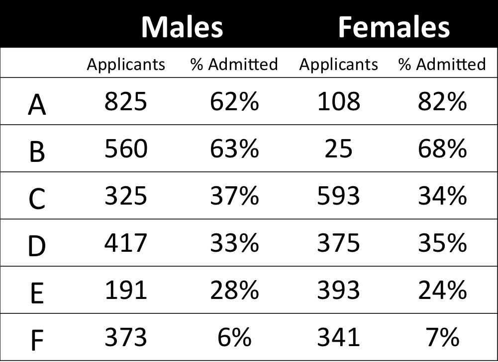
The most famous example has to be the seemingly gender-biased Berkeley admission rates:
“Examination of aggregate data on graduate admissions to the University of California, Berkeley, for fall 1973 shows a clear but misleading pattern of bias against female applicants. Examination of the disaggregated data reveals few decision-making units that show statistically significant departures from expected frequencies of female admissions, and about as many units appear to favor women as to favor men. If the data are properly pooled, taking into account the autonomy of departmental decision making, thus correcting for the tendency of women to apply to graduate departments that are more difficult for applicants of either sex to enter, there is a small but statistically significant bias in favor of women. […] The bias in the aggregated data stems not from any pattern of discrimination on the part of admissions committees, which seem quite fair on the whole, but apparently from prior screening at earlier levels of the educational system.” – part of abstract of Bickel, Hammel, & O’Connel (1975)
In a table, the effect becomes clear. While it seems as if women are rejected more often overall, women are actually less often rejected on a departmental level. Women simply applied to more selective departments more often (E & C below), resulting in the overall lower admission rate for women (35% as opposed to 44% for men).
Simpsons Paradox can easily occur in organizational or human resources settings as well. Let me run you through two illustrated examples, I simulated:
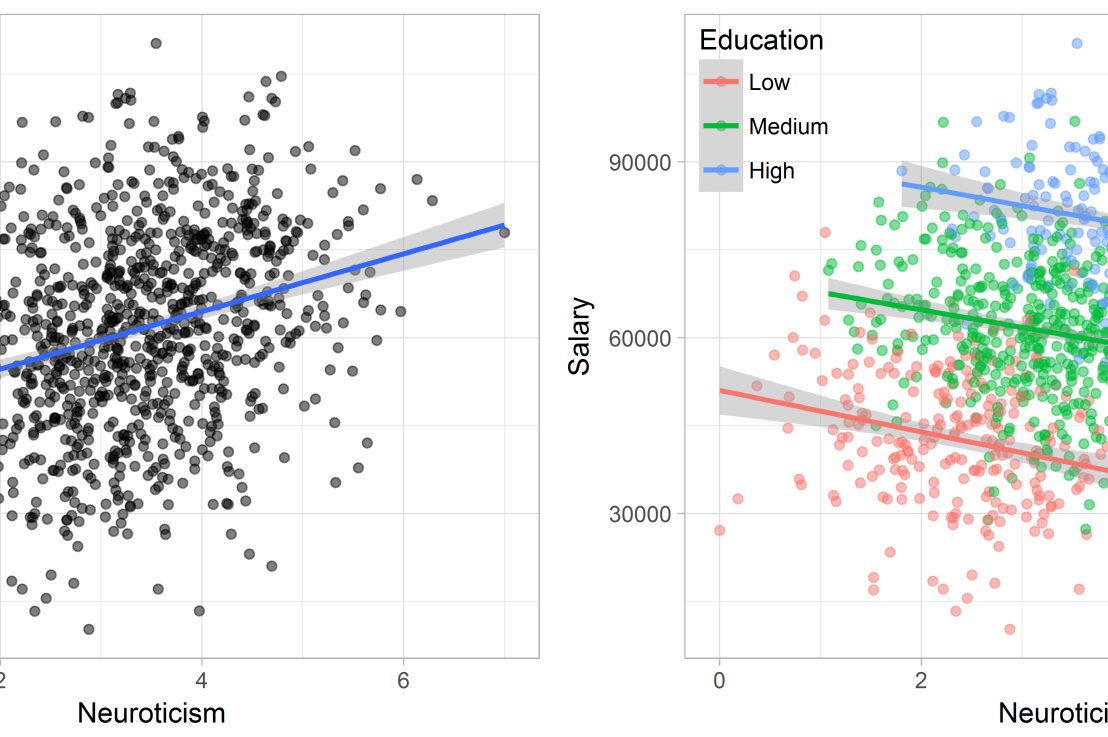
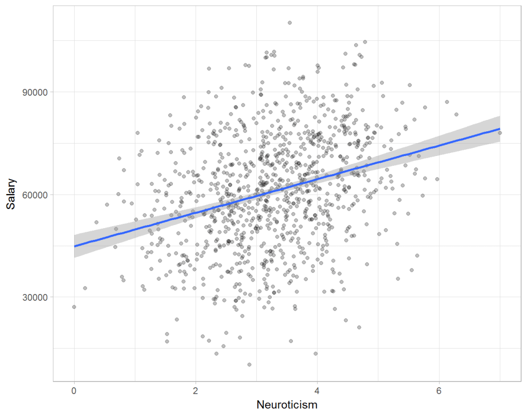
Assume you run a company of 1000 employees and you have asked all of them to fill out a Big Five personality survey. Per individual, you therefore have a score depicting his/her personality characteristic Neuroticism, which can run from 0 (not at all neurotic) to 7 (very neurotic). Now you are interested in the extent to which this Neuroticism of employees relates to their Job Performance (measured 0 – 100) and their Salary (measured in Euro’s per Year). In order to get a sense of the effects, you may decide to visualize both these relations in scatter plots:
From these visualizations it would look like Neuroticism relates significantly and positively to both employees’ performance and their yearly salary. Should you select more neurotic people to improve your overall company performance? Or are you discriminating emotionally-stable (non-neurotic) employees when it comes to salary?
Taking a closer look at the subgroups in your data, you might however find very different relationships. For instance, the positive relationship between neuroticism and performance may only apply to technical positions, but not to those employees’ in service-oriented jobs.
Similarly, splitting the employees by education level, it becomes clear that there is a relationship between neuroticism and education level that may explain the earlier association with salary. More educated employees receive higher salaries and within these groups, neuroticism is actually related to lower yearly income.
If you’d like to see the code used to simulate these data and generate the examples, you can find the R markdown file here on Rpubs.
Solving the paradox
Kievit and colleagues (2013) argue that Simpsons paradox may occur in a wide variety of research designs, methods, and questions, particularly within the social and medical sciences. As such, they propose several means to “control” or minimize the risk of it occurring. The paradox may be prevented from occurring altogether by more rigorous research design: testing mechanisms in longitudinal or intervention studies. However, this is not always feasible. Alternatively, the researchers pose that data visualization may help recognize the patterns and subgroups and thereby diagnose paradoxes. This may be easy if your data looks like this:
But rather hard, or even impossible, when your data looks more like the below:
Clustering may nevertheless help to detect Simpson’s paradox when it is not directly observable in the data. To this end, Kievit and Epskamp (2012) have developed a tool to facilitate the detection of hitherto undetected patterns of association in existing datasets. It is written in R, a language specifically tailored for a wide variety of statistical analyses which makes it very suitable for integration into the regular analysis workflow. As an R package, the tool is is freely available and specializes in the detection of cases of Simpson’s paradox for bivariate continuous data with categorical grouping variables (also known as Robinson’s paradox), a very common inference type for psychologists. Finally, its code is open source and can be extended and improved upon depending on the nature of the data being studied.
One example of application is provided in the paper, for a dataset on coffee and neuroticism. A regression analysis would suggest a significant positive association between coffee and neuroticism overall. However, when the detection algorithm of the R package is applied, a different picture appears: the analysis shows that there are three latent clusters present and that the purported positive relationship only holds for one cluster whereas it is negative in the others.
Update 24-10-2017: minutephysics – one of my favorite YouTube channels – uploaded a video explaining Simpson’s paradox very intuitively in a medical context:
Update 01-11-2017: minutephysics uploaded a follow-up video:
The paradox is that we remain reluctant to fight our bias, even when they are put in plain sight.