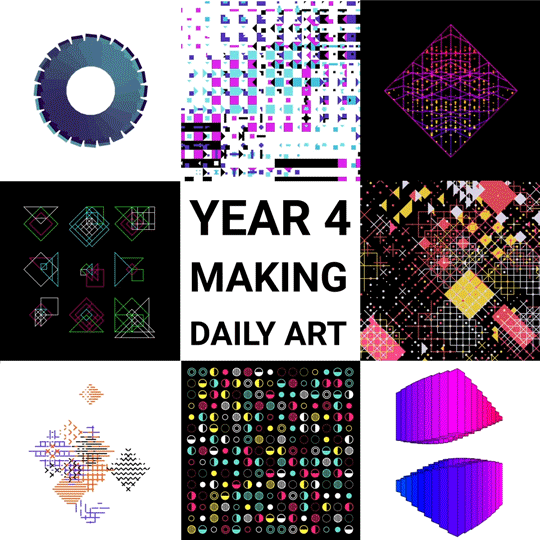
Those who have been following me for some time now will know that I am a big fan of generative art: art created through computers, mathematics, and algorithms.
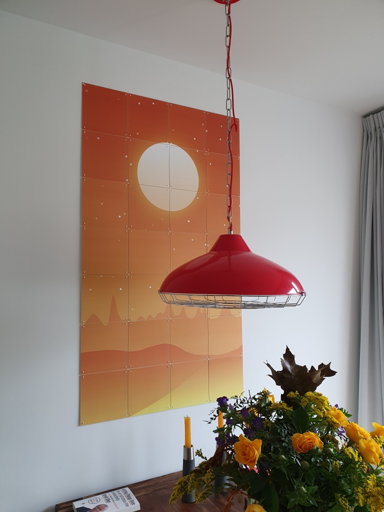
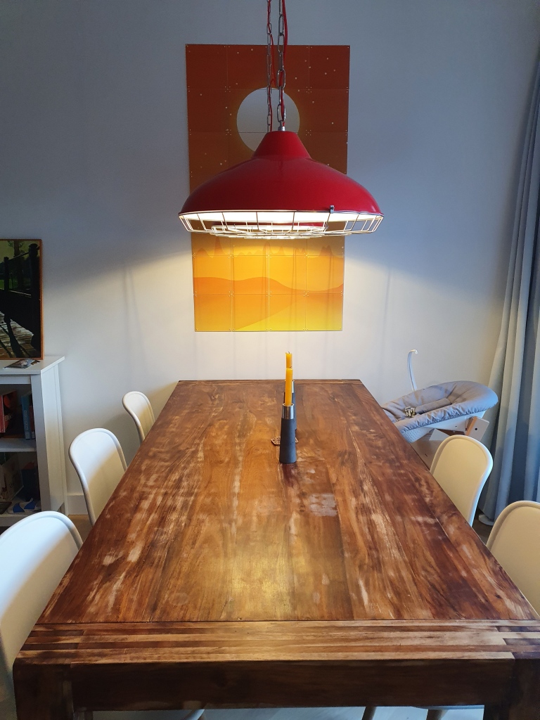
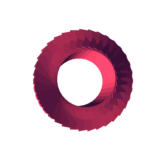
Several years back, my now wife bought me my first piece for my promotion, by Marcus Volz.
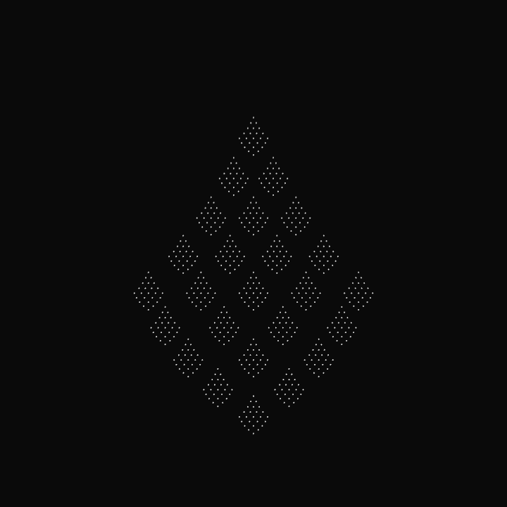
Nicholas was hesistant to sell me a piece and insisted that this series was not finished yet.
Yet, I already found it wonderful and lovely to look at and after begging Nicholas to sell us one of his early pieces, I sent it over to ixxi to have it printed and hanged it on our wall above our dinner table.
If you’re interested in Nicholas’ work, have a look at c82.net
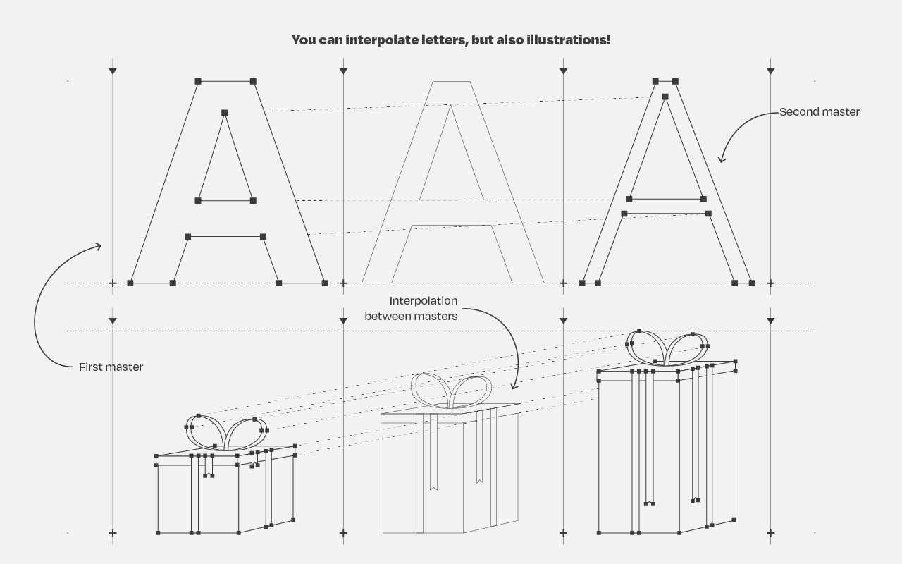
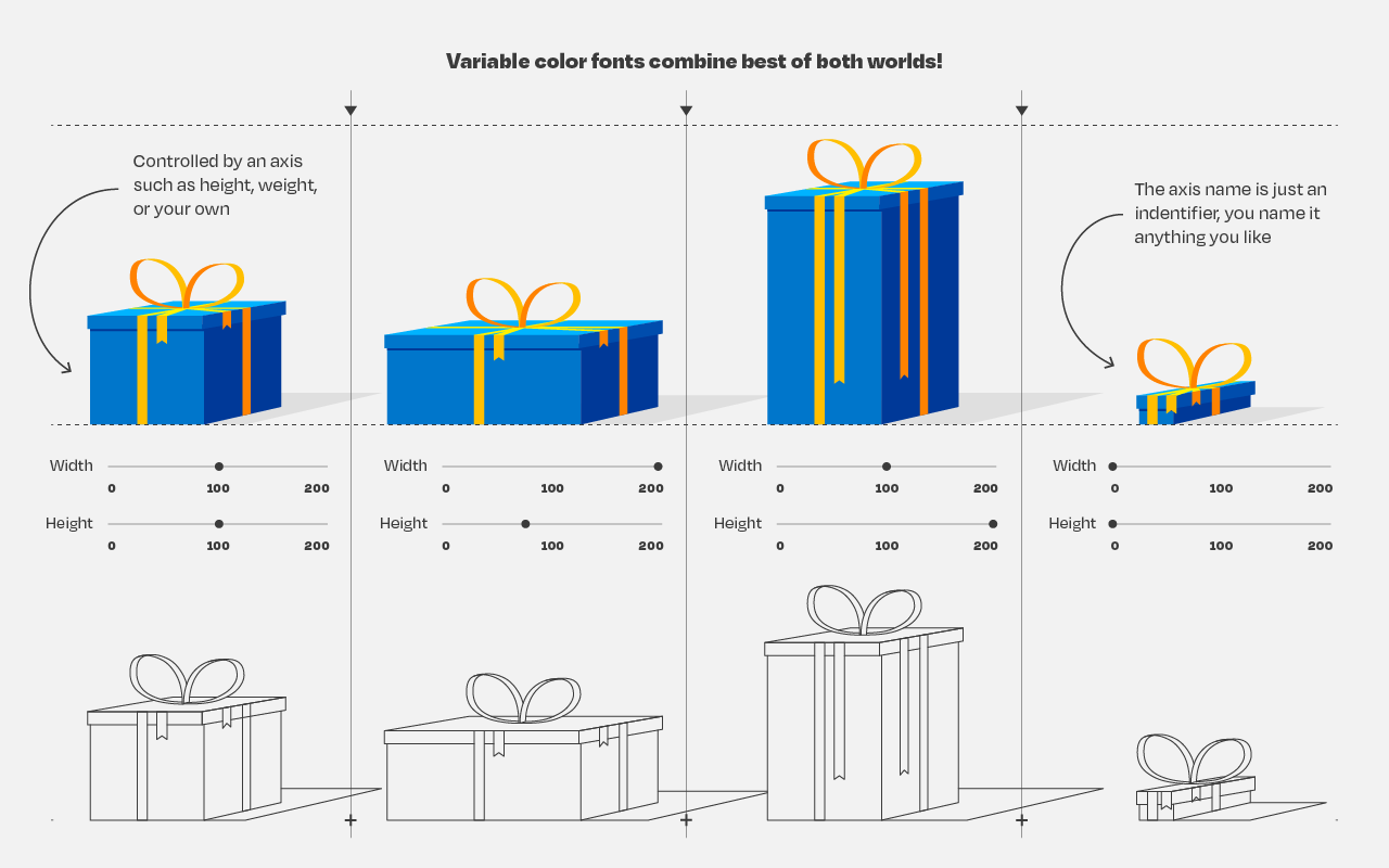
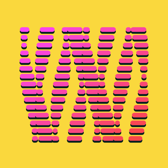
So, you’ve probably never heard of variable fonts.
Well, I sure had not when I first came across the concept a week or so ago. And I was shocked. This looked so cool. As I adjusted the size of my browser, the text and images adjusted itself along. As I made my Chrome window bigger, the text enlarged to keep filling the space it was allowed. Insane!
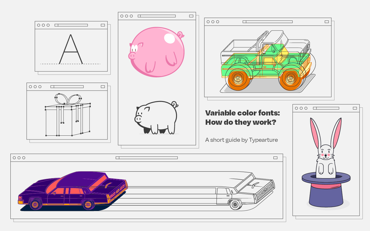
Typearture is Arthur Reinders Folmer’s adventure in type, creating type designs with a focus on conceptual, illustrative and ornamental typefaces.
The typefaces in the Typearture library are not just collections of glyphs, but typefaces that use the conventions of type design and written language to tell their stories. These stories are woven throughout the typefaces, connecting A to Z and the Lemniscate to Question mark. Each character has it’s place and meaning, making each keystroke a small tale in itself.
Processingis a flexible software sketchbook and a language for learning how to code within the context of the visual arts. It’s open-source, there are many online materials, and the language itself is very accessible.
I recently stumbled upon 17-year-old Joseff Nic from Cardiff who has been making GIFs in Processing only since 2018, but which are turning out fantastic already. You can hire him here, and have a look at his Twitter, Tumbler or Drimble channels for the originals:
Some of Joseff’s work seems inspired by David Whyte, a graphic designer from Ireland. His portfolio is quite impressive as well, very visually pleasing, and you can hire him here.
If you’re interesting in learning Processing, Daniel Shiffman demonstrates how to create the most amazing things in Processing via his Youtube channel the Coding Train, which I’ve covered before.
I came across this 1999-2003 e-book by Eric Raymond, on the Art of Unix Programming. It contains several relevant overviews of the basic principles behind the Unix philosophy, which are probably useful for anybody working in hardware, software, or other algoritmic design.
Saskia Freeke (twitter) is a Dutch artist, creative coder, interaction designer, visual designer, and educator working from Amsterdam. She has been creating an awesome digital art piece for every day since January 1st 2015. Her ever-growing collection includes some animated, visual masterpieces.
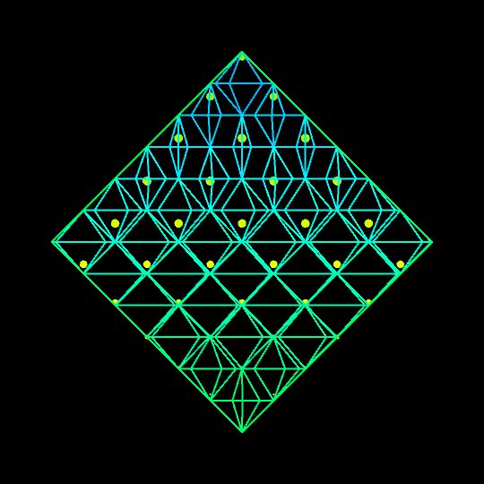
Marcus Volz is a research fellow at the University of Melbourne, studying geometric networks, optimisation and computational geometry. He’s interested in visualisation, and always looking for opportunities to represent complex information in novel ways to accelerate learning and uncover the unexpected.
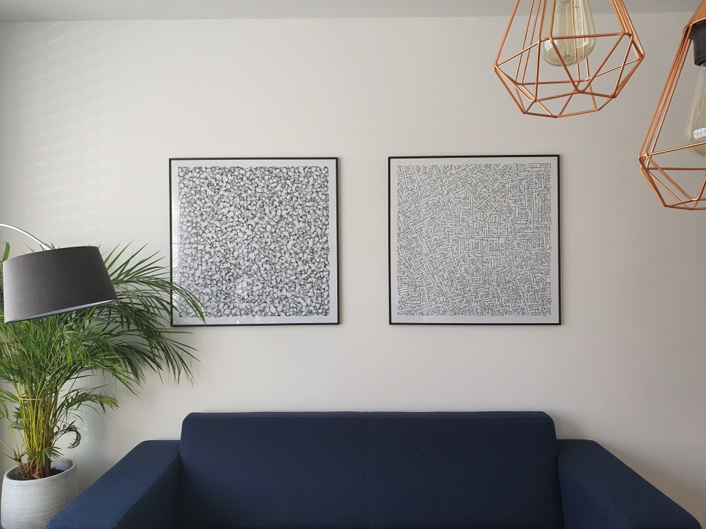
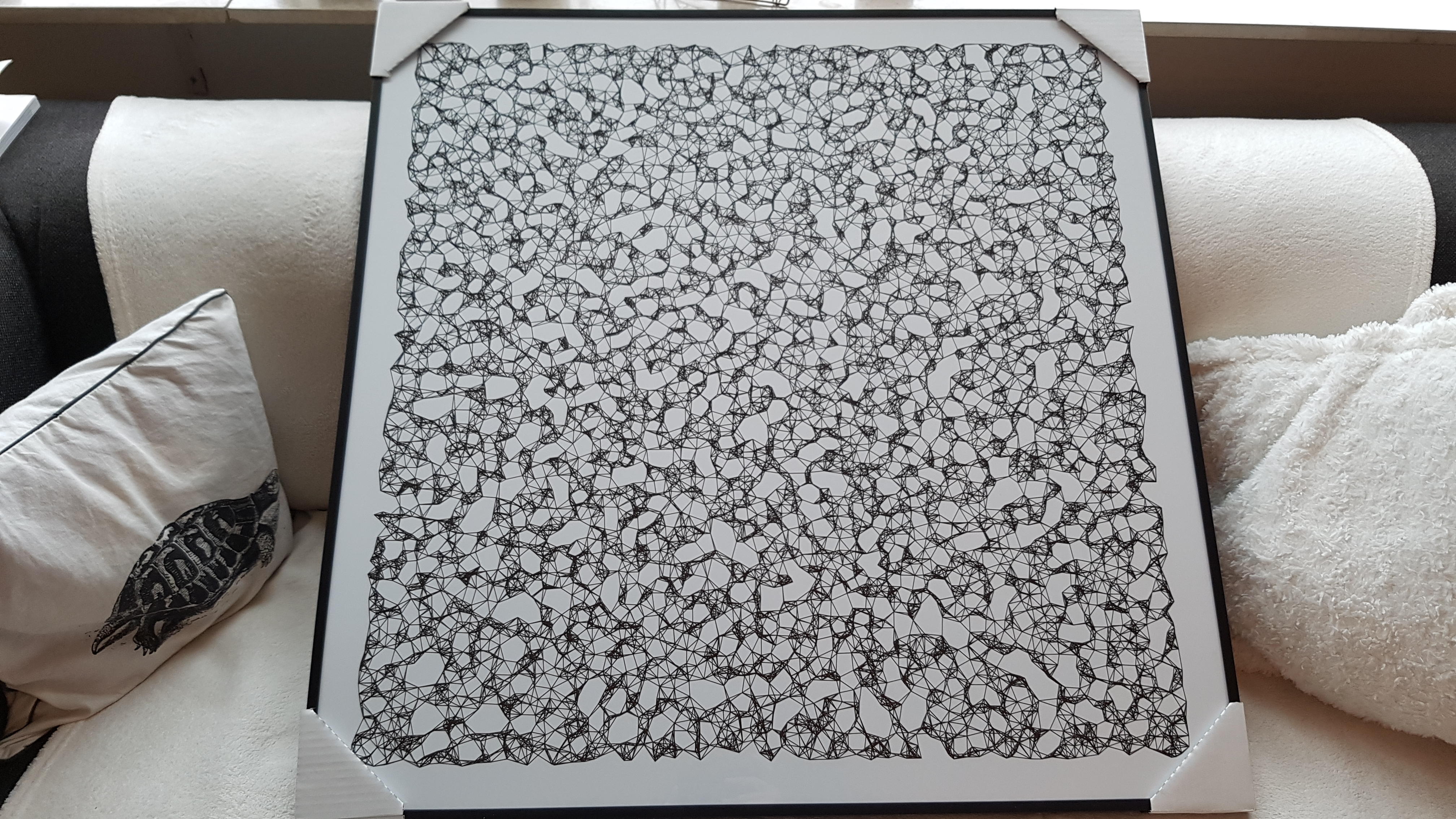
One of Marcus’ hobbies is the visualization of mathematical patterns and statistical algorithms via R. He has a whole portfolio full of them, including a Github page with all the associated R code. For my recent promotion, my girlfriend asked Marcus to generate a K-nearest neighbors visual and she had it printed on a large canvas.
The picture contains about 10.000 points, randomly uniformly distributed across x and y, connected by lines with their closest k other points. Marcus shared the code to generate such k-nearest neighbor algorithm plots here on Github. So if you know your way around R, you could make your own version:
#' k-nearest neighbour graph
#'
#' Computes a k-nearest neighbour graph for a given set of points. Refer to the \href{https://en.wikipedia.org/wiki/Nearest_neighbor_graph}{Wikipedia article} for details.
#' @param points A data frame with x, y coordinates for the points
#' @param k Number of neighbours
#' @keywords nearest neightbour graph
#' @export
#' @examples
#' k_nearest_neighbour_graph()

k_nearest_neighbour_graph <- function(points, k=8) {
  get_k_nearest <- function(points, ptnum, k) {
    xi <- points$x[ptnum]
    yi <- points$y[ptnum]     points %>%
      dplyr::mutate(dist = sqrt((x - xi)^2 + (y - yi)^2)) %>%
      dplyr::arrange(dist) %>%
      dplyr::filter(row_number() %in% seq(2, k+1)) %>%
      dplyr::mutate(xend = xi, yend = yi)
  }

  1:nrow(points) %>%
    purrr::map_df(~get_k_nearest(points, ., k))
}
Those less versed in R can use Marcus package mathart. With this package, Marcus shares many more visual depictions of cool algorithms! You can install the package and several dependencies with the following lines of code:
This page of Marcus’ mathart Github repository contains the code exact code for these and many other visualizations of algorithms and statistical phenomena. Do check it out if you’re interested!
Also, check out the “Fun” section of my R tips and tricks list for more cool visuals you can generate in R!