Tag: news

Wordle with NLP for Data Scientists

Wordle with NLP for Data Scientists

I have played my fair share of Wordle.

I’m not necessarily good at it, but most days I get to solve the puzzle.

The experience is completely different with Semantle — a Wordle-inspired puzzle in which you also need to guess the word of the day.

Unlike in Wordle, Semantle gives you unlimited guesses though. And, boy, you will need many!

Like Wordle, Semantle gives you hints as to how close your guesses were to the secret word of the day.

However, where Wordle shows you how good your guesses were in terms of the letters used, Semantle evaluates the semantic similarity of your guesses to the secret word. For the 1000 most similar words to the secret word, it will show you its closeness like in the picture above.

This semantic similarity comes from the domain of Natural Language Processing NLP — and this basically reflects how often words are used in similar contexts in natural language.

For instance, the words “love” and “hate” may seem like opposites, but they will often score similarly in grammatical sentences. According to the semantle FAQ the actual opposite of “love” is probably something like “Arizona Diamondbacks”, or “carburetor”.

Another example is last day’s solution (15 March 2022), when the secret word was circle. The ten closest words you could have guessed include circles and semicircle, but more distinctive words such as corner and clockwise.

Further downfield you could have guessed relatively close words like saucer, dot, parabola, but I would not have expected words like outwaited, weaved, and zipped.

The creator of Semantle scored the semantic similarity for almost all words used in the English language, by training a so-called word2vec model based on a very large dataset of news articles (GoogleNews-vectors-negative300.bin from late 2021).

Now, every day, one word is randomly selected as the secret word, and you can try to guess which one it is. I usually give up after 300 to 400 guesses, but my record was 76 guesses for uncovering the secret word world.

Try it out yourself: https://semantle.novalis.org/

And do share your epic wins and fails!

How a File Format Exposed a Crossword Scandal

Vincent Warmerdam shared this Youtube video which I thoroughly enjoyed watched. It’s about Saul Pwanson, a software engineer whose hobby project got a little out of hand.

In 2016, Saul Pwanson designed a plain-text file format for crossword puzzle data, and then spent a couple of months building a micro-data-pipeline, scraping tens of thousands of crosswords from various sources.

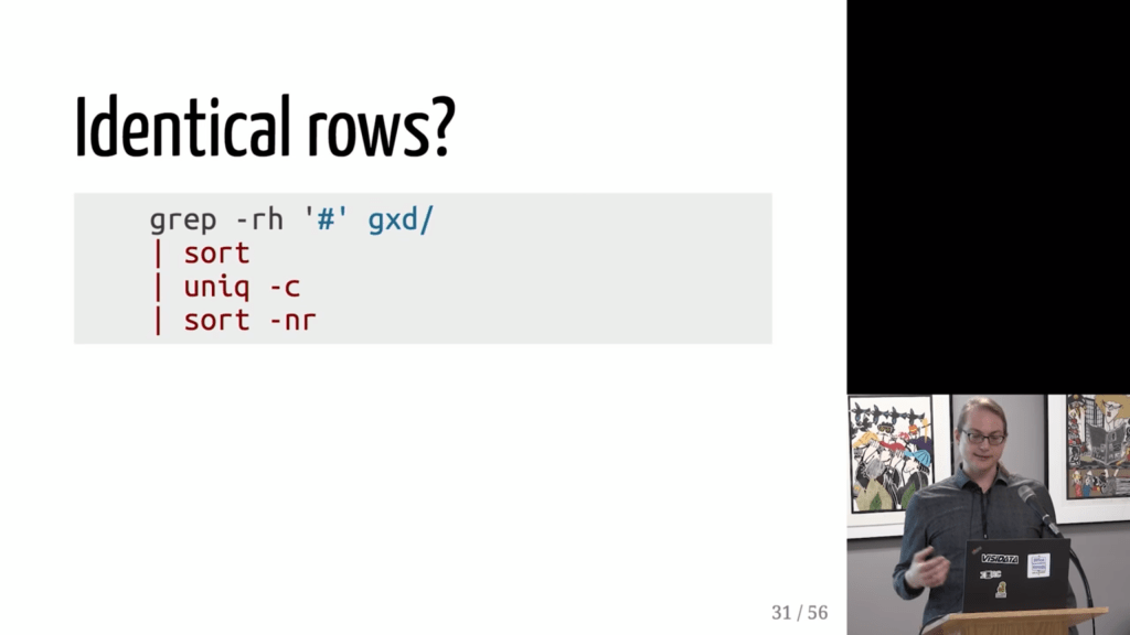
After putting all these crosswords in a simple uniform format, Saul used some simple command line commands to check for common patterns and irregularities.

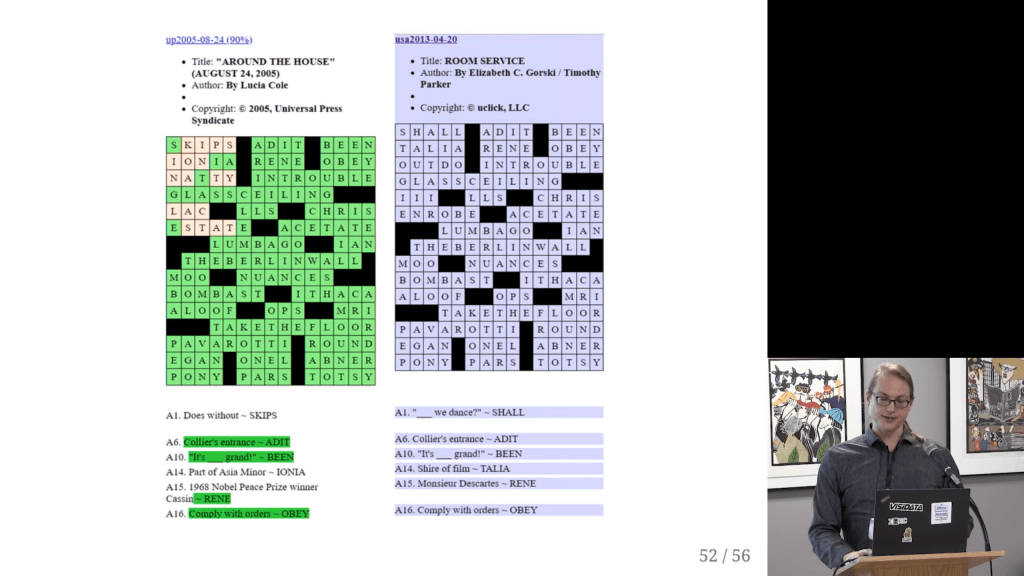
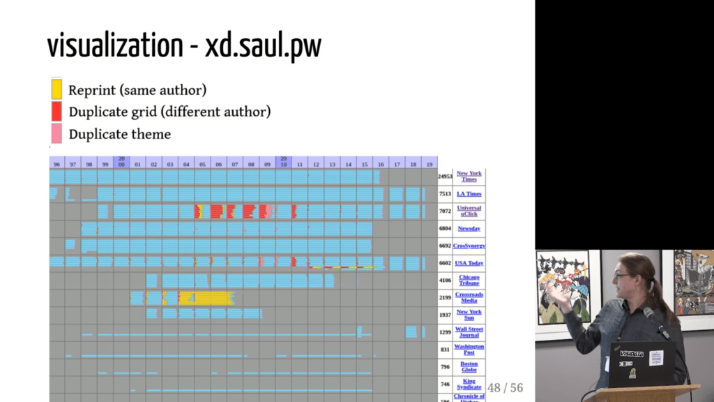
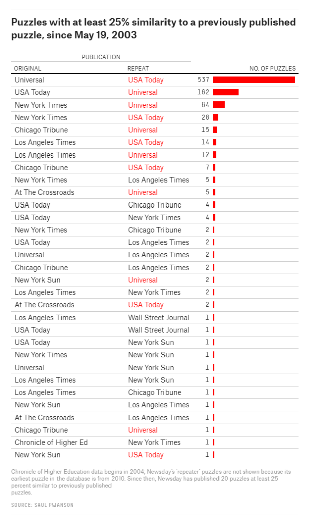
Surprisingly enough, after visualizing the results, Saul discovered egregious plagiarism by a major crossword editor that had gone on for years.

Ultimately, 538 even covered the scandal:

I thoroughly enjoyed watching this talk on Youtube.

Saul covers the file format, data pipeline, and the design choices that aided rapid exploration; the evidence for the scandal, from the initial anomalies to the final damning visualization; and what it’s like for a data project to get 15 minutes of fame.

I tried to localize the dataset online, but it seems Saul’s website has since gone offline. If you do happen to find it, please do share it in the comments!

Using data science to uncover botnets on Twitter

I love how people are using data and data science to fight fake news these days (see also Identifying Dirty Twitter Bots), and I recently came across another great example.

Conspirador Norteño (real name unkown) is a member of what they call #TheResistance. It’s a group of data scientists discovering and analyzing so-called botnets – networks of artificial accounts on social media websites, like Twitter.

TheResistance uses quantitative analysis to unveil large groups of fake accounts, spreading potential fake news, or fake-endorsing the (fake) news spread by others.

In a recent Twitter thread, Norteno shows how they discovered that many of Dr. Shiva Ayyadurai (self-proclaimed Inventor of Email) his early followers are likely bots.

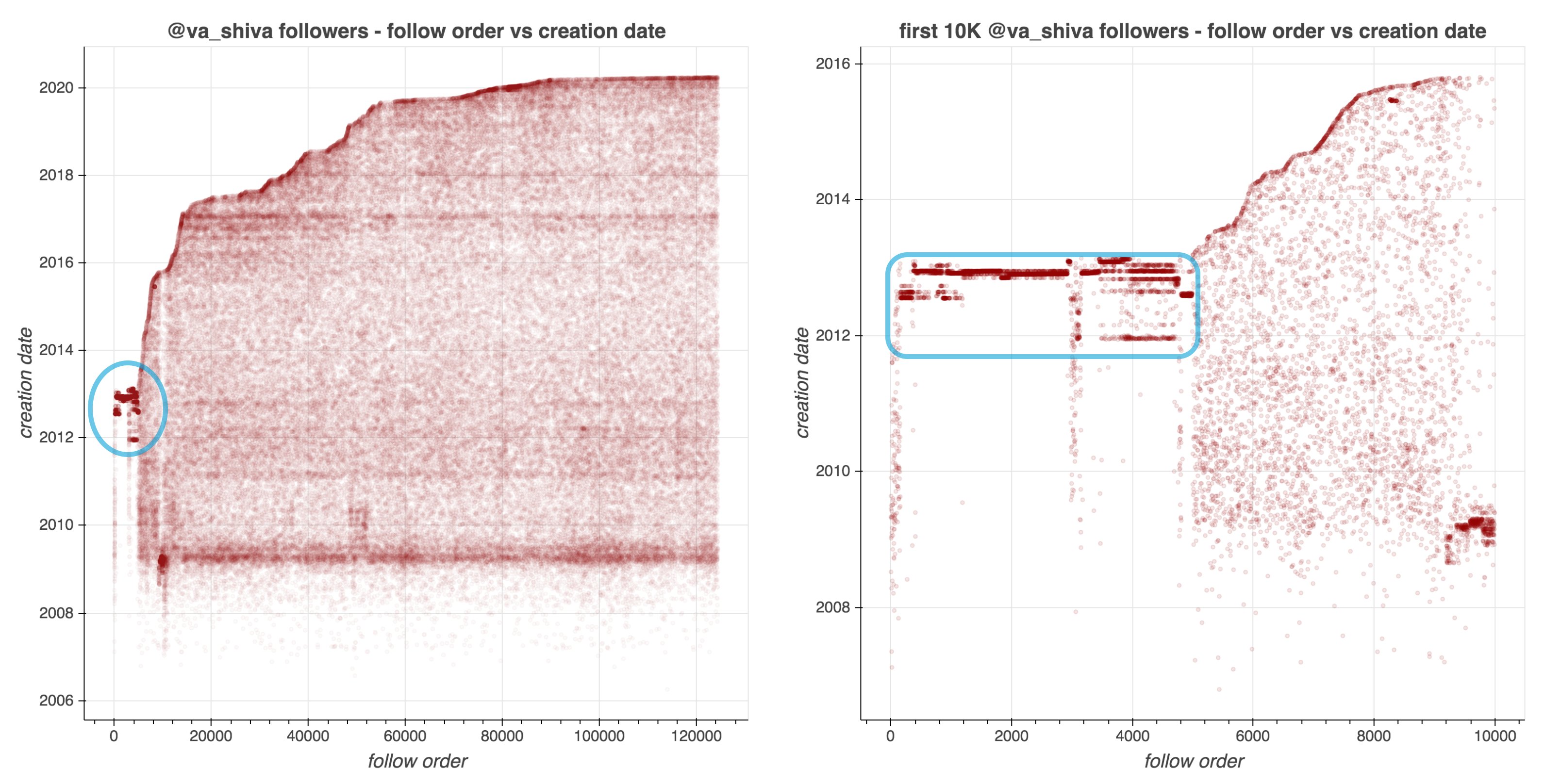
They looked at the date of these accounts started following Shiva, offset by the date of their accounts’ creation. A remarkeable pattern appeared:

Afbeelding
Via https://twitter.com/conspirator0/status/1244411551546847233/photo/1

Although @va_shiva‘s recent followers look unremarkable, a significant majority of his first 5000 followers appear to have been created in batches and to have subsequently followed @va_shiva in rapid succession.

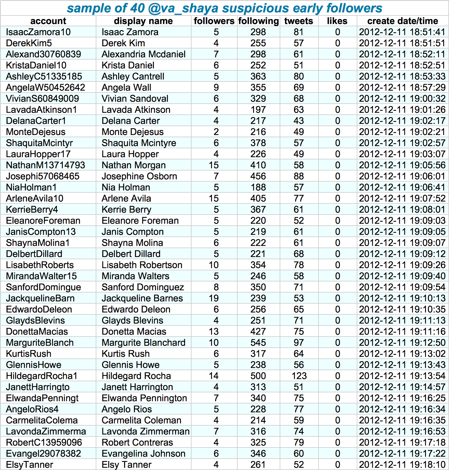
Looking at those followers in more detail, other suspicious patterns emerge. Their names follow a same pattern, they have an about equal amount of followers, followings, tweets, and (no) likes. Moreover, they were created only seconds apart. Many of them seem to follow each other as well.

Afbeelding
Via https://twitter.com/conspirator0/status/1244411636410187782/photo/1

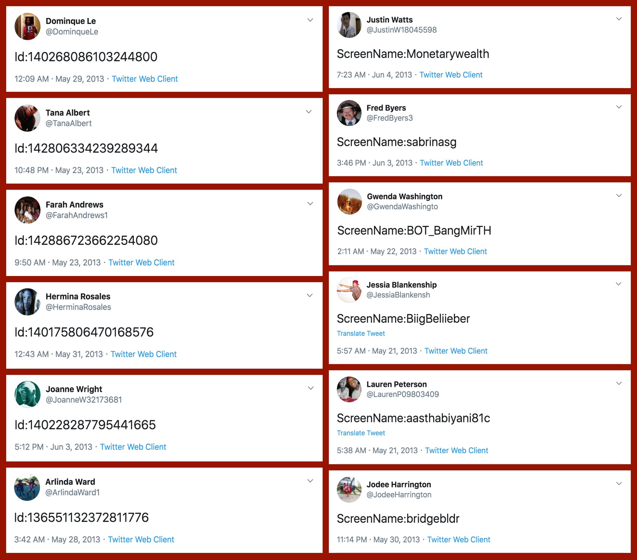
If that wasn’t enough proof of something’s off, here’s a variety of their tweets… Not really what everyday folks would tweet right? Plus similar patterns again across acounts.

Afbeelding
Via: https://twitter.com/conspirator0/status/1244411760129515522/photo/1

At first, I thought, so what? This Shiva guy probably just set up some automated (Python?) scripts to make Twitter account and follow him. Good for him. It worked out, as his most recent 10k followers followed him organically.

However, it becomes more scary if you notice this Shiva guy is (succesfully) promoting the firing of people working for the government:

Anyways, wanted to share this simple though cool approach to finding bots & fake news networks on social media. I hope you liked it, and would love to hear your thoughts in the comments!

Analysis of Media Coverage on Refugees

Analysis of Media Coverage on Refugees

Hannah Yan Han is doing #100dayprojects on data science and visual storytelling and I can only recommend that you take a look yourself. Below you find her R text analysis (#41) of UNHCR speeches and TV coverage on refugees.

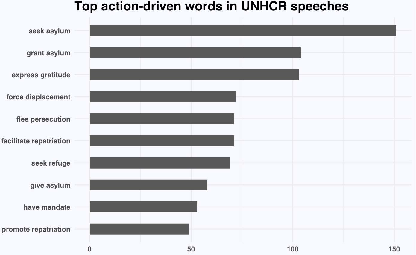
Unsurprisingly, nouns like asylum, repatriation, displacement, persecution, plight, and crisis appear significantly more often in UNHCR speeches on refugees than in general English texts. The first visualization below shows the action-oriented verbs most commonly used in combination with these nouns.

This second visualization shows the most occurring verb-noun pairs.

Hannah used newsflash to retrieve the GDELT data on US TV news. Some channels seem to cover refugees more than others. I would have loved to see which topics occurred on each channel, but unfortunately she did not report on this.

Summarizing our Daily News: Clustering 100.000+ Articles in Python

Summarizing our Daily News: Clustering 100.000+ Articles in Python

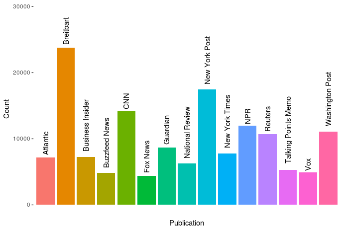
Andrew Thompson was interested in what 10 topics a computer would identify in our daily news. He gathered over 140.000 new articles from the archives of 10 different sources, as you can see in the figure below.

The sources of the news articles used in the analysis.

In Python, Andrew converted the text of all these articles into a manageable form (tf-idf document term matrix (see also Harry Plotter: Part 2)), reduced these data to 100 dimensions using latent semantic analysis (singular value decomposition), and ran a k-means clustering to retrieve the 10 main clusters. I included his main results below, but I highly suggest you visit the original article on Medium as Andrew used Plotly to generate interactive plots!

newplot
Most important words per topic (interactive visual in original article)

The topics structure seems quite nice! Topic 0 involves legal issues, such as immigration, whereas topic 1 seems to be more about politics. Topic 8 is clearly sports whereas 9 is education. Next, Andres inspected which media outlet covers which topics most. Again, visit the original article for interactive plots!

newplot (1).png
Media outlets and the topics they cover (interactive version in original article)

In light of the fake news crisis and the developments in (internet) media, I believe Andrew’s conclusions on these data are quite interesting.

I suppose different people could interpret this data and these graphs differently, but I interpret them as the following: when forced into groups, the publications sort into Reuters and everything else.

[…]

Every publication in this dataset except Reuters shares some common denominators. They’re entirely funded on ads and/or subscriptions (Vox and BuzzFeed also have VC funding, but they’re ad-based models), and their existence relies on clicks. By contrast, Reuters’s news product is merely the public face of a massive information conglomerate. Perhaps more importantly, it’s a news wire whose coverage includes deep reporting on the affairs of our financial universe, and therefore is charged with a different mandate than the others — arguably more than the New York Times, it must cover all the news, without getting trapped in the character driven reality-TV spectacle that every other citizen of the dataset appears to so heavily relish in doing. Of them all, its voice tends to maintain the most moderate indoor volume, and no single global event provokes larger-than-life outrage, if outrage can be provoked from Reuters at all. Perhaps this is the product of belonging to the financial press and analyzing the world macroscopically; the narrative of the non-financial press fails to accord equal weight to a change in the LIBOR rate and to the policy proposals of a madman, even though it arguably should. Every other publication here seems to bear intimations of utopia, and the subtext of their content is often that a perfect world would materialize if we mixed the right ingredients in the recipe book, and that the thing you’re outraged about is actually the thing standing between us and paradise. In my experience as a reader, I’ve never felt anything of the sort emanate from Reuters.

This should not be interpreted as asserting that the New York Times and Breitbart are therefore identical cauldrons of apoplexy. I read a beautifully designed piece today in the Times about just how common bioluminescence is among deep sea creatures. It goes without saying that the prospect of finding a piece like that in Breitbart is nonexistent, which is one of the things I find so god damned sad about that territory of the political spectrum, as well as in its diametrical opponents a la Talking Points Memo. But this is the whole point: show an algorithm the number of stories you write about deep sea creatures and it’ll show you who you are. At a finer resolution, we would probably find a chasm between the Times and Fox News, or between NPR and the New York Post. See that third cluster up there, where all the words are kind of compressed with lower TfIdf values and nothing sticks out? It’s actually a whole jungle of other topics, and you can run the algorithm on just that cluster and get new groups and distinctions — and one of those clusters will also be a compression of different kinds of stories, and you can do this over and over in a fractal of machine learning. The distinction here is not the only one, but it is, from the aerial perspective of data, the first.

It would be really interesting to see whether more high-quality media outlets, like the New York Times, could be easily distinguished from more sensational outlets, such as Buzzfeed, when more clusters were used, or potentially other text analytics methodology, like latent Dirichlet allocation.