Vincent Warmerdam shared this Youtube video which I thoroughly enjoyed watched. It’s about Saul Pwanson, a software engineer whose hobby project got a little out of hand.
In 2016, Saul Pwanson designed a plain-text file format for crossword puzzle data, and then spent a couple of months building a micro-data-pipeline, scraping tens of thousands of crosswords from various sources.
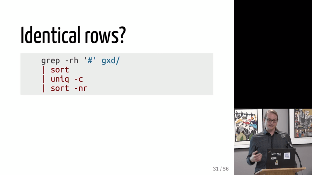
After putting all these crosswords in a simple uniform format, Saul used some simple command line commands to check for common patterns and irregularities.
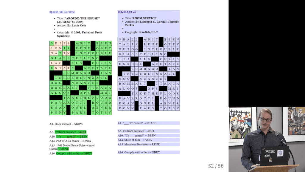
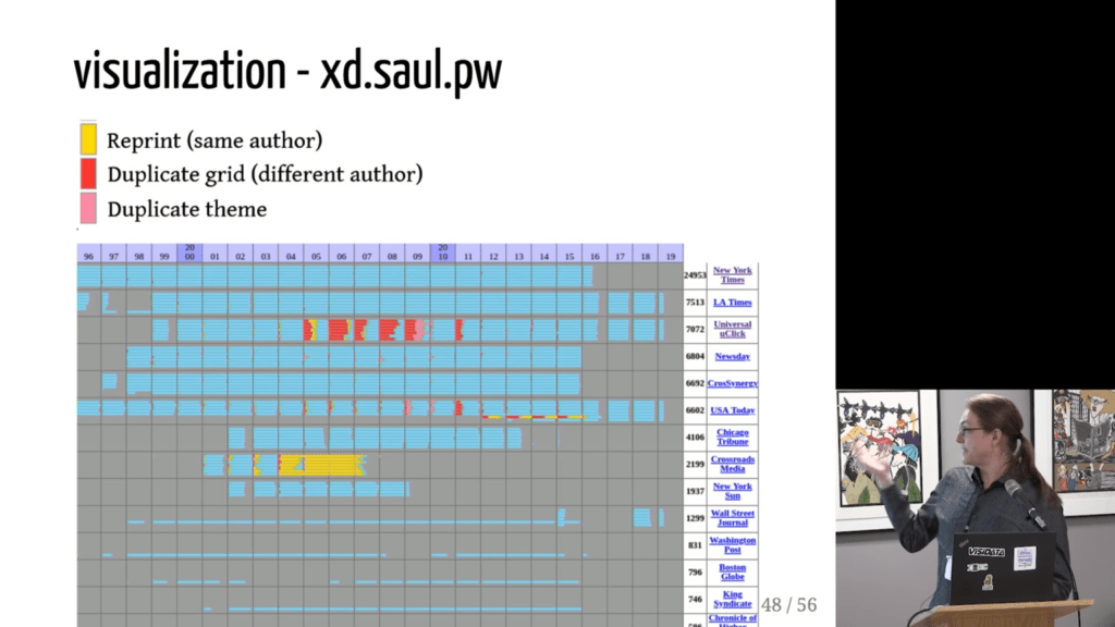
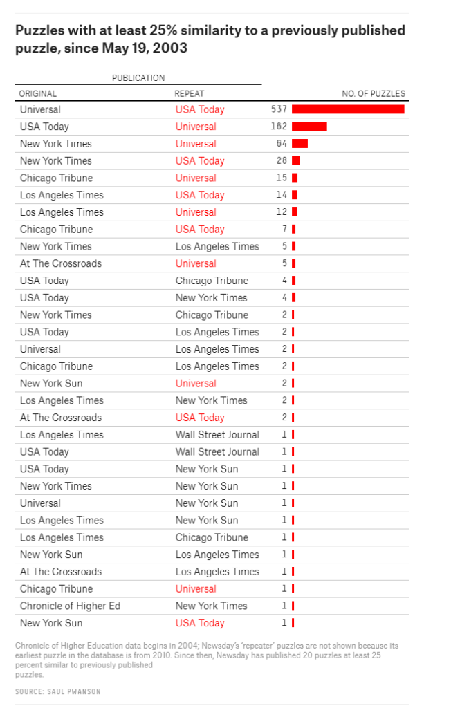
Surprisingly enough, after visualizing the results, Saul discovered egregious plagiarism by a major crossword editor that had gone on for years.
I thoroughly enjoyed watching this talk on Youtube.
Saul covers the file format, data pipeline, and the design choices that aided rapid exploration; the evidence for the scandal, from the initial anomalies to the final damning visualization; and what it’s like for a data project to get 15 minutes of fame.
I tried to localize the dataset online, but it seems Saul’s website has since gone offline. If you do happen to find it, please do share it in the comments!
If you are looking for a project to build a bot or AI application, look no further.
Enter the stage, PyBoy, a Nintendo Game Boy (DMG-01 [1989]) written in Python 2.7. The implementation runs in almost pure Python, but with dependencies for drawing graphics and getting user interactions through SDL2 and NumPy.
PyBoy is great for your AI robot projects as it is loadable as an object in Python. This means, it can be initialized from another script, and be controlled and probed by the script. You can even use multiple emulators at the same time, just instantiate the class multiple times.
The imagery suggests you can play anything from classic Super Mario to Pokemon. I suggest you start with the github, background report and PyBoy documentation right away.
The field of computer vision tries to replicate our human visual capabilities, allowing computers to perceive their environment in a same way as you and I do. The recent breakthroughs in this field are super exciting and I couldn’t but share them with you.
In the TED talk below by Joseph Redmon (PhD at the University of Washington) showcases the latest progressions in computer vision resulting, among others, from his open-source research on Darknet – neural network applications in C. Most impressive is the insane speed with which contemporary algorithms are able to classify objects. Joseph demonstrates this by detecting all kinds of random stuff practically in real-time on his phone! Moreover, you’ve got to love how well the system works: even the ties worn in the audience are classified correctly!
The second talk, below, is more scientific and maybe even a bit dry at the start. Blaise Aguera y Arcas (engineer at Google) starts with a historic overview brain research but, fortunately, this serves a cause, as ~6 minutes in Blaise provides one of the best explanations I have yet heard of how a neural network processes images and learns to perceive and classify the underlying patterns. Blaise continues with a similarly great explanation of how this process can be reversed to generate weird, Asher-like images, one could consider creative art:
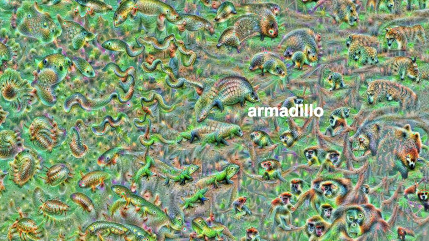
An example of a reversed neural network thus “estimating” an image of a bird [via Youtube]Blaise’s colleagues at Google took this a step further and used t-SNE to visualize the continuous space of animal concepts as perceived by their neural network, here a zoomed in part on the Armadillo part of the map, apparently closely located to fish, salamanders, and monkeys?
A zoomed view of part of a t-SNE map of latent animal concepts generated by reversing a neural network [via Youtube]We’ve seen these latent spaces/continua before. This example Andrej Karpathy shared immediately comes to mind:
If you want to learn more about this process of image synthesis through deep learning, I can recommend the scientific papers discussed by one of my favorite Youtube-channels, Two-Minute Papers. Karoly’s videos, such as the ones below, discuss many of the latest developments:
Let me know if you have any other video’s, papers, or materials you think are worthwhile!
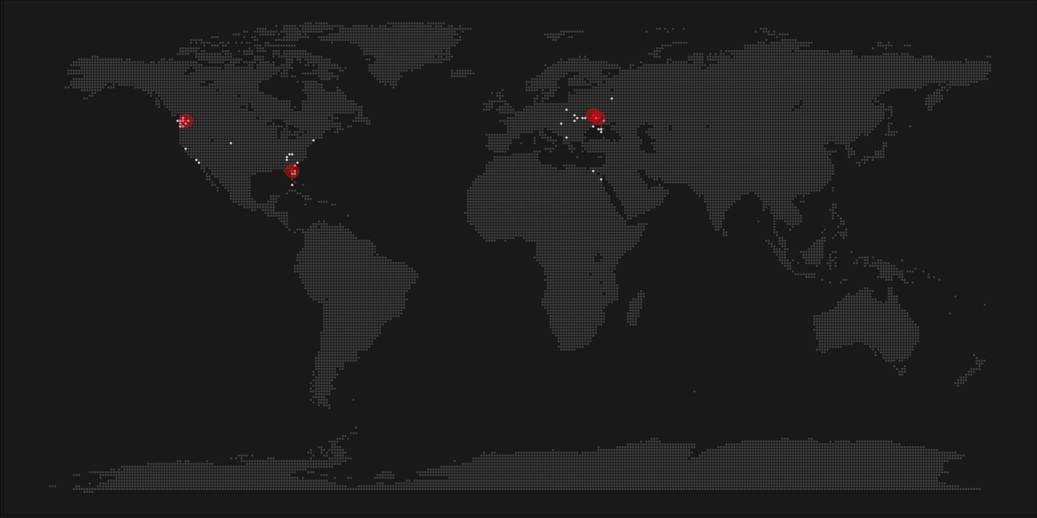
A pixel map of holiday and living locations made by Taras Kaduk in R [original]
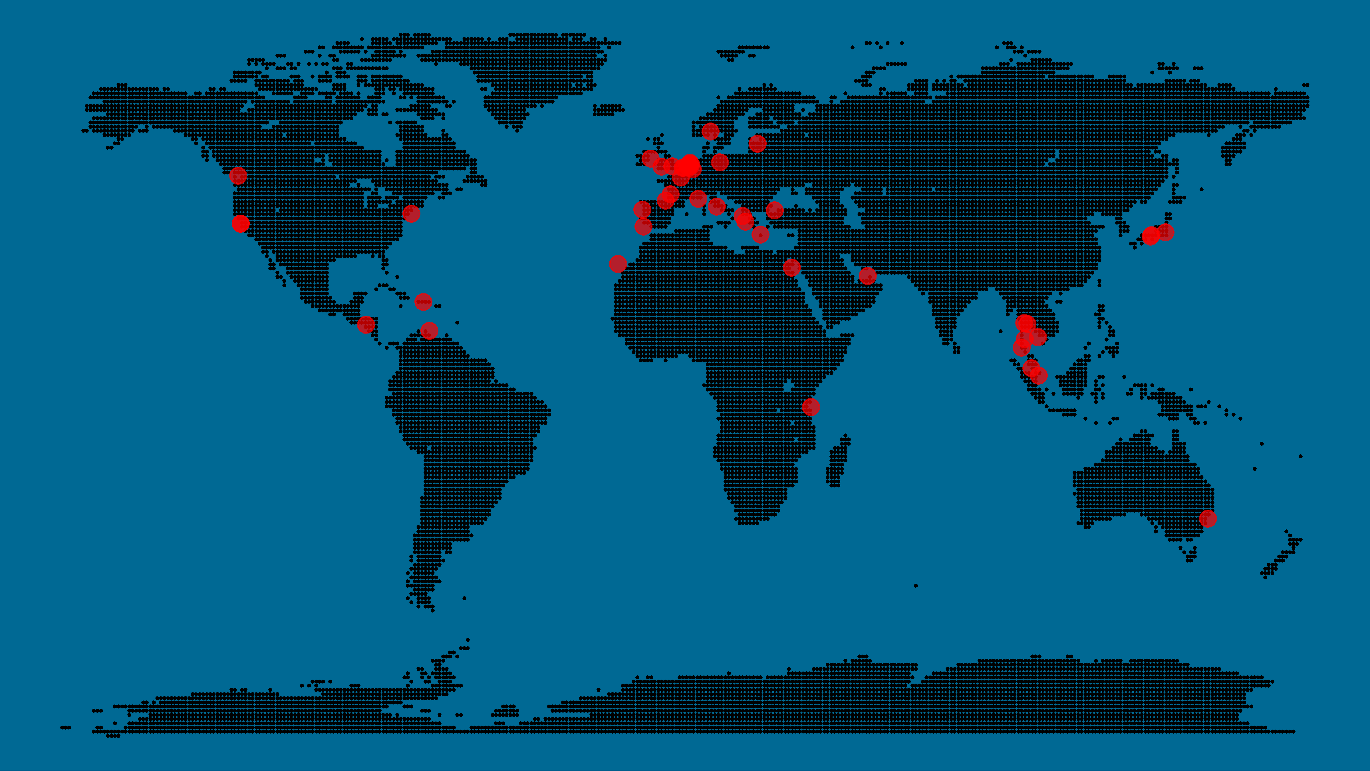
Taras Kaduk seems as excited about R and the tidyverse as I am, as he built the beautiful map above. It flags all the cities he has visited and, in red, the cities he has lived. Taras was nice enough to share his code here, in the original blog post.
Now, I am not much of a globetrotter, but I do like programming. Hence, I immediately wanted to play with the code and visualize my own holiday destinations. Below you can find my attempt. The updated code I also posted below, but WordPress doesn’t handle code well, so you better look here.
Let’s run you through the steps to make such a map. First, we need to load some packages. I use the apply family to install and/or load a set of packages so that if I/you run the script on a different computer, it will still work. In terms of packages, the tidyverse (read more) includes some nice data manipulation packages as well as the famous ggplot2 package for visualizations. We need maps and ggmap for their mapping functionalities. here is a great little package for convenient project management, as you will see (read more).
Next, we need to load in the coordinates (longitudes and latitudes) of our holiday destinations. Now, I started out creating a dataframe with city coordinates by hand. However, this was definitely not a scale-able solution. Fortunately, after some Googling, I came across ggmap::geocode(). This function allows you to query the Google maps API(no longer works) Data Science Toolkit, which returns all kinds of coordinates data for any character string you feed it.
Although, I ran into two problems with this approach, this was nothing we couldn’t fix. First, my home city of Breda apparently has a name-city in the USA, which Google favors. Accordingly, you need to be careful and/or specific regarding the strings you feed to geocode() (e.g., “Breda NL“). Second, API’s often have a query limit, meaning you can only ask for data every so often. geocode() will quickly return NAs when you feed it more than two, three values. Hence, I wrote a simple while loop to repeat the query until the API retrieves coordinates. The query will pause shortly in between every attempt. Returned coordinates are then stored in the empty dataframe I created earlier. Now, we can easily query a couple dozen of locations without errors.
You can try it yourself: all you need to change is the city_name string.
### cities data ----------------------------------------------------------------

# cities to geolocate
city_name <- c("breda NL", "utrecht", "rotterdam", "tilburg", "amsterdam",
               "london", "singapore", "kuala lumpur", "zanzibar", "antwerp",
               "middelkerke", "maastricht", "bruges", "san fransisco", "vancouver",
               "willemstad", "hurghada", "paris", "rome", "bordeaux",
               "berlin", "kos", "crete", "kefalonia", "corfu",
               "dubai", " barcalona", "san sebastian", "dominican republic",
               "porto", "gran canaria", "albufeira", "istanbul",
               "lake como", "oslo", "riga", "newcastle", "dublin",
               "nice", "cardiff", "san fransisco", "tokyo", "kyoto", "osaka",
               "bangkok", "krabi thailand", "chang mai thailand", "koh tao thailand")

# initialize empty dataframe
tibble(
  city = city_name,
  lon = rep(NA, length(city_name)),
  lat = rep(NA, length(city_name))
) ->
  cities

# loop cities through API to overcome SQ limit
# stop after if unsuccessful after 5 attempts
for(c in city_name){
  temp <- tibble(lon = NA)
  # geolocate until found or tried 5 times
  attempt <- 0 # set attempt counter
  while(is.na(temp$lon) & attempt < 5) {
    temp <- geocode(c, source = "dsk")
    attempt <- attempt + 1
    cat(c, attempt, ifelse(!is.na(temp[[1]]), "success", "failure"), "\n") # print status
    Sys.sleep(runif(1)) # sleep for random 0-1 seconds
  }
  # write to dataframe
  cities[cities$city == c, -1] <- temp
}
Now, Taras wrote a very convenient piece of code to generate the dotted world map, which I borrowed from his blog:
With both the dot data and the cities’ geocode() coordinates ready, it is high time to visualize the map. Note that I use one geom_point() layer to plot the dots, small and black, and another layer to plot the cities data in transparent red. Taras added a third layer for the cities he had actually lived in; I purposefully did not as I have only lived in the Netherlands and the UK. Note that I again use the convenient here::here() function to save the plot in my current project folder.
I very much like the look of this map and I’d love to see what innovative, other applications you guys can come up with. To copy the code, please look here on RPubs. Do share your personal creations and also remember to take a look at Taras original blog!
Due to the recent updates to the gganimate package, the code below no longer produces the desired animation. A working, updated version can be foundhere.
if(!"tidyverse" %in% installed.packages()) install.packages("tidyverse")

library("tidyverse")

n <- 100
tibble(x = runif(n),
y = runif(n),
s = runif(n, min = 4, max = 20)) %>%
ggplot(aes(x, y, size = s)) +
geom_point(color = "white", pch = 42) +
scale_size_identity() +
coord_cartesian(c(0,1), c(0,1)) +
theme_void() +
theme(panel.background = element_rect("black"))
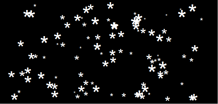
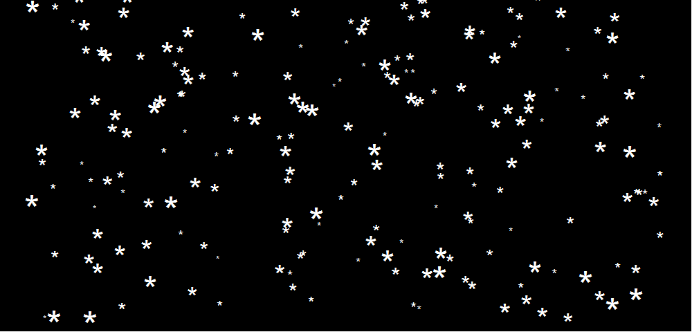
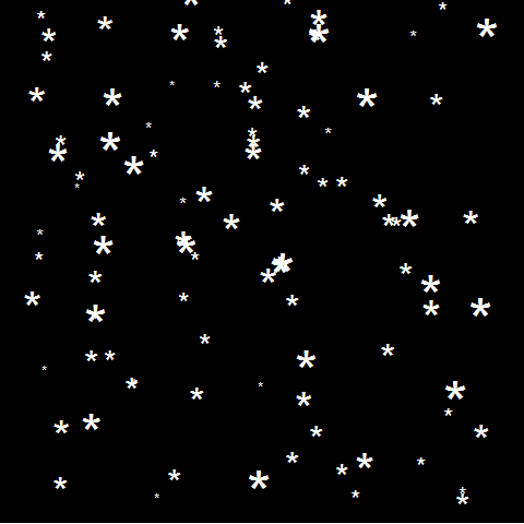
This greatly fits the Christmas theme we have going here. Inspired by Ilya’s script, I decided to make an animated snowy GIF! Sure R is able to make something like the lively visualizations Daniel Shiffman (Coding Train) usually makes in Processing/JavaScript? It seems so:
### ANIMATED SNOW === BY PAULVANDERLAKEN.COM
### PUT THIS FILE IN AN RPROJECT FOLDER

# load in packages
pkg <- c("here", "tidyverse", "gganimate", "animation")
sapply(pkg, function(x){
if (!x %in% installed.packages()){install.packages(x)}
library(x, character.only = TRUE)
})

# parameters
n <- 100 # number of flakes
times <- 100 # number of loops
xstart <- runif(n, max = 1) # random flake start x position
ystart <- runif(n, max = 1.1) # random flake start y position
size <- runif(n, min = 4, max = 20) # random flake size
xspeed <- seq(-0.02, 0.02, length.out = 100) # flake shift speeds to randomly pick from
yspeed <- runif(n, min = 0.005, max = 0.025) # random flake fall speed

# create storage vectors
xpos <- rep(NA, n * times)
ypos <- rep(NA, n * times)

# loop through simulations
for(i in seq(times)){
if(i == 1){
# initiate values
xpos[1:n] <- xstart
ypos[1:n] <- ystart
} else {
# specify datapoints to update
first_obs <- (n*i - n + 1)
last_obs <- (n*i)
# update x position
# random shift
xpos[first_obs:last_obs] <- xpos[(first_obs-n):(last_obs-n)] - sample(xspeed, n, TRUE)
# update y position
# lower by yspeed
ypos[first_obs:last_obs] <- ypos[(first_obs-n):(last_obs-n)] - yspeed
# reset if passed bottom screen
xpos <- ifelse(ypos < -0.1, runif(n), xpos) # restart at random x
ypos <- ifelse(ypos < -0.1, 1.1, ypos) # restart just above top
}
}

# store in dataframe
data_fluid <- cbind.data.frame(x = xpos,
y = ypos,
s = size,
t = rep(1:times, each = n))

# create animation
snow <- data_fluid %>%
ggplot(aes(x, y, size = s, frame = t)) +
geom_point(color = "white", pch = 42) +
scale_size_identity() +
coord_cartesian(c(0, 1), c(0, 1)) +
theme_void() +
theme(panel.background = element_rect("black"))

# save animation
gganimate(snow, filename = here("snow.gif"), title_frame = FALSE, interval = .1)
Updates:
21/12/2017: Keith combined sound and image to create this very merry video.
A few weeks ago, Magic Sudoku was released for iOS11. This app by a company named Hatchlings automatically solves sudoku puzzles using a combination of Computer Vision, Machine Learning, and Augmented Reality. The app works on iPad Pro’s and iPhone 6s or above and can be downloaded from the App Store.
Magic Sudoku gives a magical experience when users point their phone at a Sudoku puzzle: the puzzle is instantaneously solved and displayed on their screen. In several seconds, the following occurs behind the scenes:
“One of the original reasons I chose a Sudoku solver as our first AR app was that I knew classifying digits is basically the “hello world” of Machine Learning. I wanted to dip my toe in the water of Machine Learning while working on a real-world problem. This seemed like a realistic app to tackle.” – Brad Dwyer, Founder at Hatchlings
Particularly the training process of the app interested me. In his blog, Brad explains how they bought out the entire stock of Sudoku books of a specific bookstore and, with the help of his team, ripped each book apart to scan each small square with a number and upload in to a server. In the end, this server contained about 600,000 images, but all were completely unlabeled. Via a simple game, they asked Hatchlings users to classify these images by pressing the number keys on their keyboard. Within 24 hours, all 600,000 images were classified!
Nevertheless, some users had misunderstood the task (or just plainly ignored it) and as a consequence there were still a significant number of misidentified images. So Brad created a second tool that displayed 100 images of a single class to users, who where consequently asked to click the ones that didn’t match. These were subsequently thrown back into the first tool to be reclassified.
Quickly, the developers had enough verified data to add an automatic accuracy checker into both tools for future data runs. Funnily enough, they programmed it in such a way that users were periodically shown already known/classified images in order to check the validity of their inputs and determine how much to trust their answers going forward. This whole process reminds me on a blog I wrote recently, regarding human-computer interactions in reinforcement learning.
For several more weeks, users classified more scanned data so that, by the time the app was launched, it had been trained on over a million images of Sudoku squares. The results were amazing as the application had a 98.6% accuracy on launch (currently above 99% accuracy). One minor deficit was that the app was trained on paper Sudoku’s. However, when it aired, many users wanted to quickly test it and searched for Sudoku images on Google, which the app wouldn’t process that well.
“Problem number one was that our machine learning model was only trained on paper puzzles; it didn’t know what to think about pixels on a screen. I pulled an all nighter that first week and re-trained our model with puzzles on computer screens.
Problem number two was that ARKit only supports horizontal planes like tables and floors (not vertical planes like computer monitors). Solving this was a trickier problem but I did come up with a hacky workaround. I used a combination of some heuristics and FeaturePoint detection to place puzzles on non-horizontal planes.” – Brad Dwyer, Founder at Hatchlings