The R programming language has seen the integration of many languages; C, C++, Python, to name a few, can be seamlessly embedded into R so one can conveniently call code written in other languages from the R console. Little known to many, R works just as well with JavaScript—this book delves into the various ways both languages can work together.
John Coene is an well-known R and JavaScript developer. He recently wrote a book on JavaScript for R users, of which he published an online version free to access here.
The book is definitely worth your while if you want to better learn how to develop front-end applications (in JavaScript) on top of your statistical R programs. Think of better understanding, and building, yourself Shiny modules or advanced data visualizations integrated right into webpages.
A nice step on your development path towards becoming a full stack developer by combining R and JavaScript!
Yet most R developers are not familiar with one of web browsers’ core technology: JavaScript. This book aims to remedy that by revealing how much JavaScript can greatly enhance various stages of data science pipelines from the analysis to the communication of results.
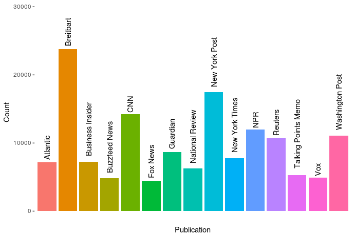
Andrew Thompson was interested in what 10 topics a computer would identify in our daily news. He gathered over 140.000 new articles from the archives of 10 different sources, as you can see in the figure below.
The sources of the news articles used in the analysis.
In Python, Andrew converted the text of all these articles into a manageable form (tf-idf document term matrix (see also Harry Plotter: Part 2)), reduced these data to 100 dimensions using latent semantic analysis (singular value decomposition), and ran a k-means clustering to retrieve the 10 main clusters. I included his main results below, but I highly suggest you visit the original article on Medium as Andrew used Plotly to generate interactive plots!
Most important words per topic (interactive visual in original article)
The topics structure seems quite nice! Topic 0 involves legal issues, such as immigration, whereas topic 1 seems to be more about politics. Topic 8 is clearly sports whereas 9 is education. Next, Andres inspected which media outlet covers which topics most. Again, visit the original article for interactive plots!
Media outlets and the topics they cover (interactive version in original article)
In light of the fake news crisis and the developments in (internet) media, I believe Andrew’s conclusions on these data are quite interesting.
I suppose different people could interpret this data and these graphs differently, but I interpret them as the following: when forced into groups, the publications sort into Reuters and everything else.
[…]
Every publication in this dataset except Reuters shares some common denominators. They’re entirely funded on ads and/or subscriptions (Vox and BuzzFeed also have VC funding, but they’re ad-based models), and their existence relies on clicks. By contrast, Reuters’s news product is merely the public face of a massive information conglomerate. Perhaps more importantly, it’s a news wire whose coverage includes deep reporting on the affairs of our financial universe, and therefore is charged with a different mandate than the others — arguably more than the New York Times, it must cover all the news, without getting trapped in the character driven reality-TV spectacle that every other citizen of the dataset appears to so heavily relish in doing. Of them all, its voice tends to maintain the most moderate indoor volume, and no single global event provokes larger-than-life outrage, if outrage can be provoked from Reuters at all. Perhaps this is the product of belonging to the financial press and analyzing the world macroscopically; the narrative of the non-financial press fails to accord equal weight to a change in the LIBOR rate and to the policy proposals of a madman, even though it arguably should. Every other publication here seems to bear intimations of utopia, and the subtext of their content is often that a perfect world would materialize if we mixed the right ingredients in the recipe book, and that the thing you’re outraged about is actually the thing standing between us and paradise. In my experience as a reader, I’ve never felt anything of the sort emanate from Reuters.
This should not be interpreted as asserting that the New York Times and Breitbart are therefore identical cauldrons of apoplexy. I read a beautifully designed piece today in the Times about just how common bioluminescence is among deep sea creatures. It goes without saying that the prospect of finding a piece like that in Breitbart is nonexistent, which is one of the things I find so god damned sad about that territory of the political spectrum, as well as in its diametrical opponents a la Talking Points Memo. But this is the whole point: show an algorithm the number of stories you write about deep sea creatures and it’ll show you who you are. At a finer resolution, we would probably find a chasm between the Times and Fox News, or between NPR and the New York Post. See that third cluster up there, where all the words are kind of compressed with lower TfIdf values and nothing sticks out? It’s actually a whole jungle of other topics, and you can run the algorithm on just that cluster and get new groups and distinctions — and one of those clusters will also be a compression of different kinds of stories, and you can do this over and over in a fractal of machine learning. The distinction here is not the only one, but it is, from the aerial perspective of data, the first.
It would be really interesting to see whether more high-quality media outlets, like the New York Times, could be easily distinguished from more sensational outlets, such as Buzzfeed, when more clusters were used, or potentially other text analytics methodology, like latent Dirichlet allocation.
Help yourself to these free books, tutorials, packages, cheat sheets, and many more materials for R programming. There’s a separate overview for handy R programming tricks. If you have additions, please comment below or contact me!
Integrated Development Environments (IDEs) & Graphical User Inferfaces (GUIs)
Descriptions mostly taken from their own websites:
RStudio*** – Open source and enterprise ready professional software
Jupyter Notebook*** – open-source web application that allows you to create and share documents that contain live code, equations, visualizations and narrative text across dozens of programming languages.


