Did you know that dragonflies are one of the most effective and accurate predators alive? And that while it has a brain consisting of very few neurons. Neuroscientist Greg Gage and his colleagues studied how a dragonfly locks onto its preys and captures it within milliseconds. Actually, a dragonfly seems to be little more than a small neural network hooked up to some wings, and optimized through millions of years of evolution.
I wrote about Emily Robinson and her A/B testing activities at Etsy before, but now she’s back with a great new blog full of practical advice: Emily provides 12 guidelines for A/B testing that help to setup effective experiments and mitigate data-driven but erroneous conclusions:
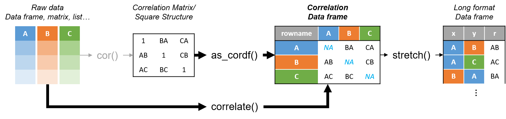
R’s standard correlation functionality (base::cor) seems very impractical to the new programmer: it returns a matrix and has some pretty shitty defaults it seems. Simon Jackson thought the same so he wrote a tidyverse-compatible new package: corrr!
Simon wrote some practical R code that has helped me out greatly before (e.g., color palette’s), but this new package is just great. He provides an elaborate walkthrough on his own blog, which I can highly recommend, but I copied some teasers below.
Diagram showing how the new functionality of corrr works.
Apart from corrr::correlate to retrieve a correlation data frame and corrr::stretch to turn that data frame into a long format, the new package includes corrr::focus, which can be used to simulteneously select the columns and filter the rows of the variables focused on. For example:
# install.packages("tidyverse")
library(tidyverse)

# install.packages("corrr")
library(corrr)

# install.packages("here")
library(here)

dir.create(here::here("images")) # create an images directory

mtcars %>%
  corrr::correlate() %>%
  # use mirror = TRUE to not only select columns but also filter rows
  corrr::focus(mpg:hp, mirror = TRUE) %>%
  corrr::network_plot(colors = c("red", "green")) %>%
  ggplot2::ggsave(
    filename = here::here("images", "mtcars_networkplot.png"),
    width = 5,
    height = 5
    )
With corrr::networkplot you get an immediate sense of the relationships in your data.
Let’s try some different visualizations:
mtcars %>%
  corrr::correlate() %>%
  corrr::focus(mpg) %>%
  dplyr::mutate(rowname = reorder(rowname, mpg)) %>%
  ggplot2::ggplot(ggplot2::aes(rowname, mpg)) +
  # color each bar based on the direction of the correlation
  ggplot2::geom_col(ggplot2::aes(fill = mpg >= 0)) +
  ggplot2::coord_flip() +
  ggplot2::ggsave(
    filename = here::here("images", "mtcars_mpg-barplot.png"),
    width = 5,
    height = 5
  )
The tidy correlation data frames can be easily piped into a ggplot2 function call
corrr also provides some very helpful functionality display correlations. Take, for instance, corrr::fashion and corrr::shave:
mtcars %>%
  corrr::correlate() %>%
  corrr::focus(mpg:hp, mirror = TRUE) %>%
  # converts the upper triangle (default) to missing values
  corrr::shave() %>%
  # converts a correlation df into clean matrix
  corrr::fashion() %>%
  readr::write_excel_csv(here::here("correlation-matrix.csv"))
Exporting a nice looking correlation matrix has never been this easy.
Finally, there is the great function of corrr::rplot to generate an amazing correlation overview visual in a wingle line. However, here it is combined with corr::rearrange to make sure that closely related variables are actually closely located on the axis, and again the upper half is shaved away:
Generate fantastic single-line correlation overviews with <code>corrr::rplot</code>
For some more functionalities, please visit Simon’s blog and/or the associated GitHub page. If you copy the code above and play around with it, be sure to work in an Rproject else the here::here() functions might misbehave.
Nicolas Rougier, Michael Droettboom, Philip Bourne wrote an open access article for the Public Library of Open Science (PLOS) in 2014, proposing ten simple rules for better figures. Below I posted these 10 rules and quote several main sentences extracted from the original article.
Rule 1: Know Your Audience
It is important to identify, as early as possible in the design process, the audience and the message the visual is to convey. The graphical design of the visual should be informed by this intent. […] The general public may be the most difficult audience of all since you need to design a simple, possibly approximated, figure that reveals only the most salient part of your research.
Rule 2: Identify Your Message
It is important to clearly identify the role of the figure, i.e., what is the underlying message and how can a figure best express this message? […] Only after identifying the message will it be worth the time to develop your figure, just as you would take the time to craft your words and sentences when writing an article only after deciding on the main points of the text.
Rule 3: Adapt the Figure to the Support Medium
Ideally, each type of support medium requires a different figure, and you should abandon the practice of extracting a figure from your article to be put, as is, in your oral presentation. […] For example, during an oral presentation, a figure will be displayed for a limited time. Thus, the viewer must quickly understand what is displayed and what it represents while still listening to your explanation.
Rule 4: Captions Are Not Optional
The caption explains how to read the figure and provides additional precision for what cannot be graphically represented. This can be thought of as the explanation you would give during an oral presentation, or in front of a poster, but with the difference that you must think in advance about the questions people would ask. […] if there is a point of interest in the figure (critical domain, specific point, etc.), make sure it is visually distinct but do not hesitate to point it out again in the caption.
Rule 5: Do Not Trust the Defaults
All plots require at least some manual tuning of the different settings to better express the message, be it for making a precise plot more salient to a broad audience, or to choose the best colormap for the nature of the data.
Rule 6: Use Color Effectively
As explained by Edward Tufte [1], color can be either your greatest ally or your worst enemy if not used properly. If you decide to use color, you should consider which colors to use and where to use them. […] However, if you have no such need, you need to ask yourself, “Is there any reason this plot is blue and not black?”
Rule 7: Do Not Mislead the Reader
What distinguishes a scientific figure from other graphical artwork is the presence of data that needs to be shown as objectively as possible. […] As a rule of thumb, make sure to always use the simplest type of plots that can convey your message and make sure to use labels, ticks, title, and the full range of values when relevant.
Example from the paper on how visualization parameters can convey a misleading message.
Rule 8: Avoid “Chartjunk”
Chartjunk refers to all the unnecessary or confusing visual elements found in a figure that do not improve the message (in the best case) or add confusion (in the worst case). For example, chartjunk may include the use of too many colors, too many labels, gratuitously colored backgrounds, useless grid lines, etc. The term was first coined by Edward Tutfe [1]; he argues that any decorations that do not tell the viewer something new must be banned: “Regardless of the cause, it is all non-data-ink or redundant data-ink, and it is often chartjunk.” Thus, in order to avoid chartjunk, try to save ink, or electrons in the computing era.
Rule 9: Message Trumps Beauty
There exists a myriad of online graphics in which aesthetic is the first criterion and content comes in second place. Even if a lot of those graphics might be considered beautiful, most of them do not fit the scientific framework. Remember, in science, message and readability of the figure is the most important aspect while beauty is only an option.
Rule 10: Get the Right Tool
Matplotlib is a python plotting library, primarily for 2-D plotting, but with some 3-D support, which produces publication-quality figures in a variety of hardcopy formats and interactive environments across platforms. It comes with a huge gallery of examples that cover virtually all scientific domains (http://matplotlib.org/gallery.html).
R is a language and environment for statistical computing and graphics. R provides a wide variety of statistical (linear and nonlinear modeling, classical statistical tests, time-series analysis, classification, clustering, etc.) and graphical techniques, and is highly extensible.
Inkscape is a professional vector graphics editor. It allows you to design complex figures and can be used, for example, to improve a script-generated figure or to read a PDF file in order to extract figures and transform them any way you like.
TikZ and PGF are TeX packages for creating graphics programmatically. TikZ is built on top of PGF and allows you to create sophisticated graphics in a rather intuitive and easy manner, as shown by the Tikz gallery (http://www.texample.net/tikz/examples/all/).
GIMP is the GNU Image Manipulation Program. It is an application for such tasks as photo retouching, image composition, and image authoring. If you need to quickly retouch an image or add some legends or labels, GIMP is the perfect tool.
ImageMagick is a software suite to create, edit, compose, or convert bitmap images from the command line. It can be used to quickly convert an image into another format, and the huge script gallery (http://www.fmwconcepts.com/imagemagick/index.php) by Fred Weinhaus will provide virtually any effect you might want to achieve.
D3.js (or just D3 for Data-Driven Documents) is a JavaScript library that offers an easy way to create and control interactive data-based graphical forms which run in web browsers, as shown in the gallery at http://github.com/mbostock/d3/wiki/Gallery.
Cytoscape is a software platform for visualizing complex networks and integrating these with any type of attribute data. If your data or results are very complex, cytoscape may help you alleviate this complexity.
Circos was originally designed for visualizing genomic data but can create figures from data in any field. Circos is useful if you have data that describes relationships or multilayered annotations of one or more scales.
You can download the PDF version of the full article here.
[1] Tufte EG (1983) The Visual Display of Quantitative Information. Cheshire, Connecticut: Graphics Press.
Past week, I started this great C++ tutorial: learncpp.com. It has been an amazing learning experience so far, mostly because the tutorial is very hands on, allowing you to immediately self-program all of the code examples.
Several hours in now, section 1.10b explains how to design of your own, first programs. The advice in this seciton seemd pretty universal, thus valuable regardless of the programming language you normally work in. At least, I found it to resonates with my personal experiences so I highly recommend that you take 10 minutes to read it yourself: www.learncpp.com/cpp-tutorial/1-10b-how-to-design-your-first-programs. For those who dislike detailed insights, here are the main pointers:
A little up-front planning saves time and frustration in the long run. Generally speaking, work through these eight steps when starting a new program or project:
Define the problem
Collect the program’s basic requirements (e.g., functionality, constraints)
Define your tools, targets, and backup plan
Break hard problems down into easy problems
Figure out (and list) the sequence of events
Figure out the data inputs and outputs for each task
Write the task details
Connect the data inputs and outputs
Some general words of advice when writing programs:
Keep your programs simple to start. Often new programmers have a grand vision for all the things they want their program to do. “I want to write a role-playing game with graphics and sound and random monsters and dungeons, with a town you can visit to sell the items that you find in the dungeon” If you try to write something too complex to start, you will become overwhelmed and discouraged at your lack of progress. Instead, make your first goal as simple as possible, something that is definitely within your reach. For example, “I want to be able to display a 2d field on the screen”.
Add features over time. Once you have your simple program working and working well, then you can add features to it. For example, once you can display your 2d field, add a character who can walk around. Once you can walk around, add walls that can impede your progress. Once you have walls, build a simple town out of them. Once you have a town, add merchants. By adding each feature incrementally your program will get progressively more complex without overwhelming you in the process.
Focus on one area at a time. Don’t try to code everything at once, and don’t divide your attention across multiple tasks. Focus on one task at a time, and see it through to completion as much as is possible. It is much better to have one fully working task and five that haven’t been started yet than six partially-working tasks. If you split your attention, you are more likely to make mistakes and forget important details.
Test each piece of code as you go. New programmers will often write the entire program in one pass. Then when they compile it for the first time, the compiler reports hundreds of errors. This can not only be intimidating, if your code doesn’t work, it may be hard to figure out why. Instead, write a piece of code, and then compile and test it immediately. If it doesn’t work, you’ll know exactly where the problem is, and it will be easy to fix. Once you are sure that the code works, move to the next piece and repeat. It may take longer to finish writing your code, but when you are done the whole thing should work, and you won’t have to spend twice as long trying to figure out why it doesn’t.
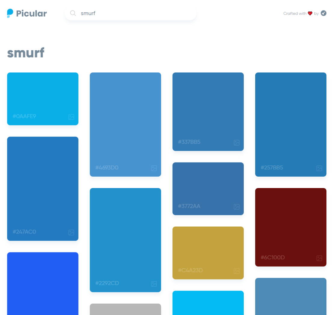
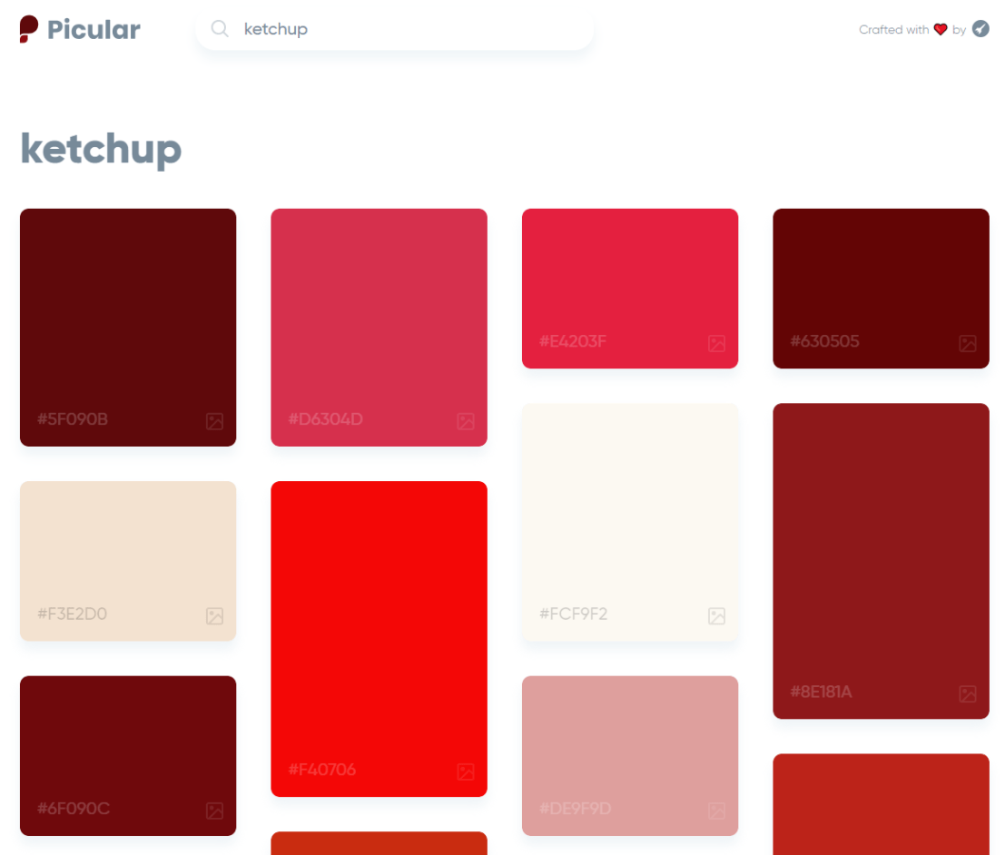
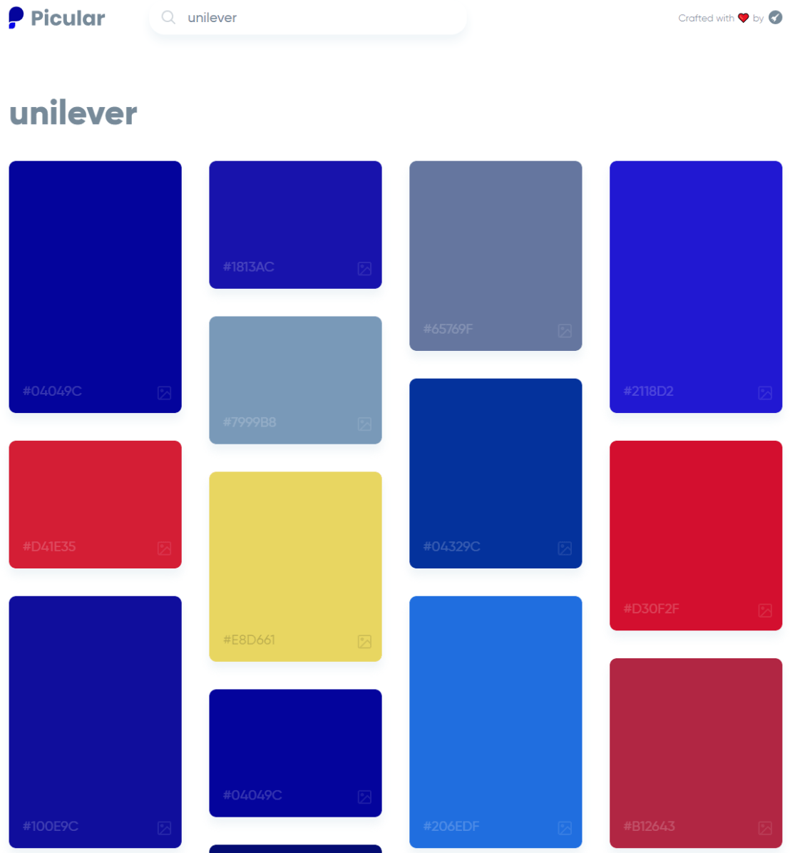
Picular.co calls itself Google, but for colors on its website. And not without good reason. On the site, you type in a color association (e.g., forest green), and it provides you an palette overview of associated colors and their hexadecimal (Hex) codes.
I don’t precisely know how it works, but it seems to work quite well!


![journal.pcbi.1003833.g006[2].png](https://paulvanderlaken.com/wp-content/uploads/2018/09/journal-pcbi-1003833-g0062.png?w=1108)