How do scurvy, astronomy, alchemy and data science relate to each other?
In this goto conference presentation, Lucas Vermeer — Director of Experimentation at Booking.com — uses some amazing storytelling to demonstrate how the value of data (science) is largely by organizations capability to gather the right data — the data they actually need.
It’s a definite recommendation to watch for data scientists and data science leaders out there.
Here are the slides, and they contain some great oneliners:
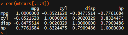
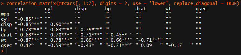
In most (observational) research papers you read, you will probably run into a correlation matrix. Often it looks something like this:
In Social Sciences, like Psychology, researchers like to denote the statistical significance levels of the correlation coefficients, often using asterisks (i.e., *). Then the table will look more like this:
Regardless of my personal preferences and opinions, I had to make many of these tables for the scientific (non-)publications of my Ph.D..
I remember that, when I first started using R, I found it quite difficult to generate these correlation matrices automatically.
Yes, there is the cor function, but it does not include significance levels.
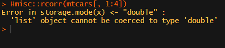
Then there the (in)famous Hmisc package, with its rcorr function. But this tool provides a whole new range of issues.
What’s this storage.mode, and what are we trying to coerce again?
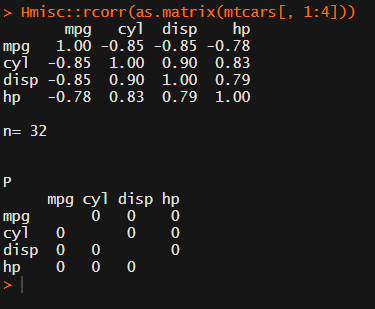
Soon you figure out that Hmisc::rcorr only takes in matrices (thus with only numeric values). Hurray, now you can run a correlation analysis on your dataframe, you think…
Yet, the output is all but publication-ready!
You wanted one correlation matrix, but now you have two… Double the trouble?
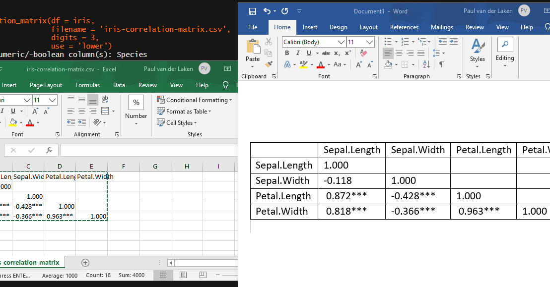
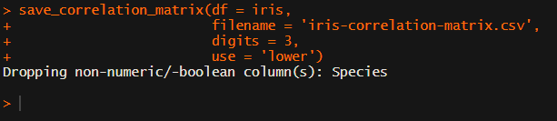
[UPDATED] To spare future scholars the struggle of the early day R programming, Laura Lambert and I created an R package corrtable, which includes the helpful function correlation_matrix.
This correlation_matrix takes in a dataframe, selects only the numeric (and boolean/logical) columns, calculates the correlation coefficients and p-values, and outputs a fully formatted publication-ready correlation matrix!
For instance, you can use only 2 decimals. You can focus on the lower triangle (as the lower and upper triangle values are identical). And you can drop the diagonal values:
Or maybe you are interested in a different type of correlation coefficients, and not so much in significance levels:
Cascading Stylesheets — or CSS — is the first technology you should start learning after HTML. While HTML is used to define the structure and semantics of your content, CSS is used to style it and lay it out. For example, you can use CSS to alter the font, color, size, and spacing of your content, split it into multiple columns, or add animations and other decorative features.
I was personally encoutered CSS in multiple stages of my Data Science career:
When I started using (R) markdown (see here, or here), I could present my data science projects as HTML pages, styled through CSS.
When I got more acustomed to building web applications (e.g., Shiny) on top of my data science models, I had to use CSS to build more beautiful dashboard layouts.
When I was scraping data from Ebay, Amazon, WordPress, and Goodreads, my prior experiences with CSS & HTML helped greatly to identify and interpret the elements when you look under the hood of a webpage (try pressing CTRL + SHIFT + C).
I know others agree with me when I say that the small investment in learning the basics behind HTML & CSS pay off big time:
ok listen……. i finally took a few hours to learn some CSS basics and big time recommend to any and all #rstats people who have always felt absolutely clueless looking up CSS stuff on stack overflow
I read that Mozilla offers some great tutorials for those interested in learning more about “the web”, so here are some quicklinks to their free tutorials:
According to Jake Voytko, data science and engineering teams run more efficiently and spread knowledge more quickly when there is a single person setting the technical direction of a team. The so-called “tech lead“.
Sometimes tech lead is an official title, referring to the position between an engineering manager and the engineering team. Oftentimes it is just a unofficial role one grows in to.
Now, according to Jake, you can learn to become a tech lead. And you can be good at it too. Somebody has to do it, so it might as well be you! It could allow you to leverage your time to move the organization forward, and enables you to influence data science or engineering throughout the entire team!
In this original blog, which I thoroughly enjoyed reading, Jake explains in more detail what it takes to be(come) a good tech lead. Here just the headers copied, but if you’re interested, take a look at the full article:
Less time writing code
Helping others often (esp. juniors)
Helping others first
Doing unsexy, unthankful work to enable the team
Being an ally (of underrepresented groups)
Spreading knowledge, or making sure it spreads
And this is what Jake feels his work week looks like as a tech lead:
Kevin Markham shares his tips and tricks for the most common data handling tasks on twitter. He compiled the top 100 in this one amazing overview page. Find the hyperlinks to specific sections below!
🐼🤹♂️ pandas trick:
Want to plot a DataFrame? It's as easy as: df.plot(kind='…')
You can use: line 📈 bar 📊 barh hist box 📦 kde area scatter hexbin pie 🥧