Category: programming

Dynamic Programming MIT Course

Dynamic Programming MIT Course

Cover image by xkcd

Over the last months I’ve been working my way through Project Euler in my spare time. I wanted to learn Python programming, and what better way than solving mini-problems and -projects?!

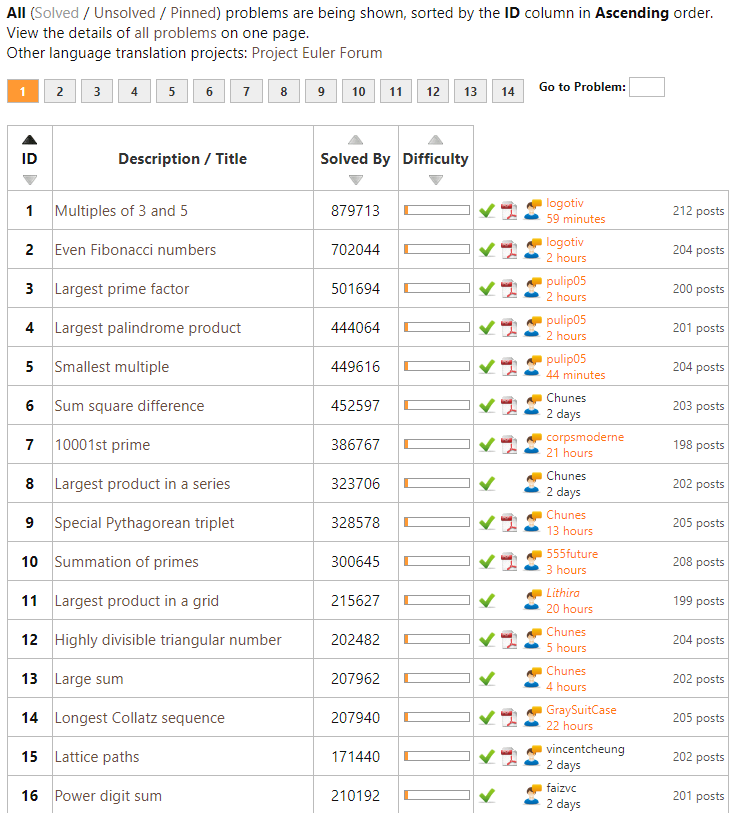
Well, Project Euler got a ton of these, listed in increasing order of difficulty. It starts out simple: to solve the first problem you need to write a program to identify multiples of 3 and 5. Next, in problem two, you are asked to sum the first thousand even Fibonacci numbers. Each problem, the task at hand gets slighly more difficult…

For me, Project Euler combines math, programming, and stats in a way that really keeps me motivated to continue and learn new concepts and programming / problem-solving approaches.

However, at problem 31, I really got stuck. For several hours, I struggled to solve it in a satisfactory fashion, even though most other problems only take 5-90 minutes.

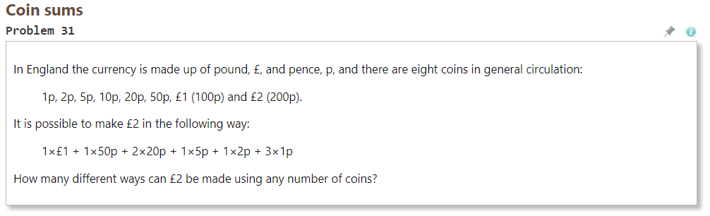
After hours of struggling, I pretty much gave up, and googled some potential solutions. Aparently, the way to solve problem 31, is to take a so-called dynamic programming approach.

Dynamic programming is both a mathematical optimization method and a computer programming method. The method was developed by Richard Bellman in the 1950s and has found applications in numerous fields, from aerospace engineering to economics. In both contexts it refers to simplifying a complicated problem by breaking it down into simpler sub-problems in a recursive manner. While some decision problems cannot be taken apart this way, decisions that span several points in time do often break apart recursively. Likewise, in computer science, if a problem can be solved optimally by breaking it into sub-problems and then recursively finding the optimal solutions to the sub-problems, then it is said to have optimal substructure.

https://en.wikipedia.org/wiki/Dynamic_programming

Now, this sounded like something I’d like to learn more about! I was already quite familiar with recursive problems and solutions, but this dynamic programming sounded next-level.

So I googled and googled for tutorials and other resources, and I finally came across this free 2011 MIT course that I intend to view over the coming weeks.

There’s even a course website with additional materials and assignments (in Python).

ASSN #TOPICSPROBLEM SETSSOLUTIONS
1Asymptotic complexity, recurrence relations, peak findingProblem Set 1 (PDF)
Problem Set 1 Code (ZIP)
Problem Set 1 Solutions (PDF)
2Fractal rendering, digital circuit simulationProblem Set 2 (PDF)
Problem Set 2 Code (ZIP)
Problem Set 2 Solutions (PDF)
Problem Set 2 Code Solutions (ZIP – 7.7MB)
3Range queries, digital circuit layoutProblem Set 3 (PDF)
Problem Set 3 Code (ZIP – 3.2MB)
Problem Set 3 Solutions (PDF)
Problem Set 3 Code Solutions (ZIP – 15.7MB)
4Hash functions, Python dictionaries, matching DNA sequencesProblem Set 4 (PDF)
Problem Set 4 Code (GZ – 12.4MB) (kfasta.py courtesy of Kevin Kelley, and used with permission.)
Problem Set 4 Solutions (PDF)
Problem Set 4 Code Solutions (ZIP)
5The Knight’s Shield, RSA public key encryption, image decryptionProblem Set 5 (PDF)
Problem Set 5 Code (ZIP)
Problem Set 5 Grading Explanation (PDF)
Problem Set 5 Solutions (PDF)
Problem Set 5 Code Solutions (ZIP)
6Social networks, Rubik’s Cube, DijkstraProblem Set 6 (PDF)
Problem Set 6 Code (ZIP – 2.9MB) (nhpn.py courtesy of Punyashloka Biswal and Michael Lieberman; Pocket Cube Solver courtesy of Huan Liu and Anh Nguyen. Used with permission.)
Problem Set 6 Solutions (PDF)
Problem Set 6 Code Solutions (ZIP)
7Seam carving, stock purchasing and knapsackProblem Set 7 (PDF)
Seam Carving for Content-Aware Image ResizingProblem Set 7 Code (ZIP) (Sunset image © source unknown. All rights reserved. This content is excluded from our Creative Commons license. For more information, see http://ocw.mit.edu/fairuse.)Problem Set 7 Answer Template (ZIP)Problem Set 7 Grading Explanation (PDF)
Problem Set 7 Solutions (PDF)
Problem Set 7 Code Solutions (ZIP)

Will you join me? And let me know what you think!

For those less interested in (dynamic) programming but mostly in machine learning, there’s this other great MIT OpenCourseWare youtube playlist of their Artificial Intelligence course. I absolutely loved that course and I really powered through it in a matter of weeks (which is why I am already psyched about this new one). I learned so much new concepts, and I strongly recommend it. Unfortunately, the professor recently passed away.

Learn Programming Project-Based: Build-Your-Own-X

Learn Programming Project-Based: Build-Your-Own-X

Last week, this interesting reddit thread was filled with overviews for cool projects that may help you learn a programming language. The top entries are:

There’s a wide range of projects you can get started on building:

If you want to focus on building stuff in a specific programming language, you can follow these links:

If you’re really into C, then follow these links to build your own:

Causal Random Forests, by Mark White

Causal Random Forests, by Mark White

I stumbled accros this incredibly interesting read by Mark White, who discusses the (academic) theory behind, inner workings, and example (R) applications of causal random forests:

EXPLICITLY OPTIMIZING ON CAUSAL EFFECTS VIA THE CAUSAL RANDOM FOREST: A PRACTICAL INTRODUCTION AND TUTORIAL (By Mark White)

These so-called “honest” forests seem a great technique to identify opportunities for personalized actions: think of marketing, HR, medicine, healthcare, and other personalized recommendations. Note that an experimental setup for data collection is still necessary to gather the right data for these techniques.

https://www.markhw.com/blog/causalforestintro

Tidy Machine Learning with R’s purrr and tidyr

Tidy Machine Learning with R’s purrr and tidyr

Jared Wilber posted this great walkthrough where he codes a simple R data pipeline using purrr and tidyr to train a large variety of models and methods on the same base data, all in a non-repetitive, reproducible, clean, and thus tidy fashion. Really impressive workflow!

Comparison between R dplyr and data.table code

Comparison between R dplyr and data.table code

Atrebas created this extremely helpful overview page showing how to program standard data manipulation and data transformation routines in R’s famous packages dplyr and data.table.

The document has been been inspired by this stackoverflow question and by the data.table cheat sheet published by Karlijn Willems.

Resources for data.table can be found on the data.table wiki, in the data.table vignettes, and in the package documentation. Reference documents for dplyr include the dplyr cheat sheet, the dplyr vignettes, and the package documentation.

Here’s a hyperlinked table of contents:

ROC, AUC, precision, and recall visually explained

ROC, AUC, precision, and recall visually explained

A receiver operating characteristic (ROC) curve displays how well a model can classify binary outcomes. An ROC curve is generated by plotting the false positive rate of a model against its true positive rate, for each possible cutoff value. Often, the area under the curve (AUC) is calculated and used as a metric showing how well a model can classify data points.

If you’re interest in learning more about ROC and AUC, I recommend this short Medium blog, which contains this neat graphic:

Dariya Sydykova, graduate student at the Wilke lab at the University of Texas at Austin, shared some great visual animations of how model accuracy and model cutoffs alter the ROC curve and the AUC metric. The quotes and animations are from the associated github repository.

ROC & AUC

The plot on the left shows the distributions of predictors for the two outcomes, and the plot on the right shows the ROC curve for these distributions. The vertical line that travels left-to-right is the cutoff value. The red dot that travels along the ROC curve corresponds to the false positive rate and the true positive rate for the cutoff value given in the plot on the left.

The traveling cutoff demonstrates the trade-off between trying to classify one outcome correctly and trying to classify the other outcome correcly. When we try to increase the true positive rate, we also increase the false positive rate. When we try to decrease the false positive rate, we decrease the true positive rate.

cutoff.gif

The shape of an ROC curve changes when a model changes the way it classifies the two outcomes.

The animation [below] starts with a model that cannot tell one outcome from the other, and the two distributions completely overlap (essentially a random classifier). As the two distributions separate, the ROC curve approaches the left-top corner, and the AUC value of the curve increases. When the model can perfectly separate the two outcomes, the ROC curve forms a right angle and the AUC becomes 1.

Precision-Recall

Two other metrics that are often used to quantify model performance are precision and recall.

Precision (also called positive predictive value) is defined as the number of true positives divided by the total number of positive predictions. Hence, precision quantifies what percentage of the positive predictions were correct: How correct your model’s positive predictions were.

Recall (also called sensitivity) is defined as the number of true positives divided by the total number of true postives and false negatives (i.e. all actual positives). Hence, recall quantifies what percentage of the actual positives you were able to identify: How sensitive your model was in identifying positives.

Dariya also made some visualizations of precision-recall curves:

Precision-recall curves also displays how well a model can classify binary outcomes. However, it does it differently from the way an ROC curve does. Precision-recall curve plots true positive rate (recall or sensitivity) against the positive predictive value (precision). 

In the middle, here below, the ROC curve with AUC. On the right, the associated precision-recall curve.

Similarly to the ROC curve, when the two outcomes separate, precision-recall curves will approach the top-right corner. Typically, a model that produces a precision-recall curve that is closer to the top-right corner is better than a model that produces a precision-recall curve that is skewed towards the bottom of the plot.

Class imbalance

Class imbalance happens when the number of outputs in one class is different from the number of outputs in another class. For example, one of the distributions has 1000 observations and the other has 10. An ROC curve tends to be more robust to class imbalanace that a precision-recall curve. 

In this animation [below], both distributions start with 1000 outcomes. The blue one is then reduced to 50. The precision-recall curve changes shape more drastically than the ROC curve, and the AUC value mostly stays the same. We also observe this behaviour when the other disribution is reduced to 50. 

Here’s the same, but now with the red distribution shrinking to just 50 samples.

Dariya invites you to use these visualizations for educational purposes:

Please feel free to use the animations and scripts in this repository for teaching or learning. You can directly download the gif files for any of the animations, or you can recreate them using these scripts. Each script is named according to the animation it generates (i.e. animate_ROC.r generates ROC.gifanimate_SD.r generates SD.gif, etc.).

Want to learn more about the different evaluation metrics for machine learning? Here’s a nice how-to guide by Neptune.ai demonstrating different metrics applied in Python.