Coming from a social sciences background, I learned to use R-squared as a way to assess model performance and goodness of fit for regression models.
Yet, in my current day job, I nearly never use the metric any more. I tend to focus on predictive power, with metrics such as MAE, MSE, or RMSE. These make much more sense to me when comparing models and their business value, and are easier to explain to stakeholders as an added bonus.
We can’t just throw data into machines and expect to see any meaning […], we need to think [about this]. I see a strong trend in the practitioners community to just automate everything, to just throw data into a black box and expect to get money out of it, and I really don’t believe in that.
All pictures below are slides from the above video.
My summary / interpretation
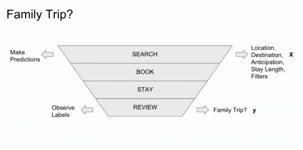
Lucas highlights an example he has been working on at Booking.com, where they seek to predict which searching activities on their website are for family trips.
What happens is that people forget to specify that they intend to travel as a family, forget to input one/two/three child travellers will come along on the trip, and end up not being able to book the accomodations that come up during their search. If Booking.com would know, in advance, that people (may) be searching for family accomodations, they can better guide these bookers to family arrangements.
The problem here is that many business processes in real life look and act like a funnel. Samples drop out of the process during the course of it. So too the user search activity on Booking.com’s website acts like a funnel.
People come to search for arrangements
Less people end up actually booking arrangements
Even less people actually go on their trip
And even less people then write up a review
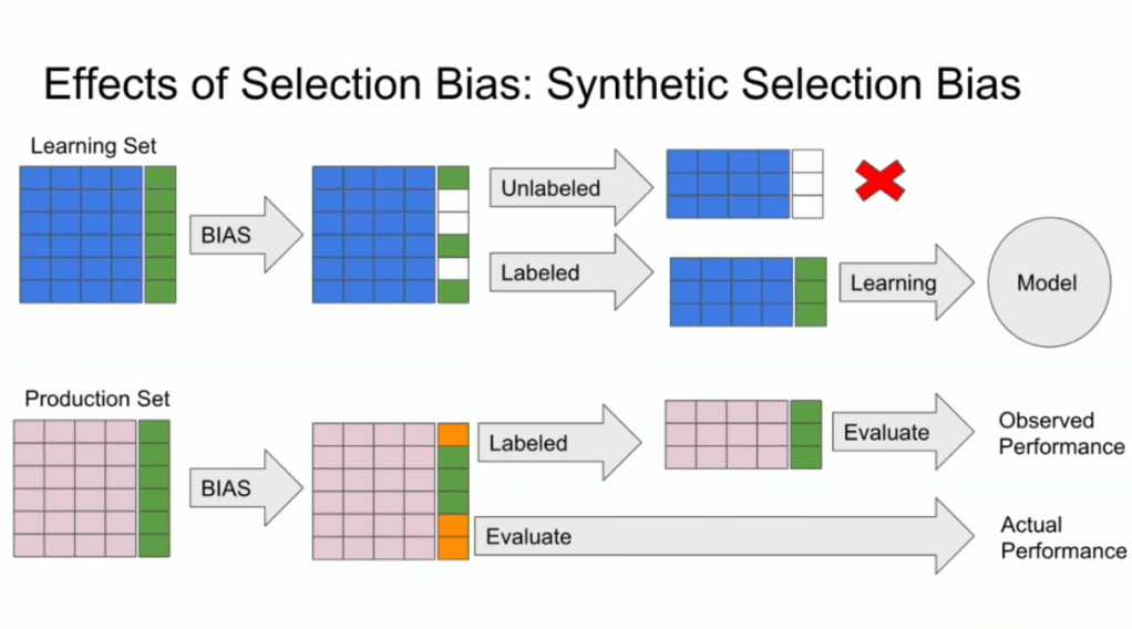
However, only for those people that end up writing a review, Booking.com knows 100% certain that they it concerned a family trip, as that is the moment the user can specify so. Of all other people, who did not reach stage 4 of the funnel, Booking.com has no (or not as accurate an) idea whether they were looking for family trips.
Such a funnel thus inherently produces business data with selection bias in it. Only for people making it to the review stage we know whether they were family trips or not. And only those labeled data can be used to train our machine learning model.
And now for the issue: if you train and evaluate a machine learning model on data generated with such a selection bias, your observed performance metrics will not reflect the actual performance of your machine learning model!
Actually, they are pretty much overestimates.
This is very much an issue, even though many ML practitioners don’t see aware. Selection bias makes us blind as to the real performance of our machine learning models. It produces high variance in the region of our feature space where labels are missing. This leads us to being overconfident in our ability to predict whether some user is looking for a family trip. And if the mechanism causing the selection bias is still there, we could never find out that we are overconfident. Consistently estimating, say, 30% of people are looking for family trips, whereas only 25% are.
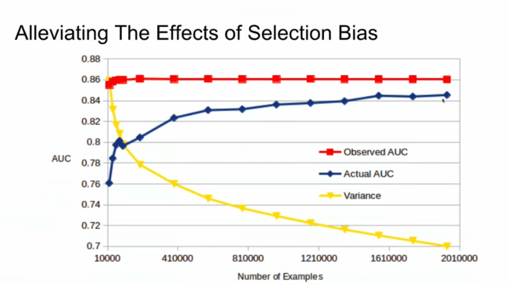
Fortunately, Lucas proposes a very simple solution! Just adding more observations can (partially) alleviate this detrimental effect of selection bias. Although our bias still remains, the variance goes down and the difference between our observed and actual performance decreases.
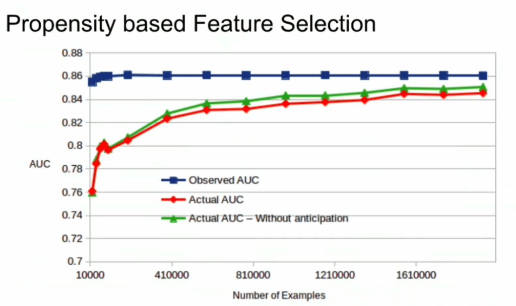
A second issue and solution to selection bias relates to propensity (see also): the extent to which your features X influence not only the outcome Y, but also the selection criteria s.
If our features X influence both the outcome Y but also the selection criteria s, selection bias will occur in your data and can thus screw up your conclusion. In order to inspect to what extent this occurs in your setting, you will want to estimate a propensity model. If that model is good, and X appears valuable in predicting s, you have a selection bias problem.
Via a propensity model s ~ X, we quantify to what extent selection bias influences our data and model. The nice thing is that we, as data scientists, control the features X we use to train a model. Hence, we could just use only features X that do not predict s to predict Y. Conclusion: we can conduct propensity-based feature selection in our Y ~ X by simply avoiding features X that predicted s!
Still, Lucas does point that this becomes difficult when you have valuable features that predict both s and Y. Hence, propensity-based feature selection may end up cost(ing) you performance, as you will need to remove features relevant to Y.
A receiver operating characteristic (ROC) curve displays how well a model can classify binary outcomes. An ROC curve is generated by plotting the false positive rate of a model against its true positive rate, for each possible cutoff value. Often, the area under the curve (AUC) is calculated and used as a metric showing how well a model can classify data points.
If you’re interest in learning more about ROC and AUC, I recommend this short Medium blog, which contains this neat graphic:
Dariya Sydykova, graduate student at the Wilke lab at the University of Texas at Austin, shared some great visual animations of how model accuracy and model cutoffs alter the ROC curve and the AUC metric. The quotes and animations are from the associated github repository.
ROC & AUC
The plot on the left shows the distributions of predictors for the two outcomes, and the plot on the right shows the ROC curve for these distributions. The vertical line that travels left-to-right is the cutoff value. The red dot that travels along the ROC curve corresponds to the false positive rate and the true positive rate for the cutoff value given in the plot on the left.
The traveling cutoff demonstrates the trade-off between trying to classify one outcome correctly and trying to classify the other outcome correcly. When we try to increase the true positive rate, we also increase the false positive rate. When we try to decrease the false positive rate, we decrease the true positive rate.
The shape of an ROC curve changes when a model changes the way it classifies the two outcomes.
The animation [below] starts with a model that cannot tell one outcome from the other, and the two distributions completely overlap (essentially a random classifier). As the two distributions separate, the ROC curve approaches the left-top corner, and the AUC value of the curve increases. When the model can perfectly separate the two outcomes, the ROC curve forms a right angle and the AUC becomes 1.
Precision-Recall
Two other metrics that are often used to quantify model performance are precision and recall.
Precision (also called positive predictive value) is defined as the number of true positives divided by the total number of positive predictions. Hence, precision quantifies what percentage of the positive predictions were correct: How correct your model’s positive predictions were.
Recall (also called sensitivity) is defined as the number of true positives divided by the total number of true postives and false negatives (i.e. all actual positives). Hence, recall quantifies what percentage of the actual positives you were able to identify: How sensitive your model was in identifying positives.
Dariya also made some visualizations of precision-recall curves:
Precision-recall curves also displays how well a model can classify binary outcomes. However, it does it differently from the way an ROC curve does. Precision-recall curve plots true positive rate (recall or sensitivity) against the positive predictive value (precision).
In the middle, here below, the ROC curve with AUC. On the right, the associated precision-recall curve.
Similarly to the ROC curve, when the two outcomes separate, precision-recall curves will approach the top-right corner. Typically, a model that produces a precision-recall curve that is closer to the top-right corner is better than a model that produces a precision-recall curve that is skewed towards the bottom of the plot.
Class imbalance
Class imbalance happens when the number of outputs in one class is different from the number of outputs in another class. For example, one of the distributions has 1000 observations and the other has 10. An ROC curve tends to be more robust to class imbalanace that a precision-recall curve.
In this animation [below], both distributions start with 1000 outcomes. The blue one is then reduced to 50. The precision-recall curve changes shape more drastically than the ROC curve, and the AUC value mostly stays the same. We also observe this behaviour when the other disribution is reduced to 50.
Here’s the same, but now with the red distribution shrinking to just 50 samples.
Dariya invites you to use these visualizations for educational purposes:
Please feel free to use the animations and scripts in this repository for teaching or learning. You can directly download the gif files for any of the animations, or you can recreate them using these scripts. Each script is named according to the animation it generates (i.e. animate_ROC.r generates ROC.gif, animate_SD.r generates SD.gif, etc.).
Want to learn more about the different evaluation metrics for machine learning? Here’s a nice how-to guide by Neptune.ai demonstrating different metrics applied in Python.
Past days, I discovered this series of blogs on how to win the classic game of Battleships (gameplay explanation) using different algorithmic approaches. I thought they might amuse you as well : )
The story starts with this 2012 Datagenetics blog where Nick Berry constrasts four algorithms’ performance in the game of Battleships. The resulting levels of artificial intelligence (AI) seem to compare respectively to a distracted baby, two sensible adults, and a mathematical progidy.
The first, stupidest approach is to just take Random shots. The AI resulting from such an algorithm would just pick a random tile to shoot at each turn. Nick simulated 100 million games with this random apporach and computed that the algorithm would require 96 turns to win 50% of games, given that it would not be defeated before that time. At best, the expertise level of this AI would be comparable to that of a distracted baby. Basically, it would lose from the average toddler, given that the toddler would survive the boredom of playing such a stupid AI.
A first major improvement results in what is dubbed the Hunt algorithm. This improved algorithm includes an instruction to explore nearby spaces whenever a prior shot hit. Every human who has every played Battleships will do this intuitively. A great improvement indeed as Nick’s simulations demonstrated that this Hunt algorithm completes 50% of games within ~65 turns, as long as it is not defeated beforehand. Your little toddler nephew will certainly lose, and you might experience some difficulty as well from time to time.
A visual representation of the “Hunting” of the algorithm on a hit [via]
Another minor improvement comes from adding the so-called Parity principle to this Hunt algorithm (i.e., Nick’s Hunt + Parity algorithm). This principle instructs the algorithm to take into account that ships will always cover odd as well as even numbered tiles on the board. This information can be taken into account to provide for some more sensible shooting options. For instance, in the below visual, you should avoid shooting the upper left white tile when you have already shot its blue neighbors. You might have intuitively applied this tactic yourself in the past, shooting tiles in a “checkboard” formation. With the parity principle incorporated, the median completion rate of our algorithm improves to ~62 turns, Nick’s simulations showed.
Now, Nick’s final proposed algorithm is much more computationally intensive. It makes use of Probability Density Functions. At the start of every turn, it works out all possible locations that every remaining ship could fit in. As you can imagine, many different combinations are possible with five ships. These different combinations are all added up, and every tile on the board is thus assigned a probability that it includes a ship part, based on the tiles that are already uncovered.
Computing the probability that a tile contains a ship based on all possible board layouts [via]
At the start of the game, no tiles are uncovered, so all spaces will have about the same likelihood to contain a ship. However, as more and more shots are fired, some locations become less likely, some become impossible, and some become near certain to contain a ship. For instance, the below visual reflects seven misses by the X’s and the darker tiles which thus have a relatively high probability of containing a ship part.
An example distribution with seven misses on the grid. [via]
Nick simulated 100 million games of Battleship for this probabilistic apporach as well as the prior algorithms. The below graph summarizes the results, and highlight that this new probabilistic algorithm greatly outperforms the simpler approaches. It completes 50% of games within ~42 turns! This algorithm will have you crying at the boardgame table.
Relative performance of the algorithms in the Datagenetics blog, where “New Algorithm” refers to the probabilistic approach and “No Parity” refers to the original “Hunt” approach.
Reddit user /u/DataSnaek reworked this probablistic algorithm in Python and turned its inner calculations into a neat GIF. Below, on the left, you see the probability of each square containing a ship part. The brighter the color (white <- yellow <- red <- black), the more likely a ship resides at that location. It takes into account that ships occupy multiple consecutive spots. On the right, every turn the algorithm shoots the space with the highest probability. Blue is unknown, misses are in red, sunk ships in brownish, hit “unsunk” ships in light blue (sorry, I am terribly color blind).
The probability matrix as a heatmap for every square after each move in the game. [via]
This latter attempt by DataSnaek was inspired by Jonathan Landy‘s attempt to train a reinforcement learning (RL) algorithm to win at Battleships. Although the associated GitHub repository doesn’t go into much detail, the approach is elaborately explained in this blog. However, it seems that this specific code concerns the training of a neural network to perform well on a very small Battleships board, seemingly containing only a single ship of size 3 on a board with only a single row of 10 tiles.
Fortunately, Sue He wrote about her reinforcement learning approach to Battleships in 2017. Building on the open source phoenix-battleship project, she created a Battleship app on Heroku, and asked co-workers to play. This produced data on 83 real, two-person games, showing, for instance, that Sue’s coworkers often tried to hide their size 2 ships in the corners of the Battleships board.
Probability heatmaps of ship placement in Sue He’s reinforcement learning Battleships project [via]
Next, Sue scripted a reinforcement learning agent in PyTorch to train and learn where to shoot effectively on the 10 by 10 board. It became effective quite quickly, requiring only 52 turns (on average over the past 25 games) to win, after training for only a couple hundreds games.
The performance of the RL agent at Battleships during the training process [via]
However, as Sue herself notes in her blog, disappointly, this RL agent still does not outperform the probabilistic approach presented earlier in this current blog.
Reddit user /u/christawful faced similar issues. Christ (I presume he is called) trained a convolutional neural network (CNN) with the below architecture on a dataset of Battleships boards. Based on the current board state (10 tiles * 10 tiles * 3 options [miss/hit/unknown]) as input data, the intermediate convolutional layers result in a final output layer containing 100 values (10 * 10) depicting the probabilities for each tile to result in a hit. Again, the algorithm can simply shoot the tile with the highest probability.
Christ’s convolutional neural network architecture for Battleships [via]
Christ was nice enough to include GIFs of the process as well [via]. The first GIF shows the current state of the board as it is input in the CNN — purple represents unknown tiles, black a hit, and white a miss (i.e., sea). The next GIF represent the calculated probabilities for each tile to contain a ship part — the darker the color the more likely it contains a ship. Finally, the third picture reflects the actual board, with ship pieces in black and sea (i.e., miss) as white.
As cool as this novel approach was, Chris ran into the same issue as Sue, his approach did not perform better than the purely probablistic one. The below graph demonstrates that while Christ’s CNN (“My Algorithm”) performed quite well — finishing a simulated 9000 games in a median of 52 turns — it did not outperform the original probabilistic approach of Nick Berry — which came in at 42 turns. Nevertheless, Chris claims to have programmed this CNN in a couple of hours, so very well done still.
The performance of Christ’s Battleship CNN compared to Nick Berry’s original algorithms [via]
Interested by all the above, I searched the web quite a while for any potential improvement or other algorithmic approaches. Unfortunately, in vain, as I did not find a better attempt than that early 2012 Datagenics probability algorithm by Nick.
Surely, with today’s mass cloud computing power, someone must be able to train a deep reinforcement learner to become the Battleship master? It’s not all probability right, there must be some patterns in generic playing styles, like Sue found among her colleagues. Or maybe even the ability of an algorithm to adapt to the opponent’s playin style, as we see in Libratus, the poker AI. Maybe the guys at AlphaGo could give it a shot?
For starters, Christ’s provided some interesting improvements on his CNN approach. Moreover, while the probabilistic approach seems the best performing, it might not the most computationally efficient. All in all, I am curious to see whether this story will continue.
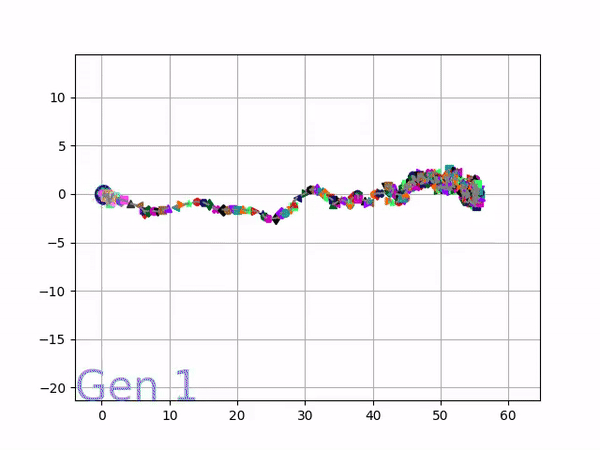
In optimizing their transportation services, Uber uses evolutionary strategies and genetic algorithms to train deep neural networks through reinforcement learning. A lot of difficult words in one sentence; you can imagine the complexity of the process.
Because it is particularly difficult to observe the underlying dynamics of this learning process in neural network optimization, Uber built VINE – a Visual Inspector for NeuroEvolution. VINE helps to discover how evolutionary strategies and genetic optimizing are performing under the hood. In a recent article, they demonstrate how VINE works on the MujocoHumanoid Locomotion task.
[…] In the Humanoid Locomotion Task, each pseudo-offspring neural network controls the movement of a robot, and earns a score, called its fitness, based on how well it walks. [Evolutionary principles] construct the next parent by aggregating the parameters of pseudo-offspring based on these fitness scores […]. The cycle then repeats.
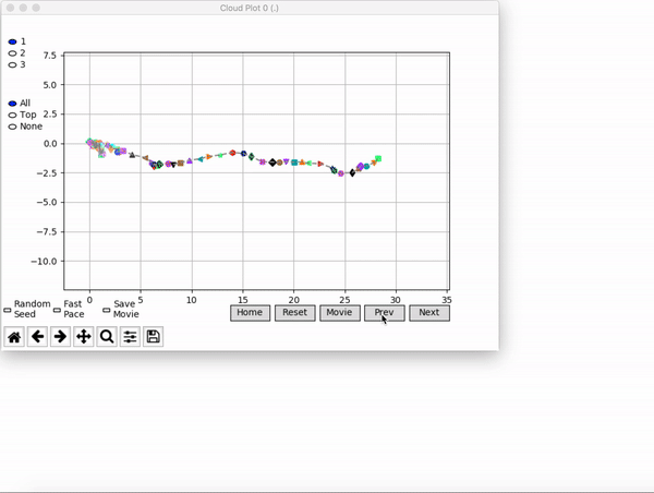
VINE plots parent neural networks and their pseudo-offspring according to their performance. Users can then interact with these plots to:
visualize parents, top performance, and/or the entire pseudo-offspring cloud of any generation,
compare between and within generation performance,
and zoom in on any pseudo-offspring (points) in the plot to display performance information.
The GIFs below demonstrate what VINE is capable of displaying:
The evolution of performance over generations. The color changes in each generation. Within a generation, the color intensity of each pseudo-offspring is based on the percentile of its fitness score in that generation (aggregated into five bins). [original]Vine allows user to deep dive into each single generation, comparing generations and each pseudo-offspring within them [original]VINE can be found at this link. It is lightweight, portable, and implemented in Python.
Simpson (1951) demonstrated that a statistical relationship observed within a population—i.e., a group of individuals—could be reversed within all subgroups that make up that population. This phenomenon, where X seems to relate to Y in a certain way, but flips direction when the population is split for W, has since been referred to as Simpson’s paradox. Others names, according to Wikipedia, include the Simpson-Yule effect, reversal paradox or amalgamation paradox.
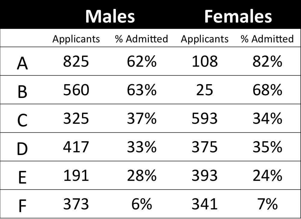
The most famous example has to be the seemingly gender-biased Berkeley admission rates:
“Examination of aggregate data on graduate admissions to the University of California, Berkeley, for fall 1973 shows a clear but misleading pattern of bias against female applicants. Examination of the disaggregated data reveals few decision-making units that show statistically significant departures from expected frequencies of female admissions, and about as many units appear to favor women as to favor men. If the data are properly pooled, taking into account the autonomy of departmental decision making, thus correcting for the tendency of women to apply to graduate departments that are more difficult for applicants of either sex to enter, there is a small but statistically significant bias in favor of women. […] The bias in the aggregated data stems not from any pattern of discrimination on the part of admissions committees, which seem quite fair on the whole, but apparently from prior screening at earlier levels of the educational system.” – part of abstract of Bickel, Hammel, & O’Connel (1975)
In a table, the effect becomes clear. While it seems as if women are rejected more often overall, women are actually less often rejected on a departmental level. Women simply applied to more selective departments more often (E & C below), resulting in the overall lower admission rate for women (35% as opposed to 44% for men).
Simpsons Paradox can easily occur in organizational or human resources settings as well. Let me run you through two illustrated examples, I simulated:
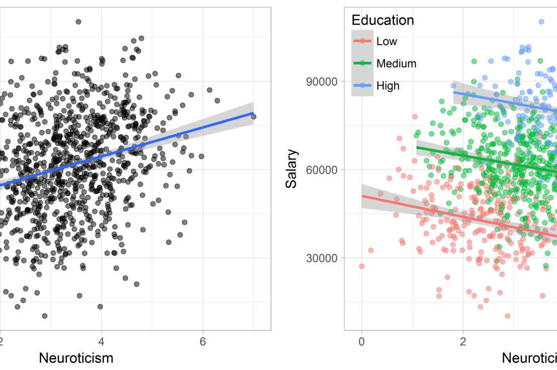
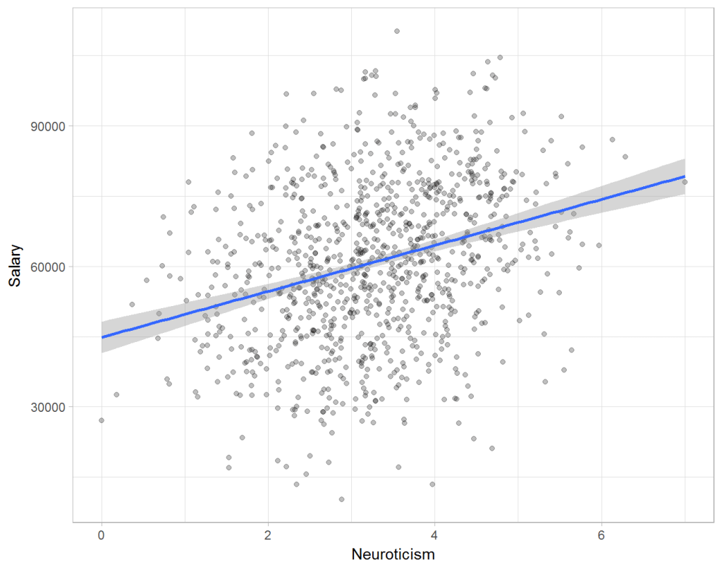
Assume you run a company of 1000 employees and you have asked all of them to fill out a Big Five personality survey. Per individual, you therefore have a score depicting his/her personality characteristic Neuroticism, which can run from 0 (not at all neurotic) to 7 (very neurotic). Now you are interested in the extent to which this Neuroticism of employees relates to their Job Performance (measured 0 – 100) and their Salary (measured in Euro’s per Year). In order to get a sense of the effects, you may decide to visualize both these relations in scatter plots:
From these visualizations it would look like Neuroticism relates significantly and positively to both employees’ performance and their yearly salary. Should you select more neurotic people to improve your overall company performance? Or are you discriminating emotionally-stable (non-neurotic) employees when it comes to salary?
Taking a closer look at the subgroups in your data, you might however find very different relationships. For instance, the positive relationship between neuroticism and performance may only apply to technical positions, but not to those employees’ in service-oriented jobs.
Similarly, splitting the employees by education level, it becomes clear that there is a relationship between neuroticism and education level that may explain the earlier association with salary. More educated employees receive higher salaries and within these groups, neuroticism is actually related to lower yearly income.
If you’d like to see the code used to simulate these data and generate the examples, you can find the R markdown file here on Rpubs.
Solving the paradox
Kievit and colleagues (2013) argue that Simpsons paradox may occur in a wide variety of research designs, methods, and questions, particularly within the social and medical sciences. As such, they propose several means to “control” or minimize the risk of it occurring. The paradox may be prevented from occurring altogether by more rigorous research design: testing mechanisms in longitudinal or intervention studies. However, this is not always feasible. Alternatively, the researchers pose that data visualization may help recognize the patterns and subgroups and thereby diagnose paradoxes. This may be easy if your data looks like this:
But rather hard, or even impossible, when your data looks more like the below:
Clustering may nevertheless help to detect Simpson’s paradox when it is not directly observable in the data. To this end, Kievit and Epskamp (2012) have developed a tool to facilitate the detection of hitherto undetected patterns of association in existing datasets. It is written in R, a language specifically tailored for a wide variety of statistical analyses which makes it very suitable for integration into the regular analysis workflow. As an R package, the tool is is freely available and specializes in the detection of cases of Simpson’s paradox for bivariate continuous data with categorical grouping variables (also known as Robinson’s paradox), a very common inference type for psychologists. Finally, its code is open source and can be extended and improved upon depending on the nature of the data being studied.
One example of application is provided in the paper, for a dataset on coffee and neuroticism. A regression analysis would suggest a significant positive association between coffee and neuroticism overall. However, when the detection algorithm of the R package is applied, a different picture appears: the analysis shows that there are three latent clusters present and that the purported positive relationship only holds for one cluster whereas it is negative in the others.
Update 24-10-2017: minutephysics – one of my favorite YouTube channels – uploaded a video explaining Simpson’s paradox very intuitively in a medical context:
Update 01-11-2017: minutephysics uploaded a follow-up video:
The paradox is that we remain reluctant to fight our bias, even when they are put in plain sight.