Category: r

ROC, AUC, precision, and recall visually explained

ROC, AUC, precision, and recall visually explained

A receiver operating characteristic (ROC) curve displays how well a model can classify binary outcomes. An ROC curve is generated by plotting the false positive rate of a model against its true positive rate, for each possible cutoff value. Often, the area under the curve (AUC) is calculated and used as a metric showing how well a model can classify data points.

If you’re interest in learning more about ROC and AUC, I recommend this short Medium blog, which contains this neat graphic:

Dariya Sydykova, graduate student at the Wilke lab at the University of Texas at Austin, shared some great visual animations of how model accuracy and model cutoffs alter the ROC curve and the AUC metric. The quotes and animations are from the associated github repository.

ROC & AUC

The plot on the left shows the distributions of predictors for the two outcomes, and the plot on the right shows the ROC curve for these distributions. The vertical line that travels left-to-right is the cutoff value. The red dot that travels along the ROC curve corresponds to the false positive rate and the true positive rate for the cutoff value given in the plot on the left.

The traveling cutoff demonstrates the trade-off between trying to classify one outcome correctly and trying to classify the other outcome correcly. When we try to increase the true positive rate, we also increase the false positive rate. When we try to decrease the false positive rate, we decrease the true positive rate.

cutoff.gif

The shape of an ROC curve changes when a model changes the way it classifies the two outcomes.

The animation [below] starts with a model that cannot tell one outcome from the other, and the two distributions completely overlap (essentially a random classifier). As the two distributions separate, the ROC curve approaches the left-top corner, and the AUC value of the curve increases. When the model can perfectly separate the two outcomes, the ROC curve forms a right angle and the AUC becomes 1.

Precision-Recall

Two other metrics that are often used to quantify model performance are precision and recall.

Precision (also called positive predictive value) is defined as the number of true positives divided by the total number of positive predictions. Hence, precision quantifies what percentage of the positive predictions were correct: How correct your model’s positive predictions were.

Recall (also called sensitivity) is defined as the number of true positives divided by the total number of true postives and false negatives (i.e. all actual positives). Hence, recall quantifies what percentage of the actual positives you were able to identify: How sensitive your model was in identifying positives.

Dariya also made some visualizations of precision-recall curves:

Precision-recall curves also displays how well a model can classify binary outcomes. However, it does it differently from the way an ROC curve does. Precision-recall curve plots true positive rate (recall or sensitivity) against the positive predictive value (precision). 

In the middle, here below, the ROC curve with AUC. On the right, the associated precision-recall curve.

Similarly to the ROC curve, when the two outcomes separate, precision-recall curves will approach the top-right corner. Typically, a model that produces a precision-recall curve that is closer to the top-right corner is better than a model that produces a precision-recall curve that is skewed towards the bottom of the plot.

Class imbalance

Class imbalance happens when the number of outputs in one class is different from the number of outputs in another class. For example, one of the distributions has 1000 observations and the other has 10. An ROC curve tends to be more robust to class imbalanace that a precision-recall curve. 

In this animation [below], both distributions start with 1000 outcomes. The blue one is then reduced to 50. The precision-recall curve changes shape more drastically than the ROC curve, and the AUC value mostly stays the same. We also observe this behaviour when the other disribution is reduced to 50. 

Here’s the same, but now with the red distribution shrinking to just 50 samples.

Dariya invites you to use these visualizations for educational purposes:

Please feel free to use the animations and scripts in this repository for teaching or learning. You can directly download the gif files for any of the animations, or you can recreate them using these scripts. Each script is named according to the animation it generates (i.e. animate_ROC.r generates ROC.gifanimate_SD.r generates SD.gif, etc.).

Want to learn more about the different evaluation metrics for machine learning? Here’s a nice how-to guide by Neptune.ai demonstrating different metrics applied in Python.

Understanding Data Distributions

Understanding Data Distributions

Having trouble understanding how to interpret distribution plots? Or struggling with Q-Q plots? Sven Halvorson penned down a visual tutorial explaining distributions using visualisations of their quantiles.

Because each slice of the distribution is 5% of the total area and the height of the graph is changing, the slices have different widths. It’s like we’re trying to cut a strange shaped cake into 20 equal pieces using parallel cuts. The slices at the center must be thinner since the distribution is denser (taller) than on the edges.

Sven on distribution signatures

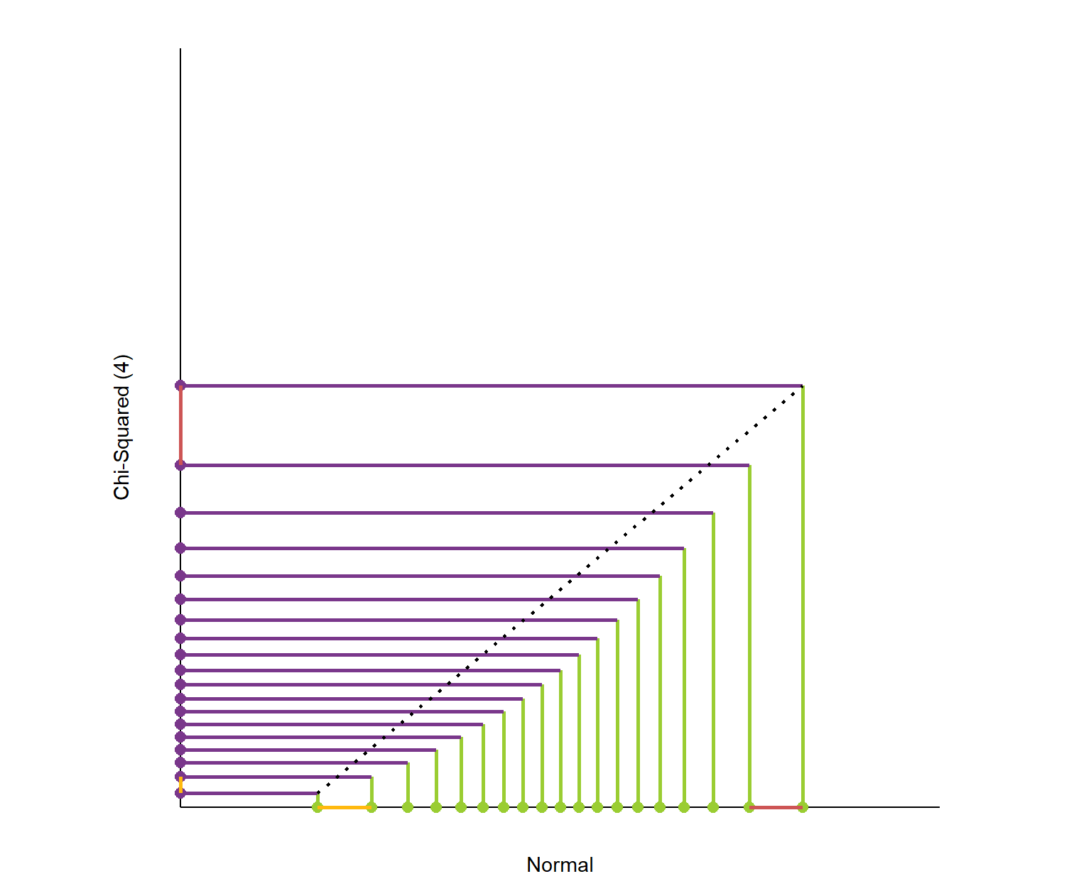
Here is the plot of matching the quantiles of the chi-squared(4) and normal distributions. I’ve again plotted these quantiles over 98% of each distribution’s range. The chi-squared distribution is skewed so its quantiles are packed into a smaller portion of its axis.

What is this graph telling us? It shows that the exchange rate between the quantiles of the two distributions is not constant.

Sven on distribution signatures

Here’s the link to the original article, and the R markdown code on github to generate the webpage.

Putting R in Production, by Heather Nolis & Mark Sellors

Putting R in Production, by Heather Nolis & Mark Sellors

It is often said that R is hard to put into production. Fortunately, there are numerous talks demonstrating the contrary.

Here’s one by Heather Nolis, who productionizes R models at T-Mobile. Her teams even shares open-source version of some of their productionized Tensorflow models on github. Read more about that model here.

There’s another great talk on the RStudio website. In this talk, Mark Sellors discusses some of the misinformation around the idea of what “putting something into production” actually means, and provides some tips on overcoming obstacles.

Cover image via Fotolia.

5 Quick Tips for Coding in the Classroom, by Kelly Bodwin

5 Quick Tips for Coding in the Classroom, by Kelly Bodwin

Kelly Bodwin is an Assistant Professor of Statistics at Cal Poly (San Luis Obispo) and teaches multiple courses in statistical programming. Based on her experiences, she compiled this great shortlist of five great tips to teach programming.

Kelly truly mentions some best practices, so have a look at the original article, which she summarized as follows:

1. Define your terms

Establish basic coding vocabulary early on.

  • What is the console, a script, the environment?
  • What is a function a variable, a dataframe?
  • What are strings, characters, and integers?

2. Be deliberate about teaching versus bypassing peripheral skills

Use tools like RStudio Cloud, R Markdown, and the usethis package to shelter students from setup.

Personally, this is what kept me from learning Python for a long time — the issues with starting up.

Kelly provides this personal checklist of peripherals skills including which ones she includes in her introductory courses:

Course TypeInstall/Update R and RStudioR Markdown fluencyPackage managementData managementFile and folder organizationGitHub
Intro Stat for Non-Majors⚠️⚠️
Intro Stat for Majors⚠️⚠️⚠️⚠️
Advanced Statistics⚠️⚠️
Intro to Statistical Computation

✅ = required course skill
⚠️ = optional, proceed with caution
❌ = avoid entirely
via https://teachdatascience.com/teaching_programming_tips/

3. Read code like English

The best way to debug is to read your process out loud as a sentence.

Basically Kelly argues that you should learn students to be able to translate their requirements into (R) code.

When you continuously read out your code as step-by-step computer instructions, students will learn to translate their own desires to computer instructions.

4. Require good coding practices from Day One

Kelly refers to this great talk by Jenny Bryan on “good” code and how to recognize it.

Kelly’s personal best practice included:

  • Clear code formatting
  • Object names follow consistent conventions
  • Lack of unnecessary code repetition
  • Reproducibility
  • Unit tests before large calculations
  • Commenting and/or documentation

For more R style guides, see my R resources overview.

5. Leave room for creativity

Open-ended questions (like “here’s a dataset, do a cool analysis“) let students explore and shine.


Large parts of the above were copied from this original article by Kelly Boldwin. I highly recommend you have a look at the original, and at the website hosting it: teachdatascience.com

Cover picture by freecodecamp.org.

Recreating graphics from the  Fundamentals of Data Visualization

Recreating graphics from the Fundamentals of Data Visualization

Claus Wilke wrote the Fundamentals of Data Visualization – a great resource that’s definitely high on my list of recommended data visualization books.

In a recent post, Claus shared the link to a GitHub repository where he hosts some of the R programming code with which Claus made the graphics for his dataviz book. The repository is named practical ggplot2, after the R package Clause used to make many of his visuals.

Check it out, the page contains some pearls and the code behind them, which will help you learn to create fabulous visualizations yourself. Some examples:

Via https://htmlpreview.github.io/?https://github.com/clauswilke/practical_ggplot2/blob/master/health_status.html
Via https://htmlpreview.github.io/?https://github.com/clauswilke/practical_ggplot2/blob/master/corruption_human_development.html

Here’s the original tweet in case you want to see the responses.

Python vs. R for Data Science, by Norm Matloff

Python vs. R for Data Science, by Norm Matloff

Cover image via Hacker Noon.

Norm Matloff is a professor of Computer Science at University College Davis. He recently updated his viewpoint on whether R or Python is the best language for Data Science. While I normally hate those opinionated comparisons, Norm’s outline of the two languages’ (dis)advantages is actually quite balanced and well-versed.

I strongly recommend that you read Norm’s original piece here.

I can mostly agree with Norm, although the blog reads as if he has a (slight) bias in favor of R. In his original blog, Norm discusses many different programming topics and provides detailed information on why he considers certain topics big wins, slight edges, or ties between the two programming languages.

In the table below, I’ve tried to summarize Norm’s opinions by converting his words to 0-100 scores per topic for a quicker overview. I’ve converted Norm’s words to scores: his huge win became 100-0, a big win 80-20, a win 70-30, an edge 60-40, and a tie 50-50.

PythonR
Elegance100
Learning curve100
Data Science libraries4060
Machine Learning6040
Statistical correctness2080
Parallel computing5050
C/C++ interface4060
Object orientation,
metaprogramming
4060
Language unity100
Linked data structures7030
Online help2080

I personally started my career with R, so that’s definitely my favorite programming language. However, I think that Python is more convenient and faster on certain topics, and closer to more mainstream programming languages, which I why I’m currently learning it next to using R.

If you want to learn R, I can recommend you follow my quick 6-step guide to learning R programming. Alternatively, Norm points to his quick tutorial on R for non-programmers, and a tutorial on Python, for learners with a programming background.

Happy learning!

PS. This tweet by John summarizes the whole discussion quite well.