Statistics, and statistical inference in specific, are becoming an ever greater part of our daily lives. Models are trying to estimate anything from (future) consumer behaviour to optimal steering behaviours and we need these models to be as accurate as possible. Trevor Hastie is a great contributor to the development of the field, and I highly recommend the machine learning books and courses that he developed, together with Robert Tibshirani. These you may find in my list of R Resources (Cheatsheets, Tutorials, & Books).
Today I wanted to share another book Hastie wrote, together with Bradley Efron, another colleague of his at Stanford University. It is called Computer Age Statistical Inference (Efron & Hastie, 2016) and is a definite must read for every aspiring data scientist because it illustrates most algorithms commonly used in modern-day statistical inference. Many of these algorithms Hastie and his colleagues at Stanford developed themselves and the book handles among others:
This blog explains t-Distributed Stochastic Neighbor Embedding (t-SNE) by a story of programmers joining forces with musicians to create the ultimate drum machine (if you are here just for the fun, you may start playing right away).
Kyle McDonald, Manny Tan, and Yotam Mann experienced difficulties in pinpointing to what extent sounds are similar (ding, dong) and others are not (ding, beep) and they wanted to examine how we, humans, determine and experience this similarity among sounds. They teamed up with some friends at Google’s Creative Lab and the London Philharmonia to realize what they have named “the Infinite Drum Machine” turning the most random set of sounds into a musical instrument.
The project team wanted to include as many different sounds as they could, but had less appetite to compare, contrast and arrange all sounds into musical accords themselves. Instead, they imagined that a computer could perform such a laborious task. To determine the similarities among their dataset of sounds – which literally includes a thousand different sounds from the ngaaarh of a photocopier to the zing of an anvil – they used a fairly novel unsupervised machine learning technique called t-Distributed Stochastic Neighbor Embedding, or t-SNE in short (t-SNE Wiki; developer: Laurens van der Maaten). t-SNE specializes in dimensionality reduction for visualization purposes as it transforms highly-dimensional data into a two- or three-dimensional space. For a rapid introduction to highly-dimensional data and t-SNE by some smart Googlers, please watch the video below.
As the video explains, t-SNE maps complex data to a two- or three-dimensional space and was therefore really useful to compare and group similar sounds. Sounds are super highly-dimensional as they are essentially a very elaborate sequence of waves, each with a pitch, a duration, a frequency, a bass, an overall length, etcetera (clearly I am no musician). You would need a lot of information to describe a specific sound accurately. The project team compared sound to fingerprints, as there is an immense amount of data in a single padamtss.
t-SNE takes into account all this information of a sound and compares all sounds in the dataset. Next, it creates 2 or 3 new dimensions and assigns each sound values on these new dimensions in such a way that sounds which were previously similar (on the highly-dimensional data) are also similar on the new 2 – 3 dimensions. You could say that t-SNE summarizes (most of) the information that was stored in the previous complex data. This is what dimensionality reduction techniques do: they reduce the number of dimensions you need to describe data (sufficiently). Fortunately, techniques such as t-SNE are unsupervised, meaning that the project team did not have to tag or describe the sounds in their dataset manually but could just let the computer do the heavy lifting.
The result of this project is fantastic and righteously bears the name of Infinite Drum Machine (click to play)! You can use the two-dimensional map to explore similar sounds and you can even make beats using the sequencing tool. The below video summarizes the creation process.
Amazed by this application, I wanted to know how t-SNE is being used in other projects. I have found a tremendous amount of applications that demonstrate how to implement t-SNE in Python, R, and even JS whereas the method also seems popular in academia.
Clusters of similar cats/dogs in Luke Metz’ application of t-SNE.Cho et al., 2014 have used t-SNE in their natural language processing projects as it allows for an easy examination of the similarity among words and phrases. Mnih and colleagues (2015) have used t-SNE to examine how neural networks were playing video games.
Two-dimensional t-SNE visualization of the hidden layer activity of neural network playing Space Invaders (Mnih et al., 2015)
On a final note, while acknowledging its potential, this blog warns for the inaccuracies in t-SNE due to the aesthetical adjustments it often seems to make. They have some lovely interactive visualizations to back up their claim. They conclude that it’s incredible flexibility allows t-SNE to find structure where other methods cannot. Unfortunately, this makes it tricky to interpret t-SNE results as the algorithm makes all sorts of untransparent adjustments to tidy its visualizations and make the complex information fit on just 2-3 dimensions.
Last week, Google released Facets, their new, open source visualization tool. Facets consists of two interfaces that allow users to investigate their data at different levels.
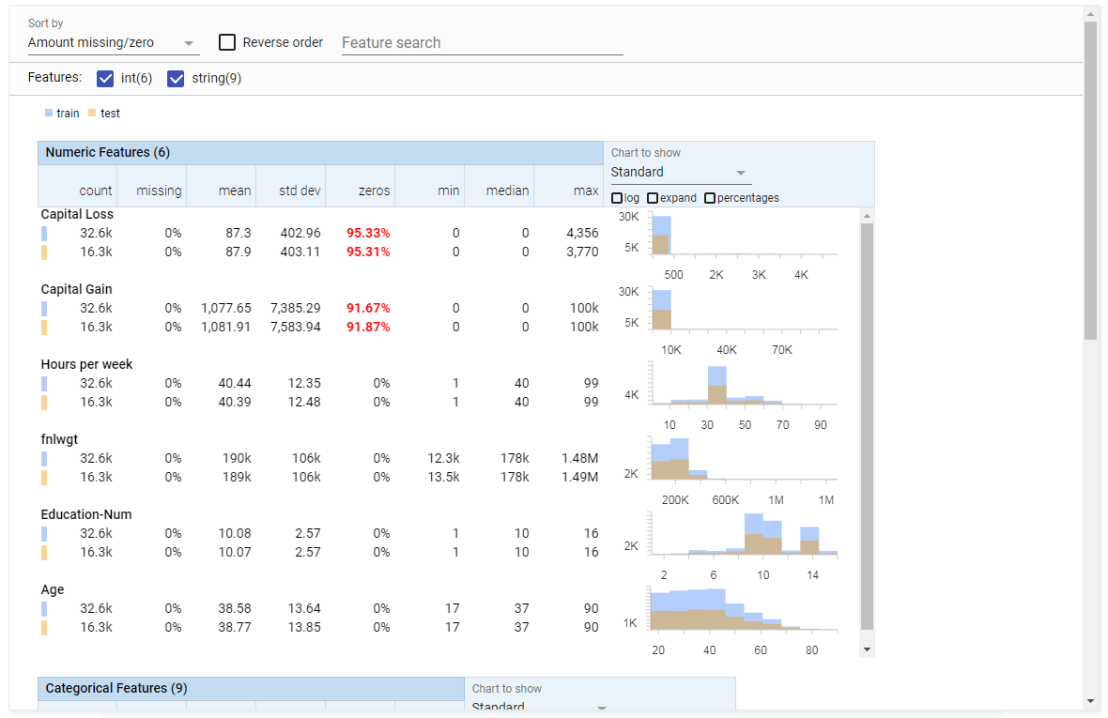
Facets Overview provides users with a quick understanding of the distribution of values across the variables in their dataset. Overview is especially helpful in detecting unexpected values, missing values, unbalanced distributions, and skewed distributions. Overview will detect all kinds of statistics for every column (i.e., variable) in your dataset, along with some simple vizualizations, such as histograms.
Example of Facets Overview tool
Dive is the name of the second interface of Facets. It provides an intuitive dashboard in which users can explore relationships between data points across the different variables in their dataset. The dashboard is easy to customize and users can control the position, color, and visual representation of each data point based on the underlying values.
Example of Facets Dive tool
Moreover, if the data points have images associated with them, these images can be used as the visual representations of the data points. The latter is especially helpful when Facets is used for its actual purpose: aiding in machine learning processes. The below GIF demonstrates how Facets Dive spots incorrectly labelled images with ease, allowing users to zoom in on a case-by-case level, for instance, to identify a frog that has been erroneously labelled as a cat.
Exploration of the CIFAR-10 dataset using Facets Dive
Following my introduction to PCA, I will demonstrate how to apply and visualize PCA in R. There are many packages and functions that can apply PCA in R. In this post I will use the function prcomp from the stats package. I will also show how to visualize PCA in R using Base R graphics. However, my favorite visualization function for PCA is ggbiplot, which is implemented by Vince Q. Vu and available on github. Please, let me know if you have better ways to visualize PCA in R.
Computing the Principal Components (PC)
I will use the classical iris dataset for the demonstration. The data contain four continuous variables which corresponds to physical measures of flowers and a categorical variable describing the flowers’ species.
We will apply PCA to the four continuous variables and use the categorical variable to visualize the PCs later. Notice that in…
Gradient Descent is, in essence, a simple optimization algorithm. It seeks to find the gradient of a linear slope, by which the resulting linear line best fits the observed data, resulting in the smallest or lowest error(s). It is THE inner working of the linear functions we get taught in university statistics courses, however, many of us will finish our Masters (business) degree without having heard the term. Hence, this blog.
Linear regression is among the simplest and most frequently used supervised learning algorithms. It reduces observed data to a linear function (Y = a + bX) in order to retrieve a set of general rules, or to predict the Y-values for instances where the outcome is not observed.
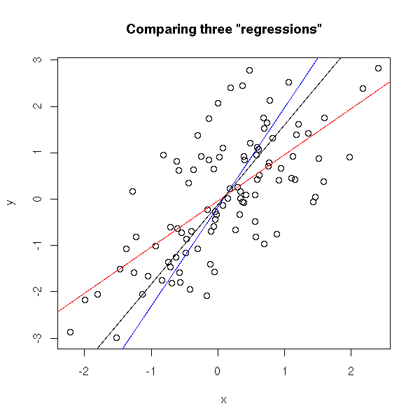
One can define various linear functions to model a set of data points (e.g. below). However, each of these may fit the data better or worse than the others. How can you determine which function fits the data best? Which function is an optimal representation of the data? Enter stage Gradient Descent. By iteratively testing values for the intersect (a; where the linear line intersects with the Y-axis (X = 0)) and the gradient (b; the slope of the line; the difference in Y when X increases with 1) and comparing the resulting predictions against the actual data, Gradient Descent finds the optimal values for the intersect and the slope. These optimal values can be found because they result in the smallest difference between the predicted values and the actual data – the least error.
The video below is part of a Coursera machine learning course of Stanford University and it provides a very intuitive explanation of the algorithm and its workings:
A recent blog demonstrates how one could program the gradient descent algorithm in R for him-/herself. Indeed, the code copied below provides the same results as the linear modelling function in R’s base environment.
gradientDesc  max_iter) {
      abline(c, m)
      converged = T
      return(paste("Optimal intercept:", c, "Optimal slope:", m))
    }
  }
}

# compare resulting coefficients
coef(lm(mpg ~ disp, data = mtcars)
gradientDesc(x = disp, y = mpg, learn_rate = 0.0000293, conv_theshold = 0.001, n = 32, max_iter = 2500000)
Although the algorithm may result in a so-called “local optimum”, representing the best fitting set of values (a & b) among a specific range of X-values, such issues can be handled but deserve a separate discussion.
Data preparation forms a large part of every data science project. Claims go to extremes, stating that 80-95% of the workload for data scientists consists of data preparation.
Outlier detection is one of the actions that make up this preparation phase. It is the process by which the analyst takes a closer look at the data and observes whether there are data points that behave differently. Such anomalies we call outliers and depending on the nature of the outlier the analyst might (not) want to handle them before continuing on to the modeling phase.
Outliers exist for several reasons, including:
The data may be incorrect.
The data may be missing but has not been registered as such.
The data may belong to a different sample.
The data may have (more) extreme underlying distributions (than expected).
Moreover, there are various types of outliers:
Point outliers are individual data points that are different from the rest of the dataset. This is the most common outlier in practice. An example would be a person of 2.10 meters tall in a dataset of sampled population lengths.
Contextual outliers are individual data points that would not necessarily be outliers based on their value but are because of the combination of their value with their current context. An example would be an outside temperature of 25 degrees Celcius, which is not necessarily weird but is most definitely unusual during the December month.
Collective outliers are collections of data points that are collective different from the rest of the data sample. Again, the individual data points would not necessarily be outliers based on their individual value but are because of their values combined. An example would be a prolonged period of extreme drought. Where days without rain may not be outliers necessarily, a long stretch without precipitation can be considered an anomaly.
There is no rigid definition of what makes a data point an outlier. One could even state that determining whether or not a data point is an outlier is a quite subjective exercise. Nevertheless, there are multiple approaches and best practices to detecting (potential) outliers.
Univariate outliers: When a case or data point has an extreme value on a single variable, we refer to it as a univariate outlier. Standardized values (Z-scores) are a frequently used method to detect univariate outliers on continuous variables. However, here the researcher will have to determine a certain threshold. For example, (-)3.29 is frequently used, where data points whose Z-value lies beyond this value are considered outliers. Here, chances would be 0.005%, or 1 in 2000, of obtaining this value if the variable follows a normal distribution. As you can see, the larger the dataset, the more likely you are to find such extreme values.
Bi- & multivariate outliers: A combination of unusual values on multiple variables simultaneously is referred to as a multivariate outlier. Here, a bivariate outlier is an outlier based on two variables. Normally you’d first check and handle univariate outliers, before turning to bi- or multivariate outliers. The process here is somewhat more complicated than for univariate outliers, and there are multiple approaches one can take (e.g. distance, leverage, discrepancy, influence). For example, you can look at the distance of each data point in the multivariate space (X1 to Xp) compared to the other data points in that space. If the distance is larger than a certain threshold, the data point can be considered a multivariate outlier, as it is that much different from the rest of the data considering multiple variables simultaneously.
Visualization: In trying to detect univariate outliers, data visualizations may come in handy. For example, histograms or frequency distributions will quickly demonstrate any data point that has unusually high or low values. Boxplots can similarly hint at values that fall only just outside of the expected range or are really extreme outliers. Boxplots combine visualization with model-based detected.
Model-based: Apart from the above-mentioned standardization with Z-values, there are multiple model-based methods for outlier detection. Most assume that the data follows a normal or Gaussian distribution, and hence identify which data points are unlikely based on the data’s mean and standard deviation. Examples are Dixon’s Q-test, Tukey’s test, Thompson Tau test, and Grubb’s test.
Grouped data: If there is a grouping variable involved in the analysis (e.g., logistic regression, analyses of variance) then the data of each group can best be assessed for outliers separately. What can be considered an outlier in one group is not necessarily an unusual observation in a different group. If the analysis to be performed does not contain a grouping variable (e.g., linear regression, SEM), then the complete dataset can be assessed for outliers as a whole.
There are several ways to handle outliers:
Keep them as is.
Exclude the data point (i.e., censoring/trimming/truncating).
Replace the data point with a missing value.
Replace the data point by the nearest ‘regular’ value (i.e., Winsoring).
Run models both with and without outliers.
Run model corrections within the analysis (only possible in specific models)
There are several reasons why you may not want to deal with outliers:
When taking a large sample, outliers are part of what one would expect.
Outliers may be part of the explanation for the phenomena under investigation
Several machine learning and modeling techniques are robust to outliers or may be able to correct for them.
To end on a light note, Malcolm Gladwell wrote a wonderful book called Outliers. In it, he examines the factors for personal success; the reasons why “outliers” such as Bill Gates have become so stinkingly wealthy. He goes to show that these successful people are not necessarily random anomalies or outliers, but that there are perfectly sensible explanations for their success.
References and further reading:
Barnett, V., & Lewis, T. (1974). Outliers in statistical data. Wiley.
Tabachnick, B. G., Fidell, L. S., & Osterlind, S. J. (2001). Using multivariate statistics. Pearson.
James, G., Witten, D., Hastie, T., & Tibshirani, R. (2013). An introduction to statistical learning. Springer.
Gladwell, M. (2008). Outliers: The story of success. Hachette UK.


![indico_features_img_callout_small-1024x973[1].jpg](https://paulvanderlaken.com/wp-content/uploads/2017/08/indico_features_img_callout_small-1024x9731.jpg?w=1108)