Lars Albertsson, former software engineer at Spotify and Google and currently freelance data engineer via mapflat, maintains this list of data engineering resources. It includes many links to videos and courses about data pipelines, batch processing, Kafka, NoSQL, Clojure, Scala, Parquet, Luigi, Storm, Spark, Hadoop, Cassandra, and other tools I am not too familiar with. Looks like it could function as a great curated overview for starters.
Last month, a video by 3Blue1Brown has been trending on YouTube, accumulating already over a quarter of a million views. It only lasts 10 minutes but provides a very good and intuitive explanation of the inner workings of Neural Networks (NN):
If you still haven’t had enough, Daniel Shiffman demonstrates how to code Neural Networks in Processing (Java), and the video displays precisely what happens behind the scenes. Finally, MIT has made their AI course material open-source, and it includes two 45 minute lectures on NNs. The lecturing professor – Patrick Winston – isn’t much of a fan of these “bulldozer” algorithms. He has a stronger preference for “more sophisticated” mathematical learning through, for instance, Support Vector Machines.
The people at Predictive Talent, Inc. took a sample of 23.4 million job postings from 5,200+ job boards and 1,800+ cities around the US. They classified these jobs using the BLS Standard Occupational Classification tree and identified their primary work locations, primary job roles, estimated salaries, and 17 other job search-related characteristics. Next, they calculated five metrics for each role and city in order to identify the 123 biggest job shortages in the US:
Monthly Demand (#): How many people are companies hiring every month? This is simply the number of unique jobs posted every month.
Unmet Demand (%): What percentage of jobs did companies have a hard time filling? Details aside, basically, if a company re-posts the same job every week for 6 weeks, one may assume that they couldn’t find someone for the first 5 weeks.
Salary ($): What’s the estimated salary for these jobs near this city? Using 145,000+ data points from the federal government and proprietary sources, along with salary information parsed from jobs themselves, they estimated the median salary for similar jobs within 100 miles of the city.
Delight (#): On a scale of 1 (least) to 10 (most delight), how easy should the job search be for the average job-seeker? This is basically the opposite of Agony.
The end result is this amazing map of the job market in the U.S, which you can interactively explore here to see where you could best start your next job hunt.
Welcome to my repository of data science, machine learning, and statistics resources. Software-specific material has to a large extent been listed under their respective overviews: R Resources & Python Resources. I also host a list of SQL Resources and datasets to practice programming. If you have any additions, please comment or contact me!
This blog explains t-Distributed Stochastic Neighbor Embedding (t-SNE) by a story of programmers joining forces with musicians to create the ultimate drum machine (if you are here just for the fun, you may start playing right away).
Kyle McDonald, Manny Tan, and Yotam Mann experienced difficulties in pinpointing to what extent sounds are similar (ding, dong) and others are not (ding, beep) and they wanted to examine how we, humans, determine and experience this similarity among sounds. They teamed up with some friends at Google’s Creative Lab and the London Philharmonia to realize what they have named “the Infinite Drum Machine” turning the most random set of sounds into a musical instrument.
The project team wanted to include as many different sounds as they could, but had less appetite to compare, contrast and arrange all sounds into musical accords themselves. Instead, they imagined that a computer could perform such a laborious task. To determine the similarities among their dataset of sounds – which literally includes a thousand different sounds from the ngaaarh of a photocopier to the zing of an anvil – they used a fairly novel unsupervised machine learning technique called t-Distributed Stochastic Neighbor Embedding, or t-SNE in short (t-SNE Wiki; developer: Laurens van der Maaten). t-SNE specializes in dimensionality reduction for visualization purposes as it transforms highly-dimensional data into a two- or three-dimensional space. For a rapid introduction to highly-dimensional data and t-SNE by some smart Googlers, please watch the video below.
As the video explains, t-SNE maps complex data to a two- or three-dimensional space and was therefore really useful to compare and group similar sounds. Sounds are super highly-dimensional as they are essentially a very elaborate sequence of waves, each with a pitch, a duration, a frequency, a bass, an overall length, etcetera (clearly I am no musician). You would need a lot of information to describe a specific sound accurately. The project team compared sound to fingerprints, as there is an immense amount of data in a single padamtss.
t-SNE takes into account all this information of a sound and compares all sounds in the dataset. Next, it creates 2 or 3 new dimensions and assigns each sound values on these new dimensions in such a way that sounds which were previously similar (on the highly-dimensional data) are also similar on the new 2 – 3 dimensions. You could say that t-SNE summarizes (most of) the information that was stored in the previous complex data. This is what dimensionality reduction techniques do: they reduce the number of dimensions you need to describe data (sufficiently). Fortunately, techniques such as t-SNE are unsupervised, meaning that the project team did not have to tag or describe the sounds in their dataset manually but could just let the computer do the heavy lifting.
The result of this project is fantastic and righteously bears the name of Infinite Drum Machine (click to play)! You can use the two-dimensional map to explore similar sounds and you can even make beats using the sequencing tool. The below video summarizes the creation process.
Amazed by this application, I wanted to know how t-SNE is being used in other projects. I have found a tremendous amount of applications that demonstrate how to implement t-SNE in Python, R, and even JS whereas the method also seems popular in academia.
Clusters of similar cats/dogs in Luke Metz’ application of t-SNE.Cho et al., 2014 have used t-SNE in their natural language processing projects as it allows for an easy examination of the similarity among words and phrases. Mnih and colleagues (2015) have used t-SNE to examine how neural networks were playing video games.
Two-dimensional t-SNE visualization of the hidden layer activity of neural network playing Space Invaders (Mnih et al., 2015)
On a final note, while acknowledging its potential, this blog warns for the inaccuracies in t-SNE due to the aesthetical adjustments it often seems to make. They have some lovely interactive visualizations to back up their claim. They conclude that it’s incredible flexibility allows t-SNE to find structure where other methods cannot. Unfortunately, this makes it tricky to interpret t-SNE results as the algorithm makes all sorts of untransparent adjustments to tidy its visualizations and make the complex information fit on just 2-3 dimensions.
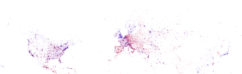
Shazam is a mobile app that can be asked to identify a song by making it “listen”’ to a piece of music. Due to its immense popularity, the organization’s name quickly turned into a verb used in regular conversation (“Do you know this song? Let’s Shazam it.“). A successful identification is referred to as a Shazam recognition.
Shazam users can opt-in to anonymously share their location data with Shazam. Umar Hansa used to work for Shazam and decided to plot the geospatial data of 1 billion Shazam recognitions, during one of the company’s “hackdays“. The following wonderful city, country, and world maps are the result.
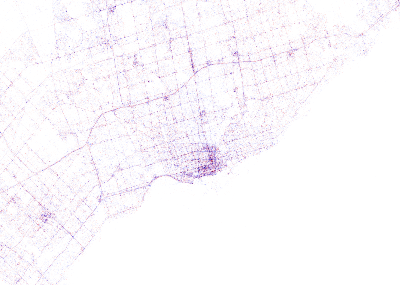
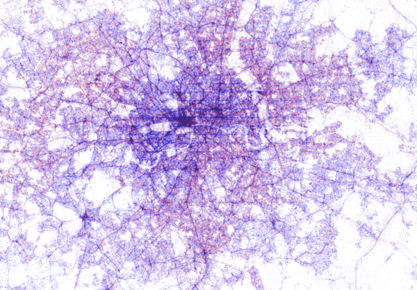
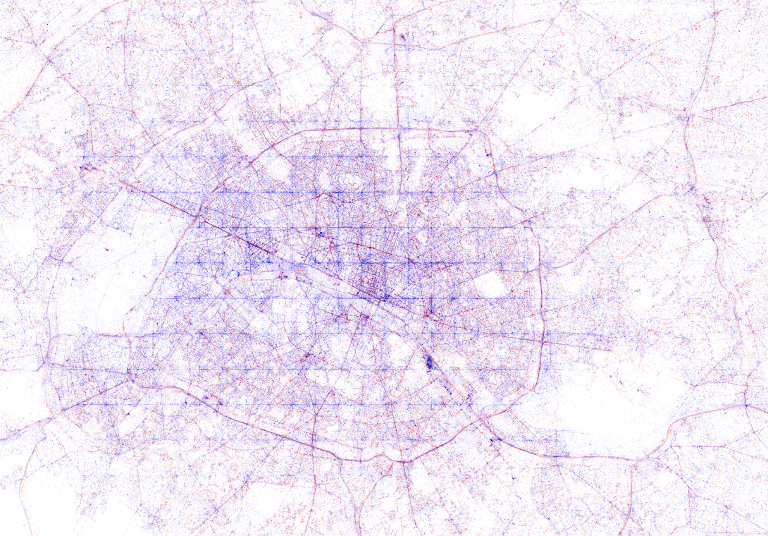
All visualisations (source) follow the same principle: Dots, representing successful Shazam recognitions, are plotted onto a blank geographical coordinate system. Can you guess the cities represented by these dots?
These first maps have an additional colour coding for operating systems. Can you guess which is which?
Blue dots represent iOS (Apple iPhones) and seem to cluster in the downtown area’s whereas red Android phones dominate the zones further from the city centres. Did you notice something else? Recall that Umar used a blank canvas, not a map from Google. Nevertheless, in all visualizations the road network is clearly visible. Umar guesses that passengers (hopefully not the drivers) often Shazam music playing in the car.
Try to guess the Canadian and American cities below and compare their layout to the two European cities that follow.
The maps were respectively of Toronto, San Fransisco, London, and Paris. It is just amazing how accurate they resemble the actual world. You have got to love the clear Atlantic borders of Europe in the world map below.
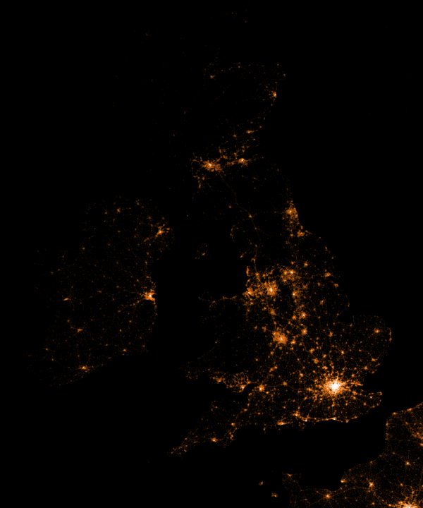
Are iPhones less common (among Shazam users) in Southern and Eastern Europe? In contrast, England and the big Japanese and Russian cities jump right out as iPhone hubs. In order to allow users to explore the data in more detail, Umar created an interactive tool comparing his maps to Google’s maps. A publicly available version you can access here (note that you can zoom in).This required quite complex code, the details of which are in his blog. For now, here is another, beautiful map of England, with (the density of) Shazam recognitions reflected by color intensity on a dark background.
London is so crowded! New York also looks very cool. Central Park, the rivers and the bay are so clearly visible, whereas Governors Island is completely lost on this map.
If you liked this blog, please read Umar’s own blog post on this project for more background information, pieces of the JavaScript code, and the original images. If you which to follow his work, you can find him on Twitter.
EDIT — Here and here you find an alternative way of visualizing geographical maps using population data as input for line maps in the R-package ggjoy.
HD version of this world map can be found on http://spatial.ly/


![indico_features_img_callout_small-1024x973[1].jpg](https://paulvanderlaken.com/wp-content/uploads/2017/08/indico_features_img_callout_small-1024x9731.jpg)


 This required quite complex code, the details of which are in