Category: tools

Flow charts and process diagrams with Draw.io & VS Code

Flow charts and process diagrams with Draw.io & VS Code

A flowchart is a picture of the separate steps of a process in sequential order. It it super useful to organize and interpret business processes, IT systems, or computer algorithms.

Icon Process #369494 - Free Icons Library
Example of a very simple flowchart

I draw flowcharts and process diagrams all the time in my daily work as a data scientist!

Drawing out the business process is often a first step in any project, in order to really understand the underlying business workflow and problems. I feel doing so greatly facilitates opportunity finding.

Moreover, when designing a machine learning or data science architecture — with data coming from different sources, being manipulated using different workflows, and ending up in models feeding multiple business processes — drawing the whole she-bang out really helps me personally to keep overview.

There are licensed software programs such as Microsoft Visio that allow you to create flowcharts. But there are also numerous free applications that can help you draw up a flow chart.

It's easier than ever to create beautiful flowcharts from Data Visualizer -  Microsoft Tech Community
Via Microsoft Tech Community

Draw.io or app.diagrams.net is my favorite free online application.

How to create flow charts in draw.io - draw.io
Via Draw.io

It allows the easy creation of beatiful flowcharts and process diagrams.

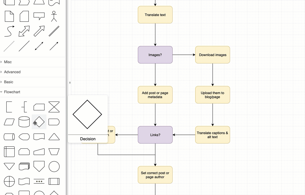
Here’s another great static example:

How to customise the draw.io interface in Confluence Cloud : draw.io  Helpdesk

Moreover, Draw.io easily integrates with other suites, like google drive, one drive, et cetera.

Now, some fellow geek out there — Henning Dieterichs — actually built an unofficial draw.io plugin for Visual Studio Code.

I’ve recently transitioned to VS Code for all my Python programming, so I really welcome this cool feature. It integrates all the flow chart functionality of draw.io right there in your IDE. Incredible!

Here’s a demo:

Via github

Here’s another demo, but with a light theme, showing how easy it is to export your diagrams to a shareable png file.

Via github

Moreover, due to VS Code’s amazing “LiveShare” feature, you can even collaborate with colleagues and build a flow chart together, simulatenously:

via Github

Now there are many more features to this plugin. You can write and change the JavaScript code behind the objects to tailor it completely to your theme and tastes. Or if you prefer working with XML, you can just alter that code. Everything seems to work as a charm.

Have a look at the plugin yourself: https://github.com/hediet/vscode-drawio


Note:
I am in no way affiliated with Draw.io, Microsoft, Visual Studio Code, or the author of this plugin.
I just get enthusiastic : )

Practical Tools for Human-Centered Design

Practical Tools for Human-Centered Design

Google’s guidebook to human-centered AI design refered to the Design Kit, containing numerous helpful tools to help you design products with user experience in mind.

The design kit website contains many practical methods, tools, case studies and much more resources to help you in the design process.

Screenshot of designkit.org/methods

Human-centered design is a practical, repeatable approach to arriving at innovative solutions. Think of these Methods as a step-by-step guide to unleashing your creativity, putting the people you serve at the center of your design process to come up with new answers to difficult problems.

The design kit methods section provides some seriously handy guidelines to help you design your products with the customer in mind. A step-by-step process guideline is offered, as well as neat worksheets to records the information you collect in the process, and a video explanation of the method.

Example method screenshot from designkit.org/methods/frame-your-design-challenge
Guidelines for Ethical AI

Guidelines for Ethical AI

As AI systems become more prevalent in society, we face bigger and tougher societal challenges. Given many of these challenges have not been faced before, practitioners will face scenarios that will require dealing with hard ethical and societal questions.

There has been a large amount of content published which attempts to address these issues through “Principles”, “Ethics Frameworks”, “Checklists” and beyond. However navigating the broad number of resources is not easy.

This repository aims to simplify this by mapping the ecosystem of guidelines, principles, codes of ethics, standards and regulation being put in place around artificial intelligence.

github.com/EthicalML/awesome-artificial-intelligence-guidelines/
🔍 High Level Frameworks & Principles🔏 Processes & Checklists🔨 Interactive & Practical Tools
📜 Industry standards initiatives📚 Online Courses🤖 Research and Industry Newsletters
⚔ Regulation and Policy
Links to Awesome Artificial Intelligence Guidelines

This overview of ethical guidelines for Artificial Intelligence is by the same author of the repository of Machine Learning production resources shared earlier this year.

Repository of Production Machine Learning

Repository of Production Machine Learning

The Institute for Ethical Machine Learning compiled this amazing curated list of open source libraries that will help you deploy, monitor, version, scale, and secure your production machine learning.

🔍 Explaining predictions & models🔏 Privacy preserving ML📜 Model & data versioning
🏁 Model Training Orchestration💪 Model Serving and Monitoring🤖 Neural Architecture Search
📓 Reproducible Notebooks📊 Visualisation frameworks🔠 Industry-strength NLP
🧵 Data pipelines & ETL🏷️ Data Labelling🗞️ Data storage
📡 Functions as a service🗺️ Computation distribution📥 Model serialisation
🧮 Optimized calculation frameworks💸 Data Stream Processing🔴 Outlier and Anomaly Detection
🌀 Feature engineering🎁 Feature Stores⚔ Adversarial Robustness
💰 Commercial Platforms
Direct links to the sections of the Github repo

The Institute for Ethical Machine Learning is a think-tank that brings together with technology leaders, policymakers & academics to develop standards for ML.

Create a publication-ready correlation matrix, with significance levels, in R

Create a publication-ready correlation matrix, with significance levels, in R

TLDR; You can use the corrtable package (see CRAN or Github)!

In most (observational) research papers you read, you will probably run into a correlation matrix. Often it looks something like this:

FACTOR ANALYSIS

In Social Sciences, like Psychology, researchers like to denote the statistical significance levels of the correlation coefficients, often using asterisks (i.e., *). Then the table will look more like this:

Table 4 from Family moderators of relation between community ...

Regardless of my personal preferences and opinions, I had to make many of these tables for the scientific (non-)publications of my Ph.D..

I remember that, when I first started using R, I found it quite difficult to generate these correlation matrices automatically.

Yes, there is the cor function, but it does not include significance levels.

Then there the (in)famous Hmisc package, with its rcorr function. But this tool provides a whole new range of issues.

What’s this storage.mode, and what are we trying to coerce again?

Soon you figure out that Hmisc::rcorr only takes in matrices (thus with only numeric values). Hurray, now you can run a correlation analysis on your dataframe, you think…

Yet, the output is all but publication-ready!

You wanted one correlation matrix, but now you have two… Double the trouble?

[UPDATED] To spare future scholars the struggle of the early day R programming, Laura Lambert and I created an R package corrtable, which includes the helpful function correlation_matrix.

This correlation_matrix takes in a dataframe, selects only the numeric (and boolean/logical) columns, calculates the correlation coefficients and p-values, and outputs a fully formatted publication-ready correlation matrix!

You can specify many formatting options in correlation_matrix.

For instance, you can use only 2 decimals. You can focus on the lower triangle (as the lower and upper triangle values are identical). And you can drop the diagonal values:

Or maybe you are interested in a different type of correlation coefficients, and not so much in significance levels:

For other formatting options, do have a look at the source code on github.

Now, to make matters even easier, the package includes a second function (save_correlation_matrix) to directly save any created correlation matrices:

Once you open your new correlation matrix file in Excel, it is immediately ready to be copy-pasted into Word!

If you are looking for ways to visualize your correlations do have a look at the packages corrr, corrplot, or ppsr.

I hope this package is of help to you!

Do reach out if you get to use them in any of your research papers!

Sign up to keep up to date on the latest R, Data Science & Tech content:

Visualizing and interpreting Cohen’s d effect sizes

Visualizing and interpreting Cohen’s d effect sizes

Cohen’s d (wiki) is a statistic used to indicate the standardised difference between two means. Resarchers often use it to compare the averages between groups, for instance to determine that there are higher outcomes values in a experimental group than in a control group.

Researchers often use general guidelines to determine the size of an effect. Looking at Cohen’s d, psychologists often consider effects to be small when Cohen’s d is between 0.2 or 0.3, medium effects (whatever that may mean) are assumed for values around 0.5, and values of Cohen’s d larger than 0.8 would depict large effects (e.g., University of Bath).

The two groups’ distributions belonging to small, medium, and large effects visualized

Kristoffer Magnusson hosts this Cohen’s d effect size comparison tool on his website the R Psychologist, but recently updated the visualization and its interactivity. And the tool looks better than ever:

Moreover, Kristoffer adds some nice explanatons of the numbers and their interpretation in real life situations:

If you find the tool useful, please consider buying Kristoffer a coffee or buying one of his beautiful posters, like the one above, or below:

Frequentisme betekenis testen poster horizontaal image 0

By the way, Kristoffer hosts many other interesting visualization tools (most made with JavaScript’s D3 library) on statistics and statistical phenomena on his website, have a look!