Tag: communication

How to Speak – MIT lecture by Patrick Winston

How to Speak – MIT lecture by Patrick Winston

Patrick Winston was a professor of Artificial Intelligence at MIT. Having taught with great enthusiasm for over 50 years, he passed away past June.

As a speaker [Patrick] always had his audience in the palm of his hand. He put a tremendous amount of work into his lectures, and yet managed to make them feel loose and spontaneous. He wasn’t flashy, but he was compelling and direct.

Peter Szolovits via http://news.mit.edu/2019/patrick-winston-professor-obituary-0719

I’ve written about Patrick’s MIT course on Artificial Intelligence before, as all 20+ lectures have been shared open access online on Youtube. I’ve worked through the whole course in 2017/2018, and it provided me many new insights into the inner workings of common machine learning algorithms.

Now, I stumbled upon another legacy of Patrick that has been opened up as of December 20th 2019. A lecture on “How to Speak” – where Patrick explains what he think makes a talk enticing, inspirational, and interesting.

Patrick Winston’s How to Speak talk has been an MIT tradition for over 40 years. Offered every January, the talk is intended to improve your speaking ability in critical situations by teaching you a few heuristic rules.

https://ocw.mit.edu/resources/res-tll-005-how-to-speak-january-iap-2018/

That’s all I’m going to say about it, you should have a look yourself! If you don’t apply these techniques yet, do try them out, they will really upgrade your public speaking effectiveness:

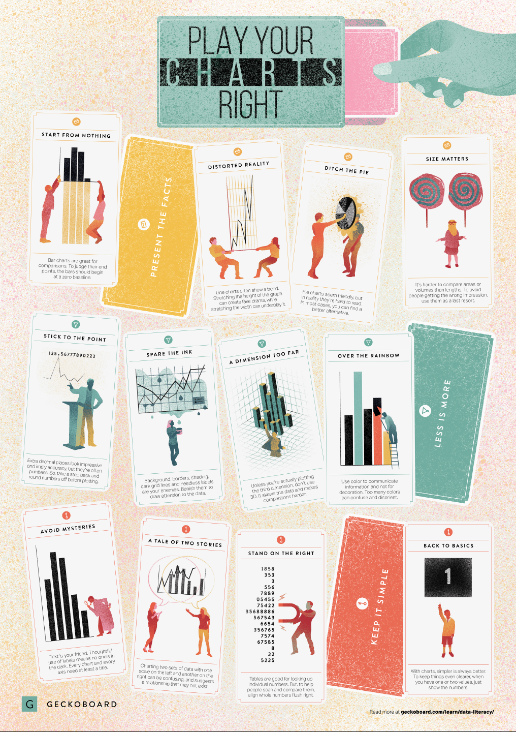
Play Your Charts Right: Tips for Effective Data Visualization – by Geckoboard

Play Your Charts Right: Tips for Effective Data Visualization – by Geckoboard

In a world where data really matters, we all want to create effective charts. But data visualization is rarely taught in schools, or covered in on-the-job training. Most of us learn as we go along, and therefore we often make choices or mistakes that confuse and disorient our audience.
From overcomplicating or overdressing our charts, to conveying an entirely inaccurate message, there are common design pitfalls that can easily be avoided. We’ve put together these pointers to help you create simpler charts that effectively get across the meaning of your data.

Geckoboard

Based on work by experts such as Stephen Few, Dona Wong, Albert Cairo, Cole Nussbaumer Knaflic, and Andy Kirk, the authors at Geckoboard wrote down a list of recommendations which I summarize below:

Present the facts

  • Start your axis at zero whenever possible, to prevent misinterpretation. Particularly bar charts.
  • The width and height of line and scatter plots influence its messages.
  • Area and size are hard to interpret. Hence, there’s often a better alternative to the pie chart. Read also this.

Less is more

  • Use colors for communication, not decoration.
  • Diminish non-data ink, to draw attention to that which matters.
  • Do not use the third dimension, unless you are plotting it.
  • Avoid overselling numerical accuracy with precise decimal values.

Keep it simple

  • Annotate your plots; include titles, labels or scales.
  • Avoid squeezing too much information in a small space. For example, avoid a second x- or y-axis whenever possible.
  • Align your numbers right, literally.
  • Don’t go for fancy; go for clear. If you have few values, just display the values.

Infographic summary

A/B testing and Statistics at Etsy, by Emily Robinson

A/B testing and Statistics at Etsy, by Emily Robinson

Generating numbers is easy; generating numbers you should trust is hard!

Emily Robinson is a data scientist at Etsy, an e-commerce website for handmade and vintage products. In the #rstats community, Emily is nearly as famous as her brother David Robinson, whom we know from the tidytext R-package.

Like any large tech company, Etsy relies heavily on statistics to improve their way of doing business. In their case, data from real-life experiments provide the business intelligence that allow effective decision-making. For instance, they experiment with the layout of their buttons, with the text shown near products, or with the suggestions made after a search query. To detect whether such changes have (ever so) small effects on Etsy’s KPI’s (e.g., conversion), data scientists such as Emily rely on traditional A/B testing.

In a 40-minute presentation, Emily explains how statistical issues such as skewed distributions, outliers, and power are dealt with at Etsy, among others using bootstrapping and simulations. Moreover, 30 minutes in Emily shares her lessons when it comes to working with (less stats-savvy) business stakeholders. For instance, how to help identify and transform business questions into data questions back into business solutions, or how to deal with the desire to peek at the results of experiments early.

Overall, I can the presentation below, the slides of which you find on Emily’s GitHub.