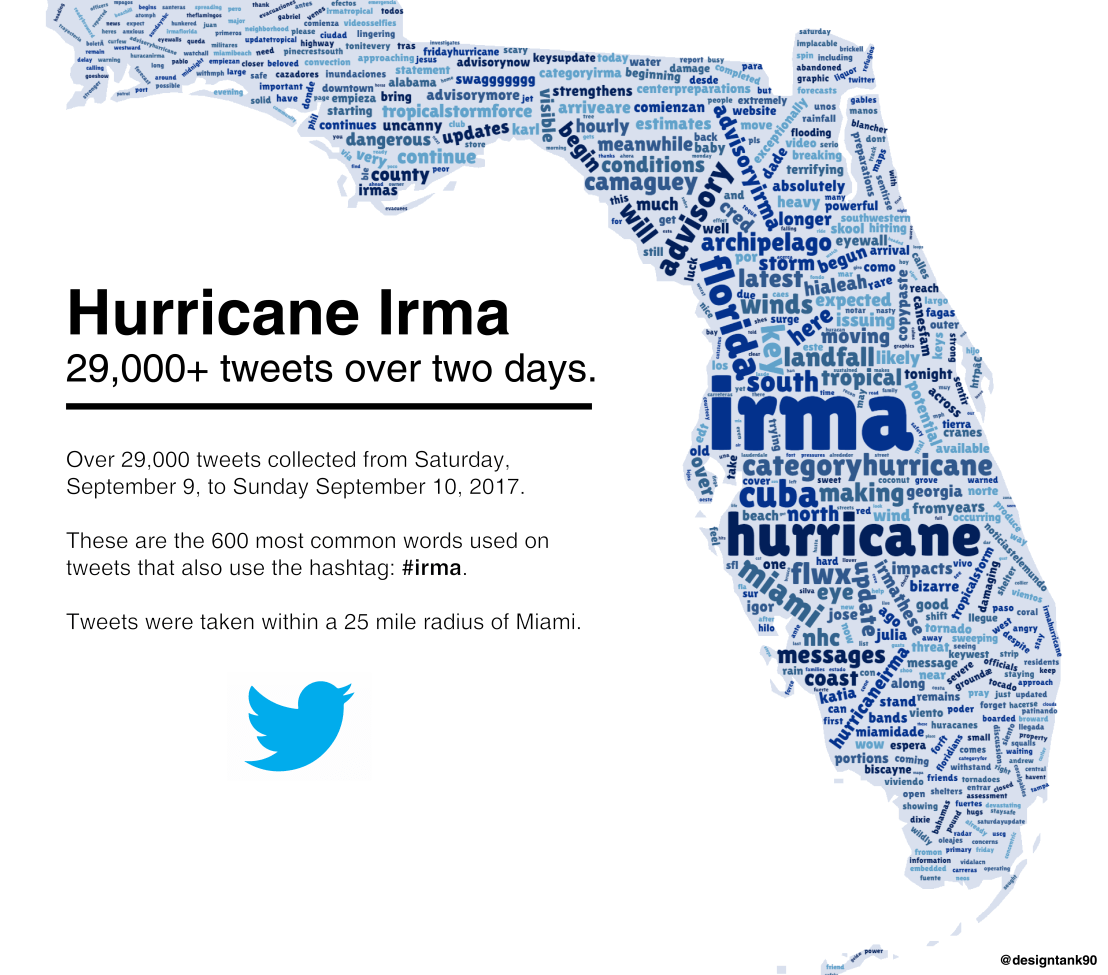
Reddit user LucasCu90 used the R package twitteR to retrieve all tweets that were sent with #Irma and a Geocode of central Miami (25 mile radius) from Saturday September 9, to Sunday September 10, 2017 (the period of Irma’s approach and initial landfall on the Florida Keys and the mainland). From the 29,000 tweets he collected, Lucas then retrieved the 600 most common words and overlaid them on a map of Florida, with their size relative to their frequency in the data. The result is quite nice!
Jack Zhao from Small Multiples – a multidisciplinary team of data specialists, designers and developers – retrieved the Language Spoken at Home (LANP) data from the 2016 Census and turned it into a dot density map that vividly shows how people from different cultures coexist (or not) in ultra high resolution (using Python, englewood library, QGIS, Carto). Each colored dot in the visualizations below represents five people from the same language group in the area. Highly populated areas have a higher density of dots; while language diversity is shown through the number of different colors in the given area.
Good news: the maps are interactive! Here’s Sydney:
Eastern Asian: Chinese, Japanese, Korean, Other Eastern Asian Languages
Southeast Asian: Burmese and Related Languages, Hmong-Mien, Mon-Khmer, Tai, Southeast Asian Austronesian Languages, Other Southeast Asian Languages
Southern Asian: Dravidian, Indo-Aryan, Other Southern Asian Languages
Southwest And Central Asian: Iranic, Middle Eastern Semitic Languages, Turkic, Other Southwest and Central Asian Languages
Northern European: Celtic, English, German and Related Languages, Dutch and Related Languages, Scandinavian, Finnish and Related Languages
Southern European: French, Greek, Iberian Romance, Italian, Maltese, Other Southern European Languages
Eastern European: Baltic, Hungarian, East Slavic, South Slavic, West Slavic, Other Eastern European Languages
Australian Indigenous: Arnhem Land and Daly River Region Languages, Yolngu Matha, Cape York Peninsula Languages, Torres Strait Island Languages, Northern Desert Fringe Area Languages, Arandic, Western Desert Languages, Kimberley Area Languages, Other Australian Indigenous Languages
The US Census Download Center contains rich information on its countries demographic data. Here you can find a piece of R code that uses the highcharter package in R to create an interactive map showing the median household per country.
The Washinton Post is known for the lovely visualizations accompanying their stories. In a recent post, they visualized how long it would take you to get out of the downtown areas of various cities. They compared all the major U.S. cities and examined different leaving times. Unfortunately, I cannot copy the visualizations’ text here, but please do have a look at the originals.
How far could you get in 1-5 hours when departing from downtown areas?How far could you get in 1 hour when leaving Los Angeles (right) and Dallas (left), at 4 (red), 7 (yellow) or 10 p.m. (blueish).
Shazam is a mobile app that can be asked to identify a song by making it “listen”’ to a piece of music. Due to its immense popularity, the organization’s name quickly turned into a verb used in regular conversation (“Do you know this song? Let’s Shazam it.“). A successful identification is referred to as a Shazam recognition.
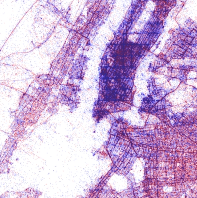
Shazam users can opt-in to anonymously share their location data with Shazam. Umar Hansa used to work for Shazam and decided to plot the geospatial data of 1 billion Shazam recognitions, during one of the company’s “hackdays“. The following wonderful city, country, and world maps are the result.
All visualisations (source) follow the same principle: Dots, representing successful Shazam recognitions, are plotted onto a blank geographical coordinate system. Can you guess the cities represented by these dots?
These first maps have an additional colour coding for operating systems. Can you guess which is which?
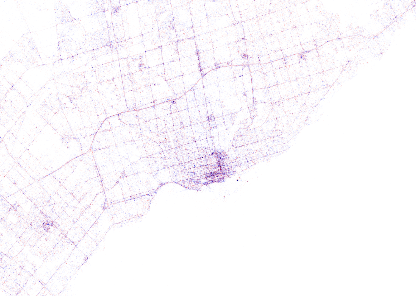
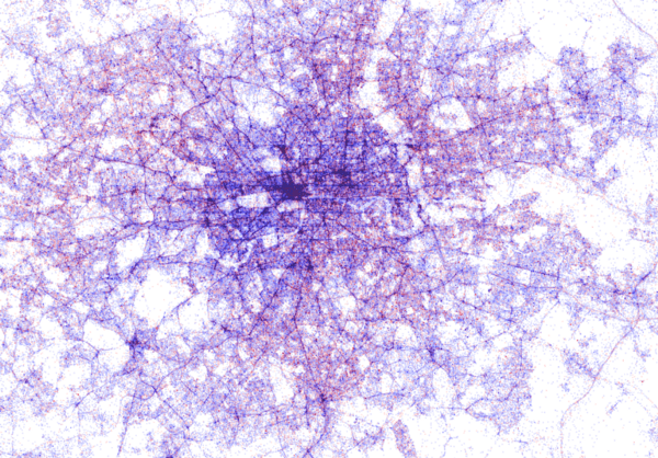
Blue dots represent iOS (Apple iPhones) and seem to cluster in the downtown area’s whereas red Android phones dominate the zones further from the city centres. Did you notice something else? Recall that Umar used a blank canvas, not a map from Google. Nevertheless, in all visualizations the road network is clearly visible. Umar guesses that passengers (hopefully not the drivers) often Shazam music playing in the car.
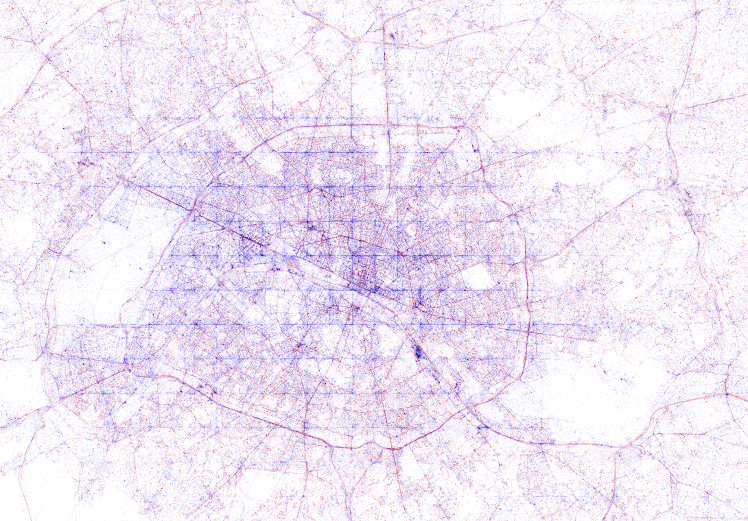
Try to guess the Canadian and American cities below and compare their layout to the two European cities that follow.
The maps were respectively of Toronto, San Fransisco, London, and Paris. It is just amazing how accurate they resemble the actual world. You have got to love the clear Atlantic borders of Europe in the world map below.
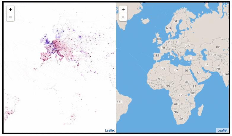
Are iPhones less common (among Shazam users) in Southern and Eastern Europe? In contrast, England and the big Japanese and Russian cities jump right out as iPhone hubs. In order to allow users to explore the data in more detail, Umar created an interactive tool comparing his maps to Google’s maps. A publicly available version you can access here (note that you can zoom in).This required quite complex code, the details of which are in his blog. For now, here is another, beautiful map of England, with (the density of) Shazam recognitions reflected by color intensity on a dark background.
London is so crowded! New York also looks very cool. Central Park, the rivers and the bay are so clearly visible, whereas Governors Island is completely lost on this map.
If you liked this blog, please read Umar’s own blog post on this project for more background information, pieces of the JavaScript code, and the original images. If you which to follow his work, you can find him on Twitter.
EDIT — Here and here you find an alternative way of visualizing geographical maps using population data as input for line maps in the R-package ggjoy.
HD version of this world map can be found on http://spatial.ly/
A few weeks back, I gave some examples of how data, predictive analytics, and visualization are changing the Tour de France experience. Today, I came across another wonderful example visualizing the sequences of geospatial data (i.e., the movement) of the cyclists during the 11th stage of the Tour de France (blue dots). Moreover, the locations of the four choppers capturing the live video feed are tracked in yellow.
This short clip again reflects the enormous amounts of rich data currently being collected in this sports event.


 This required quite complex code, the details of which are in


