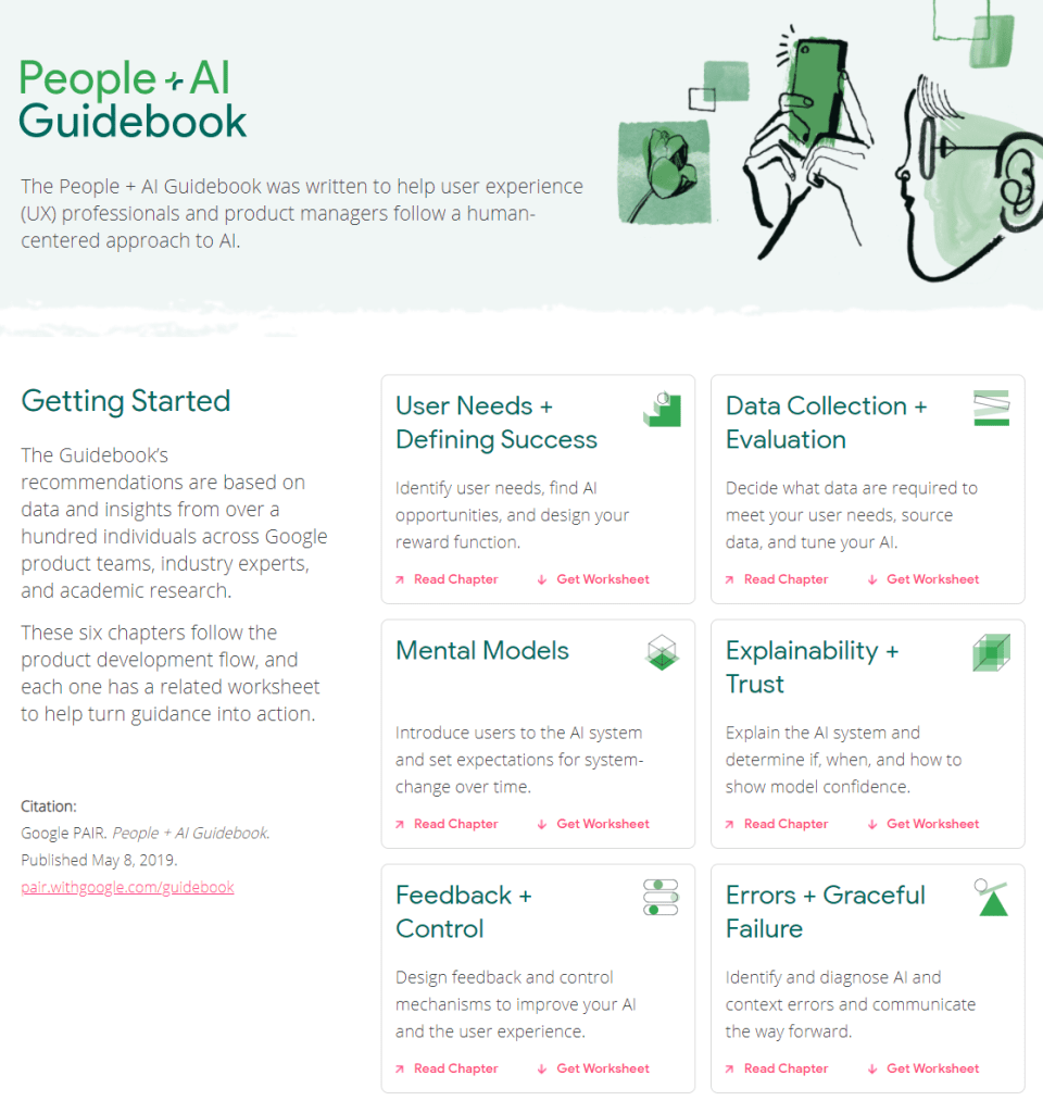
The People + AI Guidebook was written to help user experience (UX) professionals and product managers follow a human-centered approach to AI.
The Guidebook’s recommendations are based on data and insights from over a hundred individuals across Google product teams, industry experts, and academic research.
These six chapters follow the product development flow, and each one has a related worksheet to help turn guidance into action.
The People & AI guidebook is one of the products of the major PAIR project team (People & AI Research).
Here are the direct links to the six guidebook chapters:
The Institute for Ethical Machine Learning compiled this amazing curated list of open source libraries that will help you deploy, monitor, version, scale, and secure your production machine learning.
The Institute for Ethical Machine Learning is a think-tank that brings together with technology leaders, policymakers & academics to develop standards for ML.
According to Jake Voytko, data science and engineering teams run more efficiently and spread knowledge more quickly when there is a single person setting the technical direction of a team. The so-called “tech lead“.
Sometimes tech lead is an official title, referring to the position between an engineering manager and the engineering team. Oftentimes it is just a unofficial role one grows in to.
Now, according to Jake, you can learn to become a tech lead. And you can be good at it too. Somebody has to do it, so it might as well be you! It could allow you to leverage your time to move the organization forward, and enables you to influence data science or engineering throughout the entire team!
In this original blog, which I thoroughly enjoyed reading, Jake explains in more detail what it takes to be(come) a good tech lead. Here just the headers copied, but if you’re interested, take a look at the full article:
Less time writing code
Helping others often (esp. juniors)
Helping others first
Doing unsexy, unthankful work to enable the team
Being an ally (of underrepresented groups)
Spreading knowledge, or making sure it spreads
And this is what Jake feels his work week looks like as a tech lead:
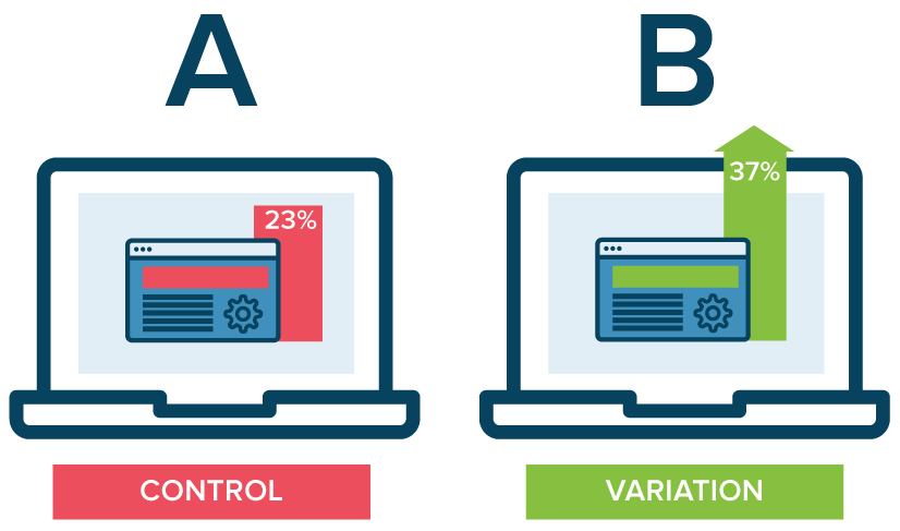
A/B testing is a method of comparing two versions of some thing against each other to determine which is better. A/B tests are often mentioned in e-commerce contexts, where the things we are comparing are web pages.
Business leaders and data scientists alike face a difficult trade-off when running A/B tests: How big should the A/B test be? Or in other words, After collecting how many data points, or running for how many days, should we make a decision whether A or B is the best way to go?
This is a tradeoff because the sample size of an A/B test determines its statistical power. This statistical power, in simple terms, determines the probability of a A/B test showing an effect if there is actually really an effect. In general, the more data you collect, the higher the odds of you finding the real effect and making the right decision.
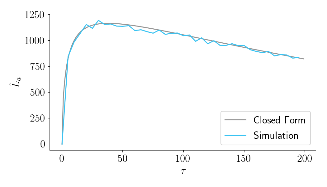
By default, researchers often aim for 80% power, with a 5% significance cutoff. But is this general guideline really optimal for the tradeoff between costs and benefits in your specific business context? Chris thinks not.
Chris said wrote a great three-piece blog in which he explains how you can mathematically determine the optimal duration of A/B-testing in your own company setting:
Part I: General Overview. Starts with a mostly non-technical overview and ends with a section called “Three lessons for practitioners”.
Part II: Expected lift. A more technical section that quantifies the benefits of experimentation as a function of sample size.
Part III: Aggregate time-discounted lift. A more technical section that quantifies the costs of experimentation as a function of sample size. It then combines costs and benefits into a closed-form expression that can be optimized. Ends with an FAQ.
Several Chinese Ph.D. students wrote a PyTorch program that can turn your holiday pictures into 3D sceneries. They call it 3D photo inpainting. Here are some examples
And here’s the new method compares to previous techniques:
We propose a method for converting a single RGB-D input image into a 3D photo, i.e., a multi-layer representation for novel view synthesis that contains hallucinated color and depth structures in regions occluded in the original view. We use a Layered Depth Image with explicit pixel connectivity as underlying representation, and present a learning-based inpainting model that iteratively synthesizes new local color-and-depth content into the occluded region in a spatial context-aware manner. The resulting 3D photos can be efficiently rendered with motion parallax using standard graphics engines. We validate the effectiveness of our method on a wide range of challenging everyday scenes and show fewer artifacts when compared with the state-of-the-arts.
I love how people are using data and data science to fight fake news these days (see also Identifying Dirty Twitter Bots), and I recently came across another great example.
Conspirador Norteño (real name unkown) is a member of what they call #TheResistance. It’s a group of data scientists discovering and analyzing so-called botnets – networks of artificial accounts on social media websites, like Twitter.
TheResistance uses quantitative analysis to unveil large groups of fake accounts, spreading potential fake news, or fake-endorsing the (fake) news spread by others.
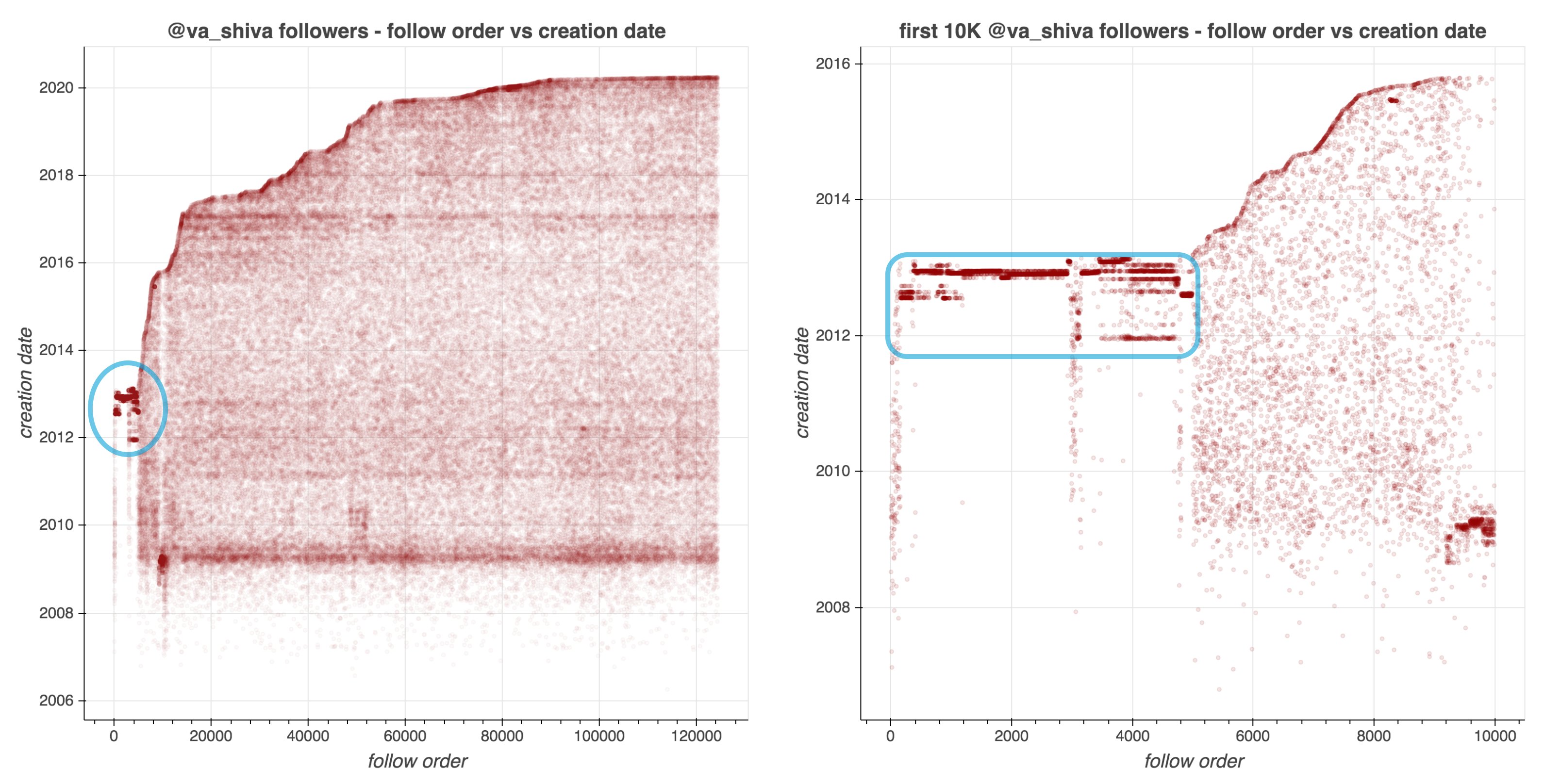
In a recent Twitter thread, Norteno shows how they discovered that many of Dr. Shiva Ayyadurai (self-proclaimed Inventor of Email) his early followers are likely bots.
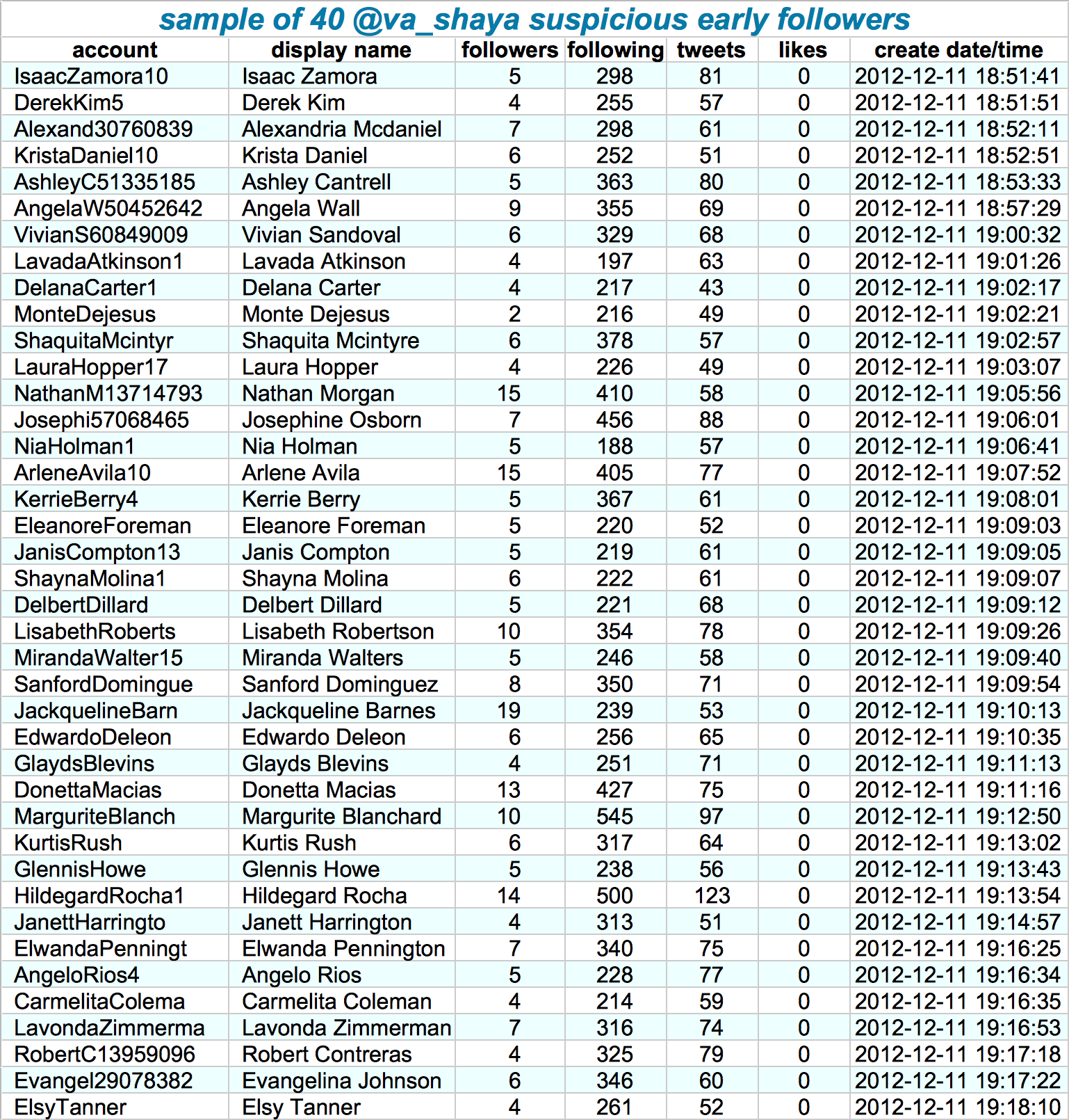
They looked at the date of these accounts started following Shiva, offset by the date of their accounts’ creation. A remarkeable pattern appeared:
Although @va_shiva‘s recent followers look unremarkable, a significant majority of his first 5000 followers appear to have been created in batches and to have subsequently followed @va_shiva in rapid succession.
Looking at those followers in more detail, other suspicious patterns emerge. Their names follow a same pattern, they have an about equal amount of followers, followings, tweets, and (no) likes. Moreover, they were created only seconds apart. Many of them seem to follow each other as well.
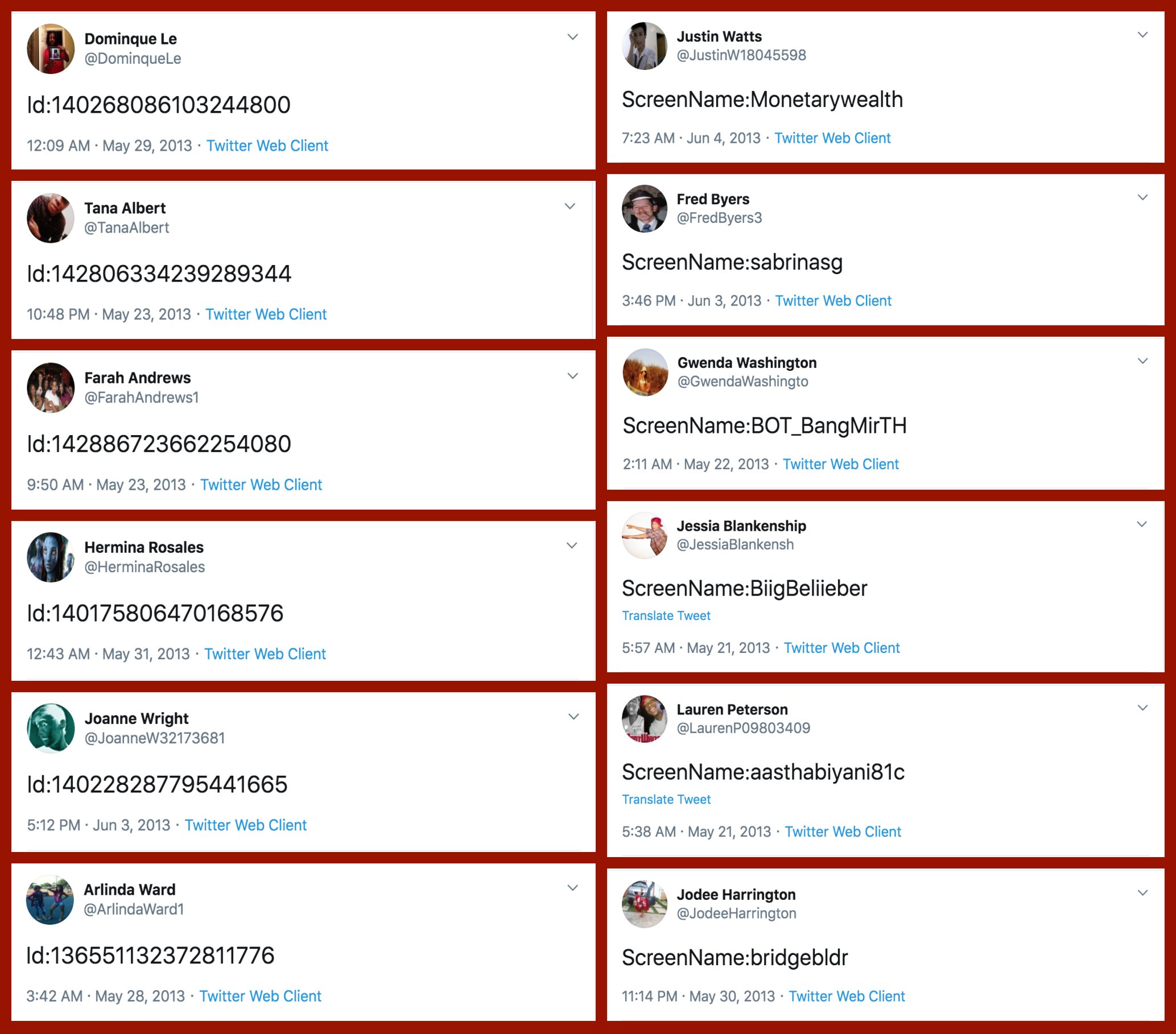
If that wasn’t enough proof of something’s off, here’s a variety of their tweets… Not really what everyday folks would tweet right? Plus similar patterns again across acounts.
At first, I thought, so what? This Shiva guy probably just set up some automated (Python?) scripts to make Twitter account and follow him. Good for him. It worked out, as his most recent 10k followers followed him organically.
However, it becomes more scary if you notice this Shiva guy is (succesfully) promoting the firing of people working for the government:
— Dr.SHIVA Ayyadurai, MIT PhD. Inventor of Email (@va_shiva) April 13, 2020
Anyways, wanted to share this simple though cool approach to finding bots & fake news networks on social media. I hope you liked it, and would love to hear your thoughts in the comments!