Regular expression (also abbreviated to regex) really is a powertool any programmer should know. It was and is one of the things I most liked learning, as it provides you with immediate, godlike powers that can speed up your (data science) workflow tenfold.
I’ve covered many regex related topics on this blog already, but thought I’d combine them and others in a nice curated overview — for myself, and for you of course, to use.
If you have any materials you liked, but are missing, please let me know!
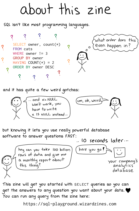
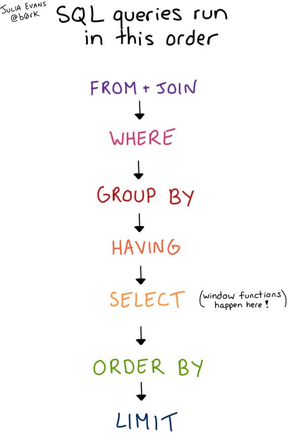
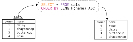
This zine explains SELECT queries step by step with tons of examples that will show you exactly what’s happening when you run a query. You’ll be able to easily translate your questions about your data into queries and get answers fast.
The magazine will set you back 12 dollars, but will make you a SQL master in no time. Plus, you will always have a cheat sheet by hand! Here’s what’s in it:
Here’s some of the actual contents you can expect, via Julia’s Twitter and the original webpage:
The title of the magazine is also quite well thought out : ) I hope you enjoy it!
Sean Owen created this handy cheat sheet that shows the most common probability distributions mapped by their underlying relationships.
Probability distributions are fundamental to statistics, just like data structures are to computer science. They’re the place to start studying if you mean to talk like a data scientist.
Owen argues that the probability distributions relate to each other in intuitive and interesting ways that makes it easier for you to recall them. For instance, several follow naturally from the Bernoulli distribution. Having this map by hand should thus help you really understand what these distributions imply.
On top of that, it’s just a nice geeky network poster!
Sean’s map of the relationships between probability distributions (via)
Now, Sean didn’t just make a fancy map. In the original blog he also explains each of the distributions and how it relates to the others. Having this knowledge is vital to being a good data scientist / analyst.
You can sometimes get away with simple analysis using R or scikit-learn without quite understanding distributions, just like you can manage a Java program without understanding hash functions. But it would soon end in tears, bugs, bogus results, or worse: sighs and eye-rolling from stats majors.
For instance, here’s Sean explaining the Binomial distribution:
The binomial distribution may be thought of as the sum of outcomes of things that follow a Bernoulli distribution. Toss a fair coin 20 times; how many times does it come up heads? This count is an outcome that follows the binomial distribution. Its parameters are n, the number of trials, and p, the probability of a “success” (here: heads, or 1). Each flip is a Bernoulli-distributed outcome, or trial. Reach for the binomial distribution when counting the number of successes in things that act like a coin flip, where each flip is independent and has the same probability of success.
This video I’ve been meaning to watch for a while now. It another great visual explanation of a statistics topic by the 3Blue1Brown Youtube channel (which I’ve covered before, multiple times).
This time, it’s all about Bayes theorem, and I just love how Grant Sanderson explains the concept so visually. He argues that rather then memorizing the theorem, we’d rather learn how to draw out the context. Have a look at the video, or read my summary below:
Grant Sanderson explains the concept very visually following an example outlined in Daniel Kahneman’s and Amos Tversky’s book Thinking Fast, Thinking Slow:
Steve is very shy and withdrawn, invariably helpful but with very little interest in people or in the world of reality. A meek and tidy soul, he has a need for order and structure, and a passion for detail.”
Is Steve more likely to be a librarian or a farmer?
Kahneman and Tversky argue that people take into account Steve’s disposition and therefore lean towards librarians.
However, few people take into account that librarians are quite scarce in our society, which is rich with farmers. For every librarian, there are 20+ farmers. Hence, despite the disposition, Steve is probably more like to be a farmer.
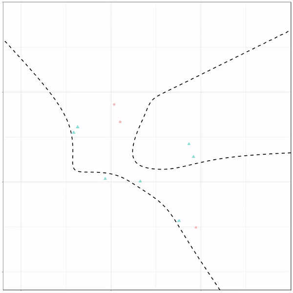
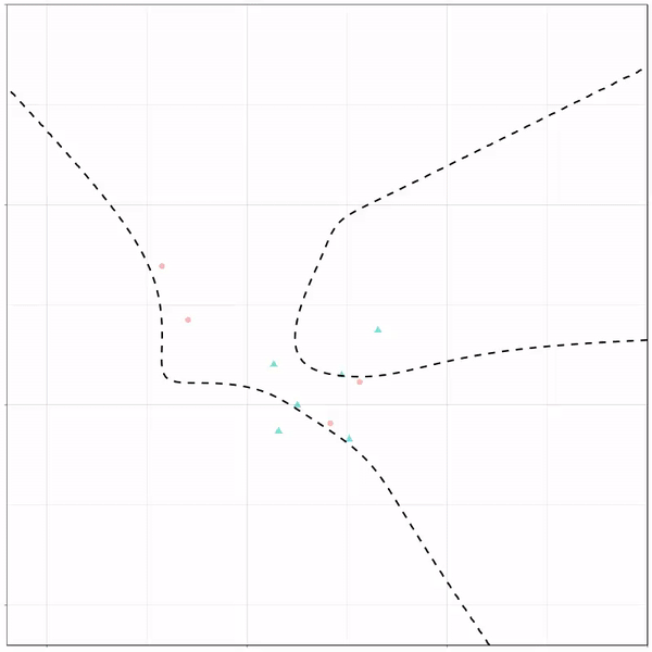
Ryan Holbrook made awesome animated GIFs in R of several classifiers learning a decision rule boundary between two classes. Basically, what you see is a machine learning model in action, learning how to distinguish data of two classes, say cats and dogs, using some X and Y variables.
These visuals can be great to understand these algorithms, the models, and their learning process a bit better.
Here’s the original tweet, with the logistic regression animation. If you follow it, you will find a whole thread of classifier GIFs. These I extracted, pasted, and explained below.
A thread of classifiers learning a decision rule. Dashed line is optimal boundary. Animations with #gganimate by @thomasp85 and @drob. #rstats
Logistic regression {stats::glm} with each class having normally distributed features. (1/n) pic.twitter.com/kKmqdO2zGy
Below is the GIF which I extracted using EZgif.com.
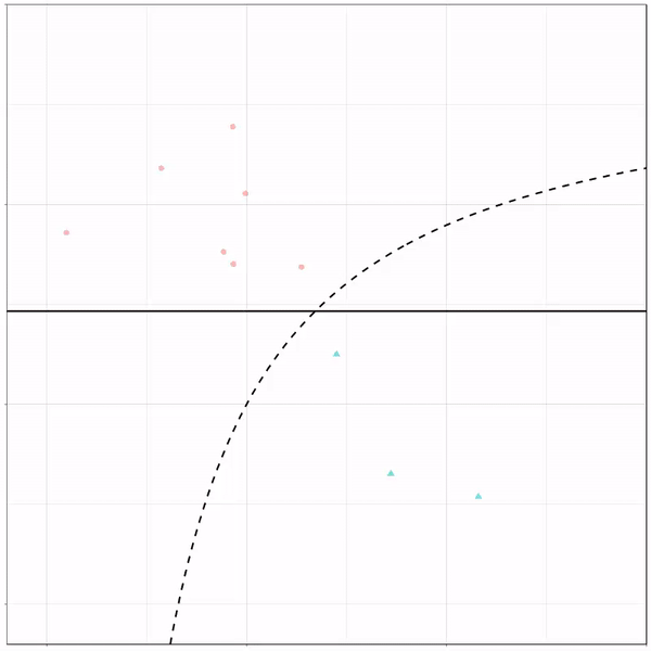
What you see is observations from two classes, say cats and dogs, each represented using colored dots. The dots are placed along X and Y axes, which represent variables about the observations. Their tail lengths and their hairyness, for instance.
Now there’s an optimal way to seperate these classes, which is the dashed line. That line best seperates the cats from the dogs based on these two variables X and Y. As this is an optimal boundary given this data, it is stable, it does not change.
However, there’s also a solid black line, which does change. This line represents the learned boundary by the machine learning model, in this case using logistic regression. As the model is shown more data, it learns, and the boundary is updated. This learned boundary represents the best line with which the model has learned to seperate cats from dogs.
Anything above the boundary is predicted to be class 1, a dog. Everything below predicted to be class 2, a cat. As logistic regression results in a linear model, the seperation boundary is very much linear/straight.
Logistic regression gif by Ryan Holbrook
These animations are great to get a sense of how the models come to their boundaries in the back-end.
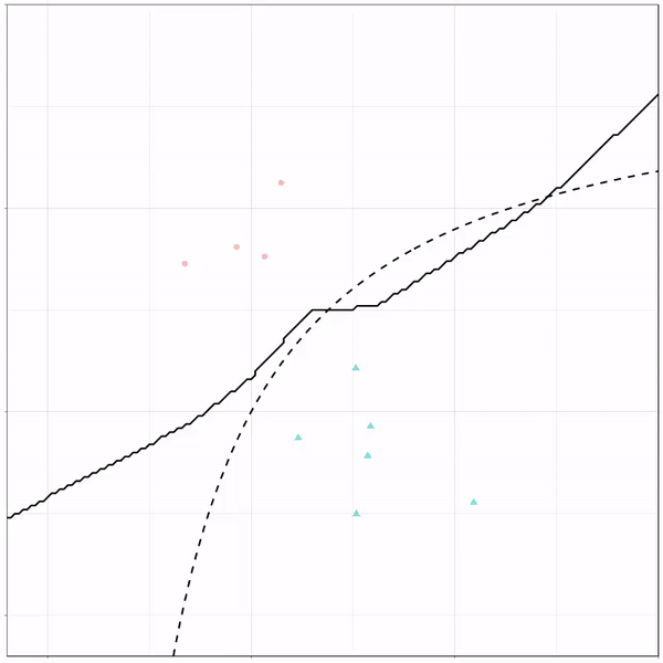
For instance, other machine learning models are able to use non-linear boundaries to dinstinguish classes, such as this quadratic discriminant analysis (qda). This “learned” boundary is much closer to the optimal boundary:
Quadratic discriminant analysis gif by Ryan Holbrook
Multivariate adaptive regression splines gif by Ryan Holbrook
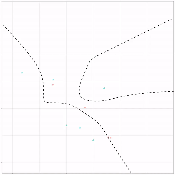
Next, we have the k-nearest neighbors algorithm, which predicts for each point (animal) the class (cat/dog) based on the “k” points closest to it. As you see, this results in a highly fluctuating, localized boundary.
K-nearest neighbors gif by Ryan Holbrook
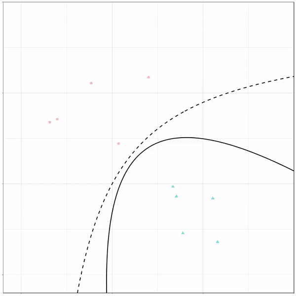
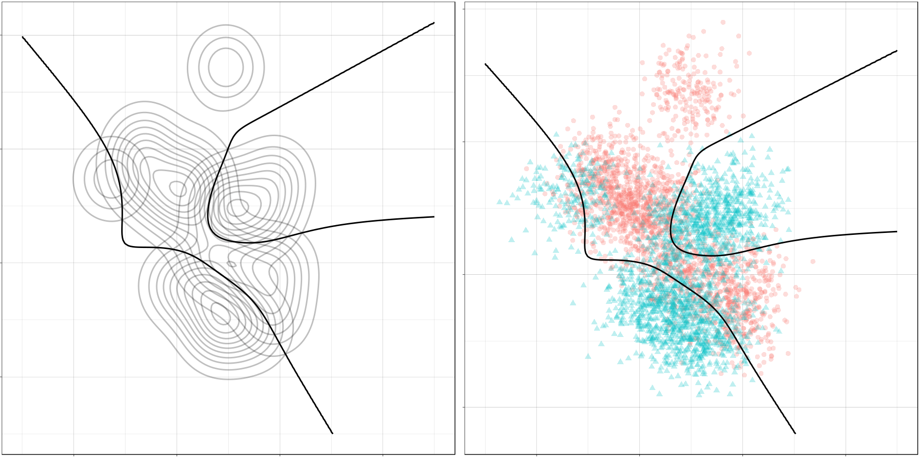
Now, Ryan decided to push the challenge, and simulate new data for two classes with a more difficult decision boundary. The new data and optimal boundaries look like this:
On these data, Ryan put a whole range of non-linear models to work.
Like this support-vector machine, which tries to create optimal boundaries built of support vectors around all the cats and all the dohs (this is definitely not a technical, error-free explanation of what’s happening here).
Let’s jump into some tree-based algorithms and the resulting models. A decision tree classifies data based on multiple, sequential, binary splits. Here, Ryan trained a simple decision tree:
Decision tree gif by Ryan Holbrook
As well as it’s big brother, a random forest, which uses hundreds of trees in the back end and thus results in a more flexible boundary:
Random forest gif by Ryan Holbrook
Extreme gradient boosting is also a tree-based algorithm, which leverages many machine learning techniques to optimize the bias-variance tradeoff. Here’s an earlier blog on how to get started with Xgboost in Python or R:
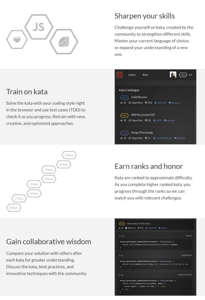
As I wrote about Project Euler and CodingGame before, someone recommended me CodeWars. CodeWars offers free online learning exercises to develop your programming skills through fun daily challenges.
In line with Project Euler, you are tasked with solving increasingly complex programming challenges. At CodeWars, these little problems you need to solve with code are called kata.
Kata take a test-driven development approach: the programs you write need to pass the tests of the developer who made the kata in the first place. Only then are you awarded with honour and can you earn your ranks and progress to the more complex kata.
Sounds fun right? I’m definitely going to check this out, as they support a wide range of programming languages, each with many kata to solve!
Python, Ruby, C++, Java, JavaScript and many other main programming languages are already supported, but CodeWards is also still developing kata for more niche or upcoming languages like R, Lua, Kotlin, and Scala.


