Category: text mining

Predict the Sentimental Response to your Facebook Posts

Predict the Sentimental Response to your Facebook Posts

Max Woolf writes machine learning blogs on his personal blog, minimaxir, and posts open-source code repositories on his GitHub. He is a former Apple Software QA Engineer and graduated from Carnegie Mellon University. I have published his work before, for instance, this short ggplot2 tutorial by MiniMaxir, but his new project really amazed me.

Max developed a Facebook web scaper in Python. This tool gathers all the posts and comments of Facebook Pages (or Open Facebook Groups) and the related metadata, including post message, post links, and counts of each reaction on the post. The data is then exported to a CSV file, which can be imported into any data analysis program like Excel, or R.

The data format returned by the Facebook scaper.

Max put his scraper to work and gathered a ton of publicly available Facebook posts and their metadata between 2016 and 2017.

Responses to collected Facebook posts.

However, this was only the beginning. In a follow-up project, Max trained a recurrent neural network (or RNN) on these 2016-2017 data in order to predict the proportionate reactions (love, wow, haha, sad, angry) to any given text. Now, he has made this neural network publicly available with the Python 2/3 module and R package, reactionrnn, which builds on Keras/TensorFlow (see Keras: Deep Learning in R or Python within 30 seconds & R learning: Neural Networks).


reactionrnn architecture

Python implementation

For Python, reactionrnn can be installed from pypi via pip:

python3 -m pip install reactionrnn

You may need to create a venv (python3 -m venv <path>) first.

from reactionrnn import reactionrnn

react = reactionrnn()
react.predict("Happy Mother's Day from the Chicago Cubs!")
[('love', 0.9765), ('wow', 0.0235), ('haha', 0.0), ('sad', 0.0), ('angry', 0.0)]

R implementation

For R, you can install reactionrnn from this GitHub repo with devtools (working on resolving issues to get package on CRAN):

# install.packages('devtools')
devtools::install_github("minimaxir/reactionrnn", subdir="R-package")
library(reactionrnn)
react <- reactionrnn()
react %>% predict("Happy Mother's Day from the Chicago Cubs!")
      love        wow       haha        sad      angry 
0.97649449 0.02350551 0.00000000 0.00000000 0.00000000 

You can view a demo of common features in this Jupyter Notebook for Python, and this R Notebook for R.

Notes

  • reactionrnn is trained on Facebook posts of 2016 and 2017 and will often yield responses that are characteristic for this corpus.
  • reactionrnn will only use the first 140 characters of any given text.
  • Max intends to build a web-based implementation using Keras.js
  • Max also intends to improve the network (longer character sequences and better performance) and released it as a commercial product if any venture capitalists are interested.
  • Max’s projects are open-source and supported by his Patreon, any monetary contributions are appreciated and will be put to good creative use.


Scraping RStudio blogs to establish how “pleased” Hadley Wickham is.

Scraping RStudio blogs to establish how “pleased” Hadley Wickham is.

This is reposted from DavisVaughan.com with minor modifications.

Introduction

A while back, I saw a conversation on twitter about how Hadley uses the word “pleased” very often when introducing a new blog post (I couldn’t seem to find this tweet anymore. Can anyone help?). Out of curiosity, and to flex my R web scraping muscles a bit, I’ve decided to analyze the 240+ blog posts that RStudio has put out since 2011. This post will do a few things:

  • Scrape the RStudio blog archive page to construct URL links to each blog post
  • Scrape the blog post text and metadata from each post
  • Use a bit of tidytext for some exploratory analysis
  • Perform a statistical test to compare Hadley’s use of “pleased” to the other blog post authors

Spoiler alert: Hadley uses “pleased” ALOT.

Required packages

library(tidyverse)
library(tidytext)
library(rvest)
library(xml2)

Extract the HTML from the RStudio blog archive

To be able to extract the text from each blog post, we first need to have a link to that blog post. Luckily, RStudio keeps an up to date archive page that we can scrape. Using xml2, we can get the HTML off that page.

archive_page <- "https://blog.rstudio.com/archives/"

archive_html <- read_html(archive_page)

# Doesn't seem very useful...yet
archive_html
## {xml_document}
## <html lang="en-us">
## [1] <head>\n<meta http-equiv="Content-Type" content="text/html; charset= ...
## [2] <body>\n    <nav class="menu"><svg version="1.1" xmlns="http://www.w ...

Now we use a bit of rvest magic combined with the HTML inspector in Chrome to figure out which elements contain the info we need (I also highly recommend SelectorGadget for this kind of work). Looking at the image below, you can see that all of the links are contained within the main tag as a tags (links).

The code below extracts all of the links, and then adds the prefix containing the base URL of the site.

links <- archive_html %>%
  
  # Only the "main" body of the archive
  html_nodes("main") %>%
  
  # Grab any node that is a link
  html_nodes("a") %>%
  
  # Extract the hyperlink reference from those link tags
  # The hyperlink is an attribute as opposed to a node
  html_attr("href") %>%
  
  # Prefix them all with the base URL
  paste0("http://blog.rstudio.com", .)

head(links)
## [1] "http://blog.rstudio.com/2017/08/16/rstudio-preview-connections/"             
## [2] "http://blog.rstudio.com/2017/08/15/contributed-talks-diversity-scholarships/"
## [3] "http://blog.rstudio.com/2017/08/11/rstudio-v1-1-preview-terminal/"           
## [4] "http://blog.rstudio.com/2017/08/10/upcoming-workshops/"                      
## [5] "http://blog.rstudio.com/2017/08/03/rstudio-connect-v1-5-4-plumber/"          
## [6] "http://blog.rstudio.com/2017/07/31/sparklyr-0-6/"

HTML from each blog post

Now that we have every link, we’re ready to extract the HTML from each individual blog post. To make things more manageable, we start by creating a tibble, and then using the mutate + map combination to created a column of XML Nodesets (we will use this combination a lot). Each nodeset contains the HTML for that blog post (exactly like the HTML for the archive page).

blog_data <- tibble(links)

blog_data <- blog_data %>%
  mutate(main = map(
                    # Iterate through every link
                    .x = links, 
                    
                    # For each link, read the HTML for that page, and return the main section 
                    .f = ~read_html(.) %>%
                            html_nodes("main")
                    )
         )

select(blog_data, main)
## # A tibble: 249 x 1
##                 main
##               <list>
##  1 <S3: xml_nodeset>
##  2 <S3: xml_nodeset>
##  3 <S3: xml_nodeset>
##  4 <S3: xml_nodeset>
##  5 <S3: xml_nodeset>
##  6 <S3: xml_nodeset>
##  7 <S3: xml_nodeset>
##  8 <S3: xml_nodeset>
##  9 <S3: xml_nodeset>
## 10 <S3: xml_nodeset>
## # ... with 239 more rows
blog_data$main[1]
## [[1]]
## {xml_nodeset (1)}
## [1] <main><div class="article-meta">\n<h1><span class="title">RStudio 1. ...

Meta information

Before extracting the blog post itself, lets grab the meta information about each post, specifically:

  • Author
  • Title
  • Date
  • Category
  • Tags

In the exploratory analysis, we will use author and title, but the other information might be useful for future analysis.

Looking at the first blog post, the Author, Date, and Title are all HTML class names that we can feed into rvest to extract that information.

In the code below, an example of extracting the author information is shown. To select a HTML class (like “author”) as opposed to a tag (like “main”), we have to put a period in front of the class name. Once the html node we are interested in has been identified, we can extract the text for that node using html_text().

blog_data$main[[1]] %>%
  html_nodes(".author") %>%
  html_text()
## [1] "Jonathan McPherson"

To scale up to grab the author for all posts, we use map_chr() since we want a character of the author’s name returned.

map_chr(.x = blog_data$main,
        .f = ~html_nodes(.x, ".author") %>%
                html_text()) %>%
  head(10)
##  [1] "Jonathan McPherson" "Hadley Wickham"     "Gary Ritchie"      
##  [4] "Roger Oberg"        "Jeff Allen"         "Javier Luraschi"   
##  [7] "Hadley Wickham"     "Roger Oberg"        "Garrett Grolemund" 
## [10] "Hadley Wickham"

Finally, notice that if we switch ".author" with ".title" or ".date" then we can grab that information as well. This kind of thinking means that we should create a function for extracting these pieces of information!

extract_info <- function(html, class_name) {
  map_chr(
          # Given the list of main HTMLs
          .x = html,
          
          # Extract the text we are interested in for each one 
          .f = ~html_nodes(.x, class_name) %>%
                  html_text())
}

# Extract the data
blog_data <- blog_data %>%
  mutate(
     author = extract_info(main, ".author"),
     title  = extract_info(main, ".title"),
     date   = extract_info(main, ".date")
    )

select(blog_data, author, date)
## # A tibble: 249 x 2
##                author       date
##                 <chr>      <chr>
##  1 Jonathan McPherson 2017-08-16
##  2     Hadley Wickham 2017-08-15
##  3       Gary Ritchie 2017-08-11
##  4        Roger Oberg 2017-08-10
##  5         Jeff Allen 2017-08-03
##  6    Javier Luraschi 2017-07-31
##  7     Hadley Wickham 2017-07-13
##  8        Roger Oberg 2017-07-12
##  9  Garrett Grolemund 2017-07-11
## 10     Hadley Wickham 2017-06-27
## # ... with 239 more rows
select(blog_data, title)
## # A tibble: 249 x 1
##                                                                          title
##                                                                          <chr>
##  1                                      RStudio 1.1 Preview - Data Connections
##  2 rstudio::conf(2018): Contributed talks, e-posters, and diversity scholarshi
##  3                                              RStudio v1.1 Preview: Terminal
##  4                                                Building tidy tools workshop
##  5                            RStudio Connect v1.5.4 - Now Supporting Plumber!
##  6                                                                sparklyr 0.6
##  7                                                                 haven 1.1.0
##  8                                   Registration open for rstudio::conf 2018!
##  9                                                          Introducing learnr
## 10                                                                dbplyr 1.1.0
## # ... with 239 more rows

Categories and tags

The other bits of meta data that might be interesting are the categories and tags that the post falls under. This is a little bit more involved, because both the categories and tags fall under the same class, ".terms". To separate them, we need to look into the href to see if the information is either a tag or a category (href = “/categories/” VS href = “/tags/”).

The function below extracts either the categories or the tags, depending on the argument, by:

  • Extracting the ".terms" class, and then all of the links inside of it (a tags).
  • Checking each link to see if the hyperlink reference contains “categories” or “tags” depending on the one that we are interested in. If it does, it returns the text corresponding to that link, otherwise it returns NAs which are then removed.

The final step results in two list columns containing character vectors of varying lengths corresponding to the categories and tags of each post.

extract_tag_or_cat <- function(html, info_name) {
  
  # Extract the links under the terms class
  cats_and_tags <- map(.x = html, 
                       .f = ~html_nodes(.x, ".terms") %>%
                              html_nodes("a"))
  
  # For each link, if the href contains the word categories/tags 
  # return the text corresponding to that link
  map(cats_and_tags, 
    ~if_else(condition = grepl(info_name, html_attr(.x, "href")), 
             true      = html_text(.x), 
             false     = NA_character_) %>%
      .[!is.na(.)])
}

# Apply our new extraction function
blog_data <- blog_data %>%
  mutate(
    categories = extract_tag_or_cat(main, "categories"),
    tags       = extract_tag_or_cat(main, "tags")
  )

select(blog_data, categories, tags)
## # A tibble: 249 x 2
##    categories       tags
##        <list>     <list>
##  1  <chr [1]>  <chr [0]>
##  2  <chr [1]>  <chr [0]>
##  3  <chr [1]>  <chr [3]>
##  4  <chr [3]>  <chr [8]>
##  5  <chr [3]>  <chr [2]>
##  6  <chr [1]>  <chr [3]>
##  7  <chr [2]>  <chr [0]>
##  8  <chr [4]> <chr [13]>
##  9  <chr [2]>  <chr [2]>
## 10  <chr [2]>  <chr [0]>
## # ... with 239 more rows
blog_data$categories[4]
## [[1]]
## [1] "Packages"  "tidyverse" "Training"
blog_data$tags[4]
## [[1]]
## [1] "Advanced R"       "data science"     "ggplot2"         
## [4] "Hadley Wickham"   "R"                "RStudio Workshop"
## [7] "r training"       "tutorial"

The blog post itself

Finally, to extract the blog post itself, we can notice that each piece of text in the post is inside of a paragraph tag (p). Being careful to avoid the ".terms" class that contained the categories and tags, which also happens to be in a paragraph tag, we can extract the full blog posts. To ignore the ".terms" class, use the :not() selector.

blog_data <- blog_data %>%
  mutate(
    text = map_chr(main, ~html_nodes(.x, "p:not(.terms)") %>%
                 html_text() %>%
                 # The text is returned as a character vector. 
                 # Collapse them all into 1 string.
                 paste0(collapse = " "))
  )

select(blog_data, text)
## # A tibble: 249 x 1
##                                                                           text
##                                                                          <chr>
##  1 Today, we’re continuing our blog series on new features in RStudio 1.1. If 
##  2 rstudio::conf, the conference on all things R and RStudio, will take place 
##  3 Today we’re excited to announce availability of our first Preview Release f
##  4 Have you embraced the tidyverse? Do you now want to expand it to meet your 
##  5 We’re thrilled to announce support for hosting Plumber APIs in RStudio Conn
##  6 We’re excited to announce a new release of the sparklyr package, available 
##  7 "I’m pleased to announce the release of haven 1.1.0. Haven is designed to f
##  8 RStudio is very excited to announce that rstudio::conf 2018 is open for reg
##  9 We’re pleased to introduce the learnr package, now available on CRAN. The l
## 10 "I’m pleased to announce the release of the dbplyr package, which now conta
## # ... with 239 more rows

Who writes the most posts?

Now that we have all of this data, what can we do with it? To start with, who writes the most posts?

blog_data %>%
  group_by(author) %>%
  summarise(count = n()) %>%
  mutate(author = reorder(author, count)) %>%
  
  # Create a bar graph of author counts
  ggplot(mapping = aes(x = author, y = count)) + 
  geom_col() +
  coord_flip() +
  labs(title    = "Who writes the most RStudio blog posts?",
       subtitle = "By a huge margin, Hadley!") +
  # Shoutout to Bob Rudis for the always fantastic themes
  hrbrthemes::theme_ipsum(grid = "Y")

Tidytext

I’ve never used tidytext before today, but to get our feet wet, let’s create a tokenized tidy version of our data. By using unnest_tokens() the data will be reshaped to a long format holding 1 word per row, for each blog post. This tidy format lends itself to all manner of analysis, and a number of them are outlined in Julia Silge and David Robinson’s Text Mining with R.

tokenized_blog <- blog_data %>%
  select(title, author, date, text) %>%
  unnest_tokens(output = word, input = text)

select(tokenized_blog, title, word)
## # A tibble: 84,542 x 2
##                                     title       word
##                                     <chr>      <chr>
##  1 RStudio 1.1 Preview - Data Connections      today
##  2 RStudio 1.1 Preview - Data Connections      we’re
##  3 RStudio 1.1 Preview - Data Connections continuing
##  4 RStudio 1.1 Preview - Data Connections        our
##  5 RStudio 1.1 Preview - Data Connections       blog
##  6 RStudio 1.1 Preview - Data Connections     series
##  7 RStudio 1.1 Preview - Data Connections         on
##  8 RStudio 1.1 Preview - Data Connections        new
##  9 RStudio 1.1 Preview - Data Connections   features
## 10 RStudio 1.1 Preview - Data Connections         in
## # ... with 84,532 more rows

Remove stop words

A number of words like “a” or “the” are included in the blog that don’t really add value to a text analysis. These stop words can be removed using an anti_join() with the stop_words dataset that comes with tidytext. After removing stop words, the number of rows was cut in half!

tokenized_blog <- tokenized_blog %>%
  anti_join(stop_words, by = "word") %>%
  arrange(desc(date))

select(tokenized_blog, title, word)
## # A tibble: 39,768 x 2
##                                     title            word
##                                     <chr>           <chr>
##  1 RStudio 1.1 Preview - Data Connections          server
##  2 RStudio 1.1 Preview - Data Connections          here’s
##  3 RStudio 1.1 Preview - Data Connections           isn’t
##  4 RStudio 1.1 Preview - Data Connections straightforward
##  5 RStudio 1.1 Preview - Data Connections             pro
##  6 RStudio 1.1 Preview - Data Connections         command
##  7 RStudio 1.1 Preview - Data Connections         console
##  8 RStudio 1.1 Preview - Data Connections           makes
##  9 RStudio 1.1 Preview - Data Connections           makes
## 10 RStudio 1.1 Preview - Data Connections          you’re
## # ... with 39,758 more rows

Top 15 words overall

Out of pure curiousity, what are the top 15 words for all of the blog posts?

tokenized_blog %>%
  count(word, sort = TRUE) %>%
  slice(1:15) %>%
  mutate(word = reorder(word, n)) %>%
  
  ggplot(aes(word, n)) +
  geom_col() + 
  coord_flip() + 
  labs(title = "Top 15 words overall") +
  hrbrthemes::theme_ipsum(grid = "Y")

Is Hadley more “pleased” than everyone else?

As mentioned at the beginning of the post, Hadley apparently uses the word “pleased” in his blog posts an above average number of times. Can we verify this statistically?

Our null hypothesis is that the proportion of blog posts that use the word “pleased” written by Hadley is less than or equal to the proportion of those written by the rest of the RStudio team.

More simply, our null is that Hadley uses “pleased” less than or the same as the rest of the team.

Let’s check visually to compare the two groups of posts.

pleased <- tokenized_blog %>%
  
  # Group by blog post
  group_by(title) %>%
  
  # If the blog post contains "pleased" put yes, otherwise no
  # Add a column checking if the author was Hadley
  mutate(
    contains_pleased = case_when(
      "pleased" %in% word ~ "Yes",
      TRUE                ~ "No"),
    
    is_hadley = case_when(
      author == "Hadley Wickham" ~ "Hadley",
      TRUE                       ~ "Not Hadley")
    ) %>%
  
  # Remove all duplicates now
  distinct(title, contains_pleased, is_hadley)

pleased %>%
  ggplot(aes(x = contains_pleased)) +
  geom_bar() +
  facet_wrap(~is_hadley, scales = "free_y") +
  labs(title    = "Does this blog post contain 'pleased'?", 
       subtitle = "Nearly half of Hadley's do!",
       x        = "Contains 'pleased'",
       y        = "Count") +
  hrbrthemes::theme_ipsum(grid = "Y")

Is there a statistical difference here?

To check if there is a statistical difference, we will use a test for difference in proportions contained in the R function, prop.test(). First, we need a continency table of the counts. Given the current form of our dataset, this isn’t too hard with the table() function from base R.

contingency_table <- pleased %>%
  ungroup() %>%
  select(is_hadley, contains_pleased) %>%
  # Order the factor so Yes is before No for easy interpretation
  mutate(contains_pleased = factor(contains_pleased, levels = c("Yes", "No"))) %>%
  table()

contingency_table
##             contains_pleased
## is_hadley    Yes  No
##   Hadley      43  45
##   Not Hadley  17 144

From our null hypothesis, we want to perform a one sided test. The alternative to our null is that Hadley uses “pleased” more than the rest of the RStudio team. For this reason, we specify alternative = "greater".

test_prop <- contingency_table %>%
  prop.test(alternative = "greater")

test_prop
## 
##  2-sample test for equality of proportions with continuity
##  correction
## 
## data:  .
## X-squared = 43.575, df = 1, p-value = 2.04e-11
## alternative hypothesis: greater
## 95 percent confidence interval:
##  0.2779818 1.0000000
## sample estimates:
##    prop 1    prop 2 
## 0.4886364 0.1055901

We could also tidy this up with broom if we were inclined to.

broom::tidy(test_prop)
##   estimate1 estimate2 statistic      p.value parameter  conf.low conf.high
## 1 0.4886364 0.1055901  43.57517 2.039913e-11         1 0.2779818         1
##                                                                 method
## 1 2-sample test for equality of proportions with continuity correction
##   alternative
## 1     greater

Test conclusion

  • 48.86% of Hadley’s posts contain “pleased”
  • 10.56% of the rest of the RStudio team’s posts contain “pleased”
  • With a p-value of 2.04e-11, we reject the null that Hadley uses “pleased” less than or the same as the rest of the team. The evidence supports the idea that he has a much higher preference for it!

Hadley uses “pleased” quite a bit!

About the author

Davis Vaughan is a Master’s student studying Mathematical Finance at the University of North Carolina at Charlotte. He is the other half of Business Science. We develop R packages for financial analysis. Additionally, we have a network of data scientists at our disposal to bring together the best team to work on consulting projects. Check out our website to learn more! He is the coauthor of R packages tidyquant and timetk.

Variance Explained: Text Mining Trump’s Twitter – Part 2

Variance Explained: Text Mining Trump’s Twitter – Part 2

Reposted from Variance Explained with minor modifications.
This post follows an earlier post on the same topic.

A year ago today, I wrote up a blog post Text analysis of Trump’s tweets confirms he writes only the (angrier) Android half.

My analysis, shown below, concludes that the Android and iPhone tweets are clearly from different people, posting during different times of day and using hashtags, links, and retweets in distinct ways. What’s more, we can see that the Android tweets are angrier and more negative, while the iPhone tweets tend to be benign announcements and pictures.

Of course, a lot has changed in the last year. Trump was elected and inaugurated, and his Twitter account has become only more newsworthy. So it’s worth revisiting the analysis, for a few reasons:

  • There is a year of new data, with over 2700 more tweets. And quite notably, Trump stopped using the Android in March 2017. This is why machine learning approaches like didtrumptweetit.com are useful since they can still distinguish Trump’s tweets from his campaign’s by training on the kinds of features I used in my original post.
  • I’ve found a better dataset: in my original analysis, I was working quickly and used the twitteR package to query Trump’s tweets. I since learned there’s a bug in the package that caused it to retrieve only about half the tweets that could have been retrieved, and in any case, I was able to go back only to January 2016. I’ve since found the truly excellent Trump Twitter Archive, which contains all of Trump’s tweets going back to 2009. Below I show some R code for querying it.
  • I’ve heard some interesting questions that I wanted to follow up on: These come from the comments on the original post and other conversations I’ve had since. Two questions included what device Trump tended to use before the campaign, and what types of tweets tended to lead to high engagement.

So here I’m following up with a few more analyses of the \@realDonaldTrump account. As I did last year, I’ll show most of my code, especially those that involve text mining with the tidytext package (now a published O’Reilly book!). You can find the remainder of the code here.

Updating the dataset

The first step was to find a more up-to-date dataset of Trump’s tweets. The Trump Twitter Archive, by Brendan Brown, is a brilliant project for tracking them, and is easily retrievable from R.

library(tidyverse)
library(lubridate)

url <- 'http://www.trumptwitterarchive.com/data/realdonaldtrump/%s.json'
all_tweets <- map(2009:2017, ~sprintf(url, .x)) %>%
  map_df(jsonlite::fromJSON, simplifyDataFrame = TRUE) %>%
  mutate(created_at = parse_date_time(created_at, "a b! d! H!:M!:S! z!* Y!")) %>%
  tbl_df()

As of today, it contains 31548, including the text, device, and the number of retweets and favourites. (Also impressively, it updates hourly, and since September 2016 it includes tweets that were afterwards deleted).

Devices over time

My analysis from last summer was useful for journalists interpreting Trump’s tweets since it was able to distinguish Trump’s tweets from those sent by his staff. But it stopped being true in March 2017, when Trump switched to using an iPhone.

Let’s dive into at the history of all the devices used to tweet from the account, since the first tweets in 2009.

library(forcats)

all_tweets %>%
  mutate(source = fct_lump(source, 5)) %>%
  count(month = round_date(created_at, "month"), source) %>%
  complete(month, source, fill = list(n = 0)) %>%
  mutate(source = reorder(source, -n, sum)) %>%
  group_by(month) %>%
  mutate(percent = n / sum(n),
         maximum = cumsum(percent),
         minimum = lag(maximum, 1, 0)) %>%
  ggplot(aes(month, ymin = minimum, ymax = maximum, fill = source)) +
  geom_ribbon() +
  scale_y_continuous(labels = percent_format()) +
  labs(x = "Time",
       y = "% of Trump's tweets",
       fill = "Source",
       title = "Source of @realDonaldTrump tweets over time",
       subtitle = "Summarized by month")

center

A number of different people have clearly tweeted for the \@realDonaldTrump account over time, forming a sort of geological strata. I’d divide it into basically five acts:

  • Early days: All of Trump’s tweets until late 2011 came from the Web Client.
  • Other platforms: There was then a burst of tweets from TweetDeck and TwitLonger Beta, but these disappeared. Some exploration (shown later) indicate these may have been used by publicists promoting his book, though some (like this one from TweetDeck) clearly either came from him or were dictated.
  • Starting the Android: Trump’s first tweet from the Android was in February 2013, and it quickly became his main device.
  • Campaign: The iPhone was introduced only when Trump announced his campaign by 2015. It was clearly used by one or more of his staff, because by the end of the campaign it made up a majority of the tweets coming from the account. (There was also an iPad used occasionally, which was lumped with several other platforms into the “Other” category). The iPhone reduced its activity after the election and before the inauguration.
  • Trump’s switch to iPhone: Trump’s last Android tweet was on March 25th, 2017, and a few days later Trump’s staff confirmed he’d switched to using an iPhone.

Which devices did Trump use himself, and which did other people use to tweet for him? To answer this, we could consider that Trump almost never uses hashtags, pictures or links in his tweets. Thus, the percentage of tweets containing one of those features is a proxy for how much others are tweeting for him.

library(stringr)

all_tweets %>%
  mutate(source = fct_lump(source, 5)) %>%
  filter(!str_detect(text, "^(\"|RT)")) %>%
  group_by(source, year = year(created_at)) %>%
  summarize(tweets = n(),
            hashtag = sum(str_detect(str_to_lower(text), "#[a-z]|http"))) %>%
  ungroup() %>%
  mutate(source = reorder(source, -tweets, sum)) %>%
  filter(tweets >= 20) %>%
  ggplot(aes(year, hashtag / tweets, color = source)) +
  geom_line() +
  geom_point() +
  scale_x_continuous(breaks = seq(2009, 2017, 2)) +
  scale_y_continuous(labels = percent_format()) +
  facet_wrap(~ source) +
  labs(x = "Time",
       y = "% of Trump's tweets with a hashtag, picture or link",
       title = "Tweets with a hashtag, picture or link by device",
       subtitle = "Not including retweets; only years with at least 20 tweets from a device.")

center

This suggests that each of the devices may have a mix (TwitLonger Beta was certainly entirely staff, as was the mix of “Other” platforms during the campaign), but that only Trump ever tweeted from an Android.

When did Trump start talking about Barack Obama?

Now that we have data going back to 2009, we can take a look at how Trump used to tweet, and when his interest turned political.

In the early days of the account, it was pretty clear that a publicist was writing Trump’s tweets for him. In fact, his first-ever tweet refers to him in the third person:

Be sure to tune in and watch Donald Trump on Late Night with David Letterman as he presents the Top Ten List tonight!

The first hundred or so tweets follow a similar pattern (interspersed with a few cases where he tweets for himself and signs it). But this changed alongside his views of the Obama administration. Trump’s first-ever mention of Obama was entirely benign:

Staff Sgt. Salvatore A. Giunta received the Medal of Honor from Pres. Obama this month. It was a great honor to have him visit me today.

But his next were a different story. This article shows how Trump’s opinion of the administration turned from praise to criticism at the end of 2010 and in early 2011 when he started spreading a conspiracy theory about Obama’s country of origin. His second and third tweets about the president both came in July 2011, followed by many more.

Trump's first seven tweets mentioning Obama

What changed? Well, it was two months after the infamous 2011 White House Correspondents Dinner, where Obama mocked Trump for his conspiracy theories, causing Trump to leave in a rage. Trump has denied that the dinner pushed him towards politics… but there certainly was a reaction at the time.

all_tweets %>%
  filter(!str_detect(text, "^(\"|RT)")) %>%
  group_by(month = round_date(created_at, "month")) %>%
  summarize(tweets = n(),
            hashtag = sum(str_detect(str_to_lower(text), "obama")),
            percent = hashtag / tweets) %>%
  ungroup() %>%
  filter(tweets >= 10) %>%
  ggplot(aes(as.Date(month), percent)) +
  geom_line() +
  geom_point() +
  geom_vline(xintercept = as.integer(as.Date("2011-04-30")), color = "red", lty = 2) +
  geom_vline(xintercept = as.integer(as.Date("2012-11-06")), color = "blue", lty = 2) +
  scale_y_continuous(labels = percent_format()) +
  labs(x = "Time",
       y = "% of Trump's tweets that mention Obama",
       subtitle = paste0("Summarized by month; only months containing at least 10 tweets.\n",
                         "Red line is White House Correspondent's Dinner, blue is 2012 election."),
       title = "Trump's tweets mentioning Obama")

center

between <- all_tweets %>%
  filter(created_at >= "2011-04-30", created_at < "2012-11-07") %>%
  mutate(obama = str_detect(str_to_lower(text), "obama"))

percent_mentioned <- mean(between$obama)

Between July 2011 and November 2012 (Obama’s re-election), a full 32.3%% of Trump’s tweets mentioned Obama by name (and that’s not counting the ones that mentioned him or the election implicitly, like this). Of course, this is old news, but it’s an interesting insight into what Trump’s Twitter was up to when it didn’t draw as much attention as it does now.

Trump’s opinion of Obama is well known enough that this may be the most redundant sentiment analysis I’ve ever done, but it’s worth noting that this was the time period where Trump’s tweets first turned negative. This requires tokenizing the tweets into words. I do so with the tidytext package created by me and Julia Silge.

library(tidytext)

all_tweet_words <- all_tweets %>%
  mutate(text = str_replace_all(text, "https?://t.co/[A-Za-z\\d]+|&amp;", "")) %>%
  filter(!str_detect(text, "^(\"|RT)")) %>%
  unnest_tokens(word, text, token = "regex", pattern = reg) %>%
  filter(!word %in% stop_words$word, str_detect(word, "[a-z]"))
all_tweet_words %>%
  inner_join(get_sentiments("afinn")) %>%
  group_by(month = round_date(created_at, "month")) %>%
  summarize(average_sentiment = mean(score), words = n()) %>%
  filter(words >= 10) %>%
  ggplot(aes(month, average_sentiment)) +
  geom_line() +
  geom_hline(color = "red", lty = 2, yintercept = 0) +
  labs(x = "Time",
       y = "Average AFINN sentiment score",
       title = "@realDonaldTrump sentiment over time",
       subtitle = "Dashed line represents a 'neutral' sentiment average. Only months with at least 10 words present in the AFINN lexicon")

center

(Did I mention you can learn more about using R for sentiment analysis in our new book?)

Changes in words since the election

My original analysis was on tweets in early 2016, and I’ve often been asked how and if Trump’s tweeting habits have changed since the election. The remainder of the analyses will look only at tweets since Trump launched his campaign (June 16, 2015), and disregards retweets.

library(stringr)

campaign_tweets <- all_tweets %>%
  filter(created_at >= "2015-06-16") %>%
  mutate(source = str_replace(source, "Twitter for ", "")) %>%
  filter(!str_detect(text, "^(\"|RT)"))

tweet_words <- all_tweet_words %>%
  filter(created_at >= "2015-06-16")

We can compare words used before the election to ones used after.

ratios <- tweet_words %>%
  mutate(phase = ifelse(created_at >= "2016-11-09", "after", "before")) %>%
  count(word, phase) %>%
  spread(phase, n, fill = 0) %>%
  mutate(total = before + after) %>%
  mutate_at(vars(before, after), funs((. + 1) / sum(. + 1))) %>%
  mutate(ratio = after / before) %>%
  arrange(desc(ratio))

What words were used more before or after the election?

center

Some of the words used mostly before the election included “Hillary” and “Clinton” (along with “Crooked”), though he does still mention her. He no longer talks about his competitors in the primary, including (and the account no longer has need of the #trump2016 hashtag).

Of course, there’s one word with a far greater shift than others: “fake”, as in “fake news”. Trump started using the term only in January, claiming it after some articles had suggested fake news articles were partly to blame for Trump’s election.

center

As of early August Trump is using the phrase more than ever, with about 9% of his tweets mentioning it. As we’ll see in a moment, this was a savvy social media move.

What words lead to retweets?

One of the most common follow-up questions I’ve gotten is what terms tend to lead to Trump’s engagement.

word_summary <- tweet_words %>%
  group_by(word) %>%
  summarize(total = n(),
            median_retweets = median(retweet_count))

What words tended to lead to unusually many retweets, or unusually few?

word_summary %>%
  filter(total >= 25) %>%
  arrange(desc(median_retweets)) %>%
  slice(c(1:20, seq(n() - 19, n()))) %>%
  mutate(type = rep(c("Most retweets", "Fewest retweets"), each = 20)) %>%
  mutate(word = reorder(word, median_retweets)) %>%
  ggplot(aes(word, median_retweets)) +
  geom_col() +
  labs(x = "",
       y = "Median # of retweets for tweets containing this word",
       title = "Words that led to many or few retweets") +
  coord_flip() +
  facet_wrap(~ type, ncol = 1, scales = "free_y")

center

Some of Trump’s most retweeted topics include RussiaNorth Korea, the FBI (often about Clinton), and, most notably, “fake news”.

Of course, Trump’s tweets have gotten more engagement over time as well (which partially confounds this analysis: worth looking into more!) His typical number of retweets skyrocketed when he announced his campaign, grew throughout, and peaked around his inauguration (though it’s stayed pretty high since).

all_tweets %>%
  group_by(month = round_date(created_at, "month")) %>%
  summarize(median_retweets = median(retweet_count), number = n()) %>%
  filter(number >= 10) %>%
  ggplot(aes(month, median_retweets)) +
  geom_line() +
  scale_y_continuous(labels = comma_format()) +
  labs(x = "Time",
       y = "Median # of retweets")

center

Also worth noticing: before the campaign, the only patch where he had a notable increase in retweets was his year of tweeting about Obama. Trump’s foray into politics has had many consequences, but it was certainly an effective social media strategy.

Conclusion: I wish this hadn’t aged well

Until today, last year’s Trump post was the only blog post that analyzed politics, and (not unrelatedly!) the highest amount of attention any of my posts have received. I got to write up an article for the Washington Post, and was interviewed on Sky NewsCTV, and NPR. People have built great tools and analyses on top of my work, with some of my favorites including didtrumptweetit.com and the Atlantic’s analysis. And I got the chance to engage with, well, different points of view.

The post has certainly had some professional value. But it disappoints me that the analysis is as relevant as it is today. At the time I enjoyed my 15 minutes of fame, but I also hoped it would end. (“Hey, remember when that Twitter account seemed important?” “Can you imagine what Trump would tweet about this North Korea thing if we were president?”) But of course, Trump’s Twitter account is more relevant than ever.

I remember when my Android/iPhone analysis came out last year, people asked “Who cares what Trump tweets?”

😬https://twitter.com/mlcalderone/status/890287732559314944 

I don’t love analysing political data; I prefer writing about baseballbiologyR education, and programming languages. But as you might imagine, that’s the least of the reasons I wish this particular chapter of my work had faded into obscurity.

About the author:

David Robinson is a Data Scientist at Stack Overflow. In May 2015, he received his PhD in Quantitative and Computational Biology from Princeton University, where he worked with Professor John Storey. His interests include statistics, data analysis, genomics, education, and programming in R.

Follow this link to the 2016 prequel to this article.

Variance Explained: Text Mining Trump’s Twitter – Part 1: Trump is Angrier on Android

Variance Explained: Text Mining Trump’s Twitter – Part 1: Trump is Angrier on Android

Reposted from Variance Explained with minor modifications.
Note this post was written in 2016, a follow-up was posted in 2017.

This weekend I saw a hypothesis about Donald Trump’s twitter account that simply begged to be investigated with data:

View image on TwitterView image on Twitter

Every non-hyperbolic tweet is from iPhone (his staff).

Every hyperbolic tweet is from Android (from him).

When Trump wishes the Olympic team good luck, he’s tweeting from his iPhone. When he’s insulting a rival, he’s usually tweeting from an Android. Is this an artefact showing which tweets are Trump’s own and which are by some handler?

Others have explored Trump’s timeline and noticed this tends to hold up- and Trump himself does indeed tweet from a Samsung Galaxy. But how could we examine it quantitatively? I’ve been writing about text mining and sentiment analysis recently, particularly during my development of the tidytext R package with Julia Silge, and this is a great opportunity to apply it again.

My analysis, shown below, concludes that the Android and iPhone tweets are clearly from different people, posting during different times of day and using hashtags, links, and retweets in distinct ways. What’s more, we can see that the Android tweets are angrier and more negative, while the iPhone tweets tend to be benign announcements and pictures. Overall I’d agree with @tvaziri’s analysis: this lets us tell the difference between the campaign’s tweets (iPhone) and Trump’s own (Android).

The dataset

First, we’ll retrieve the content of Donald Trump’s timeline using the userTimelinefunction in the twitteR package:1

library(dplyr)
library(purrr)
library(twitteR)
# You'd need to set global options with an authenticated app
setup_twitter_oauth(getOption("twitter_consumer_key"),
                    getOption("twitter_consumer_secret"),
                    getOption("twitter_access_token"),
                    getOption("twitter_access_token_secret"))

# We can request only 3200 tweets at a time; it will return fewer
# depending on the API
trump_tweets <- userTimeline("realDonaldTrump", n = 3200)
trump_tweets_df <- tbl_df(map_df(trump_tweets, as.data.frame))
# if you want to follow along without setting up Twitter authentication,
# just use my dataset:
load(url("http://varianceexplained.org/files/trump_tweets_df.rda"))

We clean this data a bit, extracting the source application. (We’re looking only at the iPhone and Android tweets- a much smaller number are from the web client or iPad).

library(tidyr)

tweets <- trump_tweets_df %>%
  select(id, statusSource, text, created) %>%
  extract(statusSource, "source", "Twitter for (.*?)<") %>%
  filter(source %in% c("iPhone", "Android"))

Overall, this includes 628 tweets from iPhone, and 762 tweets from Android.

One consideration is what time of day the tweets occur, which we’d expect to be a “signature” of their user. Here we can certainly spot a difference:

library(lubridate)
library(scales)

tweets %>%
  count(source, hour = hour(with_tz(created, "EST"))) %>%
  mutate(percent = n / sum(n)) %>%
  ggplot(aes(hour, percent, color = source)) +
  geom_line() +
  scale_y_continuous(labels = percent_format()) +
  labs(x = "Hour of day (EST)",
       y = "% of tweets",
       color = "")

center

Trump on the Android does a lot more tweeting in the morning, while the campaign posts from the iPhone more in the afternoon and early evening.

Another place we can spot a difference is in Trump’s anachronistic behavior of “manually retweeting” people by copy-pasting their tweets, then surrounding them with quotation marks:

@trumplican2016@realDonaldTrump @DavidWohl stay the course mr trump your message is resonating with the PEOPLE”

Almost all of these quoted tweets are posted from the Android:

center

In the remaining by-word analyses in this text, I’ll filter these quoted tweets out (since they contain text from followers that may not be representative of Trump’s own tweets).

Somewhere else we can see a difference involves sharing links or pictures in tweets.

tweet_picture_counts <- tweets %>%
  filter(!str_detect(text, '^"')) %>%
  count(source,
        picture = ifelse(str_detect(text, "t.co"),
                         "Picture/link", "No picture/link"))

ggplot(tweet_picture_counts, aes(source, n, fill = picture)) +
  geom_bar(stat = "identity", position = "dodge") +
  labs(x = "", y = "Number of tweets", fill = "")

center

It turns out tweets from the iPhone were 38 times as likely to contain either a picture or a link. This also makes sense with our narrative: the iPhone (presumably run by the campaign) tends to write “announcement” tweets about events, like this:

While Android (Trump himself) tends to write picture-less tweets like:

The media is going crazy. They totally distort so many things on purpose. Crimea, nuclear, “the baby” and so much more. Very dishonest!

Comparison of words

Now that we’re sure there’s a difference between these two accounts, what can we say about the difference in the content? We’ll use the tidytext package that Julia Silge and I developed.

We start by dividing into individual words using the unnest_tokens function (see this vignette for more), and removing some common “stopwords”2:

library(tidytext)

reg <- "([^A-Za-z\\d#@']|'(?![A-Za-z\\d#@]))"
tweet_words <- tweets %>%
  filter(!str_detect(text, '^"')) %>%
  mutate(text = str_replace_all(text, "https://t.co/[A-Za-z\\d]+|&", "")) %>%
  unnest_tokens(word, text, token = "regex", pattern = reg) %>%
  filter(!word %in% stop_words$word,
         str_detect(word, "[a-z]"))

tweet_words
## # A tibble: 8,753 x 4
##                    id source             created                   word
##                                                   
## 1  676494179216805888 iPhone 2015-12-14 20:09:15                 record
## 2  676494179216805888 iPhone 2015-12-14 20:09:15                 health
## 3  676494179216805888 iPhone 2015-12-14 20:09:15 #makeamericagreatagain
## 4  676494179216805888 iPhone 2015-12-14 20:09:15             #trump2016
## 5  676509769562251264 iPhone 2015-12-14 21:11:12               accolade
## 6  676509769562251264 iPhone 2015-12-14 21:11:12             @trumpgolf
## 7  676509769562251264 iPhone 2015-12-14 21:11:12                 highly
## 8  676509769562251264 iPhone 2015-12-14 21:11:12              respected
## 9  676509769562251264 iPhone 2015-12-14 21:11:12                   golf
## 10 676509769562251264 iPhone 2015-12-14 21:11:12                odyssey
## # ... with 8,743 more rows

What were the most common words in Trump’s tweets overall?

center

These should look familiar for anyone who has seen the feed. Now let’s consider which words are most common from the Android relative to the iPhone, and vice versa. We’ll use the simple measure of log odds ratio, calculated for each word as:3

log2⁡(# in Android+1Total Android+1# in iPhone+1Total iPhone+1)”>log2(# in Android 1 / Total Android + log2⁡(# in Android+1Total Android+1# in iPhone+1Total iPhone+1)

“>1 / # in iPhone + 1 / Total iPhone 1)

android_iphone_ratios <- tweet_words %>%
  count(word, source) %>%
  filter(sum(n) >= 5) %>%
  spread(source, n, fill = 0) %>%
  ungroup() %>%
  mutate_each(funs((. + 1) / sum(. + 1)), -word) %>%
  mutate(logratio = log2(Android / iPhone)) %>%
  arrange(desc(logratio))

Which are the words most likely to be from Android and most likely from iPhone?

center

A few observations:

  • Most hashtags come from the iPhone. Indeed, almost no tweets from Trump’s Android contained hashtags, with some rare exceptions like this one. (This is true only because we filtered out the quoted “retweets”, as Trump does sometimes quote tweets like this that contain hashtags).
  • Words like “join” and “tomorrow”, and times like “7pm”, also came only from the iPhone. The iPhone is clearly responsible for event announcements like this one (“Join me in Houston, Texas tomorrow night at 7pm!”)
  • A lot of “emotionally charged” words, like “badly”, “crazy”, “weak”, and “dumb”, were overwhelmingly more common on Android. This supports the original hypothesis that this is the “angrier” or more hyperbolic account.

Sentiment analysis: Trump’s tweets are much more negative than his campaign’s

Since we’ve observed a difference in sentiment between the Android and iPhone tweets, let’s try quantifying it. We’ll work with the NRC Word-Emotion Association lexicon, available from the tidytext package, which associates words with 10 sentiments: positivenegativeangeranticipationdisgustfearjoysadnesssurprise, and trust.

nrc <- sentiments %>%
  filter(lexicon == "nrc") %>%
  dplyr::select(word, sentiment)

nrc
## # A tibble: 13,901 x 2
##           word sentiment
##               
## 1       abacus     trust
## 2      abandon      fear
## 3      abandon  negative
## 4      abandon   sadness
## 5    abandoned     anger
## 6    abandoned      fear
## 7    abandoned  negative
## 8    abandoned   sadness
## 9  abandonment     anger
## 10 abandonment      fear
## # ... with 13,891 more rows

To measure the sentiment of the Android and iPhone tweets, we can count the number of words in each category:

sources <- tweet_words %>%
  group_by(source) %>%
  mutate(total_words = n()) %>%
  ungroup() %>%
  distinct(id, source, total_words)

by_source_sentiment <- tweet_words %>%
  inner_join(nrc, by = "word") %>%
  count(sentiment, id) %>%
  ungroup() %>%
  complete(sentiment, id, fill = list(n = 0)) %>%
  inner_join(sources) %>%
  group_by(source, sentiment, total_words) %>%
  summarize(words = sum(n)) %>%
  ungroup()

head(by_source_sentiment)
## # A tibble: 6 x 4
##    source    sentiment total_words words
##                     
## 1 Android        anger        4901   321
## 2 Android anticipation        4901   256
## 3 Android      disgust        4901   207
## 4 Android         fear        4901   268
## 5 Android          joy        4901   199
## 6 Android     negative        4901   560

(For example, we see that 321 of the 4901 words in the Android tweets were associated with “anger”). We then want to measure how much more likely the Android account is to use an emotionally-charged term relative to the iPhone account. Since this is count data, we can use a Poisson test to measure the difference:

library(broom)

sentiment_differences <- by_source_sentiment %>%
  group_by(sentiment) %>%
  do(tidy(poisson.test(.$words, .$total_words)))

sentiment_differences
## Source: local data frame [10 x 9]
## Groups: sentiment [10]
## 
##       sentiment estimate statistic      p.value parameter  conf.low
##           (chr)    (dbl)     (dbl)        (dbl)     (dbl)     (dbl)
## 1         anger 1.492863       321 2.193242e-05  274.3619 1.2353162
## 2  anticipation 1.169804       256 1.191668e-01  239.6467 0.9604950
## 3       disgust 1.677259       207 1.777434e-05  170.2164 1.3116238
## 4          fear 1.560280       268 1.886129e-05  225.6487 1.2640494
## 5           joy 1.002605       199 1.000000e+00  198.7724 0.8089357
## 6      negative 1.692841       560 7.094486e-13  459.1363 1.4586926
## 7      positive 1.058760       555 3.820571e-01  541.4449 0.9303732
## 8       sadness 1.620044       303 1.150493e-06  251.9650 1.3260252
## 9      surprise 1.167925       159 2.174483e-01  148.9393 0.9083517
## 10        trust 1.128482       369 1.471929e-01  350.5114 0.9597478
## Variables not shown: conf.high (dbl), method (fctr), alternative (fctr)

And we can visualize it with a 95% confidence interval:

center

Thus, Trump’s Android account uses about 40-80% more words related to disgustsadnessfearanger, and other “negative” sentiments than the iPhone account does. (The positive emotions weren’t different to a statistically significant extent).

We’re especially interested in which words drove this different in sentiment. Let’s consider the words with the largest changes within each category:

center

This confirms that lots of words annotated as negative sentiments (with a few exceptions like “crime” and “terrorist”) are more common in Trump’s Android tweets than the campaign’s iPhone tweets.

Conclusion: the ghost in the political machine

I was fascinated by the recent New Yorker article about Tony Schwartz, Trump’s ghostwriter for The Art of the Deal. Of particular interest was how Schwartz imitated Trump’s voice and philosophy:

In his journal, Schwartz describes the process of trying to make Trump’s voice palatable in the book. It was kind of “a trick,” he writes, to mimic Trump’s blunt, staccato, no-apologies delivery while making him seem almost boyishly appealing…. Looking back at the text now, Schwartz says, “I created a character far more winning than Trump actually is.”

Like any journalism, data journalism is ultimately about human interest, and there’s one human I’m interested in: who is writing these iPhone tweets?

The majority of the tweets from the iPhone are fairly benign declarations. But consider cases like these, both posted from an iPhone:

Like the worthless @NYDailyNews, looks like @politico will be going out of business. Bad reporting- no money, no cred!

Failing @NYTimes will always take a good story about me and make it bad. Every article is unfair and biased. Very sad!

These tweets certainly sound like the Trump we all know. Maybe our above analysis isn’t complete: maybe Trump has sometimes, however rarely, tweeted from an iPhone (perhaps dictating, or just using it when his own battery ran out). But what if our hypothesis is right, and these weren’t authored by the candidate- just someone trying their best to sound like him?

Or what about tweets like this (also iPhone), which defend Trump’s slogan- but doesn’t really sound like something he’d write?

Our country does not feel ‘great already’ to the millions of wonderful people living in poverty, violence and despair.

A lot has been written about Trump’s mental state. But I’d really rather get inside the head of this anonymous staffer, whose job is to imitate Trump’s unique cadence (“Very sad!”), or to put a positive spin on it, to millions of followers. Are they a true believer, or just a cog in a political machine, mixing whatever mainstream appeal they can into the @realDonaldTrump concoction? Like Tony Schwartz, will they one day regret their involvement?

  1. To keep the post concise I don’t show all of the code, especially code that generates figures. But you can find the full code here.
  2. We had to use a custom regular expression for Twitter, since typical tokenizers would split the # off of hashtags and @ off of usernames. We also removed links and ampersands (&) from the text.
  3. The “plus ones,” called Laplace smoothing are to avoid dividing by zero and to put more trust in common words.

About the author:

David Robinson is a Data Scientist at Stack Overflow. In May 2015, he received his PhD in Quantitative and Computational Biology from Princeton University, where he worked with Professor John Storey. His interests include statistics, data analysis, genomics, education, and programming in R.

Follow this link to the 2017 sequel to this article.

Harry Plotter: Celebrating the 20 year anniversary with tidytext and the tidyverse in R

Harry Plotter: Celebrating the 20 year anniversary with tidytext and the tidyverse in R

It has been twenty years since the first Harry Potter novel, the sorcerer’s/philosopher’s stone, was published. To honour the series, I started a text analysis and visualization project, which my other-half wittily dubbed Harry Plotter. In several blogs, I intend to demonstrate how Hadley Wickham’s tidyverse and packages that build on its principles, such as tidytext (free book), have taken programming in R to an all-new level. Moreover, I just enjoy making pretty graphs : )

In this first blog (easier read), we will look at the sentiment throughout the books. In a second blog, we have examined the stereotypes behind the Hogwarts houses.

Setup

First, we need to set up our environment in RStudio. We will be needing several packages for our analyses. Most importantly, Bradley Boehmke was nice enough to gather all Harry Potter books in his harrypotter package on GitHub. We need devtools to install that package the first time, but from then on can load it in normally. Next, we load the tidytext package, which automates and tidies a lot of the text mining functionalities. We also need plyr for a specific function (ldply()). Other tidyverse packages we can load in a single bundle, including ggplot2dplyr, and tidyr, which I use in almost every of my projects. Finally, we load the wordcloud visualization package which draws on tm.

After loading these packages, I set some additional default options.

# LOAD IN PACKAGES
# library(devtools)
# devtools::install_github("bradleyboehmke/harrypotter")
library(harrypotter)
library(tidytext)
library(plyr)
library(tidyverse)
library(wordcloud)

# OPTIONS
options(stringsAsFactors = F, # do not convert upon loading
        scipen = 999, # do not convert numbers to e-values
        max.print = 200) # stop printing after 200 values

# VIZUALIZATION SETTINGS
theme_set(theme_light()) # set default ggplot theme to light
fs = 12 # default plot font size

Data preparation

With RStudio set, its time to the text of each book from the harrypotter package which we then “pipe” (%>% – another magical function from the tidyverse – specifically magrittr) along to bind all objects into a single dataframe. Here, each row represents a book with the text for each chapter stored in a separate columns. We want tidy data, so we use tidyr’s gather() function to turn each column into grouped rows. With tidytext’s unnest_tokens() function we can separate the tokens (in this case, single words) from these chapters.

# LOAD IN BOOK CHAPTERS
# TRANSFORM TO TOKENIZED DATASET
hp_words <- list(
 philosophers_stone = philosophers_stone,
 chamber_of_secrets = chamber_of_secrets,
 prisoner_of_azkaban = prisoner_of_azkaban,
 goblet_of_fire = goblet_of_fire,
 order_of_the_phoenix = order_of_the_phoenix,
 half_blood_prince = half_blood_prince,
 deathly_hallows = deathly_hallows
) %>%
 ldply(rbind) %>% # bind all chapter text to dataframe columns
 mutate(book = factor(seq_along(.id), labels = .id)) %>% # identify associated book
 select(-.id) %>% # remove ID column
 gather(key = 'chapter', value = 'text', -book) %>% # gather chapter columns to rows
 filter(!is.na(text)) %>% # delete the rows/chapters without text
 mutate(chapter = as.integer(chapter)) %>% # chapter id to numeric
 unnest_tokens(word, text, token = 'words') # tokenize data frame

Let’s inspect our current data format with head(), which prints the first rows (default n = 6).

# EXAMINE FIRST AND LAST WORDS OF SAGA
hp_words %>% head()
##                   book chapter  word
## 1   philosophers_stone       1   the
## 1.1 philosophers_stone       1   boy
## 1.2 philosophers_stone       1   who
## 1.3 philosophers_stone       1 lived
## 1.4 philosophers_stone       1    mr
## 1.5 philosophers_stone       1   and

Word frequency

A next step would be to examine word frequencies.

# PLOT WORD FREQUENCY PER BOOK
hp_words %>%
  group_by(book, word) %>%
  anti_join(stop_words, by = "word") %>% # delete stopwords
  count() %>% # summarize count per word per book
  arrange(desc(n)) %>% # highest freq on top
  group_by(book) %>% # 
  mutate(top = seq_along(word)) %>% # identify rank within group
  filter(top <= 15) %>% # retain top 15 frequent words
  # create barplot
  ggplot(aes(x = -top, fill = book)) + 
  geom_bar(aes(y = n), stat = 'identity', col = 'black') +
  # make sure words are printed either in or next to bar
  geom_text(aes(y = ifelse(n > max(n) / 2, max(n) / 50, n + max(n) / 50),
                label = word), size = fs/3, hjust = "left") +
  theme(legend.position = 'none', # get rid of legend
        text = element_text(size = fs), # determine fontsize
        axis.text.x = element_text(angle = 45, hjust = 1, size = fs/1.5), # rotate x text
        axis.ticks.y = element_blank(), # remove y ticks
        axis.text.y = element_blank()) + # remove y text
  labs(y = "Word count", x = "", # add labels
       title = "Harry Plotter: Most frequent words throughout the saga") +
  facet_grid(. ~ book) + # separate plot for each book
  coord_flip() # flip axes

download.png

Unsuprisingly, Harry is the most common word in every single book and Ron and Hermione are also present. Dumbledore’s role as an (irresponsible) mentor becomes greater as the storyline progresses. The plot also nicely depicts other key characters:

  • Lockhart and Dobby in book 2,
  • Lupin in book 3,
  • Moody and Crouch in book 4,
  • Umbridge in book 5,
  • Ginny in book 6,
  • and the final confrontation with He who must not be named in book 7.

Finally, why does J.K. seem obsessively writing about eyes that look at doors?

Estimating sentiment

Next, we turn to the sentiment of the text. tidytext includes three famous sentiment dictionaries:

  • AFINN: including bipolar sentiment scores ranging from -5 to 5
  • bing: including bipolar sentiment scores
  • nrc: including sentiment scores for many different emotions (e.g., anger, joy, and surprise)

The following script identifies all words that occur both in the books and the dictionaries and combines them into a long dataframe:

# EXTRACT SENTIMENT WITH THREE DICTIONARIES
hp_senti <- bind_rows(
  # 1 AFINN 
  hp_words %>% 
    inner_join(get_sentiments("afinn"), by = "word") %>%
    filter(score != 0) %>% # delete neutral words
    mutate(sentiment = ifelse(score < 0, 'negative', 'positive')) %>% # identify sentiment
    mutate(score = sqrt(score ^ 2)) %>% # all scores to positive
    group_by(book, chapter, sentiment) %>% 
    mutate(dictionary = 'afinn'), # create dictionary identifier
  # 2 BING 
  hp_words %>% 
    inner_join(get_sentiments("bing"), by = "word") %>%
    group_by(book, chapter, sentiment) %>%
    mutate(dictionary = 'bing'), # create dictionary identifier
  # 3 NRC 
  hp_words %>% 
    inner_join(get_sentiments("nrc"), by = "word") %>%
    group_by(book, chapter, sentiment) %>%
    mutate(dictionary = 'nrc') # create dictionary identifier
)

# EXAMINE FIRST SENTIMENT WORDS
hp_senti %>% head()
## # A tibble: 6 x 6
## # Groups:   book, chapter, sentiment [2]
##                 book chapter      word score sentiment dictionary
##                                   
## 1 philosophers_stone       1     proud     2  positive      afinn
## 2 philosophers_stone       1 perfectly     3  positive      afinn
## 3 philosophers_stone       1     thank     2  positive      afinn
## 4 philosophers_stone       1   strange     1  negative      afinn
## 5 philosophers_stone       1  nonsense     2  negative      afinn
## 6 philosophers_stone       1       big     1  positive      afinn

Wordcloud

Although wordclouds are not my favorite visualizations, they do allow for a quick display of frequencies among a large body of words.

hp_senti %>%
  group_by(word) %>%
  count() %>% # summarize count per word
  mutate(log_n = sqrt(n)) %>% # take root to decrease outlier impact
  with(wordcloud(word, log_n, max.words = 100))

download (1)

It appears we need to correct for some words that occur in the sentiment dictionaries but have a different meaning in J.K. Rowling’s books. Most importantly, we need to filter two character names.

# DELETE SENTIMENT FOR CHARACTER NAMES
hp_senti_sel <- hp_senti %>% filter(!word %in% c("harry","moody"))

Words per sentiment

Let’s quickly sketch the remaining words per sentiment.

# VIZUALIZE MOST FREQUENT WORDS PER SENTIMENT
hp_senti_sel %>% # NAMES EXCLUDED
  group_by(word, sentiment) %>%
  count() %>% # summarize count per word per sentiment
  group_by(sentiment) %>%
  arrange(sentiment, desc(n)) %>% # most frequent on top
  mutate(top = seq_along(word)) %>% # identify rank within group
  filter(top <= 15) %>% # keep top 15 frequent words
  ggplot(aes(x = -top, fill = factor(sentiment))) + 
  # create barplot
  geom_bar(aes(y = n), stat = 'identity', col = 'black') +
  # make sure words are printed either in or next to bar
  geom_text(aes(y = ifelse(n > max(n) / 2, max(n) / 50, n + max(n) / 50),
                label = word), size = fs/3, hjust = "left") +
  theme(legend.position = 'none', # remove legend
        text = element_text(size = fs), # determine fontsize
        axis.text.x = element_text(angle = 45, hjust = 1), # rotate x text
        axis.ticks.y = element_blank(), # remove y ticks
        axis.text.y = element_blank()) + # remove y text
  labs(y = "Word count", x = "", # add manual labels
       title = "Harry Plotter: Words carrying sentiment as counted throughout the saga",
       subtitle = "Using tidytext and the AFINN, bing, and nrc sentiment dictionaries") +
  facet_grid(. ~ sentiment) + # separate plot for each sentiment
  coord_flip() # flip axes

download (2).png

This seems ok. Let’s continue to plot the sentiment over time.

Positive and negative sentiment throughout the series

As positive and negative sentiment is included in each of the three dictionaries we can to compare and contrast scores.

# VIZUALIZE POSTIVE/NEGATIVE SENTIMENT OVER TIME
plot_sentiment <- hp_senti_sel %>% # NAMES EXCLUDED
  group_by(dictionary, sentiment, book, chapter) %>%
  summarize(score = sum(score), # summarize AFINN scores
            count = n(), # summarize bing and nrc counts
            # move bing and nrc counts to score 
            score = ifelse(is.na(score), count, score))  %>%
  filter(sentiment %in% c('positive','negative')) %>%   # only retain bipolar sentiment
  mutate(score = ifelse(sentiment == 'negative', -score, score)) %>% # reverse negative values
  # create area plot
  ggplot(aes(x = chapter, y = score)) +    
  geom_area(aes(fill = score > 0),stat = 'identity') +
  scale_fill_manual(values = c('red','green')) + # change colors
  # add black smoothed line without standard error
  geom_smooth(method = "loess", se = F, col = "black") + 
  theme(legend.position = 'none', # remove legend
        text = element_text(size = fs)) + # change font size
  labs(x = "Chapter", y = "Sentiment score", # add labels
       title = "Harry Plotter: Sentiment during the saga",
       subtitle = "Using tidytext and the AFINN, bing, and nrc sentiment dictionaries") +
     # separate plot per book and dictionary and free up x-axes
  facet_grid(dictionary ~ book, scale = "free_x")
plot_sentiment

download (3).png

Let’s zoom in on the smoothed average.

plot_sentiment + coord_cartesian(ylim = c(-100,50)) # zoom in plot

download (4).png

Sentiment seems overly negative throughout the series. Particularly salient is that every book ends on a down note, except the Prisoner of Azkaban. Moreover, sentiment becomes more volatile in books four through six. These start out negative, brighten up in the middle, just to end in misery again. In her final book, J.K. Rowling depicts a world about to be conquered by the Dark Lord and the average negative sentiment clearly resembles this grim outlook.

The bing sentiment dictionary estimates the most negative sentiment on average, but that might be due to this specific text.

Other emotions throughout the series

Finally, let’s look at the other emotions that are included in the nrc dictionary.

# VIZUALIZE EMOTIONAL SENTIMENT OVER TIME
hp_senti_sel %>% # NAMES EXCLUDED 
  filter(!sentiment %in% c('negative','positive')) %>% # only retain other sentiments (nrc)
  group_by(sentiment, book, chapter) %>%
  count() %>% # summarize count
  # create area plot
  ggplot(aes(x = chapter, y = n)) +
  geom_area(aes(fill = sentiment), stat = 'identity') + 
  # add black smoothing line without standard error
  geom_smooth(aes(fill = sentiment), method = "loess", se = F, col = 'black') + 
  theme(legend.position = 'none', # remove legend
        text = element_text(size = fs)) + # change font size
  labs(x = "Chapter", y = "Emotion score", # add labels
       title = "Harry Plotter: Emotions during the saga",
       subtitle = "Using tidytext and the nrc sentiment dictionary") +
  # separate plots per sentiment and book and free up x-axes
  facet_grid(sentiment ~ book, scale = "free_x") 

download (5).png

This plot is less insightful as either the eight emotions are represented by similar words or J.K. Rowling combines all in her writing simultaneously. Patterns across emotions are highly similar, evidenced especially by the patterns in the Chamber of Secrets. In a next post, I will examine sentiment in a more detailed fashion, testing the differences over time and between characters statistically. For now, I hope you enjoyed these visualizations. Feel free to come back or subscribe to read my subsequent analyses.

The second blog in the Harry Plotter series examines the stereotypes behind the Hogwarts houses.

Text Mining: Shirin’s Twitter Feed

Text mining and analytics, natural language processing, and topic modelling have definitely become sort of an obsession of mine. I am just amazed by the insights one can retrieve from textual information, and with the ever increasing amounts of unstructured data on the internet, recreational analysts are coming up with the most amazing text mining projects these days.

Only last week, I came across posts talking about how the text in the Game of Thrones books to demonstrate a gender bias, how someone created an entire book with weirdly-satisfying computer-generated poems, and how to conduct a rather impressive analysis of your Twitter following. The latter, I copied below, with all props obviously for Shirin – the author.

For those of you who want to learn more about text mining and, specifically, how to start mining in R with tidytext, an new text-mining complement to the tidyverse, I can strongly recommend the new book by Julia Silge and David Robinson. This book has helped me greatly in learning the basics and you can definitely expect some blogs on my personal text mining projects soon.

===== COPIED FROM SHIRIN’S PLAYGROUND =====

Lately, I have been more and more taken with tidy principles of data analysis. They are elegant and make analyses clearer and easier to comprehend. Following the tidyverse and ggraph, I have been quite intrigued by applying tidy principles to text analysis with Julia Silge and David Robinson’s tidytext.

In this post, I will explore tidytext with an analysis of my Twitter followers’ descriptions to try and learn more about the people who are interested in my tweets, which are mainly about Data Science and Machine Learning.

Resources I found useful for this analysis were http://www.rdatamining.com/docs/twitter-analysis-with-r and http://tidytextmining.com/tidytext.html

Retrieving Twitter data

I am using twitteR to retrieve data from Twitter (I have also tried rtweet but for some reason, my API key, secret and token (that worked with twitteR) resulted in a “failed to authorize” error with rtweet’s functions).

library(twitteR)

Once we have set up our Twitter REST API, we get the necessary information to authenticate our access.

consumerKey = "INSERT KEY HERE"
consumerSecret = "INSERT SECRET KEY HERE"
accessToken = "INSERT TOKEN HERE"
accessSecret = "INSERT SECRET TOKEN HERE"
options(httr_oauth_cache = TRUE)

setup_twitter_oauth(consumer_key = consumerKey, 
                    consumer_secret = consumerSecret, 
                    access_token = accessToken, 
                    access_secret = accessSecret)

Now, we can access information from Twitter, like timeline tweets, user timelines, mentions, tweets & retweets, followers, etc.

All the following datasets were retrieved on June 7th 2017, converted to a data frame for tidy analysis and saved for later use:

  • the last 3200 tweets on my timeline
my_name <- userTimeline("ShirinGlander", n = 3200, includeRts=TRUE)
my_name_df <- twListToDF(my_name)
save(my_name_df, file = "my_name.RData")
  • my last 3200 mentions and retweets
my_mentions <- mentions(n = 3200)
my_mentions_df <- twListToDF(my_mentions)
save(my_mentions_df, file = "my_mentions.RData")

my_retweets <- retweetsOfMe(n = 3200)
my_retweets_df <- twListToDF(my_retweets)
save(my_retweets_df, file = "my_retweets.RData")
  • the last 3200 tweets to me
tweetstome <- searchTwitter("@ShirinGlander", n = 3200)
tweetstome_df <- twListToDF(tweetstome)
save(tweetstome_df, file = "tweetstome.RData")
  • my friends and followers
user <- getUser("ShirinGlander")

friends <- user$getFriends() # who I follow
friends_df <- twListToDF(friends)
save(friends_df, file = "my_friends.RData")

followers <- user$getFollowers() # my followers
followers_df <- twListToDF(followers)
save(followers_df, file = "my_followers.RData")

Analyzing friends and followers

In this post, I will have a look at my friends and followers.

load("my_friends.RData")
load("my_followers.RData")

I am going to use packages from the tidyverse (tidyquant for plotting).

library(tidyverse)
library(tidyquant)
  • Number of friends (who I follow on Twitter): 225
  • Number of followers (who follows me on Twitter): 324
  • Number of friends who are also followers: 97

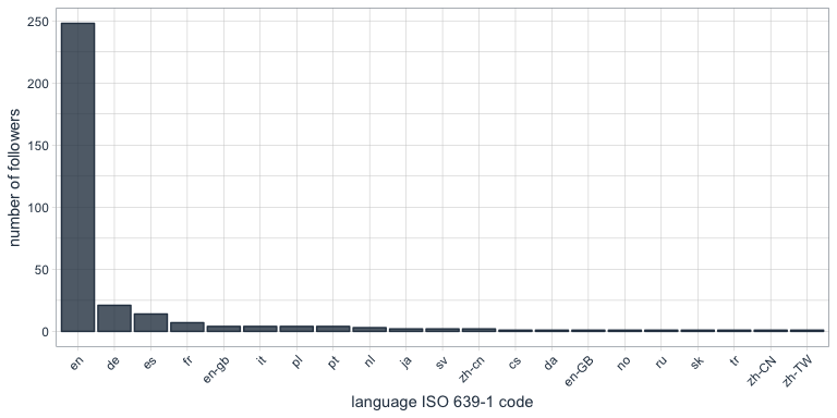
What languages do my followers speak?

One of the columns describing my followers is which language they have set for their Twitter account. Not surprisingly, English is by far the most predominant language of my followers, followed by German, Spanish and French.

followers_df %>%
  count(lang) %>%
  droplevels() %>%
  ggplot(aes(x = reorder(lang, desc(n)), y = n)) +
    geom_bar(stat = "identity", color = palette_light()[1], fill = palette_light()[1], alpha = 0.8) +
    theme_tq() +
    theme(axis.text.x = element_text(angle = 45, vjust = 1, hjust = 1)) +
    labs(x = "language ISO 639-1 code",
         y = "number of followers")

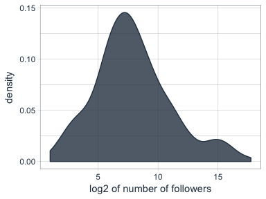
Who are my most “influential” followers (i.e. followers with the biggest network)?

I also have information about the number of followers that each of my followers have (2nd degree followers). Most of my followers are followed by up to ~ 1000 people, while only a few have a very large network.

followers_df %>%
  ggplot(aes(x = log2(followersCount))) +
    geom_density(color = palette_light()[1], fill = palette_light()[1], alpha = 0.8) +
    theme_tq() +
    labs(x = "log2 of number of followers",
         y = "density")

How active are my followers (i.e. how often do they tweet)

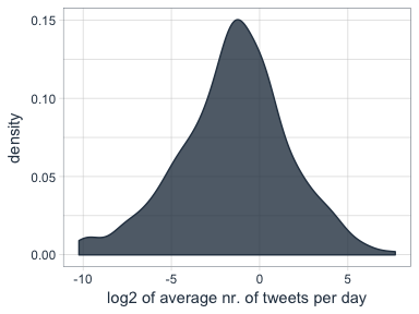
The followers data frame also tells me how many statuses (i.e. tweets) each of followers have. To make the numbers comparable, I am normalizing them by the number of days that they have had their accounts to calculate the average number of tweets per day.

followers_df %>%
  mutate(date = as.Date(created, format = "%Y-%m-%d"),
         today = as.Date("2017-06-07", format = "%Y-%m-%d"),
         days = as.numeric(today - date),
         statusesCount_pDay = statusesCount / days) %>%
  ggplot(aes(x = log2(statusesCount_pDay))) +
    geom_density(color = palette_light()[1], fill = palette_light()[1], alpha = 0.8) +
    theme_tq()

Who are my followers with the biggest network and who tweet the most?

followers_df %>%
  mutate(date = as.Date(created, format = "%Y-%m-%d"),
         today = as.Date("2017-06-07", format = "%Y-%m-%d"),
         days = as.numeric(today - date),
         statusesCount_pDay = statusesCount / days) %>%
  select(screenName, followersCount, statusesCount_pDay) %>%
  arrange(desc(followersCount)) %>%
  top_n(10)
##         screenName followersCount statusesCount_pDay
## 1        dr_morton         150937           71.35193
## 2    Scientists4EU          66117           17.64389
## 3       dr_morton_          63467           46.57763
## 4   NewScienceWrld          60092           54.65874
## 5     RubenRabines          42286           25.99592
## 6  machinelearnbot          27427          204.67061
## 7  BecomingDataSci          16807           25.24069
## 8       joelgombin           6566           21.24094
## 9    renato_umeton           1998           19.58387
## 10 FranPatogenLoco            311           28.92593
followers_df %>%
  mutate(date = as.Date(created, format = "%Y-%m-%d"),
         today = as.Date("2017-06-07", format = "%Y-%m-%d"),
         days = as.numeric(today - date),
         statusesCount_pDay = statusesCount / days) %>%
  select(screenName, followersCount, statusesCount_pDay) %>%
  arrange(desc(statusesCount_pDay)) %>%
  top_n(10)
##         screenName followersCount statusesCount_pDay
## 1  machinelearnbot          27427          204.67061
## 2        dr_morton         150937           71.35193
## 3   NewScienceWrld          60092           54.65874
## 4       dr_morton_          63467           46.57763
## 5  FranPatogenLoco            311           28.92593
## 6     RubenRabines          42286           25.99592
## 7  BecomingDataSci          16807           25.24069
## 8       joelgombin           6566           21.24094
## 9    renato_umeton           1998           19.58387
## 10   Scientists4EU          66117           17.64389

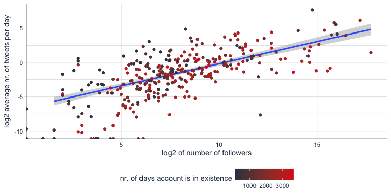
Is there a correlation between number of followers and number of tweets?

Indeed, there seems to be a correlation that users with many followers also tend to tweet more often.

followers_df %>%
  mutate(date = as.Date(created, format = "%Y-%m-%d"),
         today = as.Date("2017-06-07", format = "%Y-%m-%d"),
         days = as.numeric(today - date),
         statusesCount_pDay = statusesCount / days) %>%
  ggplot(aes(x = followersCount, y = statusesCount_pDay, color = days)) +
    geom_smooth(method = "lm") +
    geom_point() +
    scale_color_continuous(low = palette_light()[1], high = palette_light()[2]) +
    theme_tq()

Tidy text analysis

Next, I want to know more about my followers by analyzing their Twitter descriptions with the tidytext package.

library(tidytext)
library(SnowballC)

To prepare the data, I am going to unnest the words (or tokens) in the user descriptions, convert them to the word stem, remove stop words and urls.

data(stop_words)

tidy_descr <- followers_df %>%
  unnest_tokens(word, description) %>%
  mutate(word_stem = wordStem(word)) %>%
  anti_join(stop_words, by = "word") %>%
  filter(!grepl("\\.|http", word))

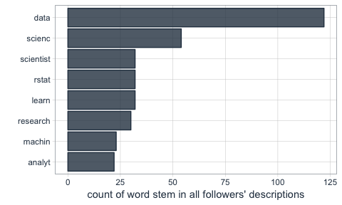
What are the most commonly used words in my followers’ descriptions?

The first question I want to ask is what words are most common in my followers’ descriptions.

Not surprisingly, the most common word is “data”. I do tweet mostly about data related topics, so it makes sense that my followers are mostly likeminded. The rest is also related to data science, machine learning and R.

tidy_descr %>%
  count(word_stem, sort = TRUE) %>%
  filter(n > 20) %>%
  ggplot(aes(x = reorder(word_stem, n), y = n)) +
    geom_col(color = palette_light()[1], fill = palette_light()[1], alpha = 0.8) +
    coord_flip() +
    theme_tq() +
    labs(x = "",
         y = "count of word stem in all followers' descriptions")

This, we can also show with a word cloud.

library(wordcloud)
library(tm)
tidy_descr %>%
  count(word_stem) %>%
  mutate(word_stem = removeNumbers(word_stem)) %>%
  with(wordcloud(word_stem, n, max.words = 100, colors = palette_light()))

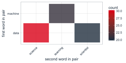
Instead of looking for the most common words, we can also look for the most common ngrams: here, for the most common word pairs (bigrams) in my followers’ descriptions.

tidy_descr_ngrams <- followers_df %>%
  unnest_tokens(bigram, description, token = "ngrams", n = 2) %>%
  filter(!grepl("\\.|http", bigram)) %>%
  separate(bigram, c("word1", "word2"), sep = " ") %>%
  filter(!word1 %in% stop_words$word) %>%
  filter(!word2 %in% stop_words$word)

bigram_counts <- tidy_descr_ngrams %>%
  count(word1, word2, sort = TRUE)
bigram_counts %>%
  filter(n > 10) %>%
  ggplot(aes(x = reorder(word1, -n), y = reorder(word2, -n), fill = n)) +
    geom_tile(alpha = 0.8, color = "white") +
    scale_fill_gradientn(colours = c(palette_light()[[1]], palette_light()[[2]])) +
    coord_flip() +
    theme_tq() +
    theme(legend.position = "right") +
    theme(axis.text.x = element_text(angle = 45, vjust = 1, hjust = 1)) +
    labs(x = "first word in pair",
         y = "second word in pair")

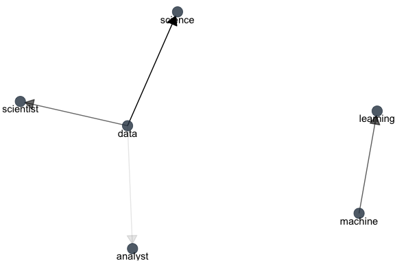
These, we can also show as a graph:

library(igraph)
library(ggraph)
bigram_graph <- bigram_counts %>%
  filter(n > 5) %>%
  graph_from_data_frame()

set.seed(1)

a <- grid::arrow(type = "closed", length = unit(.15, "inches"))
ggraph(bigram_graph, layout = "fr") +
  geom_edge_link(aes(edge_alpha = n), show.legend = FALSE,
                 arrow = a, end_cap = circle(.07, 'inches')) +
  geom_node_point(color =  palette_light()[1], size = 5, alpha = 0.8) +
  geom_node_text(aes(label = name), vjust = 1, hjust = 0.5) +
  theme_void()

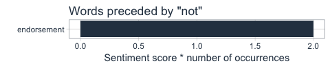
We can also use bigram analysis to identify negated meanings (this will become relevant for sentiment analysis later). So, let’s look at which words are preceded by “not” or “no”.

bigrams_separated <- followers_df %>%
  unnest_tokens(bigram, description, token = "ngrams", n = 2) %>%
  filter(!grepl("\\.|http", bigram)) %>%
  separate(bigram, c("word1", "word2"), sep = " ") %>%
  filter(word1 == "not" | word1 == "no") %>%
  filter(!word2 %in% stop_words$word)

not_words <- bigrams_separated %>%
  filter(word1 == "not") %>%
  inner_join(get_sentiments("afinn"), by = c(word2 = "word")) %>%
  count(word2, score, sort = TRUE) %>%
  ungroup()
not_words %>%
  mutate(contribution = n * score) %>%
  arrange(desc(abs(contribution))) %>%
  head(20) %>%
  mutate(word2 = reorder(word2, contribution)) %>%
  ggplot(aes(word2, n * score, fill = n * score > 0)) +
    geom_col(show.legend = FALSE) +
    scale_fill_manual(values = palette_light()) +
    labs(x = "",
         y = "Sentiment score * number of occurrences",
         title = "Words preceded by \"not\"") +
    coord_flip() +
    theme_tq()

What’s the predominant sentiment in my followers’ descriptions?

For sentiment analysis, I will exclude the words with a negated meaning from nrc and switch their positive and negative meanings from bing (although in this case, there was only one negated word, “endorsement”, so it won’t make a real difference).

tidy_descr_sentiment <- tidy_descr %>%
  left_join(select(bigrams_separated, word1, word2), by = c("word" = "word2")) %>%
  inner_join(get_sentiments("nrc"), by = "word") %>%
  inner_join(get_sentiments("bing"), by = "word") %>%
  rename(nrc = sentiment.x, bing = sentiment.y) %>%
  mutate(nrc = ifelse(!is.na(word1), NA, nrc),
         bing = ifelse(!is.na(word1) & bing == "positive", "negative", 
                       ifelse(!is.na(word1) & bing == "negative", "positive", bing)))
tidy_descr_sentiment %>%
  filter(nrc != "positive") %>%
  filter(nrc != "negative") %>%
  gather(x, y, nrc, bing) %>%
  count(x, y, sort = TRUE) %>%
  filter(n > 10) %>%
  ggplot(aes(x = reorder(y, n), y = n)) +
    facet_wrap(~ x, scales = "free") +
    geom_col(color = palette_light()[1], fill = palette_light()[1], alpha = 0.8) +
    coord_flip() +
    theme_tq() +
    labs(x = "",
         y = "count of sentiment in followers' descriptions")

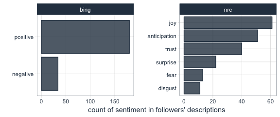
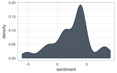
Are followers’ descriptions mostly positive or negative?

The majority of my followers have predominantly positive descriptions.

tidy_descr_sentiment %>%
  count(screenName, word, bing) %>%
  group_by(screenName, bing) %>%
  summarise(sum = sum(n)) %>%
  spread(bing, sum, fill = 0) %>%
  mutate(sentiment = positive - negative) %>%
  ggplot(aes(x = sentiment)) +
    geom_density(color = palette_light()[1], fill = palette_light()[1], alpha = 0.8) +
    theme_tq()

What are the most common positive and negative words in followers’ descriptions?

library(reshape2)
tidy_descr_sentiment %>%
  count(word, bing, sort = TRUE) %>%
  acast(word ~ bing, value.var = "n", fill = 0) %>%
  comparison.cloud(colors = palette_light()[1:2],
                   max.words = 100)

Topic modeling: are there groups of followers with specific interests?

Topic modeling can be used to categorize words into groups. Here, we can use it to see whether (some) of my followers can be grouped into subgroups according to their descriptions.

library(topicmodels)
dtm_words_count <- tidy_descr %>%
  mutate(word_stem = removeNumbers(word_stem)) %>%
  count(screenName, word_stem, sort = TRUE) %>%
  ungroup() %>%
  filter(word_stem != "") %>%
  cast_dtm(screenName, word_stem, n)

# set a seed so that the output of the model is predictable
dtm_lda <- LDA(dtm_words_count, k = 5, control = list(seed = 1234))

topics_beta <- tidy(dtm_lda, matrix = "beta")
p1 <- topics_beta %>%
  filter(grepl("[a-z]+", term)) %>% # some words are Chinese, etc. I don't want these because ggplot doesn't plot them correctly
  group_by(topic) %>%
  top_n(10, beta) %>%
  ungroup() %>%
  arrange(topic, -beta) %>%
  mutate(term = reorder(term, beta)) %>%
  ggplot(aes(term, beta, color = factor(topic), fill = factor(topic))) +
    geom_col(show.legend = FALSE, alpha = 0.8) +
    scale_color_manual(values = palette_light()) +
    scale_fill_manual(values = palette_light()) +
    facet_wrap(~ topic, ncol = 5) +
    coord_flip() +
    theme_tq() +
    labs(x = "",
         y = "beta (~ occurrence in topics 1-5)",
         title = "The top 10 most characteristic words describe topic categories.")
user_topic <- tidy(dtm_lda, matrix = "gamma") %>%
  arrange(desc(gamma)) %>%
  group_by(document) %>%
  top_n(1, gamma)
p2 <- user_topic %>%
  group_by(topic) %>%
  top_n(10, gamma) %>%
  ggplot(aes(x = reorder(document, -gamma), y = gamma, color = factor(topic))) +
    facet_wrap(~ topic, scales = "free", ncol = 5) +
    geom_point(show.legend = FALSE, size = 4, alpha = 0.8) +
    scale_color_manual(values = palette_light()) +
    scale_fill_manual(values = palette_light()) +
    theme_tq() +
    coord_flip() +
    labs(x = "",
         y = "gamma\n(~ affiliation with topics 1-5)")
library(grid)
library(gridExtra)
grid.arrange(p1, p2, ncol = 1, heights = c(0.7, 0.3))

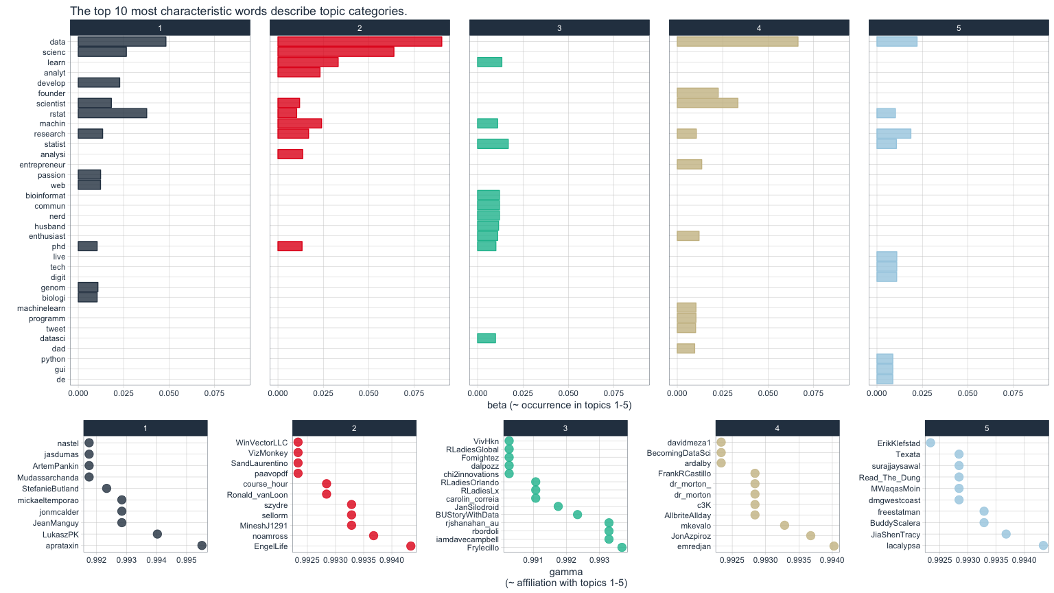
The upper of the two plots above show the words that were most strongly grouped to five topics. The lower plots show my followers with the strongest affiliation with these five topics.

Because in my tweets I only cover a relatively narrow range of topics (i.e. related to data), my followers are not very diverse in terms of their descriptions and the five topics are not very distinct.

If you find yourself in any of the topics, let me know if you agree with the topic that was modeled for you!

For more text analysis, see my post about text mining and sentiment analysis of a Stuff You Should Know Podcast.