Tag: bayesian

Bayesian data analysis for newcomers

Bayesian data analysis for newcomers

Professor John Kruschke and Torrin Liddell – one of his Ph.D. students at Indiana University – wrote a fantastically useful scientific paper introducing Bayesian data analysis to the masses. Kruschke and Liddell explain the main ideas behind Bayesian statistics, how Bayesians deal with continuous and binary variables, how to use and set meaningful priors, the differences between confidence and credibility intervals, how to perform model comparison tests, and many more. The paper is published open access so you can read it here.

I found it incredibly useful, providing me with a better understanding of how Bayesian analysis works, what kind of questions you can answer with it, and what the resulting insights would comprise of. After reading it, I was honestly asking myself why I don’t use Bayesian methods more often… So what’s next, how to learn more?


Advanced GIFs in R

Advanced GIFs in R

Rafa Irizarry is a biostatistics professor and one of the three people behind SimplyStatistics.org (the others are Jeff LeekRoger Peng). They post ideas that they find interesting and their blog contributes greatly to discussion of science/popular writing.

Rafa is the creator of many data visualization GIFs that have recently trended on the web, and in a recent post he provides all the source code behind the beautiful imagery. I sincerely recommend you check out the orginal blog if you want to find out more, but here are the GIFS:

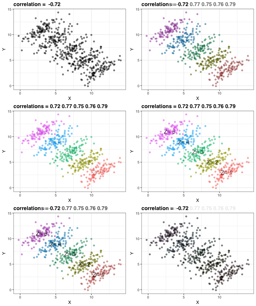
Simpson’s paradox is a statistical phenomenon where an observed relationship within a population reverses within all subgroups that make up that population. Rafa visualized it wonderfully in a GIF that took only twenty-some lines of R code:

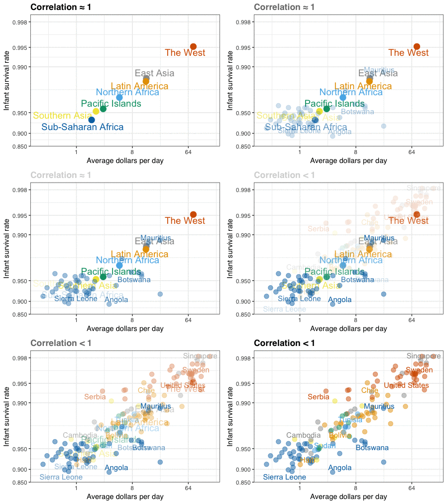
A different statistical phenomenon is discussed at the end of the original blog: namely  the ecological fallacy. It occurs when correlations that occur on the group-level are erroneously extrapolated to the individual-level. Rafa used the gapminder data included in the dslabs package to illustrate the fallacy: there is a very high correlation at the region level and a lower correlation at the individual country level:

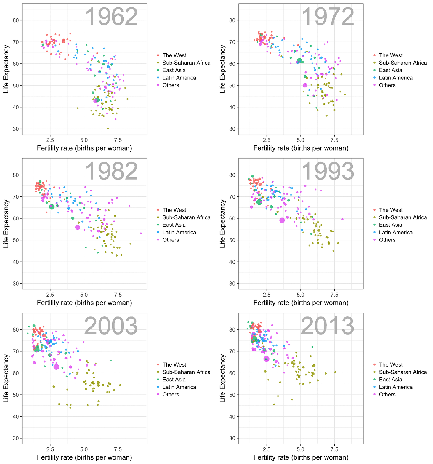
The gapminder data is also used in the next GIF. This mimics Hans Rosling’s famous animation during his talk on New Insights on Poverty, but then made with R and gganimate by Rafa:

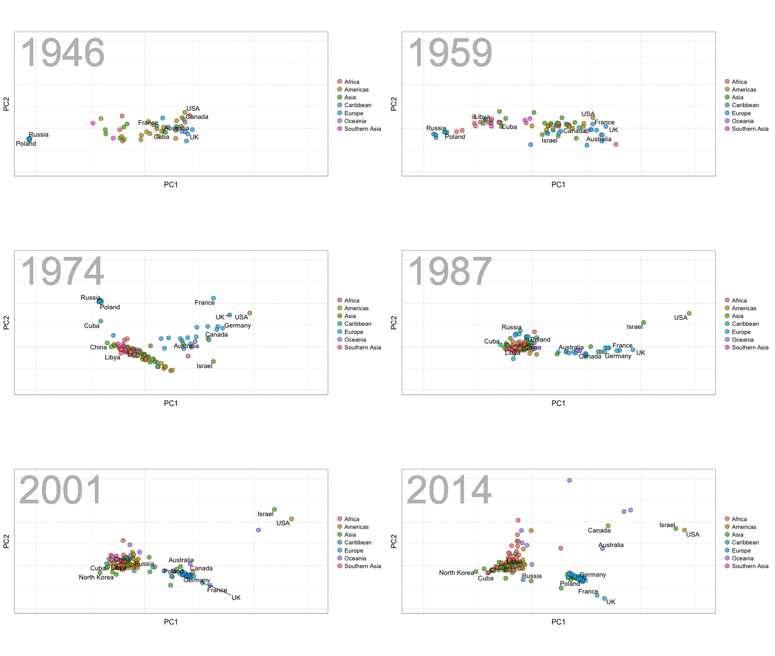
A next visualization demonstrates how the UN voting data (of Erik Voeten and Anton Strezhnev) can be used to examine different voting behaviors. It seems to reduce the voting data to a two-dimensional factor structure, and seemingly there are three distinct groups of voters these days, with particularly the USA and Israel far removed from other members:

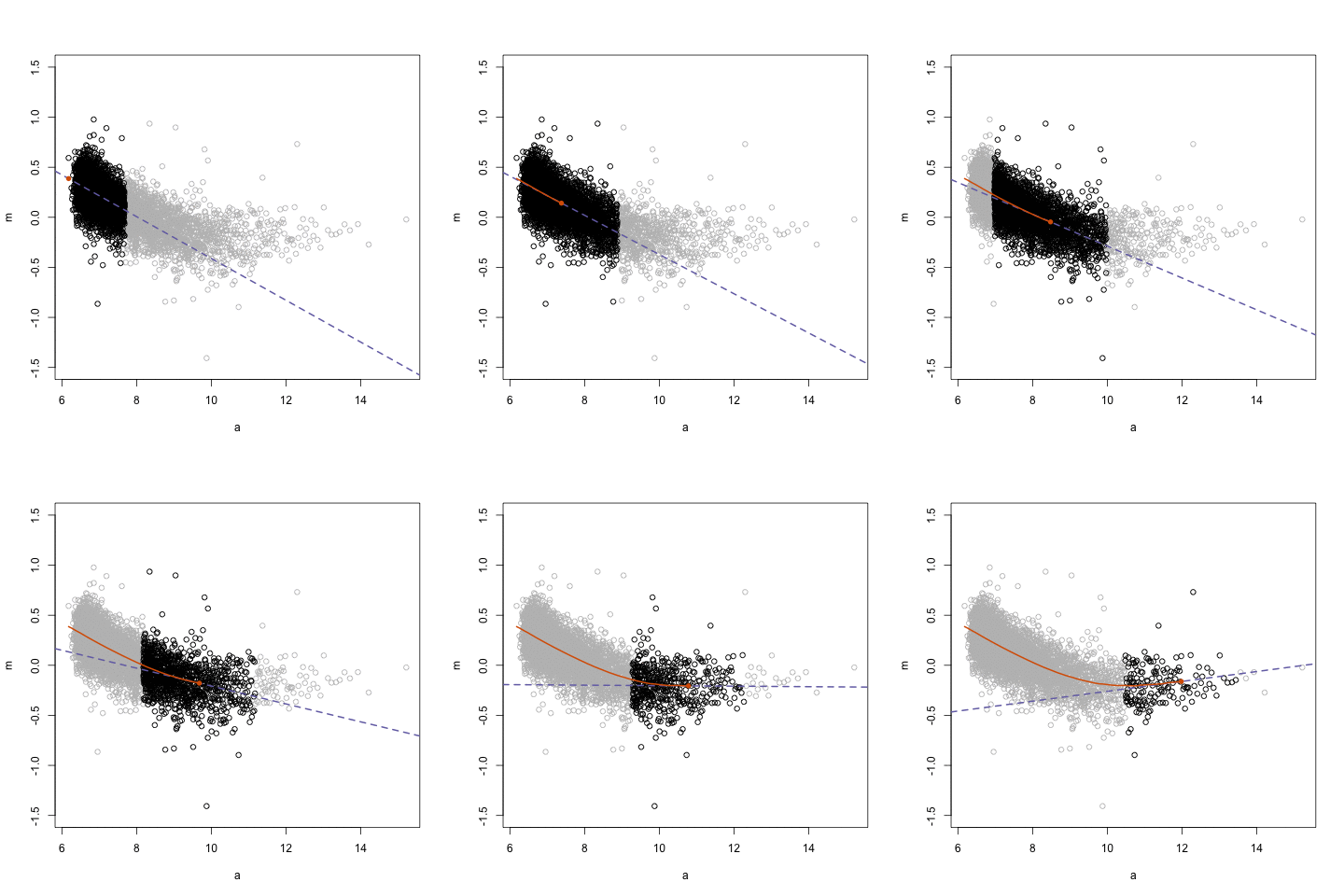
The next GIFs are more statistical. The one below demonstrates how the local regression (LOESS) works. Simply speaking, LOESS determines the relationship for a local subset of the population and when you iteratively repeat this for all local subsets in a population you get a nicely fitting LOESS curve, the red line in Rafa’s GIF:

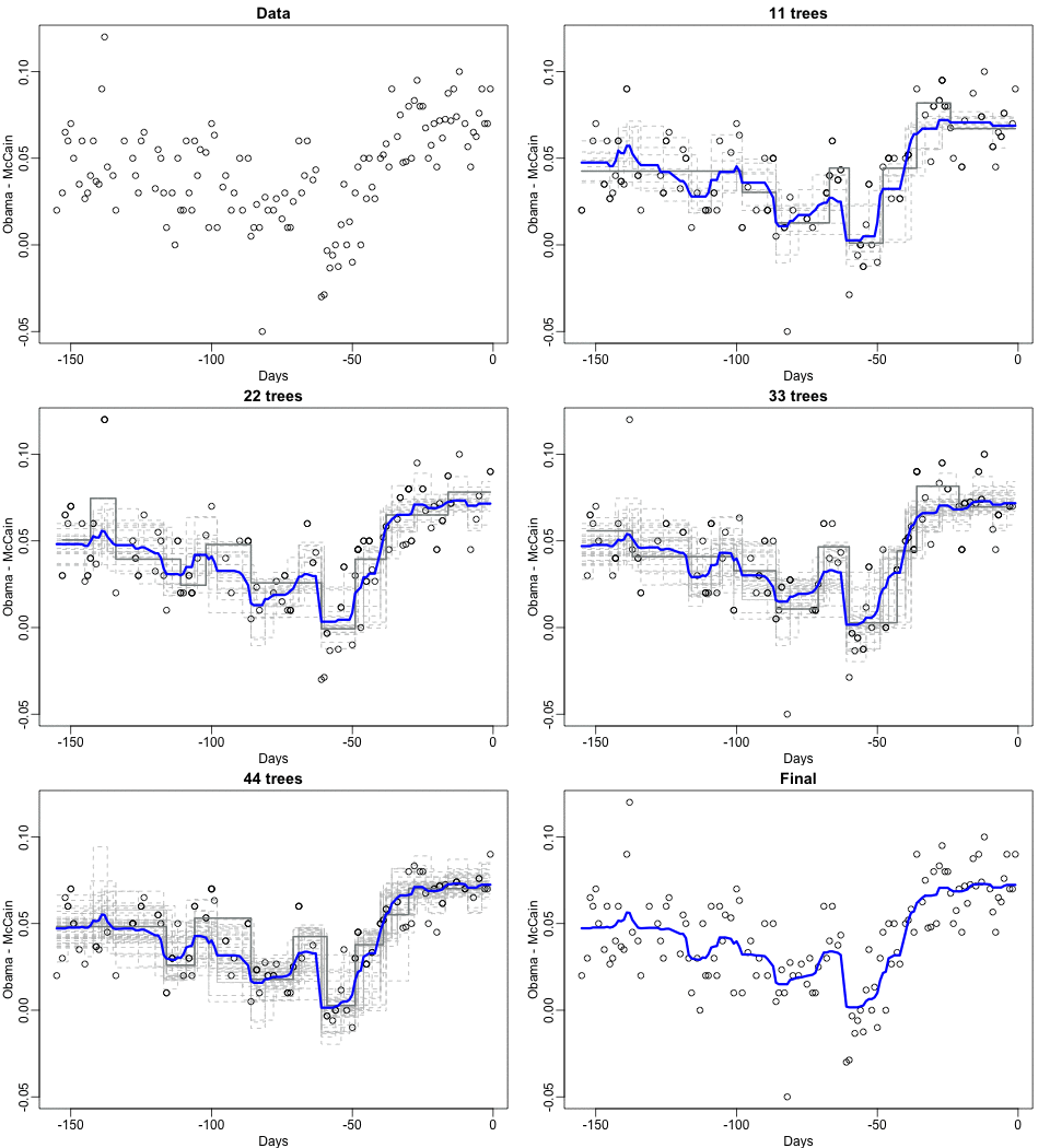
Not quite sure how to interpret the next one, but Rafa explains it visualized a random forest’s predictions using only one predictor variable. I think that different trees would then provide different predictions because they leverage different training samples, and an ensemble of those trees would then improve predictive accuracy?

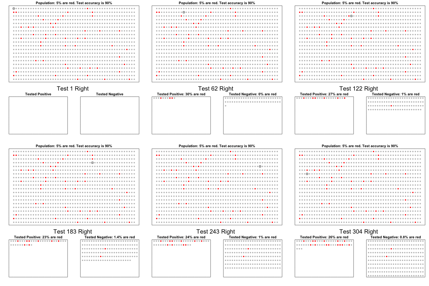
The next one is my favorite I think. This animation illustrates how a highly accurate test would function in a population with low prevalence of true values (e.g., disease, applicant success). More details are in the original blog or here.

The blog ends with a rather funny animation of the only good use of pie charts, according to Rafa:

Data Science, Machine Learning, & Statistics resources (free courses, books, tutorials, & cheat sheets)

Data Science, Machine Learning, & Statistics resources (free courses, books, tutorials, & cheat sheets)

Welcome to my repository of data science, machine learning, and statistics resources. Software-specific material has to a large extent been listed under their respective overviews: R Resources & Python Resources. I also host a list of SQL Resources and datasets to practice programming. If you have any additions, please comment or contact me!

LAST UPDATED: 21-05-2018

Courses:

Video:

Books:

Sentiment Lexicons:

Cheatsheets:

Other:

R resources (free courses, books, tutorials, & cheat sheets)

R resources (free courses, books, tutorials, & cheat sheets)

Help yourself to these free books, tutorials, packages, cheat sheets, and many more materials for R programming. There’s a separate overview for handy R programming tricks. If you have additions, please comment below or contact me!


Join 385 other subscribers

LAST UPDATED: 2021-09-24


Table of Contents (clickable)

Completely new to R? → Start learning here!


Introductory R

Introductory Books

Online Courses

Style Guides

BACK TO TABLE OF CONTENTS


Advanced R

Package Development

Non-standard Evaluation

Functional Programming

BACK TO TABLE OF CONTENTS

Cheat Sheets

Many of the above cheat sheets are hosted in the official RStudio cheat sheet overview.


Data Manipulation


Data Visualization

Colors

Interactive / HTML / JavaScript widgets

ggplot2

ggplot2 extensions

Miscellaneous

  • coefplot – visualizes model statistics
  • circlize – circular visualizations for categorical data
  • clustree – visualize clustering analysis
  • quantmod – candlestick financial charts
  • dabestr– Data Analysis using Bootstrap-Coupled ESTimation
  • devoutsvg – an SVG graphics device (with pattern fills)
  • devoutpdf – an PDF graphics device
  • cartography – create and integrate maps in your R workflow
  • colorspace – HSL based color palettes
  • viridis – Matplotlib viridis color pallete for R
  • munsell – Munsell color palettes for R
  • Cairo – high-quality display output
  • igraph – Network Analysis and Visualization
  • graphlayouts – new layout algorithms for network visualization
  • lattice – Trellis graphics
  • tmap – thematic maps
  • trelliscopejs – interactive alternative for facet_wrap
  • rgl – interactive 3D plots
  • corrplot – graphical display of a correlation matrix
  • googleVis – Google Charts API
  • plotROC – interactive ROC plots
  • extrafont – fonts in R graphics
  • rvg – produces Vector Graphics that allow further editing in PowerPoint or Excel
  • showtext – text using system fonts
  • animation – animated graphics using ImageMagick.
  • misc3d – 3d plots, isosurfaces, etc.
  • xkcd – xkcd style graphics
  • imager – CImg library to work with images
  • ungeviz – tools for visualize uncertainty
  • waffle – square pie charts a.k.a. waffle charts
  • Creating spectograms in R with hht, warbleR, soundgen, signal, seewave, or phonTools

BACK TO TABLE OF CONTENTS


Shiny, Dashboards, & Apps


Markdown & Other Output Formats

  • tidystats – automating updating of model statistics
  • papaja – preparing APA journal articles
  • blogdown – build websites with Markdown & Hugo
  • huxtable – create Excel, html, & LaTeX tables
  • xaringan – make slideshows via remark.js and markdown
  • summarytools – produces neat, quick data summary tables
  • citr – RStudio Addin to Insert Markdown Citations

Cloud, Server, & Database

BACK TO TABLE OF CONTENTS


Statistical Modeling & Machine Learning

Books

Courses

Cheat sheets

Time series

Survival analysis

Bayesian

Miscellaneous

  • corrr – easier correlation matrix management and exploration

BACK TO TABLE OF CONTENTS


Natural Language Processing & Text Mining

Regular Expressions

BACK TO TABLE OF CONTENTS


Geographic & Spatial mapping


Bioinformatics & Computational Biology

BACK TO TABLE OF CONTENTS


Integrated Development Environments (IDEs) &
Graphical User Inferfaces (GUIs)

Descriptions mostly taken from their own websites:

  • RStudio*** – Open source and enterprise ready professional software
  • Jupyter Notebook*** – open-source web application that allows you to create and share documents that contain live code, equations, visualizations and narrative text across dozens of programming languages.
  • Microsoft R tools for Visual Studio – turn Visual Studio into a powerful R IDE
  • R Plugins for Vim, Emax, and Atom editors
  • Rattle*** – GUI for data mining
  • equisse – RStudio add-in to interactively explore and visualize data
  • R Analytic Flow – data flow diagram-based IDE
  • RKWard – easy to use and easily extensible IDE and GUI
  • Eclipse StatET – Eclipse-based IDE
  • OpenAnalytics Architect – Eclipse-based IDE
  • TinnR – open source GUI and IDE
  • DisplayR – cloud-based GUI
  • BlueSkyStatistics – GUI designed to look like SPSS and SAS 
  • ducer – GUI for everyone
  • R commander (Rcmdr) – easy and intuitive GUI
  • JGR – Java-based GUI for R
  • jamovi & jmv – free and open statistical software to bridge the gap between researcher and statistician
  • Exploratory.io – cloud-based data science focused GUI
  • Stagraph – GUI for ggplot2 that allows you to visualize and connect to databases and/or basic file types
  • ggraptr – GUI for visualization (Rapid And Pretty Things in R)
  • ML Studio – interactive Shiny platform for data visualization, statistical modeling and machine learning

R & other software and languages

R & Excel

R & Python

R & SQL

  • sqldf – running SQL statements on R data frames

BACK TO TABLE OF CONTENTS


Join 385 other subscribers

R Help, Connect, & Inspiration


R Blogs


R Conferences, Events, & Meetups

R Jobs

BACK TO TABLE OF CONTENTS