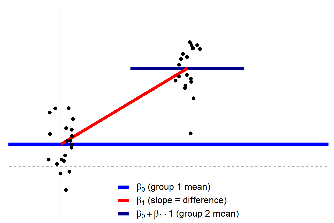
Jonas’ original blog uses R programming to visually show how the tests work, what the linear models look like, and how different approaches result in the same statistics.
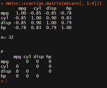
In most (observational) research papers you read, you will probably run into a correlation matrix. Often it looks something like this:
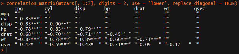
In Social Sciences, like Psychology, researchers like to denote the statistical significance levels of the correlation coefficients, often using asterisks (i.e., *). Then the table will look more like this:
Regardless of my personal preferences and opinions, I had to make many of these tables for the scientific (non-)publications of my Ph.D..
I remember that, when I first started using R, I found it quite difficult to generate these correlation matrices automatically.
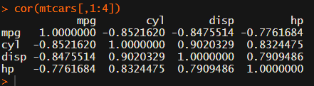
Yes, there is the cor function, but it does not include significance levels.
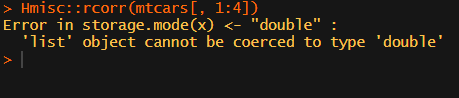
Then there the (in)famous Hmisc package, with its rcorr function. But this tool provides a whole new range of issues.
What’s this storage.mode, and what are we trying to coerce again?
Soon you figure out that Hmisc::rcorr only takes in matrices (thus with only numeric values). Hurray, now you can run a correlation analysis on your dataframe, you think…
Yet, the output is all but publication-ready!
You wanted one correlation matrix, but now you have two… Double the trouble?
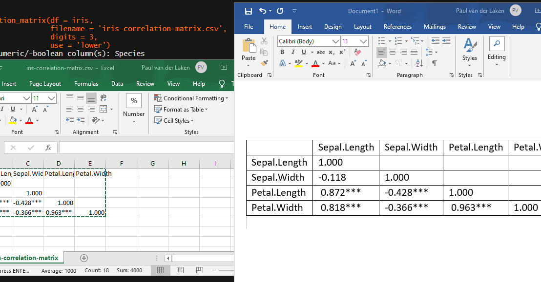
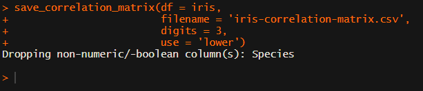
[UPDATED] To spare future scholars the struggle of the early day R programming, Laura Lambert and I created an R package corrtable, which includes the helpful function correlation_matrix.
This correlation_matrix takes in a dataframe, selects only the numeric (and boolean/logical) columns, calculates the correlation coefficients and p-values, and outputs a fully formatted publication-ready correlation matrix!
For instance, you can use only 2 decimals. You can focus on the lower triangle (as the lower and upper triangle values are identical). And you can drop the diagonal values:
Or maybe you are interested in a different type of correlation coefficients, and not so much in significance levels:
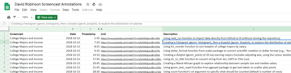
David Robinson (aka drob) is one of the best known R programmers.
Since a couple of years David has been sharing his knowledge through streaming screencasts of him programming. It’s basically part of R’s #tidytuesday movement.
Alex Cookson decided to do us all a favor and annotate all these screencasts into a nice overview.
Here you can search for video material of David using a specific function or method. There are already over a thousand linked fragments!
Very useful if you want to learn how to visualize data using ggplot2 or plotly, how to work with factors in forcats, or how to tidy data using tidyr and dplyr.
For instance, you could search for specific R functions and packages you want to learn about:
Thanks David for sharing your knowledge, and thanks Alex for maintaining this overview!
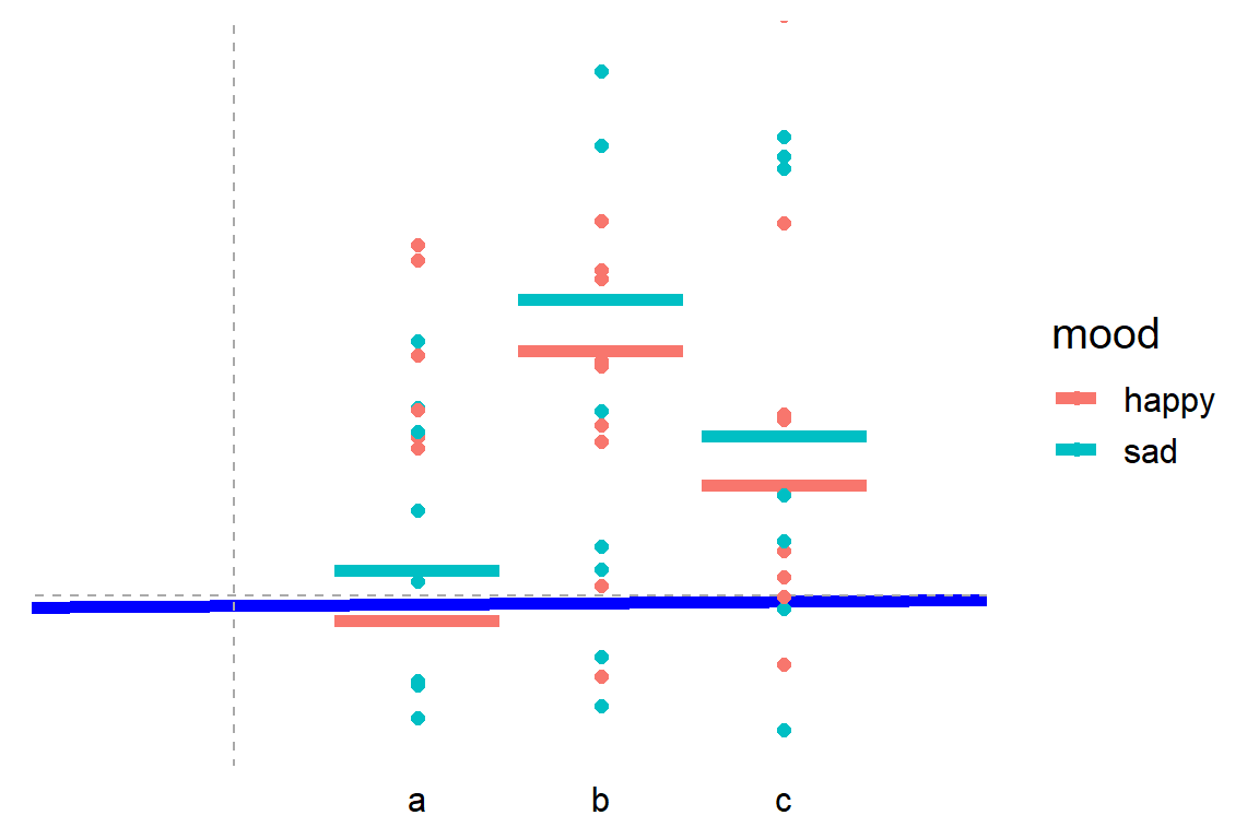
Cohen’s d (wiki) is a statistic used to indicate the standardised difference between two means. Resarchers often use it to compare the averages between groups, for instance to determine that there are higher outcomes values in a experimental group than in a control group.
Researchers often use general guidelines to determine the size of an effect. Looking at Cohen’s d, psychologists often consider effects to be small when Cohen’s d is between 0.2 or 0.3, medium effects (whatever that may mean) are assumed for values around 0.5, and values of Cohen’s d larger than 0.8 would depict large effects (e.g., University of Bath).
The two groups’ distributions belonging to small, medium, and large effects visualized
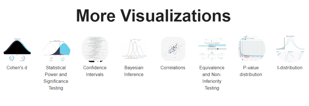
By the way, Kristoffer hosts many other interesting visualization tools (most made with JavaScript’s D3 library) on statistics and statistical phenomena on his website, have a look!
Version control is an essential tool for any software developer. Hence, any respectable data scientist has to make sure his/her analysis programs and machine learning pipelines are reproducible and maintainable through version control.
Often, we use git for version control. If you don’t know what git is yet, I advise you begin here. If you work in R, start here and here. If you work in Python, start here.
This blog is intended for those already familiar working with git, but who want to learn how to write better, more informative git commit messages. Actually, this blog is just a summary fragment of this original blog by Chris Beams, which I thought deserved a wider audience.
Summarize changes in around 50 characters or less

More detailed explanatory text, if necessary. Wrap it to about 72
characters or so. In some contexts, the first line is treated as the
subject of the commit and the rest of the text as the body. The
blank line separating the summary from the body is critical (unless
you omit the body entirely); various tools like `log`, `shortlog`
and `rebase` can get confused if you run the two together.

Explain the problem that this commit is solving. Focus on why you
are making this change as opposed to how (the code explains that).
Are there side effects or other unintuitive consequences of this
change? Here's the place to explain them.

Further paragraphs come after blank lines.

 - Bullet points are okay, too

 - Typically a hyphen or asterisk is used for the bullet, preceded
   by a single space, with blank lines in between, but conventions
   vary here

If you use an issue tracker, put references to them at the bottom,
like this:

Resolves: #123
See also: #456, #789
If you’re having a hard time summarizing your commits in a single line or message, you might be committing too many changes at once. Instead, you should try to aim for what’s called atomic commits.