Kelly Bodwin is an Assistant Professor of Statistics at Cal Poly (San Luis Obispo) and teaches multiple courses in statistical programming. Based on her experiences, she compiled this great shortlist of five great tips to teach programming.
Kelly truly mentions some best practices, so have a look at the original article, which she summarized as follows:
1. Define your terms
Establish basic coding vocabulary early on.
What is the console, a script, the environment?
What is a function a variable, a dataframe?
What are strings, characters, and integers?
2. Be deliberate about teaching versus bypassing peripheral skills
Use tools like RStudio Cloud, R Markdown, and the usethis package to shelter students from setup.
Personally, this is what kept me from learning Python for a long time — the issues with starting up.
Kelly provides this personal checklist of peripherals skills including which ones she includes in her introductory courses:
The best way to debug is to read your process out loud as a sentence.
Basically Kelly argues that you should learn students to be able to translate their requirements into (R) code.
When you continuously read out your code as step-by-step computer instructions, students will learn to translate their own desires to computer instructions.
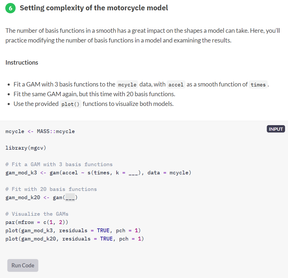
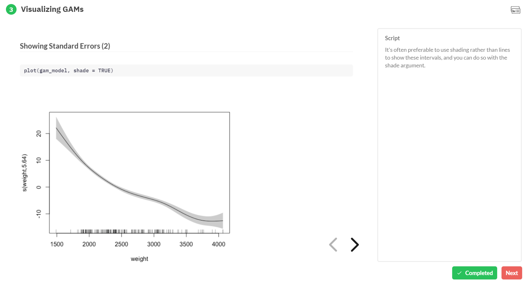
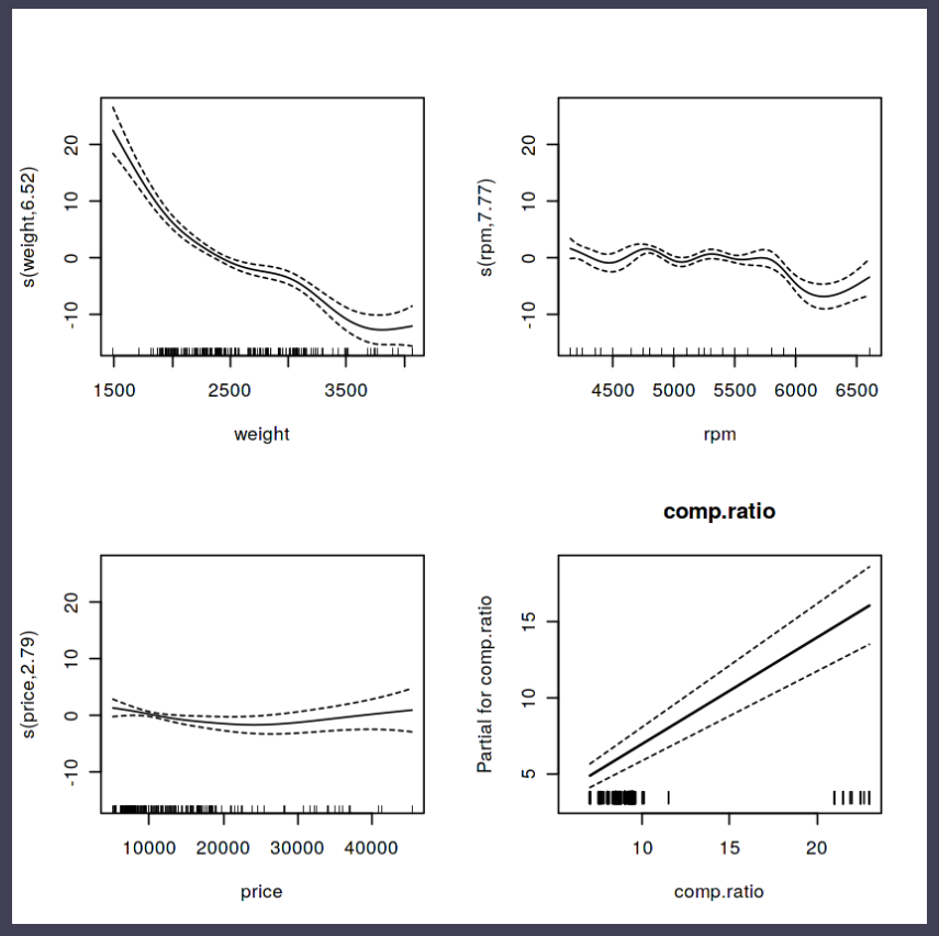
Generalized Additive Models — or GAMs in short — have been somewhat of a mystery to me. I’ve known about them, but didn’t know exactly what they did, or when they’re useful. That came to an end when I found out about this tutorial by Noam Ross.
In this beautiful, online, interactive course, Noam allows you to program several GAMs yourself (in R) and to progressively learn about the different functions and features. I am currently halfway through, but already very much enjoy it.
If you’re already familiar with linear models and want to learn something new, I strongly recommend this course!
Recently, I came across a social science paper that had used linear probability regression. I had never heard of linear probability models (LPM), but it seems just an application of ordinary least squares regression but to a binomial dependent variable.
According to some, LPM is a commonly used alternative for logistic regression, which is what I was learned to use when the outcome is binary.
Potentially because of my own social science background (HRM), using linear regression without a link transformation on binary data just seems very unintuitive and error-prone to me. Hence, I sought for more information.
I particularly liked this article by Jake Westfall, which he dubbed “Logistic regression is not fucked”, following a series of blogs in which he talks about methods that are fucked and not useful.
Jake explains the classification problem and both methods inner workings in a very straightforward way, using great visual aids. He shows how LMP would differ from logistic models, and why its proposed benefits are actually not so beneficial. Maybe I’m in my bubble, but Jake’s arguments resonated.
Here’s the summary: Arguments against the use of logistic regression due to problems with “unobserved heterogeneity” proceed from two distinct sets of premises. The first argument points out that if the binary outcome arises from a latent continuous outcome and a threshold, then observed effects also reflect latent heteroskedasticity. This is true, but only relevant in cases where we actually care about an underlying continuous variable, which is not usually the case. The second argument points out that logistic regression coefficients are not collapsible over uncorrelated covariates, and claims that this precludes any substantive interpretation. On the contrary, we can interpret logistic regression coefficients perfectly well in the face of non-collapsibility by thinking clearly about the conditional probabilities they refer to.
In a hilarious experiment the anonymous mathematician behind the website Possibly Wrong estimated that s/he only needed to open “about 400-500” packs of Skittles to find an identifical pack.
From January 12th up to April 6th, s/he put it to the test and counted the contents of an astonishing 468 packs, containing over 27.000 individual Skittles! Read all about the experiment here.
Some time back the animations below went sort of viral in the statistical programming community. In them, economics professor Nick Huntington-Klein demonstrates step-by-step how statistical tests estimate effect sizes.
I've been getting used to gganimate and thought it would be useful to put together some illustrations of what various causal inference methods *actually do to data* and how they work. Here, for example, is what it means to control for a (binary) variable pic.twitter.com/lmEvJSPQgY
Yesterday was the second anniversary of my website. I also reflected on this moment last year, and I thought to continue the tradition in 2019.
Let me start with a great, big THANK YOU to all my readers for continuing to visit my website!
You are the reason I continue to write down what I read. And maybe even the reason I continued reading and learning last year, despite all other distractions [my “real” job and my PhD : )].
Also a big thank you to all my followers on Twitter and LinkedIn, and those who have taken the time to comment or like my blogs. All of you make that I gain energy from writing this blog!
With that said, let’s start the review of the past year on my blog.
Most popular blog posts of 2018
Most importantly, let’s examine what you guys liked. Which blogs attracted the most visitors? What did you guys read?
Unfortunately, WordPress does not allow you to scrape their statistics pages. However, I was able to download monthly data manually, which I could then visualize to show you some trends.
The visual below shows the cumulative amount of visitors attracted by each blog I’ve written in 2018. Here follow links to the top 8 blogs in terms of visitor numbers this year:
rstudio::conf 2018 summary received 1514 views. It provides links to the most salient talks and presentations of the yearly R gathering.
R tips & tricks is relatively new and has only yet received 1212 views. Seperate from the R resources guide, this new list contains all the quick tricks that help you program more effectively in R.
Super Resolution: A Photo Enhancer AI received 891 views and elaborates on the development of new tools that can upgrade photo and video data quality.
Where there’s success, there’s failure. Some of my posts did not get a lot of attention by my readership. That’s unfortunate, as I really only take the time to blog about the stuff that I deem interesting enough. Were these failed blog posts just unlucky, or am I biased and were they simply really bad and uninteresting?
You be the judge! Here are some of the least read posts of 2018:
Now, let’s move to some general statistics: in 2018, paulvanderlaken.com received 85.614 views, by 57.594 unique visitors. I posted 61 new blogs, consisting of a total of 31.598 words. Fifty-one visitors liked one of my posts, and 24 visitors took the time to post a comment of their own (my replies included, probably).
Compared to last year, my website did pretty well!
2017
2018
Δ
Views
38490
85614
122%
Unique visitors
26949
57594
114%
Posts
100
61
-39%
Words / post
625
518
-17%
Likes
35
51
46%
Comments
99
24
-76%
However, the above statistics do not properly reflect the development of my website. For instance, I only really started generating traffic after my first viral post (i.e., Harry Plotter). The below graph takes that into account and better reflects the development of the traffic to my website.
The upward trend in traffic looks promising!
All time favorites
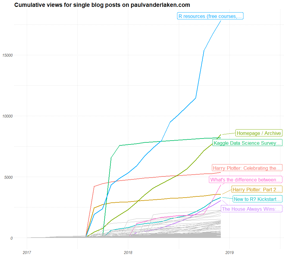
Looking back to the start of paulvanderlaken.com, let’s also examine which blogs have been performing well ever since their conception.
Clearly, most people have been coming for the R resources overview, as demonstrated by the visual below. Moreover, the majority of blog posts has not been visited much — only a handful ever cross the 1000 views mark.
Finally , let’s have a closer look as to what brought people to my website.The below visualizes the main domains that redirected visitors.
Search engines provided the majority of traffic in both 2017 and 2018 – mainly Google; to a lesser extent, DuckDuckGo and Bing (who in his right mind uses Norton Safe Search?!). My Twitter visitors increased in 2018 as compared to 2017, as did my traffic from this specific Quora page.
And that concludes my two year anniversary of paulvanderlaken.com review. I hope you enjoyed it, and that you will return to my website for the many more years to come : )
I end with a big shout out to my most loyal readers! 104 people have subscribed to my website (as of 2019-01-22) and receive an update wherener I post a new blog.
Thank you for your continued support!
Want to join this group of elite followers? Press the Follow button in the right toolbar, or at the bottom of this blog post.


