Wat gebeurt er in Nederland op het gebied van HR Analytics? Dit nieuwe boek laat zien wat enkele Nederlandse organisaties de afgelopen jaren daadwerkelijk hebben ondernomen. De verschillende auteurs, waaronder ik mij mag scharen, geven een kijkje in de praktijkwereld van het onderbouwen van HR-beslissingen aan de hand van diverse databronnen en analysetechnieken. Ze verklaren daarmee HR Analytics niet heilig, maar wie als HR- professional waarde wil toevoegen aan de business, kan er veel aan hebben. Het credo is dan: weet wat je moet doen, wees alert op de valkuilen en beschouw HR Analytics als een zevende zintuig naast je andere zintuigen. Met dit extra zintuig kun je als HR- professional scherper waarnemen wat het echte HR-probleem is, en wat mogelijk de oplossing is.
Het boek ‘HR Analytics’ is voor de moderne HR-professional die nieuwsgierig is naar wat analytics kan bij dragen aan zijn of haar professionaliteit. De voorbeelden en verhalen uit de praktijk leveren verschillende leerpunten en inzichten die helpen bij een meer analytische benadering van de diverse HR beleidsthema’s rondom recruitment, loopbanen, arbeidsvoorwaarden, training en opleiding of engagement. Het is een duwtje in de rug op weg naar HR Analytics als een toevoeging aan het HR-vak. Niet als vervanging.
Wiemer Renkema, recensist op managementboeken.nl, heeft het boek inmiddels gelezen en vat de inhoud mooi samen:
In de tien hoofdstukken van het boek komen de belangrijkste HR analytics voorbij, zoals die voor recruitment, carrièreontwikkeling, medewerkerstevredenheid en beloning. De lezer kan zelf de relevantie van ieder onderwerp bepalen en gericht de informatie zoeken die voor hem van belang is. Bij ieder onderwerp gaan de schrijvers in op alle kernvragen, wat het boek een overzichtelijke en makkelijk leesbare structuur geeft.
[…]
Je hebt geen lange adem nodig om HR analytics. Een 7e zintuig voor de moderne HR-professional te lezen. Wat een praktisch, compleet en goed geschreven boek is dit!
One year ago, I registered the domain paulvanderlaken.com with three reasons in mind: (1) I wanted an online environment to store and showcase my pet projects, (2) to share and promote some of the great blogs and research others had been writing, and (3) to show others what I was doing on my path to “data science“. The year has been just amazing. I could not have imagined the amount of positive sentiment I received from friends, family, acquaintances, and old classmates. But, most of all, the nice reactions from complete strangers across the globe! Thank you all so much for the positive response.
To my surprise, some of my stuff actually got read!
In August, I shared my Harry Plotter project and the first blog was read by 5,000 people. The second by another 3,000.
In one year, I wrote 103 blogs which got over 42,000 views by nearly 30,000 visitors. 97.5% of these views occurred in the last six months. Most referrals came via Google (45%), reddit (18%), LinkedIn (8%), Facebook (8%), and Twitter (4%), and my blogs were shared a total of 241 times. Now, 51 people follow my blog, which is best viewed on Tuesdays (31%) and around 15:00h CET (6%).
My views between January 2017 and 2018, made with ggplot2 in R.
Although my personal learning is still the main reason I maintain this blog, I am very glad people seem to enjoy tagging along. Hopefully, I can continue to discover and write about data (analysis) during the coming 12 months. For now, I’d want to thank my readers for their continued interest and, in particular, my girlfriend for coping with the numerous evenings and weekend I have wasted on my pet projects. Nonetheless, it was definitely worth the effort!
Things can get confusing quite quickly if you’re a layman. People boast about boosting while deep, brain-like networks are used to play child’s games. Data guru’s speak of mighty, though random woodlands and the media simultaneously praise and criticize IBM Watson. To create even more confusion, consultancy firms introduce a new type of analytics every year, each one more valuable than its predecessor. I am not even kidding, I counted seveneightnineten eleven types: descriptive, diagnostic, exploratory, inferential, strategic, causal, enterprise, advanced, predictive, prescriptive, adaptive, and cognitive analytics, roughly in that order of complexity.
The resulting confusion I experience firsthand in my work. In my workshops, people would ask questions like “How can I use data mining to make our dashboards to morepredictive?” or“How can I build neural networks to understand our customer needs?”. Similarly, I’ve heard managers ask for more “cognitive solutions” or “one of those fancy neural networks“. However, things can get pretty ugly, pretty soon, once unnecessary complexity is introduced without good reasons (e.g., superior performance, processing speed), appropriate foundations (e.g., accurate, valid, and sufficient data), or good research designs (e.g., control conditions, random assignment, out-of-sample validation).
It is high time to demystify the data domain. If people outside the direct domain know what’s what, they will better understand what can and can’t be done with data. Moreover, they will not be as easily fooled by the cognitive AI mumbojumbo of consultants. A recent blog made me very happy. David Robinson — data scientist at StackOverflow — proposes very simple definitions of three interrelated domains (data science, machine learning, and artificial intelligence) and highlights their differences. If you haven’t yet, do read it, but to summarize David’s take:
Data science produces insights
Machine learning produces predictions
Artificial intelligence produces actions
These definitions are overly simplistic, David acknowledges, and not without their flaws: “A fortune teller makes predictions, but we’d never say that they’re doing machine learning!”. However, I feel its a great first attempt at demystification. Particularly, the applied example with which David continues make matters more clear:
Suppose we were building a self-driving car, and were working on the specific problem of stopping at stop signs. We would need skills drawn from all three of these fields.
Machine learning: The car has to recognize a stop sign using its cameras. We construct a dataset of millions of photos of streetside objects, and train an algorithm to predict which have stop signs in them.
Artificial intelligence: Once our car can recognize stop signs, it needs to decide when to take the action of applying the brakes. It’s dangerous to apply them too early or too late, and we need it to handle varying road conditions (for example, to recognize on a slippery road that it’s not slowing down quickly enough), which is a problem of control theory.
Data science: In street tests, we find that the car’s performance isn’t good enough, with some false negatives in which it drives right by a stop sign. After analyzing the street test data, we gain the insight that the rate of false negatives depends on the time of day: it’s more likely to miss a stop sign before sunrise or after sunset. We realize that most of our training data included only objects in full daylight, so we construct a better dataset including nighttime images and go back to the machine learning step.
This got me thinking about how I would explain the field to a layman. In Human Resource Management (my PhD domain), there is enormous confusion around what’s what. When HR professionals speak of analytics they can mean about anything from a group average or a bar chart up to a deep neural network. I hoped that a simple diagram could help solve some of the confusion in terminology. Here’s my attempt:
A process diagram in order to demystify the fancy analytical terminology.
Note that this diagram reflects my personal, implicit definitions of the concepts. Hence, in many ways, it may be biased, incorrect, or plain stupid. Fortunately, the r/datascience and r/MachineLearning communities were very willing to help me improve it. I should also stress that David’s blog inspired the attempt in the first place. While the diagram still greatly oversimplifies matters (and is in conflict with the purist academic definitions), I hope its helps as a layman’s introduction to the field.
How to read it? From left to right, we start out with raw data. Often, we’d first transform this data into usable features/variables: discriminatory characteristics of the objects were trying to analyze. On the one hand, a researcher may engineer these features. For instance, by some (statistical) transformation such as taking the average X within groups or reducing the number of categories for Z. On the other hand, unsupervised machine learning techniques may be applied to (semi-)automatically engineer features by identifying relevant clusters or dimensions in the data.
Next, the features can be input into statistical analysis. Taking the upper path, both unsupervised and supervised machine learning techniques can be used to build models that can be interpreted to gain insights about phenomena. This process is what business people usually mean when they say “analytics“. Mostly, it involves descriptive, causal or inferential analyses in order to gain insights into some process or phenomenon. Taking the lower path, supervised learning may be applied build a predictive model and retrieve predictions for a dependent variable. These predictions may also be evaluated using further analysis to retrieve insights. For instance, to gain understanding about what’s driving the predictions or how the predictions may be leveraged in practice.
Finally, both predictions and insights may form the basis of actions, which can be taken by a human agent or by a computer agent. In the latter case, we would deal with AI by some definitions.
There is one more route in the diagram, going directly from the raw data to the predictions: deep learning. Here, a neural network may take in complex data (e.g., text, images, sound) and engineer relevant features autonomously to base predictions on.
Disclaimer: The diagram is a major oversimplification! Particularly the placement of and overlap between the domains in this diagram is a simplification and not very good by purist, academic standards. For instance, despite being a extremely important field of innovation, I excluded reinforcement learning as I was unable to place it without making the figure considerably more complex. Similarly, the others domains do not have as clear demarcations as this figure suggests and their placement is by my definition of them. Data science, in my opinion, reflects the diffusion of insights or knowledge from data, particularly the (human) decisions and actions made in that process. Much of data science relies on machine learning, which involves how algorithms learn a model of reality from data, observations, or experiences. This learning can occur in different forms (e.g., supervised, unsupervised, deep, and reinforcement learning) and, unlike David’s definition, thus not always output predictions (e.g., also dimensions, clusters). Finally, machine learning is a specific branch of artificial intelligence, a label that has had many definitions. In my eyes, it includes any (partially) automated process where seemingly intelligent actions are automatically executed based on decision rules. An action can be as simple as a single if-then statement or as complex as a smart fridge ordering new milk. Whether AI is or should be considered a part of data science is food for a different discussion. For much more straightforward definitions of the fields, please consult this slide shared by u/mmcmtl:
If you have any thoughts on how the above diagram and/or blog could or should be improved, feel free to comment below, reach out, or share your own attempts!
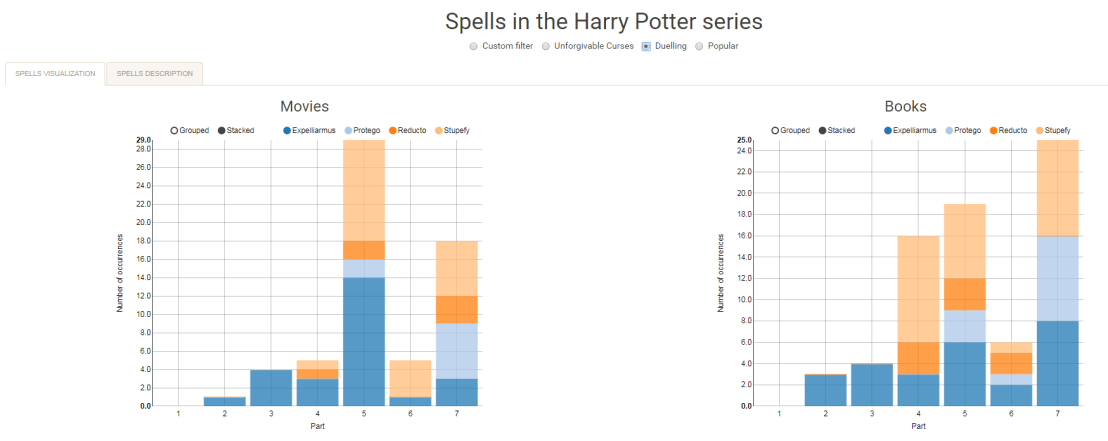
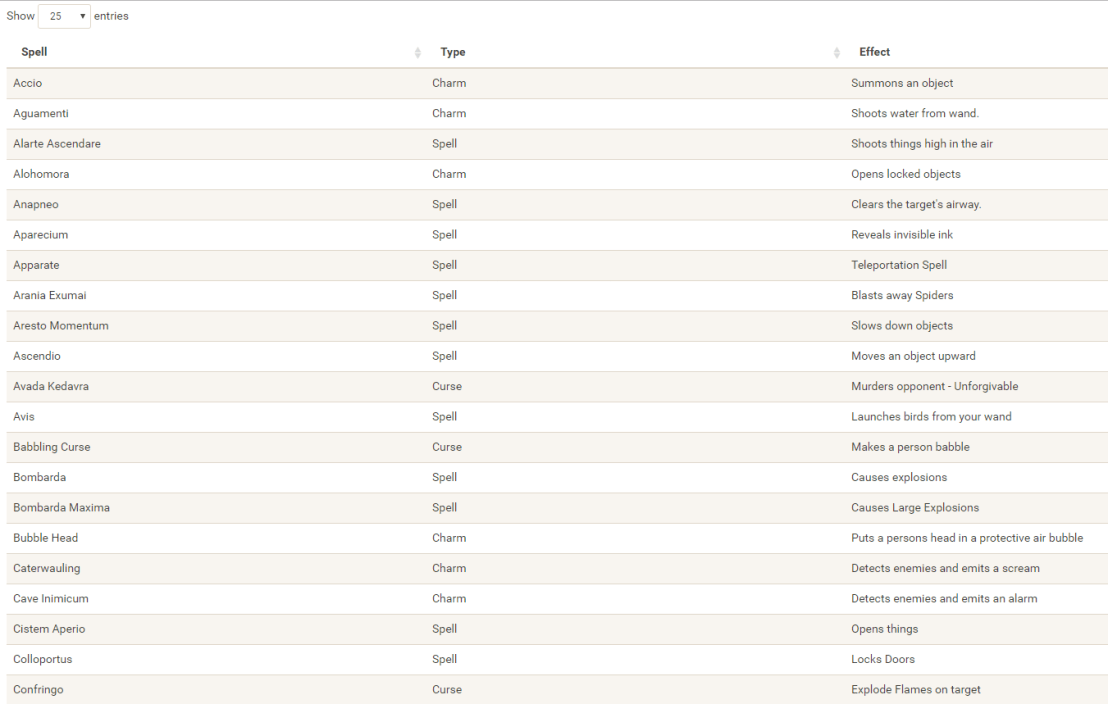
I would like to demonstrate how regular expressions can be used to retrieve (sub)strings that follow a specific format. We could use regex to examine, for instance, when, and by whom, which magical spells are cast.
Well, Prusinowskik (real name unknown) beat me to it, and how! S/He formed a comprehensive list of all spells found in the Harry Potter saga (see below), and categorized these into “spells“, “charms“, and “curses“, and into “popular“, “dueling” and “unforgivable” purposes. Next, Prusinowskik built an interactive Shiny application with lovely JavaScript graphs (package: rCharts) for us to discover precisely when during the saga which spells are cast (see also below). Moreover, the analysis was repeated for both the books and the movies.
Truly excellent work Prusinowskik! The Shiny app can be found here.
Past weekend, I visited the casino with some friends. Of all games, we enjoy North-American-style Baccarat the most. This type of Baccarat is often called Punto Banco. In short, Punto Banco is a card game in which two hands compete: the “player” and the “banker“. During each coup (a round of play), both hands get dealt either 2 or 3 cards, depending on a complex drawing schema, and all cards have a certain value. Put simply, the hand with the highest total value of cards wins the coup, after which a new one starts. Before each coup, gamblers may bet which of the hands will win. Neither hand is in any way associated with the actual house or player/gambler, so bets may be placed on both. All in all, three different bets can be placed in a game of Punto Banco:
The player hand has the highest total value, in which case the player wins (Punto);
The banker hand has the highest total value, in which case the banker wins (Banco);
The player and banker hands have equal total value, in which case there is a tie (Egalité).
If a gambler correctly bets either Punto or Banco, their bets get a 100% payoff. However, a house tax will often be applied to Banco wins. For instance, Banco wins may only pay off 95% or specific Banco wins (e.g., total card value of 5) may pay off less (e.g., 50%). Depending on house rules, a correct bet on a tie (Egalité) will pay off either 800% or 900%. A wrong bet on Punto or Banco stands in case Egalité is dealt. In all other cases of wrong bets, the house takes the money.
My friends and I like Punto Banco because it is completely random but seems “gameable”. Punto Banco is played with six or eight decks so there is no way to know which cards will be next. Moreover, the card-drawing rules are quite complex, so you never really know what’s going to happen. Sometimes both Punto and Banco get only two cards, at other times, the hand you bet on will get its third card, which might just turn things around. Punto Banco’s perceived gameability comes through our human fallacies to see patterns in randomness. Often, casino’s will place a monitor with the last fifty-so results (see below) to tempt gamblers to (erroneously) spot and bet on patterns. Alternatively, you might think it’s smart to bet against the table (play Punto when everybody else goes for Banco) or play on whatever bet won last hand. As the hands are dealt quite quickly in succession, and the minimal bet is often 10+ euro/dollar, Punto Banco is a quick way to find out how lucky you are.
Examples of Baccarat monitors, often placed next to a table.
So back to last weekend’s trip to the casino. Unfortunately, my friends and I lost quite some money at the Punto Banco table. We know the house has an edge (though smaller than in other games) but normally we are quite lucky. We often discuss what would be good strategies to minimize this houses’ edge. Obviously, you want to play as few games as possible, but that’s as far as we got in terms of strategy. Normally, we just test our luck and randomly bet Punto or Banco, and sparsely on Egalité.
As a statistical programmer, I thought it might be interesting to simulate the game and its odds from the bottom up. On the one hand, I wanted to get a sense of how favorable the odds are to the house. On the other hand, I was curious as to what extent strategies may be more or less successful in retaining at least some of your hard-earned cash.
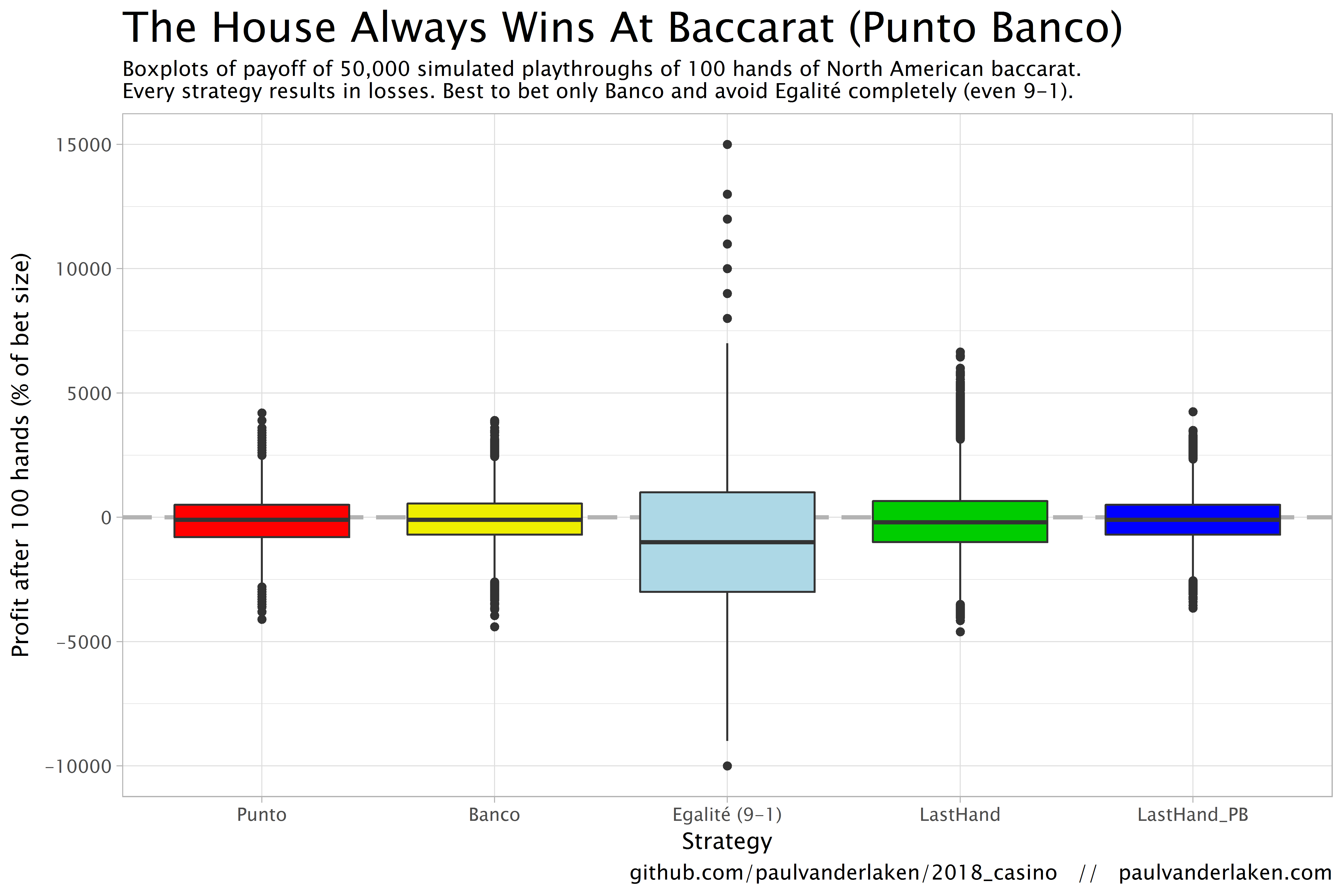
In my simulations, I follow the Holland Casino Punto Banco rules, meaning a six-deck shoe and a Banco win with 5 pays out 50%. I did adopt the more lenient 9-1 payoff for Egalité though. Several hours of programming and some million simulated Baccarat hands later, here are the results:
Do not play Baccarat / Punto Banco if you do not want to lose your money. Obviously, it’s best to not set foot in the casino if you can’t afford to lose some money. However, I eagerly pay for the entertainment value I get from it.
You lose least if you stick to Banco. Despite having only a 50% payoff when Banco wins with 5, the odds are best for Banco due to the drawing rules. Indeed, according to the Wizard of Odds, the house edge for Banco (1.06%) is slightly lower than that of Punto (1.24%).
Whatever you do, do not bet on Egalité. Because most casino’s pay out 8 to 1 in case of a correctly predicted tie, betting on one seems about the worst gambling strategy out there. With a house edge of over 14%, you are better off playing most other games (Wizard of Odds). Although casino’s paying out a tie 9 to 1 decrease the house edge to just below 5%, this is still way worse than playing either Punto or Banco.
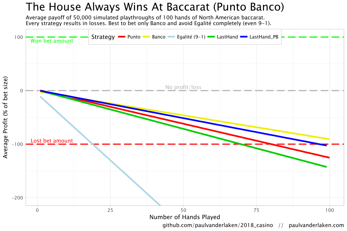
The figure below shows the results of the five strategies I tested using 50,000 simulations of 100 consecutive hands. Based on the results, I was reluctant to develop and test other strategies as results look quite straightforward: play Banco. Additionally, Wikipedia cites Thorp (1984, original reference unknown) who suggested that there are no strategies that will really result in any significant player advantage, except maybe for the endgame of a deck, which presumably requires a lot of card counting. If you nevertheless want to test other strategies, please be my guest, here are my five:
Punto: Always bet on Punto.
Banco: Always bet on Banco.
Egalité: Always bet on Egalité.
LastHand: Bet on the outcome of the last hand/coup.
LastHand_PB: Bet on the outcome of the last hand/coup, only if this was Punto or Banco.
The above figure depicts the expected value of each strategy over a series of consecutive hands played. Clearly, the payoff is quite linear, independent of your strategy. The more hands you play, the more you lose. However, also clear is that some strategies outperform others. After 100 hands of Baccarat, playing only Banco will on average result in a total loss below the amount you wager. For example, if you bet 10 euro every hand, you will have a loss of about 9 euro’s after 100 rounds, on average. This is in line with the ~1% house edge reported by the Wizard of Odds. Similarly, betting only Punto will result in a loss of about 130% of the bet amount, which is also conform the ~1.4% house edge reported by the Wizard of Odds. Betting on Punto or Banco based on whichever won last (LastHand_PB) performs somewhere in between these two strategies, losing just over 100% of the bet amount in 100 hands. Your expected losses increase when you just bet on whichever outcome came last, including Egalité, resulting in around ~-150% after 100 hands. This is mainly because betting on Egalité, which seems about the worst strategy ever, will result in a remarkable 493.9% loss after 100 hands.
Apart from these average or expected values, I was also interested in the spread of outcomes of our thousands of simulations. Particularly because gamblers on a lucky streak may win much more when betting on Egalité, as the payoff is larger (8-1 or 9-1). The figure below shows that any strategy including Egalité will indeed result in a wider spread of outcomes. Betting on Egalité may thus be a good strategy if you are by some miracle divinely lucky, have information on which cards are coming next, or have an agreement with the dealer (disclaimer: this is a joke, please do not ever bet on Egalité with the intention of making money or try to cheat at the casino).
If you want to know how I programmed these simulations, please visit the associated github repository or reach out. I intend on simulating the payoff for various other casino games in the near future (first up: BlackJack), so if you are interested keep an eye on my website or twitter.
Sentiment analysis is a topic I cover regularly, for instance, with regard to Harry Plotter, Stranger Things, or Facebook. Usually I stick to the three sentiment dictionaries (i.e., lexicons) included in the tidytext R package (Bing, NRC, and AFINN) but there are many more one could use. Heck, I’ve even tried building one myself using a synonym/antonym network (unsuccessful, though a nice challenge). Two lexicons that did become famous are SentiWordNet, accessible via the lexicon R package, and the Loughran lexicon, designed specifically for the analysis of shareholder reports.
Josh Yazman did the world a favor and compared the quality of the five lexicons mentioned above. He observed their validity in relation to the millions of restaurant reviews in the Yelp dataset. This dataset includes both textual reviews and 1 to 5 star ratings. Here’s a summary of Josh’s findings, including two visualizations (read Josh’s full blog + details here):
NRC overestimates the positive sentiment.
AFINN also provides overly positive estimates, but to a lesser extent.
Loughran seems unreliable altogether (on Yelp data).
Bing estimates are accurate as long as texts are long enough (e.g., 200+ words).
SentiWordNet‘s estimates are mostly valid and precise, also on shorter texts, but may include minor outliers.
Sentiment scores by Yelp rating, estimated using each lexicon. [original]The average sentiment score estimated using lexicons, where words are randomly sampled from the Yelp dataset. Note that, although both NRC and Bing scores are relatively positive on average, they also demonstrate a larger spread of scores (which is a good thing if you assume that reviews vary in terms of sentiment). [original]On a more detailed level, David Robinson demonstrated how to uncover performance errors or quality issues in lexicons, in his 2016 blog on the AFINN lexicon. Using only the most common words (i.e., used in 200+ reviews for at least 10 businesses) of the same Yelp dataset, David visualized the inconsistencies between the AFINN sentiment lexicon and the Yelp ratings in two very smart and appealing ways:
Words’ AFINN sentiment score by the average rating of the reviews they used in [original]As the figure above shows, David found a strong positive correlations between the sentiment score assigned to words in the AFINN lexicon and the way they are used in Yelp reviews. However, there are some exception – words that did not have the same meaning in the lexicon and the observed data. Examples of words that seem to cause errors are die and bomb (both negative AFINN scores but used in positive Yelp reviews) or, the other way around, joke and honor (positive AFINN scores but negative meanings on Yelp).
A graph of the frequency with which words are used in reviews, by the average rating of the reviews they occur in, colored for their AFINN sentiment score [original]With the graph above, it is easy to see what words cause inaccuracies. Blue words should be in the upper section of this visual while reds should be closer to the bottom. If this is not the case, a word likely has a different meaning in the lexicon respective to how it’s used on Yelp. These lexicon-data differences become increasingly important as words are located closer to the right side of the graph, which means they more frequently screw up your sentiment estimates. For instance, fine, joke, fuck and hopecause much overestimation of positive sentiment while fresh is not considered in the positive scores it entails and die causes many negative errors.
TL;DR: Sentiment lexicons vary in terms of their quality/performance. If your texts are short (few hundred words) you might be best off using Bing (tidytext). In other cases, opt for SentiWordNet (lexicon), which considers a broader vocabulary. If possible, try to evaluate inaccuracies, outliers, and/or prediction errors via data visualizations.