Category: visualization

Top-19 articles of 2019

Top-19 articles of 2019

With only one day remaining in 2019, let’s review the year. 2019 was my third year of blogging and it went by even quicker than the previous two!

Personally, it has been a busy year for me: I started a new job, increased my speaking and teaching activities, bought and moved to my new house, and got married op top of that!

Fortunately, I also started working parttime. This way, I could still reserve some time for learning and sharing my learnings. And sharing I did:

I posted 95 blogs in 2019!
That means one new post every 4 days!

paulvanderlaken.com improved its online footprint as well. We received over 100k visitors in 2019! And many of you subscribed and sticked around. Our little community now includes 55 more members than it did last year! And that is not even including the followers to my new twitter bot Artificial Stupidity!

Thank you for your continued interest!

Join 385 other subscribers

Now, I am always curious as to what brings you to my website, so let’s have a look at some 2019 statistics (which I downloaded via my new Python scraper).

Most read articles

There is clearly a power distribution in the quantity with which you read my blogs.

Some blogs consistently attract dozens of visitors each day. Others have only handful of visitors over the course of a year.

These are the 19 articles which were most read in 2019. Hyperlinks are included below the bar chart. It’s a nice combination of R programming, machine learning, HR-related materials, and some entertainment (games & gambling) in between.

Which have and haven’t you read?

  1. R resources
  2. R tips and tricks
  3. New to R?
  4. Books for the modern, data-driven HR professional
  5. The house always wins
  6. Visualization innovations
  7. Simple correlation analysis in R
  8. Beating battleships with algorithms and AI
  9. Regular expressions in R
  10. Simpson’s paradox
  11. Visualizing the k-means clustering algorithm
  12. Survival of the best fit
  13. Datasets to practice and learn data science
  14. Identifying dirty twitter bots
  15. Game of Thrones map
  16. Screeps
  17. Northstar
  18. The difference between DS, ML, and AI visualized
  19. Light GBM vs. XGBoost

Rising stars

Half of these most read articles have actually been published in 2017 or ’18 already. However, of the 95 articles published in 2019, some also demonstrate promising visitor patterns:

The People Analytics books, Visual innovations, and AI Battleships are in the top 19, and several others made it too.

Some of these newer blogs haven’t had the time to mature and redeem their place yet though. Regardless, I have high hopes!

Particularly for Neural Synesthesia, which was easily one of my greatest WOW-moments for ML applications in 2019. It’s truly mesmerizing to see a GAN traverse its latent space.

Reading & posting patterns

I have been posting quite regularly throughout the year. Apart from a holiday to Thailand during the start of January, and the start of my new job in February.

While I write and post most of my blogs in the weekend, I guess I should consider postponing publishing. As you guys are mostly active during Tuesdays and Wedsnesdays!

Statistical summary of 2019

What better way to end 2019 than with a statistical summary?

I have posted more and shorter blogs, and you’ve rewarded me with visits and more likes (also per post). However, we need more discussion!

Statistic2018 2019 Δ
Views85614107388+25%
Unique visitors5759470615+23%
Posts6195+56%
Words / post518371-40%
Likes51111118%
Comments2416-33%
As of 29/12/2019

2020 Outlook

It took some time to get started, but halfway 2017 my blog started attracting an audience. People stayed on during 2018, and visitor number continued to increase through 2019.

With an ongoing expansion from R into Python, and an increased focus on sharing resources, applications, and novelties related to data visualization and machine learning, I have a lot more in store for 2020!

I hope you stick around for the ride!

Please like, subscribe, share, and comment, and we’ll make sure 2020 will be at least as interesting and full of (machine) learning as 2019 has been!

Join 385 other subscribers
Turning the Traveling Salesman problem into Art

Turning the Traveling Salesman problem into Art

Robert Bosch is a professor of Natural Science at the department of Mathematics of Oberlin College and has found a creative way to elevate the travelling salesman problem to an art form.

For those who aren’t familiar with the travelling salesman problem (wiki), it is a classic algorithmic problem in the field of computer science and operations research. Basically, we want are looking for a mathematical solution that is cheapest, shortest, or fastest for a given problem. Most commonly, it is seen as a graph (network) describing the locations of a set of nodes (elements in that network). Wikipedia has a description I can’t improve on:

The Travelling Salesman Problem describes a salesman who must travel between N cities. The order in which he does so is something he does not care about, as long as he visits each once during his trip, and finishes where he was at first. Each city is connected to other close by cities, or nodes, by airplanes, or by road or railway. Each of those links between the cities has one or more weights (or the cost) attached. The cost describes how “difficult” it is to traverse this edge on the graph, and may be given, for example, by the cost of an airplane ticket or train ticket, or perhaps by the length of the edge, or time required to complete the traversal. The salesman wants to keep both the travel costs, as well as the distance he travels as low as possible.

Wikipedia

Here’s a visual representation of the problem and some algorithmic approaches to solving it:

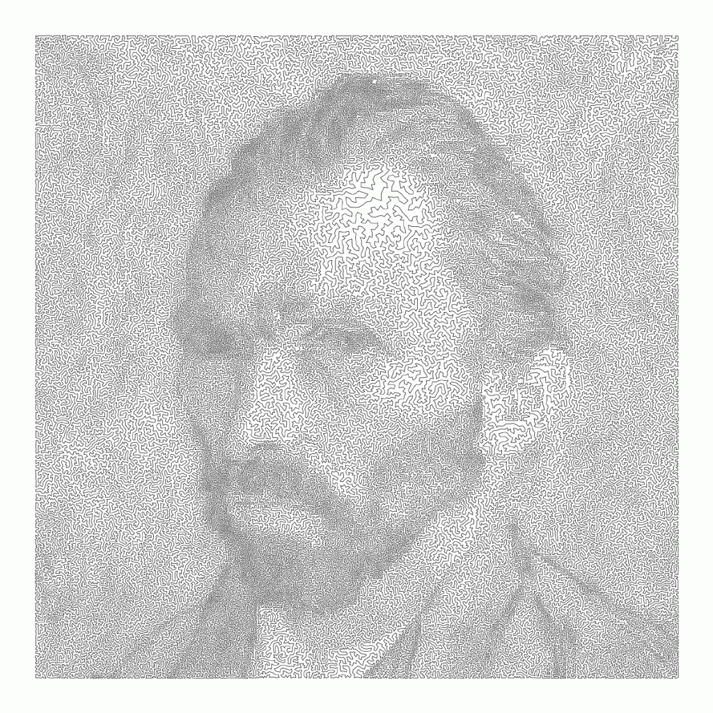
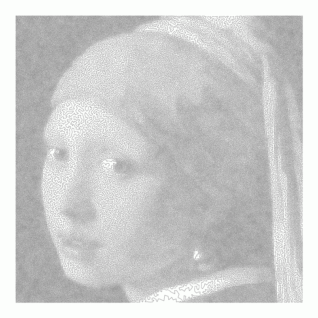
Now, Robert Bosch has applied the traveling salesman problem to well-know art pieces, trying to redraw them by connecting a series of points with one continuous line. Robert even turned it into a challenge so people can test out how well their travelling salesman algorithms perform on, for instance, the Mona Lisa, or Vincent van Gogh.

Just look at the detail on these awesome Dutch classics:

Read more about this awesome project here: http://www.math.uwaterloo.ca/tsp/data/art/

P.S. Why do Brits and Americans have this spelling feud?! As a non-native, I never know what to pick. Should I write modelling or modeling, travelling or traveling, tomato or tomato? I got taught the U.K. style, but the U.S. style pops up whenever I google stuff, so I am constantly confused! Now I subconciously intertwine both styles in a single text…

OriginLab’s Graph Gallery: A blast from the past

OriginLab’s Graph Gallery: A blast from the past

Continuing my recent line of posts on data visualization resources, I found another repository in my inbox: OriginLab’s GraphGallery!

If I’m being honest, I would personally advice you to look at the dataviz project instead, if you haven’t heard of that one yet.

However, OriginLab might win in terms of sentiment. It has this nostalgic look of the ’90s, and apparently people really used it during that time. Nevertheless, despite looking old, the repo seems to be quite extensive, with nearly 400 different types of data visualizations:

Quantity isn’t everything though, as some of the 400 entries are disgustingly horrible:

There’s so much wrong with this graph…

What I do like about this OriginLab repo is that it has an option to sort its contents using a random order. This really facilitates discovery of new pearls:

Thanks to Maarten Lambrechts for sharing this resource on twitter a while back!

Visualizing Sampling Distributions in ggplot2: Adding area under the curve

Visualizing Sampling Distributions in ggplot2: Adding area under the curve

Thank you ggplot2tutor for solving one of my struggles. Apparently this is all it takes:

ggplot(NULL, aes(x = c(-3, 3))) +
  stat_function(fun = dnorm, geom = "line")

I can’t begin to count how often I have wanted to visualize a (normal) distribution in a plot. For instance to show how my sample differs from expectations, or to highlight the skewness of the scores on a particular variable. I wish I’d known earlier that I could just add one simple geom to my ggplot!

Want a different mean and standard deviation, just add a list to the args argument:

ggplot(NULL, aes(x = c(0, 20))) +
  stat_function(fun = dnorm,
                geom = "area",
                args = list(
                  mean = 10,
                  sd = 3
                ))

Need a different distribution? Just pass a different distribution function to stat_function. For instance, an F-distribution, with the df function:

ggplot(NULL, aes(x = c(0, 5))) +
  stat_function(fun = df,
                geom = "area",
                args = list(
                  df1 = 2,
                  df2 = 10
                ))

You can make it is complex as you want. The original ggplot2tutor blog provides this example:

ggplot(NULL, aes(x = c(-3, 5))) +
  stat_function(
    fun = dnorm,
    geom = "area",
    fill = "steelblue",
    alpha = .3
  ) +
  stat_function(
    fun = dnorm,
    geom = "area",
    fill = "steelblue",
    xlim = c(qnorm(.95), 4)
  ) +
  stat_function(
    fun = dnorm,
    geom = "line",
    linetype = 2,
    fill = "steelblue",
    alpha = .5,
    args = list(
      mean = 2
    )
  ) +
  labs(
    title = "Type I Error",
    x = "z-score",
    y = "Density"
  ) +
  scale_x_continuous(limits = c(-3, 5))

Have a look at the original blog here: https://ggplot2tutor.com/sampling_distribution/sampling_distribution/

treevis.net – A Visual Bibliography of Tree Visualizations

treevis.net – A Visual Bibliography of Tree Visualizations

Last week I cohosted a professional learning course on data visualization at JADS. My fellow host was prof. Jack van Wijk, and together we organized an amazing workshop and poster event. Jack gave two lectures on data visualization theory and resources, and mentioned among others treevis.net, a resource I was unfamiliar with up until then.

treevis.net is a lot like the dataviz project in the sense that it is an extensive overview of different types of data visualizations. treevis is unique, however, in the sense that it is focused on specifically visualizations of hierarchical data: multi-level or nested data structures.

Hans-Jörg Schulz — professor of Computer Science at Aarhus University in Denmark — maintains the treevis repo. At the moment of writing, he has compiled over 300 different types of hierachical data visualizations and displays them on this website.

As an added bonus, the repo is interactive as there are several ways to filter and look for the visualization type that best fits your data and needs.

Most resources come with added links to the original authors and the original papers they were first published in, so this is truly a great resources for those interested in doing a deep dive into data visualization. Do have a look yourself!

7 Reasons You Should Use Dot Graphs, by Maarten Lambrechts

7 Reasons You Should Use Dot Graphs, by Maarten Lambrechts

In my data visualization courses, I often refer to the hierarchy of visual encoding proposed by Cleveland and McGill. In their 1984 paper, Cleveland and McGill proposed the table below, demonstrating to what extent different visual encodings of data allow readers of data visualizations to accurately assess differences between data values.

DOI: 10.2307/2288400

Since then, this table has been used and copied by many data visualization experts, and adapted to more visually appealing layouts. Like this one by Alberto Cairo, referred to in a blog by Maarten Lambrechts:

cleveland_mcgill_cairo
Via http://www.thefunctionalart.com/

Now, this brings me to the point of this current blog, in which I want to share an older post by Maarten Lambrechts. I came across Maarten’s post only yesterday, but it touches on many topics and content that I’ve covered earlier on my own website or during my courses. It’s mainly about the relative effectiveness and efficiency of using dots/points in data visualizations.

Basically, dots are often the most accurate and to the point (pun intended). With the latter, I mean in terms of inkt used, dots/points are more efficient than bars, or as Maarten says:

Points go beyond where lines and bars stop. Sounds weird, especially for those who remember from their math classes that a line is an infinite collection of points. But in visualization, points can do so much more then lines. Here are seven reasons why you should use more dot graphs, with some examples.

http://www.maartenlambrechts.com/2015/05/03/to-the-point-7-reasons-you-should-use-dot-graphs.html

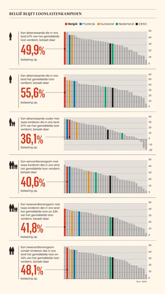
Maarten touches on the research of Cleveland and McGill, on a PLOS article advocating avoiding bars for continuous data, and on how to redesign charts to make use of more efficiënt dot/point encodings. I really loved this one redesign example Maarten shares. Unfortunately, it is in Dutch, but both graphs show pretty much the same data, though the simpler one better communicates the main message.

Do have a look at the rest of Maarten’s original blog post. I love how he ends it with some practical advice: A nice lookup table for those looking how to efficiently use points/dots to represent their n-dimensional data:

  • For comparisons of a single dimension across many categories: 1-dimensional scatterplot.
  • For detecting of skewed or bimodal distributions in 2 variables: connect 1-dimensional scatterplots (slopegraphs)
  • For showing relationships between 2 variables: 2-dimensional scatterplots.
  • For representing 4-dimensional data (3 numeric, 1 categorical or 4 numerical): bubble charts. Can also be used for 3 numerical dimensions or 2 numeric and 1 categorical value.
  • For representing 4-dimensional data +  time: animated bubble chart (aka Rosling-graph)