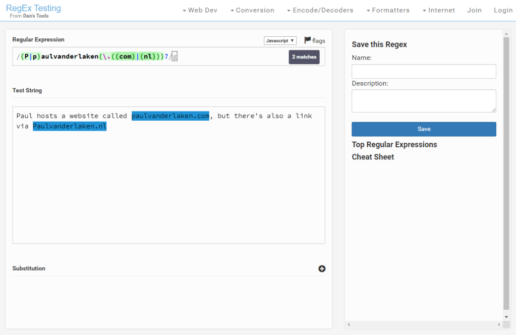
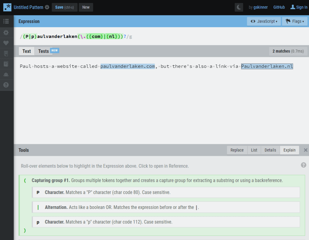
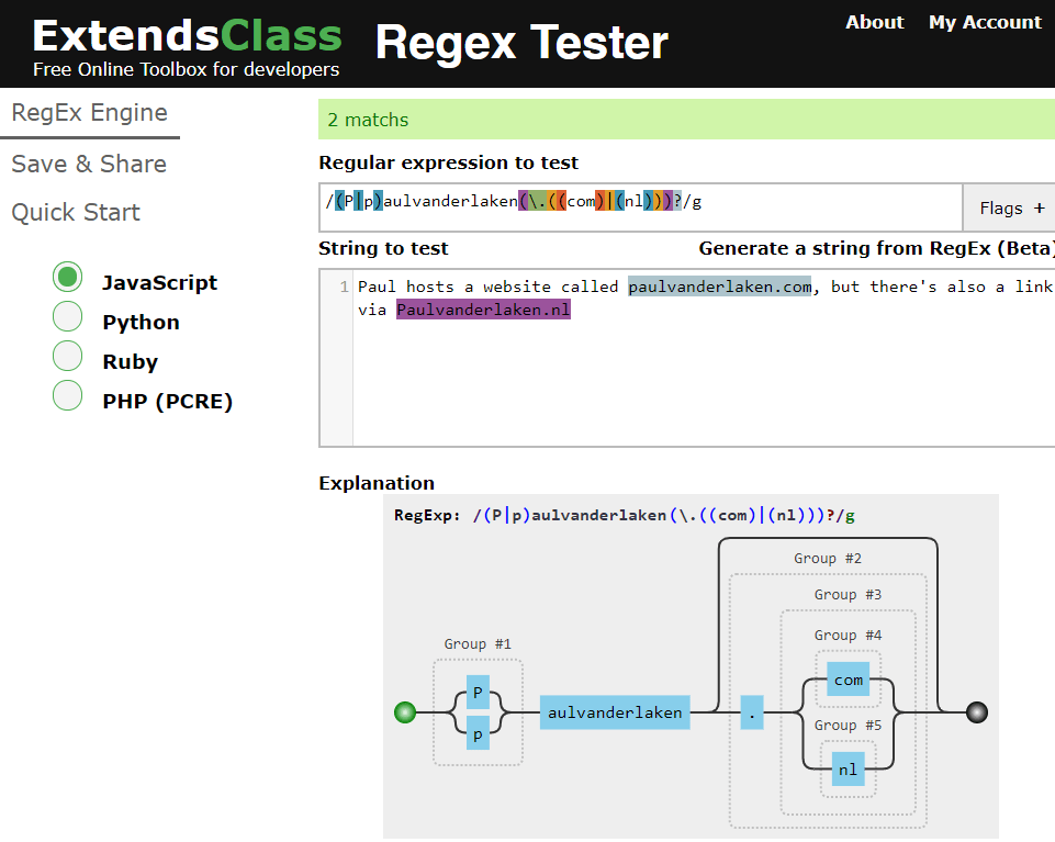
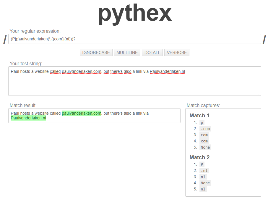
Regular expression (also abbreviated to regex) really is a powertool any programmer should know. It was and is one of the things I most liked learning, as it provides you with immediate, godlike powers that can speed up your (data science) workflow tenfold.
I’ve covered many regex related topics on this blog already, but thought I’d combine them and others in a nice curated overview — for myself, and for you of course, to use.
If you have any materials you liked, but are missing, please let me know!
Grant McDermott developed this new R package I wish I had thought of: parttree
parttree includes a set of simple functions for visualizing decision tree partitions in R with ggplot2. The package is not yet on CRAN, but can be installed from GitHub using:
Using the familiar ggplot2 syntax, we can simply add decision tree boundaries to a plot of our data.
In this example from his Github page, Grant trains a decision tree on the famous Titanic data using the parsnip package. And then visualizes the resulting partition / decision boundaries using the simple function geom_parttree()
library(parsnip)
library(titanic) ## Just for a different data set
set.seed(123) ## For consistent jitter
titanic_train$Survived = as.factor(titanic_train$Survived)
## Build our tree using parsnip (but with rpart as the model engine)
ti_tree =
  decision_tree() %>%
  set_engine("rpart") %>%
  set_mode("classification") %>%
  fit(Survived ~ Pclass + Age, data = titanic_train)
## Plot the data and model partitions
titanic_train %>%
  ggplot(aes(x=Pclass, y=Age)) +
  geom_jitter(aes(col=Survived), alpha=0.7) +
  geom_parttree(data = ti_tree, aes(fill=Survived), alpha = 0.1) +
  theme_minimal()
Super awesome!
This visualization precisely shows where the trained decision tree thinks it should predict that the passengers of the Titanic would have survived (blue regions) or not (red), based on their age and passenger class (Pclass).
This will be super helpful if you need to explain to yourself, your team, or your stakeholders how you model works. Currently, only rpart decision trees are supported, but I am very much hoping that Grant continues building this functionality!
The assumption that a Machine Learning (ML) project is done when a trained model is put into production is quite faulty. Neverthless, according to Alexandre Gonfalonieri — artificial intelligence (AI) strategist at Philips — this assumption is among the most common mistakes of companies taking their AI products to market.
Actually, in the real world, we see pretty much the opposite of this assumption. People like Alexandre therefore strongly recommend companies keep their best data scientists and engineers on a ML project, especially after it reaches production!
Why?
If you’ve ever productionized a model and really started using it, you know that, over time, your model will start performing worse.
In order to maintain the original accuracy of a ML model which is interacting with real world customers or processes, you will need to continuously monitor and/or tweak it!
In the best case, algorithms are retrained with each new data delivery. This offers a maintenance burden that is not fully automatable. According to Alexandre, tending to machine learning models demands the close scrutiny, critical thinking, and manual effort that only highly trained data scientists can provide.
This means that there’s a higher marginal cost to operating ML products compared to traditional software. Whereas the whole reason we are implementing these products is often to decrease (the) costs (of human labor)!
What causes this?
Your models’ accuracy will often be at its best when it just leaves the training grounds.
Building a model on relevant and available data and coming up with accurate predictions is a great start. However, for how long do you expect those data — that age by the day — continue to provide accurate predictions?
Chances are that each day, the model’s latent performance will go down.
This phenomenon is called concept drift, and is heavily studied in academia but less often considered in business settings. Concept drift means that the statistical properties of the target variable, which the model is trying to predict, change over time in unforeseen ways.
In simpler terms, your model is no longer modelling the outcome that it used to model. This causes problems because the predictions become less accurate as time passes.
Particularly, models of human behavior seem to suffer from this pitfall.
The key is that, unlike a simple calculator, your ML model interacts with the real world. And the data it generates and that reaches it is going to change over time. A key part of any ML project should be predicting how your data is going to change over time.
You need to create a monitoring strategy before reaching production!
According to Alexandre, as soon as you feel confident with your project after the proof-of-concept stage, you should start planning a strategy for keeping your models up to date.
How often will you check in?
On the whole model, or just some features?
What features?
In general, sensible model surveillance combined with a well thought out schedule of model checks is crucial to keeping a production model accurate. Prioritizing checks on the key variables and setting up warnings for when a change has taken place will ensure that you are never caught by a surprise by a change to the environment that robs your model of its efficacy.
Your strategy will strongly differ based on your model and your business context.
Moreover, there are many different types of concept drift that can affect your models, so it should be a key element to think of the right strategy for you specific case!
Once you observe degraded model performance, you will need to redesign your model (pipeline).
One solution is referred to as manual learning. Here, we provide the newly gathered datato our model and re-train and re-deploy it just like the first time we build the model. If you think this sounds time-consuming, you are right. Moreover, the tricky part is not refreshing and retraining a model, but rather thinking of new features that might deal with the concept drift.
A second solution could be to weight your data. Some algorithms allow for this very easily. For others you will need to custom build it in yourself. One recommended weighting schema is to use the inversely proportional age of the data. This way, more attention will be paid to the most recent data (higher weight) and less attention to the oldest of data (smaller weight) in your training set. In this sense, if there is drift, your model will pick it up and correct accordingly.
According to Alexandre and many others, the third and best solution is to build your productionized system in such a way that you continuously evaluate and retrain your models. The benefit of such a continuous learning system is that it can be automated to a large extent, thus reducing (the human labor) maintance costs.
Although Alexandre doesn’t expand on how to do these, he does formulate the three steps below:
In my personal experience, if you have your model retrained (automatically) every now and then, using a smart weighting schema, and keep monitoring the changes in the parameters and for several “unit-test” cases, you will come a long way.
If you’re feeling more adventureous, you could improve on matters by having your model perform some exploration (at random or rule-wise) of potential new relationships in your data (see for instance multi-armed bandits). This will definitely take you a long way!
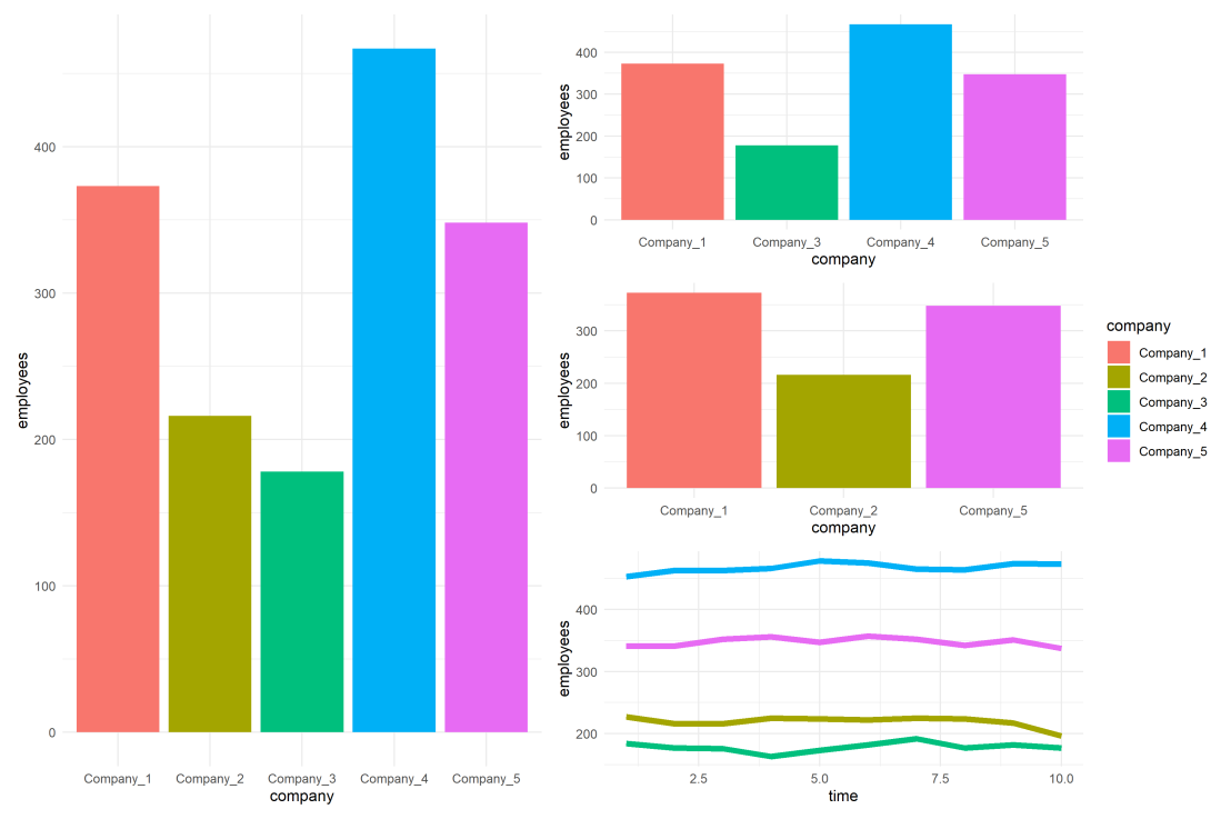
For instance, if you’re making multiple plots of the dataset — say a group of 5 companies — you want to have each company have the same, consistent coloring across all these plots.
R has some great data visualization capabilities. Particularly the ggplot2 package makes it so easy to spin up a good-looking visualization quickly.
The default in R is to look at the number of groups in your data, and pick “evenly spaced” colors across a hue color wheel. This looks great straight out of the box:
# install.packages('ggplot2')
library(ggplot2)

theme_set(new = theme_minimal()) # sets a default theme

set.seed(1) # ensure reproducibility

# generate some data
n_companies = 5
df1 = data.frame(
  company = paste('Company', seq_len(n_companies), sep = '_'),
  employees = sample(50:500, n_companies),
  stringsAsFactors = FALSE
)

# make a simple column/bar plot
ggplot(data = df1) +
  geom_col(aes(x = company, y = employees, fill = company))
However, it can be challenging is to make coloring consistent across plots.
For instance, suppose we want to visualize a subset of these data points.
index_subset1 = c(1, 3, 4, 5) # specify a subset

# make a plot using the subsetted dataframe
ggplot(data = df1[index_subset1, ]) +
  geom_col(aes(x = company, y = employees, fill = company))
As you can see the color scheme has now changed. With one less group / company, R now picks 4 new colors evenly spaced around the color wheel. All but the first are different to the original colors we had for the companies.
One way to deal with this in R and ggplot2, is to add a scale_* layer to the plot.
Here we manually set Hex color values in the scale_fill_manual function. These hex values I provided I know to be the default R values for four groups.
# install.packages('scales')

# the hue_pal function from the scales package looks up a number of evenly spaced colors
# which we can save as a vector of character hex values
default_palette = scales::hue_pal()(5)

# these colors we can then use in a scale_* function to manually override the color schema
ggplot(data = df1[index_subset1, ]) +
  geom_col(aes(x = company, y = employees, fill = company)) +
  scale_fill_manual(values = default_palette[-2]) # we remove the element that belonged to company 2
As you can see, the colors are now aligned with the previous schema. Only Company 2 is dropped, but all other companies retained their color.
However, this was very much hard-coded into our program. We had to specify which company to drop using the default_palette[-2].
If the subset changes, which often happens in real life, our solution will break as the values in the palette no longer align with the groups R encounters:
index_subset2 = c(1, 2, 5) # but the subset might change

# and all manually-set colors will immediately misalign
ggplot(data = df1[index_subset2, ]) +
  geom_col(aes(x = company, y = employees, fill = company)) +
  scale_fill_manual(values = default_palette[-2])
Fortunately, R is a smart language, and you can work your way around this!
All we need to do is created, what I call, a named-color palette!
It’s as simple as specifying a vector of hex color values! Alternatively, you can use the grDevices::rainbow or grDevices::colors() functions, or one of the many functions included in the scales package
# you can hard-code a palette using color strings
c('red', 'blue', 'green')

# or you can use the rainbow or colors functions of the grDevices package
rainbow(n_companies)
colors()[seq_len(n_companies)]

# or you can use the scales::hue_pal() function
palette1 = scales::hue_pal()(n_companies)
print(palette1)
Now we need to assign names to this vector of hex color values. And these names have to correspond to the labels of the groups that we want to colorize.
With this named color vector and the scale_*_manual functions we can now manually override the fill and color schemes in a flexible way. This results in the same plot we had without using the scale_*_manual function:
ggplot(data = df1) +
  geom_col(aes(x = company, y = employees, fill = company)) +
  scale_fill_manual(values = palette1_named)
However, now it does not matter if the dataframe is subsetted, as we specifically tell R which colors to use for which group labels by means of the named color palette:
# the colors remain the same if some groups are not found
ggplot(data = df1[index_subset1, ]) +
  geom_col(aes(x = company, y = employees, fill = company)) +
  scale_fill_manual(values = palette1_named)
# and also if other groups are not found
ggplot(data = df1[index_subset2, ]) +
  geom_col(aes(x = company, y = employees, fill = company)) +
  scale_fill_manual(values = palette1_named)
Once you are aware of these superpowers, you can do so much more with them!
How about highlighting a specific group?
Just set all the other colors to ‘grey’…
# lets create an all grey color palette vector
palette2 = rep('grey', times = n_companies)
palette2_named = setNames(object = palette2, nm = df1$company)
print(palette2_named)
# this looks terrible in a plot
ggplot(data = df1) +
  geom_col(aes(x = company, y = employees, fill = company)) +
  scale_fill_manual(values = palette2_named)
… and assign one of the company’s colors to be a different color
# override one of the 'grey' elements using an index by name
palette2_named['Company_2'] = 'red'
print(palette2_named)
# and our plot is professionally highlighting a certain group
ggplot(data = df1) +
  geom_col(aes(x = company, y = employees, fill = company)) +
  scale_fill_manual(values = palette2_named)
We can apply these principles to other types of data and plots.
For instance, let’s generate some time series data…
timepoints = 10
df2 = data.frame(
  company = rep(df1$company, each = timepoints),
  employees = rep(df1$employees, each = timepoints) + round(rnorm(n = nrow(df1) * timepoints, mean = 0, sd = 10)),
  time = rep(seq_len(timepoints), times = n_companies),
  stringsAsFactors = FALSE
)
… and visualize these using a line plot, adding the color palette in the same way as before:
ggplot(data = df2) +
  geom_line(aes(x = time, y = employees, col = company), size = 2) +
  scale_color_manual(values = palette1_named)
If we miss one of the companies — let’s skip Company 2 — the palette makes sure the others remained colored as specified:
ggplot(data = df2[df2$company %in% df1$company[index_subset1], ]) +
  geom_line(aes(x = time, y = employees, col = company), size = 2) +
  scale_color_manual(values = palette1_named)
Also the highlighted color palete we used before will still work like a charm!
ggplot(data = df2) +
  geom_line(aes(x = time, y = employees, col = company), size = 2) +
  scale_color_manual(values = palette2_named)
Now, let’s scale up the problem! Pretend we have not 5, but 20 companies.
The code will work all the same!
set.seed(1) # ensure reproducibility

# generate new data for more companies
n_companies = 20
df1 = data.frame(
  company = paste('Company', seq_len(n_companies), sep = '_'),
  employees = sample(50:500, n_companies),
  stringsAsFactors = FALSE
)

# lets create an all grey color palette vector
palette2 = rep('grey', times = n_companies)
palette2_named = setNames(object = palette2, nm = df1$company)

# highlight one company in a different color
palette2_named['Company_2'] = 'red'
print(palette2_named)

# make a bar plot
ggplot(data = df1) +
  geom_col(aes(x = company, y = employees, fill = company)) +
  scale_fill_manual(values = palette2_named) +
  theme(axis.text.x = element_text(angle = 45, hjust = 1, vjust = 1)) # rotate and align the x labels
Also for the time series line plot:
timepoints = 10
df2 = data.frame(
  company = rep(df1$company, each = timepoints),
  employees = rep(df1$employees, each = timepoints) + round(rnorm(n = nrow(df1) * timepoints, mean = 0, sd = 10)),
  time = rep(seq_len(timepoints), times = n_companies),
  stringsAsFactors = FALSE
)

ggplot(data = df2) +
  geom_line(aes(x = time, y = employees, col = company), size = 2) +
  scale_color_manual(values = palette2_named)
The possibilities are endless; the power is now yours!
Just think at the efficiency gain if you would make a custom color palette, with for instance your company’s brand colors!
For more R tricks to up your programming productivity and effectiveness, visit the R tips and tricks page!
However, paletteer is by far my favorite package for customizing your colors in R!
The paletteer package offers direct access to 1759 color palettes, from 50 different packages!
After installing and loading the package, paletteer works as easy as just adding one additional line of code to your ggplot:
install.packages("paletteer")
library(paletteer)

install.packages("ggplot2")
library(ggplot2)

ggplot(iris, aes(Sepal.Length, Sepal.Width, color = Species)) +
  geom_point() +
  scale_color_paletteer_d("nord::aurora")
paletteer offers a combined collection of hundreds of other color palettes offered in the R programming environment, so you are sure you will find a palette that you like! Here’s the list copied below, but this github repo provides more detailed information about the package contents.
I don’t want to participate in the general debate on COVID19 as there are enough, much more knowledgeable experts doing so already.
However, I did want to share something that sparked my interest: this great article by the Washington Post where they show the importance of social distancing in case of viral outbreaks with four simple simulations:
Regular viral outbreak
Viral outbreak with forced (temporary) quarantaine
Viral outbreak with moderate social distancing
Viral outbreak with extensive social distancing
While these are obviously much oversimplified models of reality, the results convey a powerful and very visual message showing the importance of our social behavior in such a crisis.
1. Simulation of regular viral outbreak2. Simulation with temporary quarantaine opening up.