Category: best practices

How to standardize group colors in data visualizations in R

How to standardize group colors in data visualizations in R

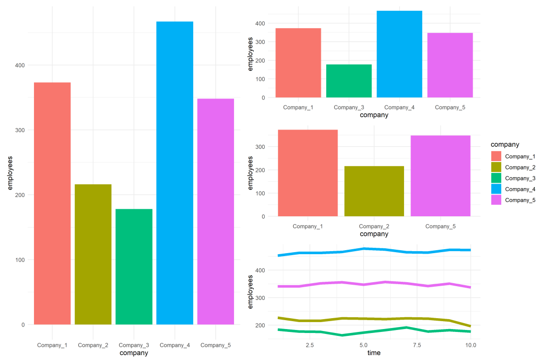
One best practice in visualization is to make your color scheme consistent across figures.

For instance, if you’re making multiple plots of the dataset — say a group of 5 companies — you want to have each company have the same, consistent coloring across all these plots.

R has some great data visualization capabilities. Particularly the ggplot2 package makes it so easy to spin up a good-looking visualization quickly.

The default in R is to look at the number of groups in your data, and pick “evenly spaced” colors across a hue color wheel. This looks great straight out of the box:

# install.packages('ggplot2')
library(ggplot2)

theme_set(new = theme_minimal()) # sets a default theme

set.seed(1) # ensure reproducibility

# generate some data
n_companies = 5
df1 = data.frame(
  company = paste('Company', seq_len(n_companies), sep = '_'),
  employees = sample(50:500, n_companies),
  stringsAsFactors = FALSE
)

# make a simple column/bar plot
ggplot(data = df1) + 
  geom_col(aes(x = company, y = employees, fill = company))

However, it can be challenging is to make coloring consistent across plots.

For instance, suppose we want to visualize a subset of these data points.

index_subset1 = c(1, 3, 4, 5) # specify a subset

# make a plot using the subsetted dataframe
ggplot(data = df1[index_subset1, ]) + 
  geom_col(aes(x = company, y = employees, fill = company))

As you can see the color scheme has now changed. With one less group / company, R now picks 4 new colors evenly spaced around the color wheel. All but the first are different to the original colors we had for the companies.

One way to deal with this in R and ggplot2, is to add a scale_* layer to the plot.

Here we manually set Hex color values in the scale_fill_manual function. These hex values I provided I know to be the default R values for four groups.

# install.packages('scales')

# the hue_pal function from the scales package looks up a number of evenly spaced colors
# which we can save as a vector of character hex values
default_palette = scales::hue_pal()(5)

# these colors we can then use in a scale_* function to manually override the color schema
ggplot(data = df1[index_subset1, ]) +
  geom_col(aes(x = company, y = employees, fill = company)) +
  scale_fill_manual(values = default_palette[-2]) # we remove the element that belonged to company 2

As you can see, the colors are now aligned with the previous schema. Only Company 2 is dropped, but all other companies retained their color.

However, this was very much hard-coded into our program. We had to specify which company to drop using the default_palette[-2].

If the subset changes, which often happens in real life, our solution will break as the values in the palette no longer align with the groups R encounters:

index_subset2 = c(1, 2, 5) # but the subset might change

# and all manually-set colors will immediately misalign
ggplot(data = df1[index_subset2, ]) +
  geom_col(aes(x = company, y = employees, fill = company)) +
  scale_fill_manual(values = default_palette[-2])

Fortunately, R is a smart language, and you can work your way around this!

All we need to do is created, what I call, a named-color palette!

It’s as simple as specifying a vector of hex color values! Alternatively, you can use the grDevices::rainbow or grDevices::colors() functions, or one of the many functions included in the scales package

# you can hard-code a palette using color strings
c('red', 'blue', 'green')

# or you can use the rainbow or colors functions of the grDevices package
rainbow(n_companies)
colors()[seq_len(n_companies)]

# or you can use the scales::hue_pal() function
palette1 = scales::hue_pal()(n_companies)
print(palette1)
[1] "#F8766D" "#A3A500" "#00BF7D" "#00B0F6" "#E76BF3"

Now we need to assign names to this vector of hex color values. And these names have to correspond to the labels of the groups that we want to colorize.

You can use the names function for this.

names(palette1) = df1$company
print(palette1)
Company_1 Company_2 Company_3 Company_4 Company_5
"#F8766D" "#A3A500" "#00BF7D" "#00B0F6" "#E76BF3"

But I prefer to use the setNames function so I can do the inititialization, assignment, and naming simulatenously. It’s all the same though.

palette1_named = setNames(object = scales::hue_pal()(n_companies), nm = df1$company)
print(palette1_named)
Company_1 Company_2 Company_3 Company_4 Company_5
"#F8766D" "#A3A500" "#00BF7D" "#00B0F6" "#E76BF3"

With this named color vector and the scale_*_manual functions we can now manually override the fill and color schemes in a flexible way. This results in the same plot we had without using the scale_*_manual function:

ggplot(data = df1) + 
  geom_col(aes(x = company, y = employees, fill = company)) +
  scale_fill_manual(values = palette1_named)

However, now it does not matter if the dataframe is subsetted, as we specifically tell R which colors to use for which group labels by means of the named color palette:

# the colors remain the same if some groups are not found
ggplot(data = df1[index_subset1, ]) + 
  geom_col(aes(x = company, y = employees, fill = company)) +
  scale_fill_manual(values = palette1_named)
# and also if other groups are not found
ggplot(data = df1[index_subset2, ]) + 
  geom_col(aes(x = company, y = employees, fill = company)) +
  scale_fill_manual(values = palette1_named)

Once you are aware of these superpowers, you can do so much more with them!

How about highlighting a specific group?

Just set all the other colors to ‘grey’…

# lets create an all grey color palette vector
palette2 = rep('grey', times = n_companies)
palette2_named = setNames(object = palette2, nm = df1$company)
print(palette2_named)
Company_1 Company_2 Company_3 Company_4 Company_5
"grey" "grey" "grey" "grey" "grey"
# this looks terrible in a plot
ggplot(data = df1) + 
  geom_col(aes(x = company, y = employees, fill = company)) +
  scale_fill_manual(values = palette2_named)

… and assign one of the company’s colors to be a different color

# override one of the 'grey' elements using an index by name
palette2_named['Company_2'] = 'red'
print(palette2_named)
Company_1 Company_2 Company_3 Company_4 Company_5
"grey" "red" "grey" "grey" "grey"
# and our plot is professionally highlighting a certain group
ggplot(data = df1) + 
  geom_col(aes(x = company, y = employees, fill = company)) +
  scale_fill_manual(values = palette2_named)

We can apply these principles to other types of data and plots.

For instance, let’s generate some time series data…

timepoints = 10
df2 = data.frame(
  company = rep(df1$company, each = timepoints),
  employees = rep(df1$employees, each = timepoints) + round(rnorm(n = nrow(df1) * timepoints, mean = 0, sd = 10)),
  time = rep(seq_len(timepoints), times = n_companies),
  stringsAsFactors = FALSE
)

… and visualize these using a line plot, adding the color palette in the same way as before:

ggplot(data = df2) + 
  geom_line(aes(x = time, y = employees, col = company), size = 2) +
  scale_color_manual(values = palette1_named)

If we miss one of the companies — let’s skip Company 2 — the palette makes sure the others remained colored as specified:

ggplot(data = df2[df2$company %in% df1$company[index_subset1], ]) + 
  geom_line(aes(x = time, y = employees, col = company), size = 2) +
  scale_color_manual(values = palette1_named)

Also the highlighted color palete we used before will still work like a charm!

ggplot(data = df2) + 
  geom_line(aes(x = time, y = employees, col = company), size = 2) +
  scale_color_manual(values = palette2_named)

Now, let’s scale up the problem! Pretend we have not 5, but 20 companies.

The code will work all the same!

set.seed(1) # ensure reproducibility

# generate new data for more companies
n_companies = 20
df1 = data.frame(
  company = paste('Company', seq_len(n_companies), sep = '_'),
  employees = sample(50:500, n_companies),
  stringsAsFactors = FALSE
)

# lets create an all grey color palette vector
palette2 = rep('grey', times = n_companies)
palette2_named = setNames(object = palette2, nm = df1$company)

# highlight one company in a different color
palette2_named['Company_2'] = 'red'
print(palette2_named)

# make a bar plot
ggplot(data = df1) + 
  geom_col(aes(x = company, y = employees, fill = company)) +
  scale_fill_manual(values = palette2_named) +
  theme(axis.text.x = element_text(angle = 45, hjust = 1, vjust = 1)) # rotate and align the x labels

Also for the time series line plot:

timepoints = 10
df2 = data.frame(
  company = rep(df1$company, each = timepoints),
  employees = rep(df1$employees, each = timepoints) + round(rnorm(n = nrow(df1) * timepoints, mean = 0, sd = 10)),
  time = rep(seq_len(timepoints), times = n_companies),
  stringsAsFactors = FALSE
)

ggplot(data = df2) + 
  geom_line(aes(x = time, y = employees, col = company), size = 2) +
  scale_color_manual(values = palette2_named)

The possibilities are endless; the power is now yours!

Just think at the efficiency gain if you would make a custom color palette, with for instance your company’s brand colors!

For more R tricks to up your programming productivity and effectiveness, visit the R tips and tricks page!

Solutions to working with small sample sizes

Solutions to working with small sample sizes

Both in science and business, we often experience difficulties collecting enough data to test our hypotheses, either because target groups are small or hard to access, or because data collection entails prohibitive costs.

Such obstacles may result in data sets that are too small for the complexity of the statistical model needed to answer the questions we’re really interested in.

Several scholars teamed up and wrote this open access book: Small Sample Size Solutions.

This unique book provides guidelines and tools for implementing solutions to issues that arise in small sample studies. Each chapter illustrates statistical methods that allow researchers and analysts to apply the optimal statistical model for their research question when the sample is too small.

This book will enable anyone working with data to test their hypotheses even when the statistical model required for answering their questions are too complex for the sample sizes they can collect. The covered statistical models range from the estimation of a population mean to models with latent variables and nested observations, and solutions include both classical and Bayesian methods. All proposed solutions are described in steps researchers can implement with their own data and are accompanied with annotated syntax in R.

You can access the book for free here!

Best practices for writing good, clean JavaScript code

Best practices for writing good, clean JavaScript code

Robert Martin’s book Clean Code has been on my to-read list for months now. Browsing the web, I stumbled across this repository of where Ryan McDermott applied the book’s principles to JavaScript. Basically, he made a guide to producing readable, reusable, and refactorable software code in JavaScript.

Although Ryan’s good and bad code examples are written in JavaScript, the basic principles (i.e. “Uncle Bob”‘s Clean Code principles) are applicable to any programming language. At least, I recognize many of the best practices I’d teach data science students in R or Python.

Find the JavaScript best practices github repo here: github.com/ryanmcdermott/clean-code-javascript

Knowing these won’t immediately make you a better software developer, and working with them for many years doesn’t mean you won’t make mistakes. Every piece of code starts as a first draft, like wet clay getting shaped into its final form. Finally, we chisel away the imperfections when we review it with our peers. Don’t beat yourself up for first drafts that need improvement. Beat up the code instead!

Ryan McDermott via clean-code-javascript

Screenshots from the repo:

Ryan McDermott’s github of clean JavaScript code

Here are some of the principles listed, with hyperlinks:

But there are many, many more! Have a look at the original repo.

How to Speak – MIT lecture by Patrick Winston

How to Speak – MIT lecture by Patrick Winston

Patrick Winston was a professor of Artificial Intelligence at MIT. Having taught with great enthusiasm for over 50 years, he passed away past June.

As a speaker [Patrick] always had his audience in the palm of his hand. He put a tremendous amount of work into his lectures, and yet managed to make them feel loose and spontaneous. He wasn’t flashy, but he was compelling and direct.

Peter Szolovits via http://news.mit.edu/2019/patrick-winston-professor-obituary-0719

I’ve written about Patrick’s MIT course on Artificial Intelligence before, as all 20+ lectures have been shared open access online on Youtube. I’ve worked through the whole course in 2017/2018, and it provided me many new insights into the inner workings of common machine learning algorithms.

Now, I stumbled upon another legacy of Patrick that has been opened up as of December 20th 2019. A lecture on “How to Speak” – where Patrick explains what he think makes a talk enticing, inspirational, and interesting.

Patrick Winston’s How to Speak talk has been an MIT tradition for over 40 years. Offered every January, the talk is intended to improve your speaking ability in critical situations by teaching you a few heuristic rules.

https://ocw.mit.edu/resources/res-tll-005-how-to-speak-january-iap-2018/

That’s all I’m going to say about it, you should have a look yourself! If you don’t apply these techniques yet, do try them out, they will really upgrade your public speaking effectiveness:

How to Read Scientific Papers

How to Read Scientific Papers

Cover image via wikihow.com/Read-a-Scientific-Paper

Reddit is a treasure trove of random stuff. However, every now and then, in the better groups, quite valuable topics pop up. Here’s one I came across on r/statistics:

Particularly the advice by grandzooby seemed worth a like, and he linked to several useful resources which I’ve summarized for you below.

An 11-step guide to reading a paper

Jennifer Raff — assistant professor at the University of Kansas — wrote this 3-page guide on how to read papers. It elaborates on 11 main pieces of advice for reading academic papers:

  1. Begin by reading the introduction, skip the abstract.
  2. Identify the general problem: “What problem is this research field trying to solve?”
  3. Try to uncover the reason and need for this specific study.
  4. Identify the specific problem: “What problems is this paper trying to solve?”
  5. Identify what the researchers are going to do to solve that problem
  6. Read & identify the methods: draw the studies in diagrams
  7. Read & identify the results: write down the main findings
  8. Determine whether the results solve the specific problem
  9. Read the conclusions and determine whether you agree
  10. Read the abstract
  11. Find out what others say about this paper

Jennifer also dedicated a more elaborate blog post to the matter (to which u/grandzooby refers).

4-step Infographic

Natalia Rodriguez made a beautiful infographic with some general advice for Elsevier:

Via https://www.elsevier.com/connect/infographic-how-to-read-a-scientific-paper

How to take notes while reading

Mary Purugganan and Jan Hewitt of Rice University propose slightly different steps for reading academic papers. Though they seem more general pointers to keep in mind to me:

  1. Skim the article and identify its structure
  2. Distinguish its main points
  3. Generate questions before and during reading
  4. Draw inferences while reading
  5. Take notes while reading

Regarding the note taking Mary and Jan propose the following template which may proof useful:

  • Citation:
  • URL:
  • Keywords:
  • General subject:
  • Specific subject:
  • Hypotheses:
  • Methodology:
  • Results:
  • Key points:
  • Context (in the broader field/your work):
  • Significance (to the field/your work):
  • Important figures/tables (description/page numbers):
  • References for further reading:
  • Other comments:

Scholars sharing their experiences

Science Magazine dedicated a long read to how to seriously read scientific papers, in which they asked multiple scholars to share their experiences and tips.

Anatomy of a scientific paper

This 13-page guide by the American Society of Plant Biologists was recommended by some, but I personally don’t find it as useful as the other advices here. Nevertheless, for the laymen, it does include a nice visualization of the anatomy of scientific papers:

Via https://aspb.org/wp-content/uploads/2016/04/HowtoReadScientificPaper.pdf

Learning How to Learn

One reddit user recommend this Coursera course, Learning How to Learn: Powerful mental tools to help you master tough subjects. It’s free, and can be taken in English, but also Portuguese, Spanish, or Chinese.

This course gives you easy access to the invaluable learning techniques used by experts in art, music, literature, math, science, sports, and many other disciplines. We’ll learn about the how the brain uses two very different learning modes and how it encapsulates (“chunks”) information. We’ll also cover illusions of learning, memory techniques, dealing with procrastination, and best practices shown by research to be most effective in helping you master tough subjects.

https://www.coursera.org/learn/learning-how-to-learn
7 Reasons You Should Use Dot Graphs, by Maarten Lambrechts

7 Reasons You Should Use Dot Graphs, by Maarten Lambrechts

In my data visualization courses, I often refer to the hierarchy of visual encoding proposed by Cleveland and McGill. In their 1984 paper, Cleveland and McGill proposed the table below, demonstrating to what extent different visual encodings of data allow readers of data visualizations to accurately assess differences between data values.

DOI: 10.2307/2288400

Since then, this table has been used and copied by many data visualization experts, and adapted to more visually appealing layouts. Like this one by Alberto Cairo, referred to in a blog by Maarten Lambrechts:

cleveland_mcgill_cairo
Via http://www.thefunctionalart.com/

Now, this brings me to the point of this current blog, in which I want to share an older post by Maarten Lambrechts. I came across Maarten’s post only yesterday, but it touches on many topics and content that I’ve covered earlier on my own website or during my courses. It’s mainly about the relative effectiveness and efficiency of using dots/points in data visualizations.

Basically, dots are often the most accurate and to the point (pun intended). With the latter, I mean in terms of inkt used, dots/points are more efficient than bars, or as Maarten says:

Points go beyond where lines and bars stop. Sounds weird, especially for those who remember from their math classes that a line is an infinite collection of points. But in visualization, points can do so much more then lines. Here are seven reasons why you should use more dot graphs, with some examples.

http://www.maartenlambrechts.com/2015/05/03/to-the-point-7-reasons-you-should-use-dot-graphs.html

Maarten touches on the research of Cleveland and McGill, on a PLOS article advocating avoiding bars for continuous data, and on how to redesign charts to make use of more efficiënt dot/point encodings. I really loved this one redesign example Maarten shares. Unfortunately, it is in Dutch, but both graphs show pretty much the same data, though the simpler one better communicates the main message.

Do have a look at the rest of Maarten’s original blog post. I love how he ends it with some practical advice: A nice lookup table for those looking how to efficiently use points/dots to represent their n-dimensional data:

  • For comparisons of a single dimension across many categories: 1-dimensional scatterplot.
  • For detecting of skewed or bimodal distributions in 2 variables: connect 1-dimensional scatterplots (slopegraphs)
  • For showing relationships between 2 variables: 2-dimensional scatterplots.
  • For representing 4-dimensional data (3 numeric, 1 categorical or 4 numerical): bubble charts. Can also be used for 3 numerical dimensions or 2 numeric and 1 categorical value.
  • For representing 4-dimensional data +  time: animated bubble chart (aka Rosling-graph)