I came across this awesome regular expression tool I wanted to share. Debuggex allows you to interactively write, test and visually inspect what your regular expressions match in either Python, JavaScript, or Perl.
Read more about regular expressions here, for instance their implementation in R.
Last year, inspired by a tweet from Ilya Kashnitsky, I wrote a snow animation which you can read all about here.
Now, this year, the old code no longer worked due to an update to the gganimate API. Hence, I was about to only refactor the code, but decided to give the whole thing a minor update. Below, you find the 2.0 version of my R snow animation.
# CUSTOM FUNCTIONS #### map_to_range <- function(x, from, to) { # Shifting the vector so that min(x) == 0 x <- x - min(x) # Scaling to the range of [0, 1] x <- x / max(x) # Scaling to the needed amplitude x <- x * (to - from) # Shifting to the needed level x + from }
# CONSTANTS #### N <- 500 # number of flakes TIMES <- 100 # number of loops XPOS_DELTA <- 0.01 YSPEED_MIN = 0.005 YSPEED_MAX = 0.03 FLAKE_SIZE_COINFLIP = 5 FLAKE_SIZE_COINFLIP_PROB = 0.1 FLAKE_SIZE_MIN = 4 FLAKE_SIZE_MAX = 20
GIFs or animations are rising quickly in the data visualization world (see for instance here).
However, in my personal experience, they are not as widely used in business settings. You might even say animations are frowned by, for instance, LinkedIn, which removed the option to even post GIFs on their platform!
Nevertheless, animations can be pretty useful sometimes. For instance, they can display what happens during a process, like a analytical model converging, which can be useful for didactic purposes. Alternatively, they can be great for showing or highlighting trends over time.
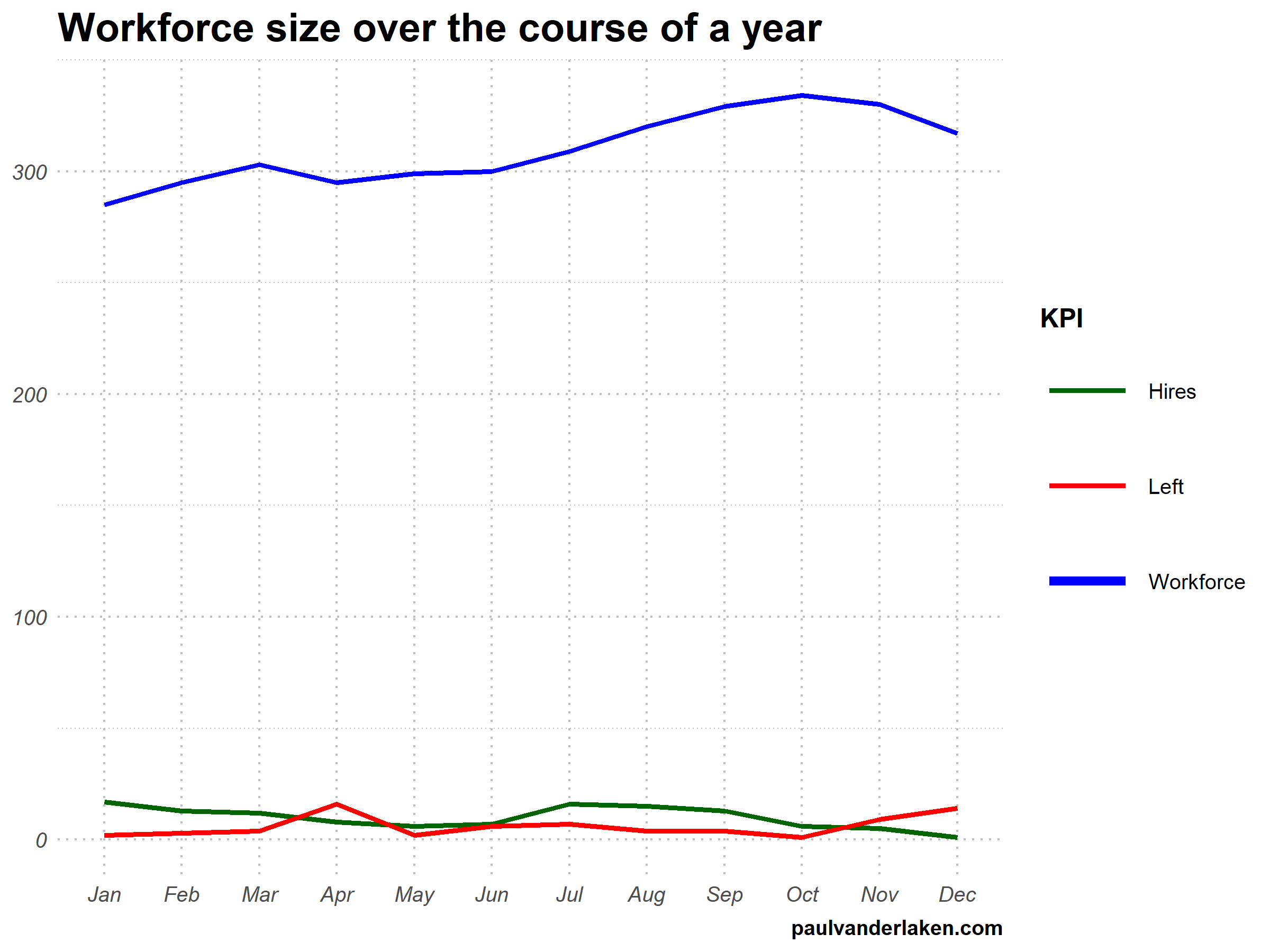
I am curious what you think are the pro’s and con’s of animations. Below, I posted two visualizations of the same data. The data consists of the simulated workforce trends, including new hires and employee attrition over the course of twelve months.
versus
Would you prefer the static, or the animated version? Please do share your thoughts in the comments below, or on the respective LinkedIn and Twitter posts!
Want to reproduce these plots? Or play with the data? Here’s the R code:
# transform to long format wf_long <- gather(wf, key = "variable", value = "value", -month) capitalize the name of variables wf_long$variable <- capitalize_string(wf_long$variable)
# VISUALIZE & ANIMATE #### # draw workforce plot ggplot(wf_long, aes(x = month, y = value, group = variable)) + geom_line(aes(col = variable, size = variable == "workforce")) + scale_color_manual(values = COLORS) + scale_size_manual(values = c(LINE_SIZE2, LINE_SIZE1), guide = FALSE) + guides(color = guide_legend(override.aes = list(size = c(rep(LINE_SIZE2, 2), LINE_SIZE1)))) + # theme_PVDL() + labs(x = NULL, y = NULL, color = "KPI", caption = "paulvanderlaken.com") + ggtitle("Workforce size over the course of a year") + NULL -> workforce_plot
Browse through hundreds of helpful data visualization tools, programs, and services. All neatly organized by Andy Kirk in categories: data handling, applications, programming, web-based, qualitative, mapping, specialist, and colour. What a great repository!
One of their GIFs I particularly liked, copied below. Using the OpenSci syn package they looked up synonyms for cool and printed those in some nice colors.
On GitHub, you can find the original code for this project. However, I didn’t get it working on my machine — due to recent updates to the gganimate package — so I had to create my own version, which you find below.
devtools::install_github("ropenscilabs/syn") # only needed for first-time install devtools::install_github('thomasp85/gganimate') # install the most recent version of gganimate
synonyms <- syn("great") # store synonyms for your word of chosing
n = 15 # number of synonyms to sample time = 3 # their position in the plot as well as the duration of their display
# generate dataframe with random synonyms sentences and assigned locations sentences_df <- data_frame( sentence = paste("#rstats ==", sample(synonyms, n), "!!") , x = time , y = seq(time, time * n, time) )
# generate the actual plot ggplot(sentences_df, aes(x, -y, label = sentence, group = sentence, fill = sentence)) + geom_label(size = 10, colour = "white", label.size = 0.3) + transition_components(id = sentence, time = y, enter_length = n * time + time , exit_length = n * time + time) + scale_fill_viridis_d() + theme_void() + theme(legend.position = "none") -> plot1
# animate the plot animate(plot1, nframes = n * time + time)
This code renders the following GIF:
Try to play around with the code to change the GIF:
Change the set.seed argument to get different synonyms in there,
Change the n to include more or less words,
Change the x and y variables to position the labels differently,
Change the size, colour, and fill of the geom_label function to change the label design,
Or change the transition_components arguments to change the display timing.
Moreover, you could change the sentence variable to something to motivate yourself. For instnace, in the following code, I changed it to include my name, and synonyms for the word good. Moreover, I picked a different gganimate function — transition_time — to display the labels according to a different pattern.
set.seed(2) # for reproducibility purposes
# generate dataframe with random synonyms sentences and assigned locations sentences_df <- data_frame( sentence = paste0("Paul is ", sample(syn("good"), n), "!") , x = time , y = seq(time, time * n, time) )
# animate the plot animate(plot2, nframes = n * time + time)
I think the result is very pleasing, comforting, and positive! Except maybe for the dinkum bit, but fortunately neither I or thesaurus.com know what that means, so it might as well be positive : )
If you go about creating your own animations, you can save them using the save_animation function of the gganimate package. Good luck!
PS. The code to generate the GIF at the top of this blog is posted below. It uses another gganimate function called transition_states:
set.seed(3) # for reproducibility purposes

time = 5
n = 5

# generate dataframe with random synonyms sentences and assigned locations
sentences_df <- data_frame(
  sentence = paste0("You are ", sample(syn("amazing"), n), "!")
  , x = runif(n)
  , y = seq(time, time * n, time)
)

# generate the actual plot
ggplot(sentences_df,
       aes(x, -y,
           label = sentence,
           group = sentence,
           fill = sentence)) +
  geom_label(size = 12, colour = "white", label.size = 0.5) +
  transition_states(states = sentence, transition_length = time, state_length = time) +
  theme_void() +
  theme(legend.position = "none") +
  coord_cartesian(xlim = c(-0.5, 1.5)) ->
  plot3

# animate the plot
animate(plot3, nframes = n * time + time)
The R for Data Science (R4DS) book by Hadley Wickham is a definite must-read for every R programmer. Amongst others, the power of functional programming is explained in it very well in the chapter on Iteration. I wrote about functional programming before, but I recently re-read the R4DS book section after coming across some new valuable resources on particularly R’s purrr functions.
The purpose of this blog post is twofold. First, I wanted to share these new resources I came across, along with the other resources I already have collected over time on functional programming. Second, I wanted to demonstrate via code why functional programming is so powerful, and how it can speed up, clean, and improve your own workflow.
1. Resources
So first things first, “what are these new functional programming resources?”, you must be wondering. Well, here they are:
Thomas Mock was as inspired by the R4DS book as I was, and will run you through the details behind some of the examples in this tutorial.
Hadley Wickham himself gave a talk at a 2016 EdinbR meetup, explaing why and how to (1) use tidyr to make nested data frame, (2) use purrr for functional programming instead of for loops, and (3) visualise models by converting them to tidy data with broom:
Via YouTube.
Colin Fay dedicated several blogs to purrr. Some are very helpful as introduction — particularly this one — others demonstrate more expert applications of the power of purrr — such as this sequence of six blogs on web mining.
This GitHub repository by Dan Ovando does a fantastic job of explaining functional programming and demonstrating the functionality of purrr.
Cormac Nolan made a beautiful RPub Markdown where he displays how functional programming in combination with purrr‘s functions can result in very concise, fast, and supercharged code.
Last, but not least, part of Duke University 2017’s statistical programming course can be found here, related to functional programming with and without purrr.
2. Functional programming example
I wanted to run you through the basics behind functional programming, the apply family and their purrring successors. I try to do so by providing you some code which you can run in R yourself alongside this read. The content is very much inspired on the R4DS book chapter on iteration.
Let’s start with some data
# let's grab a subset of the mtcars dataset
mtc <- mtcars[ , 1:3] # store the first three columns in a new object
Say we would like to know the average (mean) value of the data in each of the columns of this new dataset. A starting programmer would usually write something like the below:
#### basic approach:

mean(mtc$mpg)
mean(mtc$cyl)
mean(mtc$disp)
However, this approach breaks therule of three! Bascially, we want to avoid copying and pasting anything more than twice.
A basic solution would be to use a for-loop to iterate through each column’s data one by one, and calculate and store the mean for each. Here, we first want to pre-allocate an output vector, in order to prevent that we grow (and copy into memory) a vector in each of the iterations of our for-loop. Details regarding why you do not want to grow a vector can be found here. A similar memory-issue you can create with for-loops is described here.
In the end, our for-loop approach to calculating column means could look something like this:
#### for loop approach:

output <- vector("double", ncol(mtc)) # pre-allocate an empty vector

# replace each value in the vector by the column mean using a for loop
for(i in seq_along(mtc)){
  output[i] <- mean(mtc[[i]])
}

# print the output
output
[1] 20.09062 6.18750 230.72188
This output is obviously correct, and the for-loop does the job, however, we are left with some unnecessary data created in our global environment, which not only takes up memory, but also creates clutter.
ls() # inspect global environment
[1] "i" "mtc" "output"
Let’s remove the clutter and move on.
rm(i, output) # remove clutter
Now, R is a functional programming language so this means that we can write our own function with for-loops in it! This way we prevent the unnecessary allocation of memory to overhead variables like i and output. For instance, take the example below, where we create a custom function to calculate the column means. Note that we still want to pre-allocate a vector to store our results.
#### functional programming approach:

col_mean <- function(df) {
  output <- vector("double", length(df))
  for (i in seq_along(df)) {
    output[i] <- mean(df[[i]])
  }
  output
}
Now, we can call this standardized piece of code by calling the function in different contexts:
This way we prevent that we have to write the same code multiple times, thus preventing errors and typos, and we are sure of a standardized output.
Moreover, this functional programming approach does not create unnecessary clutter in our global environment. The variables created in the for loop (i and output) only exist in the local environment of the function, and are removed once the function call finishes. Check for yourself, only our dataset and our user-defined function col_mean remain:
ls()
[1] "col_mean" "mtc"
For the specific purpose we are demonstrating here, a more flexible approach than our custom function already exists in base R: in the form of the apply family. It’s a set of functions with internal loops in order to “apply” a function over the elements of an object. Let’s look at some example applications for our specific problem where we want to calculate the mean values for all columns of our dataset.
#### apply approach:

# apply loops a function over the margin of a dataset
apply(mtc, MARGIN = 1, mean) # either by its rows (MARGIN = 1)
apply(mtc, MARGIN = 2, mean) # or over the columns (MARGIN = 2)

# in both cases apply returns the results in a vector
# sapply loops a function over the columns, returning the results in a vector
sapply(mtc, mean)
  mpg       cyl      disp
20.09062   6.18750 230.72188
# lapply loops a function over the columns, returning the results in a list
lapply(mtc, mean)
Sidenote: sapply and lapply both loop their input function over a dataframe’s columns by default as R dataframes are actually lists of equal-length vectors (see Advanced R [Wickham, 2014]).
# tapply loops a function over a vector
# grouping it by a second INDEX vector
# and returning the results in a vector
tapply(mtc$mpg, INDEX = mtc$cyl, mean)
   4        6        8
26.66364 19.74286 15.10000
These apply functions are a cleaner approach than the prior for-loops, as the output is more predictable (standard a vector or a list) and no unnecessary variables are allocated in our global environment.
Performing the same action to each element of an object and saving the results is so common in programming that our friends at RStudio decided to create the purrr package. It provides another family of functions to do these actions for you in a cleaner and more versatile approach building on functional programming.
install.packages("purrr")
library("purrr")
Like the apply family, there are multiple functions that each return a specific output:
# map_lgl returns a logical vector
# as numeric means aren't often logical, I had to call a different function
map_lgl(mtc, is.logical) # mtc's columns are numerical, hence FALSE
mpg   cyl  disp
FALSE FALSE FALSE
# map_int returns an integer vector
# as numeric means aren't often integers, I had to call a different function
map_int(mtc, is.integer) # returned FALSE, which is converted to integer (0)
mpg  cyl disp
  0    0    0
#map_dbl returns a double vector.
map_dbl(mtc, mean)
  mpg       cyl      disp
20.09062   6.18750 230.72188
# map_chr returns a character vector.
map_chr(mtc, mean)
     mpg          cyl         disp
"20.090625"   "6.187500" "230.721875"
All purrr functions are implemented in C. This makes them a little faster at the expense of readability. Moreover, the purrr functions can take in additional arguments. For instance, in the below example, the na.rm argument is passed to the mean function
map_dbl(rbind(mtc, c(NA, NA, NA)), mean) # returns NA due to the row of missing values
map_dbl(rbind(mtc, c(NA, NA, NA)), mean, na.rm = TRUE) # handles those NAs
mpg  cyl disp
 NA   NA   NA

     mpg       cyl      disp
20.09062   6.18750 230.72188
Once you get familiar with purrr, it becomes a very powerful tool. For instance, in the below example, we split our little dataset in groups for cyl and then run a linear model within each group, returning these models as a list (standard output of map). All with only three lines of code!
We can expand this as we go, for instance, by inputting this list of linear models into another map function where we run a model summary, and then extract the model coefficient using another subsequent map:
mtc %>% split(.$cyl) %>% map(~ lm(mpg ~ disp, data = .)) %>% map(summary) %>% # returns a list of linear model summaries map("coefficients")
$4
              Estimate Std. Error   t value     Pr(>|t|)
(Intercept) 40.8719553 3.58960540 11.386197 1.202715e-06
disp        -0.1351418 0.03317161 -4.074021 2.782827e-03
$6
                Estimate Std. Error   t value    Pr(>|t|)
(Intercept) 19.081987419 2.91399289 6.5483988 0.001243968
disp         0.003605119 0.01555711 0.2317344 0.825929685
$8
               Estimate  Std. Error   t value     Pr(>|t|)
(Intercept) 22.03279891 3.345241115  6.586311 2.588765e-05
disp        -0.01963409 0.009315926 -2.107584 5.677488e-02
The possibilities are endless, our code is fast and readable, our function calls provide predictable return values, and our environment stays clean!
PS. sorry for the terrible layout but WordPress really has been acting up lately… I really should move to some other blog hosting method. Any tips? Potentially Jekyll?


