This pearl had been resting in my inbox for quite a while before I was able to add it to my R resources list. Citing its GitHub page, ggstatsplot is an extension of ggplot2 package for creating graphics with details from statistical tests included in the plots themselves and targeted primarily at behavioral sciences community to provide a one-line code to produce information-rich plots. The package is currently maintained and still under development by Indrajeet Patil. Nevertheless, its functionality is already quite impressive. You can download the latest stable version via:
utils::install.packages(pkgs="ggstatsplot")
Or download the development version via:
devtools::install_github(
repo="IndrajeetPatil/ggstatsplot", # package path on GitHubdependencies=TRUE, # installs packages which ggstatsplot depends onupgrade_dependencies=TRUE# updates any out of date dependencies
)
The package currently supports many different statistical plots, including:
This function creates either a violin plot, a box plot, or a mix of two for between-group or between-condition comparisons and additional detailed results from statistical tests can be added in the subtitle. The simplest function call looks like the below, but much more complex information can be added and specified.
set.seed(123) # to get reproducible results
# the functions work approximately the same as ggplot2
ggstatsplot::ggbetweenstats(
data=datasets::iris,
x=Species,
y=Sepal.Length,
messages=FALSE
) +
# and can be adjusted using the same, orginal function calls
ggplot2::coord_cartesian(ylim= c(3, 8)) +ggplot2::scale_y_continuous(breaks= seq(3, 8, by=1))
All pictures copied from the GitHub page of ggstatsplot [original]
ggscatterstats
Not all plots are ggplot2-compatible though, for instance, ggscatterstats is not. Nevertheless, it produces a very powerful plot in my opinion.
All pictures copied from the GitHub page of ggstatsplot [original]
ggcormat
ggcorrmat is also quite impressive, producing correlalograms with only minimal amounts of code as it wraps around ggcorplot. The defaults already produces publication-ready correlation matrices:
ggstatsplot::ggcorrmat(
data=datasets::iris,
corr.method="spearman",
sig.level=0.005,
cor.vars=Sepal.Length:Petal.Width,
cor.vars.names= c("Sepal Length", "Sepal Width", "Petal Length", "Petal Width"),
title="Correlalogram for length measures for Iris species",
subtitle="Iris dataset by Anderson",
caption= expression(
paste(
italic("Note"),
": X denotes correlation non-significant at ",
italic("p "),
"< 0.005; adjusted alpha"
)
)
)
All pictures copied from the GitHub page of ggstatsplot [original]
ggcoefstats
Finally, ggcoefstats is a wrapper around GGally::ggcoef, creating a plot with the regression coefficients’ point estimates as dots with confidence interval whiskers. Here’s an example with some detailed specifications:
ggstatsplot::ggcoefstats(
x=stats::lm(formula=mpg~am*cyl,
data=datasets::mtcars),
point.color="red",
vline.color="#CC79A7",
vline.linetype="dotdash",
stats.label.size=3.5,
stats.label.color= c("#0072B2", "#D55E00", "darkgreen"),
title="Car performance predicted by transmission and cylinder count",
subtitle="Source: 1974 Motor Trend US magazine"
) +ggplot2::scale_y_discrete(labels= c("transmission", "cylinders", "interaction")) +ggplot2::labs(x="regression coefficient",
y=NULL)
All pictures copied from the GitHub page of ggstatsplot [original]I for one am very curious to see how Indrajeet will further develop this package, and whether academics will start using it as a default in publishing.
I stumbled across this open access book by Rob Hyndman, the god of time series, and George Athanasopoulos, a colleague statistician / econometrician at Monash University in Melbourne Australia.
Hyndman and Athanasopoulos provide a comprehensive introduction to forecasting methods, accessible and relevant among others for business professionals without any formal training in the area. All R examples in the book assume work build on the fpp2 R package. fpp2 includes all datasets referred to in the book and depends on other R packages including forecast and ggplot2.
Some examples of the analyses you can expect to recreate, ignore the agricultural topic for now ; )
One of the example analysis you will recreate by following the book (Figure 3.3)You will be forecasting price data using different analyses and adjustments (Figure 3.4)
I highly recommend this book to any professionals or students looking to learn more about forecasting and time series modelling. There is also a DataCamp course based on this book. If you got value out of this free book, be sure to buy a hardcopy as well.
Professor John Kruschke and Torrin Liddell – one of his Ph.D. students at Indiana University – wrote a fantastically useful scientific paper introducing Bayesian data analysis to the masses. Kruschke and Liddell explain the main ideas behind Bayesian statistics, how Bayesians deal with continuous and binary variables, how to use and set meaningful priors, the differences between confidence and credibility intervals, how to perform model comparison tests, and many more. The paper is published open access so you can read it here.
I found it incredibly useful, providing me with a better understanding of how Bayesian analysis works, what kind of questions you can answer with it, and what the resulting insights would comprise of. After reading it, I was honestly asking myself why I don’t use Bayesian methods more often… So what’s next, how to learn more?
Past weekend, I visited the casino with some friends. Of all games, we enjoy North-American-style Baccarat the most. This type of Baccarat is often called Punto Banco. In short, Punto Banco is a card game in which two hands compete: the “player” and the “banker“. During each coup (a round of play), both hands get dealt either 2 or 3 cards, depending on a complex drawing schema, and all cards have a certain value. Put simply, the hand with the highest total value of cards wins the coup, after which a new one starts. Before each coup, gamblers may bet which of the hands will win. Neither hand is in any way associated with the actual house or player/gambler, so bets may be placed on both. All in all, three different bets can be placed in a game of Punto Banco:
The player hand has the highest total value, in which case the player wins (Punto);
The banker hand has the highest total value, in which case the banker wins (Banco);
The player and banker hands have equal total value, in which case there is a tie (Egalité).
If a gambler correctly bets either Punto or Banco, their bets get a 100% payoff. However, a house tax will often be applied to Banco wins. For instance, Banco wins may only pay off 95% or specific Banco wins (e.g., total card value of 5) may pay off less (e.g., 50%). Depending on house rules, a correct bet on a tie (Egalité) will pay off either 800% or 900%. A wrong bet on Punto or Banco stands in case Egalité is dealt. In all other cases of wrong bets, the house takes the money.
My friends and I like Punto Banco because it is completely random but seems “gameable”. Punto Banco is played with six or eight decks so there is no way to know which cards will be next. Moreover, the card-drawing rules are quite complex, so you never really know what’s going to happen. Sometimes both Punto and Banco get only two cards, at other times, the hand you bet on will get its third card, which might just turn things around. Punto Banco’s perceived gameability comes through our human fallacies to see patterns in randomness. Often, casino’s will place a monitor with the last fifty-so results (see below) to tempt gamblers to (erroneously) spot and bet on patterns. Alternatively, you might think it’s smart to bet against the table (play Punto when everybody else goes for Banco) or play on whatever bet won last hand. As the hands are dealt quite quickly in succession, and the minimal bet is often 10+ euro/dollar, Punto Banco is a quick way to find out how lucky you are.
Examples of Baccarat monitors, often placed next to a table.
So back to last weekend’s trip to the casino. Unfortunately, my friends and I lost quite some money at the Punto Banco table. We know the house has an edge (though smaller than in other games) but normally we are quite lucky. We often discuss what would be good strategies to minimize this houses’ edge. Obviously, you want to play as few games as possible, but that’s as far as we got in terms of strategy. Normally, we just test our luck and randomly bet Punto or Banco, and sparsely on Egalité.
As a statistical programmer, I thought it might be interesting to simulate the game and its odds from the bottom up. On the one hand, I wanted to get a sense of how favorable the odds are to the house. On the other hand, I was curious as to what extent strategies may be more or less successful in retaining at least some of your hard-earned cash.
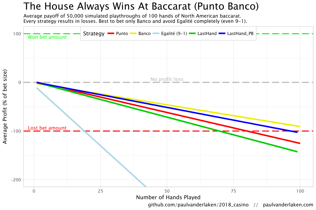
In my simulations, I follow the Holland Casino Punto Banco rules, meaning a six-deck shoe and a Banco win with 5 pays out 50%. I did adopt the more lenient 9-1 payoff for Egalité though. Several hours of programming and some million simulated Baccarat hands later, here are the results:
Do not play Baccarat / Punto Banco if you do not want to lose your money. Obviously, it’s best to not set foot in the casino if you can’t afford to lose some money. However, I eagerly pay for the entertainment value I get from it.
You lose least if you stick to Banco. Despite having only a 50% payoff when Banco wins with 5, the odds are best for Banco due to the drawing rules. Indeed, according to the Wizard of Odds, the house edge for Banco (1.06%) is slightly lower than that of Punto (1.24%).
Whatever you do, do not bet on Egalité. Because most casino’s pay out 8 to 1 in case of a correctly predicted tie, betting on one seems about the worst gambling strategy out there. With a house edge of over 14%, you are better off playing most other games (Wizard of Odds). Although casino’s paying out a tie 9 to 1 decrease the house edge to just below 5%, this is still way worse than playing either Punto or Banco.
The figure below shows the results of the five strategies I tested using 50,000 simulations of 100 consecutive hands. Based on the results, I was reluctant to develop and test other strategies as results look quite straightforward: play Banco. Additionally, Wikipedia cites Thorp (1984, original reference unknown) who suggested that there are no strategies that will really result in any significant player advantage, except maybe for the endgame of a deck, which presumably requires a lot of card counting. If you nevertheless want to test other strategies, please be my guest, here are my five:
Punto: Always bet on Punto.
Banco: Always bet on Banco.
Egalité: Always bet on Egalité.
LastHand: Bet on the outcome of the last hand/coup.
LastHand_PB: Bet on the outcome of the last hand/coup, only if this was Punto or Banco.
The above figure depicts the expected value of each strategy over a series of consecutive hands played. Clearly, the payoff is quite linear, independent of your strategy. The more hands you play, the more you lose. However, also clear is that some strategies outperform others. After 100 hands of Baccarat, playing only Banco will on average result in a total loss below the amount you wager. For example, if you bet 10 euro every hand, you will have a loss of about 9 euro’s after 100 rounds, on average. This is in line with the ~1% house edge reported by the Wizard of Odds. Similarly, betting only Punto will result in a loss of about 130% of the bet amount, which is also conform the ~1.4% house edge reported by the Wizard of Odds. Betting on Punto or Banco based on whichever won last (LastHand_PB) performs somewhere in between these two strategies, losing just over 100% of the bet amount in 100 hands. Your expected losses increase when you just bet on whichever outcome came last, including Egalité, resulting in around ~-150% after 100 hands. This is mainly because betting on Egalité, which seems about the worst strategy ever, will result in a remarkable 493.9% loss after 100 hands.
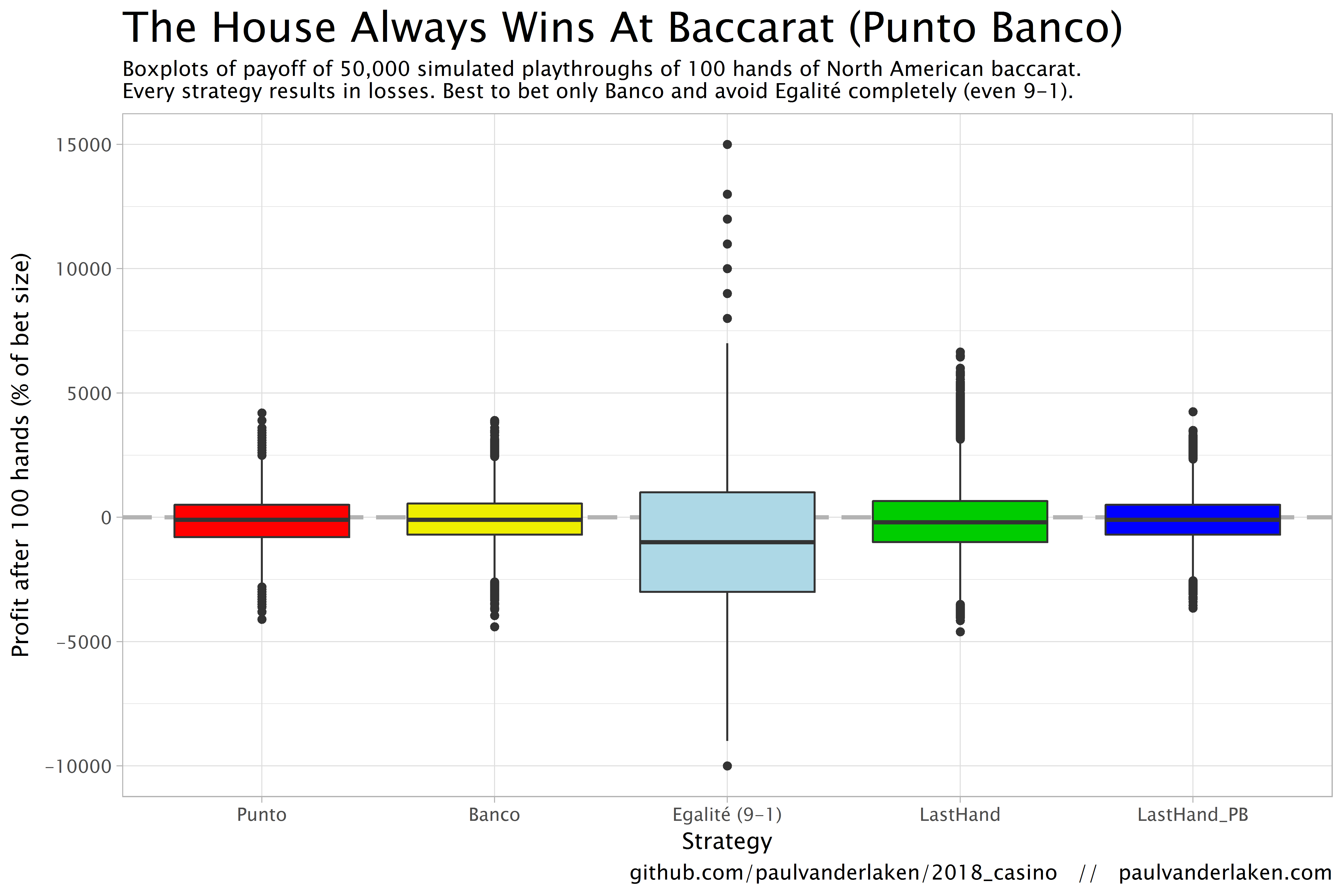
Apart from these average or expected values, I was also interested in the spread of outcomes of our thousands of simulations. Particularly because gamblers on a lucky streak may win much more when betting on Egalité, as the payoff is larger (8-1 or 9-1). The figure below shows that any strategy including Egalité will indeed result in a wider spread of outcomes. Betting on Egalité may thus be a good strategy if you are by some miracle divinely lucky, have information on which cards are coming next, or have an agreement with the dealer (disclaimer: this is a joke, please do not ever bet on Egalité with the intention of making money or try to cheat at the casino).
If you want to know how I programmed these simulations, please visit the associated github repository or reach out. I intend on simulating the payoff for various other casino games in the near future (first up: BlackJack), so if you are interested keep an eye on my website or twitter.
When I was an undergrad, I was told that beyond a certain sample size (n=30 if I recall correctly), t-tests and ANOVAs are fine. This was a lie. I wished I had been taught robust methods and that t-tests and ANOVAs on means are only a few options among many alternatives. Indeed, t-tests and ANOVAs on means are not robust to outliers, skewness, heavy-tails, and for independent groups, differences in skewness, variance (heteroscedasticity) and combinations of these factors (Wilcox & Keselman, 2003; Wilcox, 2012). The main consequence is a lack of statistical power. For this reason, it is often advised to report a measure of effect size to determine, for instance, if a non-significant effect (based on some arbitrary p value threshold) could be due to lack of power, or reflect a genuine lack of effect. The rationale is that an effect could be associated with a sufficiently large effect…
Like any large tech company, Etsy relies heavily on statistics to improve their way of doing business. In their case, data from real-life experiments provide the business intelligence that allow effective decision-making. For instance, they experiment with the layout of their buttons, with the text shown near products, or with the suggestions made after a search query. To detect whether such changes have (ever so) small effects on Etsy’s KPI’s (e.g., conversion), data scientists such as Emily rely on traditional A/B testing.
In a 40-minute presentation, Emily explains how statistical issues such as skewed distributions, outliers, and power are dealt with at Etsy, among others using bootstrapping and simulations. Moreover, 30 minutes in Emily shares her lessons when it comes to working with (less stats-savvy) business stakeholders. For instance, how to help identify and transform business questions into data questions back into business solutions, or how to deal with the desire to peek at the results of experiments early.
Overall, I can the presentation below, the slides of which you find on Emily’s GitHub.