Nothing beats a aesthetically-pleasing data visualization in the form of a map (see evidence here, here, here, or here).
Moreover, we’ve already witnessed some great R tutorials by Ilya Kashnitsky before (see Animated Snow in R).
These two come together in Ilya’s recent post on subplots in ggplot2 maps, with which he completely amazed me. The creation process is actually easier than the end result makes it look: make several visualizations and add them as ggplot2::annotation_custom() to your main ggplot2 map — the same as if you are adding a logo to your plot. Enjoy:
Timo Grossenbacher works as reporter/coder for SRF Data, the data journalism unit of Swiss Radio and TV. He analyzes and visualizes data and investigates data-driven stories. On his website, he hosts a growing list of cool projects. One of his recent blogs covers categorical spatial interpolation in R. The end result of that blog looks amazing:
This map was built with data Timo crowdsourced for one of his projects. With this data, Timo took the following steps, which are covered in his tutorial:
Read in the data, first the geometries (Germany political boundaries), then the point data upon which the interpolation will be based on.
Preprocess the data (simplify geometries, convert CSV point data into an sf object, reproject the geodata into the ETRS CRS, clip the point data to Germany, so data outside of Germany is discarded).
Then, a regular grid (a raster without “data”) is created. Each grid point in this raster will later be interpolated from the point data.
Run the spatial interpolation with the kknn package. Since this is quite computationally and memory intensive, the resulting raster is split up into 20 batches, and each batch is computed by a single CPU core in parallel.
Visualize the resulting raster with ggplot2.
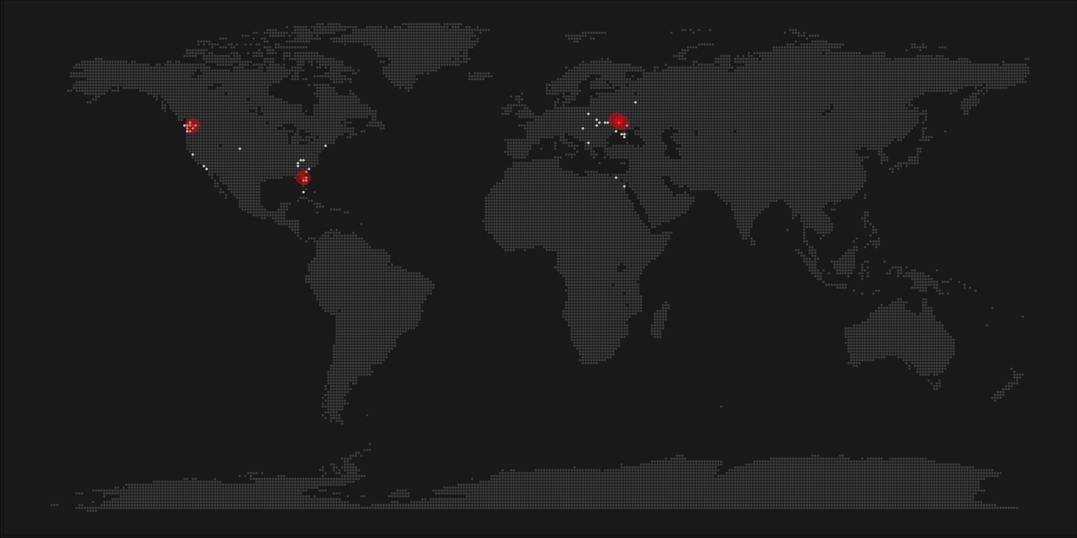
All code for the above process can be accessed on Timo’s Github. The georeferenced points underlying the interpolation look like the below, where each point represents the location of a person who selected a certain pronunciation in an online survey. More details on the crowdsourced pronunciation project van be found here, .
Another of Timo’s R map, before he applied k-nearest neighbors on these crowdsourced data. [original]If you want to know more, please read the original blog or follow Timo’s new DataCamp course called Communicating with Data in the Tidyverse.
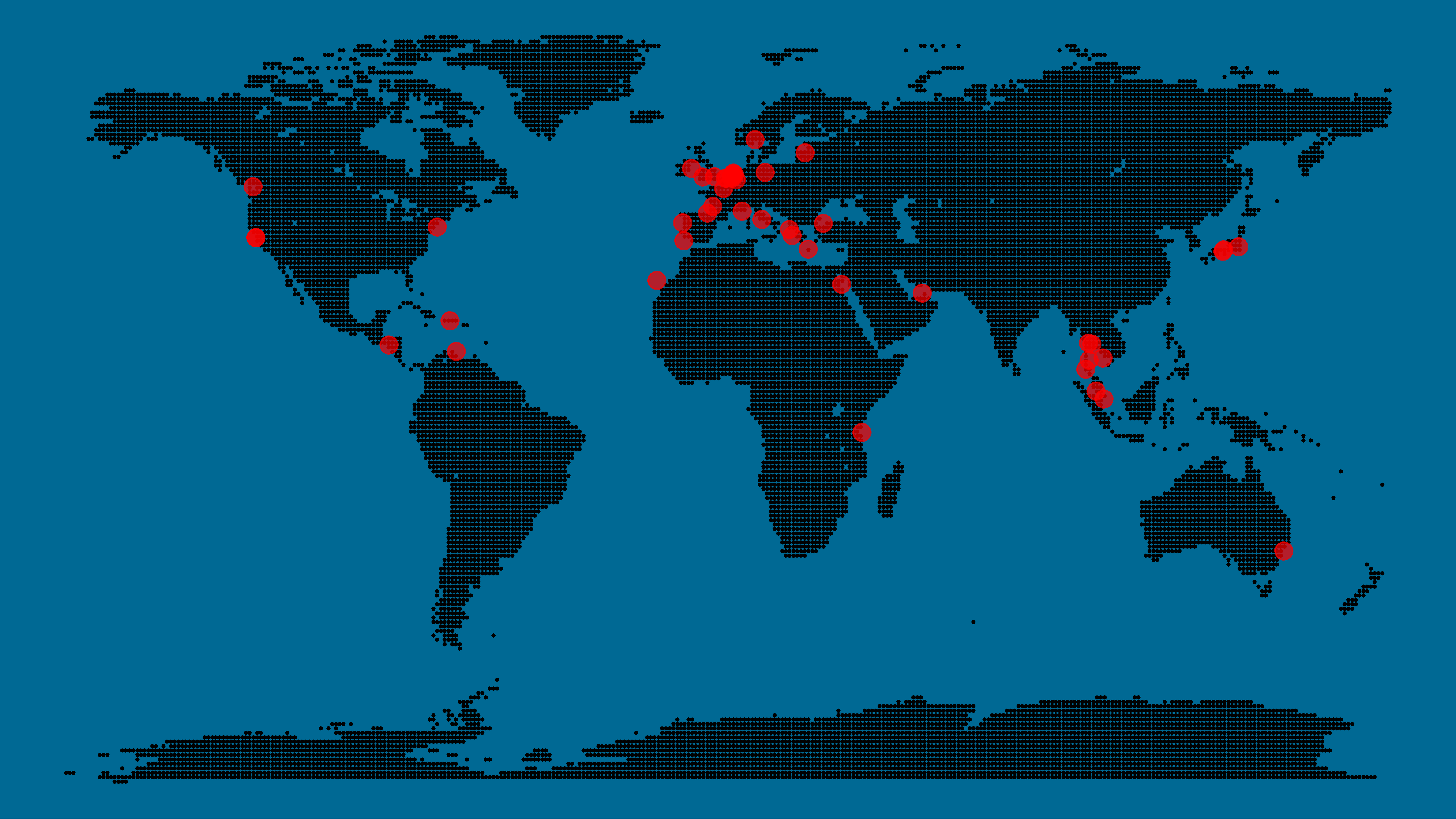
A pixel map of holiday and living locations made by Taras Kaduk in R [original]
Taras Kaduk seems as excited about R and the tidyverse as I am, as he built the beautiful map above. It flags all the cities he has visited and, in red, the cities he has lived. Taras was nice enough to share his code here, in the original blog post.
Now, I am not much of a globetrotter, but I do like programming. Hence, I immediately wanted to play with the code and visualize my own holiday destinations. Below you can find my attempt. The updated code I also posted below, but WordPress doesn’t handle code well, so you better look here.
Let’s run you through the steps to make such a map. First, we need to load some packages. I use the apply family to install and/or load a set of packages so that if I/you run the script on a different computer, it will still work. In terms of packages, the tidyverse (read more) includes some nice data manipulation packages as well as the famous ggplot2 package for visualizations. We need maps and ggmap for their mapping functionalities. here is a great little package for convenient project management, as you will see (read more).
Next, we need to load in the coordinates (longitudes and latitudes) of our holiday destinations. Now, I started out creating a dataframe with city coordinates by hand. However, this was definitely not a scale-able solution. Fortunately, after some Googling, I came across ggmap::geocode(). This function allows you to query the Google maps API(no longer works) Data Science Toolkit, which returns all kinds of coordinates data for any character string you feed it.
Although, I ran into two problems with this approach, this was nothing we couldn’t fix. First, my home city of Breda apparently has a name-city in the USA, which Google favors. Accordingly, you need to be careful and/or specific regarding the strings you feed to geocode() (e.g., “Breda NL“). Second, API’s often have a query limit, meaning you can only ask for data every so often. geocode() will quickly return NAs when you feed it more than two, three values. Hence, I wrote a simple while loop to repeat the query until the API retrieves coordinates. The query will pause shortly in between every attempt. Returned coordinates are then stored in the empty dataframe I created earlier. Now, we can easily query a couple dozen of locations without errors.
You can try it yourself: all you need to change is the city_name string.
### cities data ----------------------------------------------------------------

# cities to geolocate
city_name <- c("breda NL", "utrecht", "rotterdam", "tilburg", "amsterdam",
               "london", "singapore", "kuala lumpur", "zanzibar", "antwerp",
               "middelkerke", "maastricht", "bruges", "san fransisco", "vancouver",
               "willemstad", "hurghada", "paris", "rome", "bordeaux",
               "berlin", "kos", "crete", "kefalonia", "corfu",
               "dubai", " barcalona", "san sebastian", "dominican republic",
               "porto", "gran canaria", "albufeira", "istanbul",
               "lake como", "oslo", "riga", "newcastle", "dublin",
               "nice", "cardiff", "san fransisco", "tokyo", "kyoto", "osaka",
               "bangkok", "krabi thailand", "chang mai thailand", "koh tao thailand")

# initialize empty dataframe
tibble(
  city = city_name,
  lon = rep(NA, length(city_name)),
  lat = rep(NA, length(city_name))
) ->
  cities

# loop cities through API to overcome SQ limit
# stop after if unsuccessful after 5 attempts
for(c in city_name){
  temp <- tibble(lon = NA)
  # geolocate until found or tried 5 times
  attempt <- 0 # set attempt counter
  while(is.na(temp$lon) & attempt < 5) {
    temp <- geocode(c, source = "dsk")
    attempt <- attempt + 1
    cat(c, attempt, ifelse(!is.na(temp[[1]]), "success", "failure"), "\n") # print status
    Sys.sleep(runif(1)) # sleep for random 0-1 seconds
  }
  # write to dataframe
  cities[cities$city == c, -1] <- temp
}
Now, Taras wrote a very convenient piece of code to generate the dotted world map, which I borrowed from his blog:
With both the dot data and the cities’ geocode() coordinates ready, it is high time to visualize the map. Note that I use one geom_point() layer to plot the dots, small and black, and another layer to plot the cities data in transparent red. Taras added a third layer for the cities he had actually lived in; I purposefully did not as I have only lived in the Netherlands and the UK. Note that I again use the convenient here::here() function to save the plot in my current project folder.
I very much like the look of this map and I’d love to see what innovative, other applications you guys can come up with. To copy the code, please look here on RPubs. Do share your personal creations and also remember to take a look at Taras original blog!
Kaggle conducts industry-wide surveys to assess the state of data science and machine learning. Over 17,000 individuals worldwide participated in the survey, myself included, and 171 countries and territories are represented in the data.
There is an ongoing debate regarding whether R or Python is better suited for Data Science (probably the latter, but I nevertheless prefer the former). The thousands of responses to the Kaggle survey may provide some insights into how the preferences for each of these languages are dispersed over the globe. At least, that was what I thought when I wrote the code below.
### PAUL VAN DER LAKEN### 2017-10-31### KAGGLE DATA SCIENCE SURVEY### VISUALIZING WORLD WIDE RESPONSES### AND PYTHON/R PREFERENCES# LOAD IN LIBRARIESlibrary(ggplot2)library(dplyr)library(tidyr)library(tibble)# OPTIONS & STANDARDIZATIONoptions(stringsAsFactors=F)theme_set(theme_light())dpi=600w=12h=8wm_cor=0.8hm_cor=0.8capt="Kaggle Data Science Survey 2017 by paulvanderlaken.com"# READ IN KAGGLE DATAmc<-read.csv("multipleChoiceResponses.csv")%>%as.tibble()# READ IN WORLDMAP DATAworldMap<-map_data(map="world")%>%as.tibble()# ALIGN KAGGLE AND WORLDMAP COUNTRY NAMESmc$Country[!mc$Country%in%worldMap$region]%>%unique()worldMap$region%>%unique()%>%sort(F)mc$Country[mc$Country=="United States"]<-"USA"mc$Country[mc$Country=="United Kingdom"]<-"UK"mc$Country[grepl("China|Hong Kong", mc$Country)]<-"China"# CLEAN UP KAGGLE DATAlvls=c("","Rarely", "Sometimes", "Often", "Most of the time")labels=c("NA", lvls[-1])ind_data<-mc%>%select(Country, WorkToolsFrequencyR, WorkToolsFrequencyPython)%>%mutate(WorkToolsFrequencyR=factor(WorkToolsFrequencyR,
levels=lvls, labels=labels))%>%mutate(WorkToolsFrequencyPython=factor(WorkToolsFrequencyPython,
levels=lvls, labels=labels))%>%filter(!(Country==""|is.na(WorkToolsFrequencyR)|is.na(WorkToolsFrequencyPython)))# AGGREGATE TO COUNTRY LEVELcountry_data<-ind_data%>%group_by(Country)%>%summarize(N=n(),
R=sum(WorkToolsFrequencyR%>%as.numeric()),
Python=sum(WorkToolsFrequencyPython%>%as.numeric()))# CREATE THEME FOR WORLDMAP PLOTtheme_worldMap<-theme(plot.background=element_rect(fill="white"),
panel.border=element_blank(),
panel.grid=element_blank(),
panel.background=element_blank(),
legend.background=element_blank(),
legend.position=c(0, 0.2),
legend.justification=c(0, 0),
legend.title=element_text(colour="black"),
legend.text=element_text(colour="black"),
legend.key=element_blank(),
legend.key.size=unit(0.04, "npc"),
axis.text=element_blank(),
axis.title=element_blank(),
axis.ticks=element_blank())
After aligning some country names (above), I was able to start visualizing the results. A first step was to look at the responses across the globe. The greener the more responses and the grey countries were not represented in the dataset. A nice addition would have been to look at the response rate relative to country population.. any volunteers?
Now, let’s look at how frequently respondents use Python and R in their daily work. I created two heatmaps: one excluding the majority of respondents who indicated not using either Python or R, probably because they didn’t complete the survey.
# AGGREGATE DATA TO WORKTOOL RESPONSESworktool_data<-ind_data%>%group_by(WorkToolsFrequencyR, WorkToolsFrequencyPython)%>%count()# HEATMAP OF PREFERRED WORKTOOLSggplot(worktool_data, aes(x=WorkToolsFrequencyR, y=WorkToolsFrequencyPython))+geom_tile(aes(fill=log(n)))+geom_text(aes(label=n), col="black")+scale_fill_gradient(low="red", high="yellow")+labs(title="Heatmap of Python and R usage",
subtitle="Most respondents indicate not using Python or R (or did not complete the survey)",
caption=capt,
fill="Log(N)")
# HEATMAP OF PREFERRED WORKTOOLS# EXCLUSING DOUBLE NA'Sworktool_data%>%filter(!(WorkToolsFrequencyPython=="NA"&WorkToolsFrequencyR=="NA"))%>%ungroup()%>%mutate(perc=n/sum(n))%>%ggplot(aes(x=WorkToolsFrequencyR, y=WorkToolsFrequencyPython))+geom_tile(aes(fill=n))+geom_text(aes(label=paste0(round(perc,3)*100,"%")), col="black")+scale_fill_gradient(low="red", high="yellow")+labs(title="Heatmap of Python and R usage (non-users excluded)",
subtitle="There is a strong reliance on Python and less users focus solely on R",
caption=capt,
fill="N")
Okay, now let’s map these frequency data on a worldmap. Because I’m interested in the country level differences in usage, I look at the relative usage of Python compared to R. So the redder the country, the more Python is used by Data Scientists in their workflow whereas R is the preferred tool in the bluer countries. Interesting to see, there is no country where respondents really use R much more than Python.
# WORLDMAP OF RELATIVE WORKTOOL PREFERENCEggplot(country_data)+geom_map(data=worldMap,
aes(map_id=region, x=long, y=lat),
map=worldMap, fill="grey")+geom_map(aes(map_id=Country, fill=Python/R),
map=worldMap, size=0.3)+scale_fill_gradient(low="blue", high="red", name="Python/R")+theme_worldMap+labs(title="Relative usage of Python to R per country",
subtitle="Focus on Python in Russia, Israel, Japan, Ukraine, China, Norway & Belarus",
caption=capt)+coord_equal()
Countries are color-coded for their relative preference for Python (red/purple) or R (blue) as a Data Science tool. 167 out of 171 countries (98%) demonstrate a value of > 1, indicating a preference for Python over R.
Thank you for reading my visualization report. Please do try and extract some other interesting insights from the data yourself.
# retrieve data filelink="https://gist.githubusercontent.com/maartenzam/787498bbc07ae06b637447dbd430ea0a/raw/9a9dafafb44d8990f85243a9c7ca349acd3a0d07/worldtilegrid.csv"geodata<-read.csv(link)%>%as.tibble()# load in geodatastr(geodata)# examine geodata
Do you have a bunch of data but you can’t seem to figure out how to display it? Or looking for that one specific visualization of which you can’t remember the name?
www.datavizproject.com provides a most comprehensive overview of all the different ways to visualize your data. You can sort all options by Family, Input, Function, and Shape to find that one dataviz that best conveys your message.
Update: look at some of these other repositories here or here.