The website PapersWithCode.com lists all scientific publications of which the codes are open-sourced on GitHub. Moreover, you can sort these papers by the stars they accumulated on Github over the past days.
The authors, @rbstojnic and @rosstaylor90, just made this in their spare time. Thank you, sirs!
Papers with Code allows you to quickly browse state-of-the-art research on GANs and the code behind them, for instance. Alternatively, you can browse for research and code on sentiment analysis or LSTMs.
In optimizing their transportation services, Uber uses evolutionary strategies and genetic algorithms to train deep neural networks through reinforcement learning. A lot of difficult words in one sentence; you can imagine the complexity of the process.
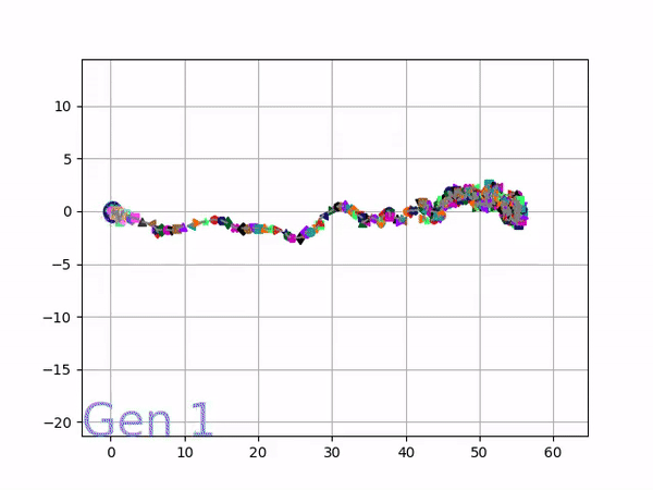
Because it is particularly difficult to observe the underlying dynamics of this learning process in neural network optimization, Uber built VINE – a Visual Inspector for NeuroEvolution. VINE helps to discover how evolutionary strategies and genetic optimizing are performing under the hood. In a recent article, they demonstrate how VINE works on the MujocoHumanoid Locomotion task.
[…] In the Humanoid Locomotion Task, each pseudo-offspring neural network controls the movement of a robot, and earns a score, called its fitness, based on how well it walks. [Evolutionary principles] construct the next parent by aggregating the parameters of pseudo-offspring based on these fitness scores […]. The cycle then repeats.
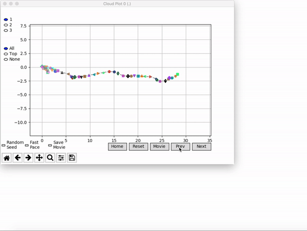
VINE plots parent neural networks and their pseudo-offspring according to their performance. Users can then interact with these plots to:
visualize parents, top performance, and/or the entire pseudo-offspring cloud of any generation,
compare between and within generation performance,
and zoom in on any pseudo-offspring (points) in the plot to display performance information.
The GIFs below demonstrate what VINE is capable of displaying:
The evolution of performance over generations. The color changes in each generation. Within a generation, the color intensity of each pseudo-offspring is based on the percentile of its fitness score in that generation (aggregated into five bins). [original]Vine allows user to deep dive into each single generation, comparing generations and each pseudo-offspring within them [original]VINE can be found at this link. It is lightweight, portable, and implemented in Python.
In the video below, one of my favorite YouTube channels (Two Minute Papers) discusses a new super resolution project where academic scholars taught a neural network to improve low quality photo’s. The researchers took the same picture with multiple camera’s of varying quality and allowed a neural network to learn how the lowest quality pictures can be adjusted to more closely resemble their high quality counterparts. A very interesting approach and the results are just mind-boggling:
Professor John Kruschke and Torrin Liddell – one of his Ph.D. students at Indiana University – wrote a fantastically useful scientific paper introducing Bayesian data analysis to the masses. Kruschke and Liddell explain the main ideas behind Bayesian statistics, how Bayesians deal with continuous and binary variables, how to use and set meaningful priors, the differences between confidence and credibility intervals, how to perform model comparison tests, and many more. The paper is published open access so you can read it here.
I found it incredibly useful, providing me with a better understanding of how Bayesian analysis works, what kind of questions you can answer with it, and what the resulting insights would comprise of. After reading it, I was honestly asking myself why I don’t use Bayesian methods more often… So what’s next, how to learn more?
Kaggle conducts industry-wide surveys to assess the state of data science and machine learning. Over 17,000 individuals worldwide participated in the survey, myself included, and 171 countries and territories are represented in the data.
There is an ongoing debate regarding whether R or Python is better suited for Data Science (probably the latter, but I nevertheless prefer the former). The thousands of responses to the Kaggle survey may provide some insights into how the preferences for each of these languages are dispersed over the globe. At least, that was what I thought when I wrote the code below.
### PAUL VAN DER LAKEN### 2017-10-31### KAGGLE DATA SCIENCE SURVEY### VISUALIZING WORLD WIDE RESPONSES### AND PYTHON/R PREFERENCES# LOAD IN LIBRARIESlibrary(ggplot2)library(dplyr)library(tidyr)library(tibble)# OPTIONS & STANDARDIZATIONoptions(stringsAsFactors=F)theme_set(theme_light())dpi=600w=12h=8wm_cor=0.8hm_cor=0.8capt="Kaggle Data Science Survey 2017 by paulvanderlaken.com"# READ IN KAGGLE DATAmc<-read.csv("multipleChoiceResponses.csv")%>%as.tibble()# READ IN WORLDMAP DATAworldMap<-map_data(map="world")%>%as.tibble()# ALIGN KAGGLE AND WORLDMAP COUNTRY NAMESmc$Country[!mc$Country%in%worldMap$region]%>%unique()worldMap$region%>%unique()%>%sort(F)mc$Country[mc$Country=="United States"]<-"USA"mc$Country[mc$Country=="United Kingdom"]<-"UK"mc$Country[grepl("China|Hong Kong", mc$Country)]<-"China"# CLEAN UP KAGGLE DATAlvls=c("","Rarely", "Sometimes", "Often", "Most of the time")labels=c("NA", lvls[-1])ind_data<-mc%>%select(Country, WorkToolsFrequencyR, WorkToolsFrequencyPython)%>%mutate(WorkToolsFrequencyR=factor(WorkToolsFrequencyR,
levels=lvls, labels=labels))%>%mutate(WorkToolsFrequencyPython=factor(WorkToolsFrequencyPython,
levels=lvls, labels=labels))%>%filter(!(Country==""|is.na(WorkToolsFrequencyR)|is.na(WorkToolsFrequencyPython)))# AGGREGATE TO COUNTRY LEVELcountry_data<-ind_data%>%group_by(Country)%>%summarize(N=n(),
R=sum(WorkToolsFrequencyR%>%as.numeric()),
Python=sum(WorkToolsFrequencyPython%>%as.numeric()))# CREATE THEME FOR WORLDMAP PLOTtheme_worldMap<-theme(plot.background=element_rect(fill="white"),
panel.border=element_blank(),
panel.grid=element_blank(),
panel.background=element_blank(),
legend.background=element_blank(),
legend.position=c(0, 0.2),
legend.justification=c(0, 0),
legend.title=element_text(colour="black"),
legend.text=element_text(colour="black"),
legend.key=element_blank(),
legend.key.size=unit(0.04, "npc"),
axis.text=element_blank(),
axis.title=element_blank(),
axis.ticks=element_blank())
After aligning some country names (above), I was able to start visualizing the results. A first step was to look at the responses across the globe. The greener the more responses and the grey countries were not represented in the dataset. A nice addition would have been to look at the response rate relative to country population.. any volunteers?
Now, let’s look at how frequently respondents use Python and R in their daily work. I created two heatmaps: one excluding the majority of respondents who indicated not using either Python or R, probably because they didn’t complete the survey.
# AGGREGATE DATA TO WORKTOOL RESPONSESworktool_data<-ind_data%>%group_by(WorkToolsFrequencyR, WorkToolsFrequencyPython)%>%count()# HEATMAP OF PREFERRED WORKTOOLSggplot(worktool_data, aes(x=WorkToolsFrequencyR, y=WorkToolsFrequencyPython))+geom_tile(aes(fill=log(n)))+geom_text(aes(label=n), col="black")+scale_fill_gradient(low="red", high="yellow")+labs(title="Heatmap of Python and R usage",
subtitle="Most respondents indicate not using Python or R (or did not complete the survey)",
caption=capt,
fill="Log(N)")
# HEATMAP OF PREFERRED WORKTOOLS# EXCLUSING DOUBLE NA'Sworktool_data%>%filter(!(WorkToolsFrequencyPython=="NA"&WorkToolsFrequencyR=="NA"))%>%ungroup()%>%mutate(perc=n/sum(n))%>%ggplot(aes(x=WorkToolsFrequencyR, y=WorkToolsFrequencyPython))+geom_tile(aes(fill=n))+geom_text(aes(label=paste0(round(perc,3)*100,"%")), col="black")+scale_fill_gradient(low="red", high="yellow")+labs(title="Heatmap of Python and R usage (non-users excluded)",
subtitle="There is a strong reliance on Python and less users focus solely on R",
caption=capt,
fill="N")
Okay, now let’s map these frequency data on a worldmap. Because I’m interested in the country level differences in usage, I look at the relative usage of Python compared to R. So the redder the country, the more Python is used by Data Scientists in their workflow whereas R is the preferred tool in the bluer countries. Interesting to see, there is no country where respondents really use R much more than Python.
# WORLDMAP OF RELATIVE WORKTOOL PREFERENCEggplot(country_data)+geom_map(data=worldMap,
aes(map_id=region, x=long, y=lat),
map=worldMap, fill="grey")+geom_map(aes(map_id=Country, fill=Python/R),
map=worldMap, size=0.3)+scale_fill_gradient(low="blue", high="red", name="Python/R")+theme_worldMap+labs(title="Relative usage of Python to R per country",
subtitle="Focus on Python in Russia, Israel, Japan, Ukraine, China, Norway & Belarus",
caption=capt)+coord_equal()
Countries are color-coded for their relative preference for Python (red/purple) or R (blue) as a Data Science tool. 167 out of 171 countries (98%) demonstrate a value of > 1, indicating a preference for Python over R.
Thank you for reading my visualization report. Please do try and extract some other interesting insights from the data yourself.
Max Woolf writes machine learning blogs on his personal blog, minimaxir, and posts open-source code repositories on his GitHub. He is a former Apple Software QA Engineer and graduated from Carnegie Mellon University. I have published his work before, for instance, this short ggplot2 tutorial by MiniMaxir, but his new project really amazed me.
Max developed a Facebook web scaper in Python. This tool gathers all the posts and comments of Facebook Pages (or Open Facebook Groups) and the related metadata, including post message, post links, and counts of each reaction on the post. The data is then exported to a CSV file, which can be imported into any data analysis program like Excel, or R.
The data format returned by the Facebook scaper.
Max put his scraper to work and gathered a ton of publicly available Facebook posts and their metadata between 2016 and 2017.
Responses to collected Facebook posts.
However, this was only the beginning. In a follow-up project, Max trained a recurrent neural network (or RNN) on these 2016-2017 data in order to predict the proportionate reactions (love, wow, haha, sad, angry) to any given text. Now, he has made this neural network publicly available with the Python 2/3 module and R package, reactionrnn, which builds on Keras/TensorFlow (see Keras: Deep Learning in R or Python within 30 seconds & R learning: Neural Networks).
reactionrnn architecture
Python implementation
For Python, reactionrnn can be installed from pypi via pip:
python3 -m pip install reactionrnn
You may need to create a venv (python3 -m venv <path>) first.
from reactionrnn import reactionrnn

react = reactionrnn()
react.predict("Happy Mother's Day from the Chicago Cubs!")
reactionrnn is trained on Facebook posts of 2016 and 2017 and will often yield responses that are characteristic for this corpus.
reactionrnn will only use the first 140 characters of any given text.
Max intends to build a web-based implementation using Keras.js
Max also intends to improve the network (longer character sequences and better performance) and released it as a commercial product if any venture capitalists are interested.
Max’s projects are open-source and supported by his Patreon, any monetary contributions are appreciated and will be put to good creative use.